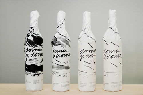
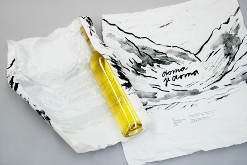
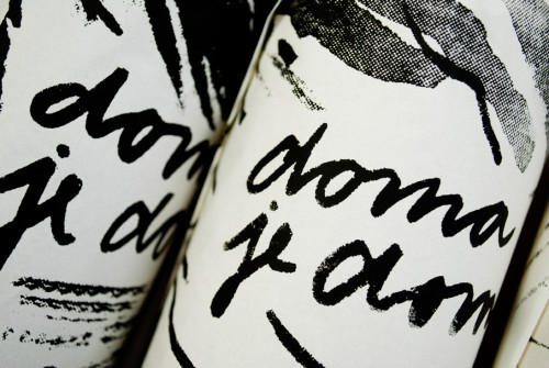
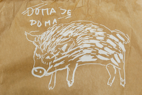
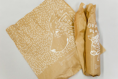
Home is home is a packaging design by Slovakian designer Lucia Blanáriková for a small family-owned wine company, “Home is home”. The package is made from kitchen baking paper, as the design needed to look home friendly. The idea of simply wrapping the bottle with a personalized, hand-printed or drawn paper is amazing and unique. The monochrome illustrations look upscale and contemporary, corresponding to the quality of the product inside.
After graduating from the Academy of Fine Arts and Design in Bratislava with MA Degree in graphic design, Lucia Blanáriková studied spatial graphics, poster design studio, serigraphy studio, editorial design studio and book art studio in Strzemiński Academy of Art in Łódź, Poland, finishing with an impressive range of skills in design. Often combining illustration and graphic design, she balances her time between personal projects, and client projects, all driven by her keen interest and love towards creating.
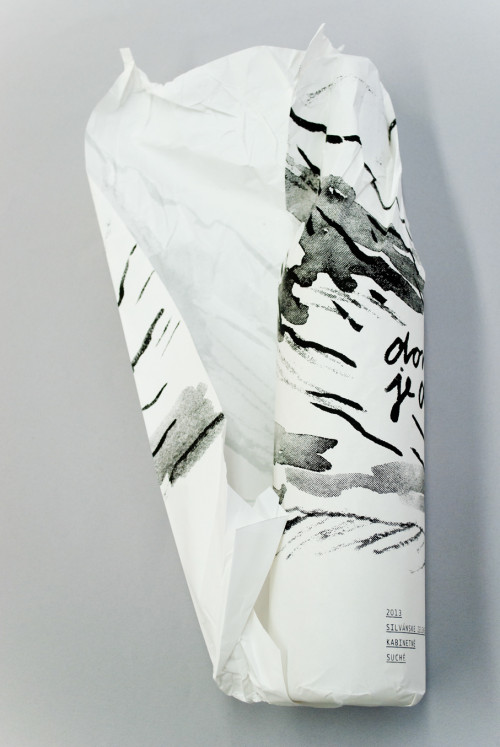
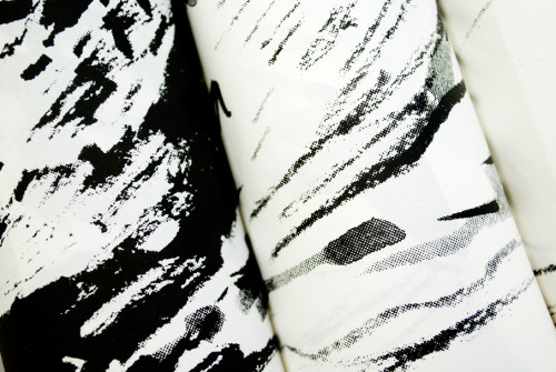
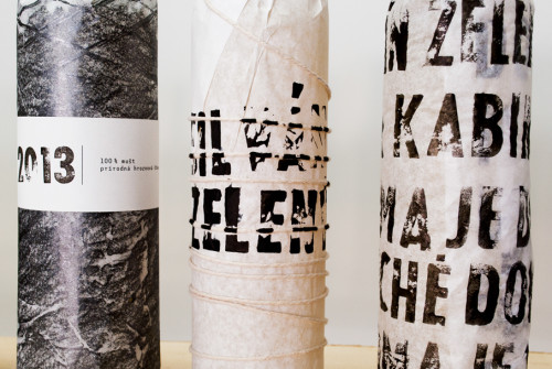
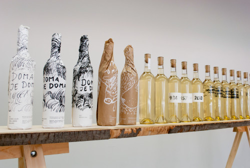
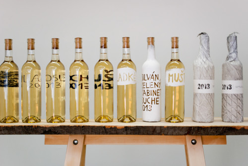
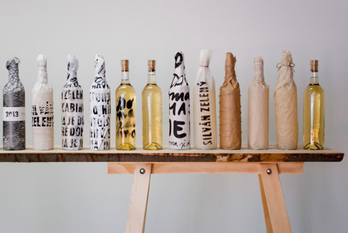
The Home is Home packaging range shows the evolution from an empty wine bottle to the final result (first picture with four bottles of wine). On the final concept, the style of drawings corresponds to the quality of the wine (highest quality, finest drawing). The idea of exchanging the basic wine label to a wrapping paper, which includes all the necessary information, is brilliant. And as the wine is unwrapped, you are left is a tasty product as well as a beautiful drawing which could be re-purposed or even framed.

 Images via Lucia Blanáriková

