How does an Austrian graphic designer end up in New York, with a career many would envy. Graphic designer, branding expert and typography enthusiast – Verena Michelitsch took a minute off her busy schedule and spoke to us about the differences between NY and Austrian design scene, her latest projects as well as her love for simple design and geometric shapes.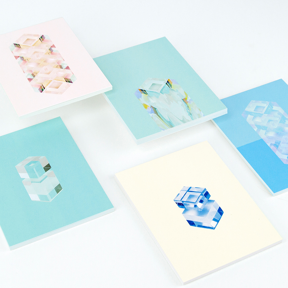
Can you briefly introduce yourself and describe what you do?
I am a graphic designer originally from Austria, working and living in New York. I am specialized in branding, illustration and art direction across print and digital media.
How would you describe your style, what inspires you?
In general I like it clean and minimal but I’m using illustration and icons a lot in my branding projects, I enjoy creating patterns and a more illustrative world around a brand.
I’m inspired by pretty much everything around me. The people that I’m working with as well as my boyfriend who I’m doing quite a few side projects with. I am a lover of typefaces, will know about a new type foundry the day they launch. I think from type design itself one can learn true basics about design: harmonies between the letters, their shape, scale, character and historic references etc. Of course living in NY inspires me a lot, getting to know many insanely creative and interesting people and living in a fast-paced ever-changing environment.
Where or who are you working for at the moment, and what was the last project you were working on?
I am a Senior Designer at RoAndCo, a branding and art direction studio, focussed on fashion, luxury and lifestyle brands. One of my favorite projects is a branding for a swimwear brand called Seilenna. It’s a big branding project, including everything from logo design, packaging, e-comm site design to art direction. It’s rewarding seeing a brand come to life from the very beginning. You should check out the designer Annelies de Rouck’s beautiful swimwear, the site will launch soon.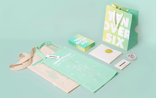
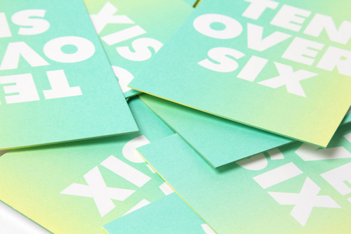 Tenoversix Presents – Illustration, Packaging Design, Graphic Design. Studio: RoAndCo. Creative Direction: Roanne Adams.
Why did you choose to move to New York, or did NY choose you?
I always wanted to work abroad for a little while and was planning to do that right after I graduated from college, but then I had great opportunities to start a company (a freelance collective) with my good friends Mario and Philipp in Graz. They had just founded EN GARDE and wanted me to join them. I have spent four years as an Art Director at EN GARDE and then left to pursue my original dream, moving to NY and working for one of my biggest inspirations, Stefan Sagmeister and Jessica Walsh. I landed an internship and then a freelance gig at Pentagram Design. After a few months in NY I went back to Austria, deciding I want to make the big move, got rid of my apartment in Graz and started to work as a designer for RoAndCo in New York City.
How does the NY design scene differ from Austria?
Naturally, the design scene is bigger, you eventually get to meet people you’ve been looking up to in your early career days. I think the design scene in Austria is actually pretty good, there are lots of very passionate people caring about making events, creating platforms and meetups for designers. There are some great studios and agencies that can compete on an international level. I think the Austrian design scene has changed a lot since I have started with design, about 10 years ago when I started to study Communication Design in Graz. The agency world was ruled by advertising, there were a few studios in Vienna that were really design focussed as far as I know.
Of course the NY design scene has a lot to offer and it’s amazing to have many opportunities to connect with amazing people.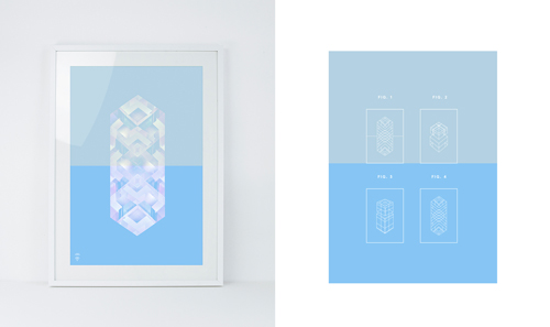
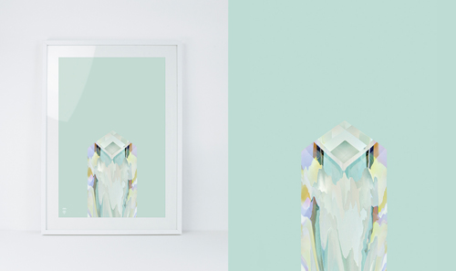
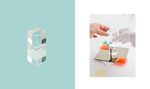 Reflections – Illustration, Photography. In collaboration with Tobias van Schneider. Different materials like paper, plastic and plexiglass were stacked, arranged and shot from an angle to create crystal-like shapes.
You seem to use a lot of geometric shapes and patterns in your work, why is this?
Haha, I’m not sure why I do that. I guess I have always liked that, my mum and my aunt showed my photos of drawings I did when I was four or so, that I didn’t even remember but they were kind of similar to some illustrations that I’m doing now. Not saying that I haven’t changed my illustration style in 15 years but seems like my style has been anchored since my early days as a designer/illustrator 😉
I like the idea of creating images by using simple shapes or lines, using as less components as needed, although I am also a fan of creating patterns and more decorative stuff.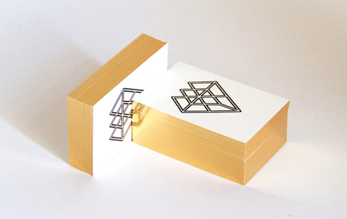 Personal business cards. Letterpress printed by the Infinitive Factory, edge gilding by Steinbrener.
We absolute adore your gold-edges business cards. Do you like to experiment with different printing and finishing techniques? Do you have favorites when it comes to paper, or which do you consider very trendy at the moment?
My business cards are a few years old actually, I wanted to keep them really simple just using my logo that my boyfriend designed for me, black on white. The golden edges were done by an old bible maker in upper Austria, I have sent him my cards and got back a pile of awesome hand gilded cards. I love to experiment with printing techniques, but think it always has to serve the message, the brand and the feeling you want to communicate. Surely there’s lots of trendy stuff out there that looks fancy at first sight but kind of lacks a concept or meaning. I like when the printing or finishing technique serves a purpose or underlies a concept.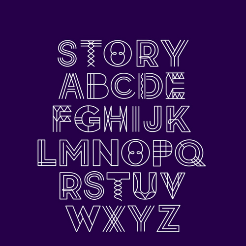
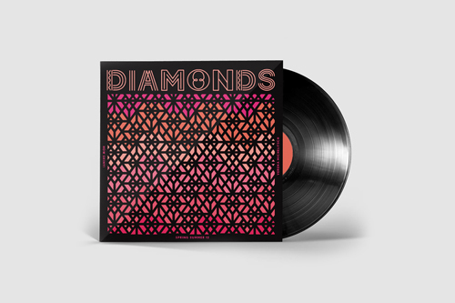 Sunday Type
What role does paper play in your work?
I am not a crazy print or paper expert or fan, I like looking into it when I need it and enjoy talking to and learning from experts. I like interactive design or art direction the same as print design, I don’t consider myself to be a print designer mainly but of course I have a soft spot for paper, textures and materials.
We wrote about the Ada Blackjack branding you designed together with Tobias Van Schneider, how did you two end up working together?
Tobias is my boyfriend and we moved to NY together. I was there a couple of months before him, while he worked for Fantasy Interactive in Stockholm, where he met Lucas whose girlfriend Ivonne designs and makes bags. Ivonne had an Etsy shop at that time, her stuff looked great and Lucas asked us to redo the branding for her. Tobias and I worked on it on from Stockholm and New York, while Ivonne was based in Barcelona. We did the whole project over skype calls and basecamp.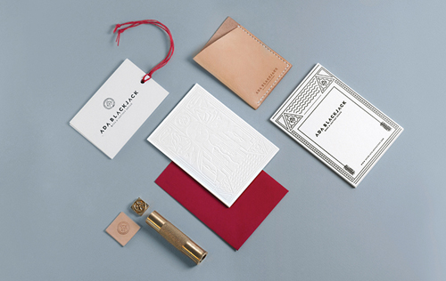
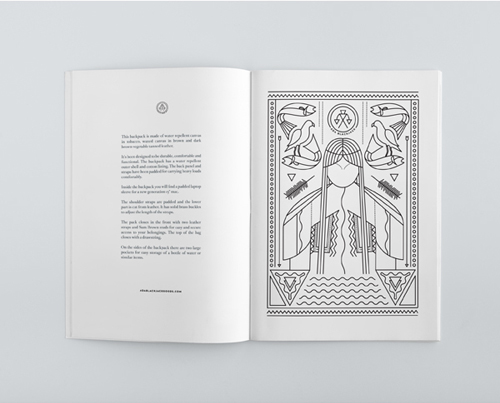 Not All Those Who Wonder Are Lost – branding for Ada Blackjack by Verena Michelitsch and Tobias van Schneider.
Can you show us one of your projects you are particularly proud of?
The branding project for a swimwear brand called Seilenna I currently love the most, I mentioned it earlier.
I am afraid I can’t show it yet! But hope to be able to share it very soon.
Do you have any favorite illustrators or designers whose work you admire?
I love the illustrations of Carl & Craig, Leslie David, the illustrative posters of the Swiss designer Felix Pfaeffli and the art of Tauba Auerbach. I admire Swiss type design a lot, everything that’s happening around the scene of type design and art direction classes of ECAL Lausanne is pretty awesome.
Plans, hopes and dreams for the future?
I am thankful for the great opportunities I was given, all the great people and clients I have worked with.
I hope it’ll go on like that. My biggest dream is to go back to freelance and work independently in a few years and being able to create and live off my own products (what it’ll be, I have no idea but will figure it out).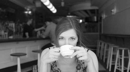 Thank you so much Verena for taking the time to answer our many questions, we wish you an amazing summer back in New York and all the best for you in the future !
Photos via Verena Michelitsch

