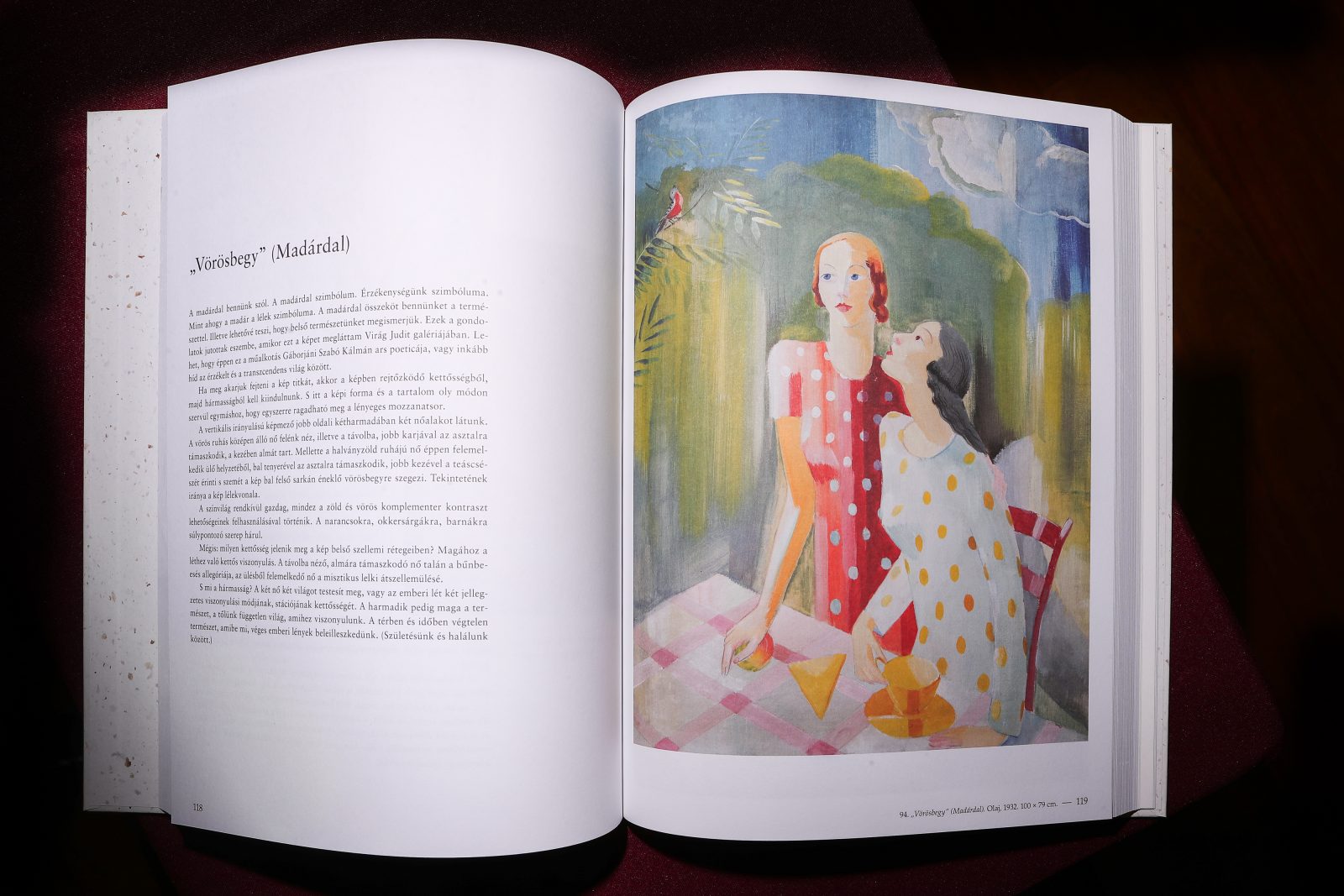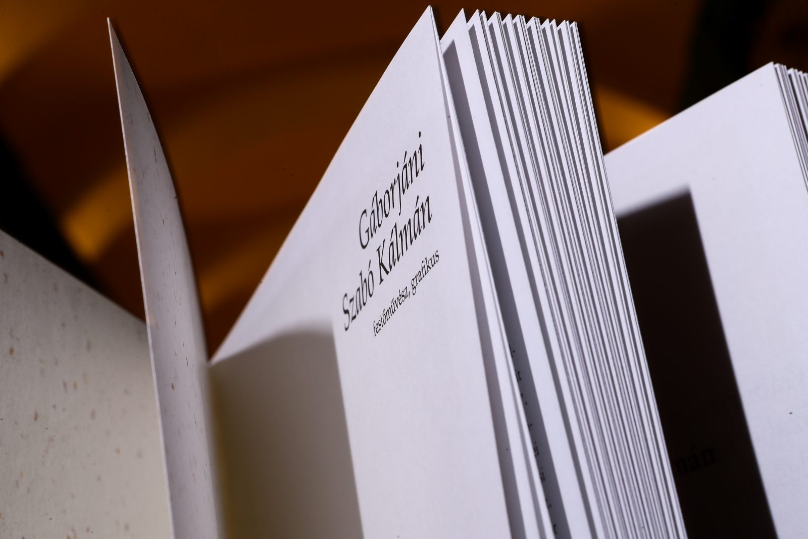
The album Gáborjáni Szabó Kálmán festőművész, grafikus – Kálmán Gáborjáni Szabó, painter and graphic artist in English – features the works of Hungarian painter, graphic artist, and art teacher Gáborjáni Szabó Kálmán, whose life and work was closely connected with The Reformed College of Debrecen, the largest city of the Tiszántúl region, an area that lies between the Tisza river of Hungary and the Apuseni Mountains of Romania. The album, which was published as part of the Public Collections Series of the Church District of the Tiszántúl, was printed in The Alföldi Printing House that has been operating continuously since 1561 and for centuries, served as the printing company of the city of Debrecen and the Reformed Church District.
The Alföldi Printing House has been cherishing written culture and protecting the traditions of book printing for over 460 years, being one of the first places in Hungary to print books with sheet-fed and web offset printing, and now producing more than 29 million books a year with state-of-the-art machines and technologies. The long tradition of book printing in the area, as well as the Main Library of the Reformed College, provided a strong foundation for the work of the artist, so it is not surprising, Kálmán Gáborjáni Szabó took his first steps towards fame as a woodcutter. The Main Library holds an outstanding collection of 114 unique copies (works that have only one copy left in the whole world), has a manuscripts division, an archive of ancient forms, and collection of records of old Hungarian literature prior to 1711.
The design of the album draws inspiration from the puritan style of the Reformed Church, as well as the scents, colors, and interior of the College Library and the works it holds within
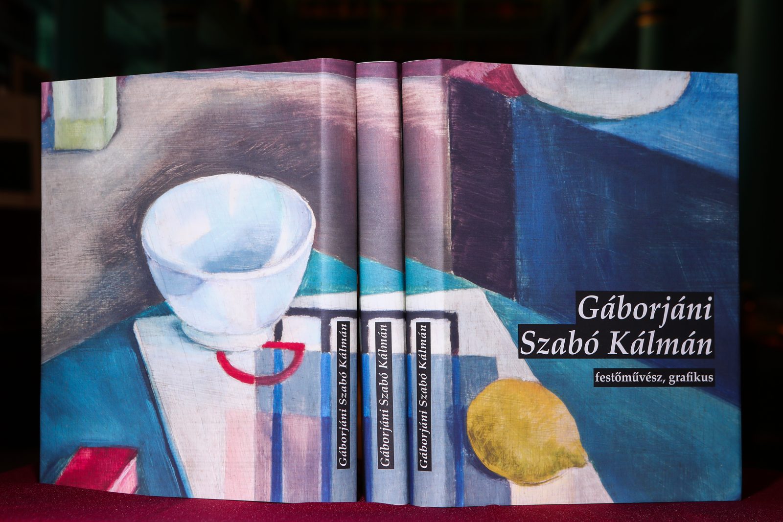
The designer of the album is graphic artist Kamilla Mikáczó, who has worked on numerous projects and book series of the Hungarian Reformed Church. In terms of her style and thematic scope, she kept to the Puritan style of the Reformed Church. She was inspired by the scents, colors, interior space of the College Library and its wonderful volumes, as well as the objects, textiles, goldsmith masterpieces of the College Museum. The book has a simple design and uses classic typography. Its protective cover creates internal tension with its bright colors and the constructive work selected for it against the black woodcut patches of the flat “decorative elements” on the uniquely creative and archaic lamination of the board cover. It articulates the main idea and mood of the work and indicates that it explores a diverse oeuvre including images of life, drawings, woodcuts, photos, paintings, frescoes, and rich written material.
The book has a simple design and uses classic typography. Its protective cover creates internal tension with its bright colors and the constructive work selected for it against the black woodcut patches of the flat “decorative elements” on the uniquely creative and archaic lamination of the board cover.
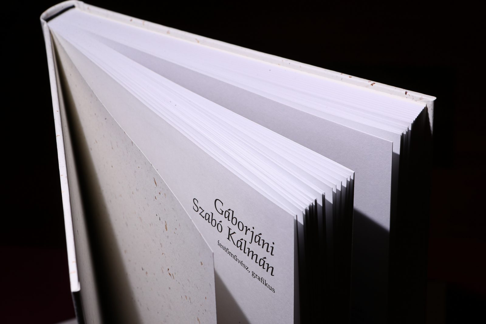
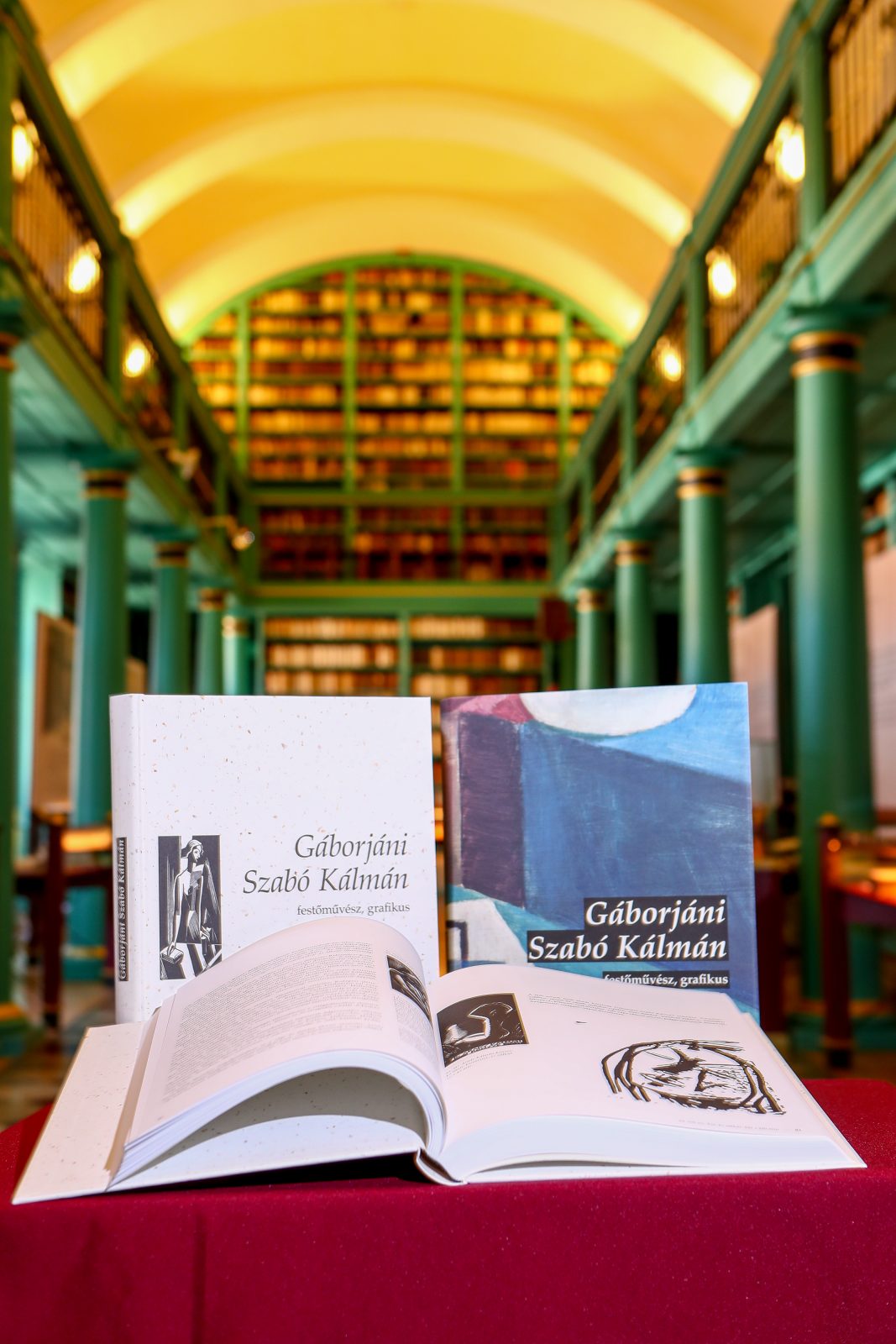
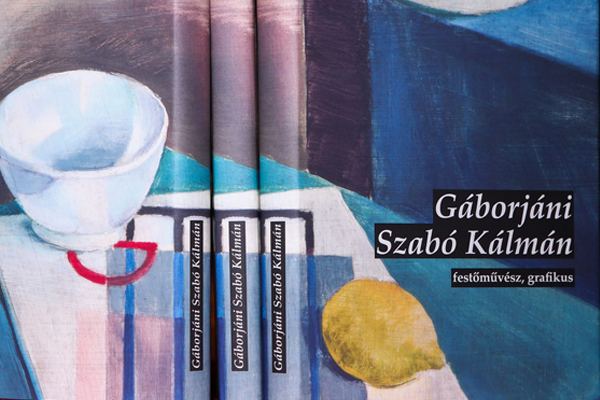
The inner pages of the album are printed on two shades of Munken, while the cover is wrapped in Coffee paper for a vintage look and feel
The pages inside were printed on two shades of Munken paper, the natural white shade of Munken Lynx Rough and the cream shade of Munken Pure Rough, both in 120 gsm. The matte, environmentally-friendly Munken papers align well with the profile of the artist. “We looked for a paper style that accommodates both the woodcut and oil paintings in a refreshing way. Gáborjáni’s woodcut/xylography series represented the starting point and the aim was to achieve an adequate contrast. Munken’s matte, loose-structured texture lets paint pigments permeate perfectly. The colors are not boastful but restrained and the diverse imagery lines up in harmony in the bulky album. It precisely reproduces painted traces of the polished wooden blocks, the transparency of the pencil lines and aquarelle, as well as the brush strokes of oil and wall painting”, explains Botond Gáborjáni Szabó.
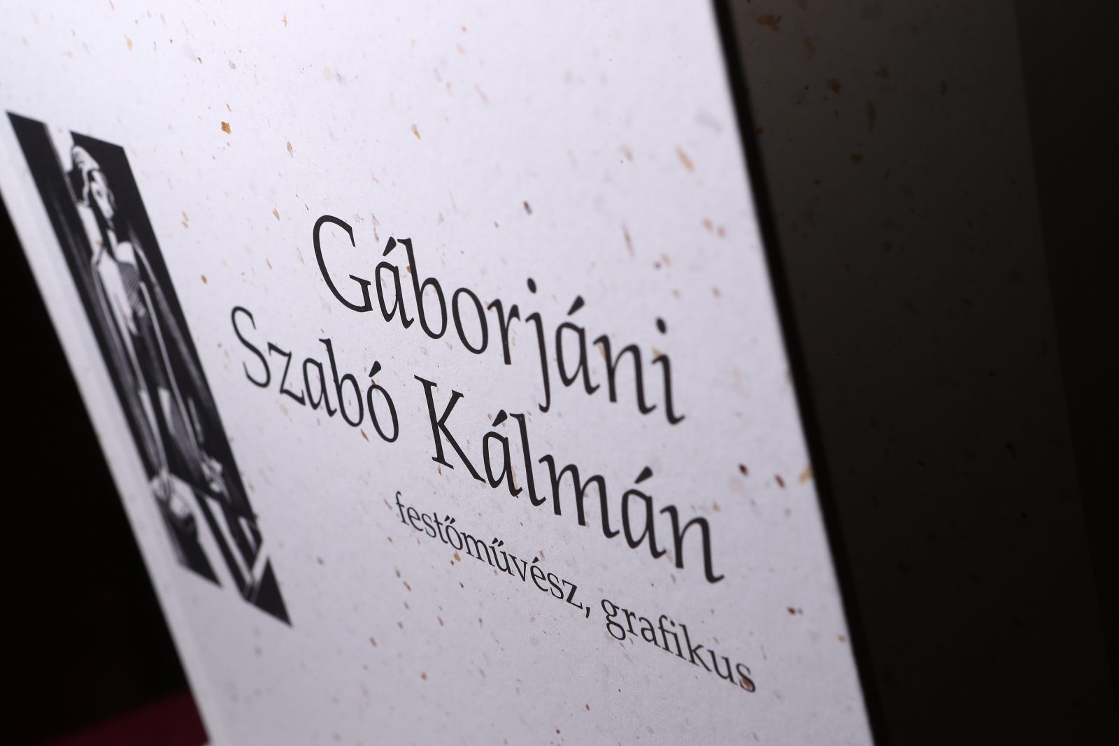
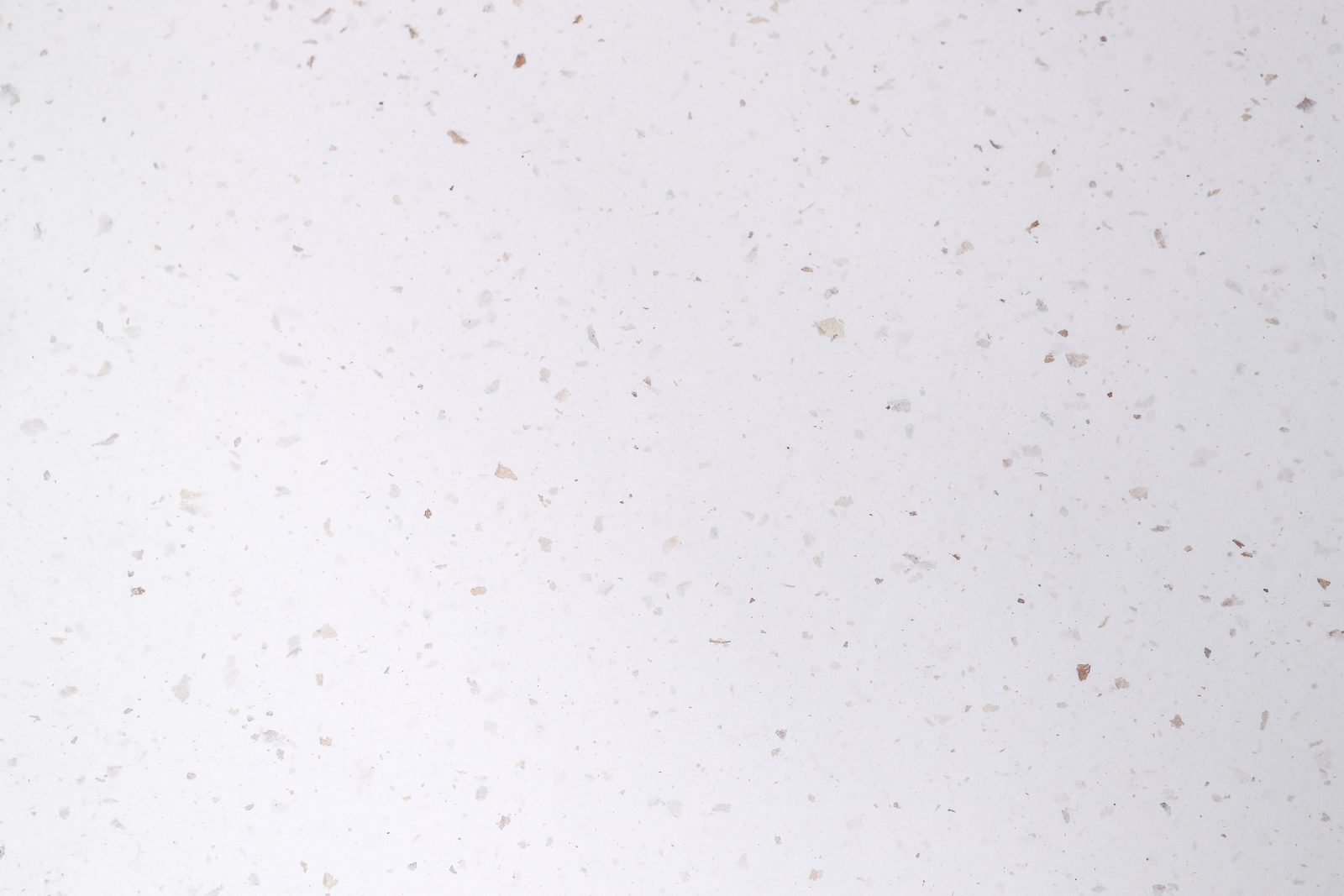
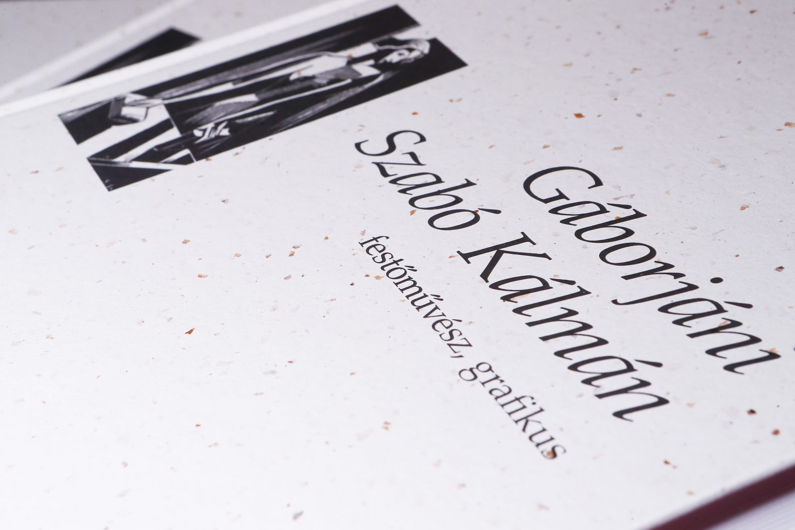
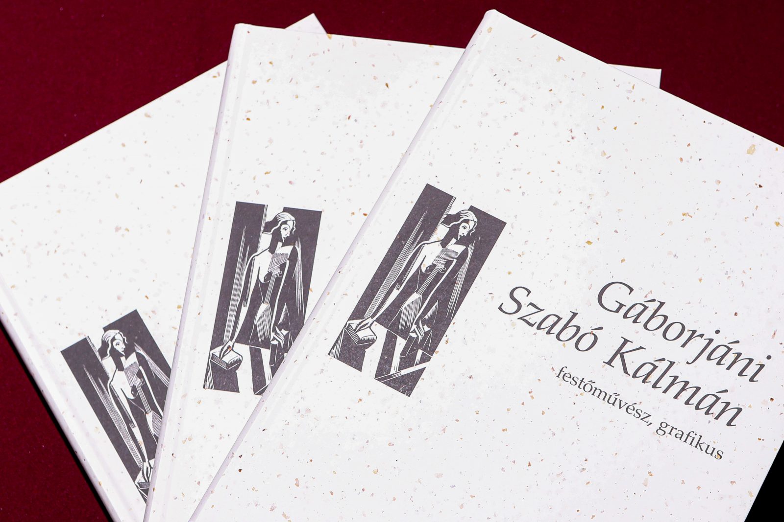
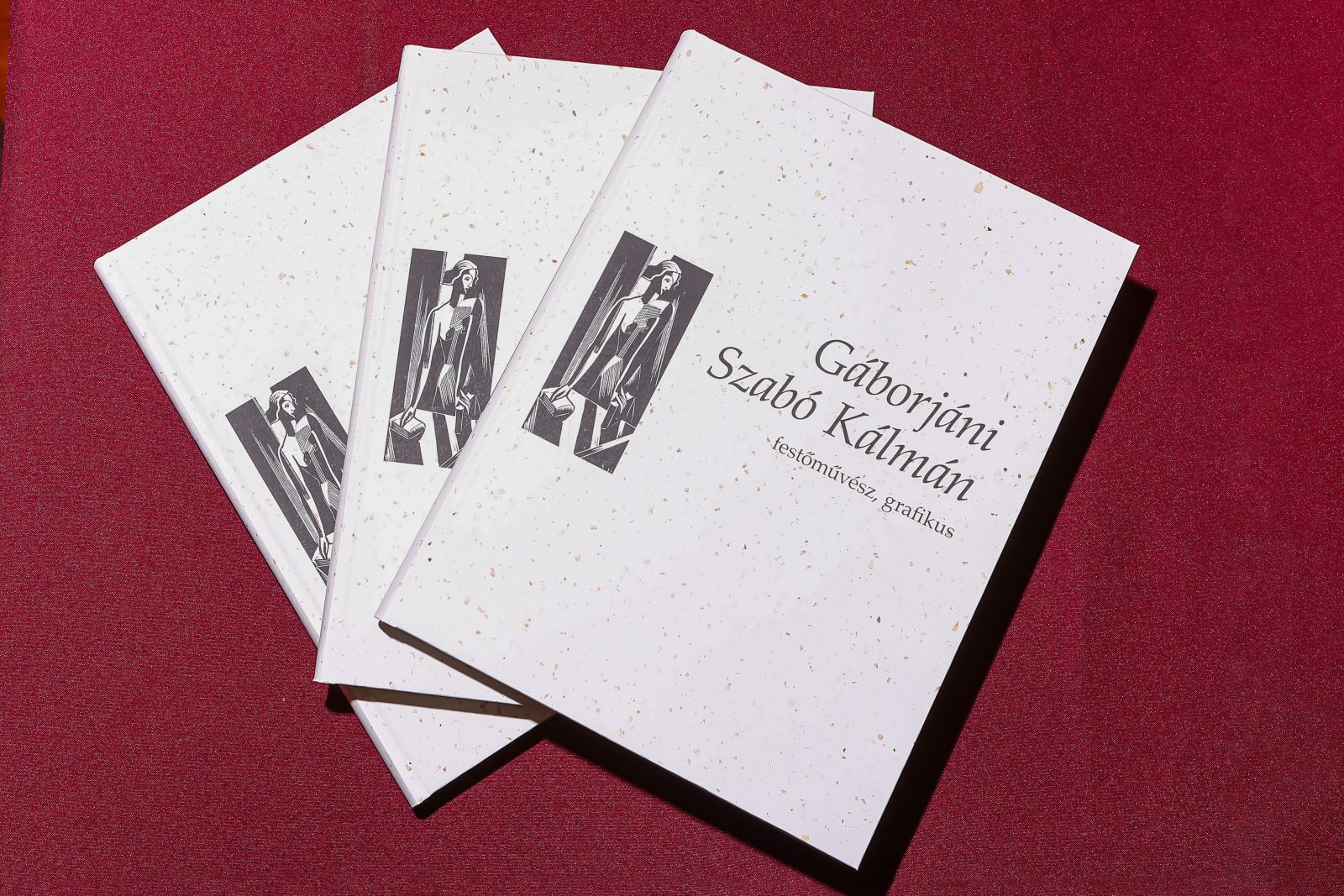
The Coffee paper’s wonderful texture integrates the coarse broken structure of coffee beans into the pulp. It results in a uniquely “coffee-style” texture providing a haptic experience. The image of the woodcut printed on it in black almost smooths into it, the patches slightly show through, making it archaic, abraded.
The cover hardboard was coated with Coffee paper in 120 gsm – previously featured here – and the material is used on the flyleaf as well. The Coffee paper’s wonderful texture integrates the coarse broken structure of coffee beans into the pulp. It results in a uniquely “coffee-style” texture providing a haptic experience. The image of the woodcut printed on it in black almost smooths into it, the patches slightly show through, making it archaic, abraded. This surface is protected by the Silk foil protective cover where the unique feature of Munken Pure also provides an exciting experience with its extraordinary texture. The rounded spine is topped with a black end and, implying that the use of colors will achieve their full meaning inside the book.
Coffee paper, Munken Lynx Rough, and Munken Pure Rough are exclusively available at Europapier Group. You can order your own copy of the book at muzeum.drk.hu.