The spirits and alcohol market is incredibly saturated, and the intense competition among brands on the shelves is often done by the means of packaging and branding design. Even though we all know it’s all about the flavor and quality of the product itself in the end, the visual look of the bottle and packaging is the only weapon at hand in the fierce fight to be the chosen one!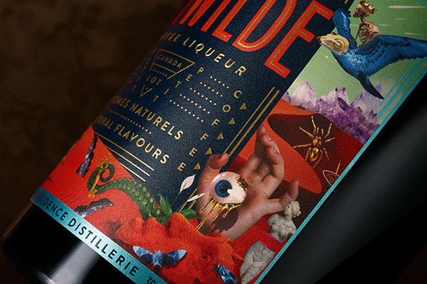
Reaching for the top shelf, we’ve selected ten of our favorite spirit bottle packaging designs from the “lux” category
This rivalry of brands has resulted in an unbelievable display of inspiring and imaginative branding and packaging designs, which we’ve drooled and oozed over before in 31 Beer & Wine & Spirit Label and Packaging Designs Full of Character and B Stands For Brewsky – 50 Beautiful Beer Label Designs, but this time we’re focusing on the higher end of the spectrum – ” the good stuff” – that’s traditionally only brought out on special occasions.
We’re reached and rummaged through the top shelf of our figurative liquor cabinet and chose 10 of our favorite spirit bottle packaging design that’ll knock your socks off. All ten designs are eye-catching in their own unique way, and we paid special attention to the papers and printing methods utilized in the concepts.
We’re reached and rummaged through the top shelf of our figurative liquor cabinet and chose 10 of our favorite spirit bottle packaging design that’ll knock your socks off!
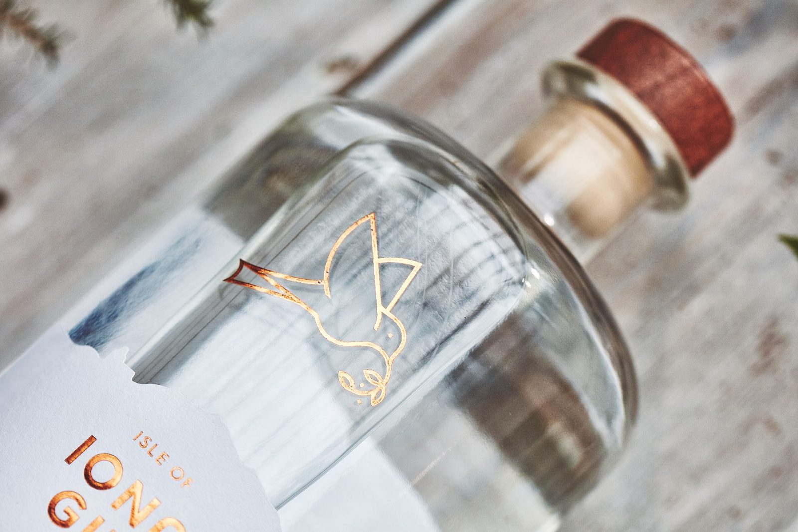
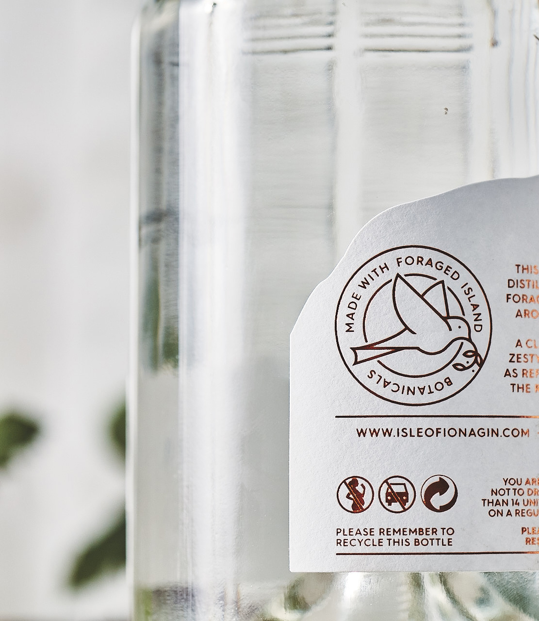
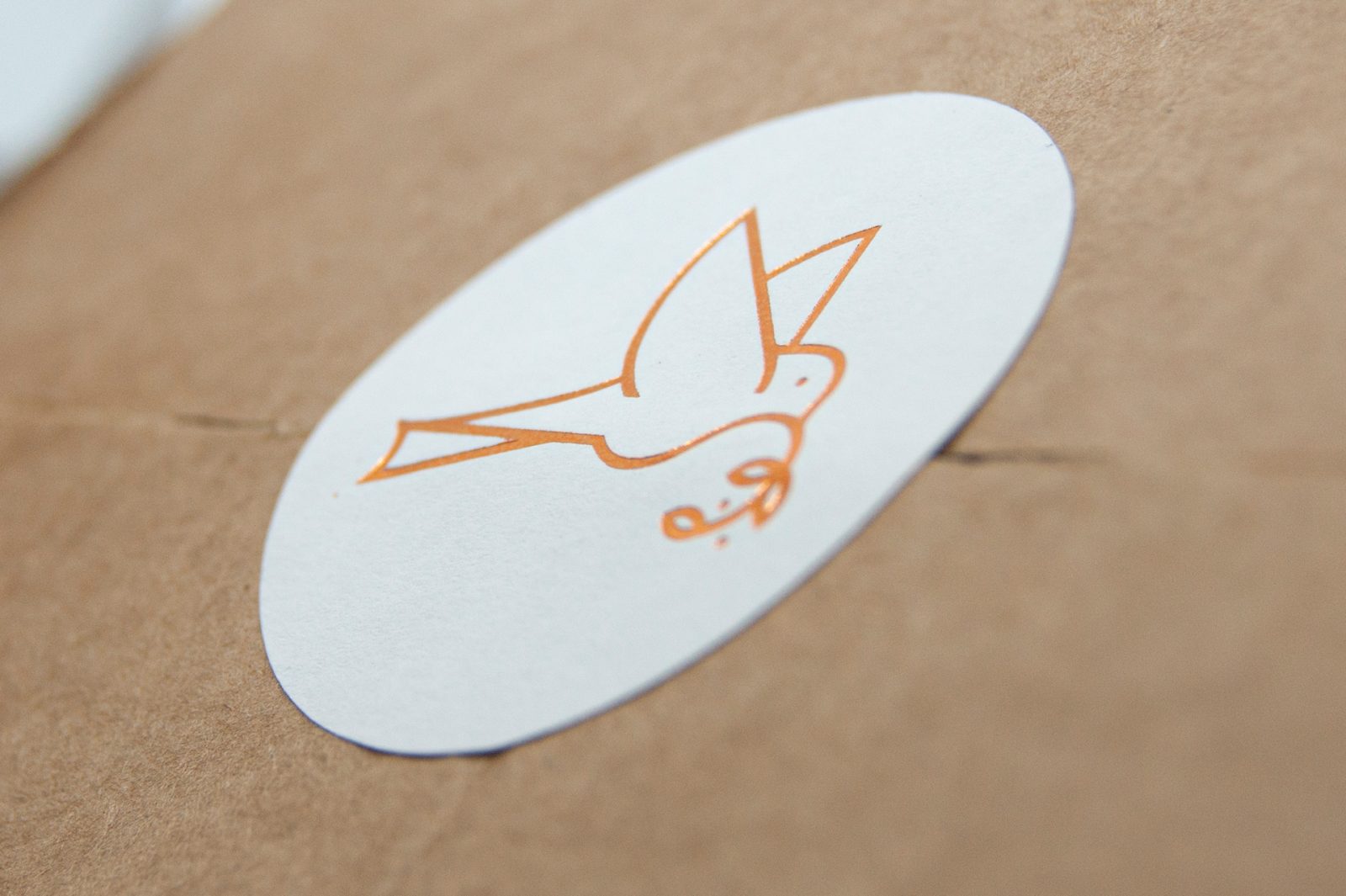
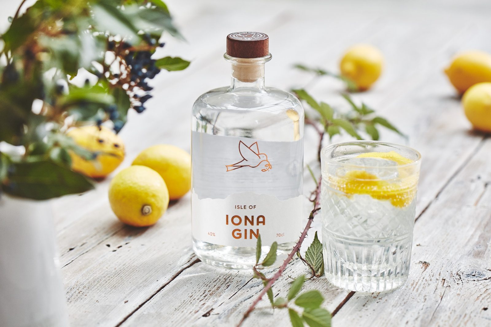
Isle of Iona Fin branding and packaging by My Creative Branding Agency
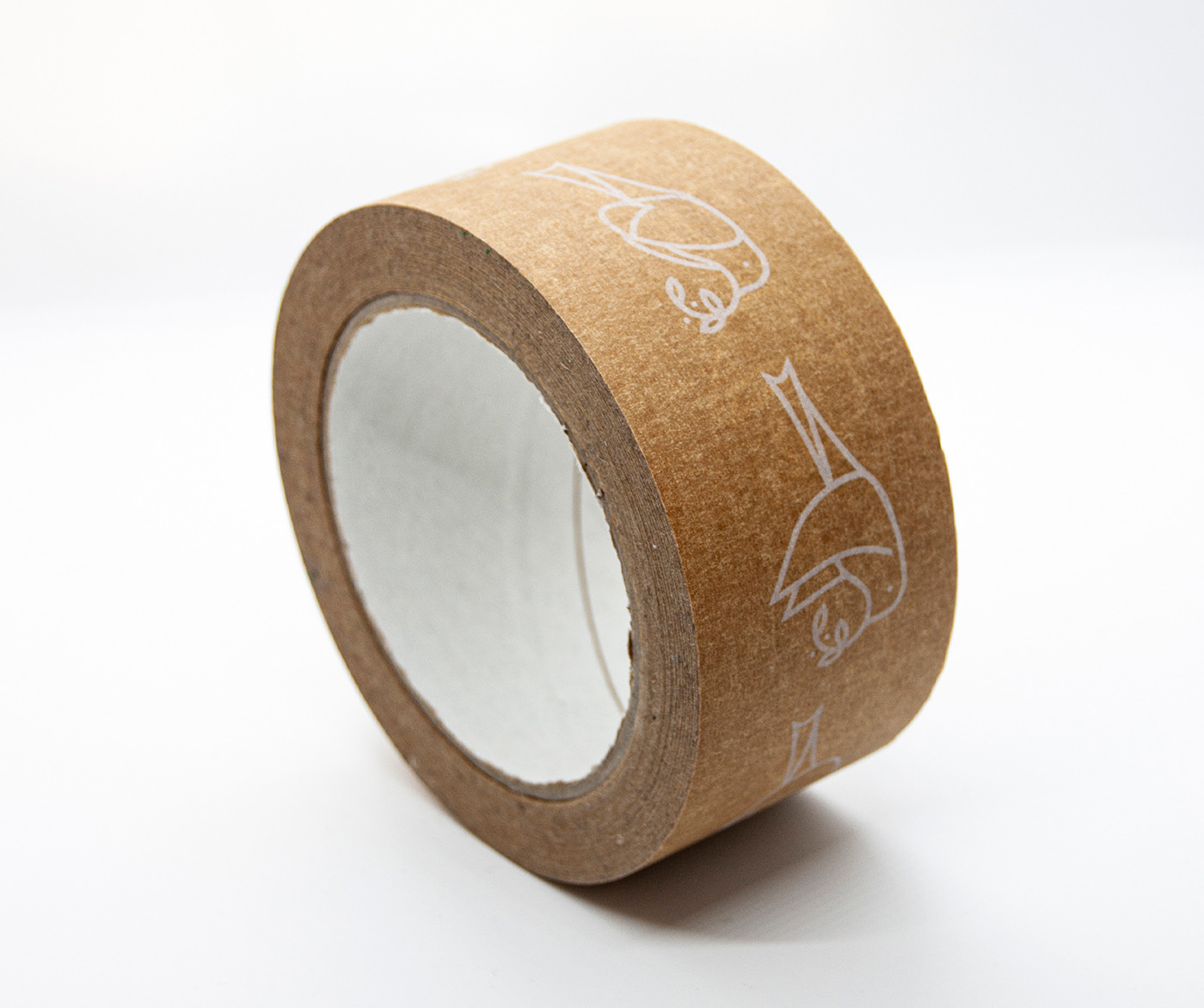
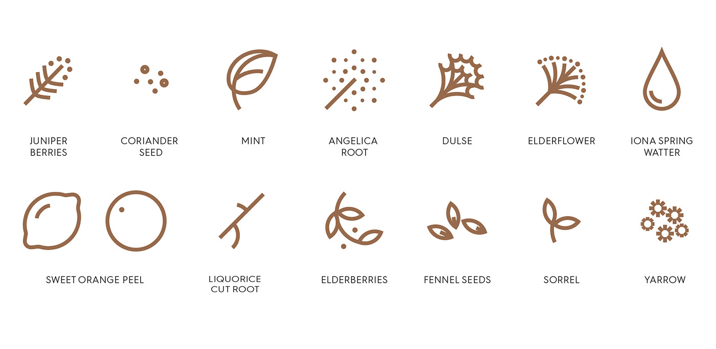
Isle of Iona Gin is a premium spirit distilled from foraged botanicals from around the Island. The Gin has a pure, clean and zesty taste (perfect straight on the rocks with a twisted lemon.) With this in mind, My Creative wanted to create a brand that would capture the fresh and unspoiled beauty of the island. With a clear design, pure white nu-coated paper with a flash of bronze foil to show off its quality. Throughout the design, a dove motif was used that represents peace, a well-established icon of the Isle of Iona, and the world-famous Abby. The dove was also used to depict the foraging of ingredients gathered to produce the gin.
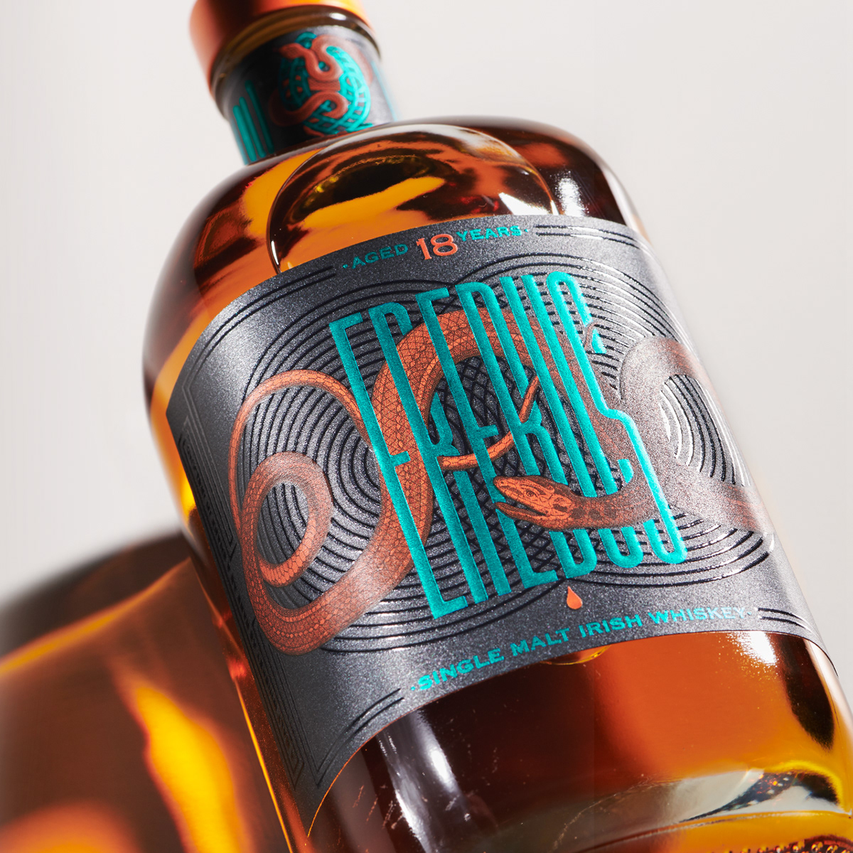
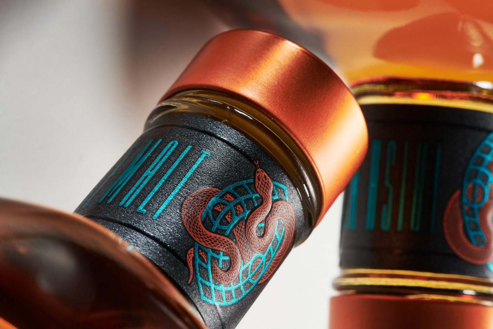
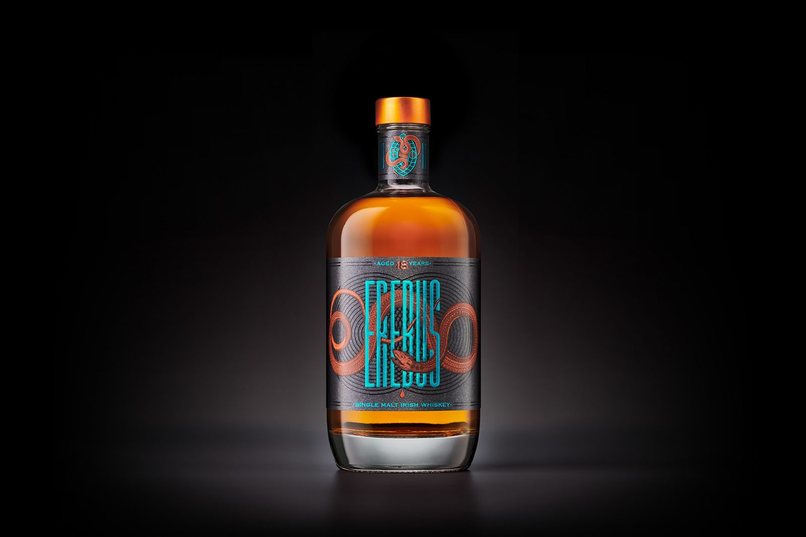
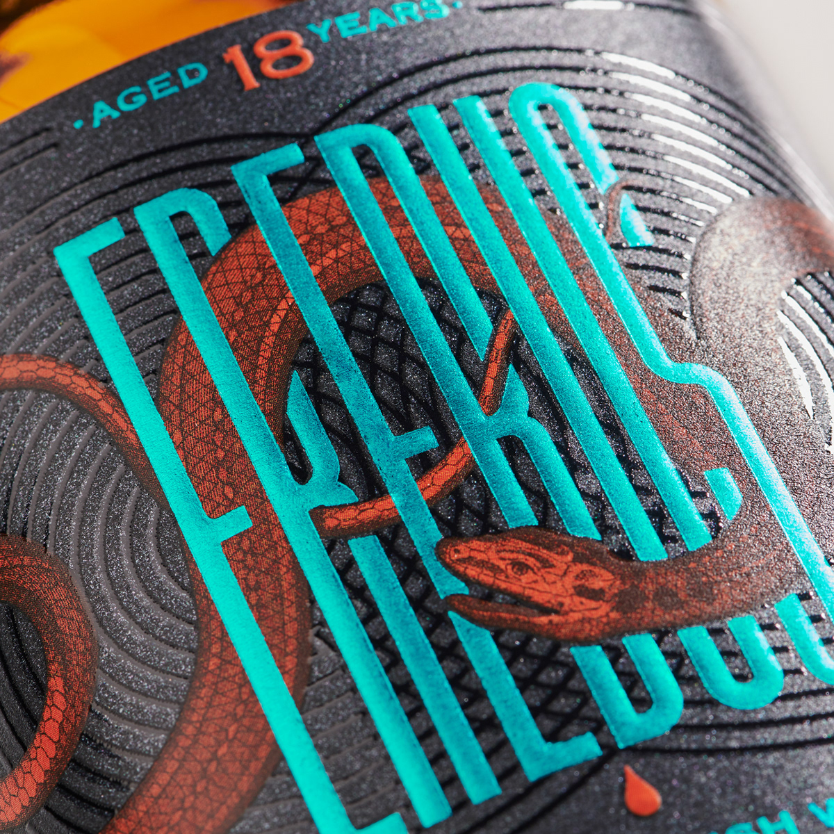
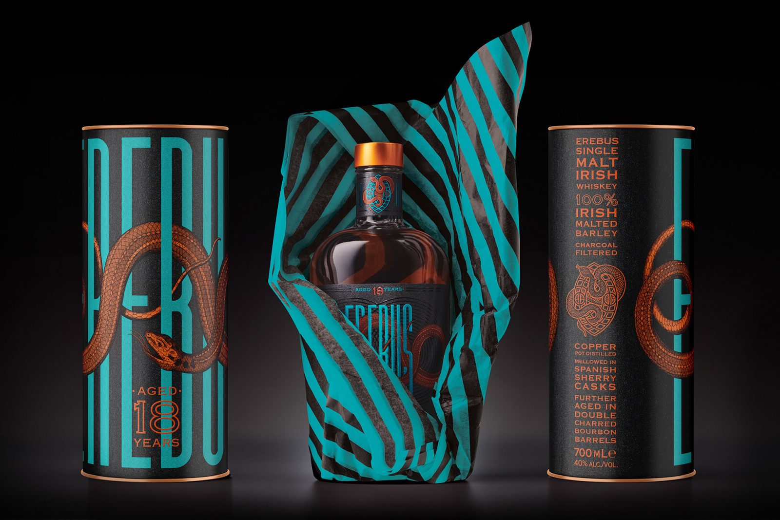
Erebus Single Malt Irish Whiskey packaging by Harcus Design
A Single Malt Whiskey is as rare as a snake in Ireland. In mythology, ‘Erebus’ was the Greek God of Darkness, a personification of lustful desires who presided over the mysterious shadowlands. He was a primordial deity seen as the embodiment of darkness. His name comes from the Greek ‘Erebos’ meaning the darkness or shadow.
Dzama Rum packaging by Alex Arzuman, Andy Migevant & Lila Le Minh
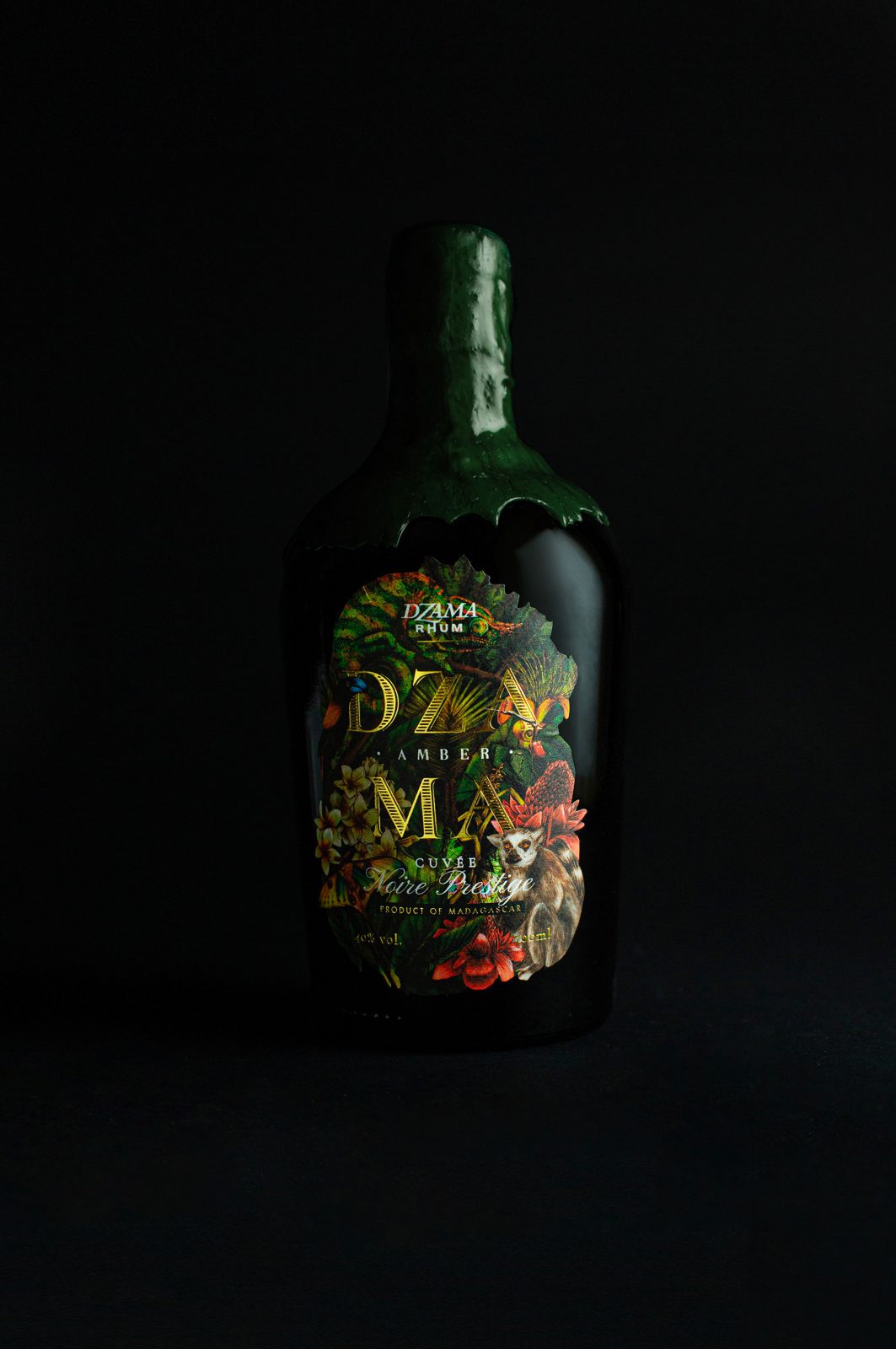
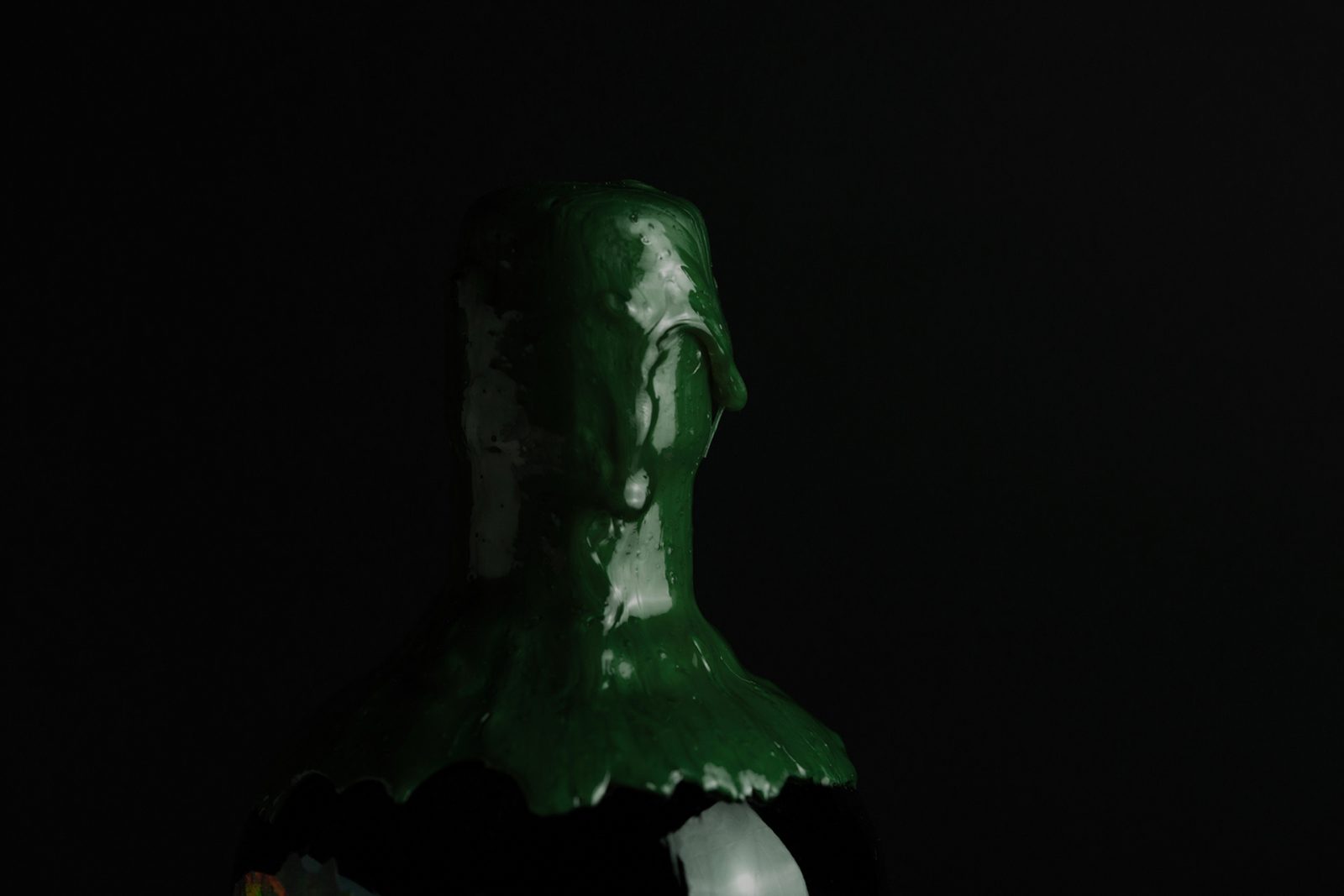
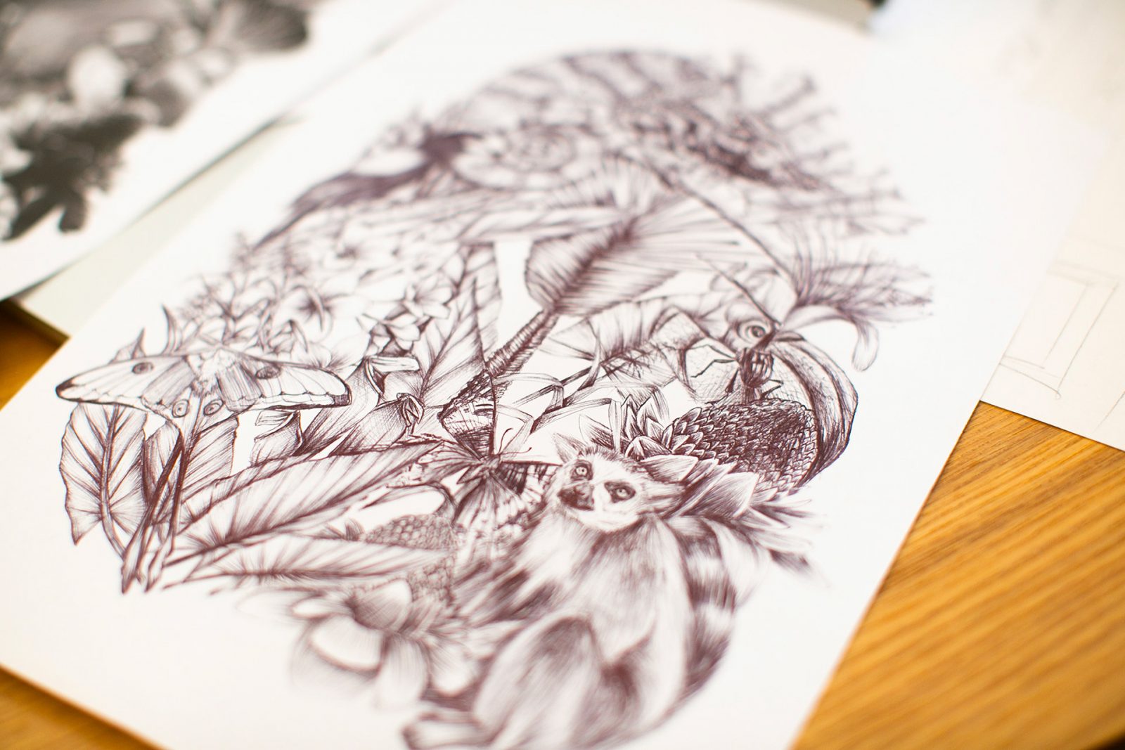
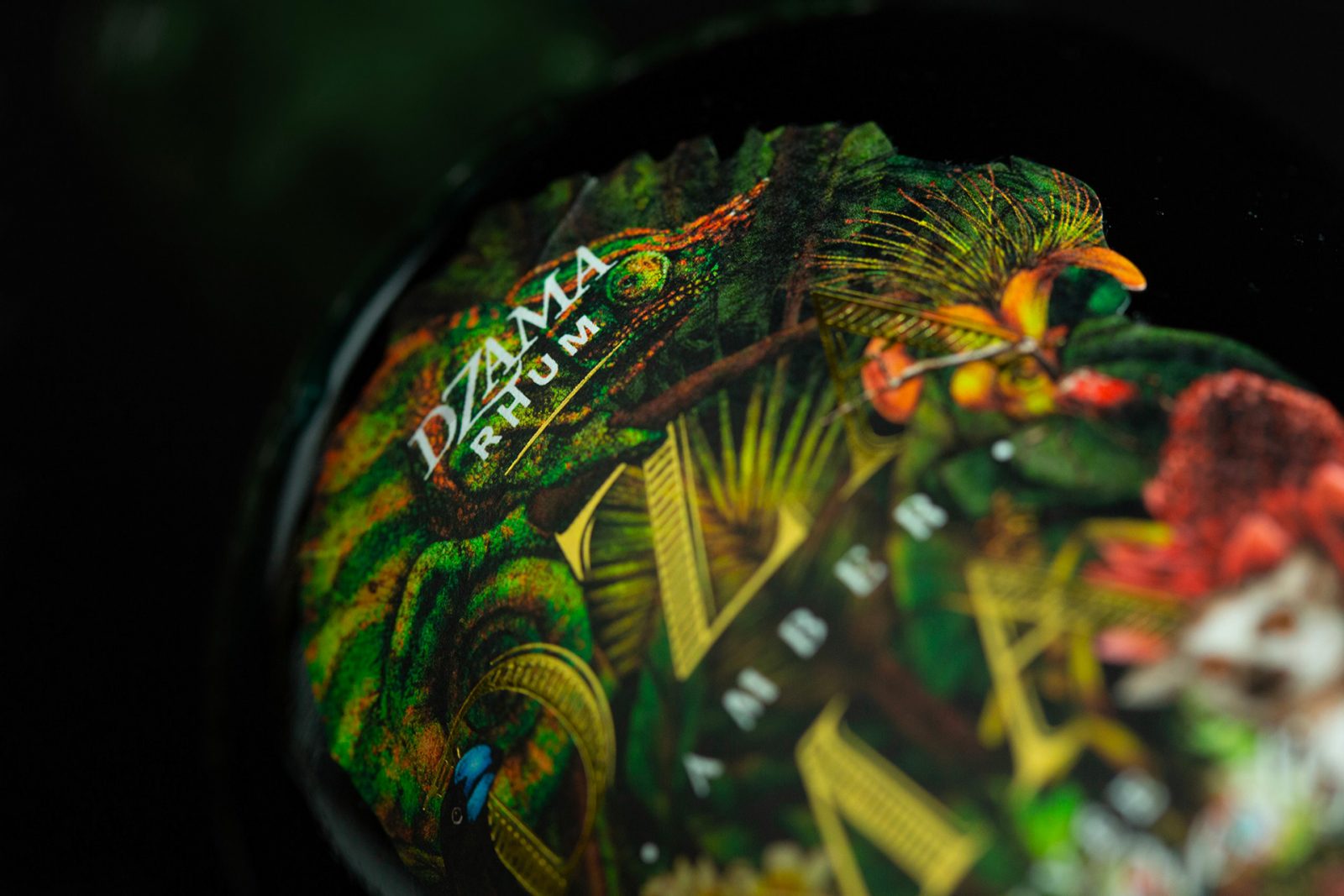
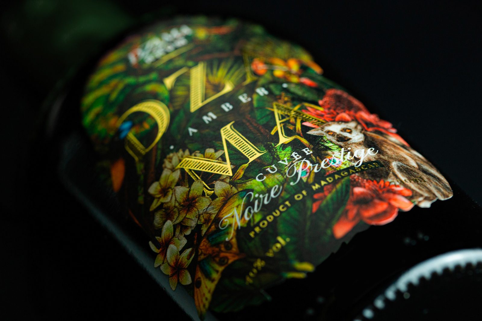
Alex Arzuman, Andy Migevant & Lila Le Minh created a concept bottle for the brand Dzama Rhum. A unique alcohol brand owned by Vidzar, a Malagasy group. Our studio made a flourishing illustration by using handmade illustrations of the fauna and flora of Madagascar island. The idea is to bring all the sensations and flavors of the rum to the bottle. All the elements on the label (animals, plants, and insects) are endemic of the island. The bottleneck is dipped in a green organic wax in order to give each bottle a completely different ” leaf look like” one of another.
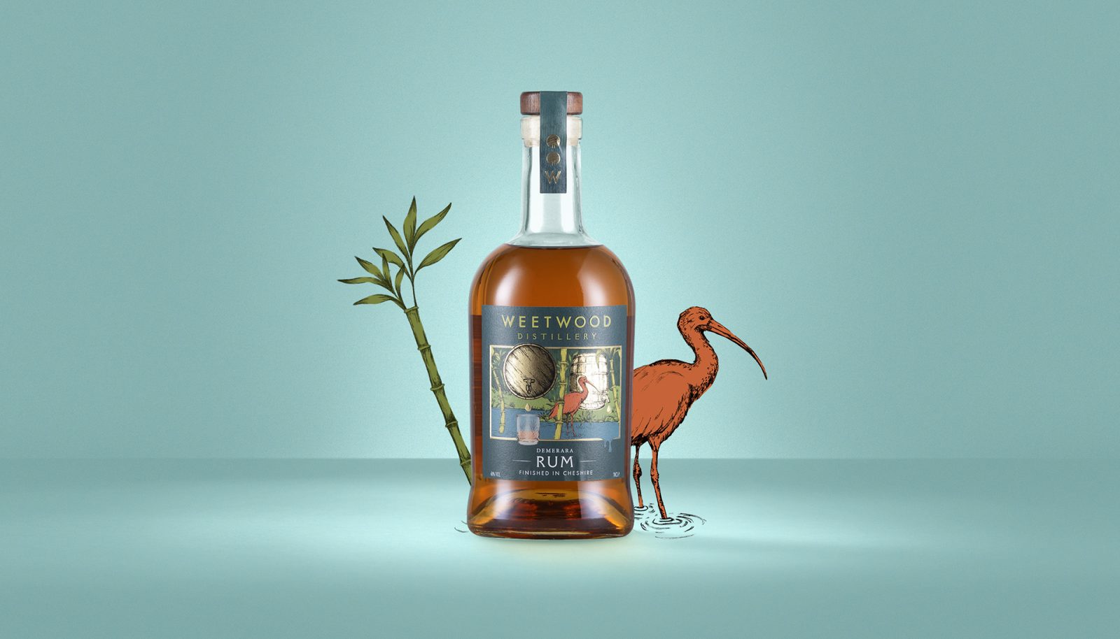
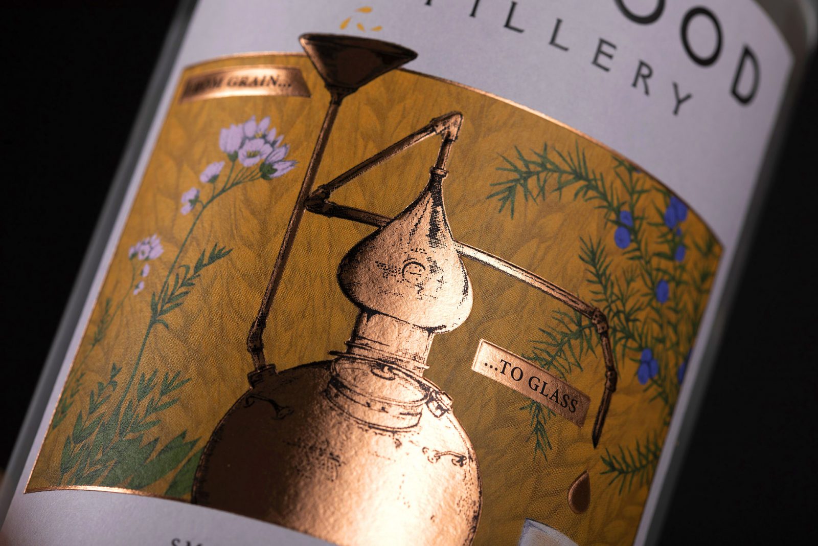
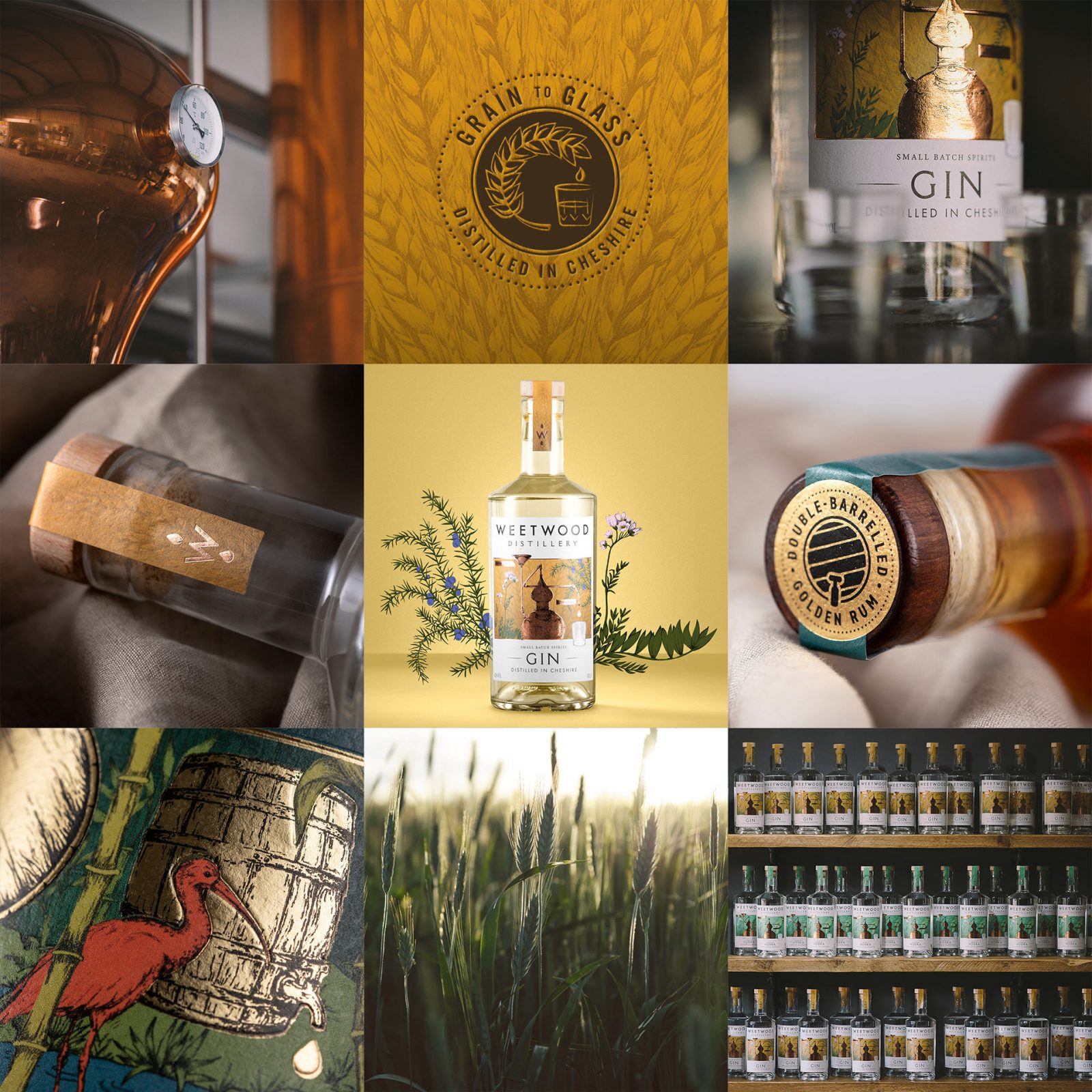
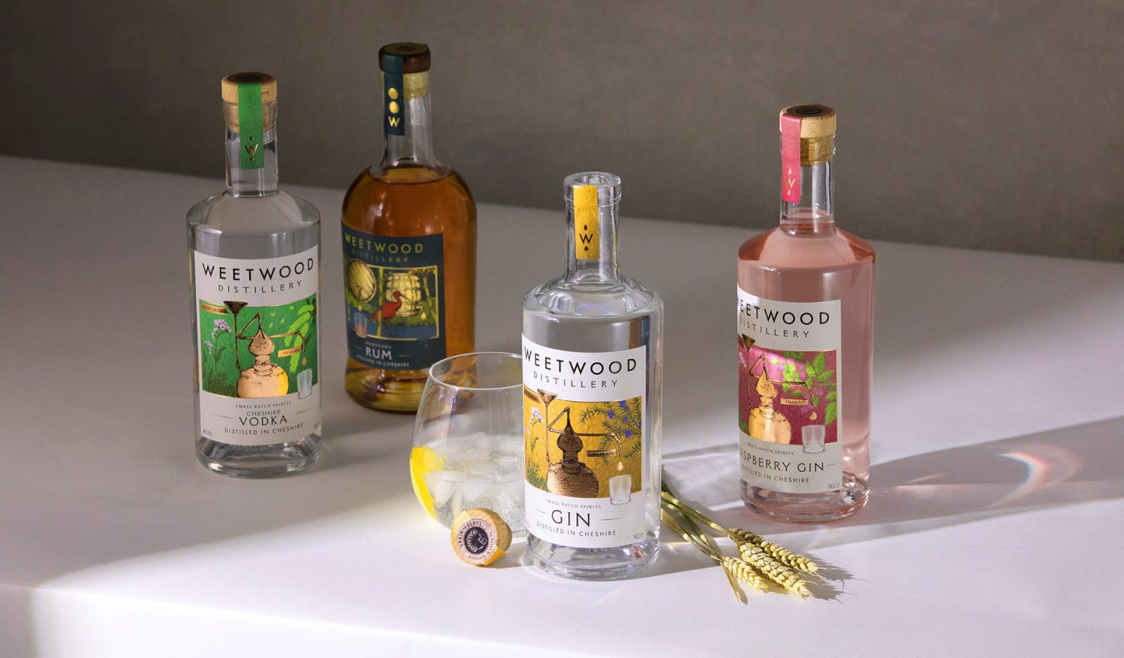
Weetwood Distillery branding and packaging by Kingdom & Sparrow
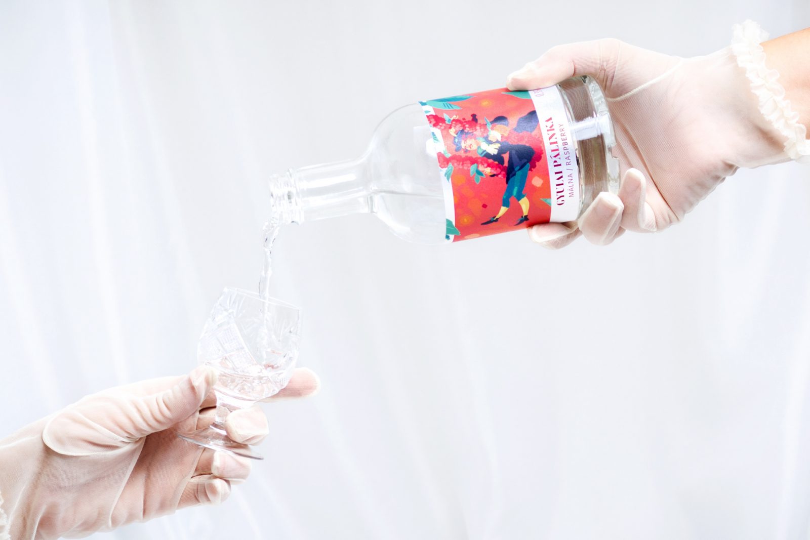
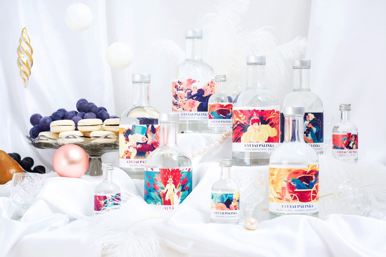
Gyulai Pálinka Spirit label series design by Halisten Studio
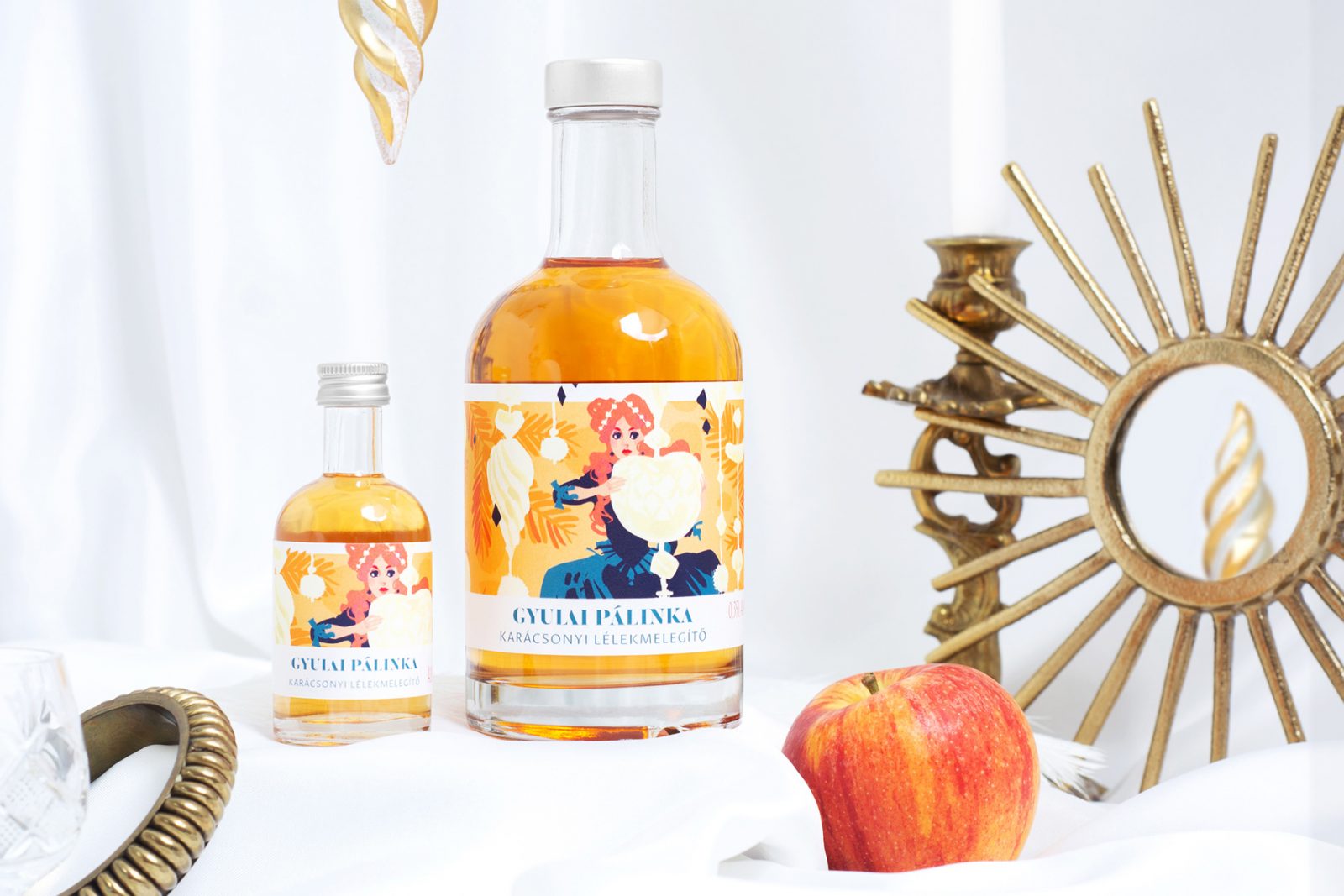
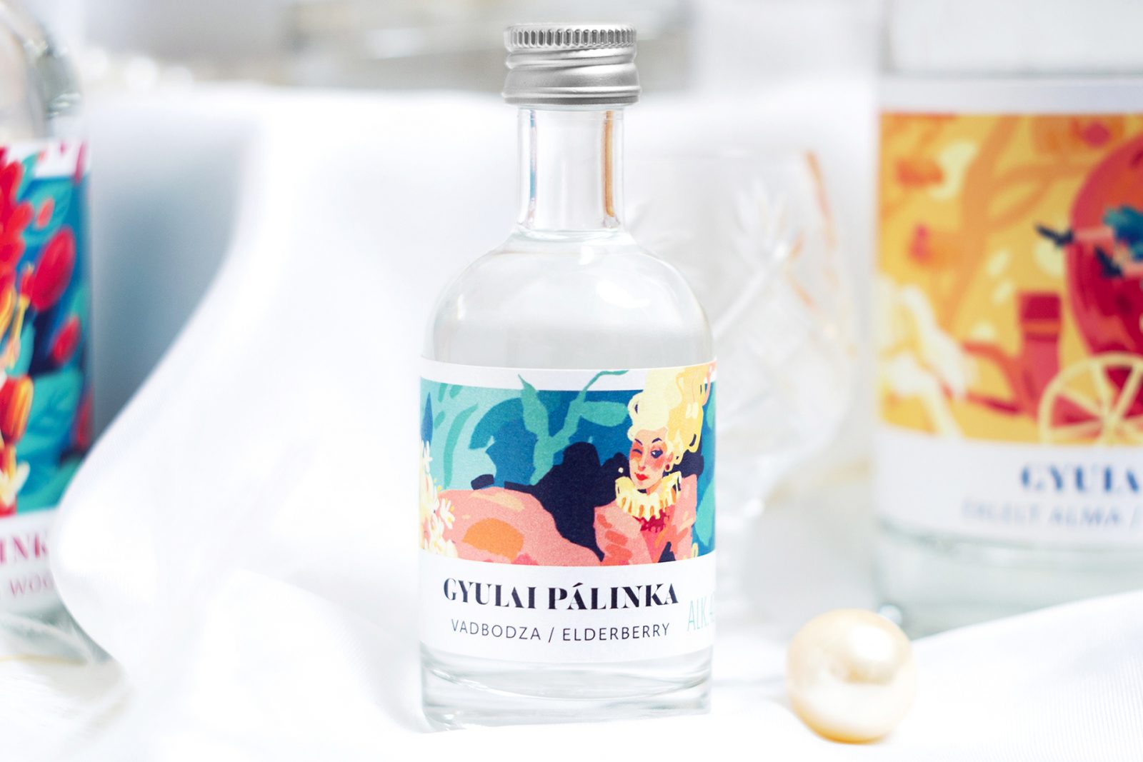
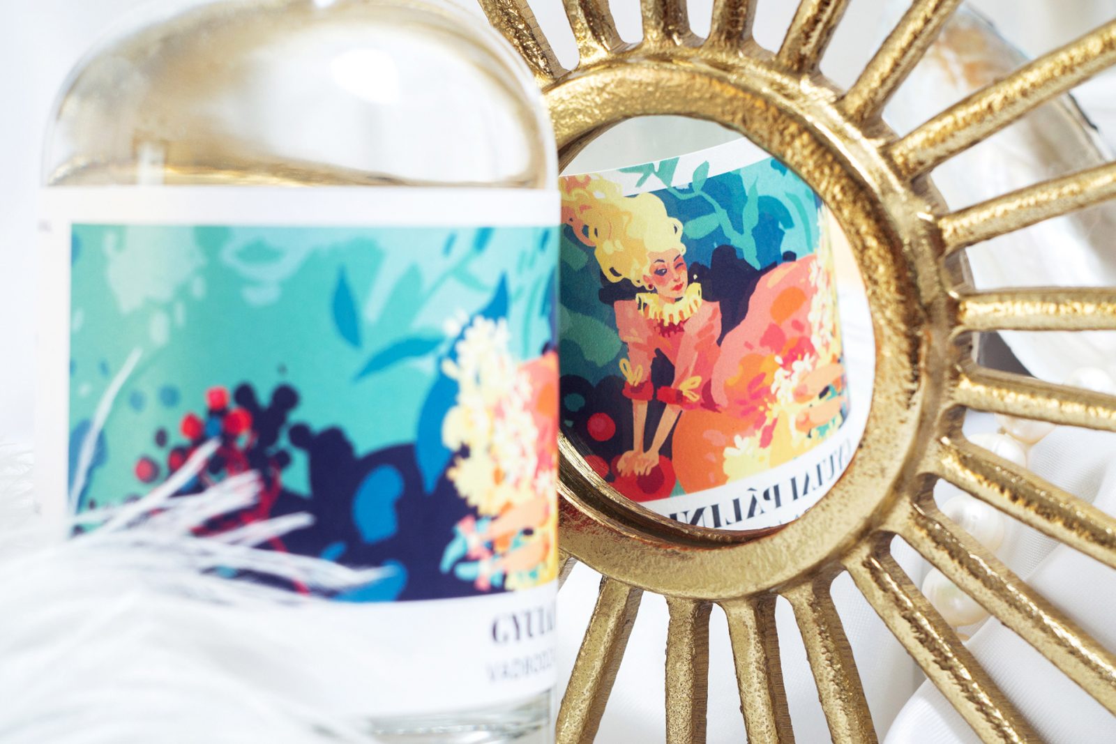
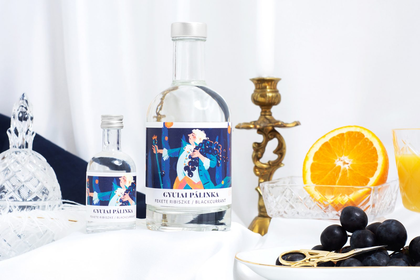
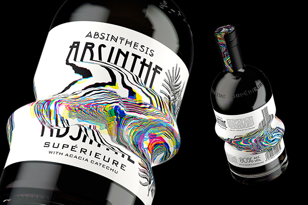
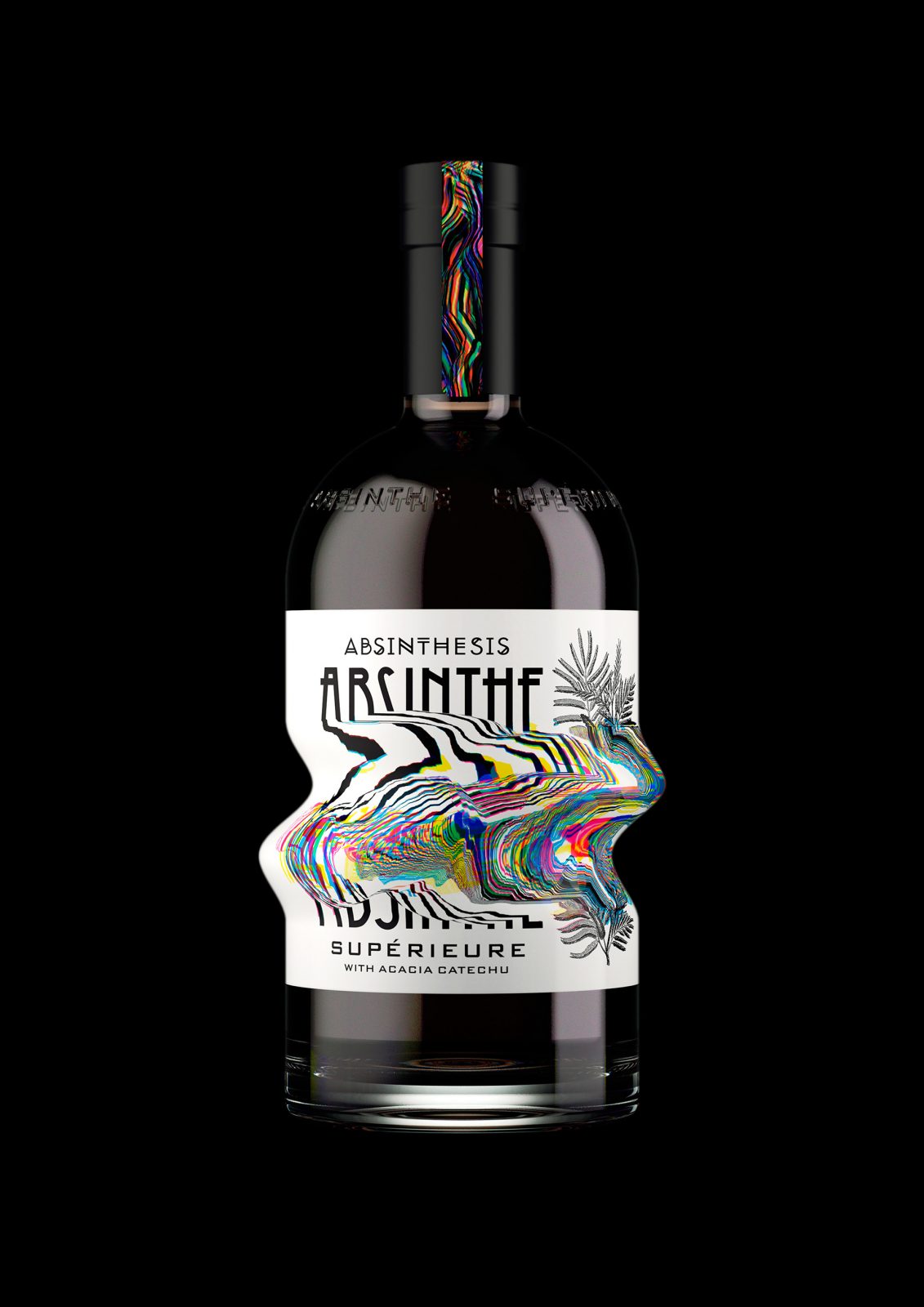
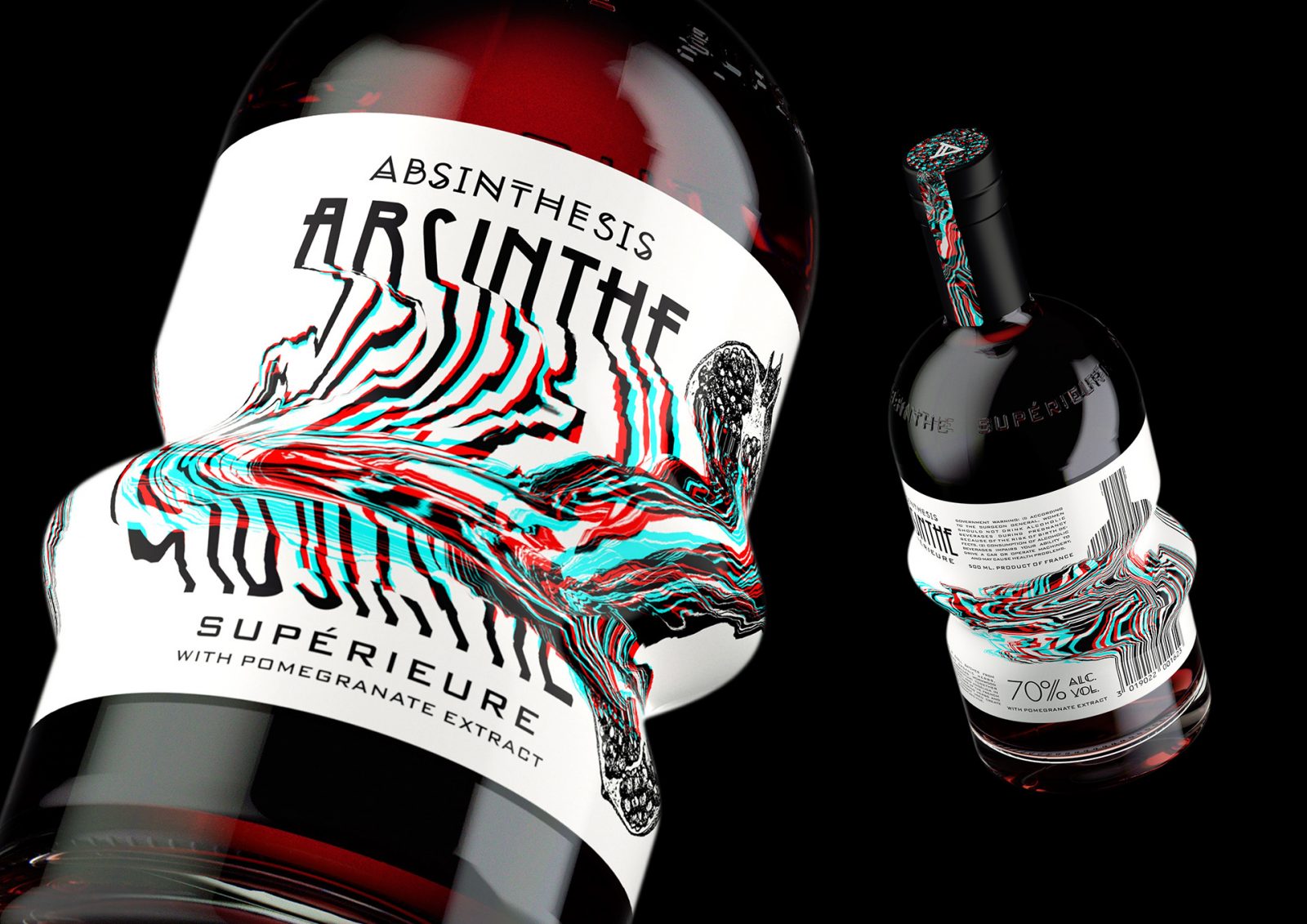
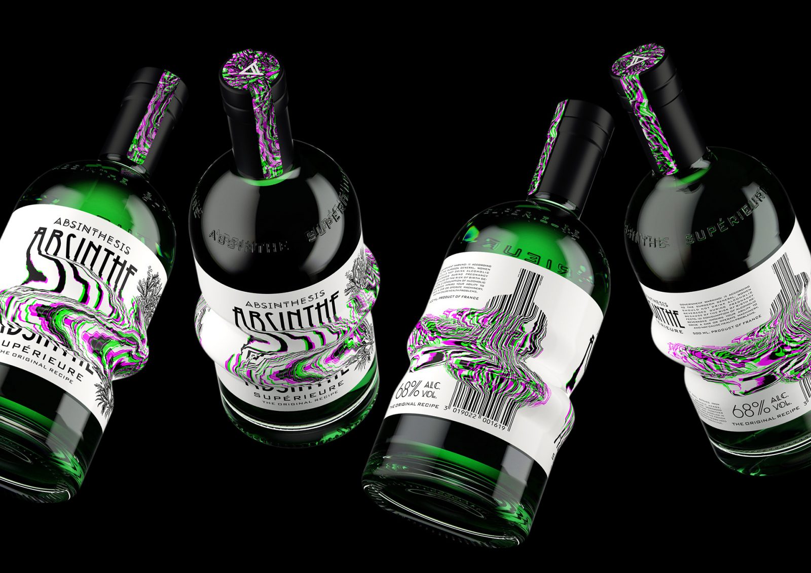
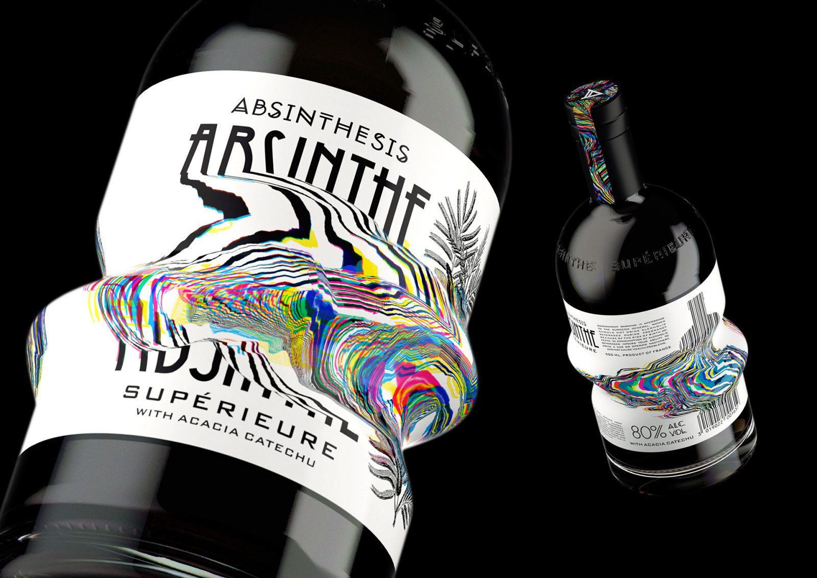
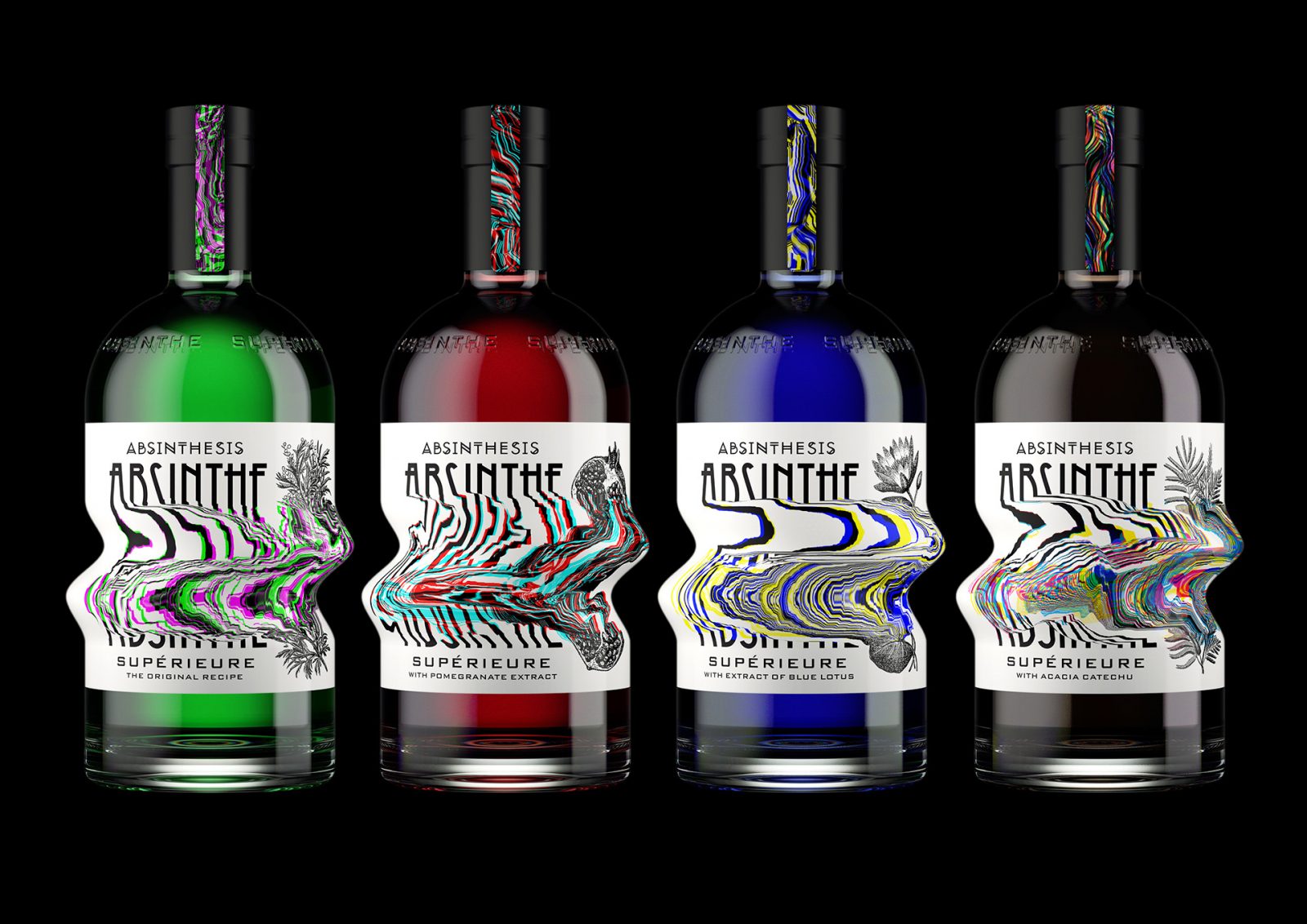
ABSINTHESIS. Absinthe Supérieure packaging design by Yevgeny Razumov
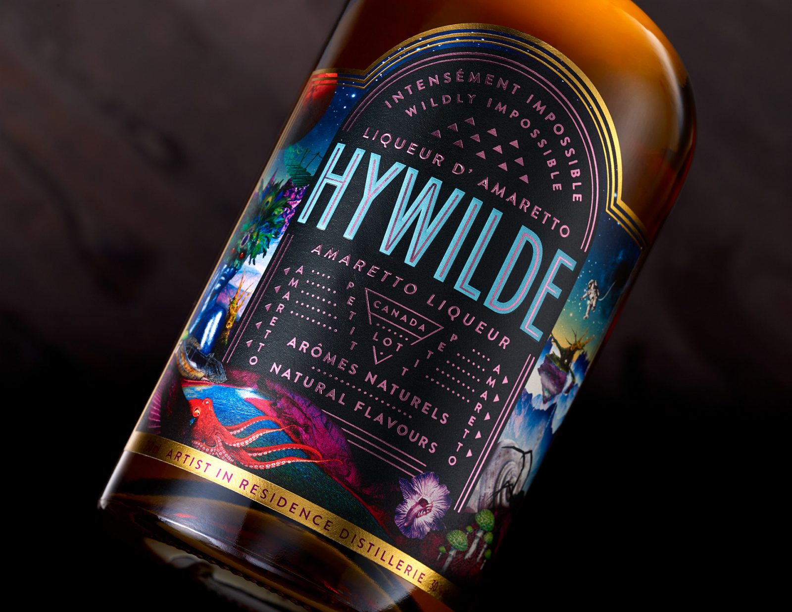
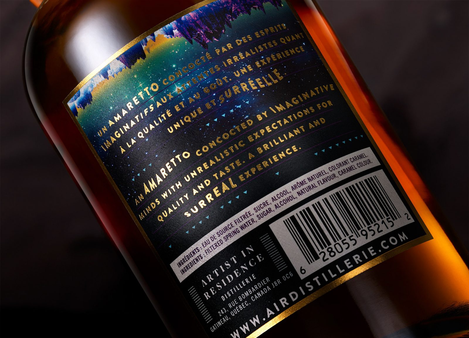
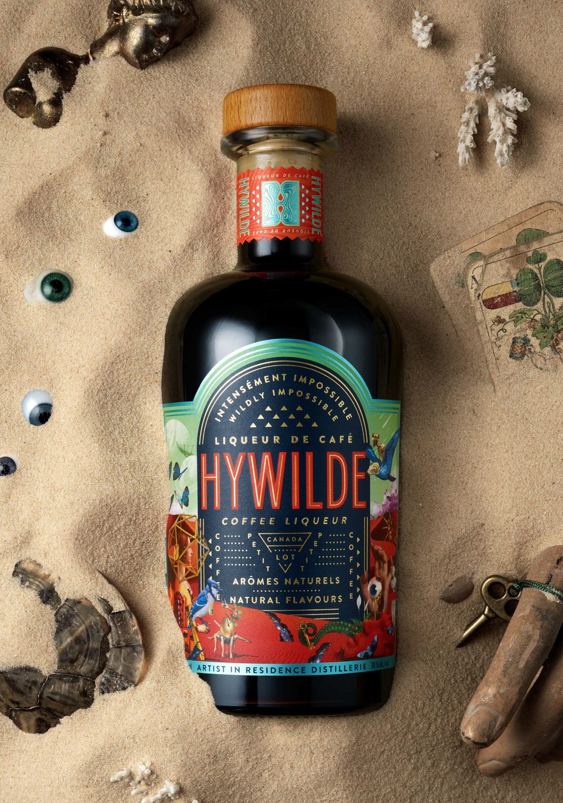
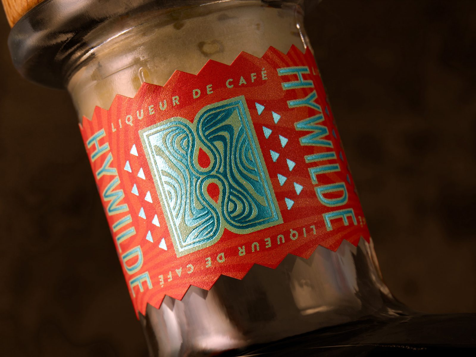
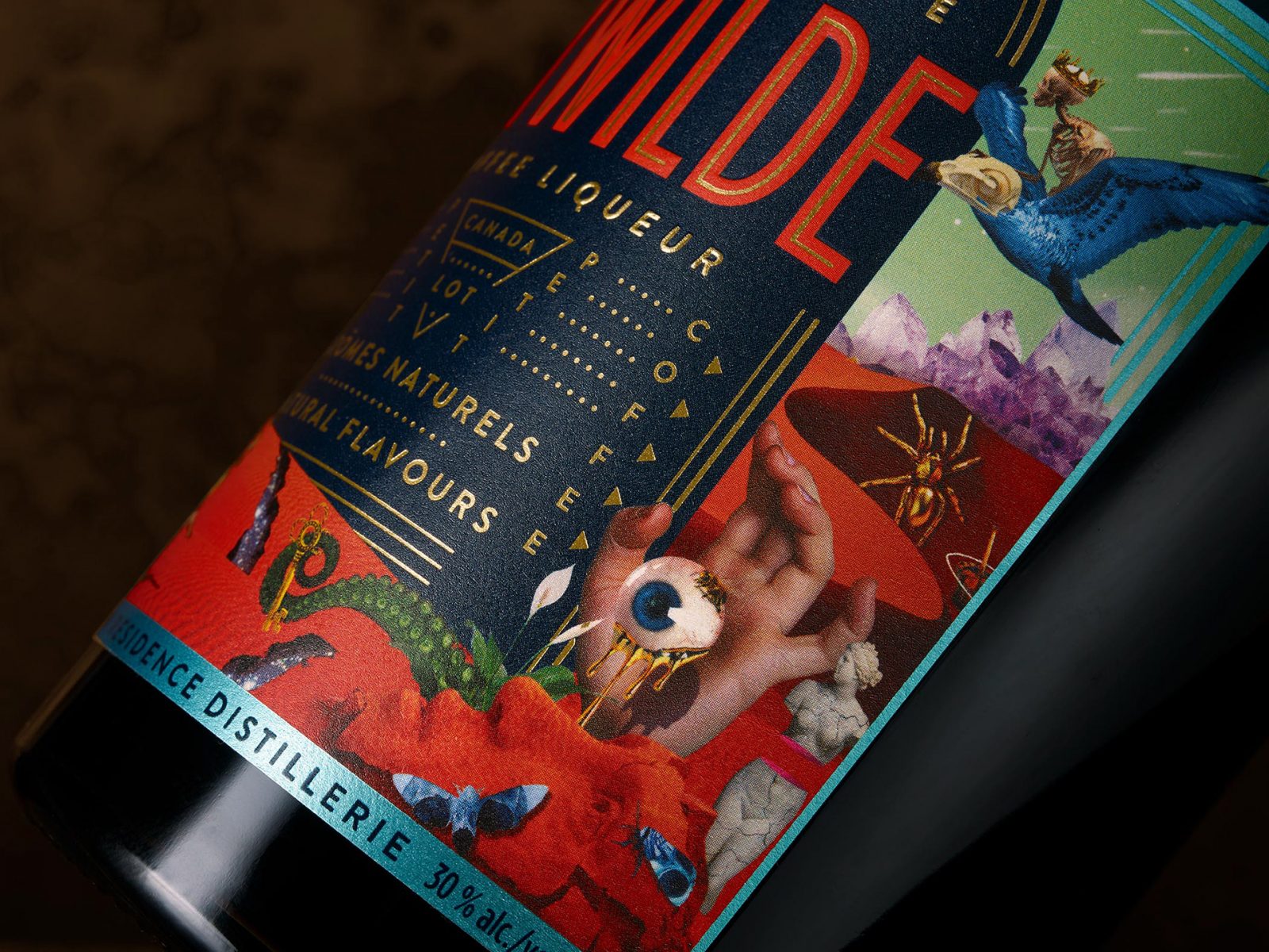
HYWILDE coffee and amaretto liquor branding and packaging by Chad Michael Studio
A wildly impossible coffee and amaretto liqueur concocted from imaginative minds with unrealistic expectations for quality and taste. A brilliant and surreal experience crafted from 100% Arabica beans and natural flavors. Vibrantly colorful design full of otherworldly illustrations, created for Artist In Residence Distillerie by Chad Micheal Studio.
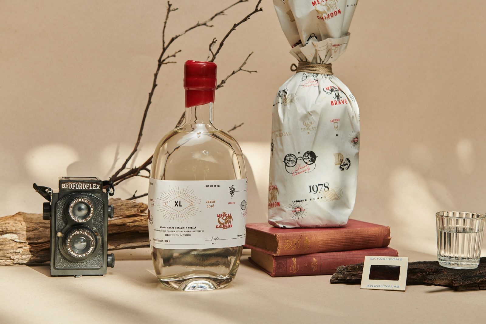
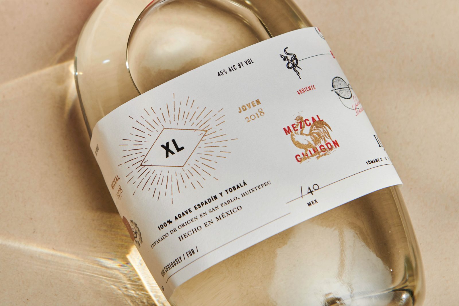
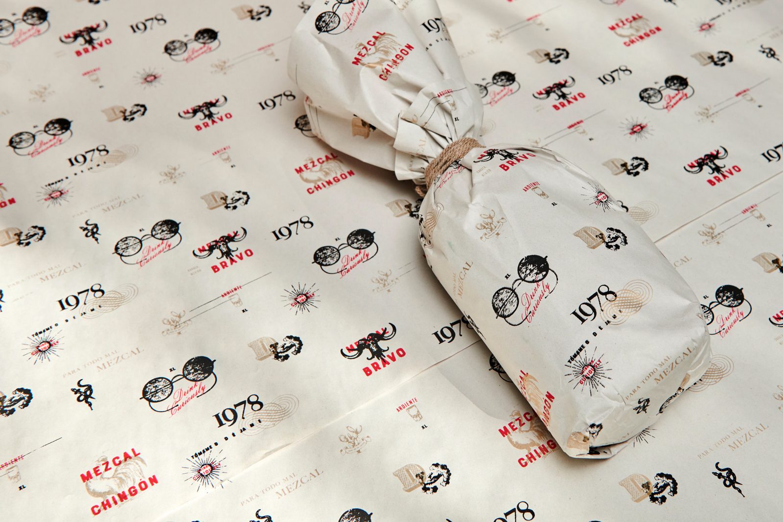
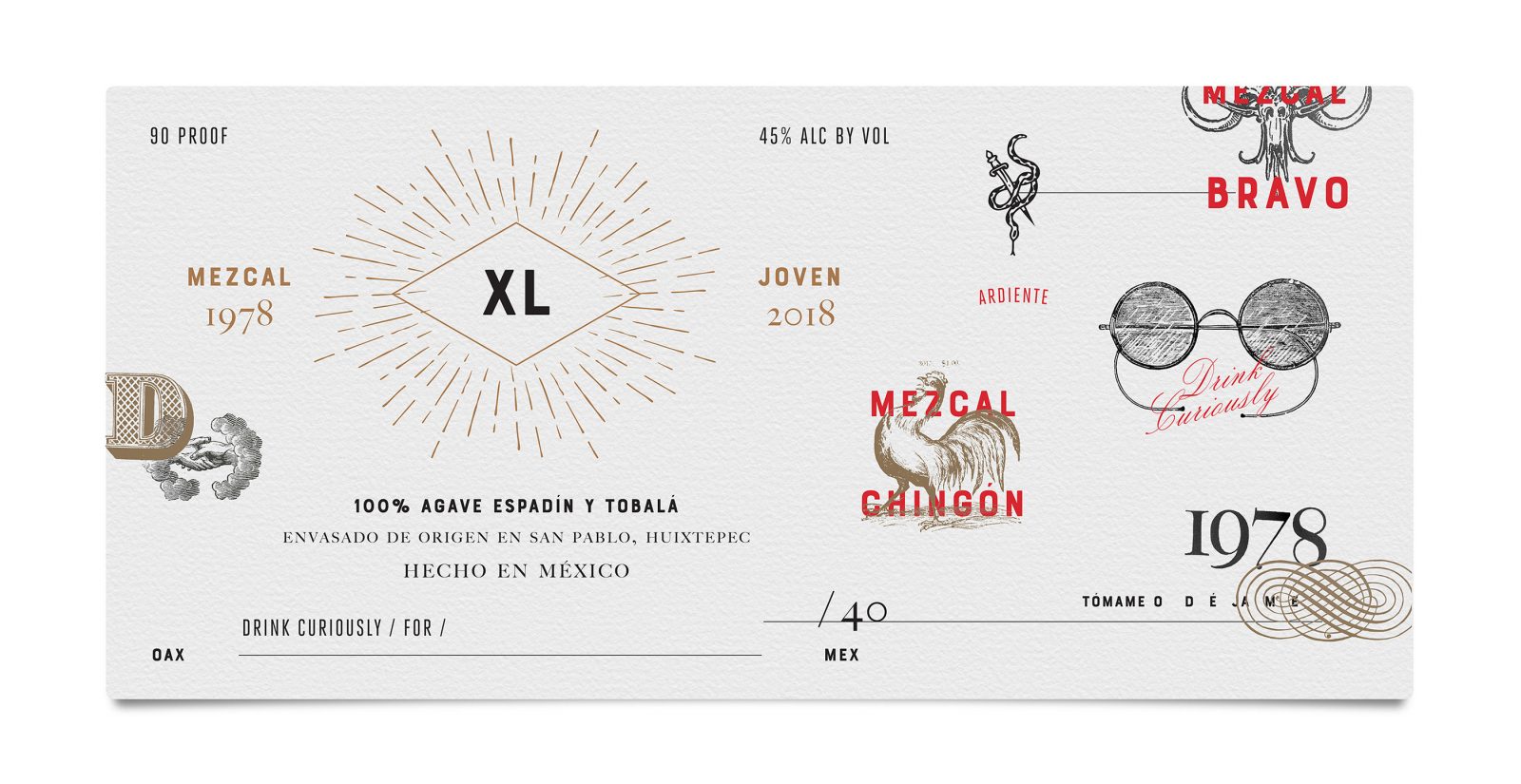
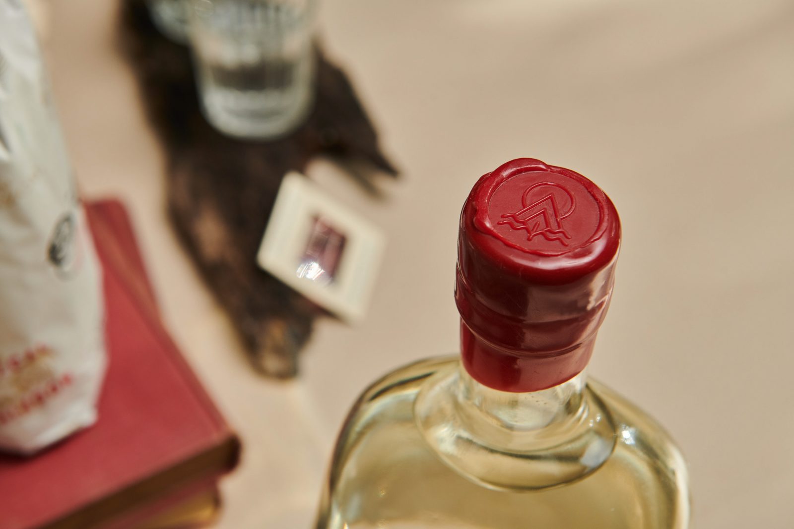
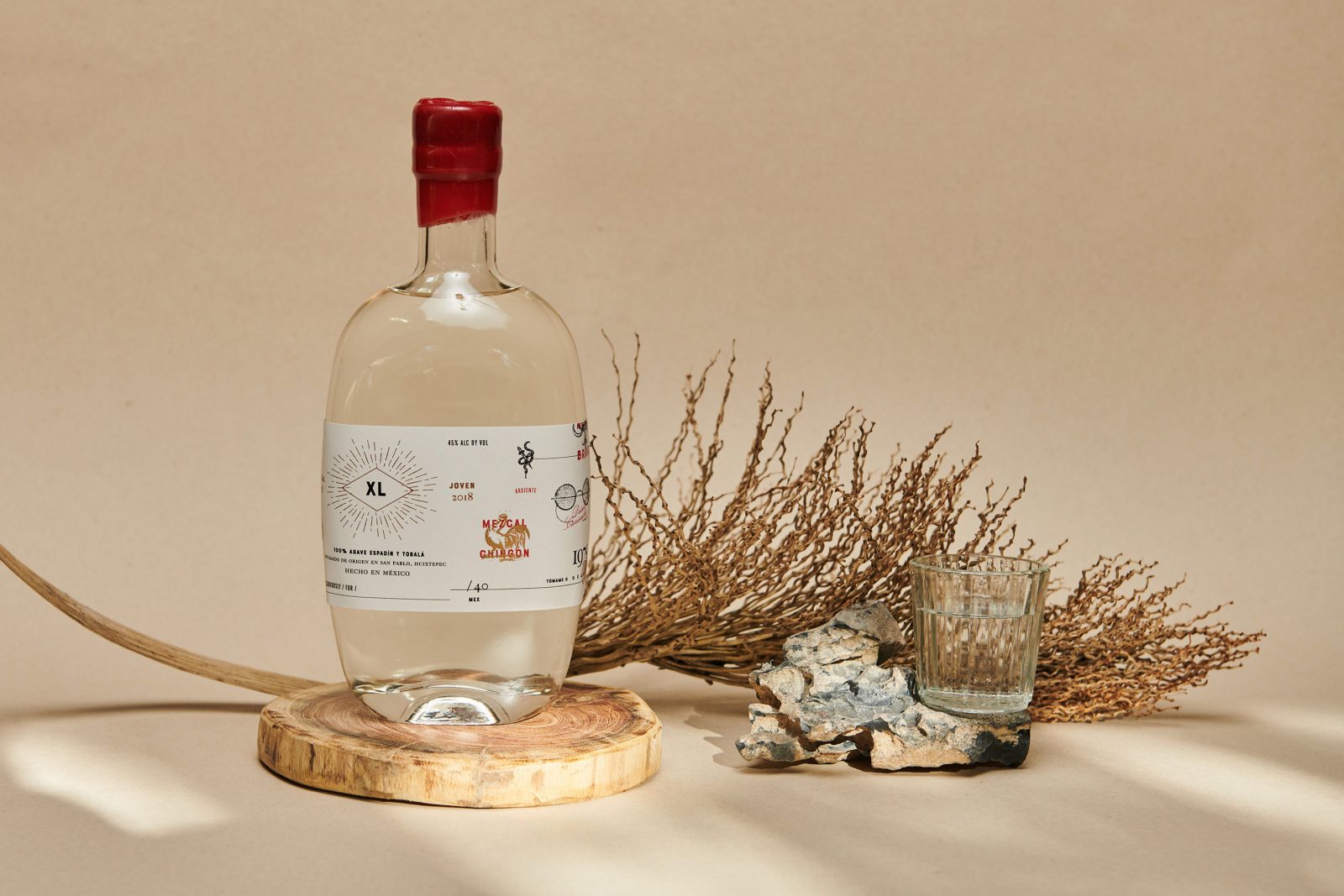
XL Mezcal Spirit packaging and branding by Menta
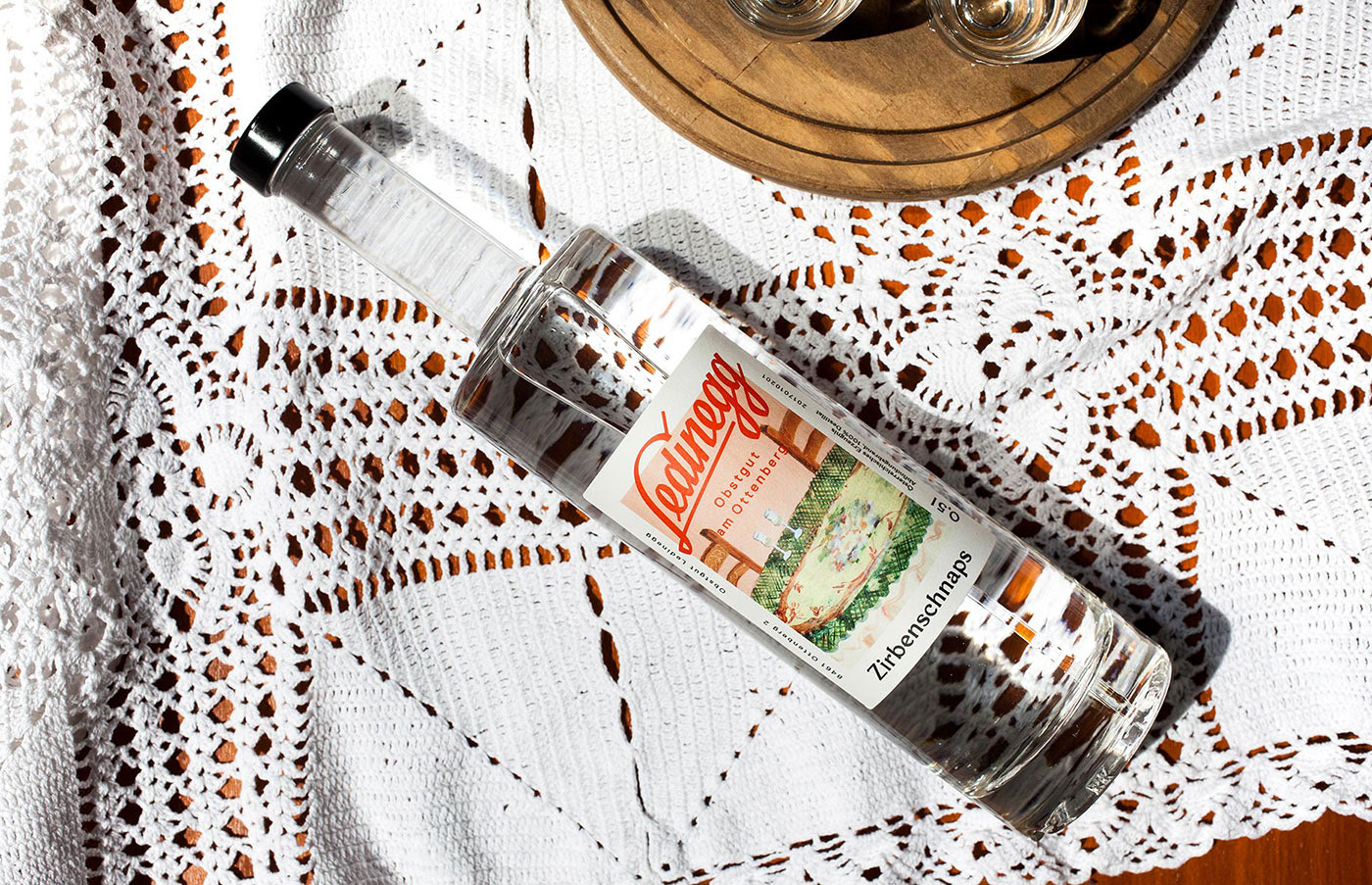
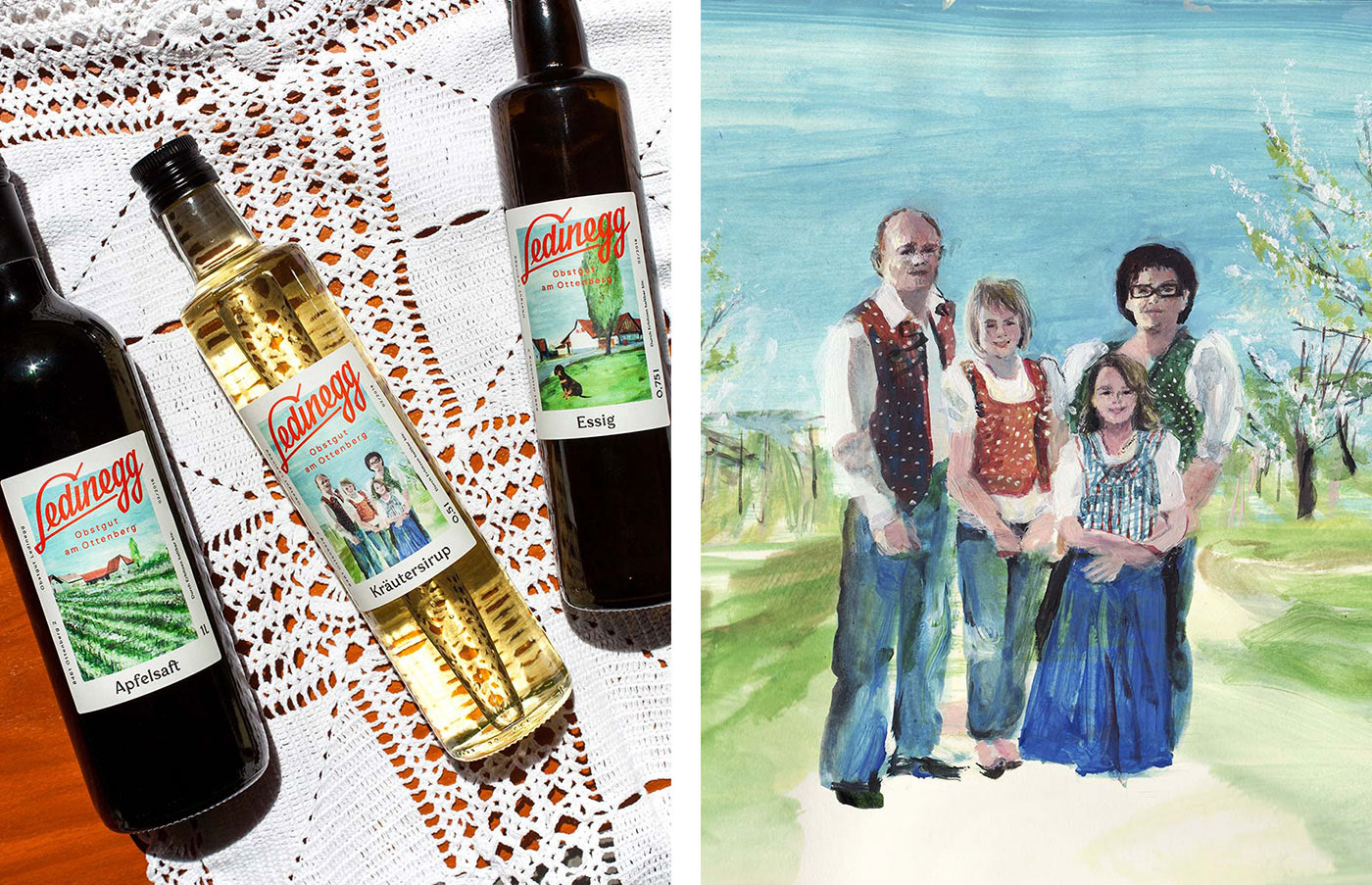
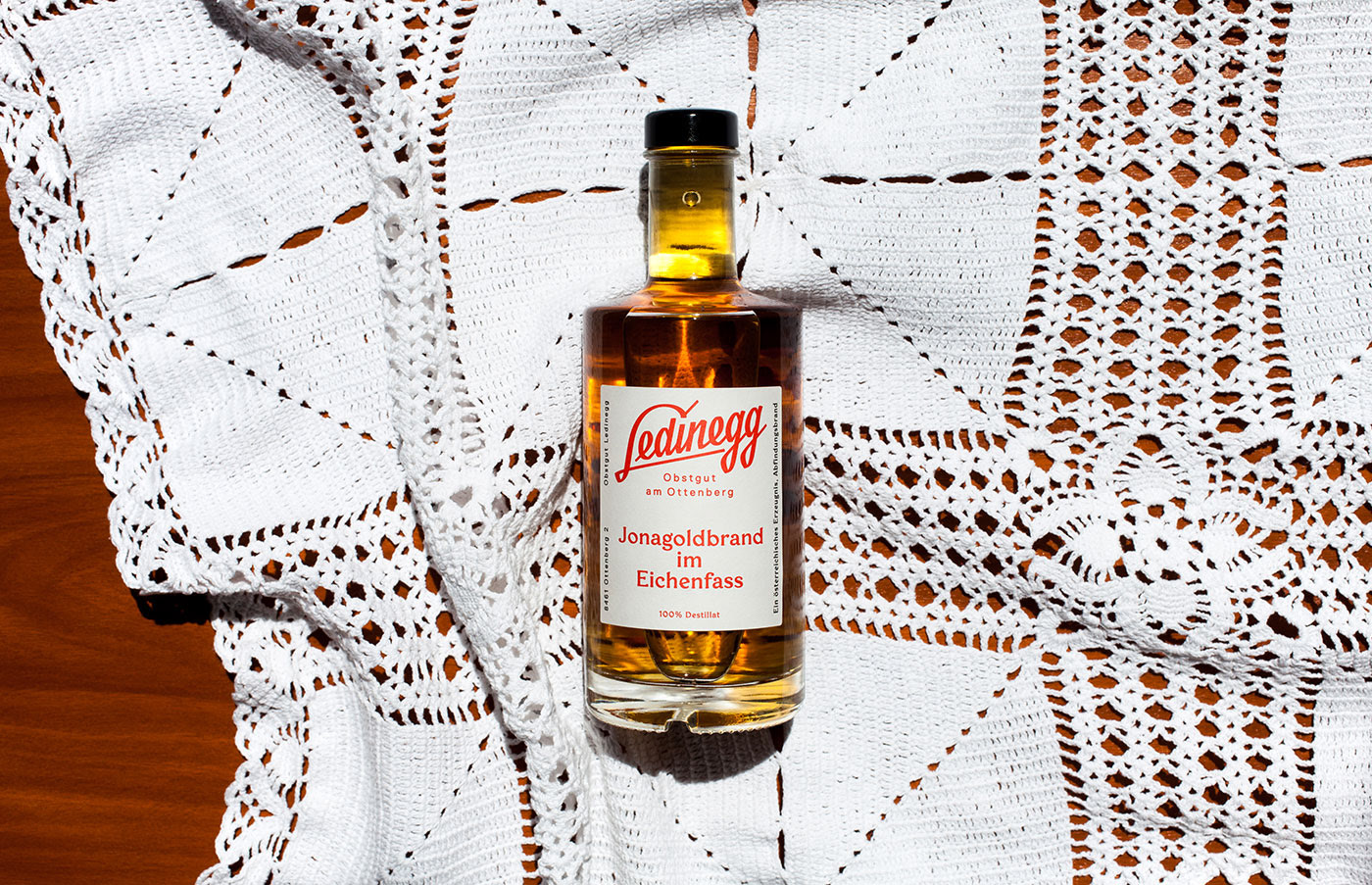
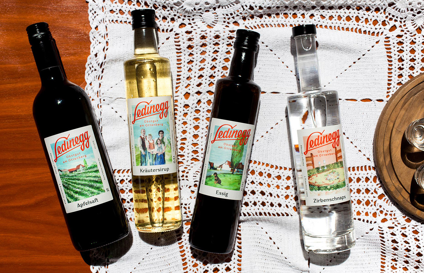
Ledinegg Obstgut am Ottenberg branding and packaging by Bruch Idee & Form
Plums, cherries, peaches, kiwis but especially apples play an important role in the life of family Ledinegg. The South-Styrian fruit growers create passionate and excellent juices and hard liquor which are well known in the region and beyond that. The new lettering creates a strong and individual appearance and communicates the family’s values, the hillside situation, and their main focus on fruit. Viola Nicolai’s colorful, friendly and native watercolor illustrations show the family, their dog waiting on the access road, the yard surrounded by steep hills, or just a table with glasses to entertain new costumers and complement the lettering and the clear typographic approach.
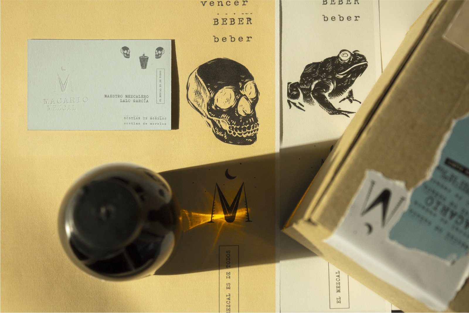
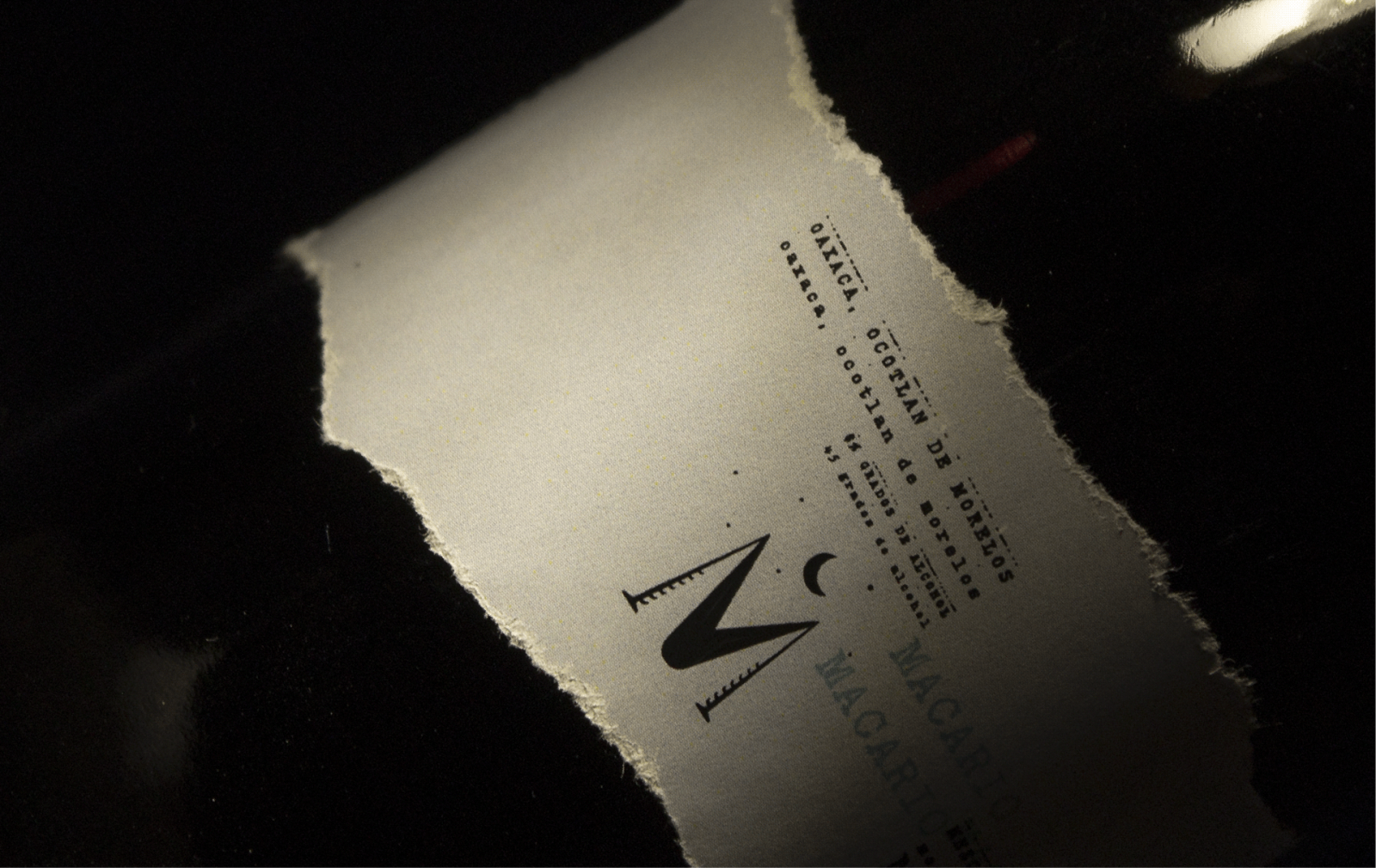
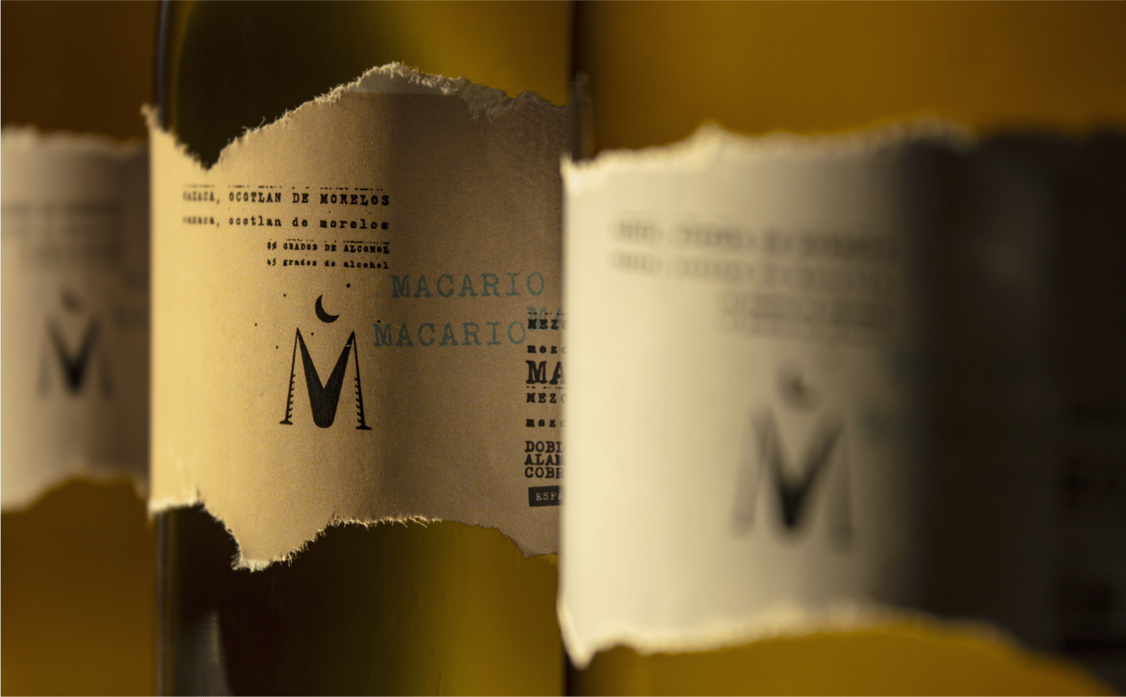
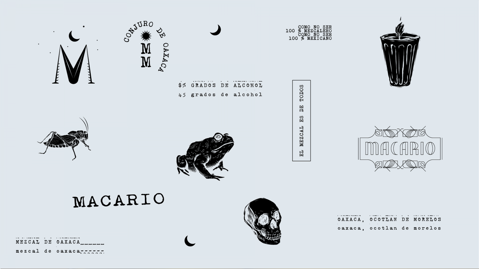
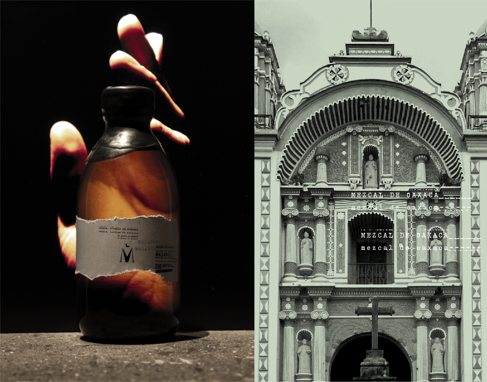
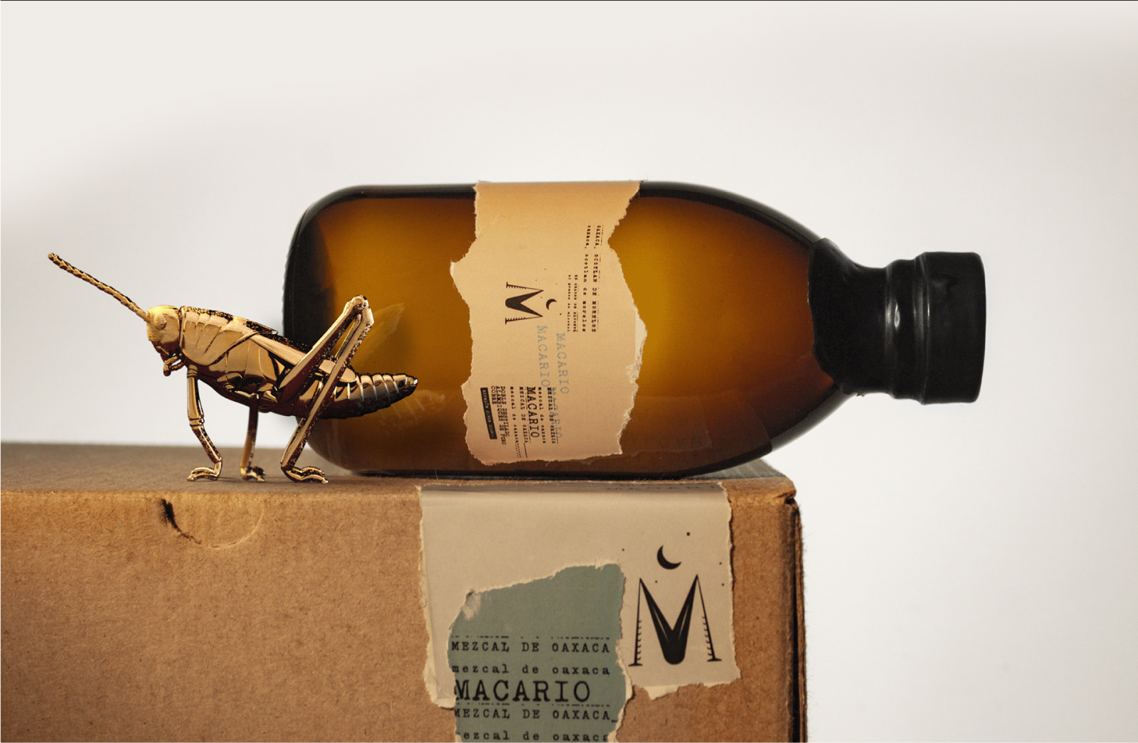
Macario Mezcal branding and packaging by HI! ESTUDIO
