Boo Republic is an award-winning design studio founded by Marios Georntamilis in 2017, that provides stand-out design solutions for clients in the need of branding, packaging, and web interfaces. Combating both modern and traditional mediums, Boo Republic believes in a holistic approach, as well as in the age-old saying the devil is in the details, as “usually the small things are the most impactful”. The studio recently designed an inspiring concept for a new series of lavish soap bars by 111Elies, which taps into the history and traditions of local folklore motifs.
The 111Elies identity is an ode to organic simplicity and traditional practices
The love for nature’s grandeur and noble simplicity is deeply engraved in Boo Republic’s creative journey in designing a fresh visual identity for 111Elies’ new soap bar line. 111Elies’ devotion to natural ingredients and planet-friendly processes shaped the concept into an ode to organic simplicity and traditional practices. The Greek skincare brand’s name 111Elies’ (111Olives” in English) comes from the 111 olive trees planted in the family-owned company’s field, which is where the passion for making natural products originates, as well as what kickstarted the business.
The studio’s design solution for the packaging was to highlight the combination of two basic values; local production and design intricacy.
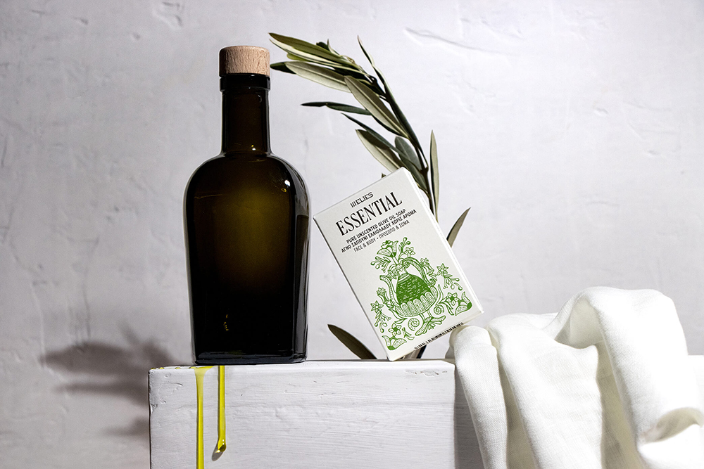
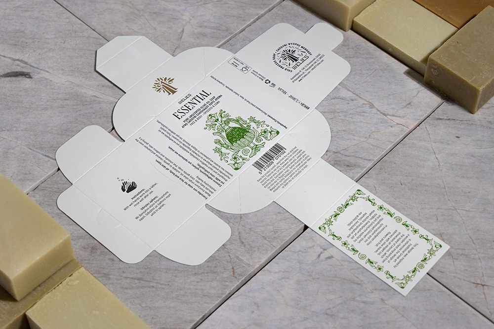
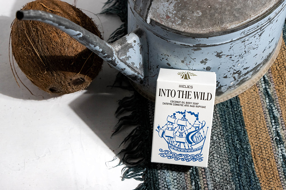
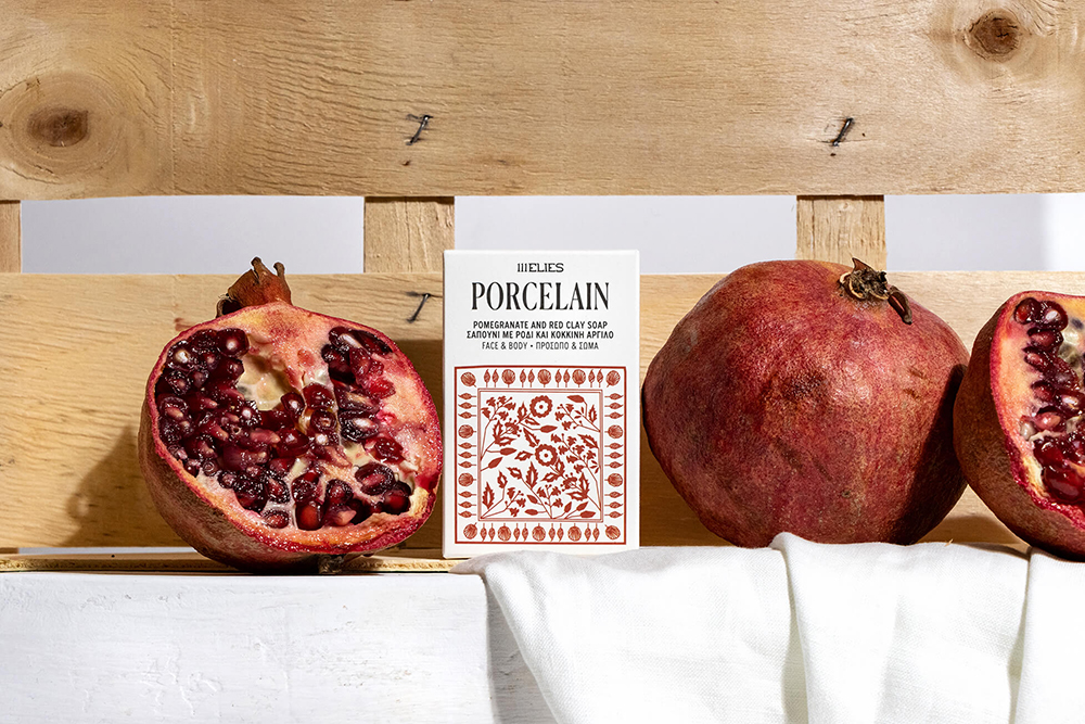
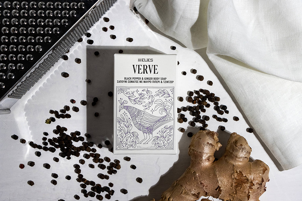
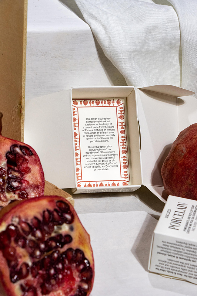
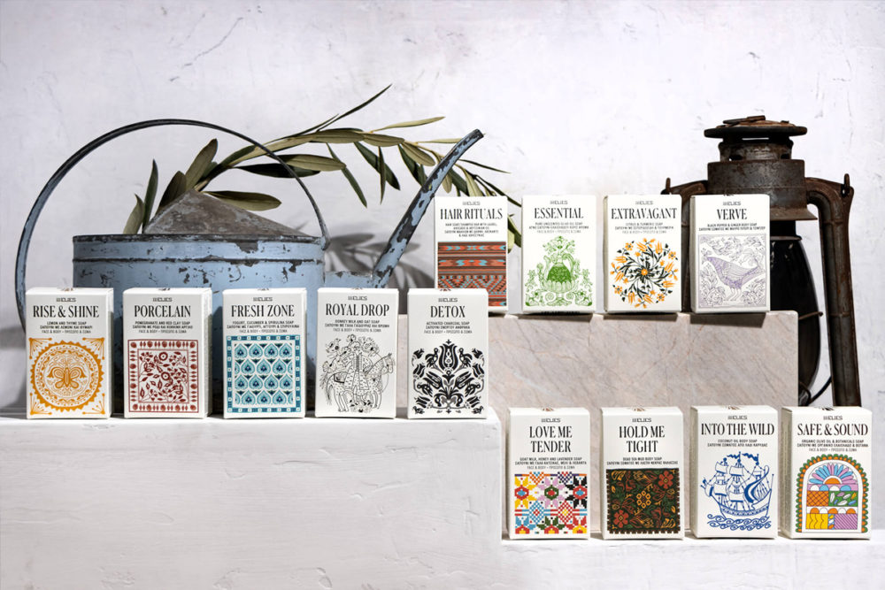
The collaboration between Boo Republic and 111Elies began with the studio designing the packaging for the brand’s new line of 13 skin and hair care soap bars, each of which has a distinct active ingredient, scent, and benefits, while all are produced to protect and nourish. The studio’s design solution for the packaging was to highlight the combination of two basic values; local production and design intricacy. “An element from the past, representing the folklore and handmade, was what we needed to spice things up and spark memories. After extensive research into the archives of EOMMEX (Hellenic Organisation of Small and Medium Enterprises and Handicraft), featuring traditional and folk Greek motifs and compositions from carpets, ceramics, fabrics, and others – various elements were highlighted and translated into a visual language applicable to the product range”, Boo Republic writes.

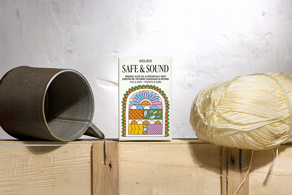
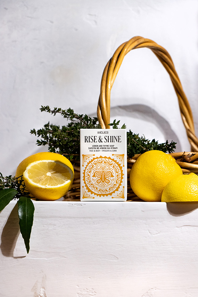
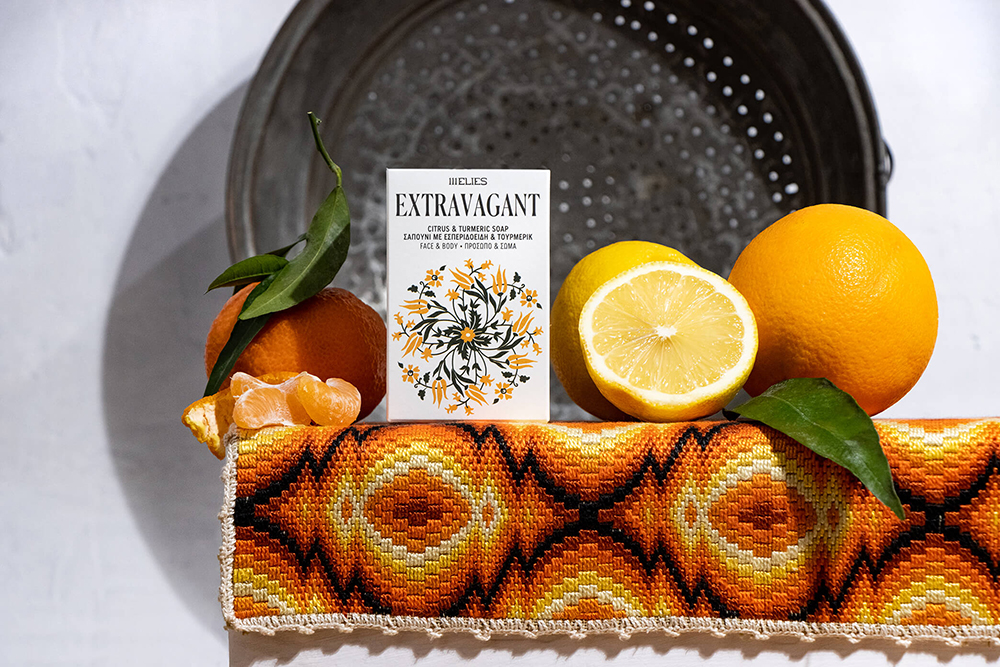
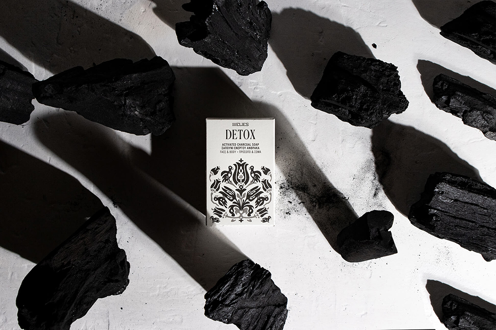
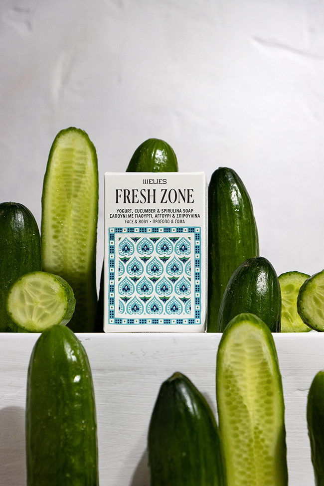
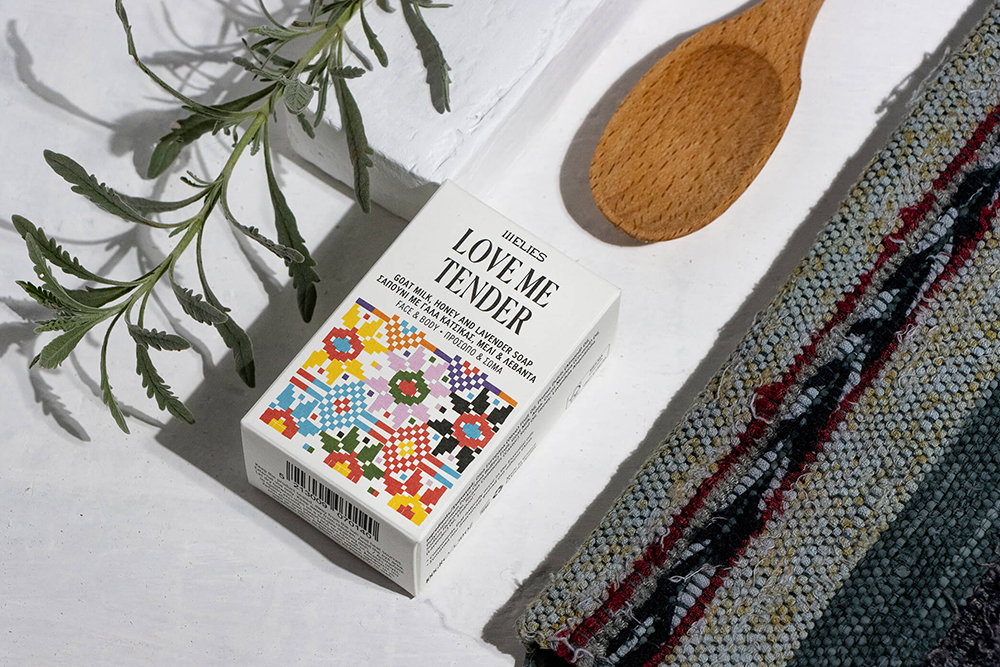
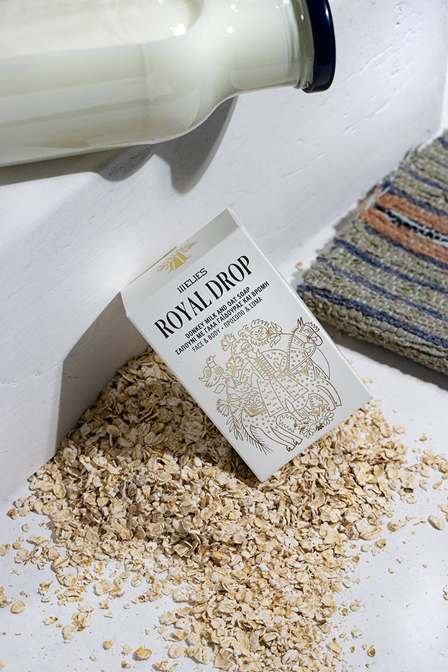
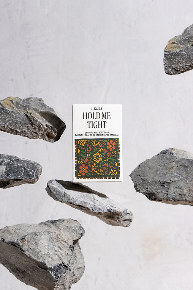
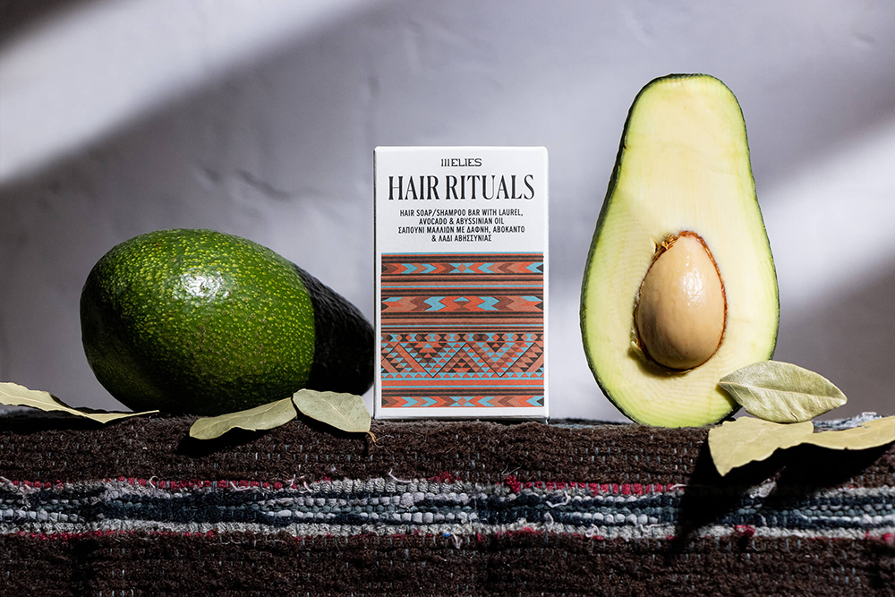
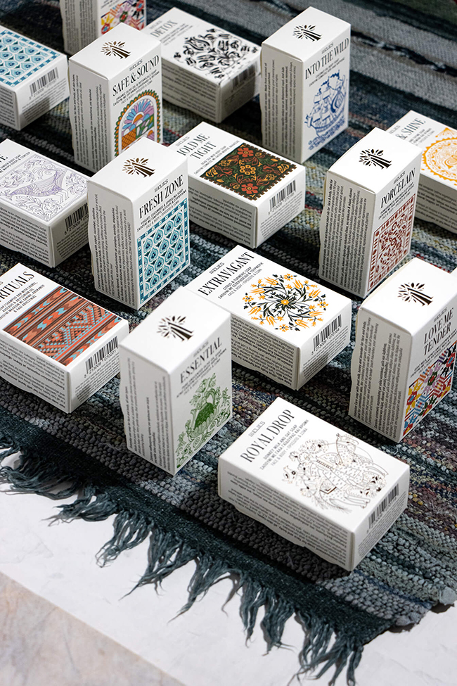
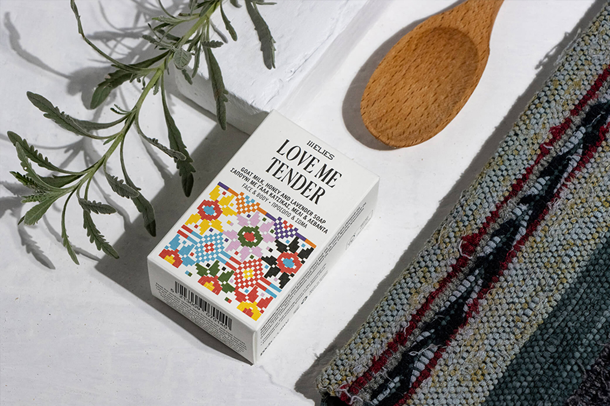
The illustrations, which vary from intricate monochrome patterns to more colorful and bold designs, loosely reflect each soap bar’s characteristics, while following the natural color palette from its main ingredients.
Using this extensive research as a reference, the studio created 13 beautiful illustrations, one for each style of soap. The illustrations, which vary from intricate monochrome patterns to more colorful and bold designs, loosely reflect each soap bar’s characteristics, while following the natural color palette from its main ingredients. The studio chose classic high-quality Munken by Arctic Paper for the packaging, which was printed by a local printing house Fotolio. The concept’s typographic elements reflect elegance as well as the delicacy of the products themselves, featuring an ornate serif font that embraces the illustrative compositions, and are matched with a bolder, and more contemporary sans-serif font.
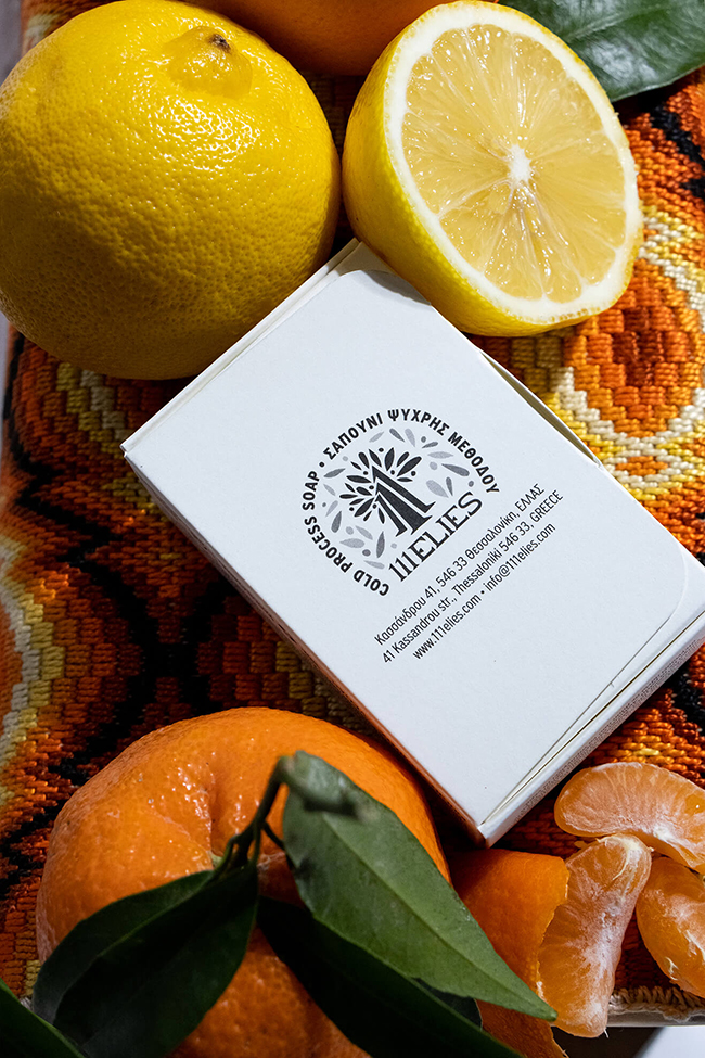
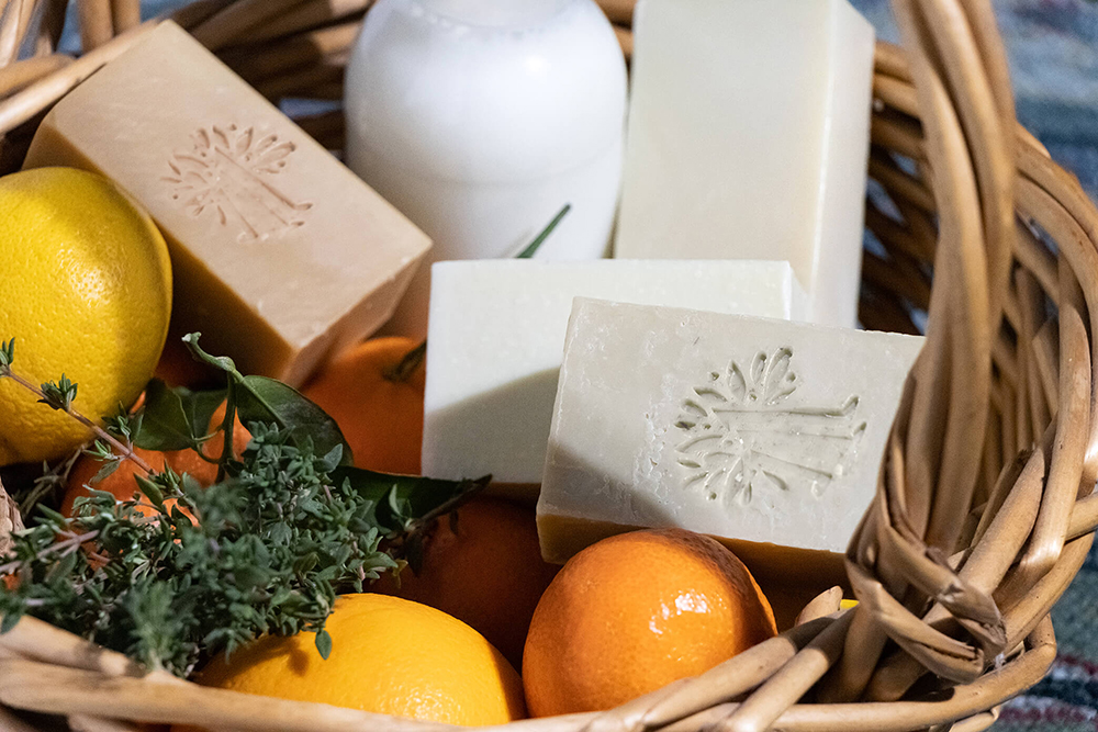
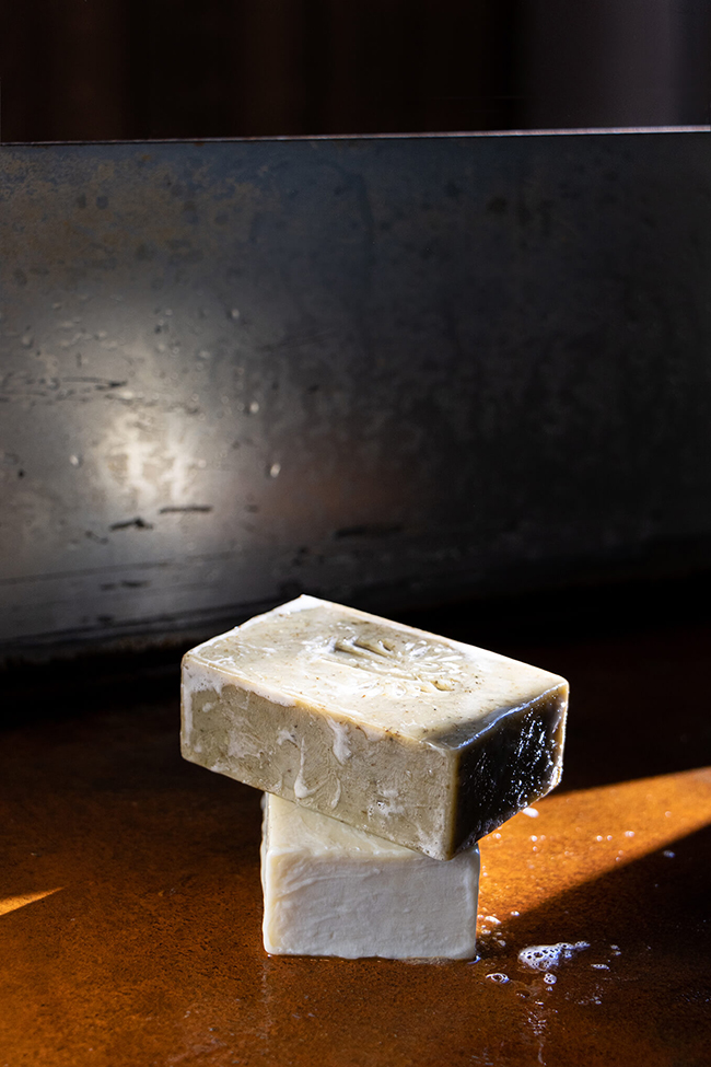
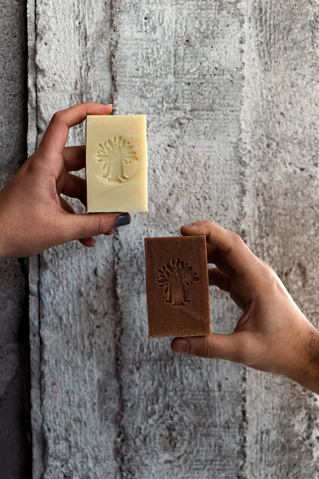
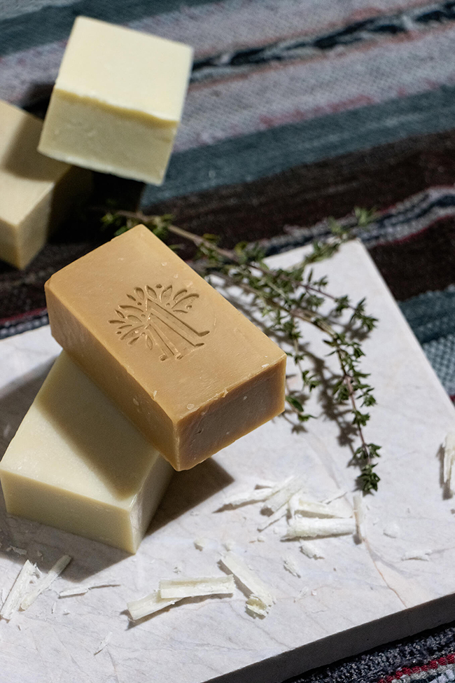
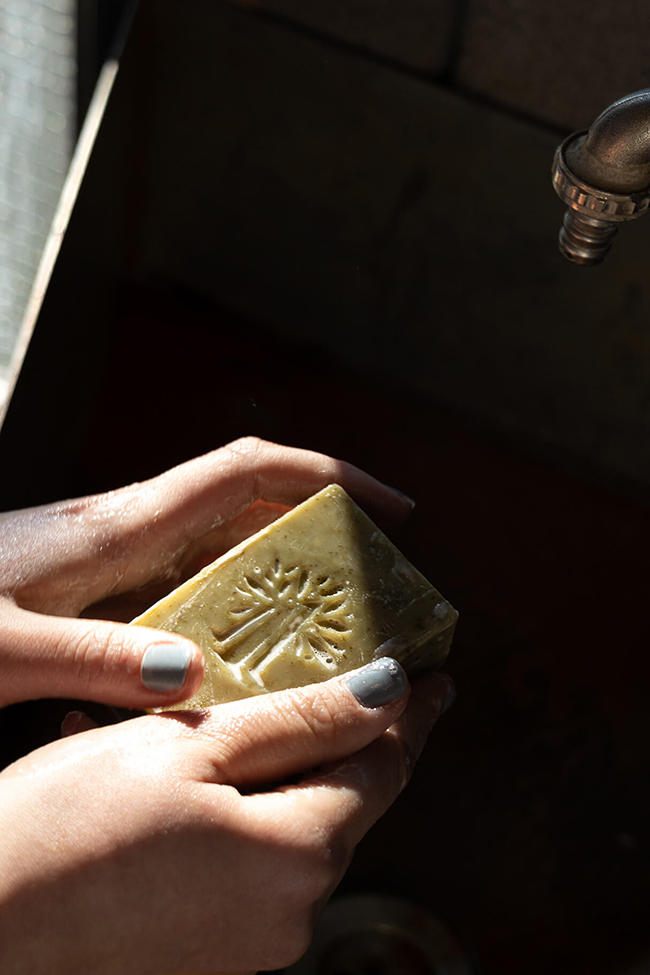
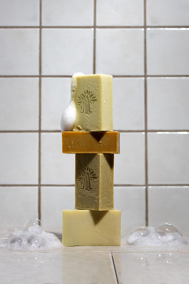
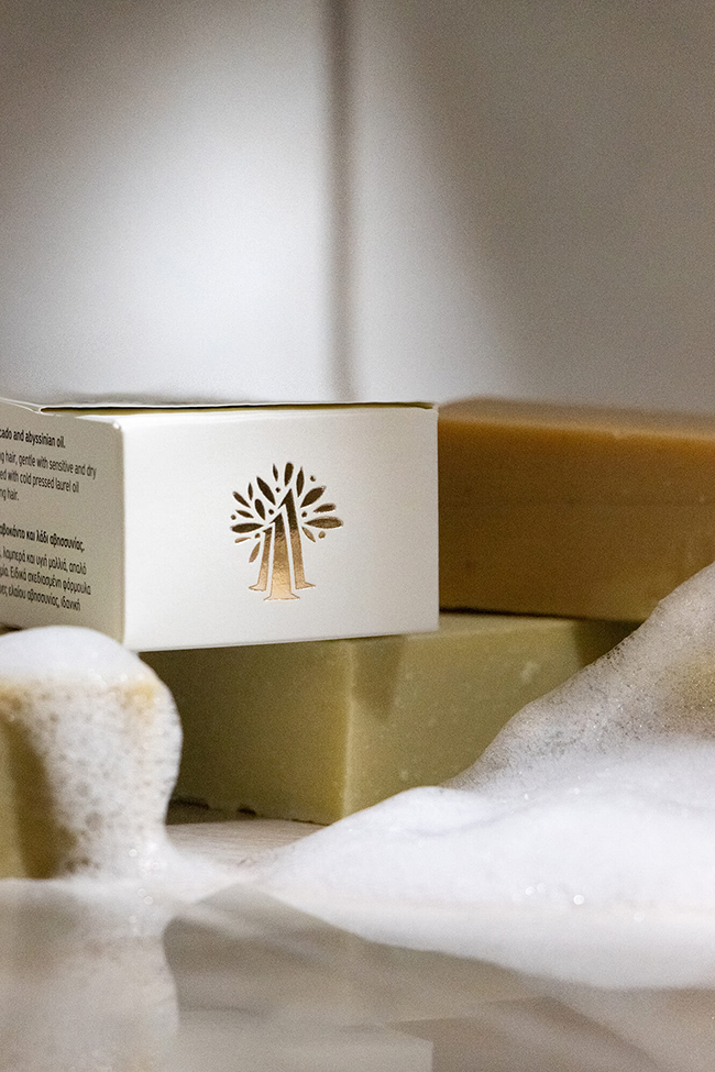
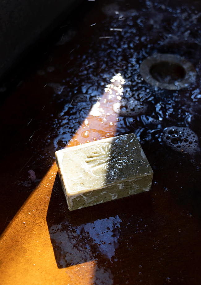
The logo of the range is full of character, as organic shapes that take the form of trees create the number “111”, distinctive to the brand, while minimalistic leaves and dots, referencing olives complete the image of a forest of olive trees. A reduced version of the logo is also stamped on the soap bars, bringing the concept into a full circle.
For more branding and packaging inspiration, follow Boo Republic on Instagram.
