While the whole world stands still as we’re all urged to spend our time indoors, many of us are mourning after missed or canceled holidays and family trips. And although we know and understand it’s for the better of us, and the right thing to do for the common good, being stuck at home when you’re dreaming of visiting the next place on your bucket list can feel pretty grim – and may result is a major case of wanderlust.
So while we wait for the situation to pass (and it will!) escapism is an amazing way to avoid boredom and apathy that comes from pacing within the four walls of our home. And just like we can escape reality to the world of books, games, and movies, we can take an imaginary trip to our favorite holiday destination via these amazingly inspirational hotel and holiday resort branding design concepts.
In support of the #StayHome movement, to offer a cure for wanderlust, and a little escapism, we’ve searched and listed below fourteen of our favorite hotel, hostel, and holiday resort branding and visual identity design concepts.
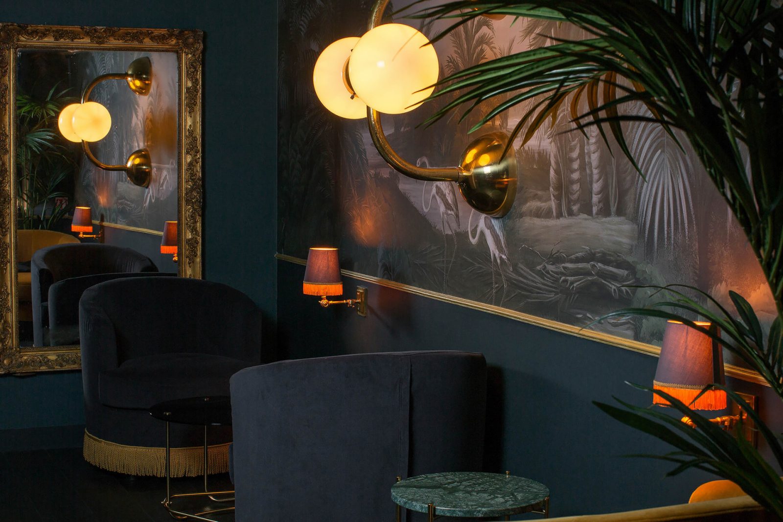
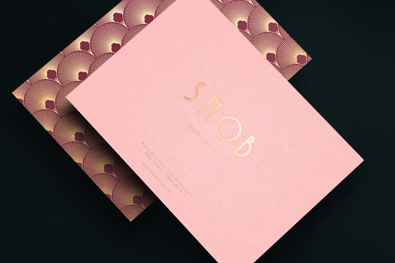
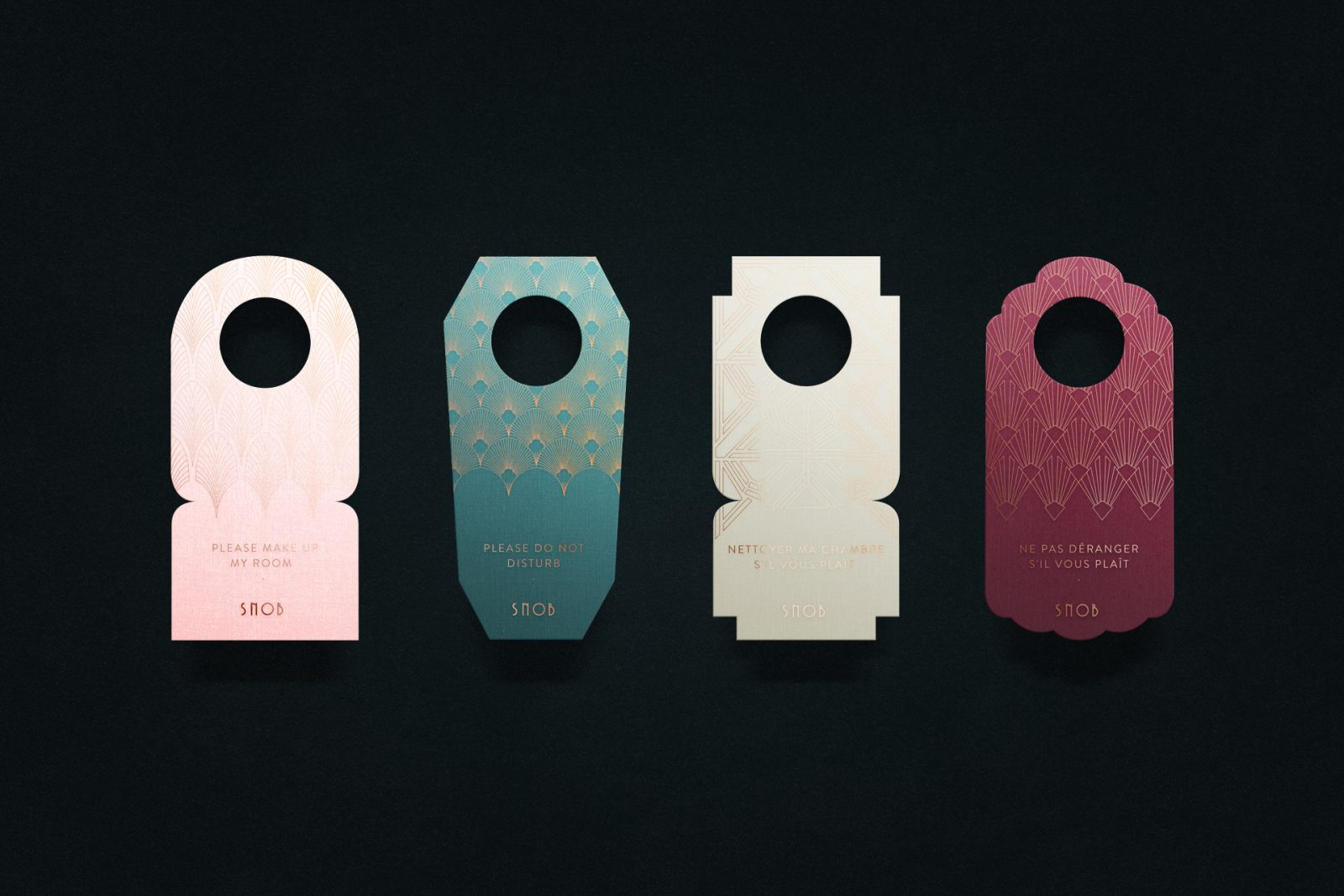
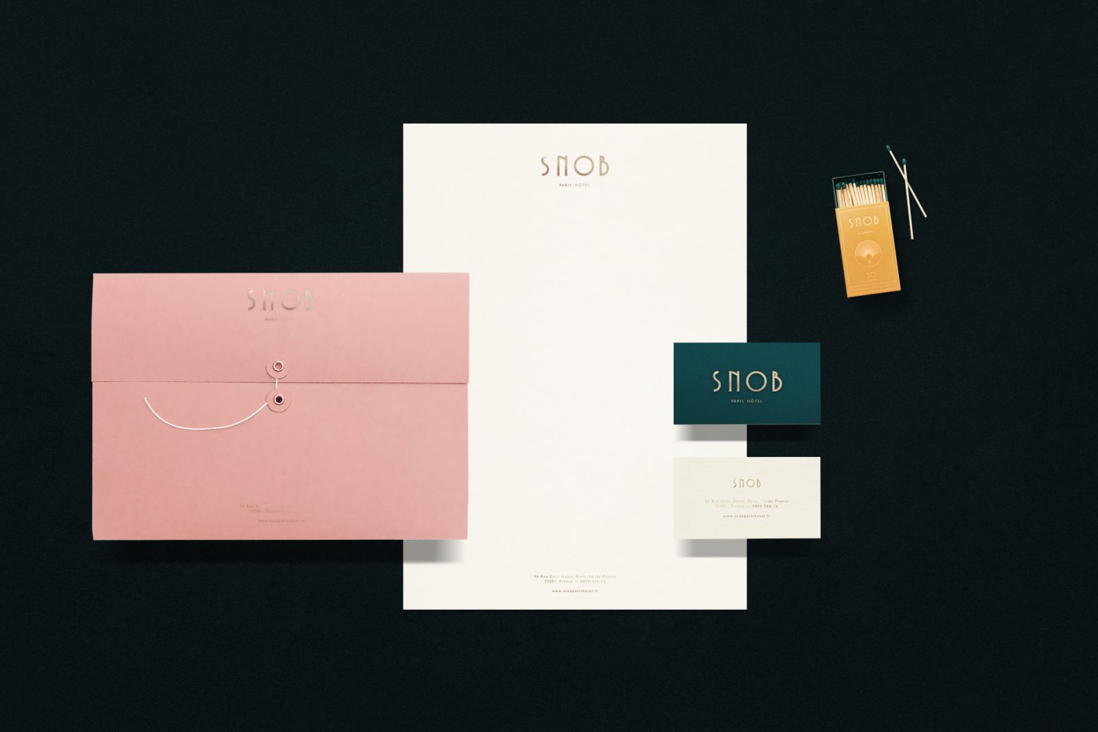
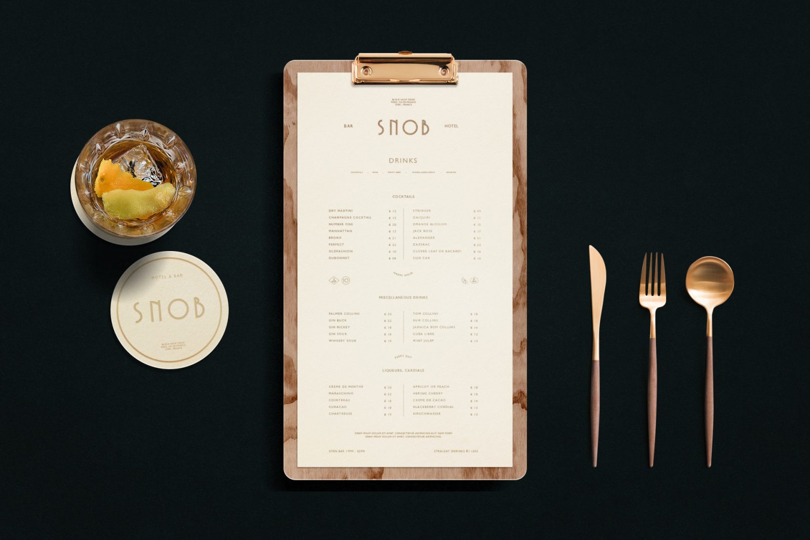
Snob Hôtel Brand Identity Concept by Composé
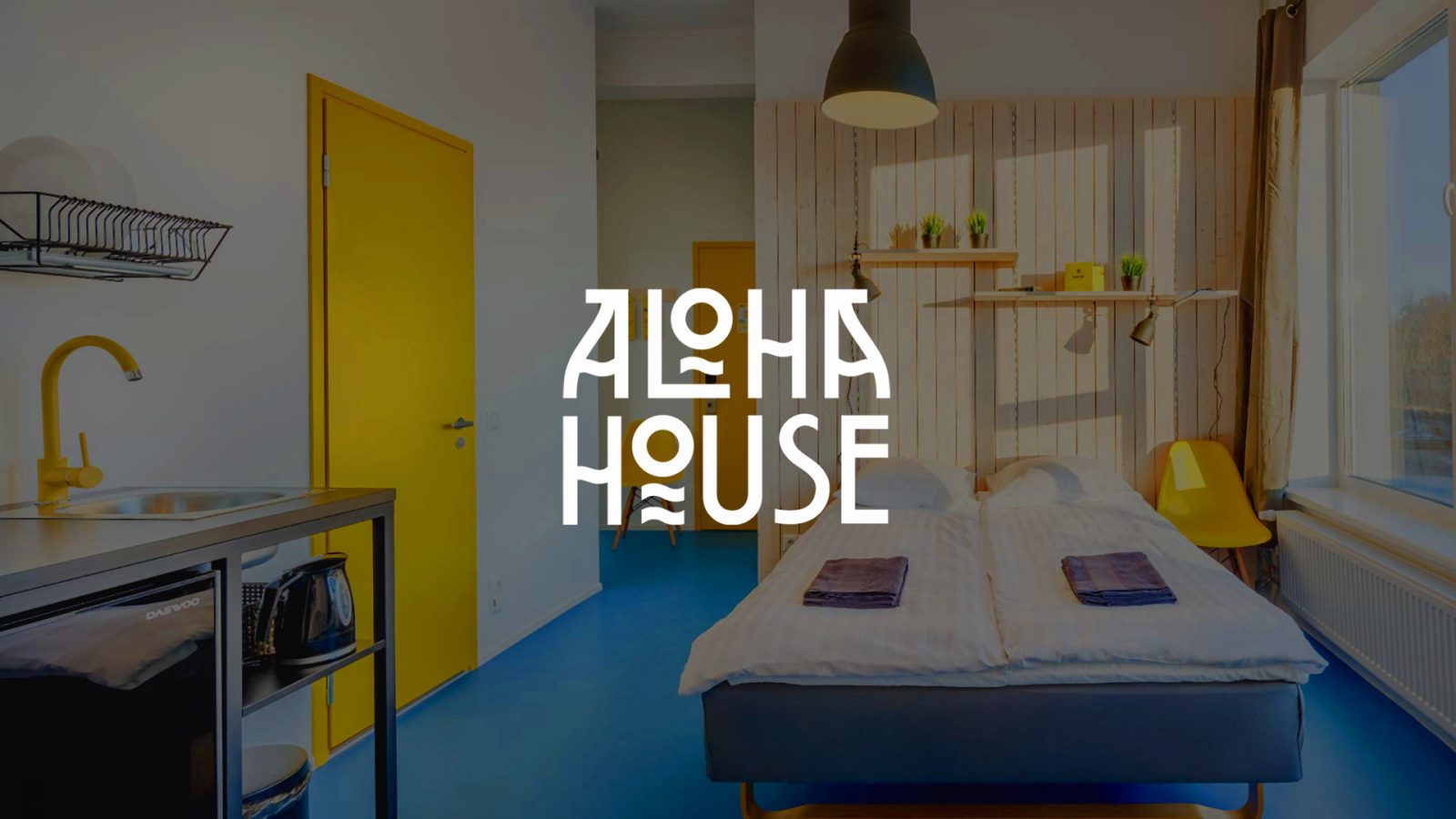
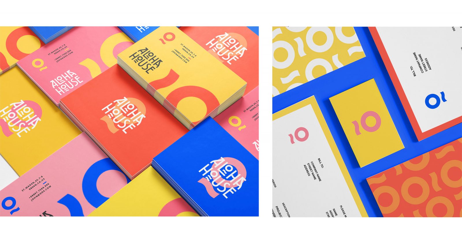
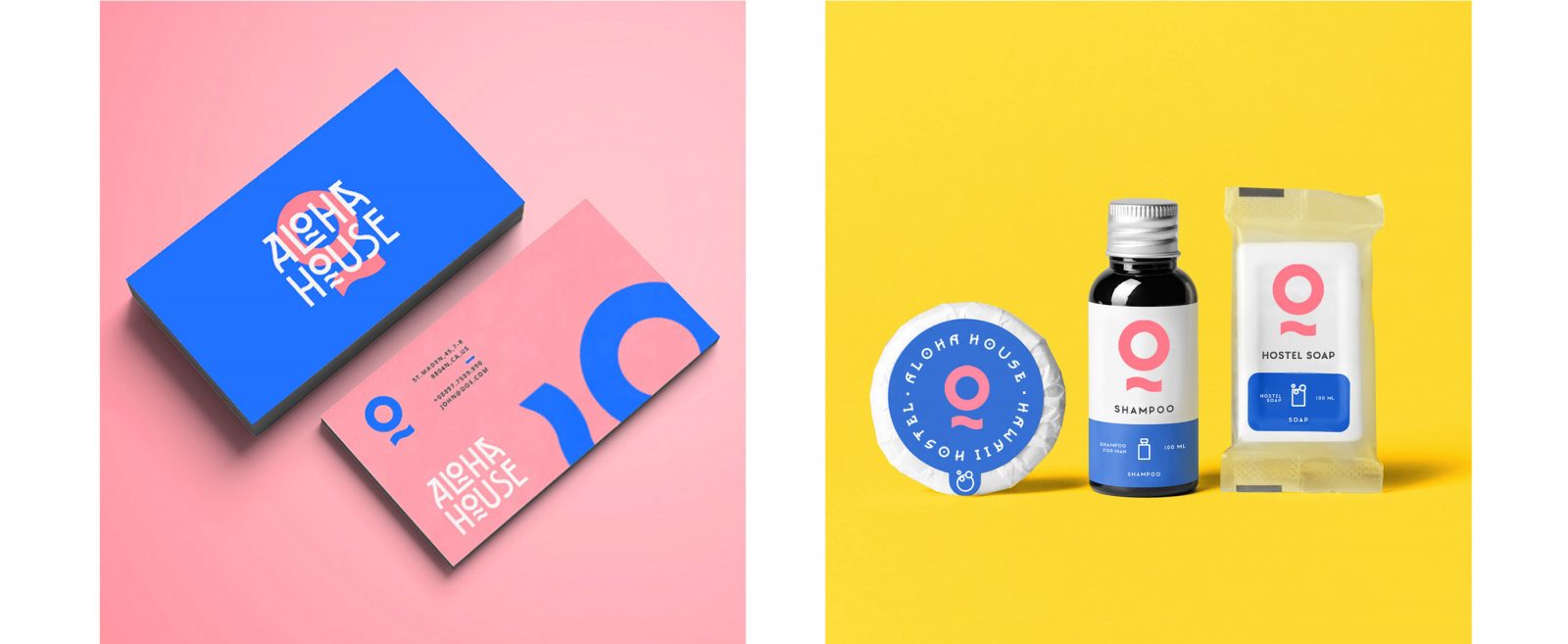
Aloha House Hotel Branding by Кamila Shazamova
Aloha House – this is a charming place located 1 block from Waikiki Beach. The outdoor pool and sun terrace offer panoramic views of Diamond Head. The bright and colorful branding concept echoes the spirit and atmosphere of everyone’s favorite holiday destination island.

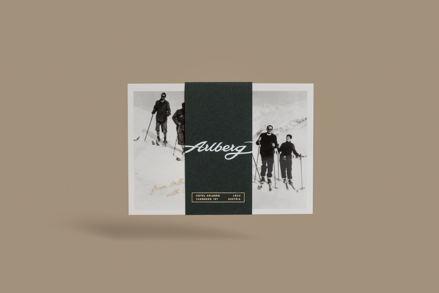
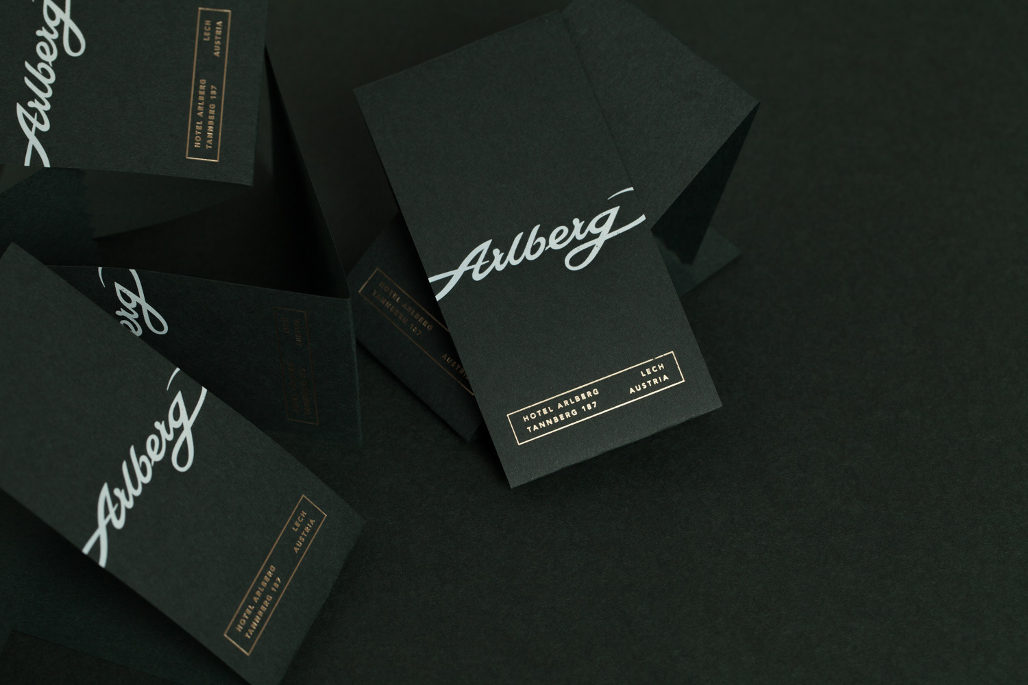
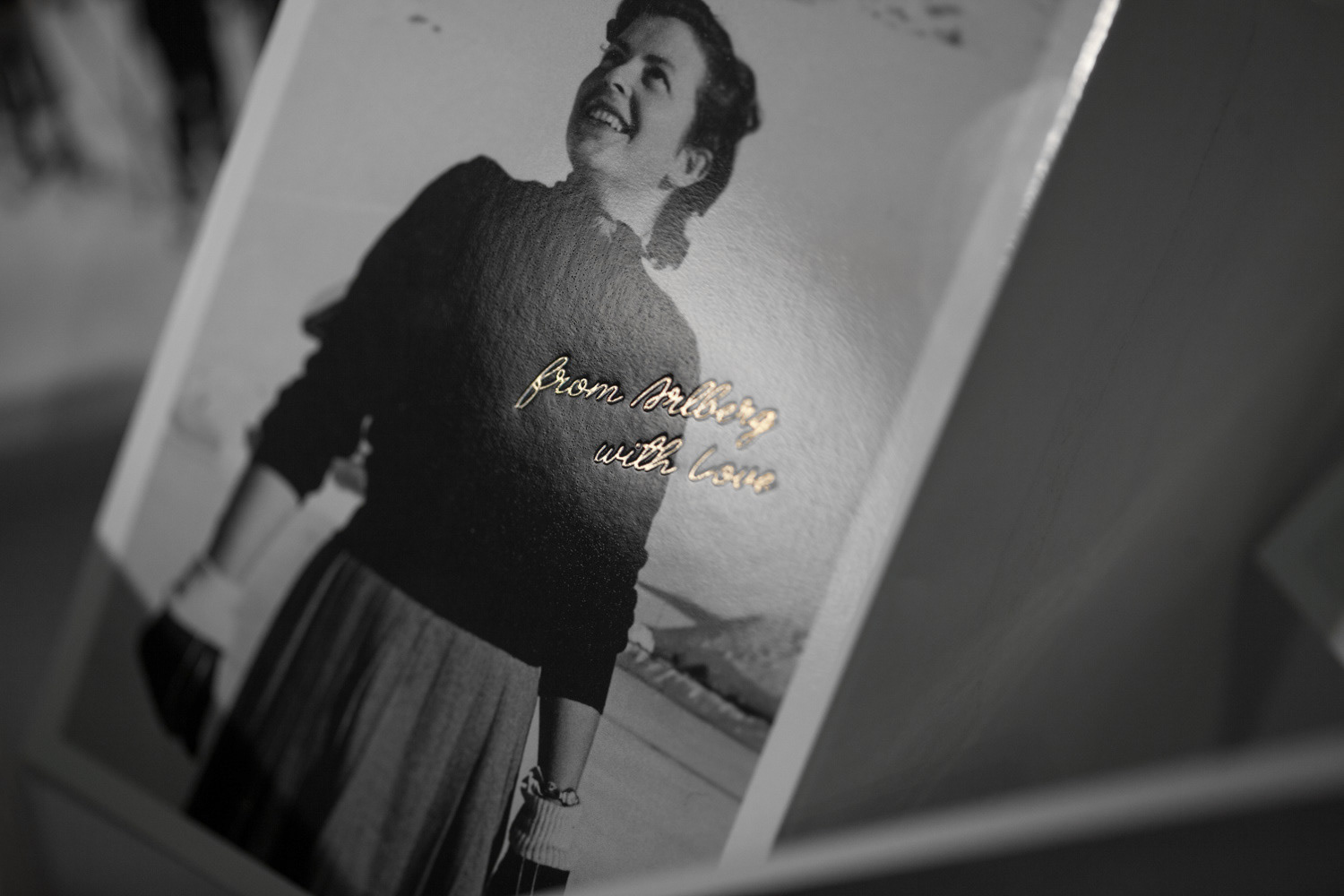
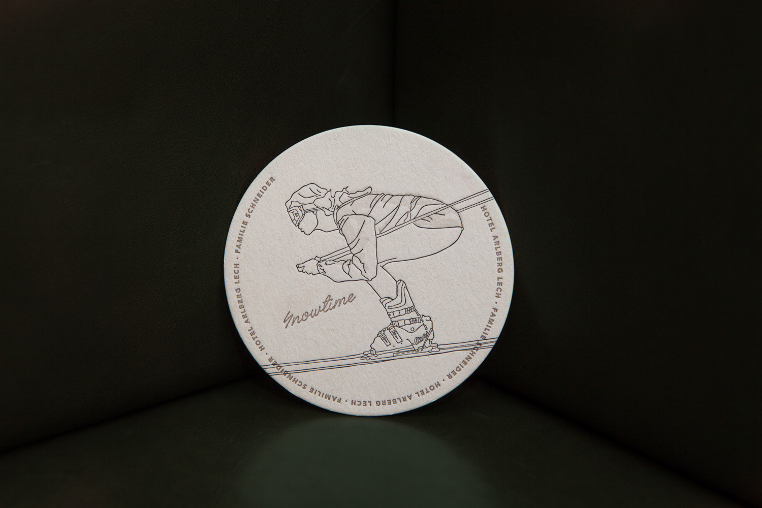
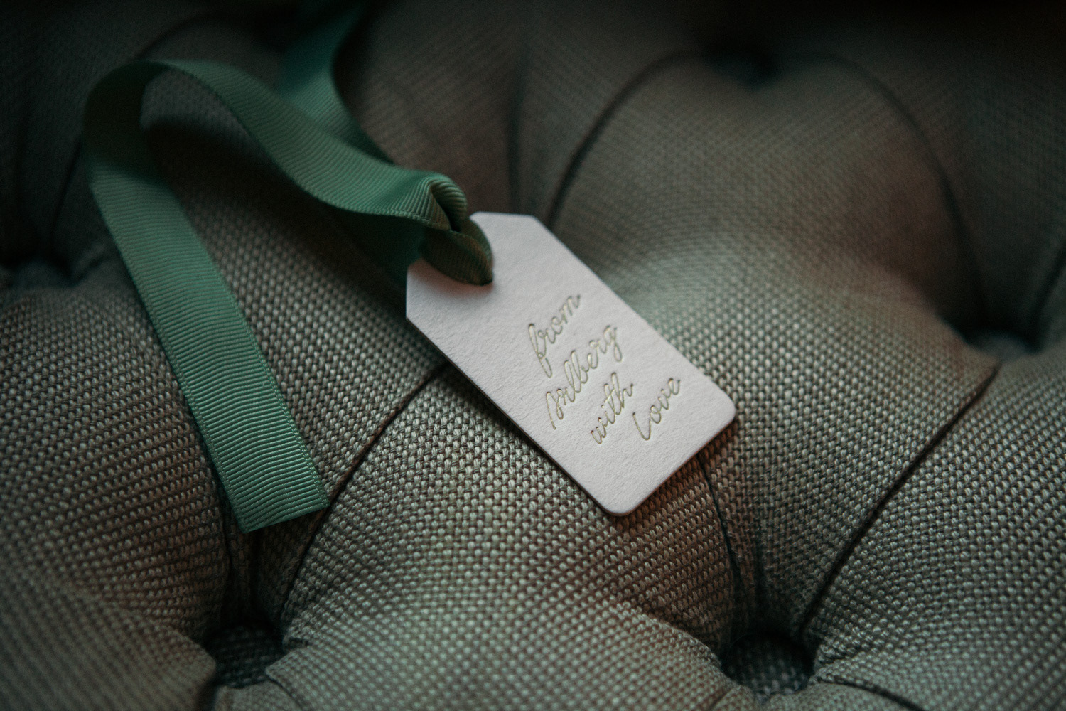
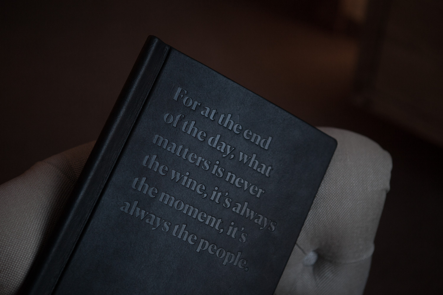
Hotel Arlberg Lech Re-branding by Bureau Rabensteiner
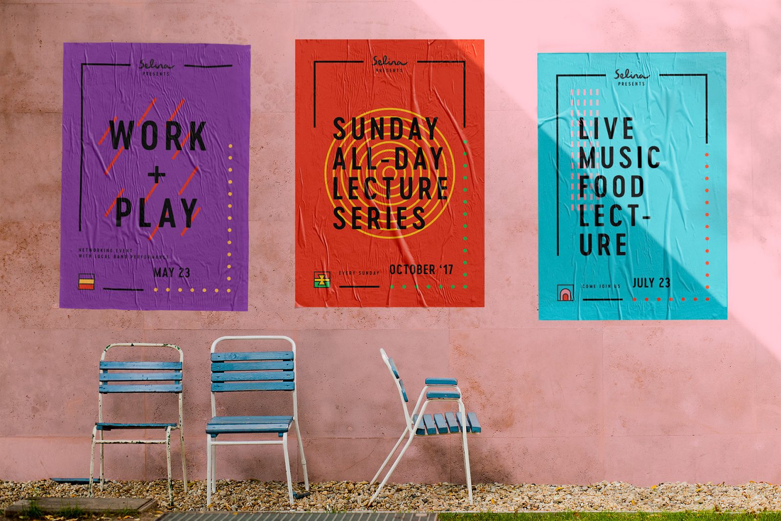
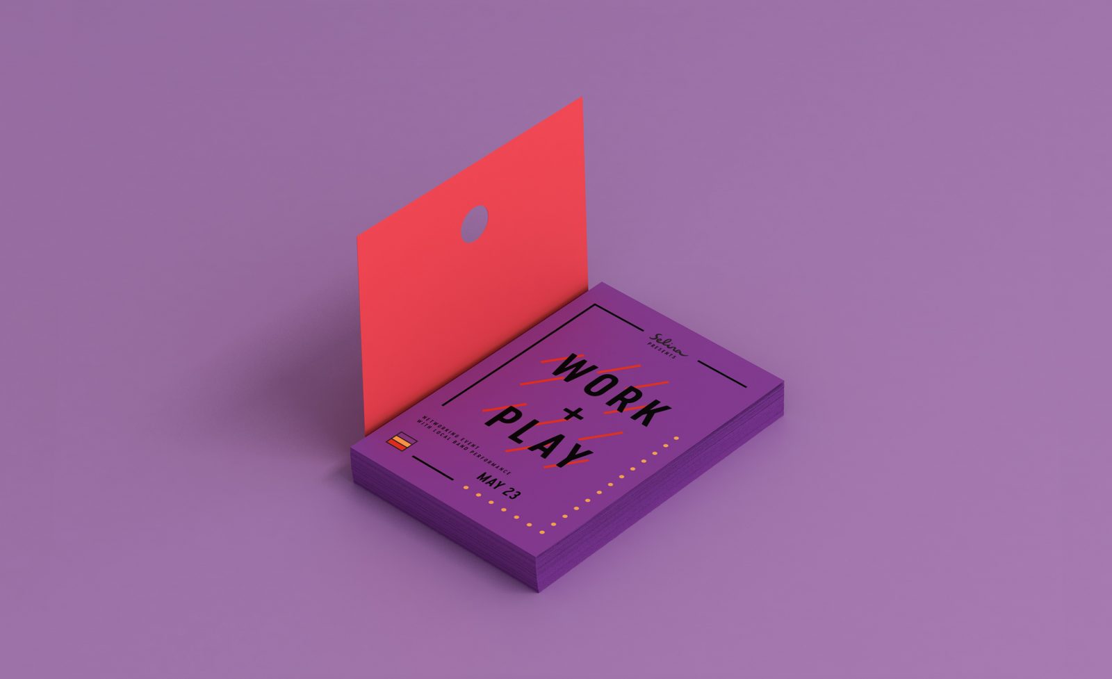
Selina Hostels Rebranding by Squat New York
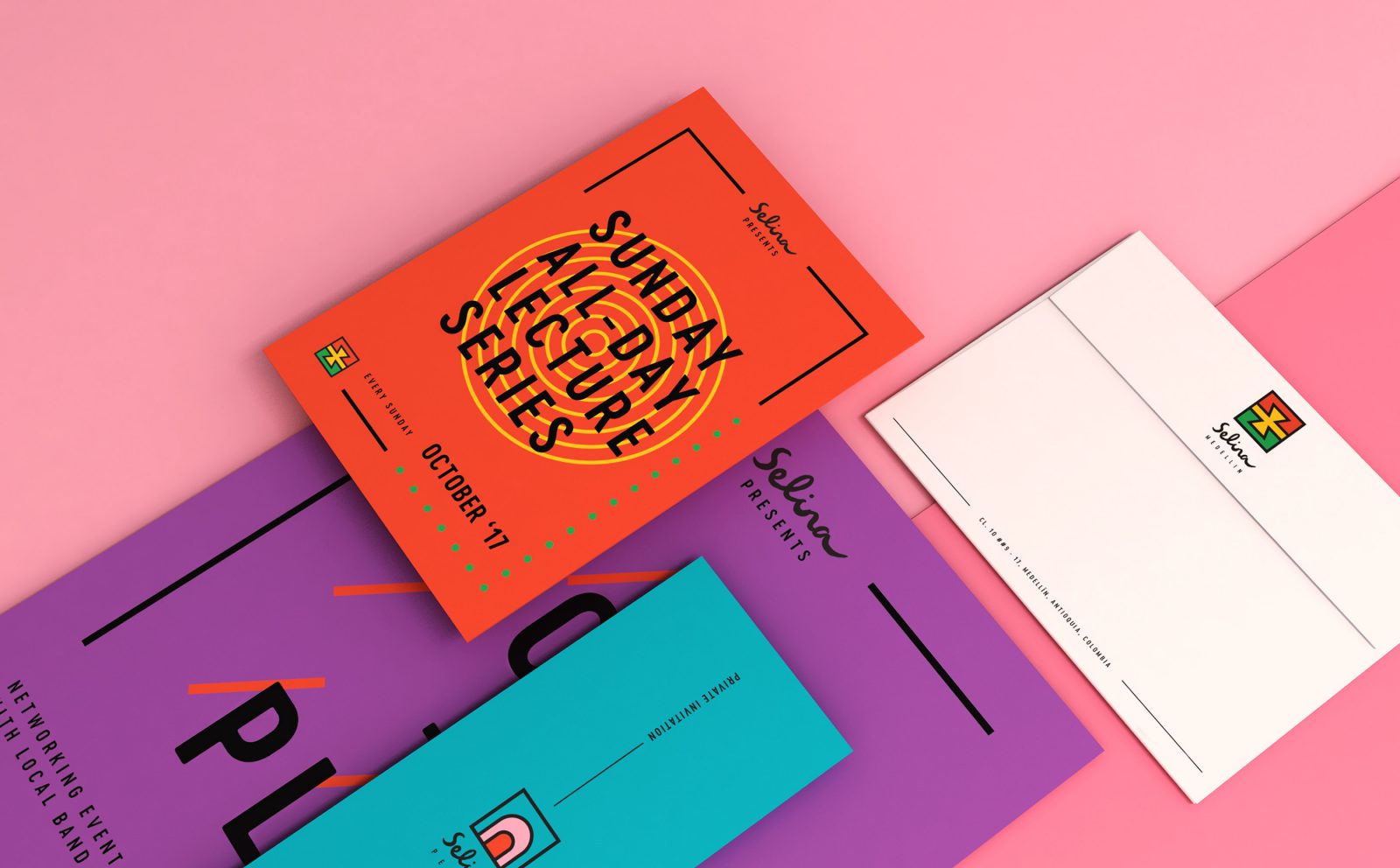
Selina is one of the only hostel chains in Latin America offering guests luxurious, yet budget-friendly sleeping rooms and coworking spaces for workers on the go. The company’s previous brand was geared toward a young, fun-loving crowd, more interested in enjoying a party atmosphere than cultural experiences.
Selina went to Squat New York looking for a new brand face that unites and appeals to a modern, slightly older generation of “macpackers.” These are serious travelers who desire to expand their cultural palate and make their trips both personally and professionally productive. With this more mature audience in mind, Squat New York set out to build a brand reflective of each location’s exploration opportunities, communal learning spaces and Latin American flair.


Stayery Hotel Corporate Design by Make Studio
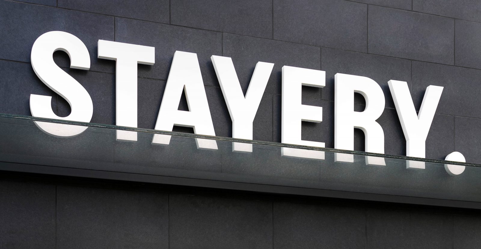
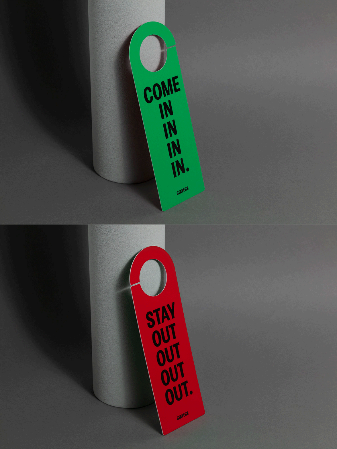
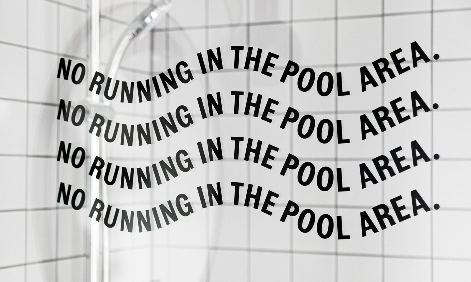
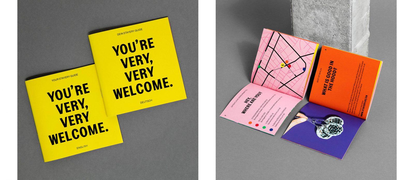
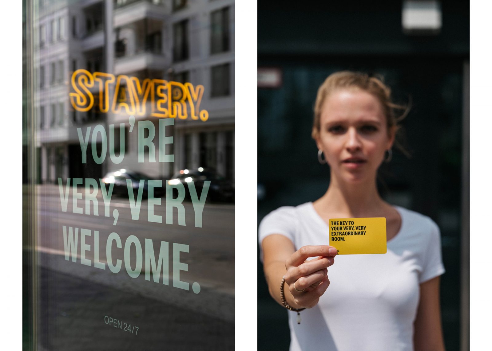
The STAYERY is a completely new kind of serviced apartment with locations in Berlin, Bielefeld, and others to come. As their strategic partner, Make Studio built a strong corporate identity and a flexible design system for the hotel. Make Studio created the name and logo and various applications such as stationery, packaging, signage and digital services like the website, apps, and mailings.
The hotels claim; Stay very, very extraordinary is the inspiration behind the bold design, while typography plays a major role in the corporate design. Combining two typefaces and seven fresh colors a playful yet simple design system was built. Additionally, the use of repetition and artificially prolonged words create a distinctive corporate language that reflects STAYERY’s long-term-stay concept.
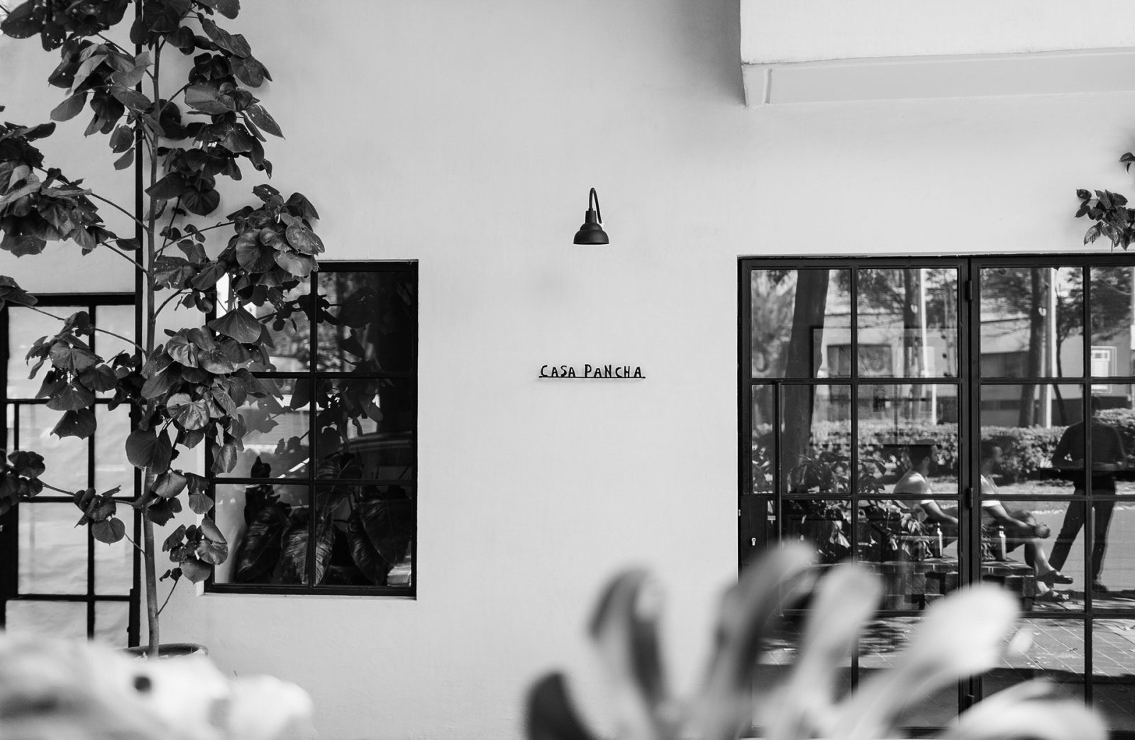
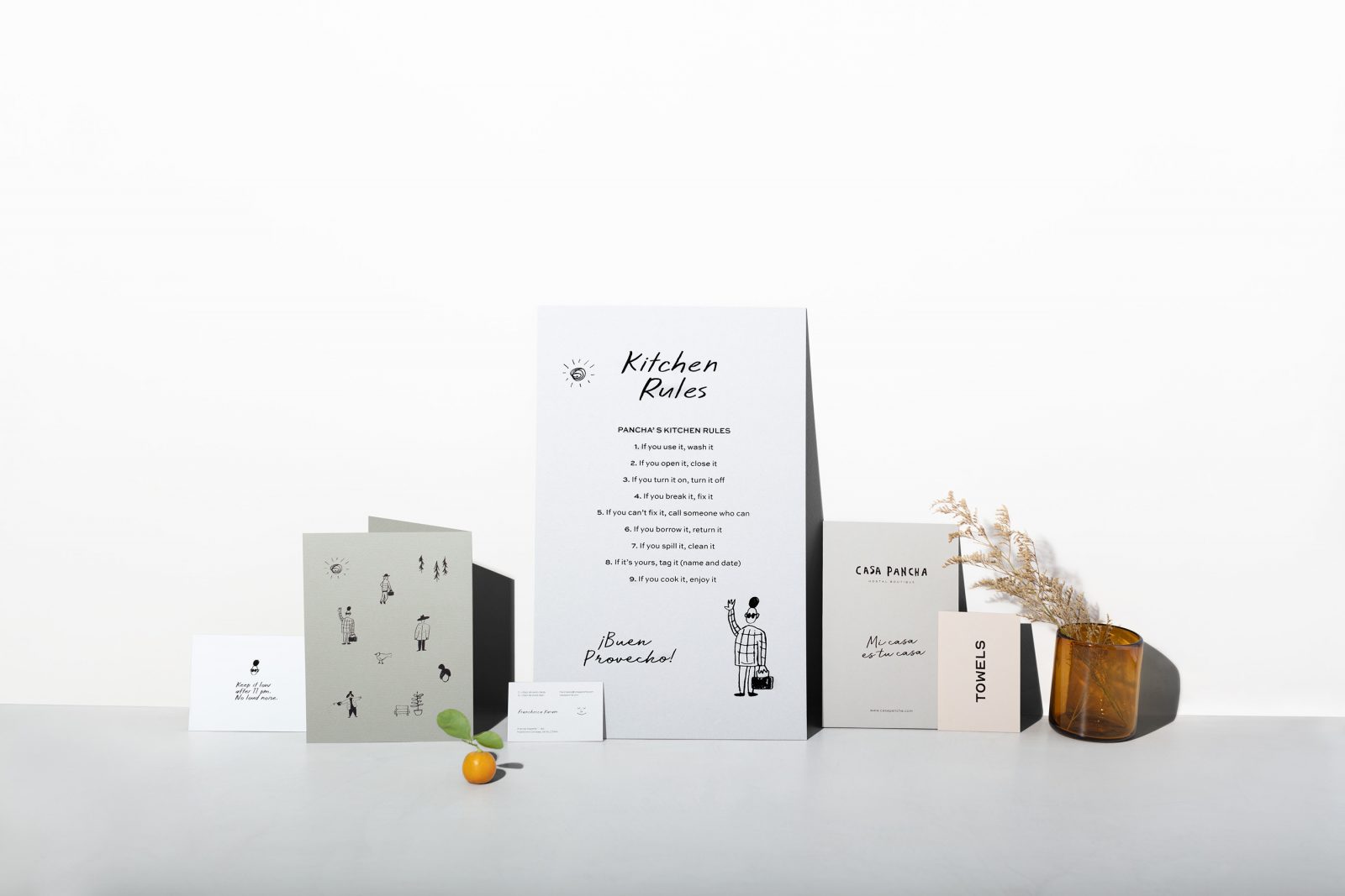
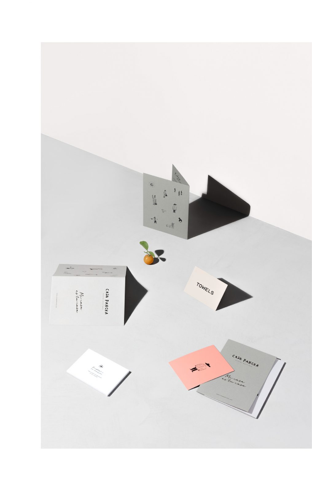
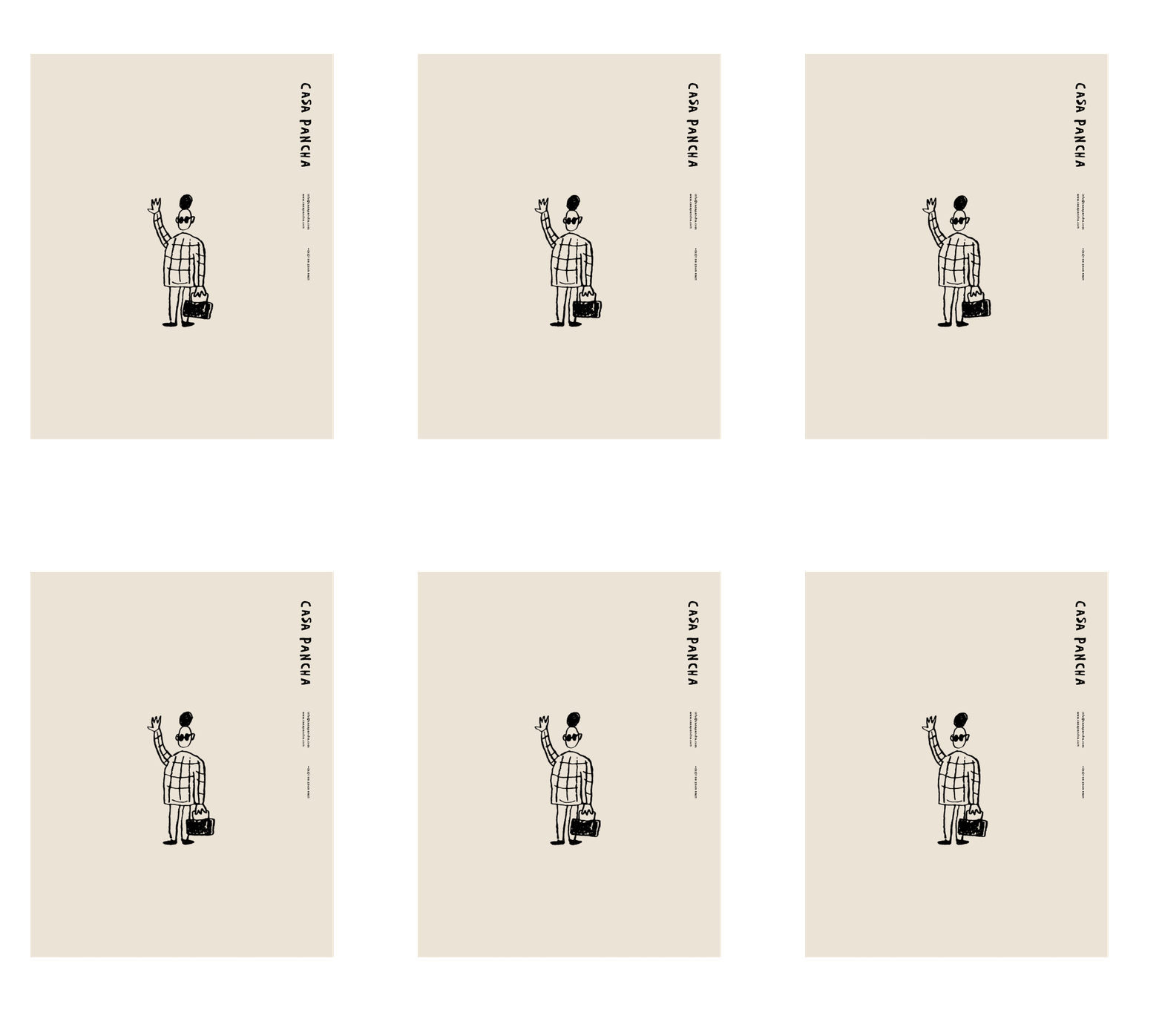
Boutique Hostel Casa Pancha Visual Identity by Ladente Studio
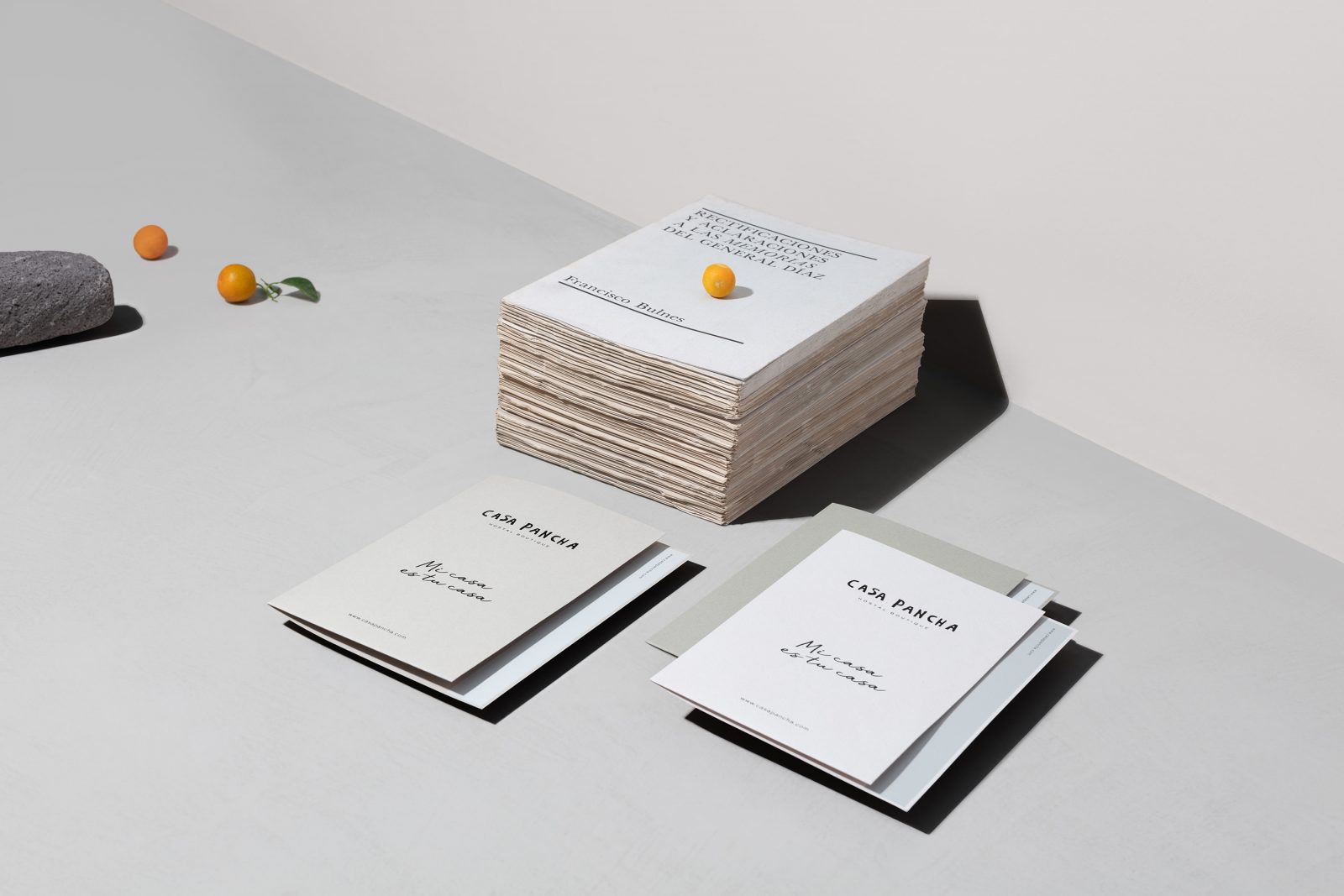
Boutique hostel located in the heart of Mexico City. Ladente Studio’s challenge was to create a story that resonates with an international audience – design a unique experience and connect with an intimate narrative. “Mi casa es tu casa.” became the mantra. Complete signage system, brand collaterals, interior design, and the website was thoroughly evaluated. Ladente Studio revealed a series of design elements that conduct guests into a journey to Mexican artisan pieces. Laughter, food, mezcal, education, insights, and kinship are some of the core values transmitted.
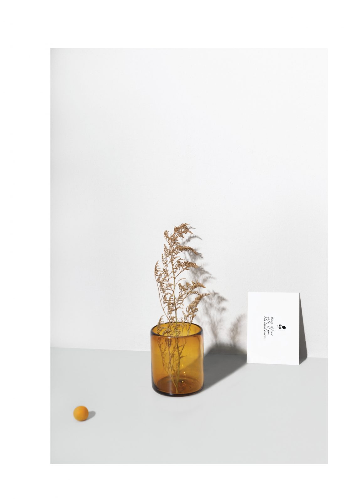
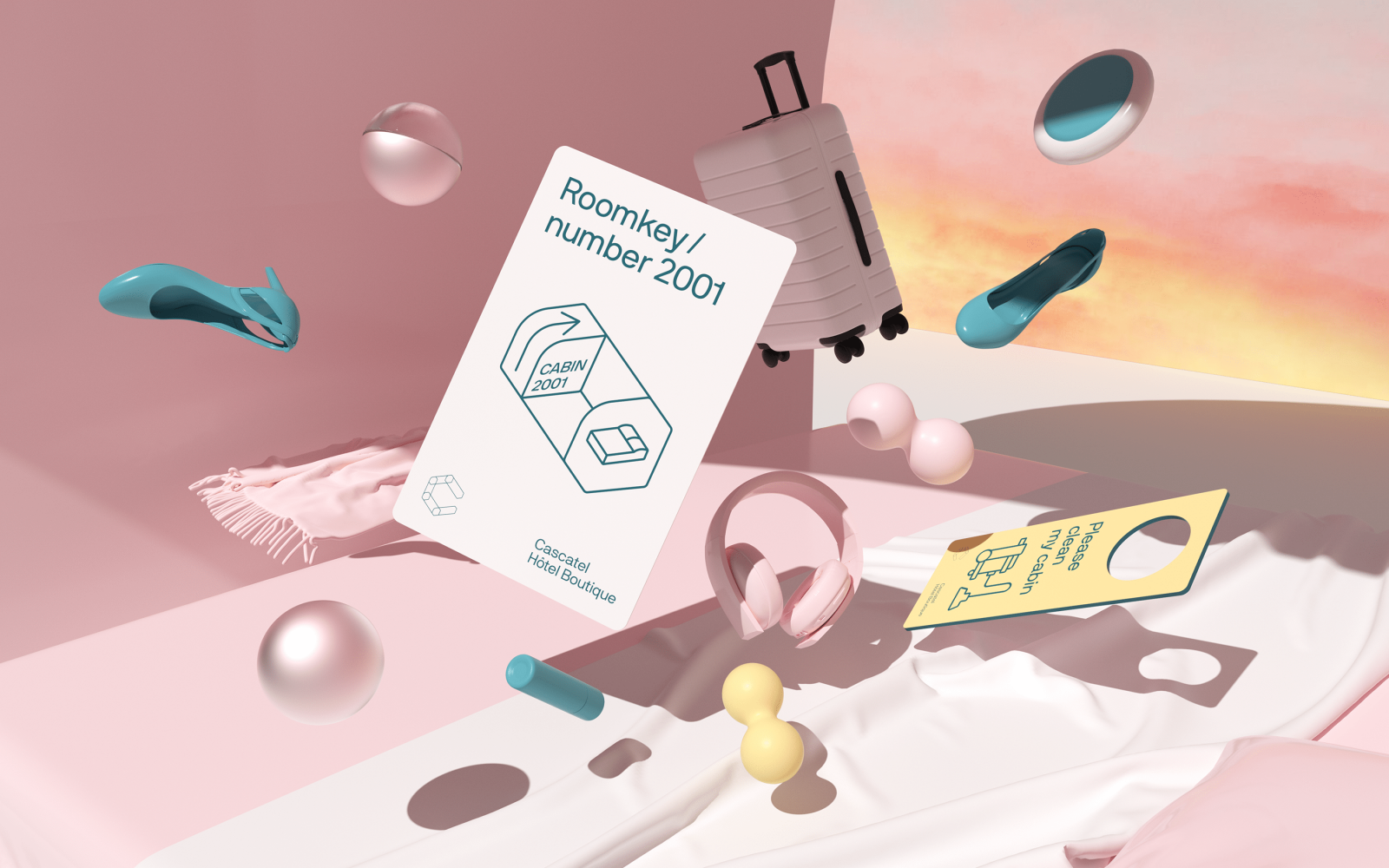
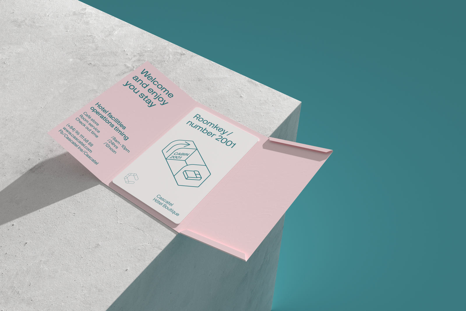
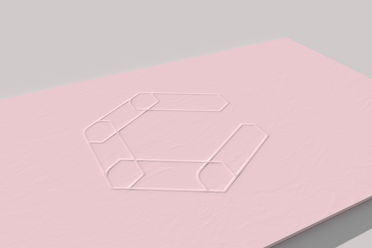
Cascatel Hotel Branding by Sharpen
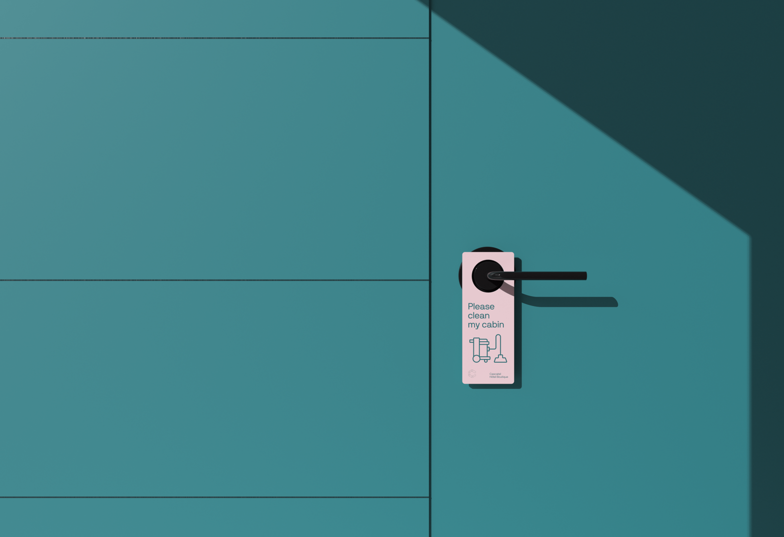
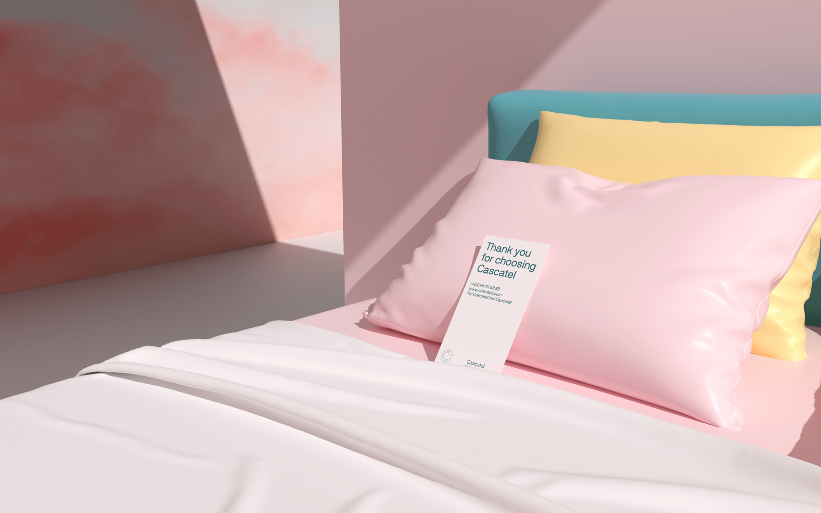
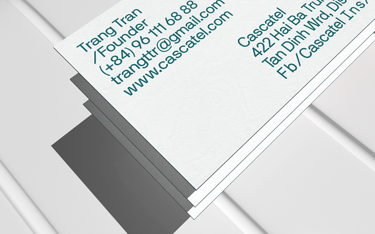
Cascatel locates in the central urban district 1, HCM city. The space furniture is inspired by model aircraft cabin – small but delicate. Cascatel not only provides convenience but also satisfies almost the requirement of “a modern customer”. The space room is designed in a “space-saving” style integrated with multi-functional advanced technology; The main deep tone alternated with bright elegant tone color evokes an airy, open and warm space, mixed with a familiar feeling. Cascatel’s furniture was completely invested in sophisticated and modern equipment which made customers have to say: “This place has all that I need”.
Sharpen Studio developed the visual identity system in the domed structure of Cascatel in order to flexible broaden space in a smart way and can be applied in every Cascatel’s illustration factor, such as Directional signage, stationery. Therefore, it always makes you feel an open, welcoming atmosphere and fully furnished – appropriate with trending of young modern people and active travelers.
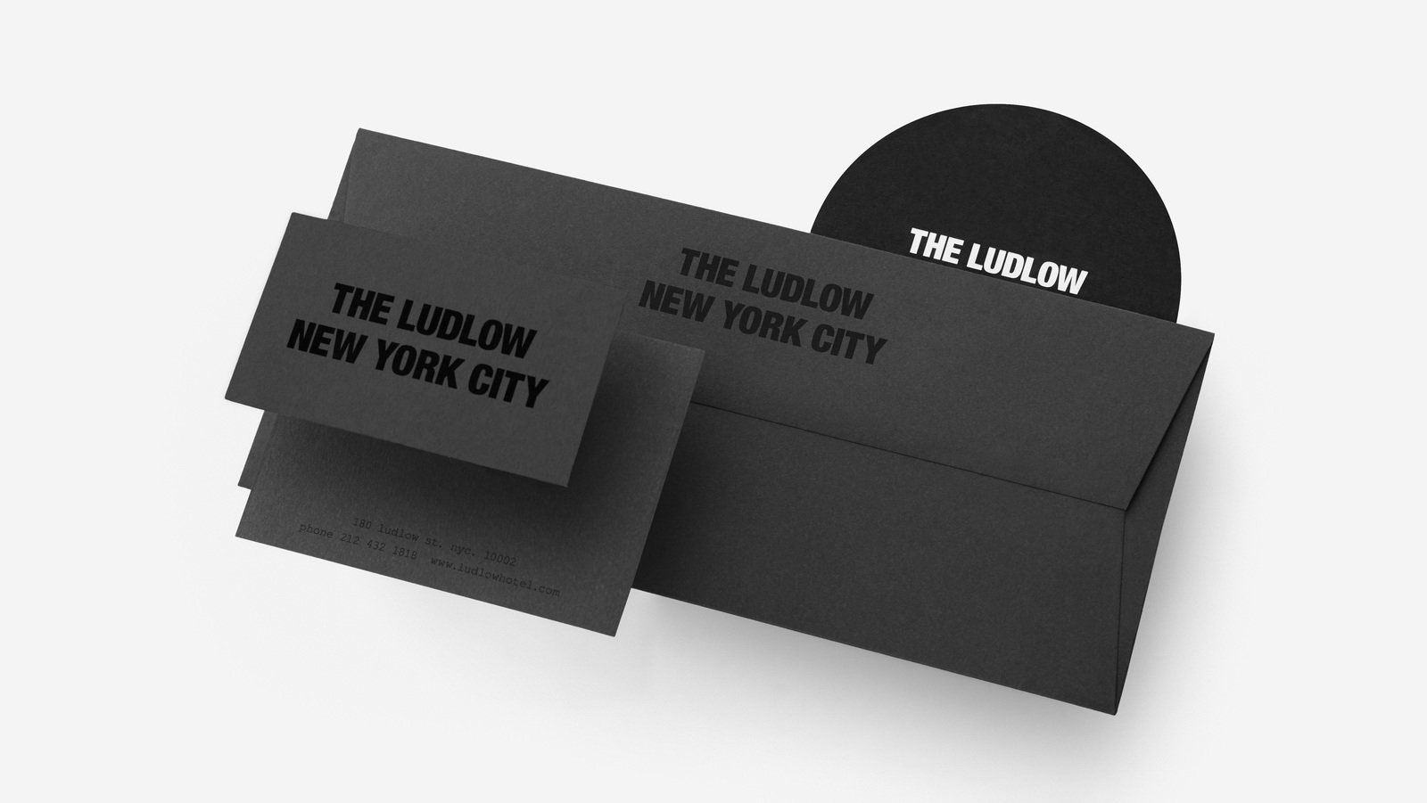
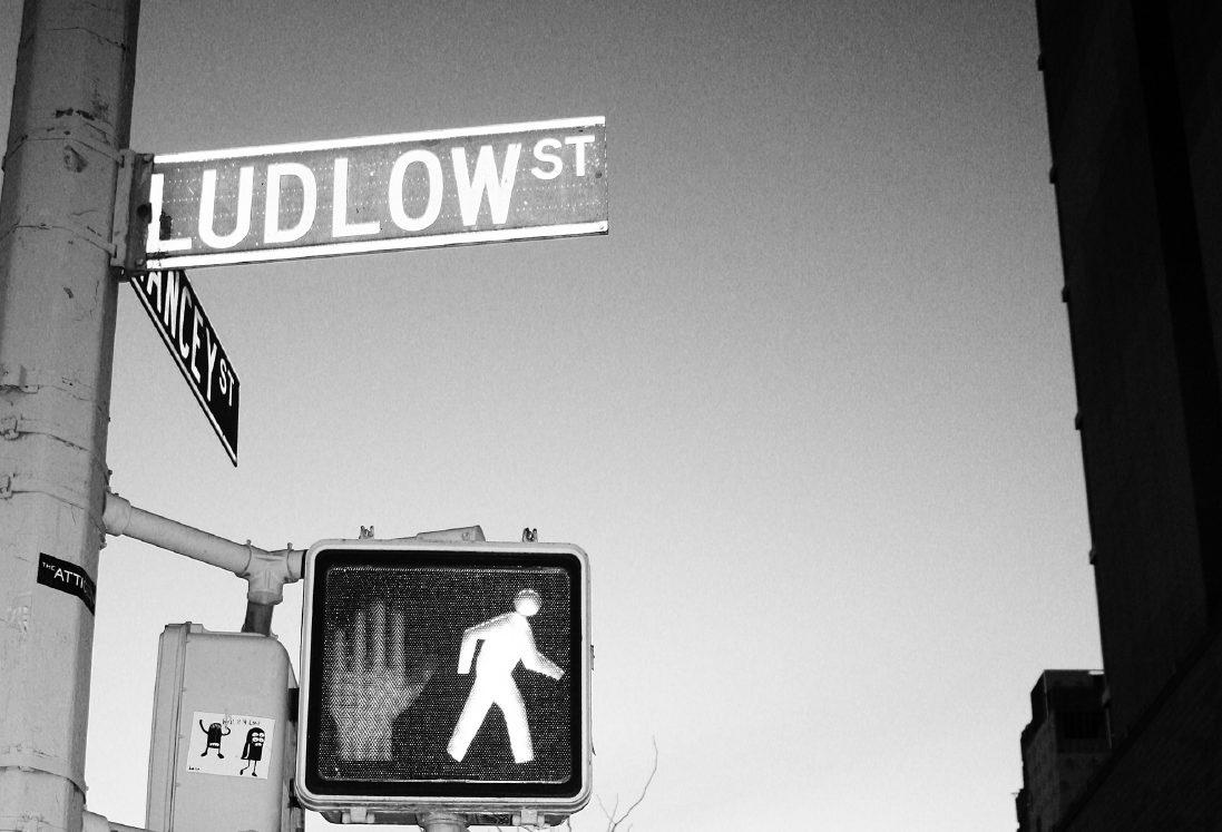
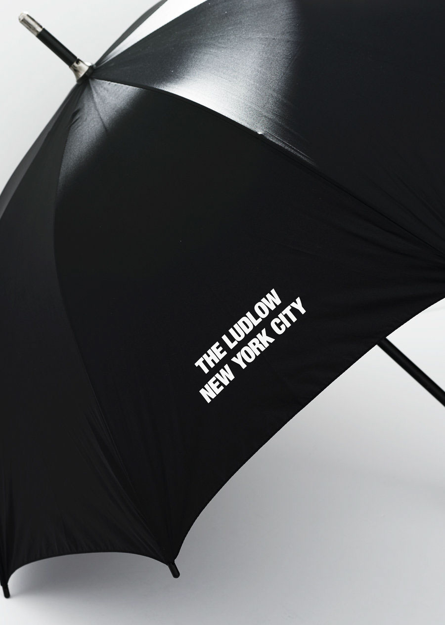
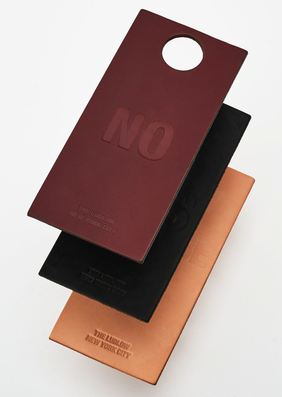
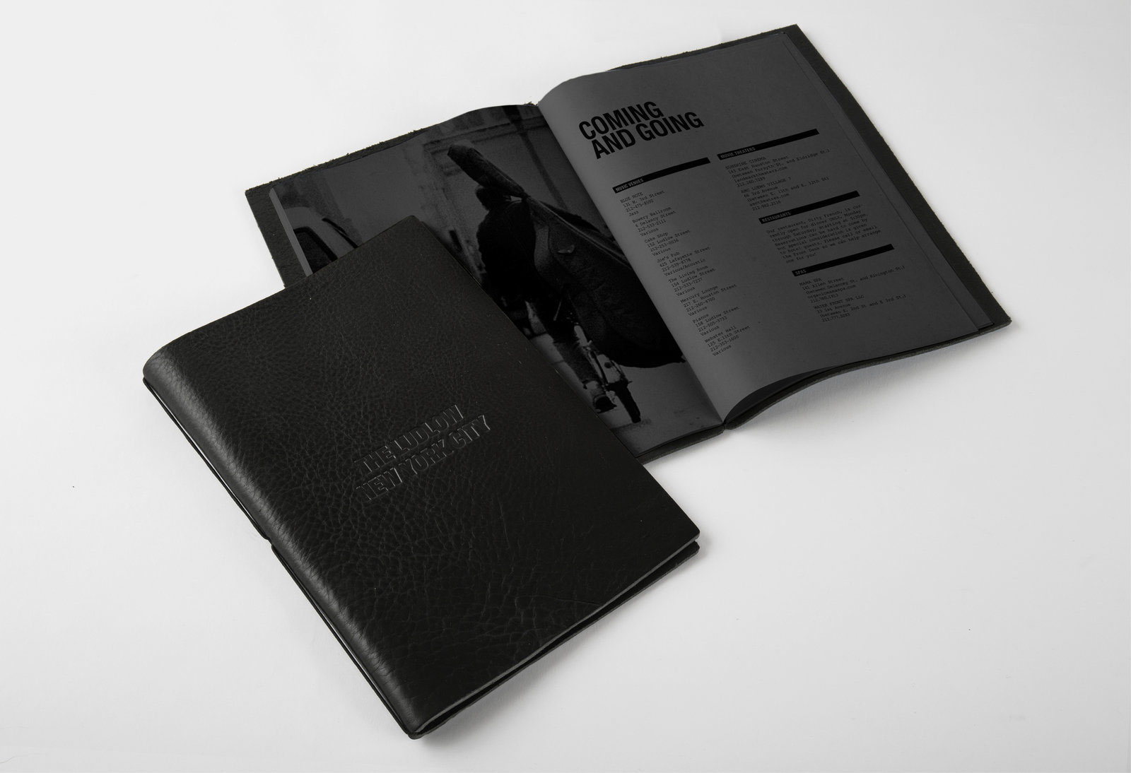
A Hotel Brand for Downtown The Ludlow by Watson & Company
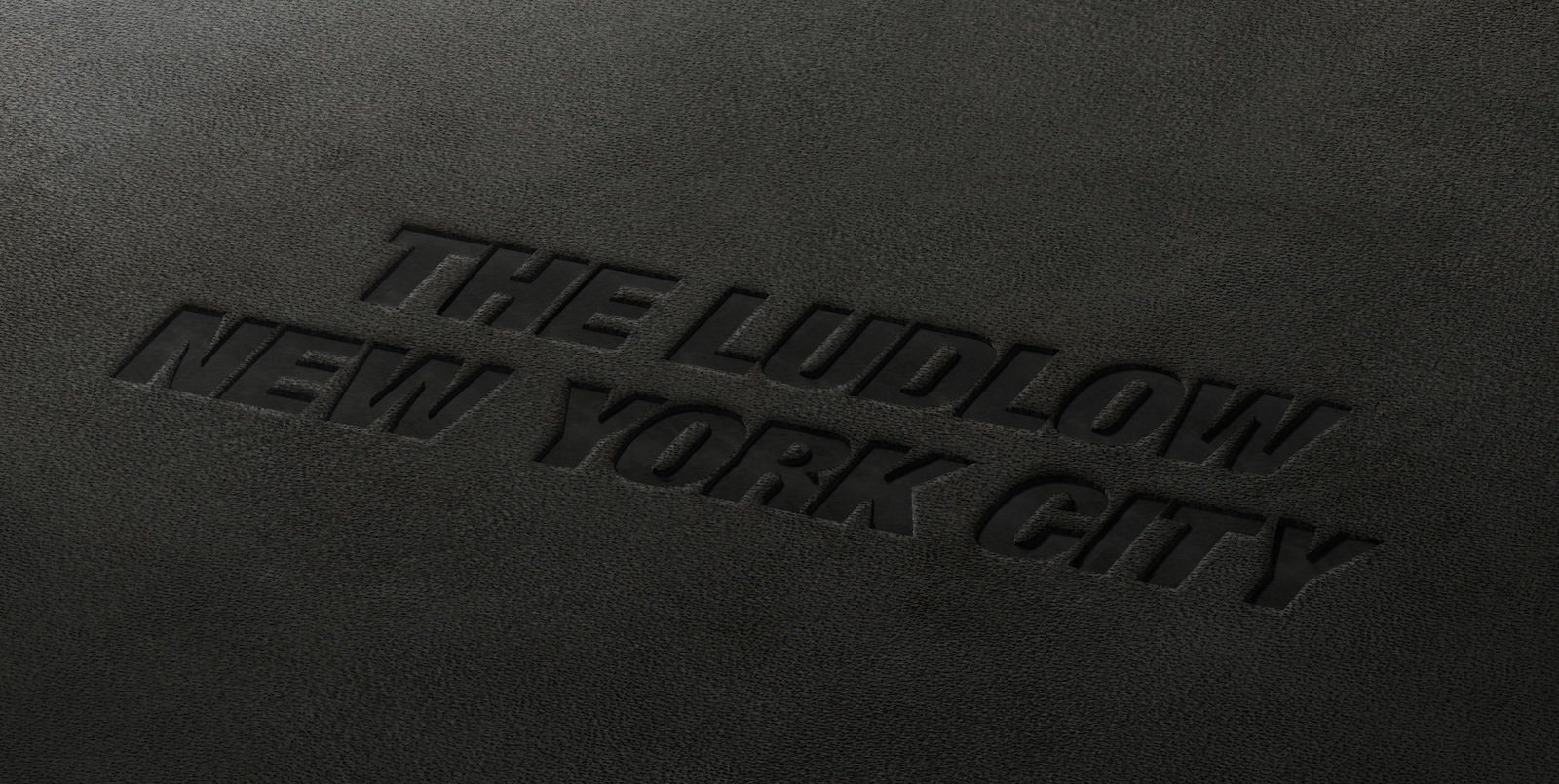
Manhattan’s latest living room is a study in rustic cool. Built for travelers who want to live like New Yorkers — even if just for a night — and for New Yorkers who want to live luxuriously, The Ludlow Hotel embeds the historic Lower East Side’s gritty past with a future that looks exceptionally chic. While hotelier, Sean MacPherson, renovated the space, Watson re-mastered the brand identity — website and signage included.
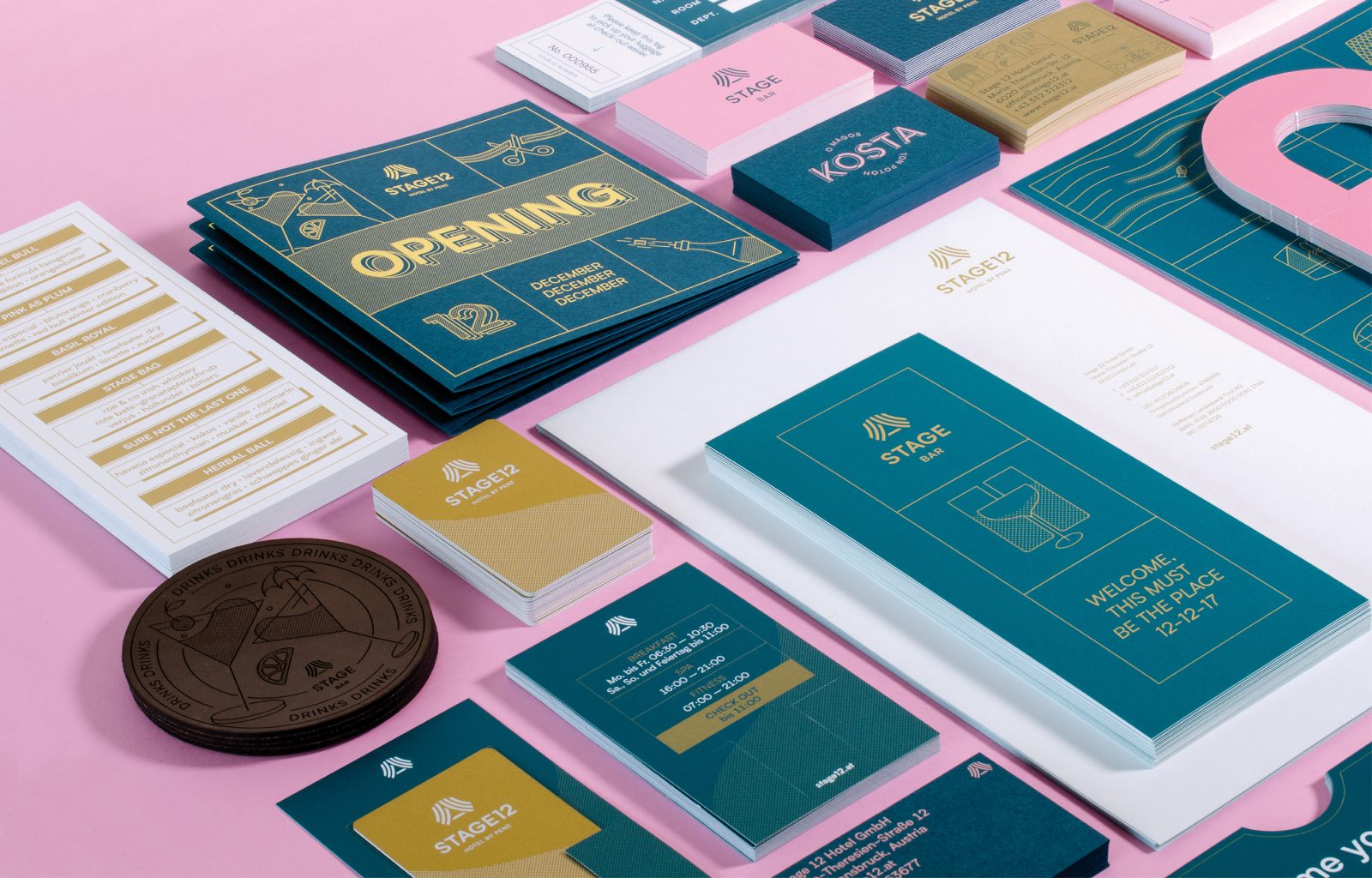
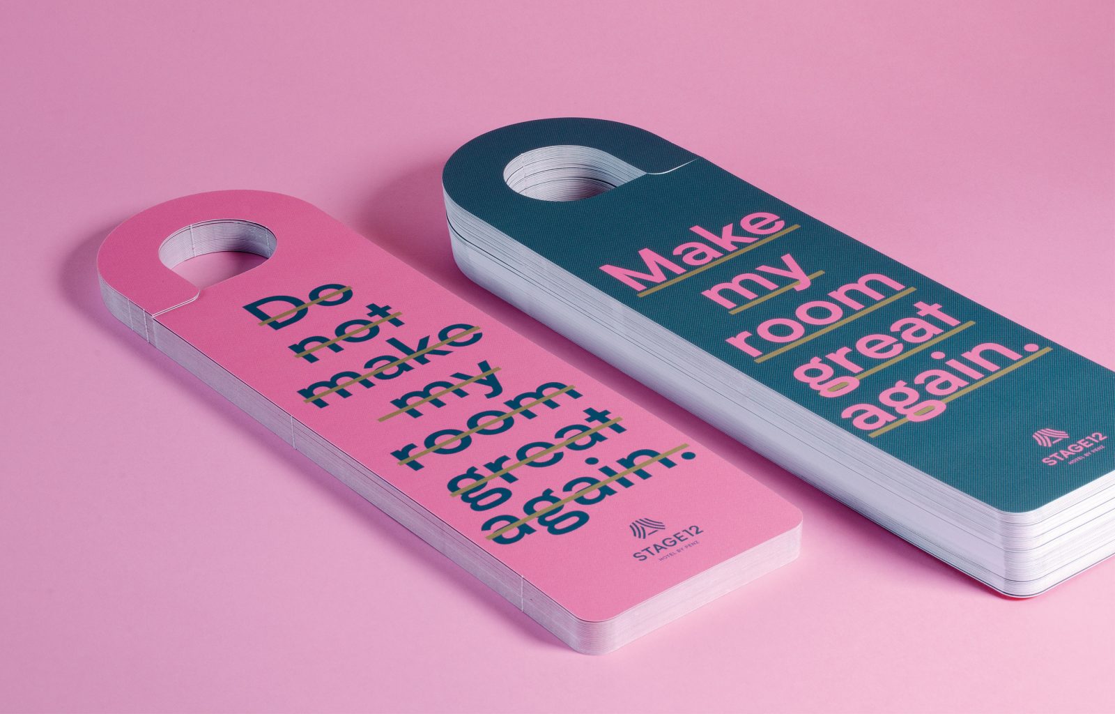
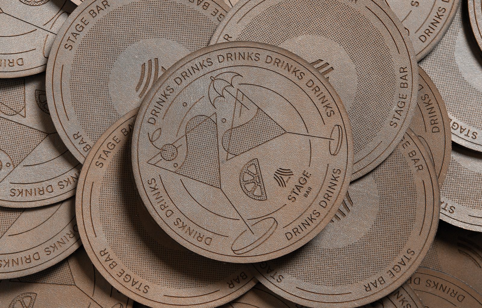
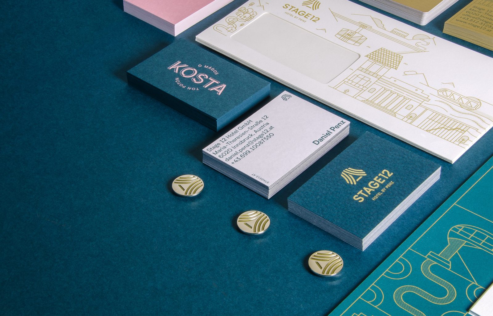
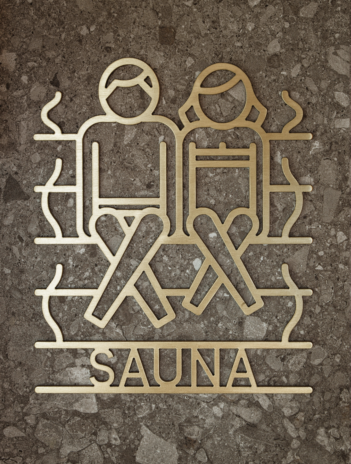
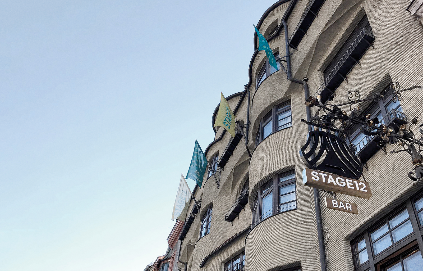
Stage 12 — Hotel by Penz new Corporate Identity by ICARUS Creative
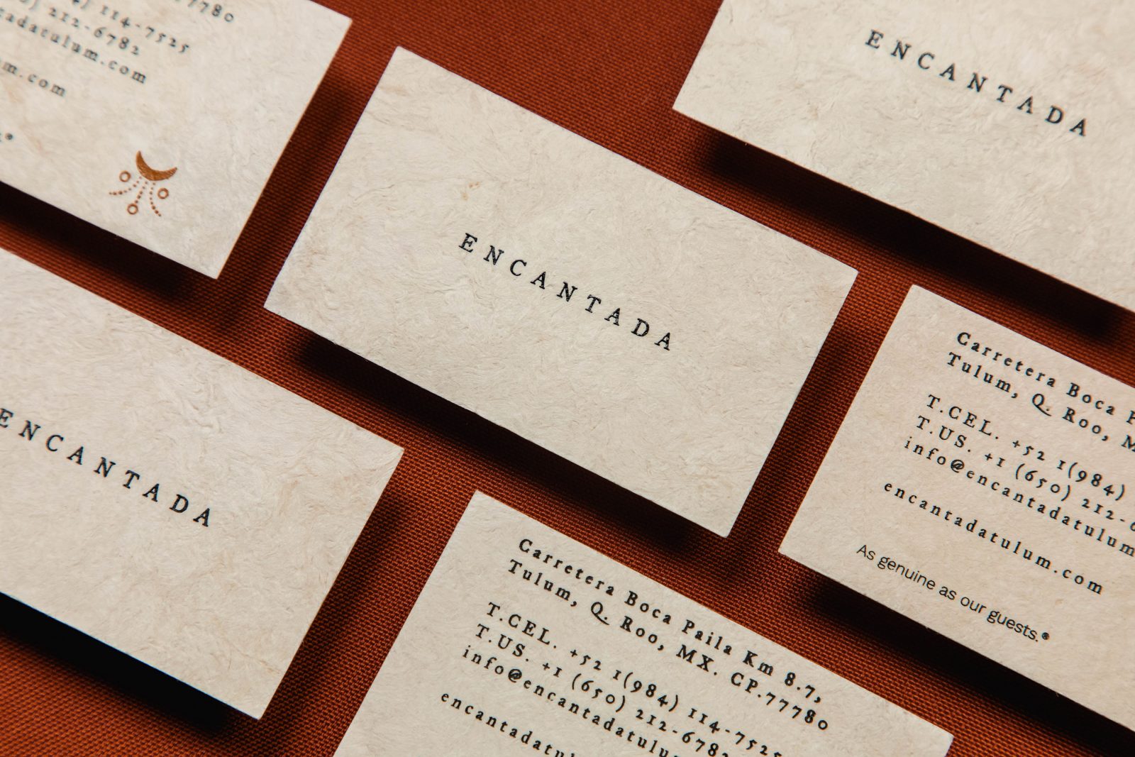
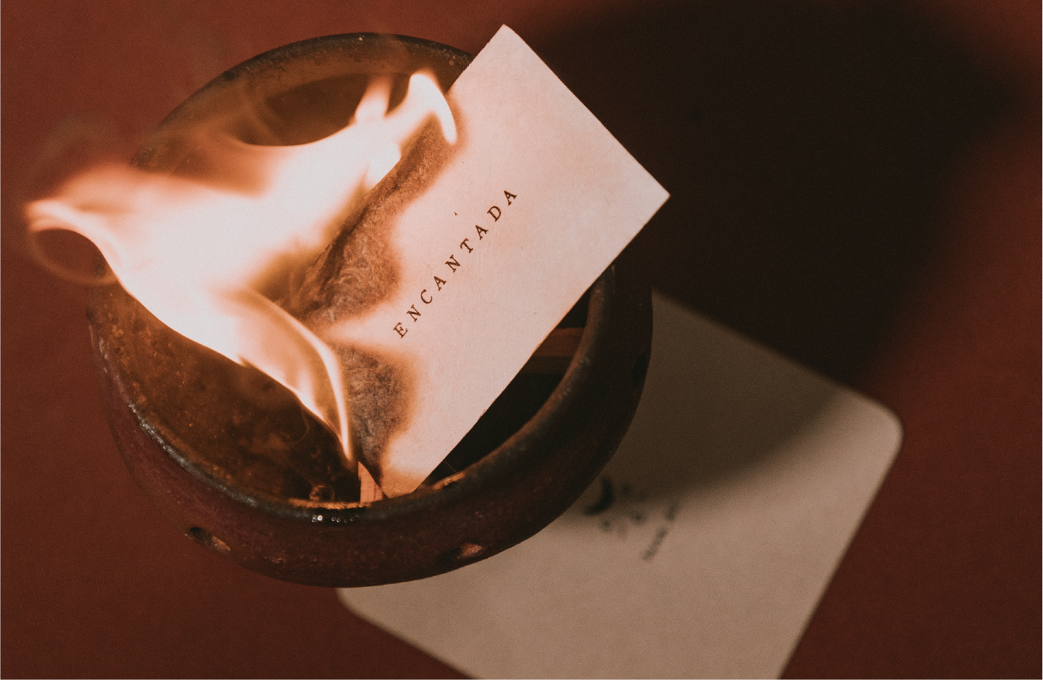
Encantada Holiday Resort Visual Identity by Bienal Comunicación
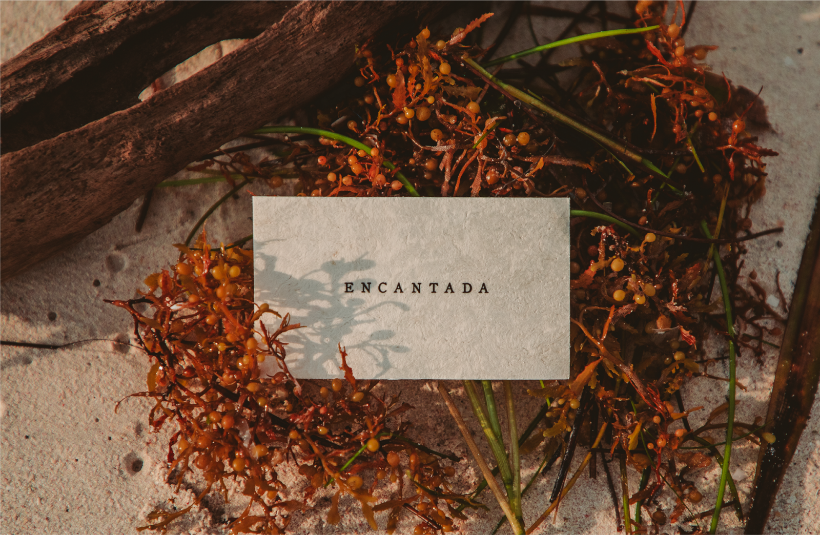
Encantada is a private paradise sprung from the millennial roots of Tulum, under the stars and moon that lightened the ancient nights; a place of magical hands of corn, wood, and sea. A Boutique Hotel with a soul, a dialogue with the nature and spirituality of the Mayan Riviera, Encantada is as genuine as its guests.
Encantada’s design is inspired by the pre-Columbian age and is the result of a dialogue between the mystical Mayan roots of the land, the natural splendor of Tulum, the divine movement of the sea and the sky that creates a powerful and flexible identity, based in fluid patterns that touch the soul like the sea draw lines on the sand.
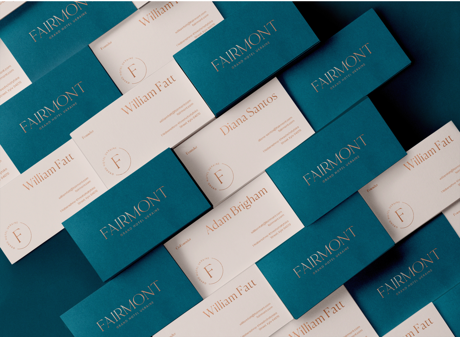
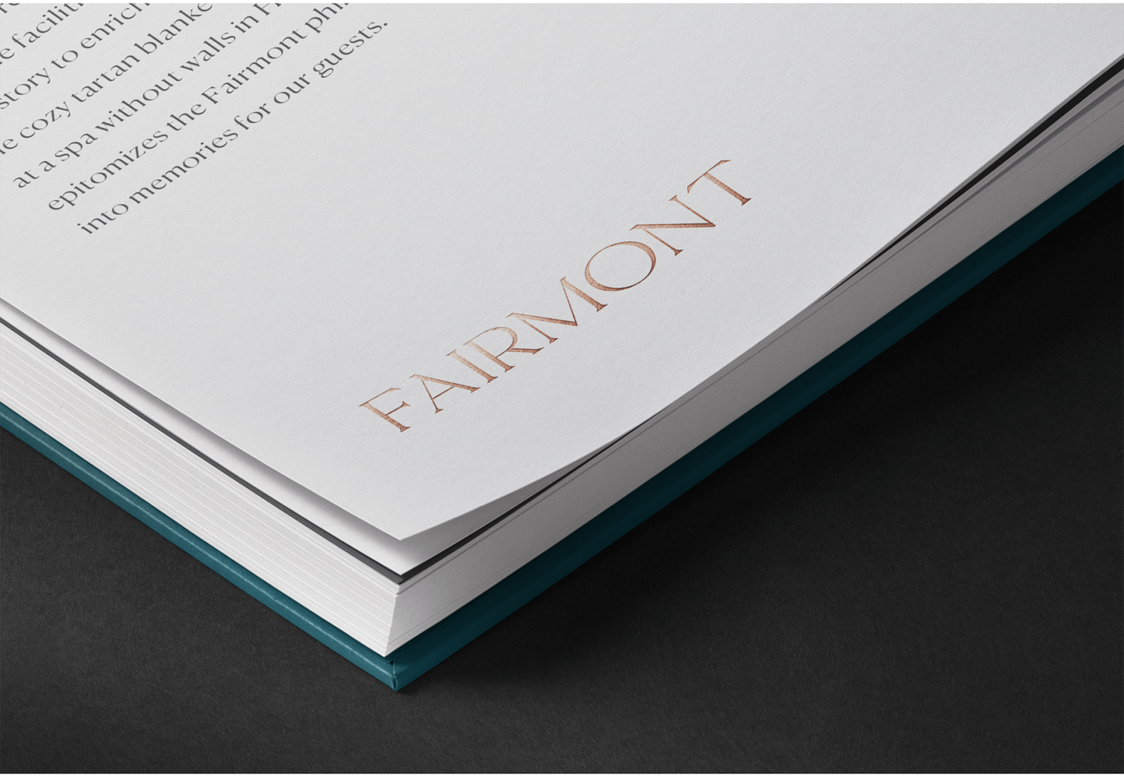
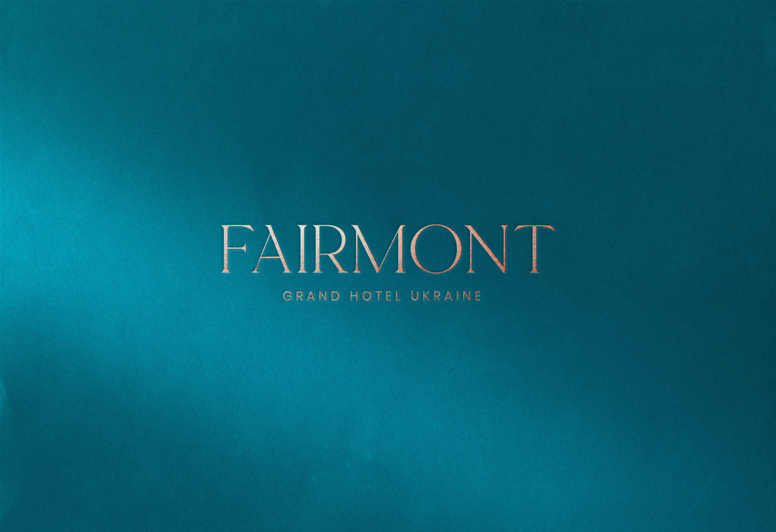
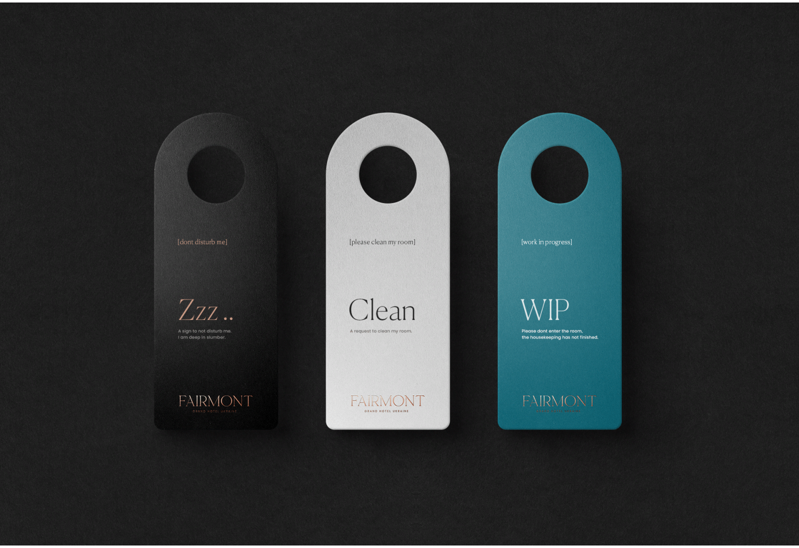
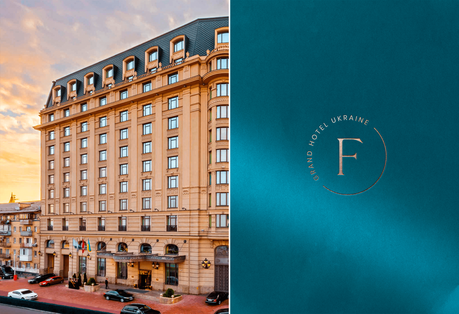
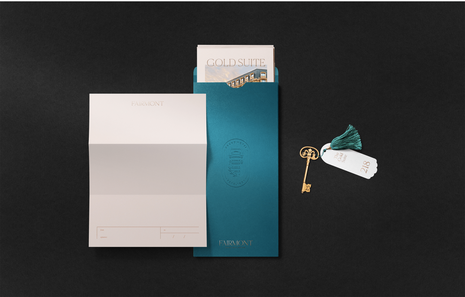
Fairmont Hotel Identity Rebranding by Denis Stekhin, Arthur Galustyan, Nataliia Degtiarova
Fairmont Hôtels & Resorts is a chain of luxury hotels headquartered in Toronto, Ontario. It was established in 2001 and operates 75 properties in 24 countries, with a strong presence in Canada and the United States. The main goal of the rebranding was to emphasize status and recognition around the world.
The main tool in this task was to change the perception of already familiar things in a new way. This will be a new experience both for frequent guests and for the people who have it for the first time. The materials that were used are a turquoise and copper shade of metal, to emphasize the uniqueness, features, and proximity to nature.
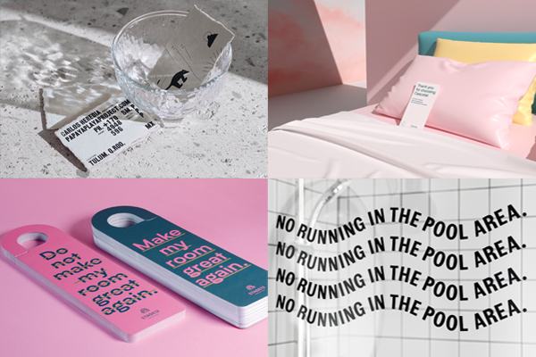
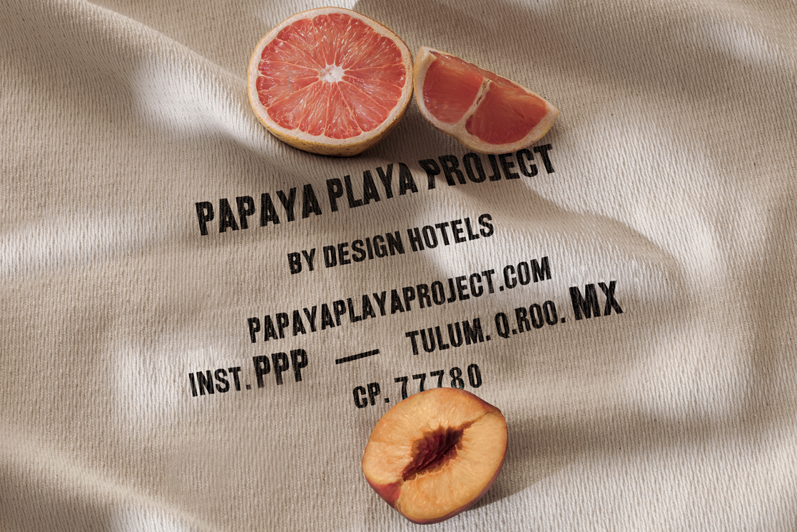
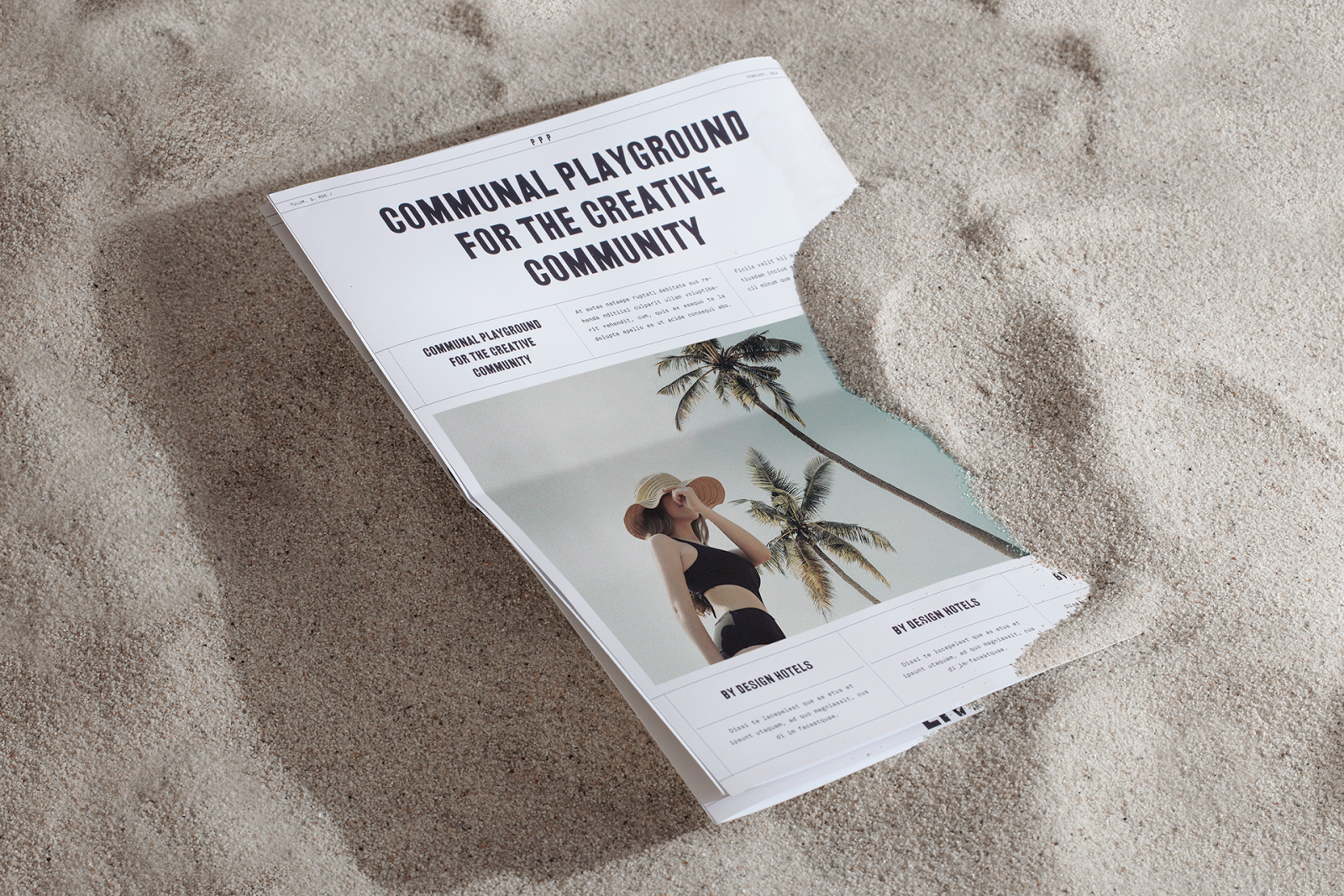
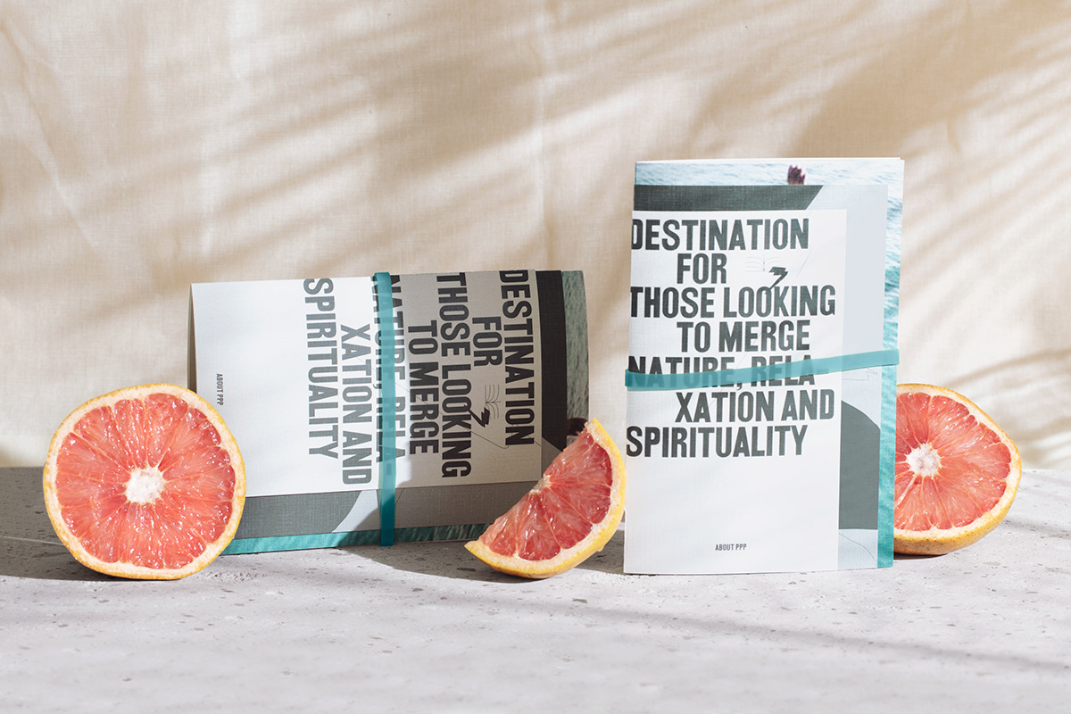
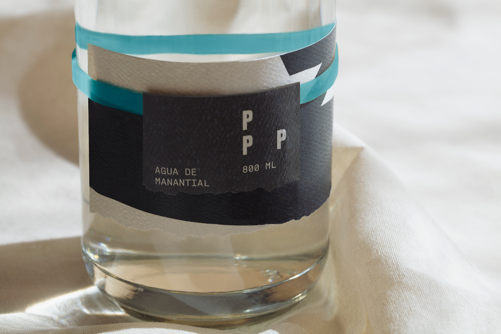
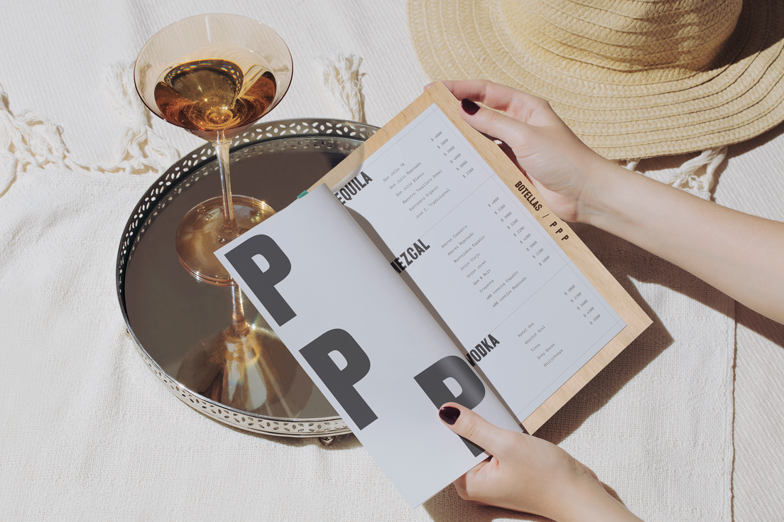
Papaya Playa Project Design Hotel Identity Rebranding by Futura
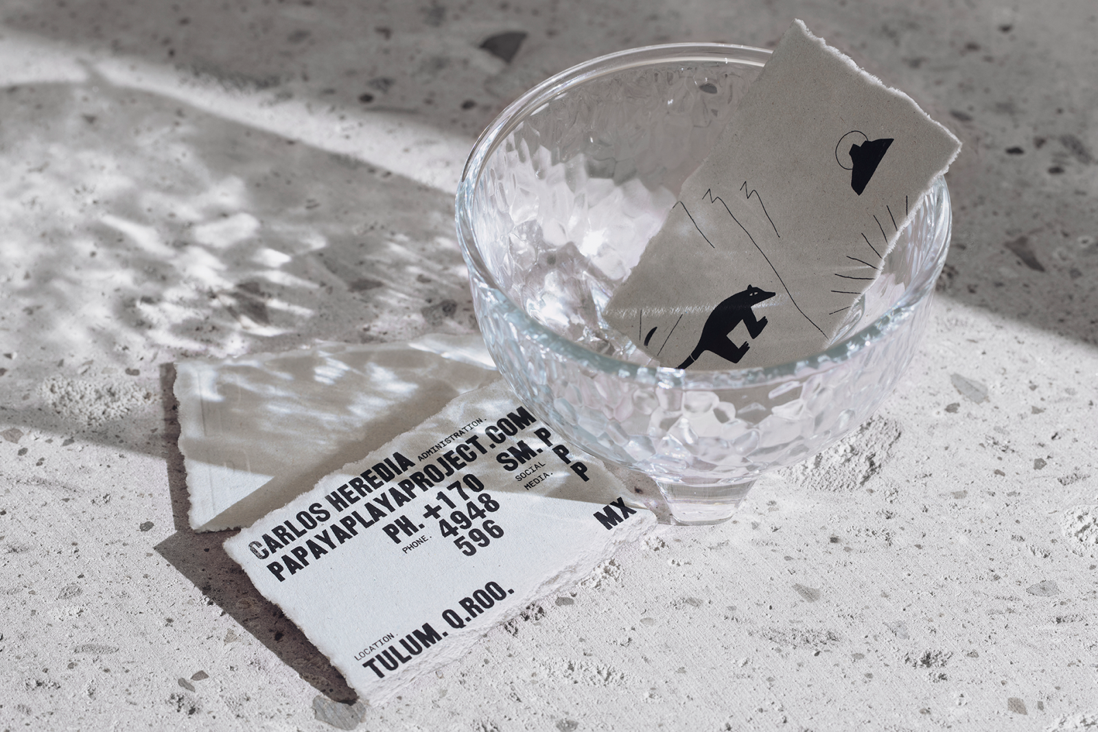
Papaya Playa Project, located in Tulum, Quintana Roo, is a hotel that set out to discover a new form of hospitality. Merging local culture and sustainability to set the stage for a unique hospitality experience; Papaya Beach Project is involved in different projects focused on spirituality, arts, and community. For the rebranding, Futura decided to respect the original graphic values of the brand but upgrading them in a fresh way. Likewise, the studio developed a graphic system taking into account typographies, photos, and textures; maintaining the same visual language as before, but with different hierarchy and composition ways that aim to maximize the visual scope of the brand.
To consolidate the system Future developed a family of abstract and figurative icons that represent the key characteristics of the graniceros shamans, people with a supernatural power to communicate and intertwine with the weather and thus take care of nature.
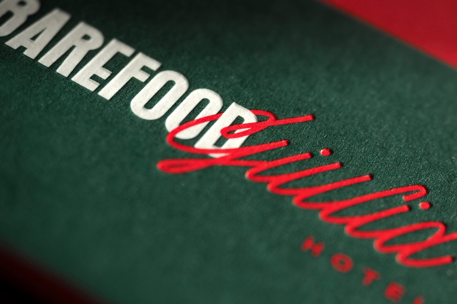
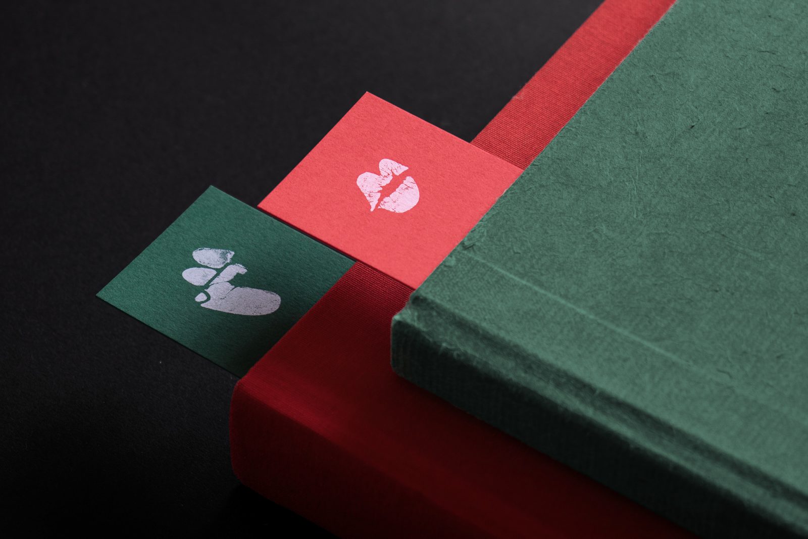
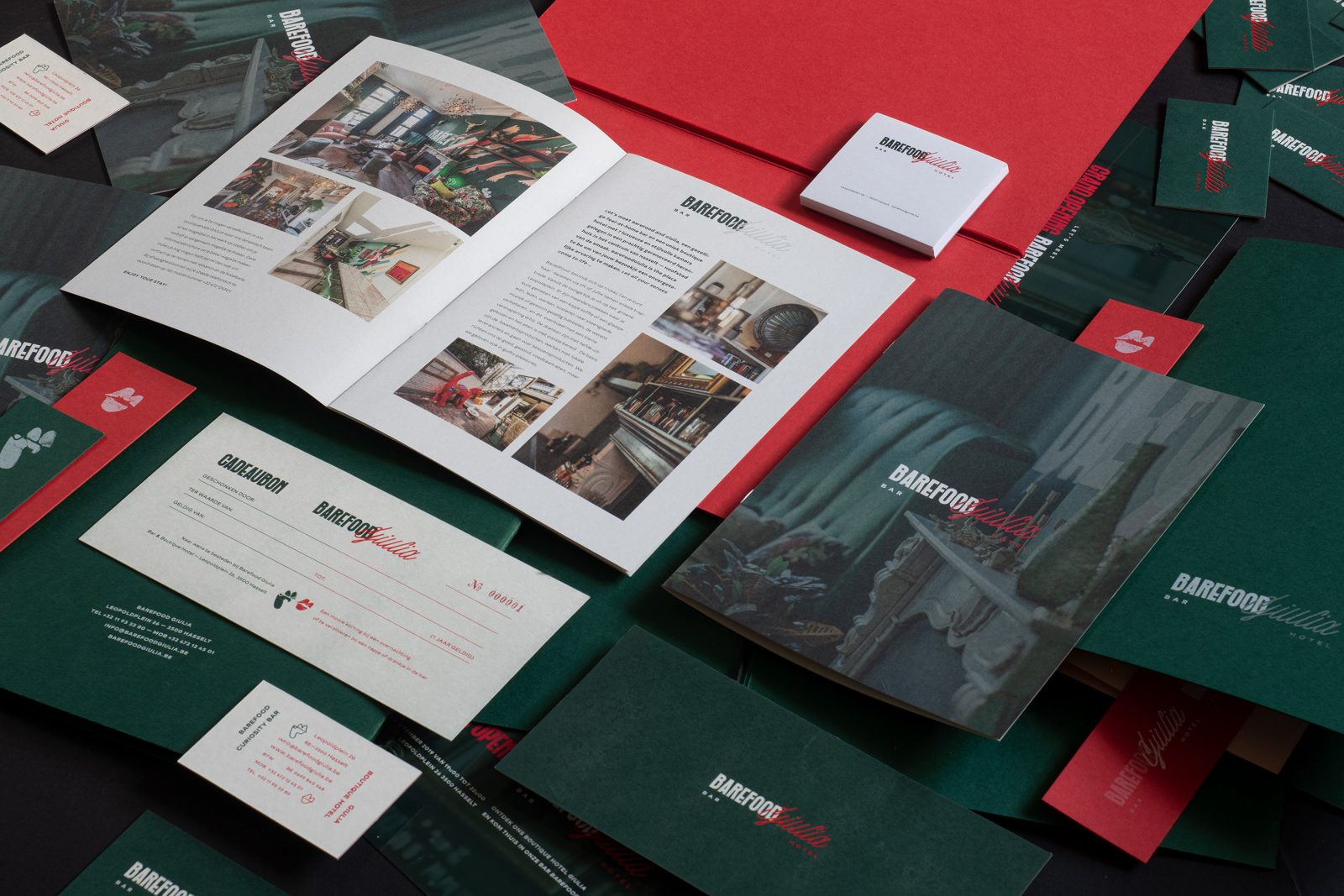
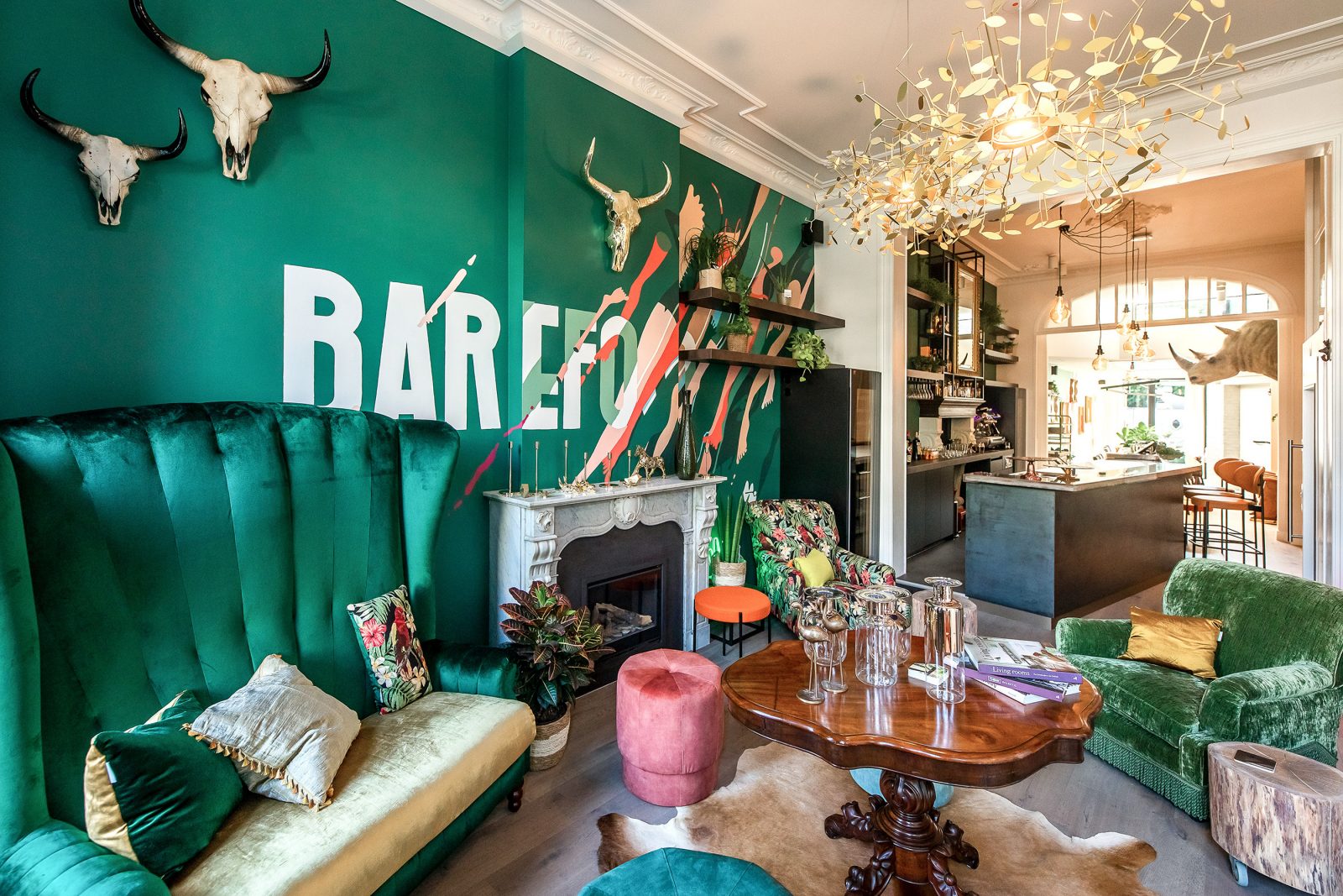
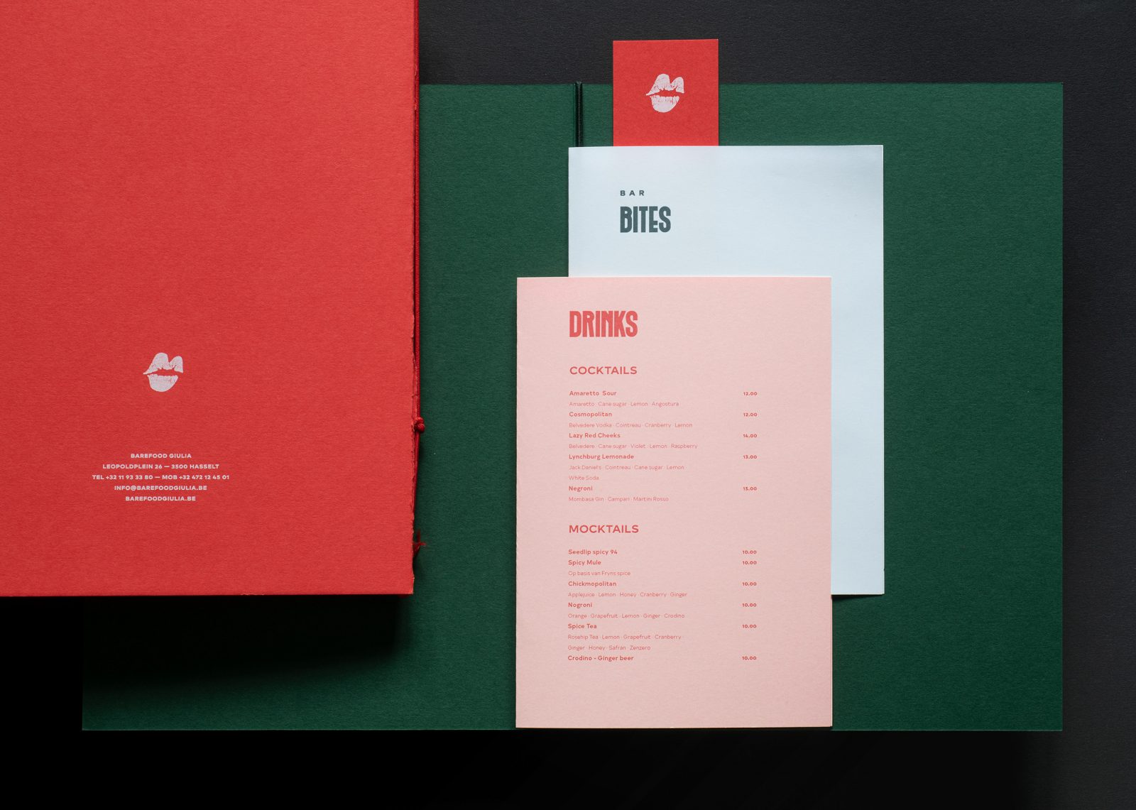
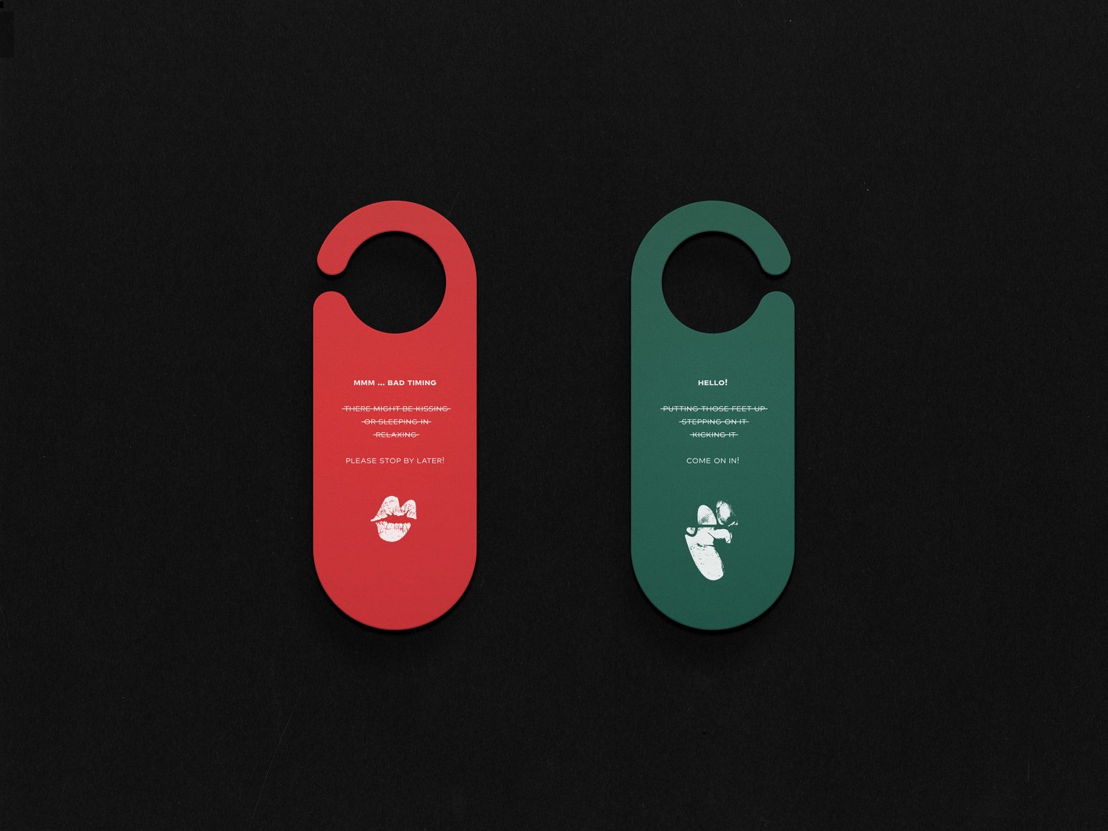
Barefood Giulia Boutique Hotel Visual Identity by Eskader Studio
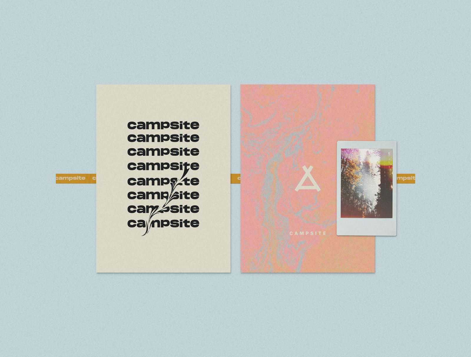
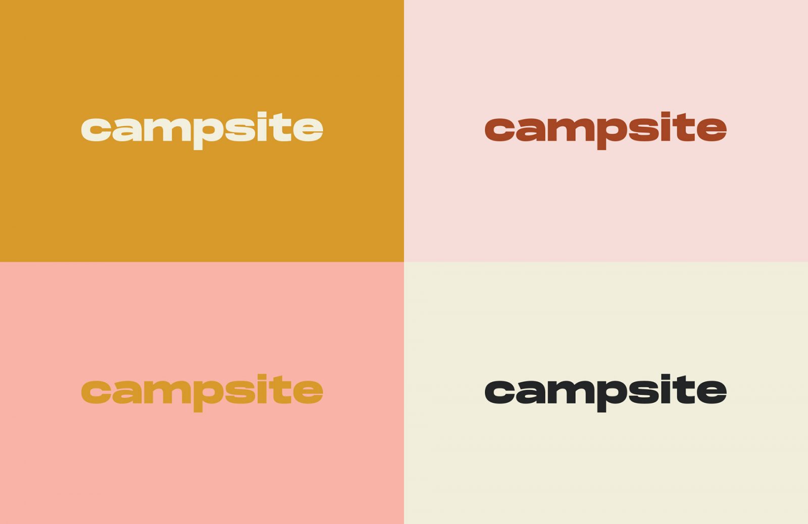
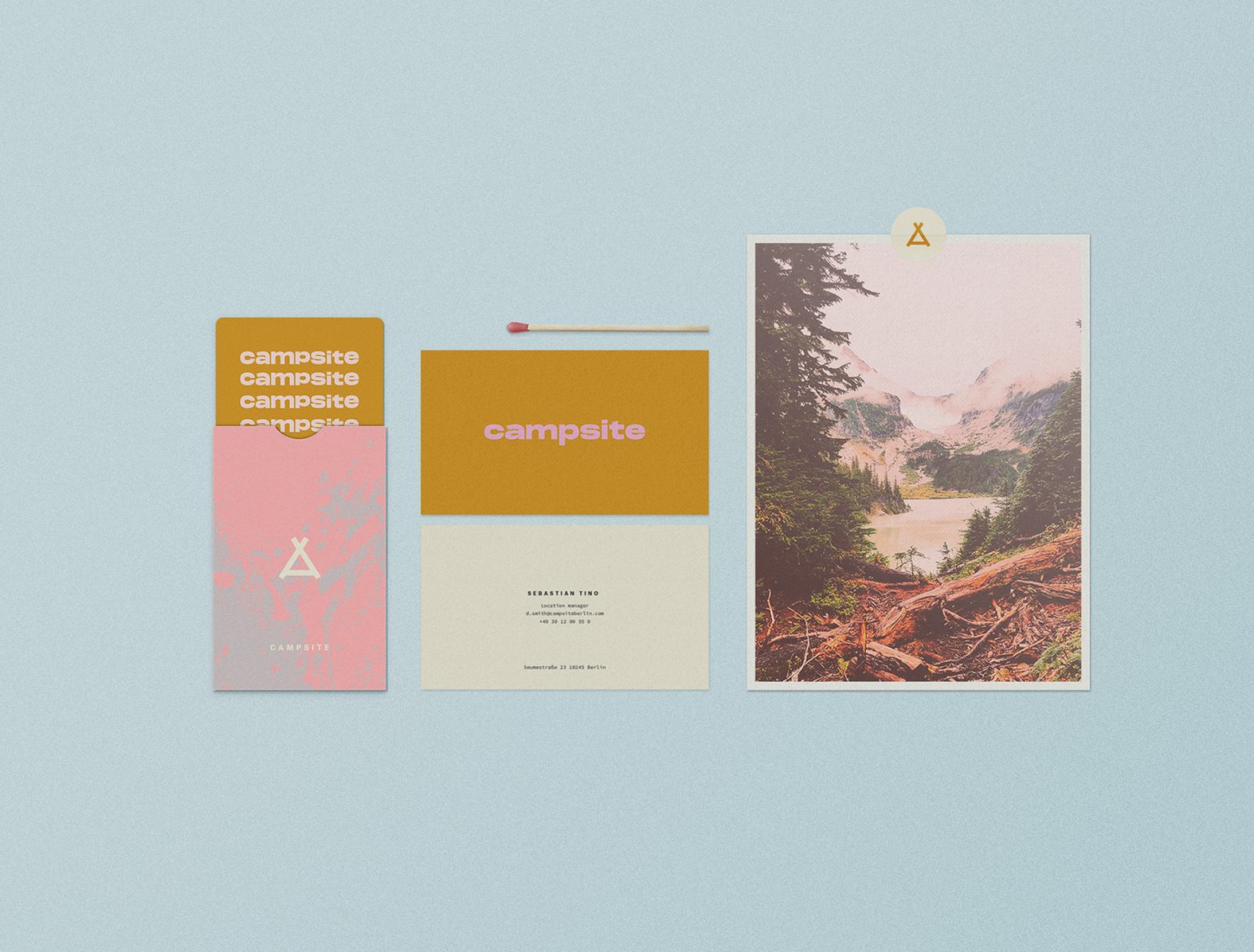
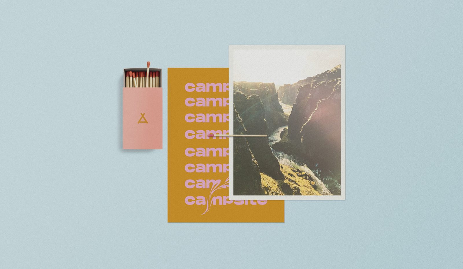
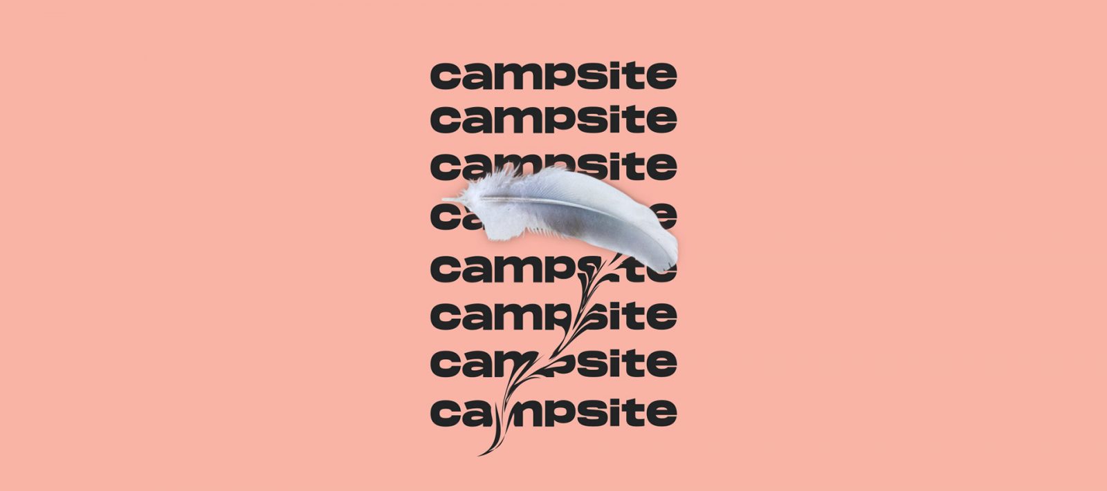
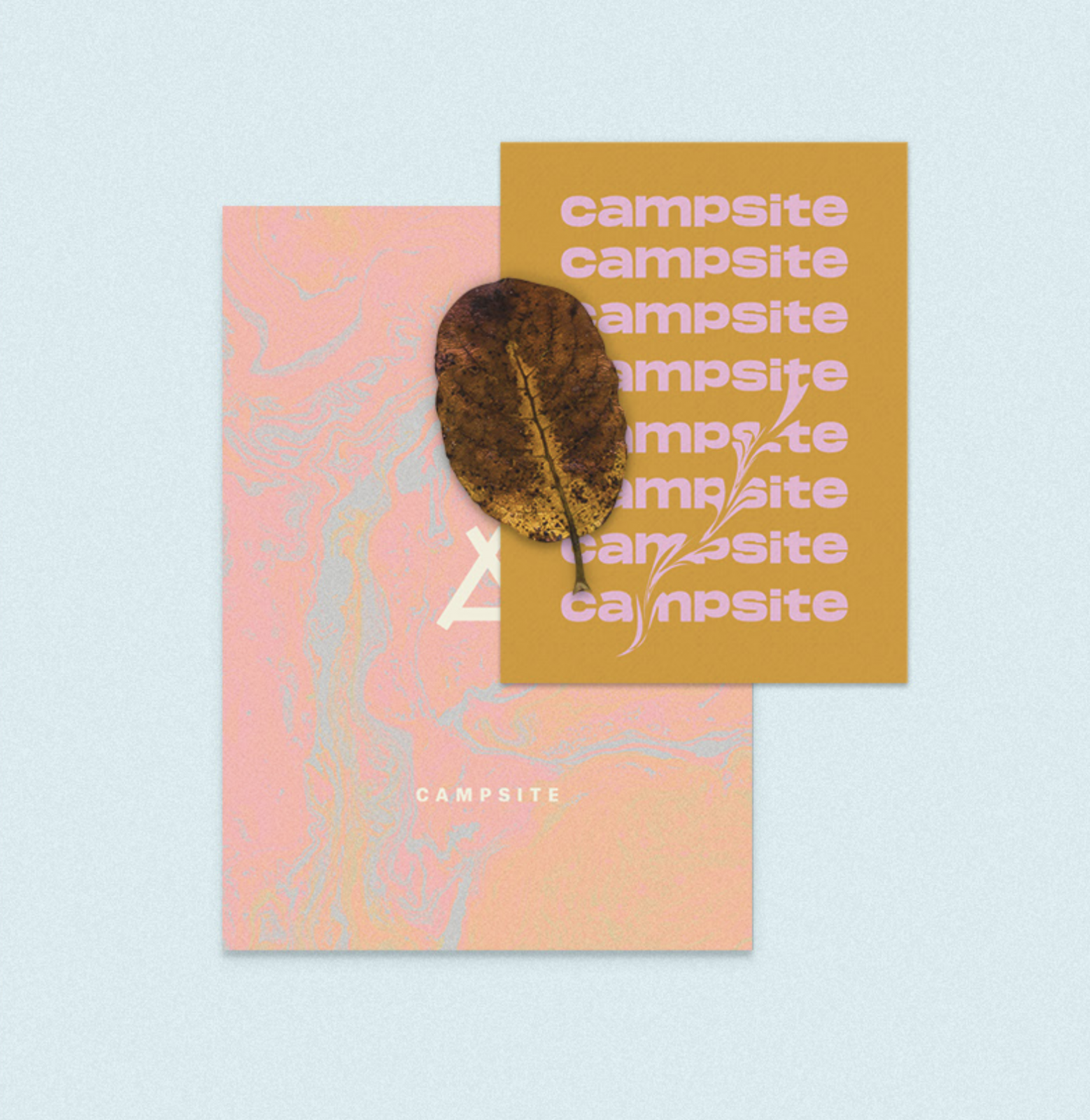
Campsite Hostel Visual Identity by Hello Comrade
Campsite is a Berlin-based hostel concept with a shared co-working space. The brand and respective art direction draw upon the site’s ambition to draw together people with distinctly different backgrounds and origins to build a common community. Like a remote campground in nature, Campsite generously offers its land for unforgettable experiences and life-long connections.
