I’m first to admit I’ve grabbed a bottle of wine off the grocery store shelf just because of what’s on the label. Especially for someone who definitely is not an expert on wines, how could I resist getting to know one of the 9 personalities of Gut Oggau wines or the cool ampers and illustrated Hither & Yon? I collected 15 amazing wines, just because of how great the packaging and label design is!
When we see a bottle of wine for the first time almost all the information we have on it is on its packaging. This is when good design comes into play. Besides the specific information of the name, brand, variety, and percentage, it needs to show the mood, the feel and the personality of the wine. For a light summer picnic you’ll choose one that seems bubbly and fun, for an intimate dinner a darker, elegant design is a natural choice. I personally love wine labels and how they are designed. For a wine novice, it’s no joke that the label is most often the deciding factor when it comes to choosing a bottle and great design helps with this decision. Here are 15 different wines from all across the world, who’s design caught my eye!
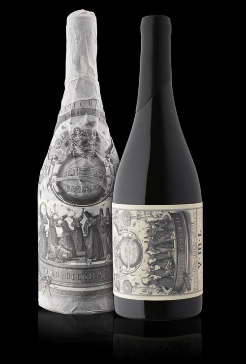
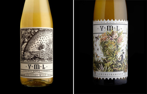 Branding and Packaging for VML Winery by Stranger&Stranger
Ginny Lambrix, a winemaker from VML Winery in California is said to be a witch. Ok, she’s not a pointy-hat-broomstick kind of witch but she is a biodynamic winemaker and she does things with potions and skulls that just sound a bit too witchy. NY-based design agency Stranger&Stranger (very fitting!) designed her wine labels which are suitably worshipful.
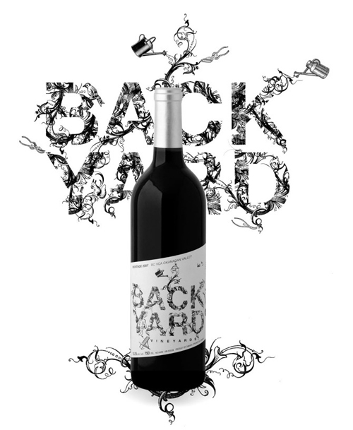
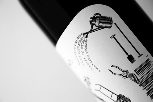
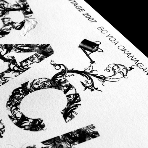 Label illustration for Backyard wine by Fabien Barral
Canadian illustrator Fabien Barral is behind the black&white wine label designs of the BC Backyard Vineyards wine. All the details and delicate touch tell of a sophisticated and mature wine. I love how it is the illustration that forms the typography of the name. Excellent!
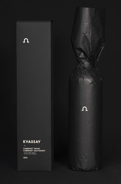
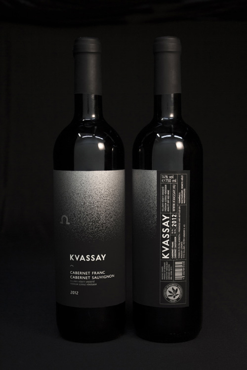 Packaging for the red wine of Kvassay winery by Eszter Misztarka.
The two kinds of grapes, Cabernet Franc and Cabernet Sauvignon, that constitute this wine are grown in Villány, Remete-dűlő. When choosing the cave-motif as the central icon of the design, Eszter Misztarka was trying to unfold the implication of this telling place-name, namely: the solace of a hermit. Then, this motif has been mixed with the Omega-sign, commonly known as the symbol of the beginning and end of all things. Another central motif of the label derives from a good observation of the wine itself: when serving genuine red wine, a so called glicerine-ring appears on the rim of the glass, creating a crown on the wine. Thus, her plan was based on this silver transition, referring to the high qualities of this wine.
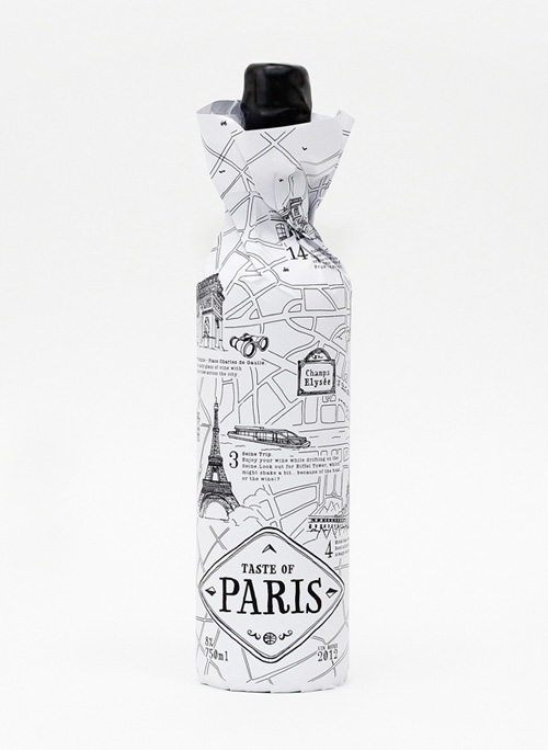
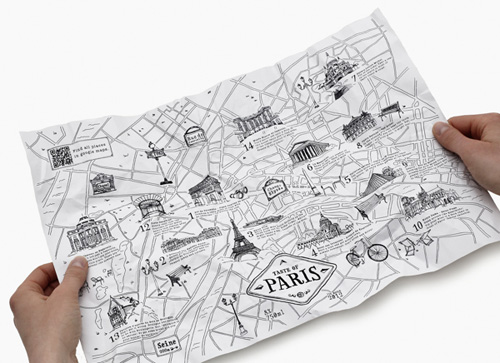 Taste of… wine packaging design by Nina Brandt
German designer Nina Brand designed a new multi-functional imaginary wine packaging. The wine label is more than an illustrated package design. It is a city map, showing the most beautiful places to enjoy the taste of the wine… and the taste of the city. I love this idea, a perfect gift for someone who just moved into a new city or people visiting a new place. Wonder what a map of our city of Vienna would have on it?
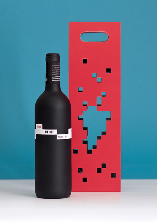
 Error Wine label and packaging design by wel .
A cheeky identity and packaging design by Polish design agency wel for the red wine Error. Inspired by the state of erased memory which often appears after drinking alcohol (reminder to drink responsibly!). Cut-outs remind of missing pixels and are cut into shape of grape bunch as well as the continent of South America, origin of the wine. Surprising element is the word “error” printed inside the packaging with the letter “e” hidden on the inner side of the label.
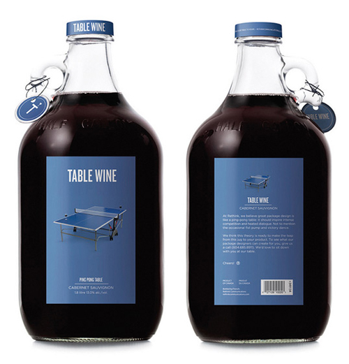
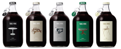
Not an actual wine, but the idea and design is so good and hilarious I had to include it in the list. Originally created by the Canadian Rethink design agency solely to showcase their potential as packaging designers. It’s a shame, because if this bottle was on sale I’d most probably grab it off the shelf.
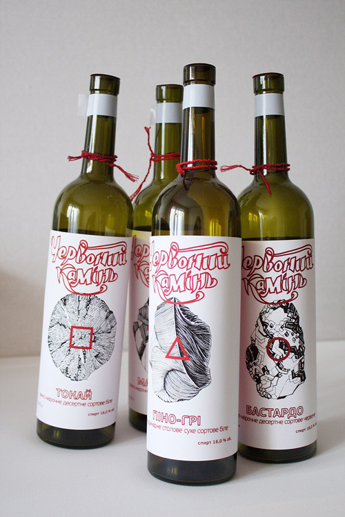
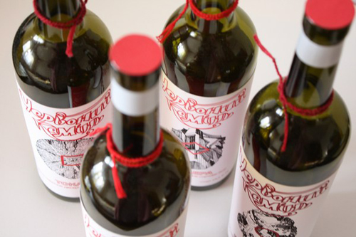 Wine package and label design by Nina Boiko for Yepbohuu Kamihl
Ukrainian designer Nina Boiko from Kiev designed these three-colored wine labels. The inspiration behind the illustrations were minerals and substances found in nature, and they go nicely with the black&white with red accents. The red string around the neck of the bottle is a simple and elegant detail.
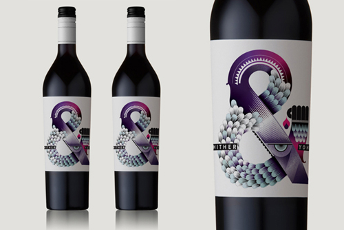
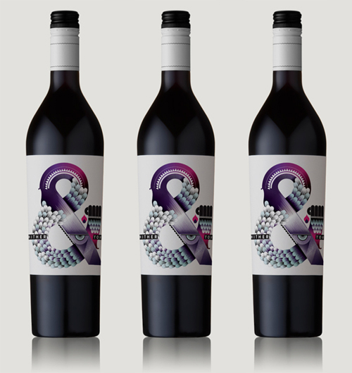
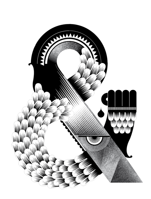 Hither & Yon wine label illustration by Studio My Name is Wend
Parisian design Studio My Name is Wendy is known for their graphic and geometric illustrations, and the Esperluette Freaks wineries label designs are no different. The Hither & Yon label got it’s inspiration from shapes and colors that are known to spark the appetite. This is one of my favorite designs of the list and I’d definitely pick it off the shelf at the store!
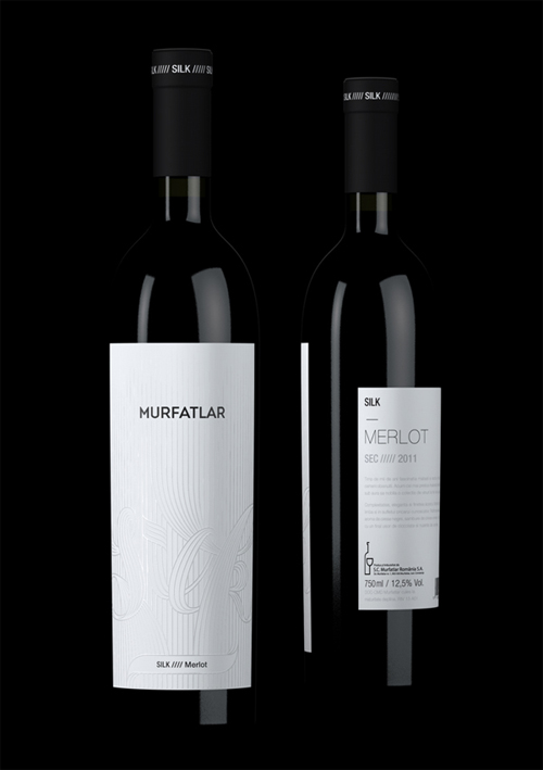
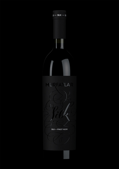 Murfatlat Silk wine label by Alex Beltechi
Silk is a new Romanian line of high-end wines merlot and pinot noir produced by the Murfatlar winery. The Bucharest-based designer Alex Beltechi designed the packaging while at Agency Three, under the creative direction of Andrei Tripsa. The simplicity and elegance make the designs beautiful and the all-white versus all-black pair looks stunning together.
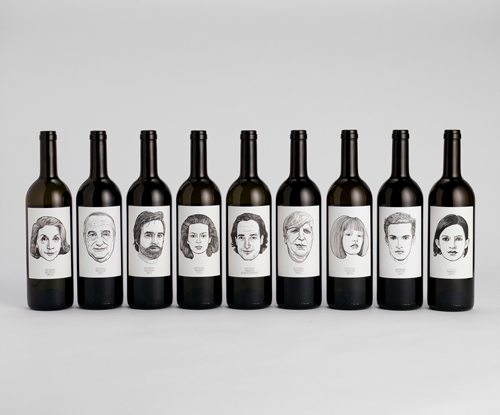
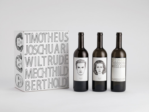 Gut Oggau Wine label and packaging design by Jung v.Matt an der Donau
Gut Oggau is an Austrian winery with nine wines, which all differ in age and character. The task of Jung v. Matt was to design the labels and packaging for these wines. And because each wine, much like a human, has its own personality, they gave them faces, stories and names. I love this idea! I’d love to taste them all to find out who or which, is my favorite personality. Wildrude sounds like a nice new friend?
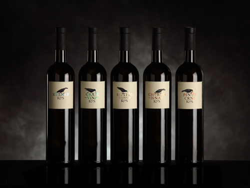
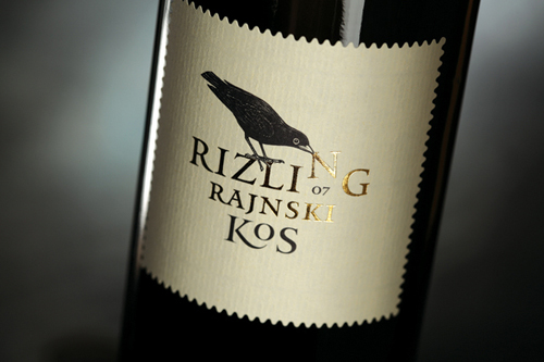 Blackbird wine branding design by Studio Cuculić
The collection of 5 different labels for Blackbird Winery – Rizling Rajnski, Pinot Crni, Kerner Kos, Grase Vina and Chardonnay Kos – was designed by Studio Cuculić from Zagreb, Croatia. The main character in the design is a blackbird, stealing the letters from the wine names. The same idea is carried through each label with small alterations. A classic that works!
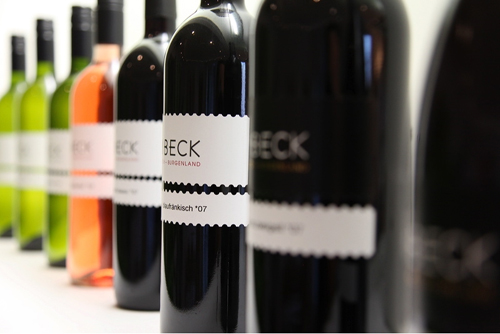
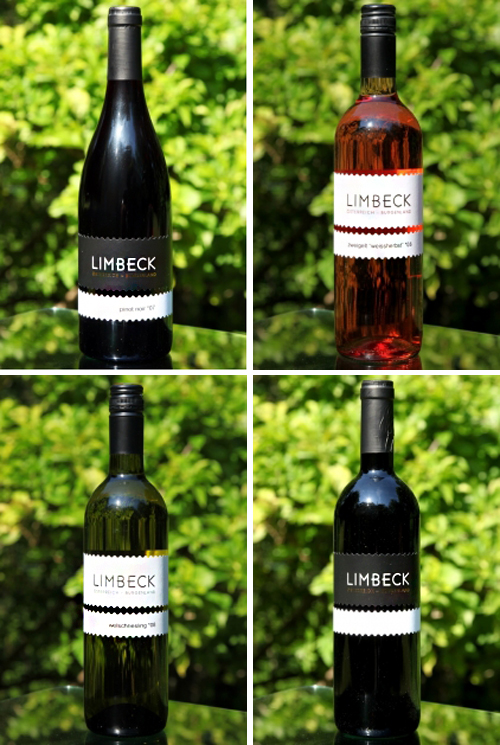 Limbeck wine from beautiful Burgenland
These traditional Austrian Limbeck wines have simple elegant labels, with geometrically cut out edges. Even though the packaging tells of a classic, elegant and somewhat traditional Austrian wine, the small details of serrated label edging caught my attention. Also, sleek typography never harms anybody!
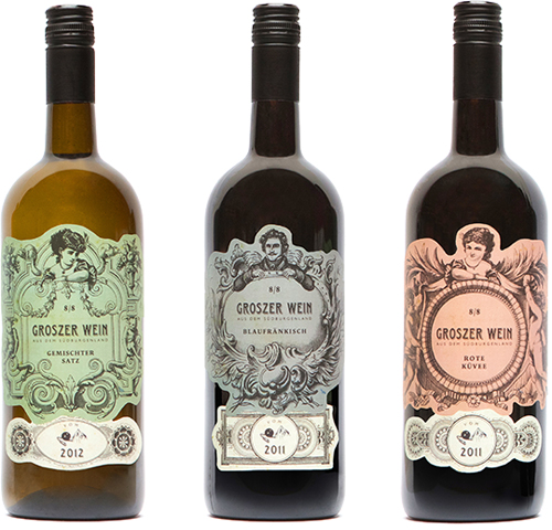
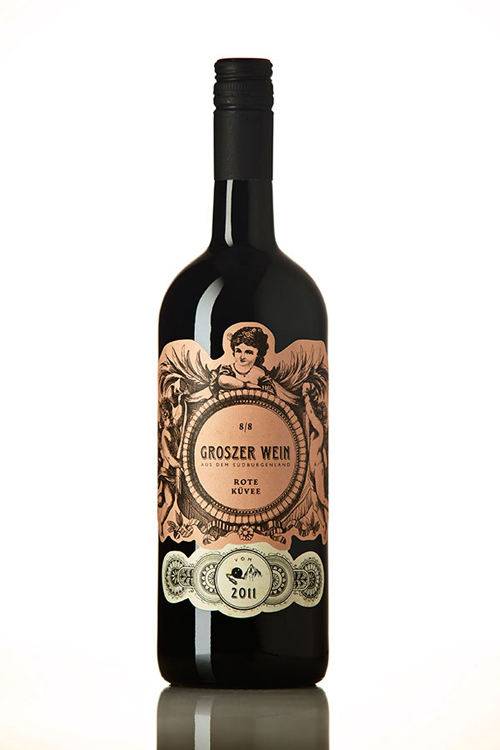 Groszer Wein from Südburgenland
The intentional spelling mistake in the labels of these Austrian Eisenberg wines (grosz, rather than groß or gross) draws a bullseye on the traditional character of the wines, as do the playfully decorative graphics on them, which directly evoke the formerly Hungarian Südburgenland of the 19th century. Too Grosz? Totally Crazy? With labels like this, no way would I dare to throw the bottle away.
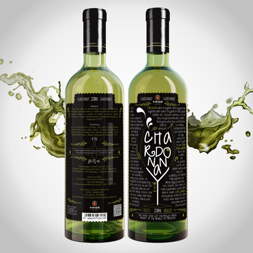
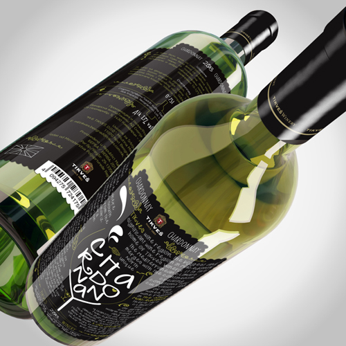 Wine label design suggestion for Tikves by Igor Adamovic
Igor Adamovic, a Serbian designer working for Control Creative design agency, took part in the Skopje Design Week & Tikves winery Tikves competition to design new wine labels for the Tikves wines. The modern take in the design is fun and definitely would appeal to the younger generation.
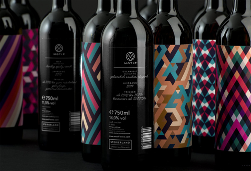
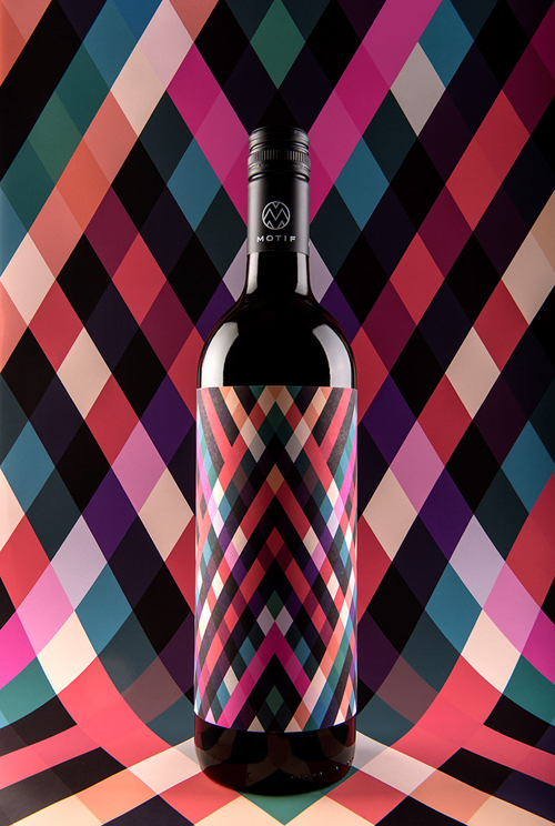 Motiv Wine packaging by En Garde
The sharp, geometric patterns and trendy color scheme of Motiv wines which demand attention are the handy work of the Austrian design agency En Garde. I love this design so much I’ve already written a whole feature on it before, here, where I got the inspiration to write this whole list.
Hope you have enjoyed the list and if you know of any amazing new wine packaging and label design, you are almost more than welcome to send in your ideas and submissions!
Photos © (click on photos)

