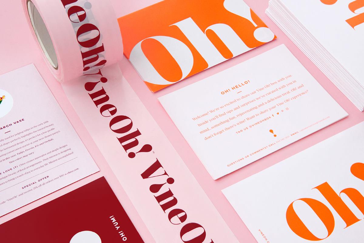
For as long as I can remember, the year 2020 has been seen as something magical and mythical, yet to everyone’s disappointment, flying cars, personal helicopters, and robot servers are yet to become the norm, among us normal folk at least. But as we get used to calling this decade the New ’20s, we seem to be taking refuge in the familiar. 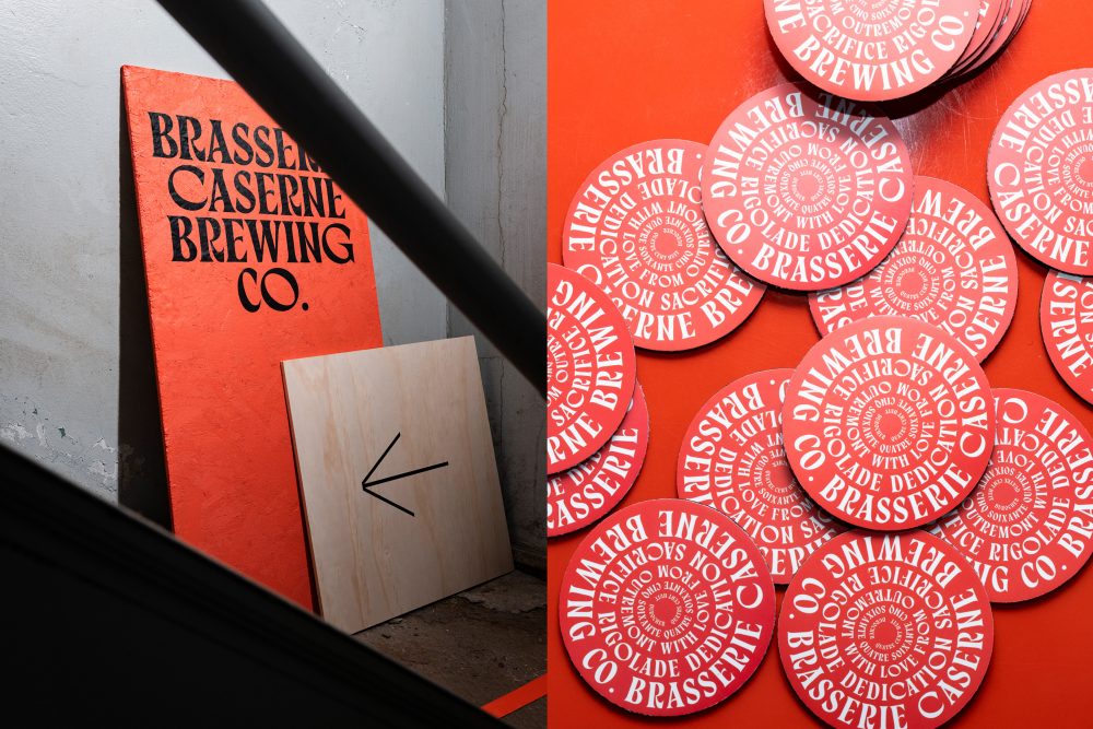
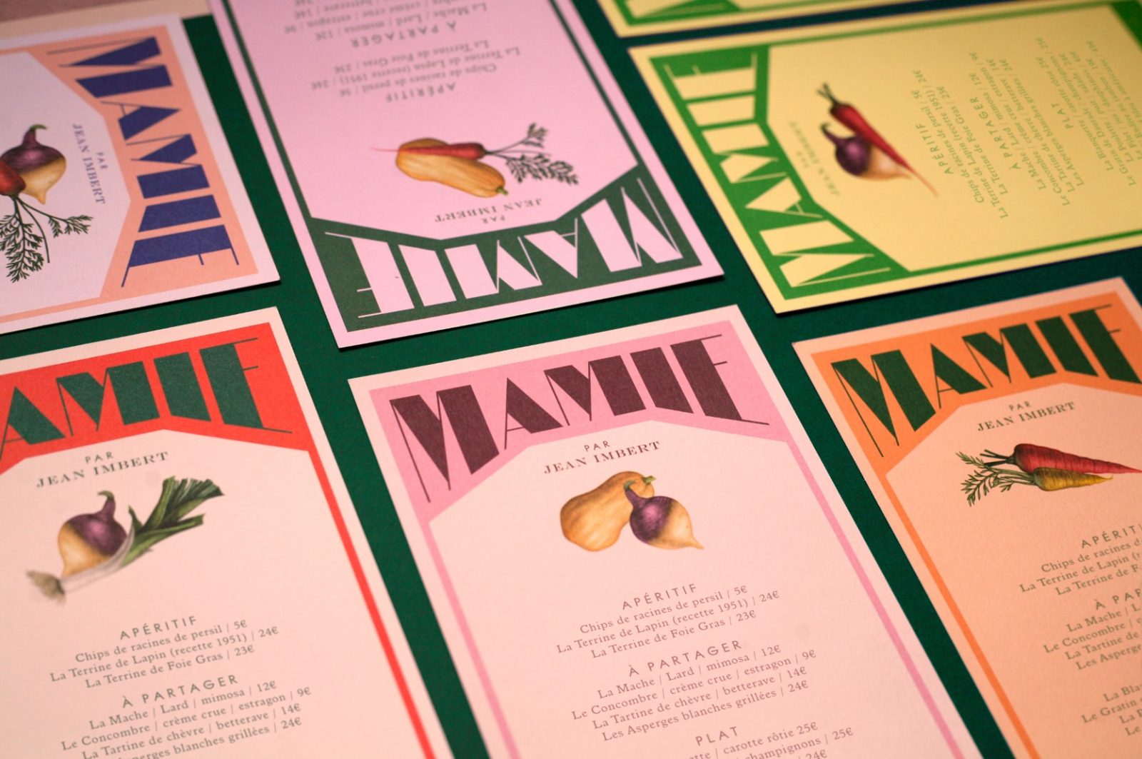
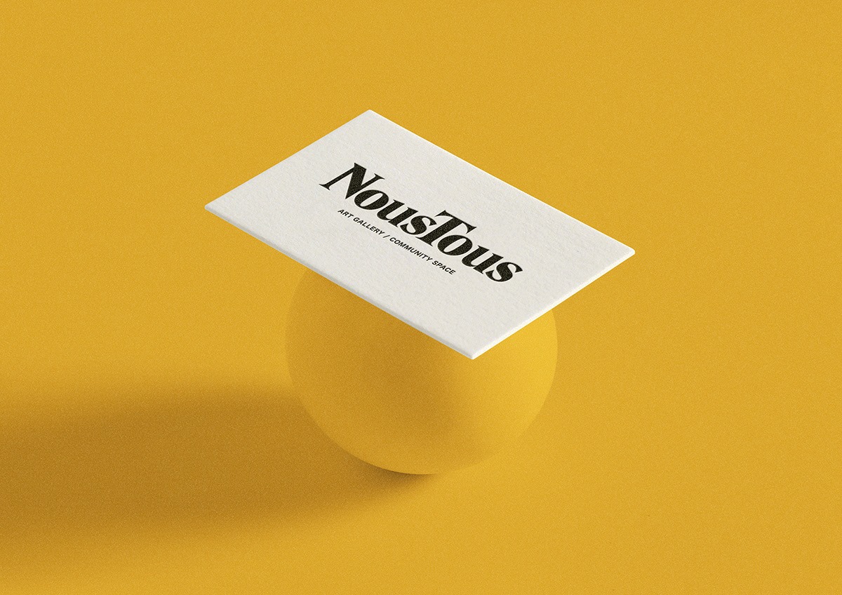
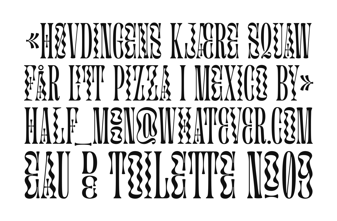
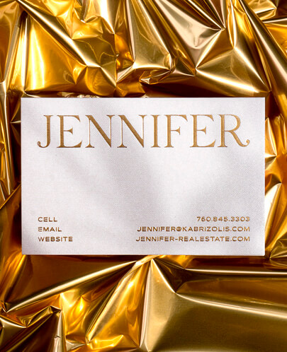
Retrofuturistic typography expresses itself in various ways
Trends are proven to be moving in circles, as designers and creatives draw inspiration from the days gone past. When looking into the upcoming trends and current movements taking place in the design industry, the similarities between now and last century are obvious yet inspiring. Without feeling stuffy and tired, creatives are finding inspiration in the 19th hundreds, especially in the first half of it, creating an array of designs in a style most commonly described as retrofuturistic.
When talking about the 20’s you might imagine jazz bands and flapper dresses, but it’s the decade in which “graphic design” was given its name and typography experimentations became popular and widespread. In 1920s new printing techniques started allowing designers to break free from the limitations of the traditional typecase. Old rules were ignored and creativity in its wildest form was embraced. Boldly mixing old and traditional with new and futuristic. In the “New 20s” of the 20th century, the same daring attitude towards type and typography is raising its head once again, as designers are fearlessly creating innovative design with combining the old with the new.
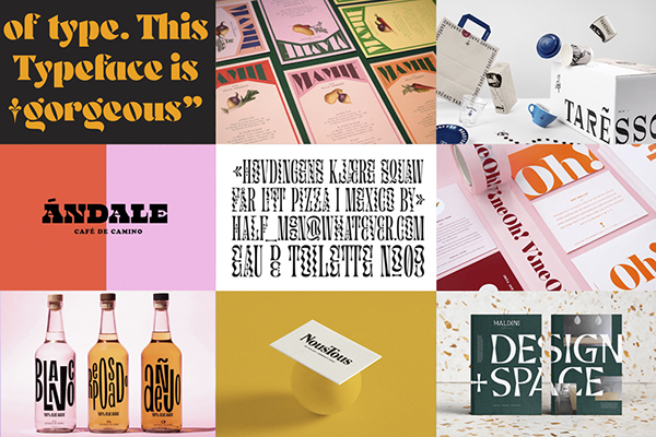
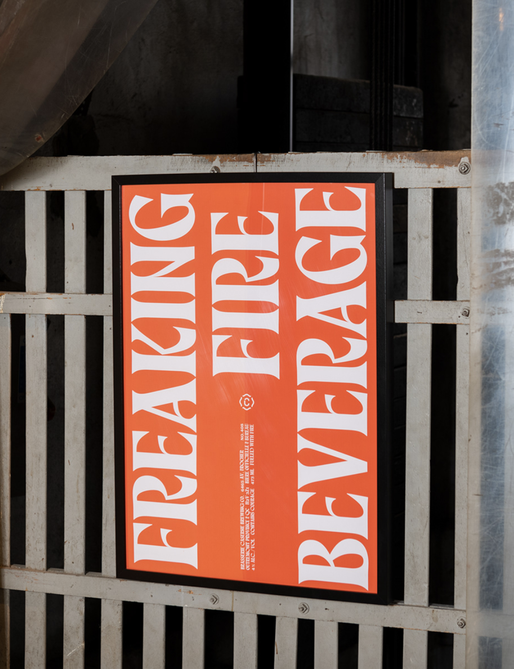
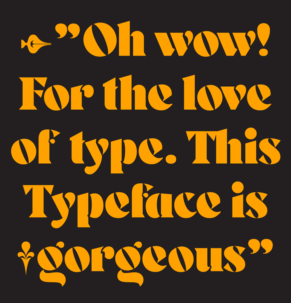
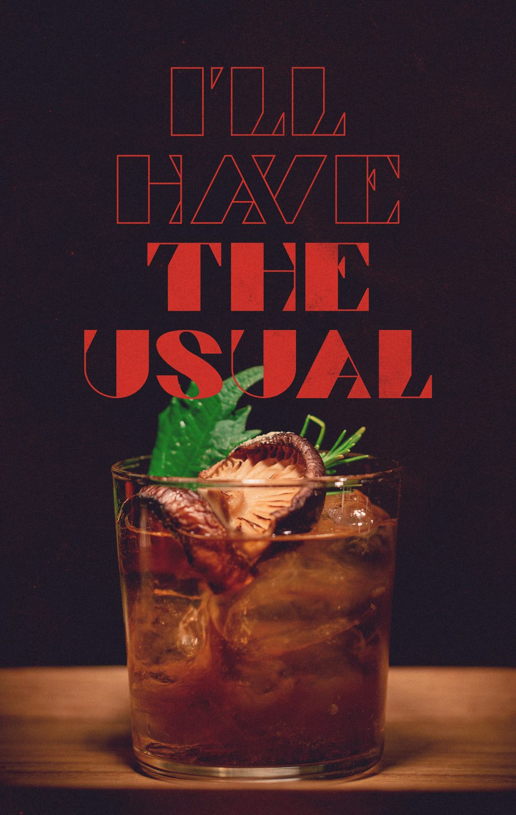
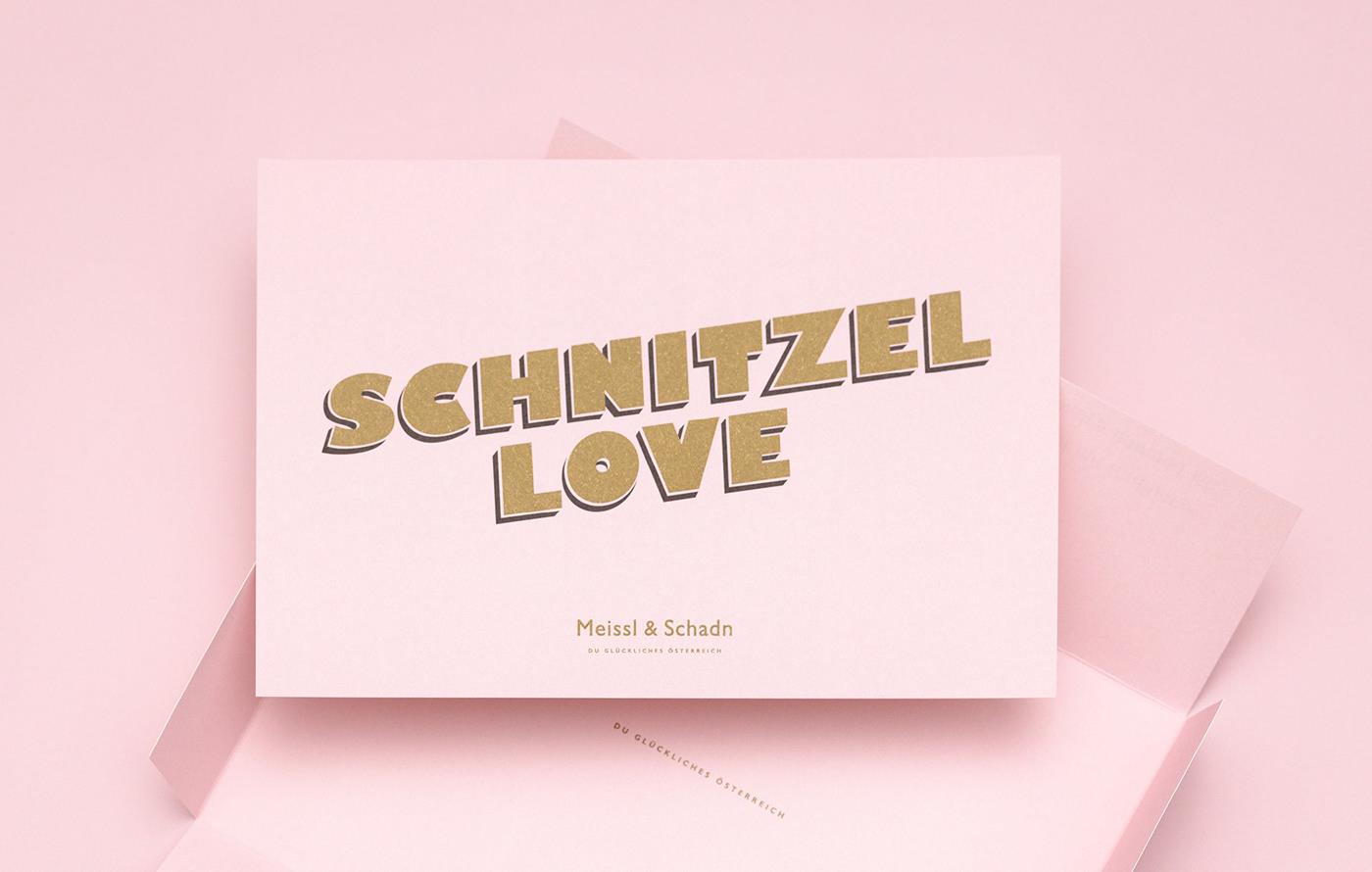
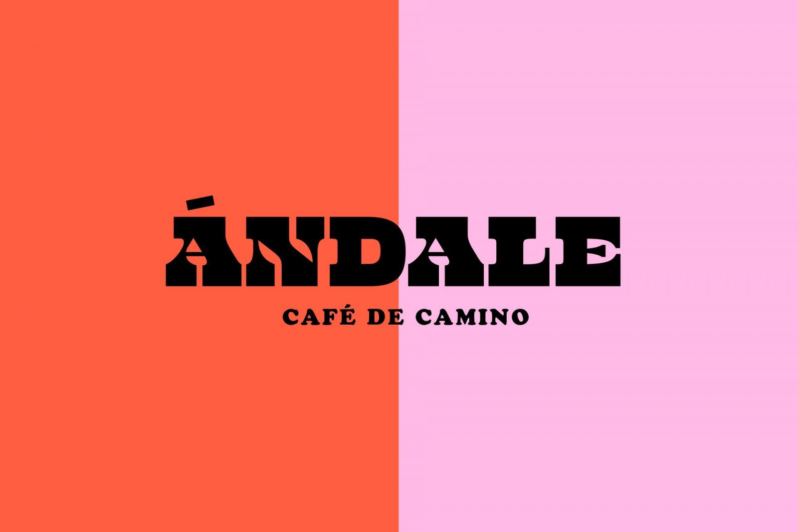
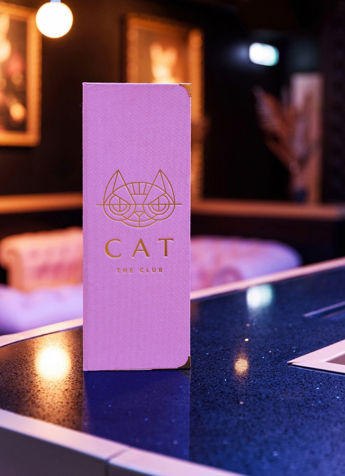
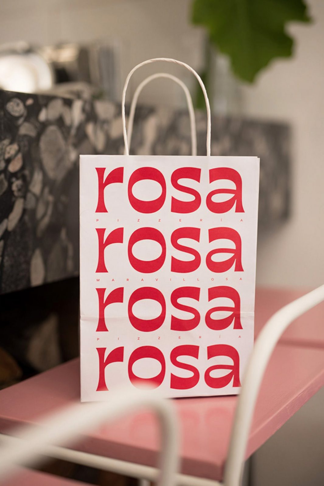
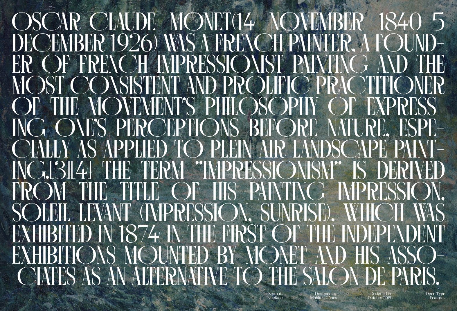
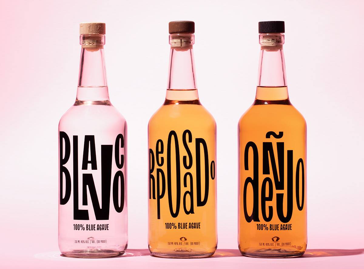
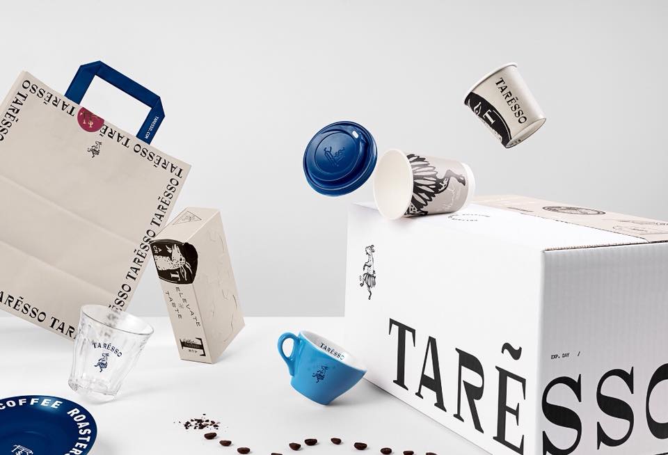
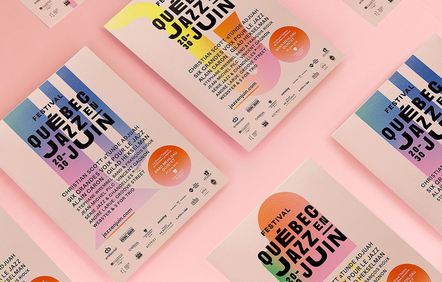
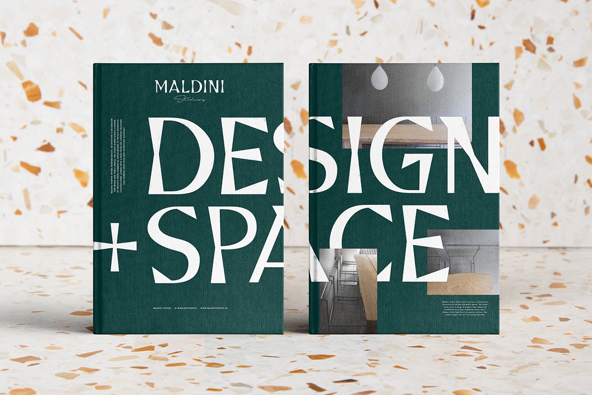
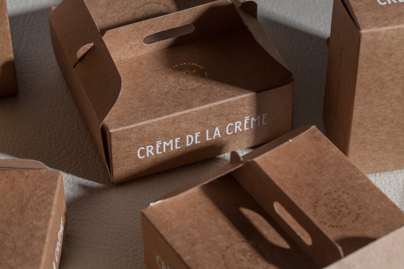
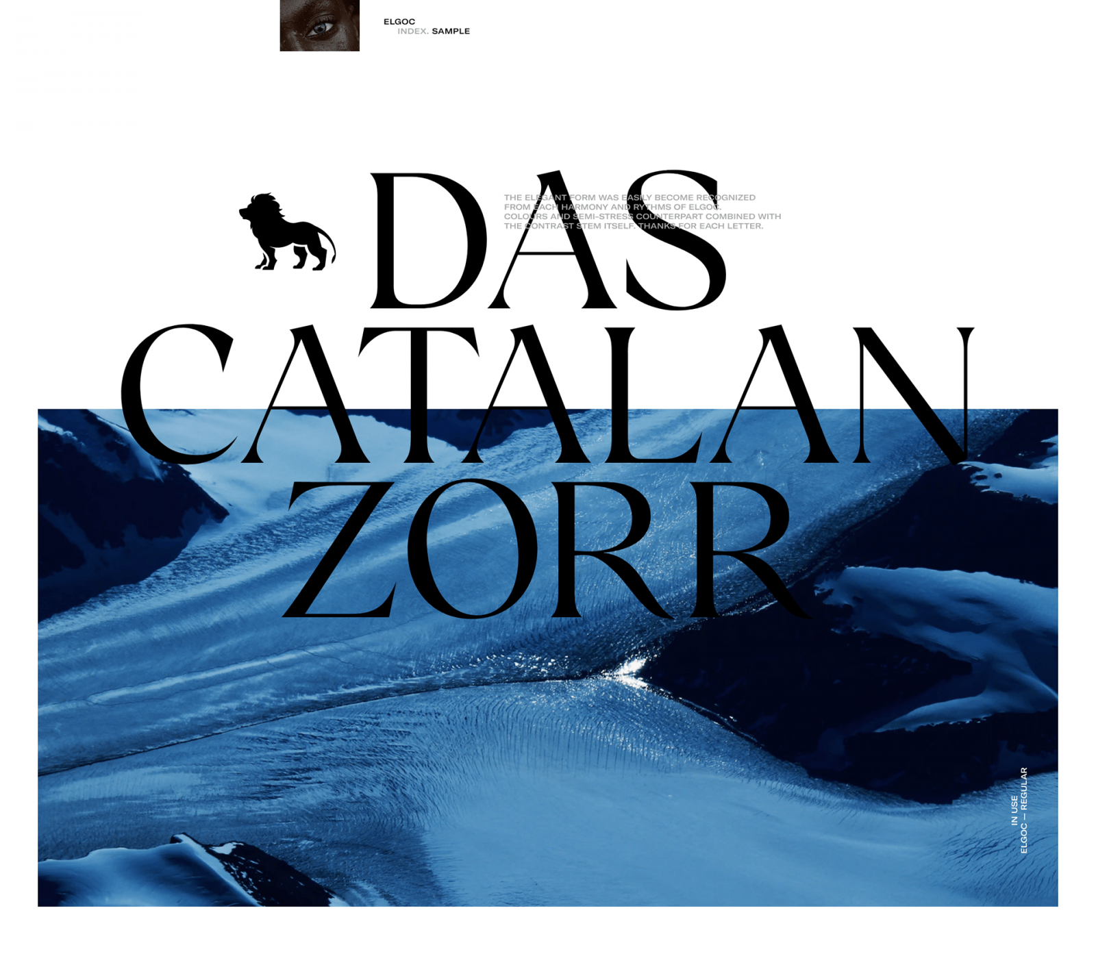
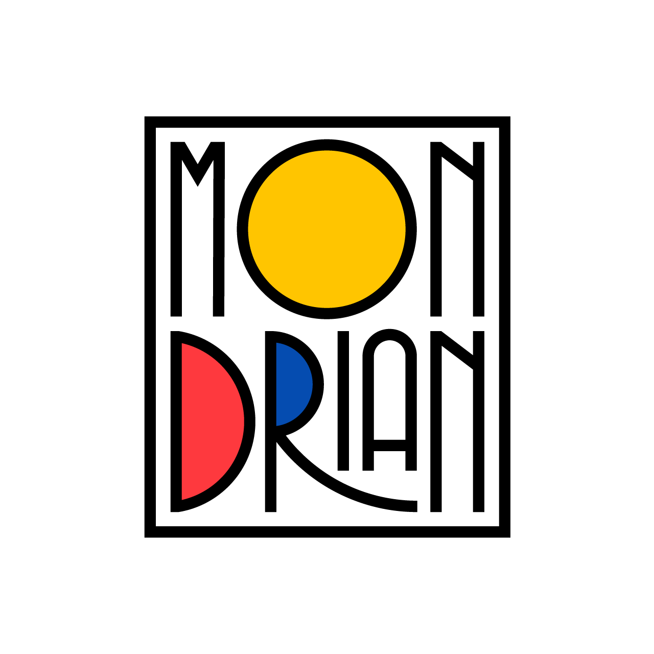
Below you can see twenty inspiring examples of the retrofuturistic typography and its possibilities in branding, packaging, poster design, and more. Click here, for more typography inspiration.

