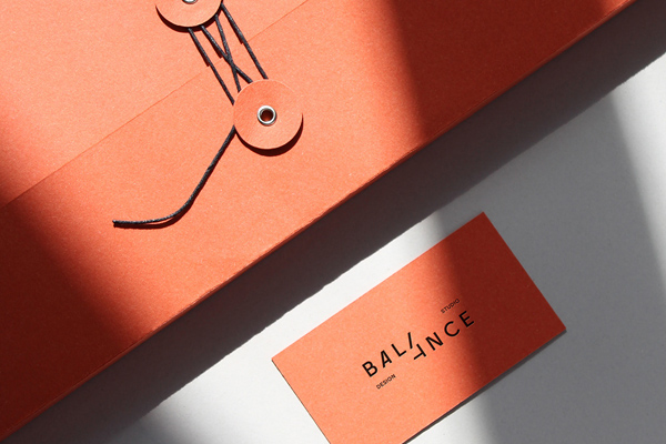
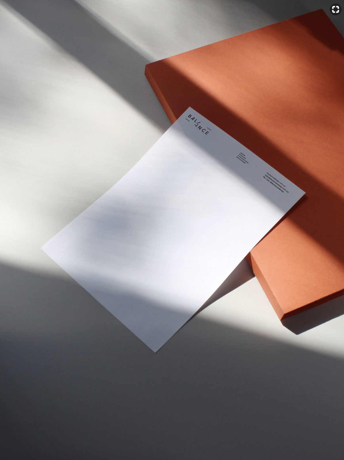
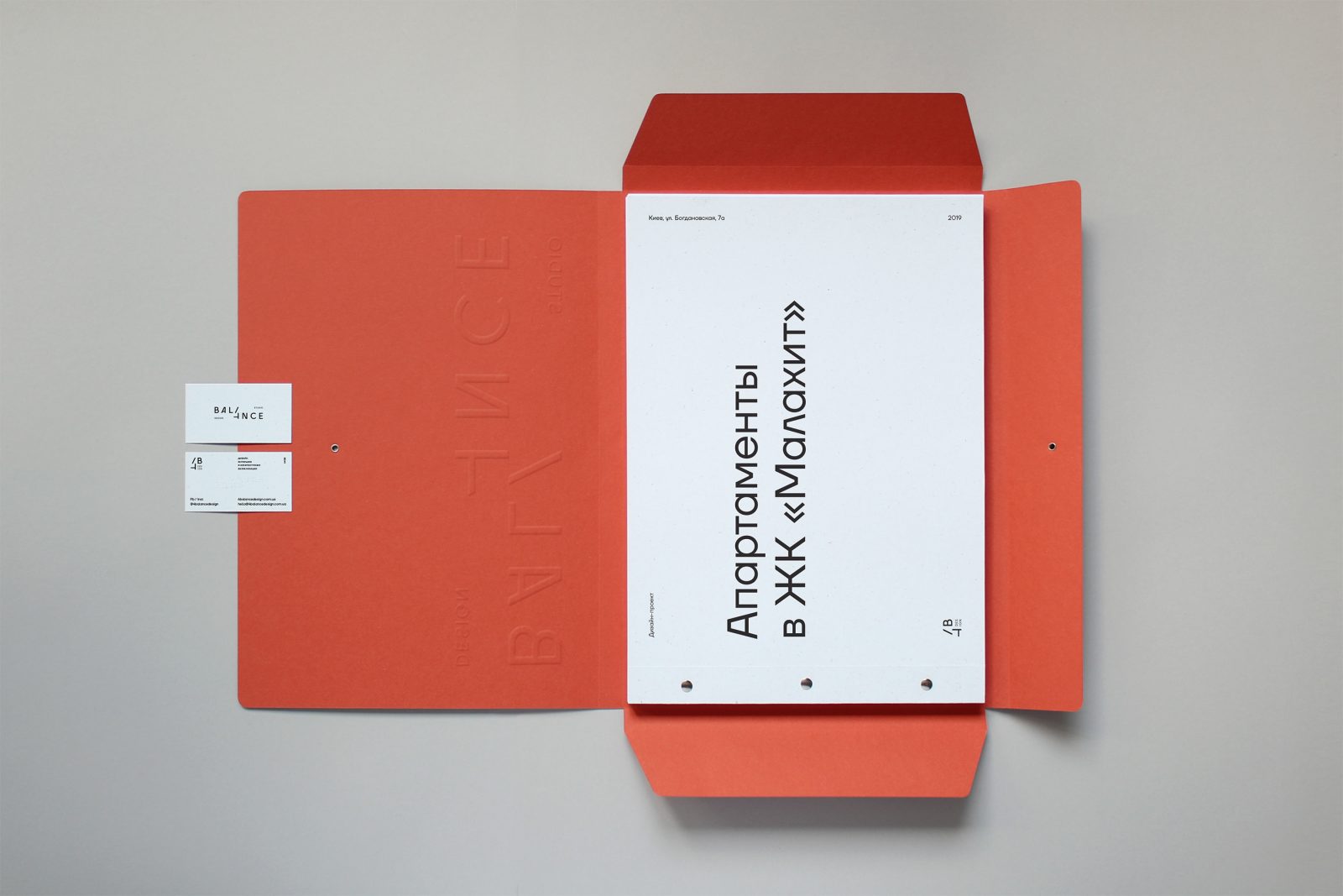
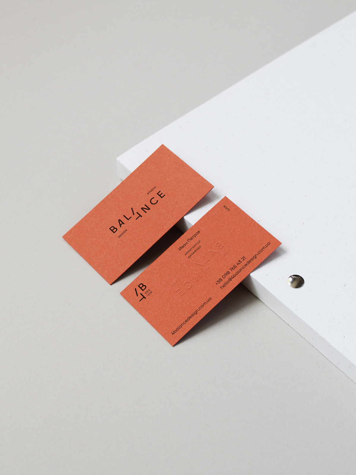
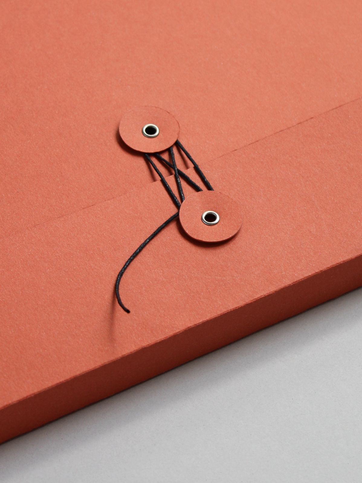
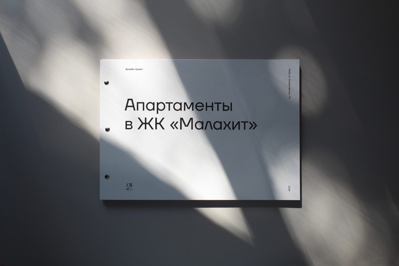
4balance is an interior design and architectural visualization studio based in Kyiv, Ukraine, who tasked Daria Stetsenko (previously here and here) to design a visual corporate identity and printed matter including business cards, blanks, folders, etc. The 4balance studio creates a functional, comfortable, balanced living space, and Stetsenko, who has a strong minimalist approach towards the work she creates, aimed to emphasize these qualities in the concept. 
graphic designer Daria Stetsenko has a strong minimalist approach towards the work she creates, resulting in timeless designs
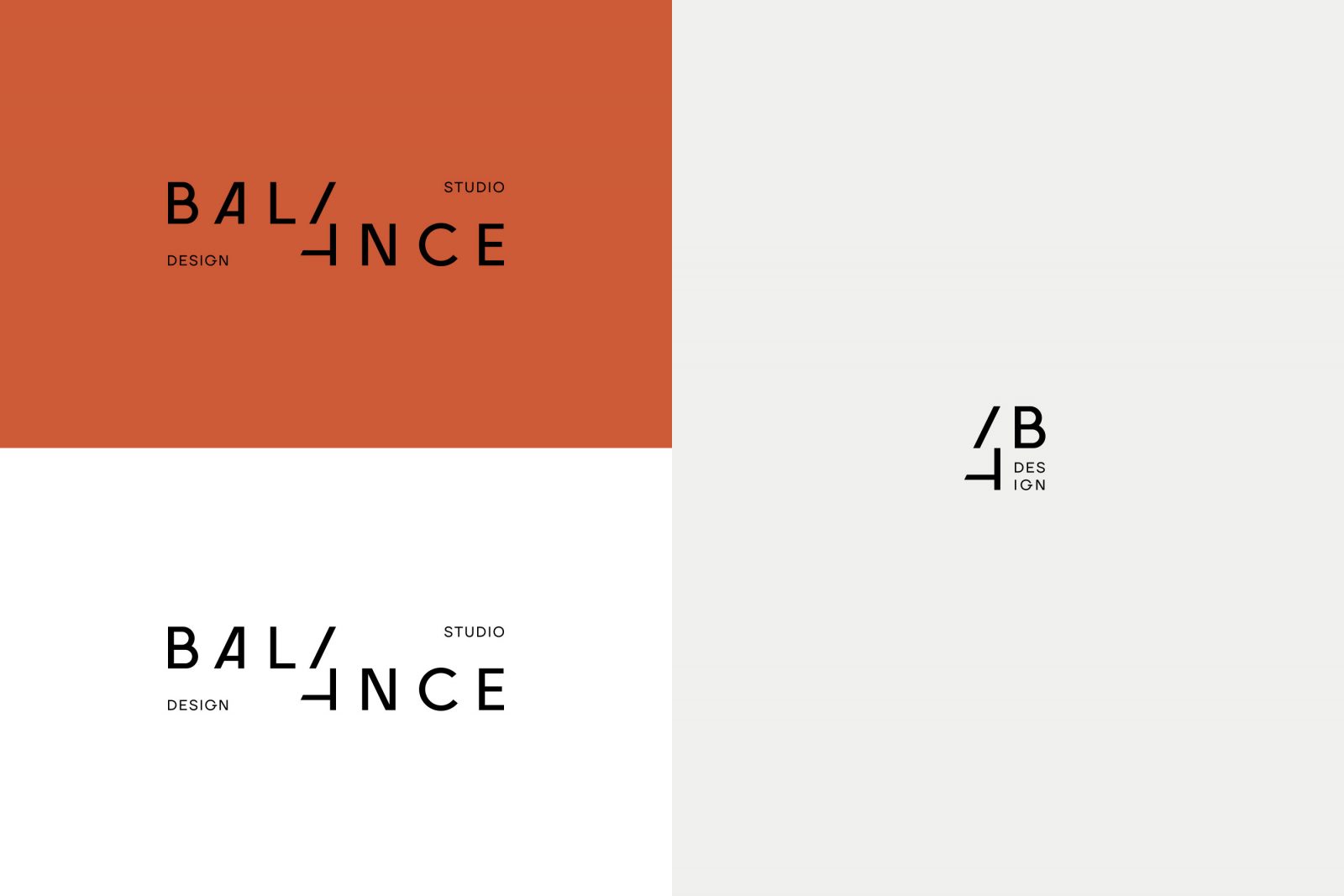
A very minimal, practical, and concise corporate identity was born, without any extra decoration, detailed elements or gimmicks of the kind. The concept revolves around a contemporary sans serif logotype which is created with a simple shift in layout.
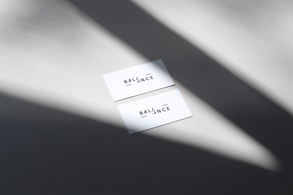
The unique logo symbolizes the two parts of the studio, and the emergence of new ideas as a result of teamwork
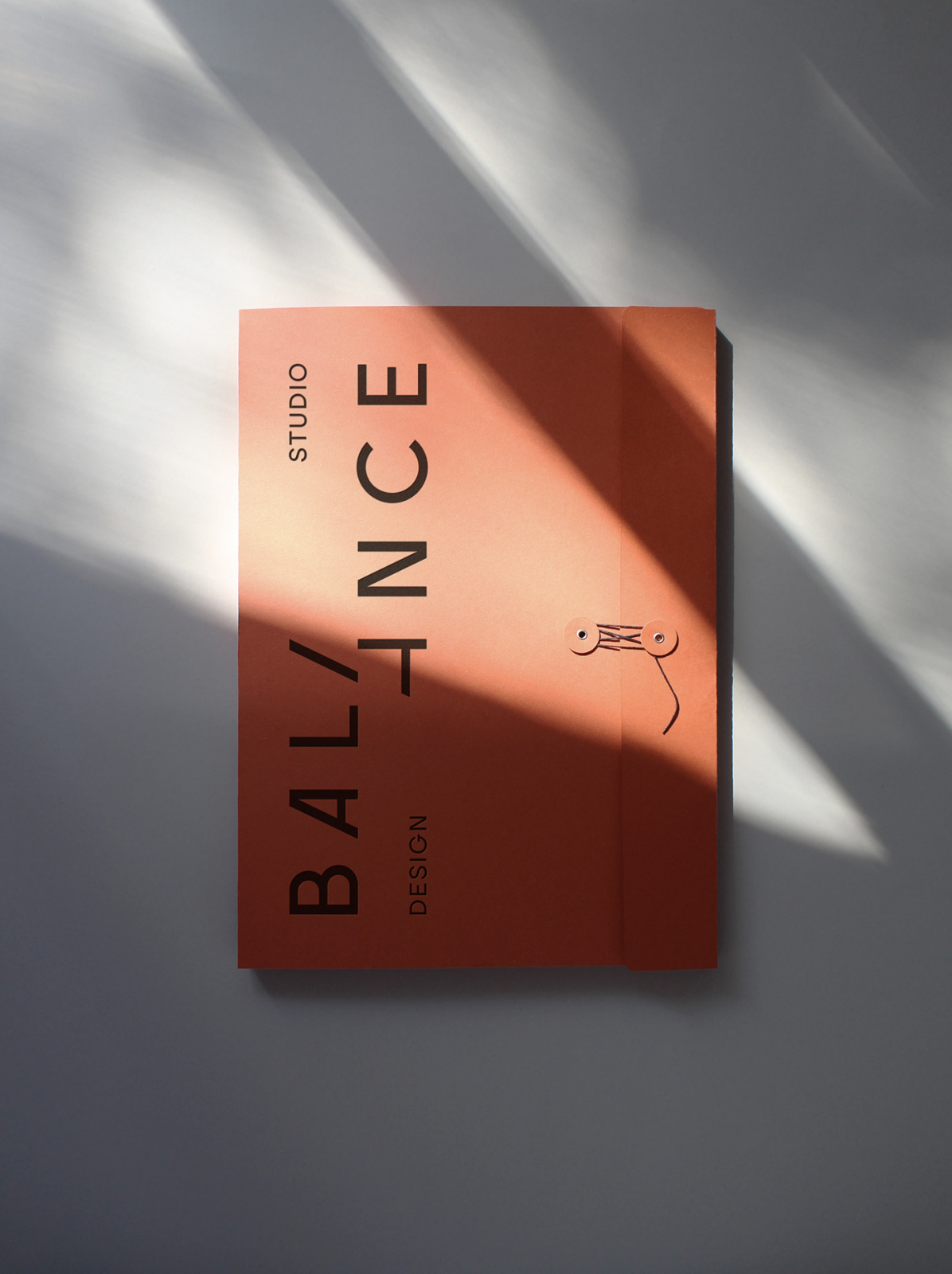
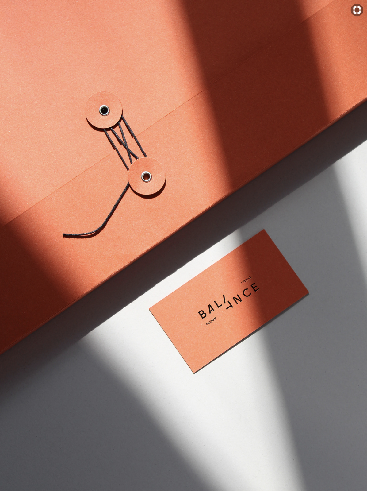
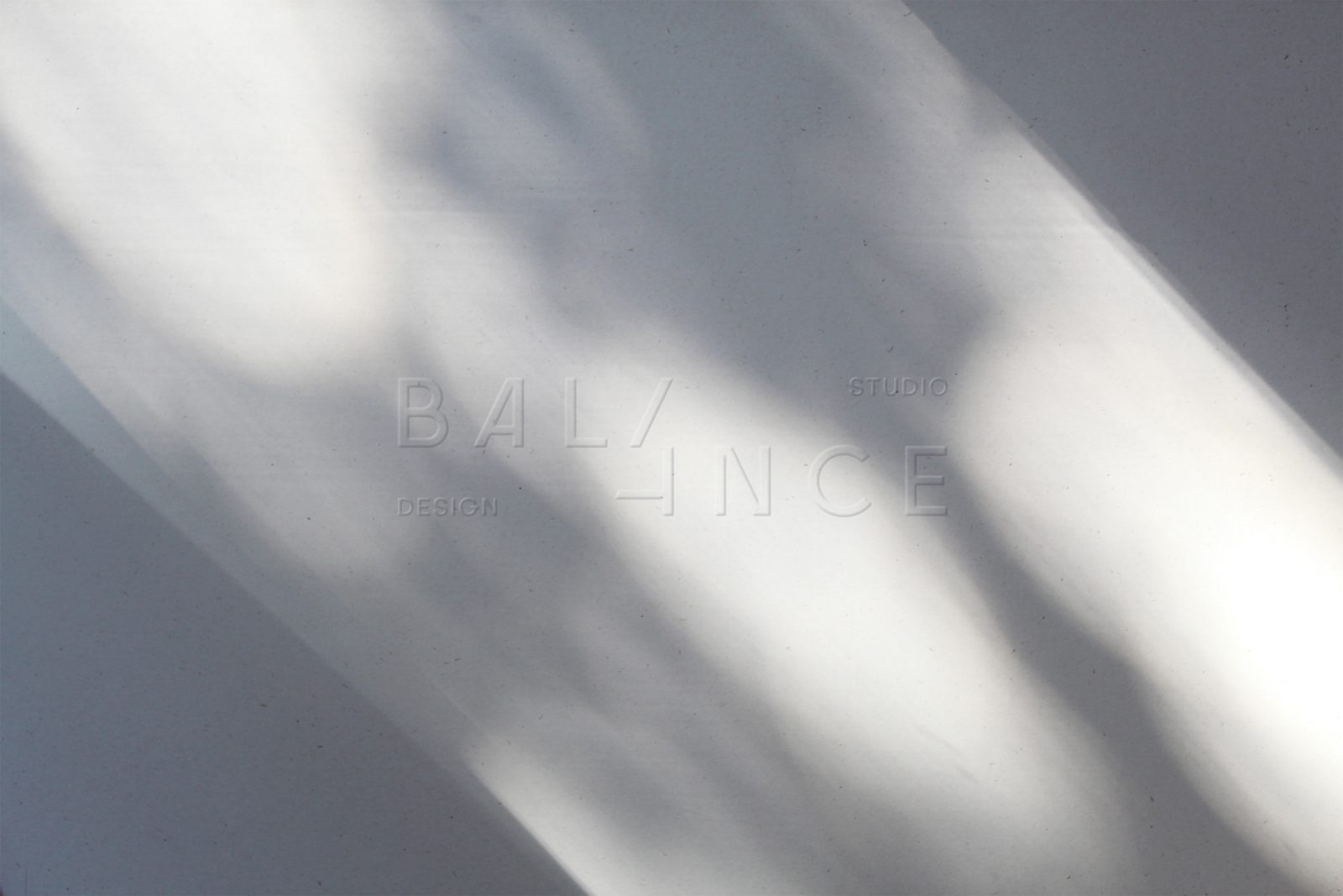
Two parts of the word BALANCE are shifted relative to each other along the diagonal of the letter A. As a result, the number 4 appears in the center. The logo symbolizes the balance of the two parts, the addition to each other, the emergence of new ideas as a result of teamwork.
In addition to the primary logo, a compact version of the logo was developed which simply states: 4B. The brand color palette consists of light gray and red brick colors creating a timeless yet attention-demanding aesthetic. The letterpressed printed logo creates a nice embossed counterpart on the inside of the folders and business cards, beautifully supporting the minimal design, creating depth and dimension, echoing the concept of the logo.
Images © Daria Stetsenko

