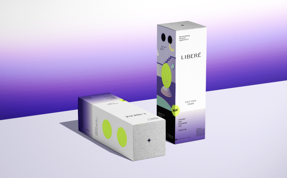
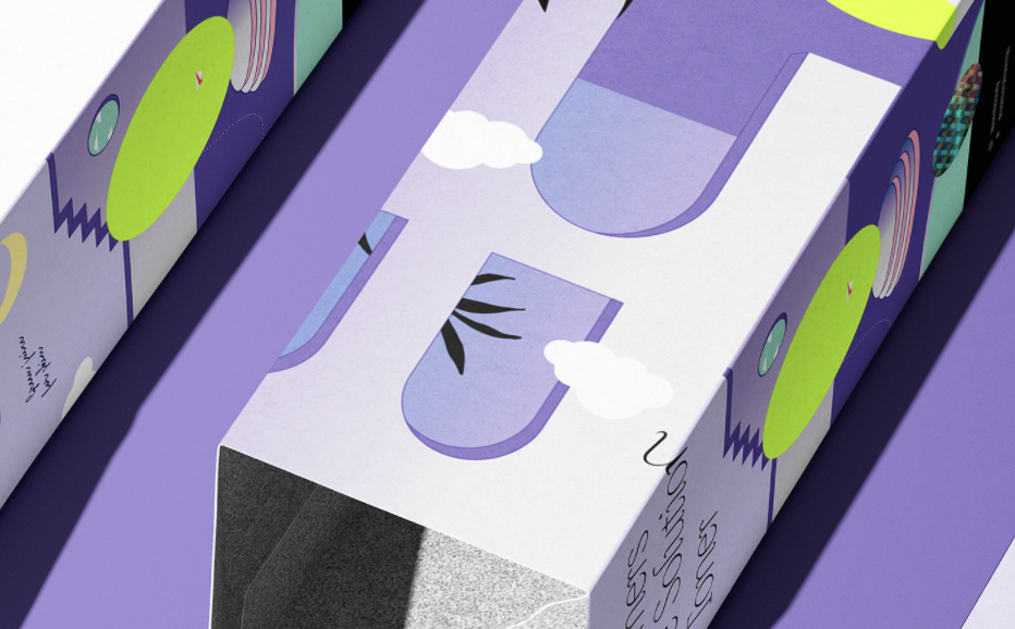
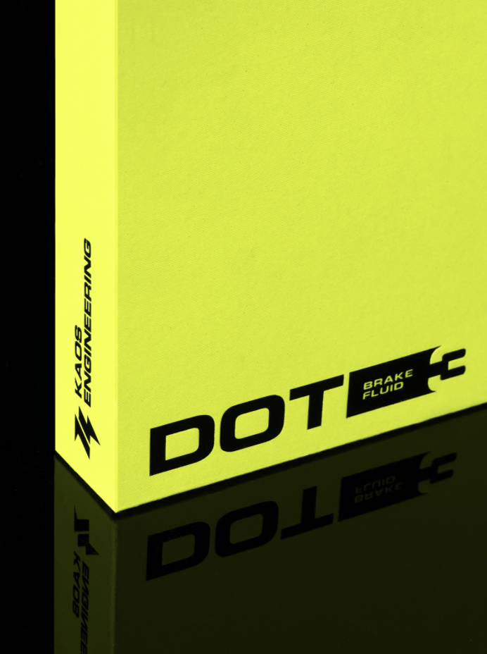
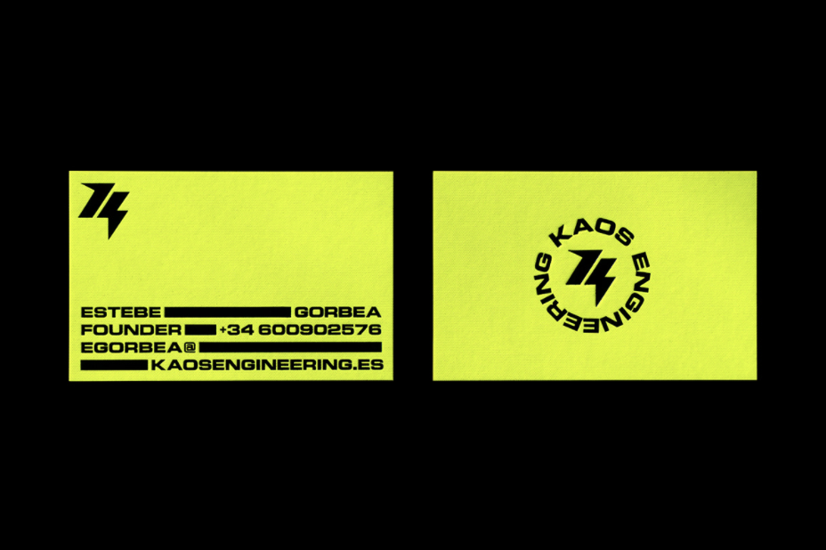
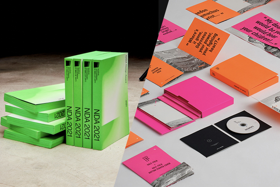
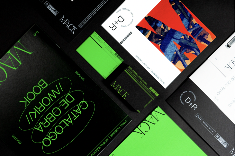
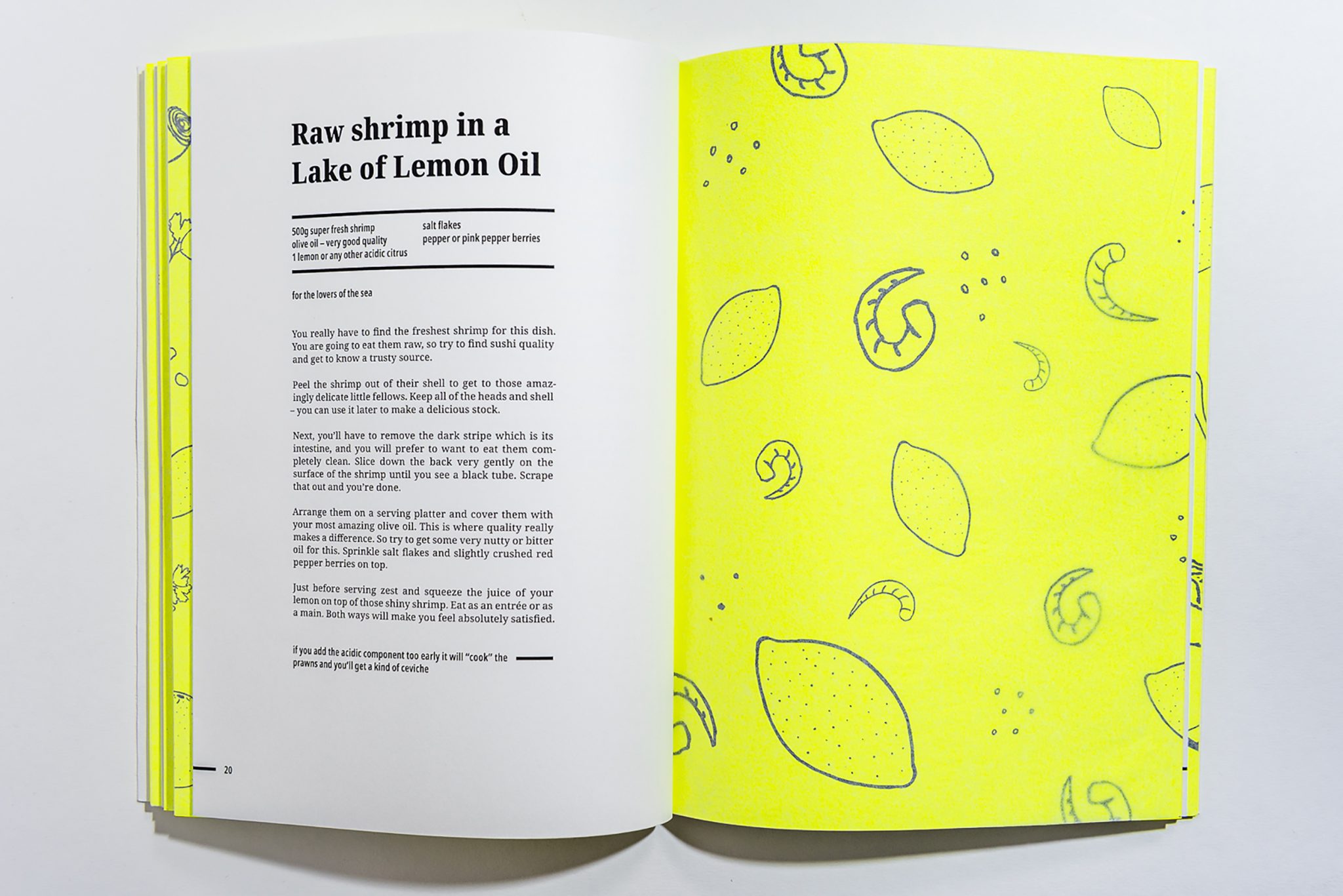
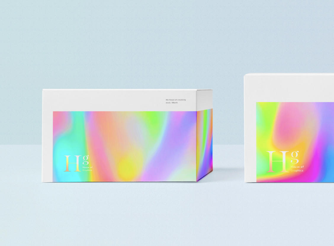
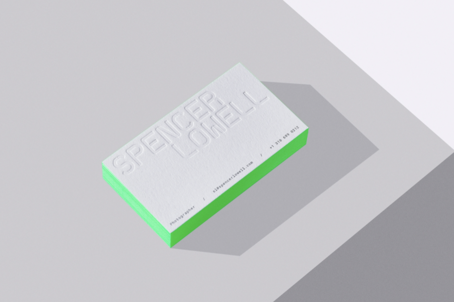
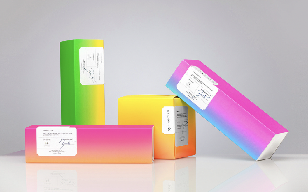
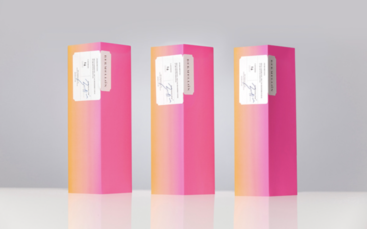
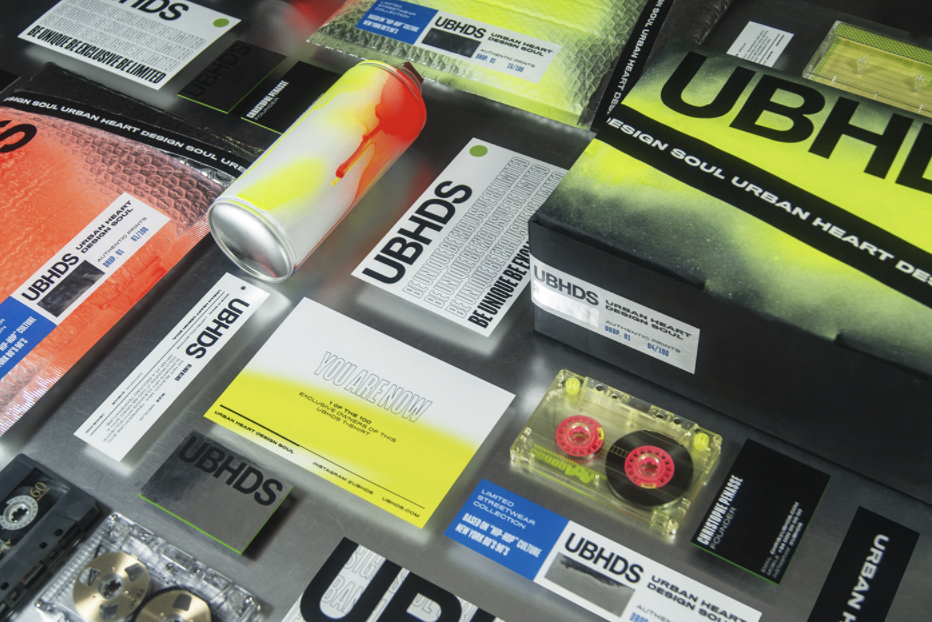
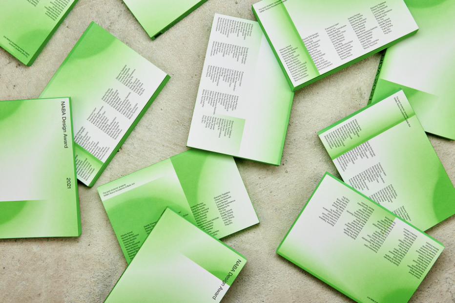
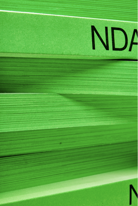
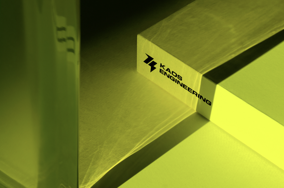
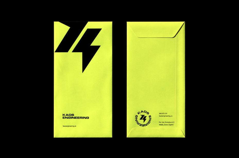
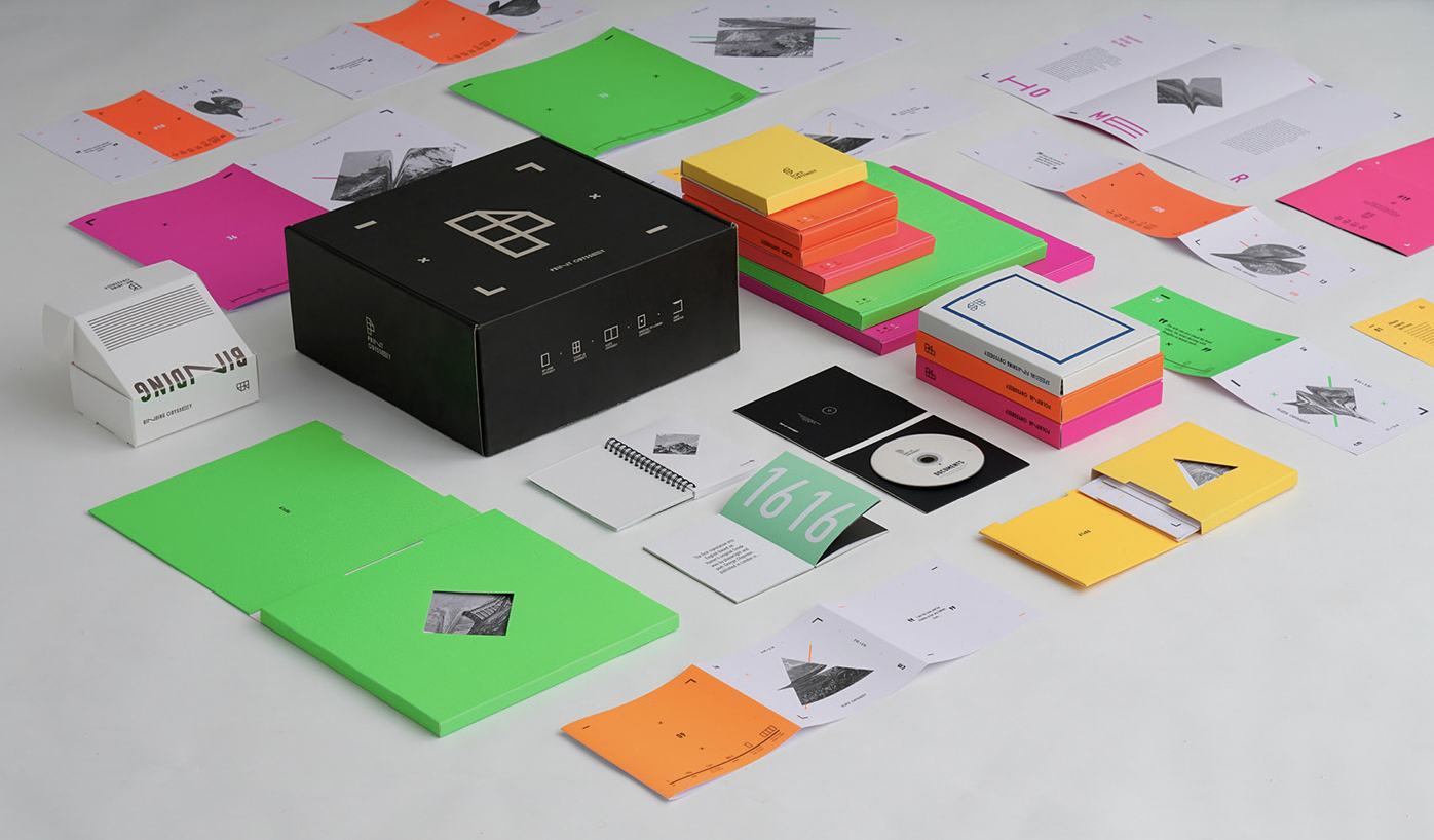
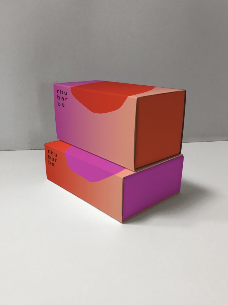
Nothing screams the 80s like neon colors in all their shameless splendor. Some hate them and some love them, but they’re back – and they’re back with a vengeance, baby! While other trends can be easier to predict as they take time to develop, some seem to pop back from the past when you least expect them. The sudden comeback of the neon might be a move to counterbalance the minimalist movement we’ve been seeing in the last few years. Minimalist elements, mindfulness, gentle values, and comforting colors and textures are given needed contrast with trippy patterns, eclectic typefaces, and bold, solid neon hues. Neon colors are that boost of energy we all so desperately need – and deserve – after the last few years in hibernation.
Neon colors are that boost of energy we all so desperately need – and deserve – after the last few years in hibernation.
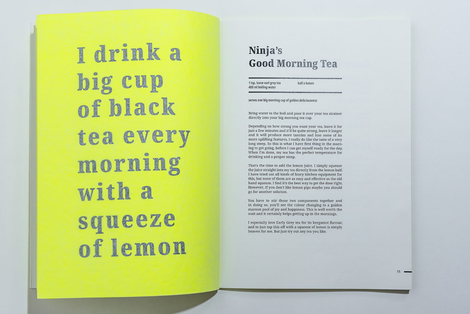
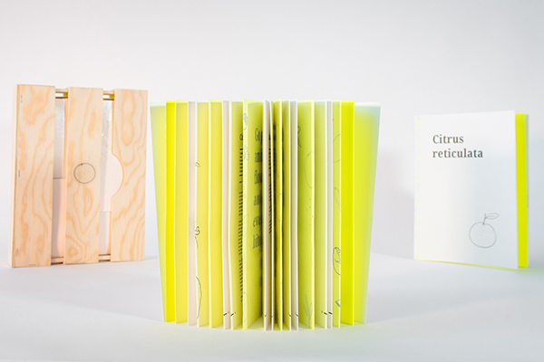
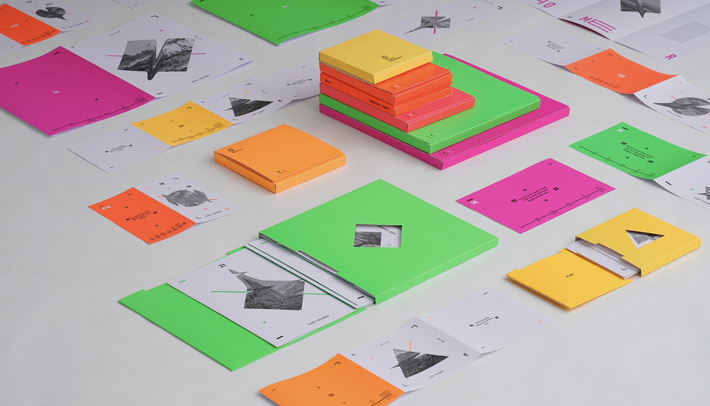
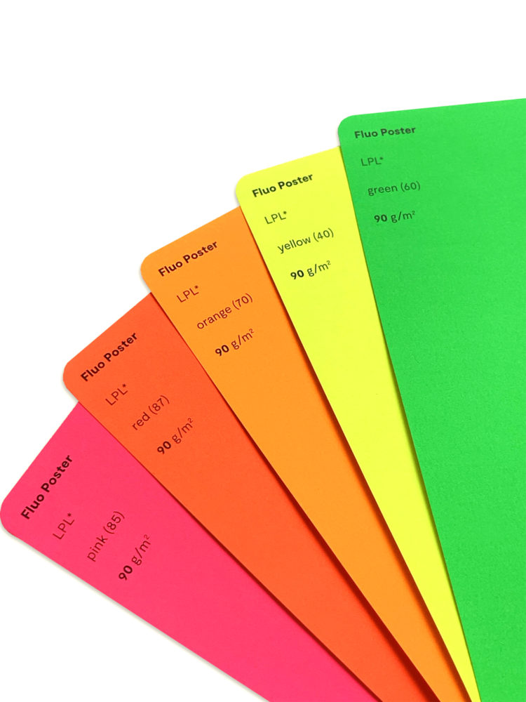
Fluo Poster in the Design Papers Collection come in all saturated highlighter hues: pink, red, orange, yellow, and green
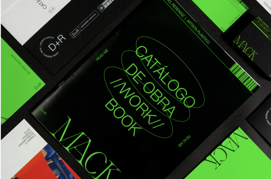
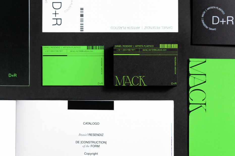
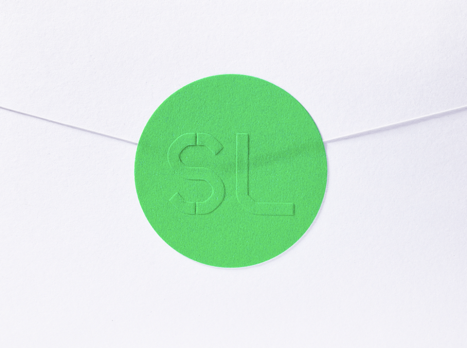
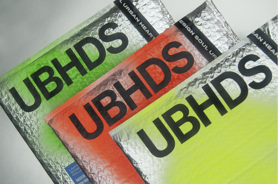
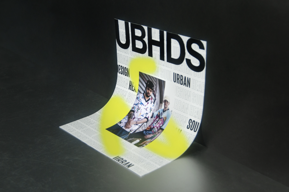
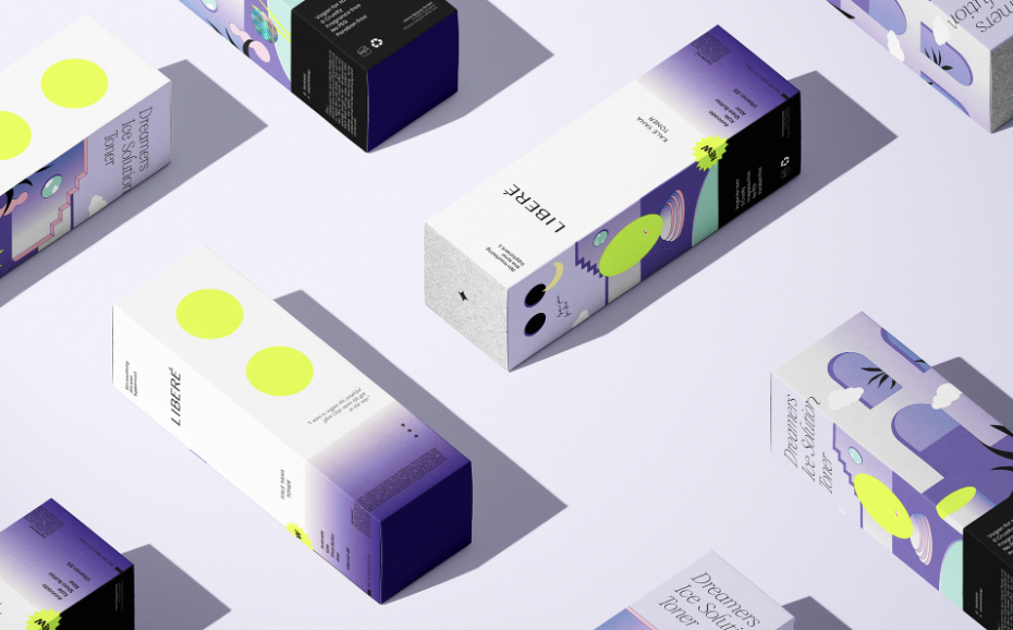
The argument that neon colors lack the needed elegance or sophistication that successful branding and packaging concepts require, is misleading, as the innovative ways these saturated highlighter hues are now applied to projects are more likely to intrigue than beguile the viewer.
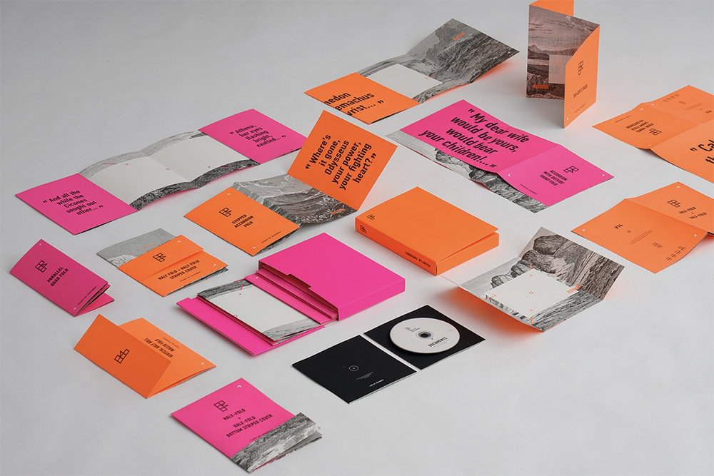
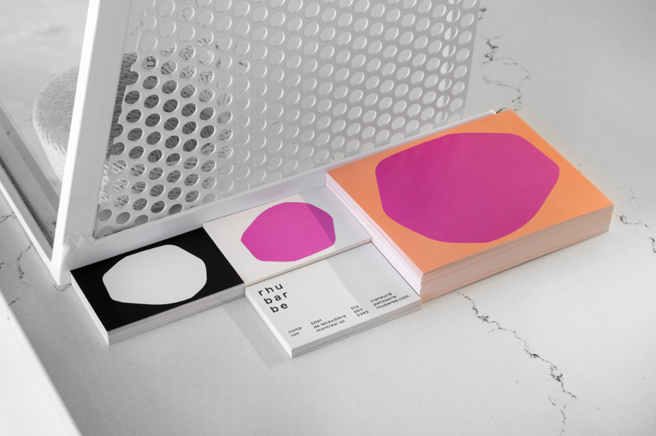
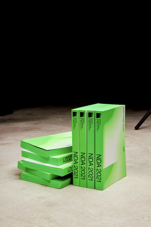
While a classic and proven choice for concert posters, neon can be applied in various ways in print products. They are great for adding depth and movement to gradient patterns, an impactful choice for details in contrast with white and black, and of course the ultimate attention-grab when used in a monochromatic style. You can find a selection of highlighted neon hues in the Design Papers Collection, named Fluo Poster, which includes bold pink, red, orange, yellow, and green shades in 90 gsm.
The argument that neon colors lack the needed elegance or sophistication that successful branding and packaging concepts require, is debunked, as the innovative ways these saturated highlighter hues are applied to projects are more likely to intrigue than beguile the viewer.
It remains to be seen if the love for neon is a passing flying star in the trend skyline – or a sign of a greater shift toward a brighter, bolder color palette in the coming years. But till then, let’s enjoy this curated collection of beautiful print projects from around the world that so well demonstrate the value neon can bring to any project. For more current trends, read our late articles on Typography In Focus – Branding & Packaging Design Trends of 2022 and “Very Peri” Packaging & Branding Inspiration to Welcome In Pantone’s Color of the Year 2022.
