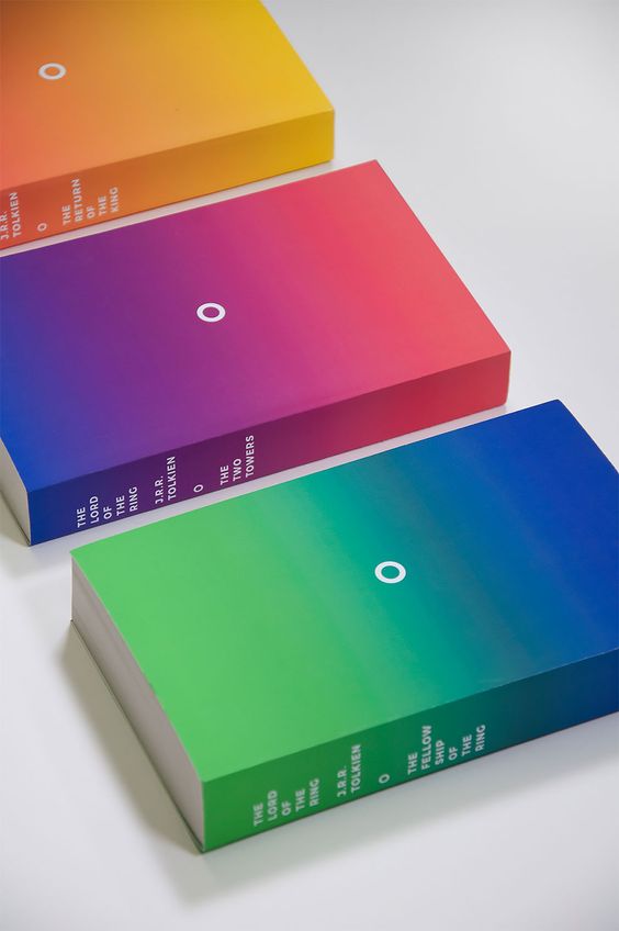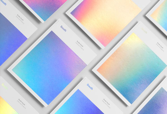
It feels like I’ve taken a time machine and traveled back to the ’90s – the golden era of platform shoes, crop tops, and glitter. Trends have always moved in cycles, re-emerging every 20 to 30 years, but the effect of the ’90s trend has taken over our lives like no other trend in the past decade. And the world of paper, branding, and packaging has not gone unaffected. Many things popular at the moment, from paper cutouts to custom hand lettering were a hit during the last decade before the millennium, but one trend above all is having a comeback like no other – and that’s gradients!
Gradients add dimension and depth
Before the world domination of flat design, gradients were a popular way of adding dimension and depth to a design, elevating an image with a color overlay or a texture in otherwise minimal illustration. And now designers are effortlessly combining the two. Gradients are great for elevating a minimalistic packaging design or give a pop of fresh energy for a brand looking for a fresh new look. It can be used with similar tones for a muted touch, or by combining every color under the sky as a powerful tool.
Blending of colors in a seamless way
Simply put, gradient means a transition or blending of colors in a seamless way. A gradient can be as bold or as subtle as needed, it can be on center stage or in a supporting role in the background. Its use is so versatile, it offers many unique opportunities for branding and packaging design, where the skill of grabbing one’s attention is much appreciated.
By blending together vibrant shades of colors, new energetic color combinations are created, which help a brand stand out among many. A key factor to gradients new-born success comes from its ability to stay fresh and modern, like these 15 stunning branding and packaging examples below demonstrate.
What do you think of the gradient trend? Are you sick of living in the past, or do you think gradients have still more to offer?


