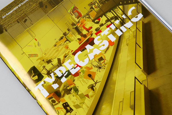
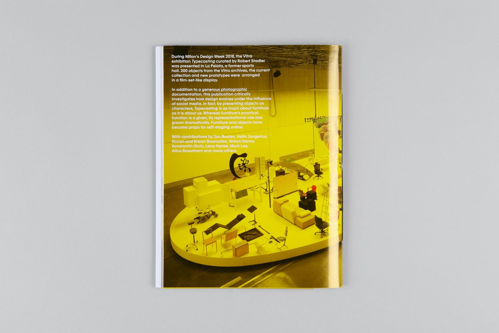
London based design practice Zak Group was commissioned by Vitra to design the brand identity, campaign, and catalog for Typecasting, an exhibition of iconic, forgotten, and new Vitra furniture. Curated by designer Robert Stadler, the exhibition took place at a historic sports hall La Pelota, during Milan Design Week last year. 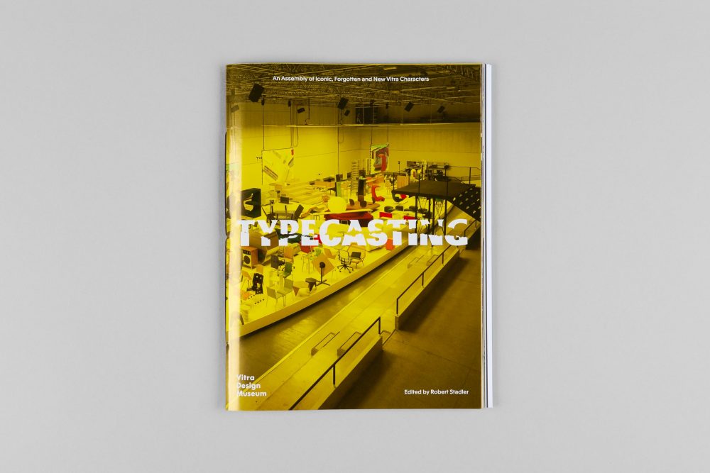
An assembly of iconic, forgotten and new Vitra characters
Along with their obvious practical use as seating, chairs have always had a representative function – the selection of a specific chair is also an act of self-definition and self-portrayal. – Robert Stadler, designer and curator of the exhibition
 .
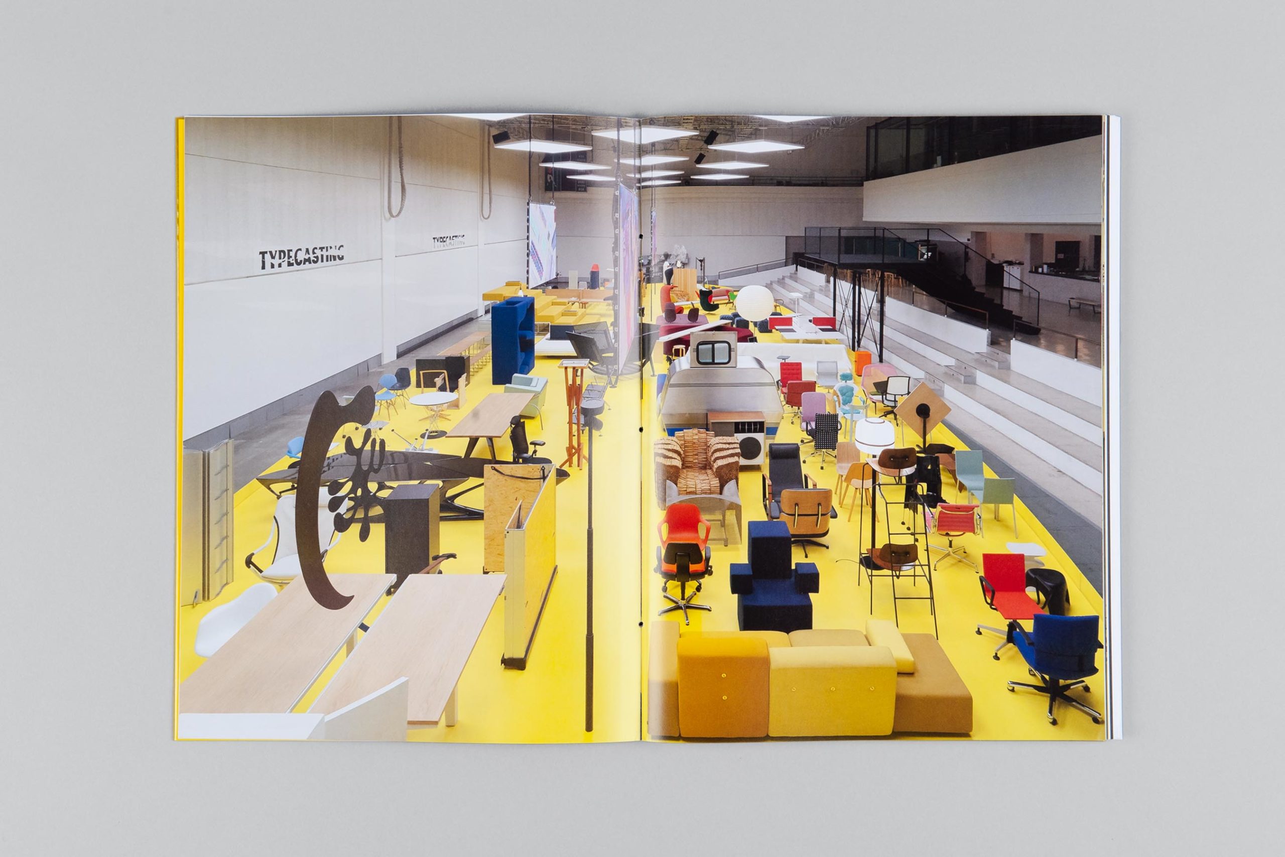
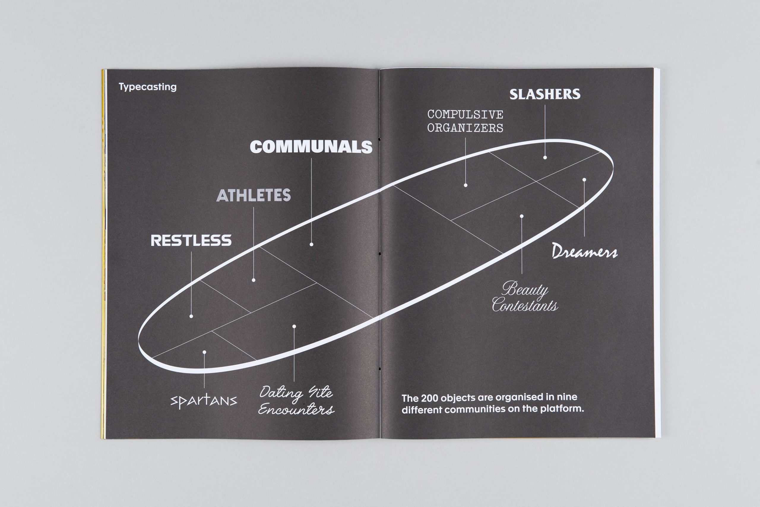
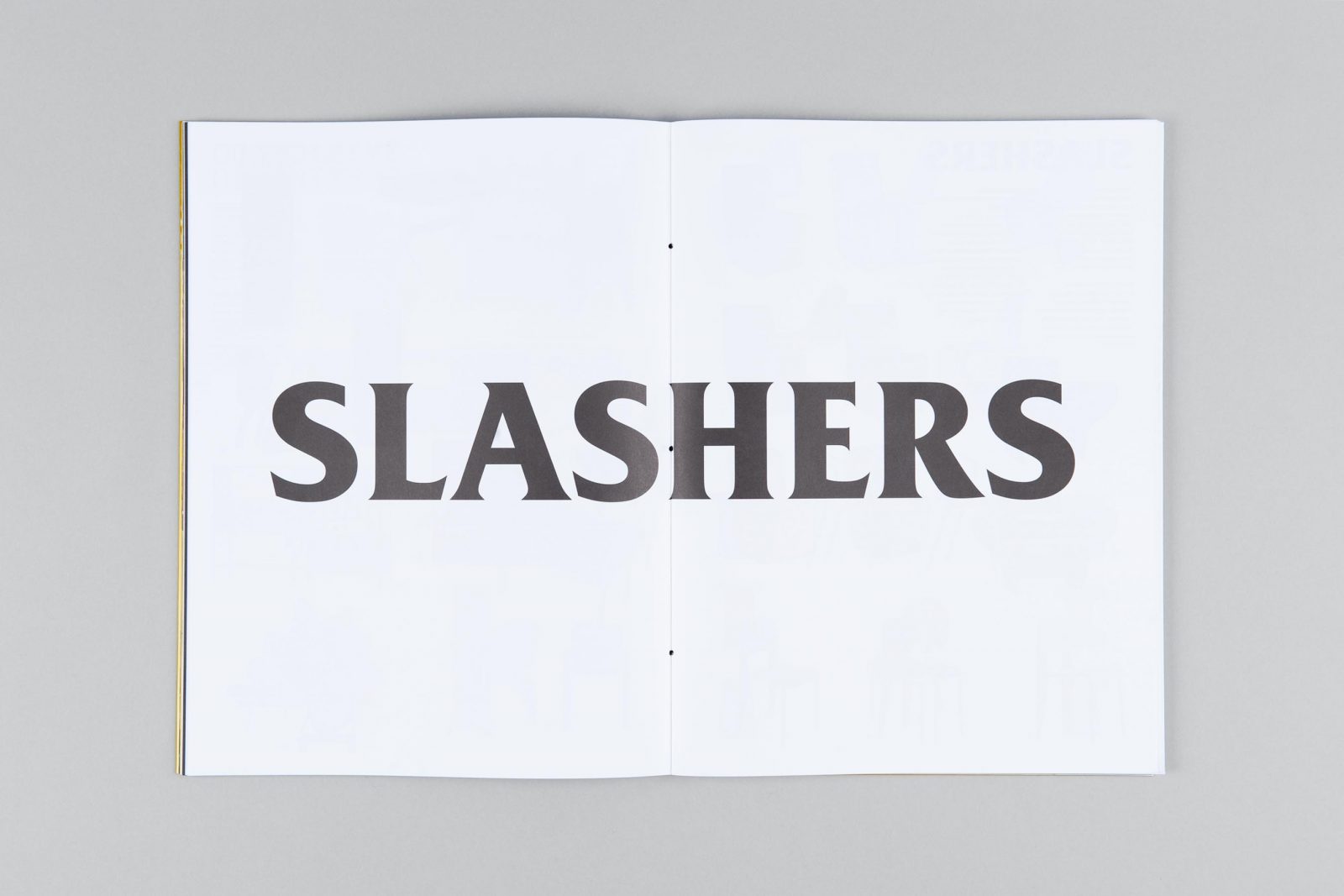
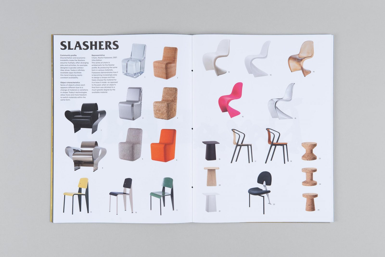
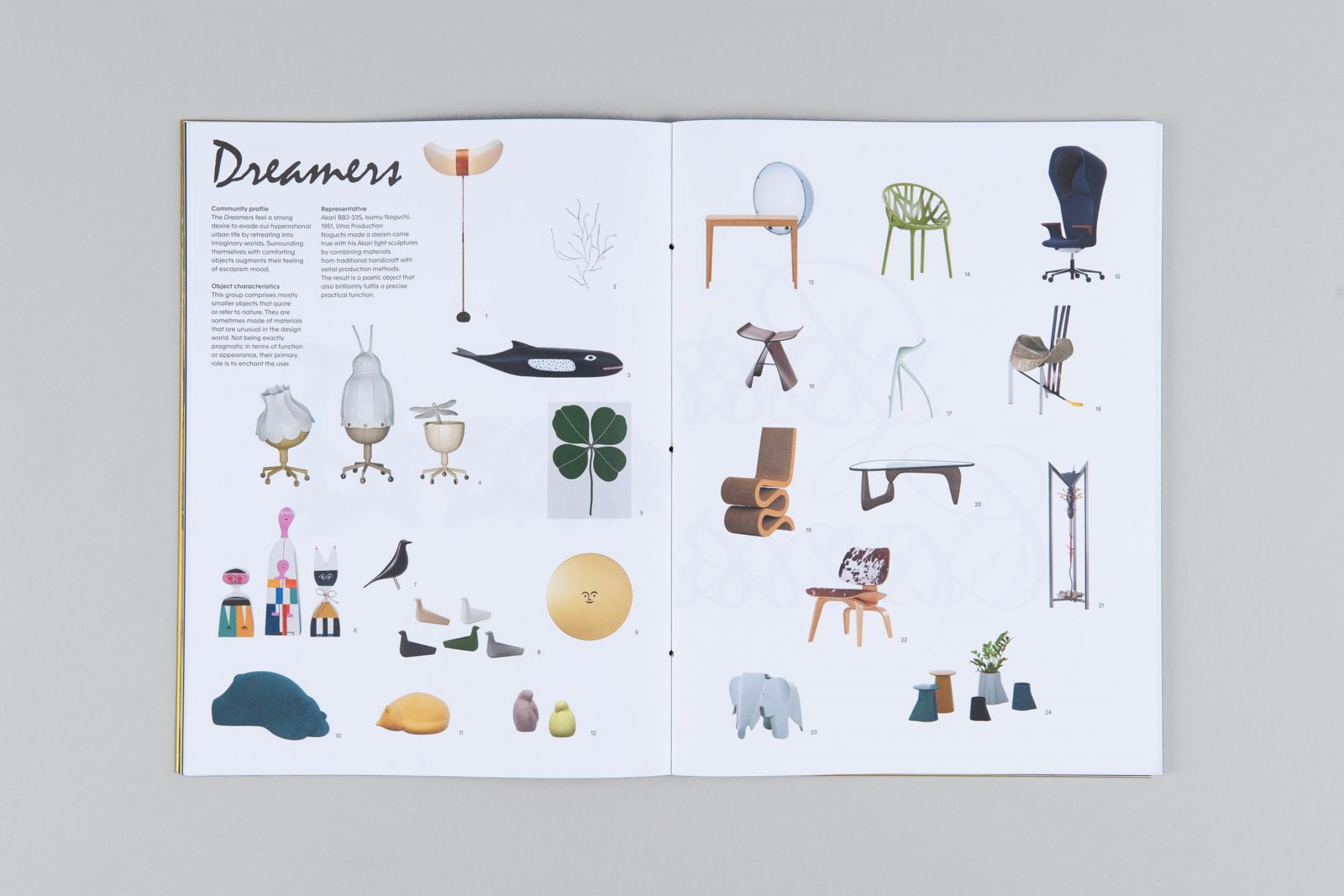
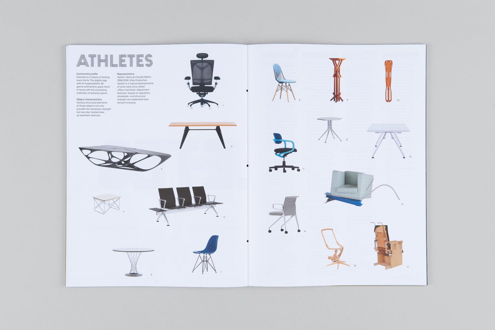
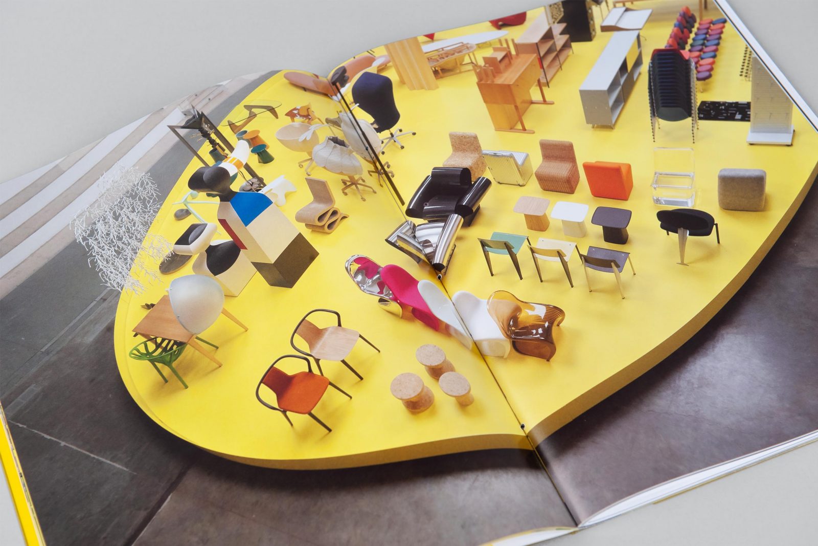
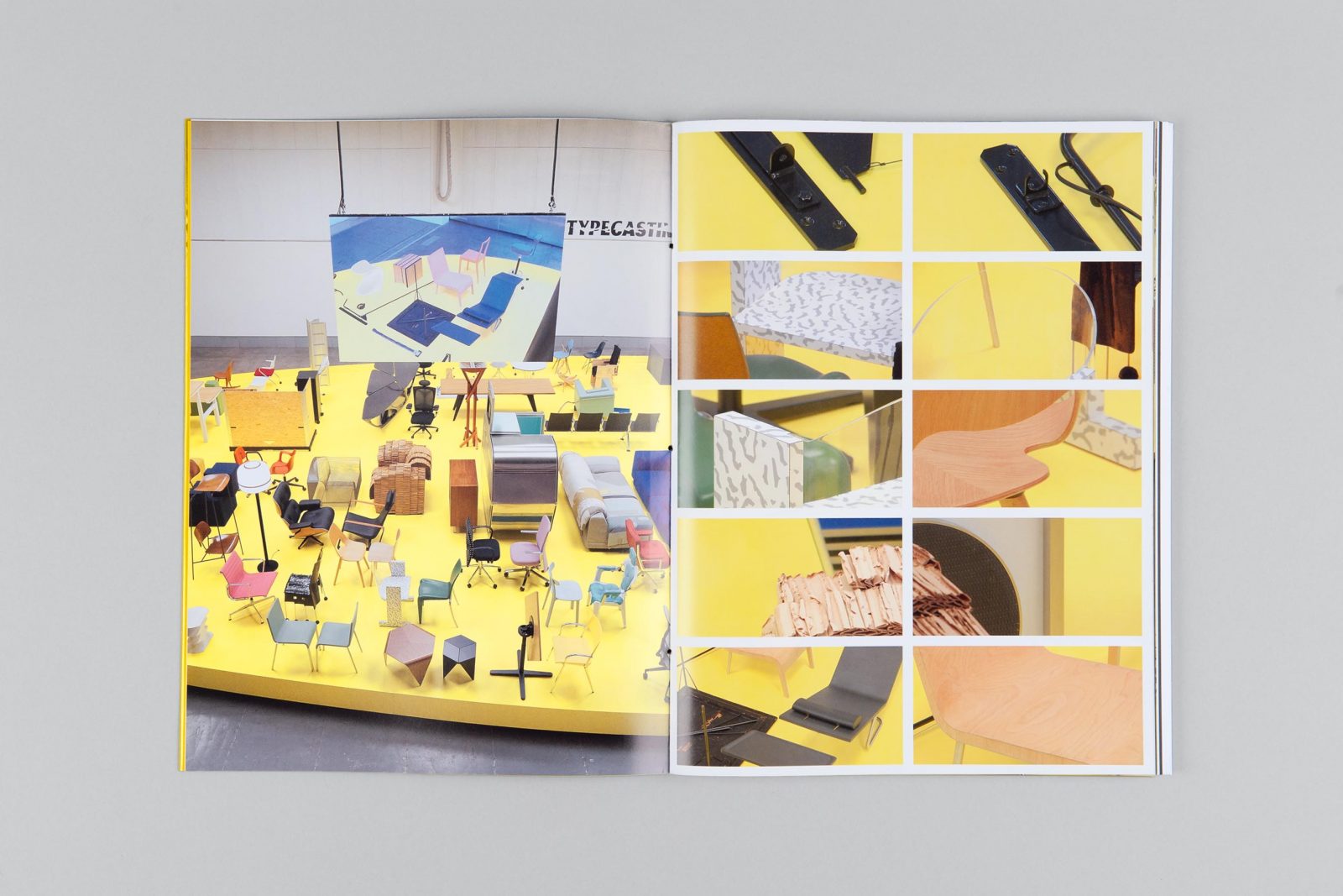
.Wanting to emphasize the social role of furniture, chair, in particular, the curator Rober Stadler designed the exhibition as a reflection of modern reality by presenting the objects as personalities with various attitudes. The 200 furniture showcased were grouped into nine categories, with titles such as athletes, dreamers, slashers, and compulsive organizers. Stadler selected pieces from both current production and the company’s archives, complementing them with new designs – grouping them based on their specific characteristics on both aesthetics as well as usability.
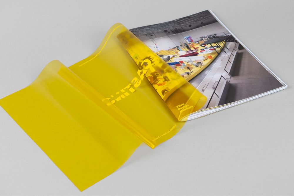 The catalogue functions as an index to the physical display of the exhibition
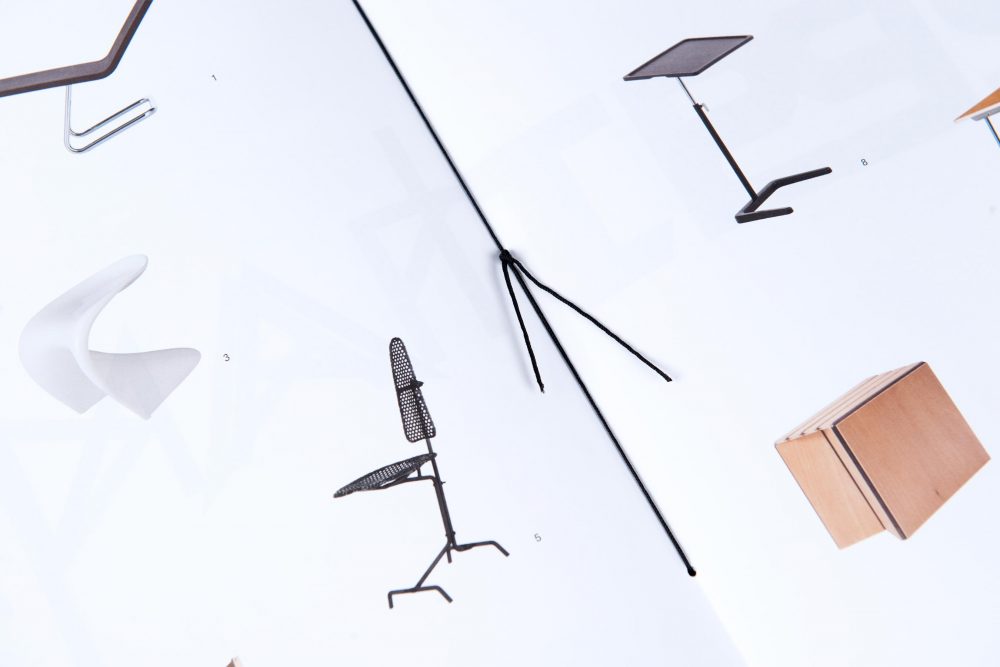
Additionally to the identity and campaign graphics of the exhibition, the catalog was designed by Zak Group, with an aim to function as an index to the physical display of the exhibition. Besides being an extensive photographic documentation, the publication critically investigates how the design evolves under the influence of social media. In fact, by presenting the objects as characters, Typecasting is as much about furniture as it is about us.
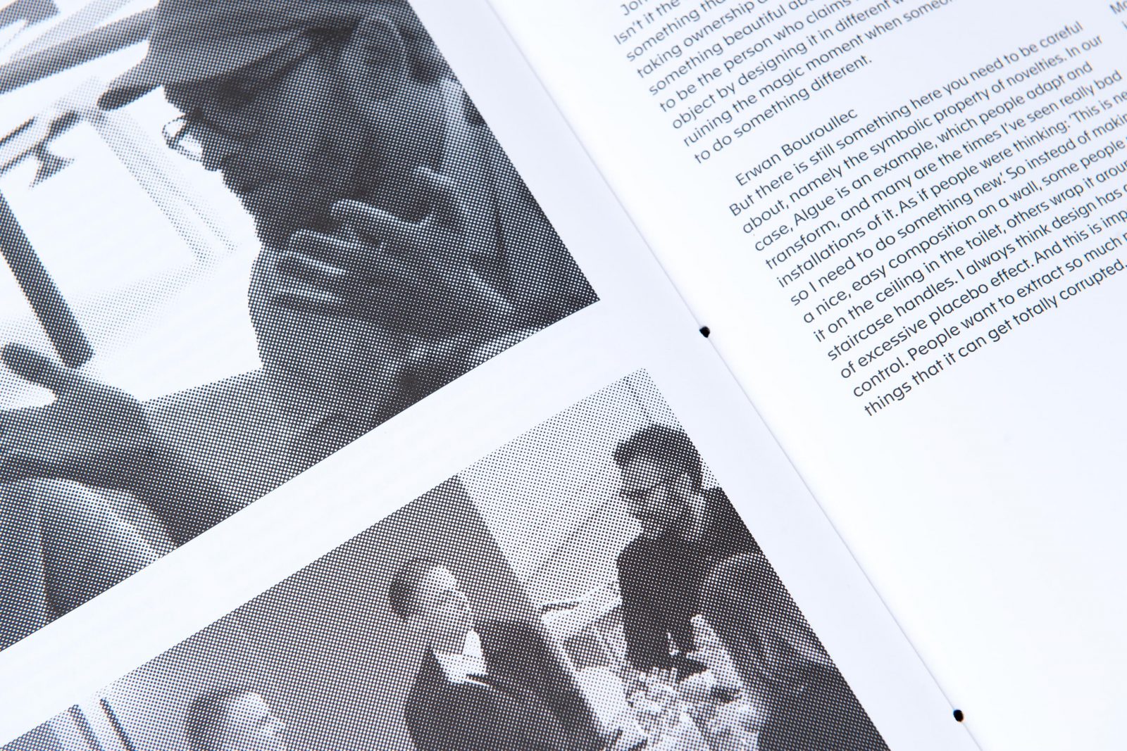
Alongside the transcription of debates on design relevant issues including Konstantin Grcic, Hella Jongerius and the Bouroullecs, the catalog includes Q&As with quotes by writers, designers, and artists such as Simon Denny and Jasper Morrison.
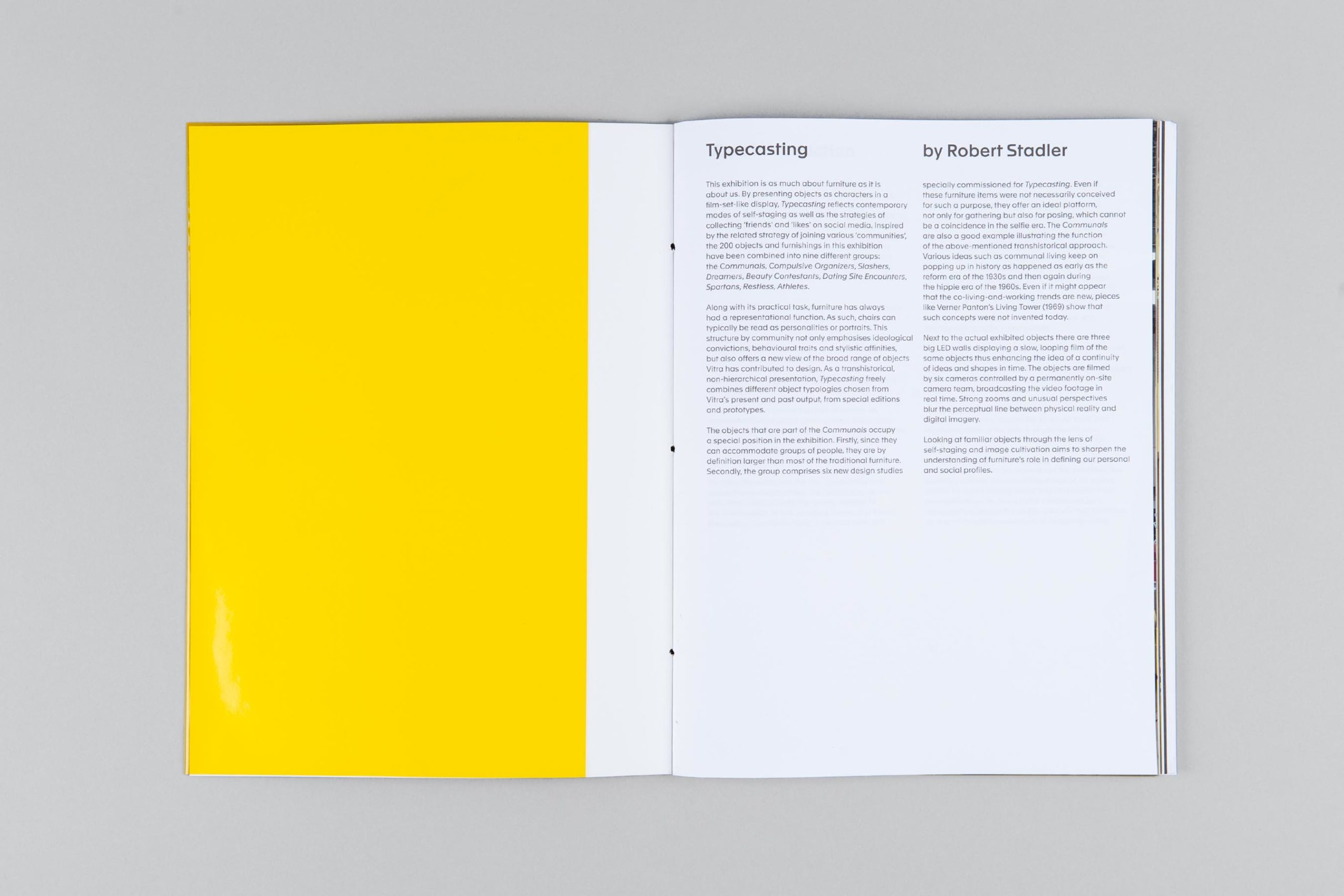
We chose a combination of rough, uncoated paper for texts and smooth matte-coated paper for high quality reproductions. The contrasting materiality echos Typecasting’s dualities and contradictions: the retinal and the intellectual, the rough and the smooth and chapters such as Slashers and Spartans. The papers are certified to the strictest environmental standards.
.
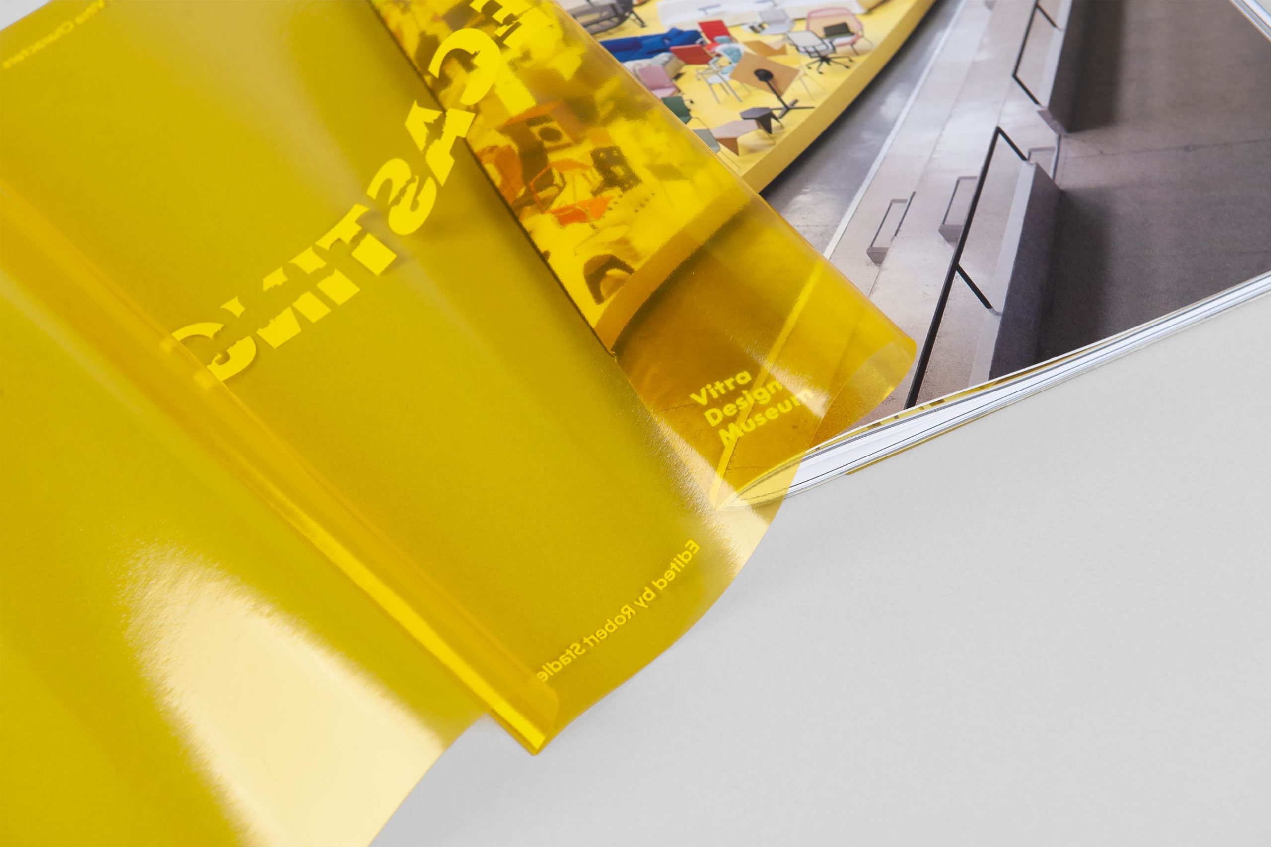
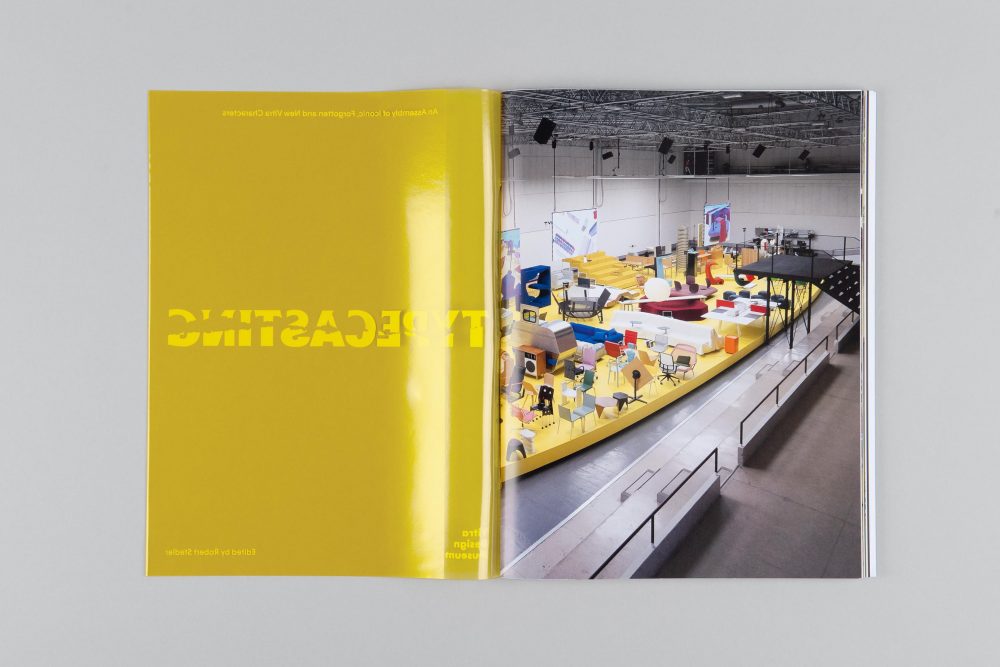
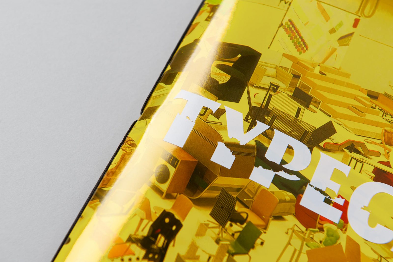
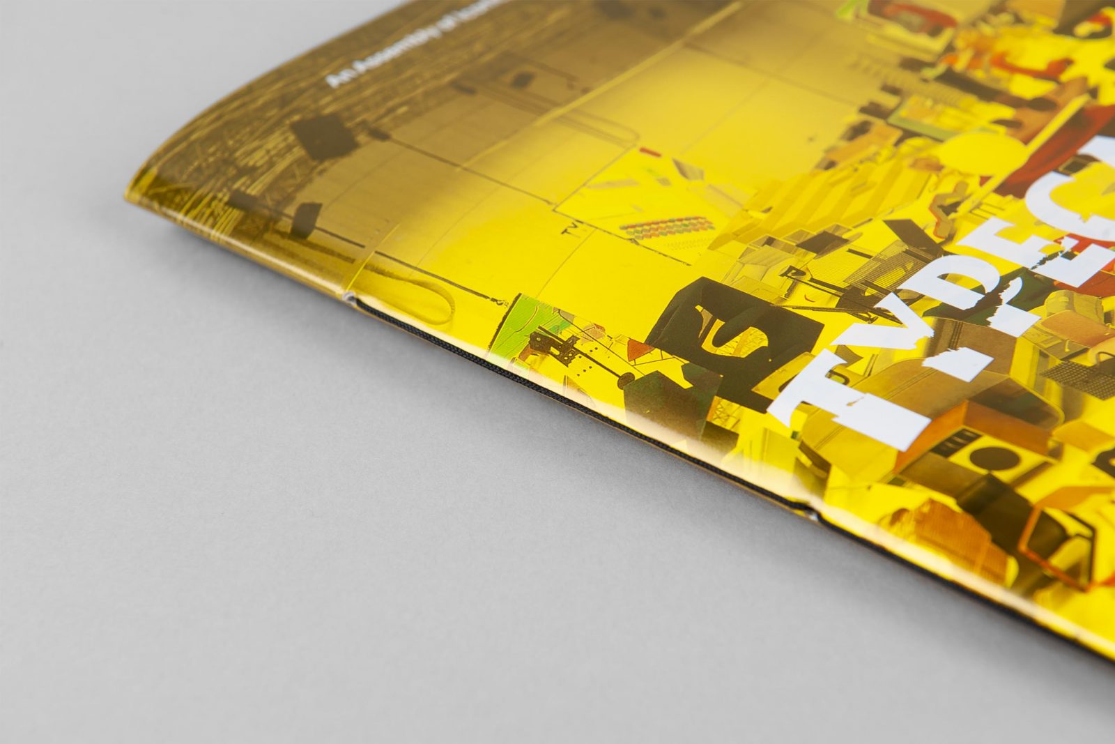
The publication design is impressive, with a beautiful bright yellow transparent PVC dust jacket echoing the main color of the exhibition’s central stage. While the contrasting materiality of Typecasting’s dualities and contradictions are reflected in the smooth matte-coated 300gsm and 115gsm GardaMatt Art, chosen for the cover and inside image pages, and rough, uncoated 80gsm and 130gsm Munken Polar for the text pages – both qualities exclusive available by Europapier.
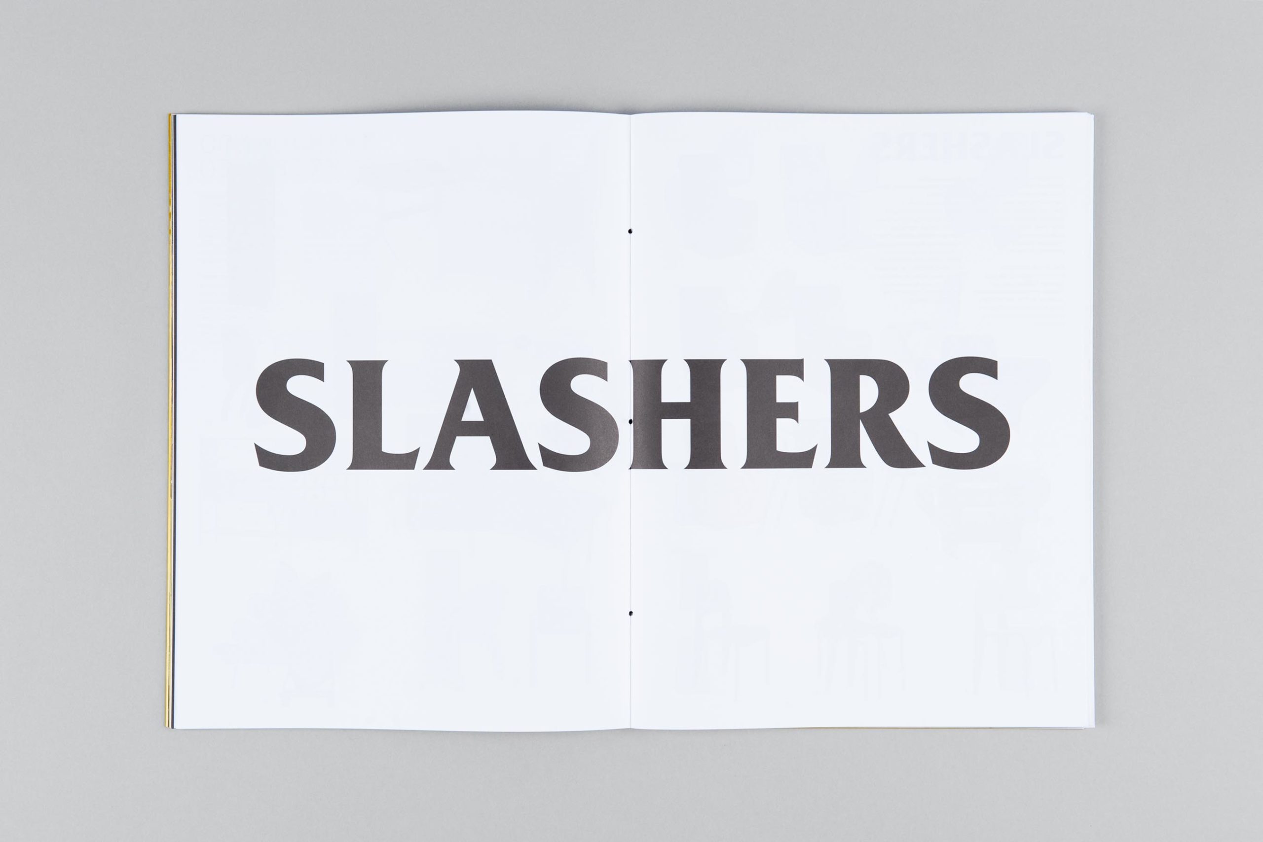
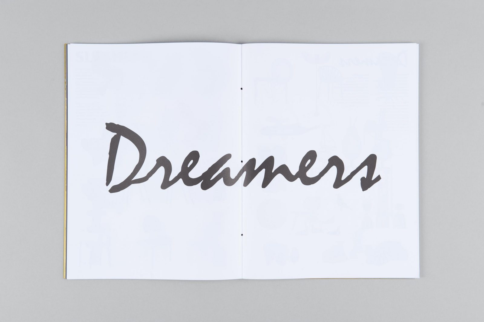
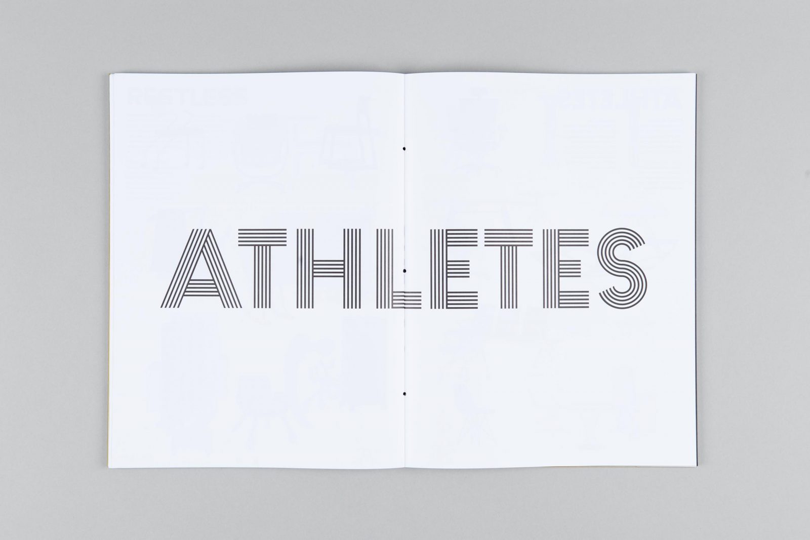
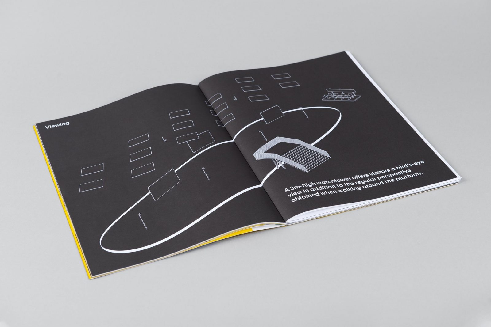
The catalog is bound in a single, hand-sewn, signature gathering with a collection of floor plans that locate the characters “on stage’”, video stills taken with hand-controlled cameras and introductions to the concept of the nine groups through playful typography, as each group is given a typeface that reflects its character.
© Zak Group

