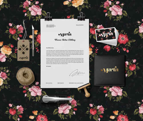
A 25-year old graphic designer Dawid Cmok from Zabrze Poland is responsible for the new visual identity of the urban women’s clothing store MARTA. He created a distinctive visual identity for the clothing store & tailor based on a functional and minimalist design that would easily be recognized and still be distinguished among other such brands in the world.
Dawid Cmok has an impressively long list of clients under his belt considering his young age. He is known as a versatile designer who does not restrict himself, as he freely tampers with digital art, photo manipulation and typography. Also a talented graffiti artist who gets his inspiration from his surroundings, Cmok is a man of many talents, which this flowery brand identity proves once and for all.
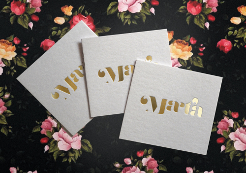
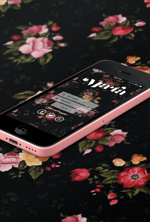
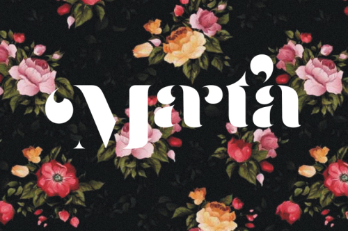
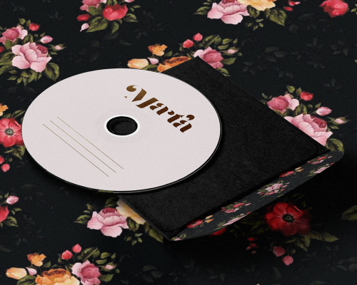
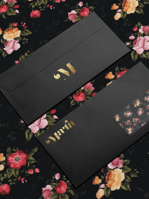
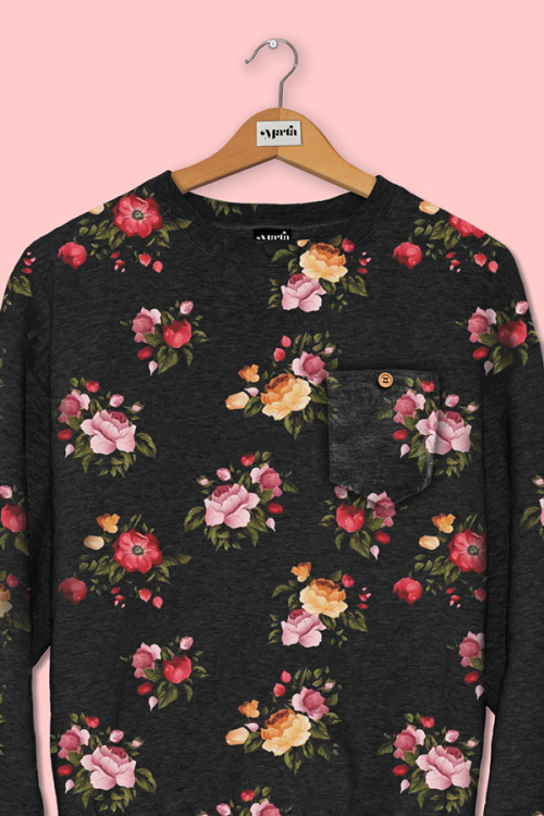
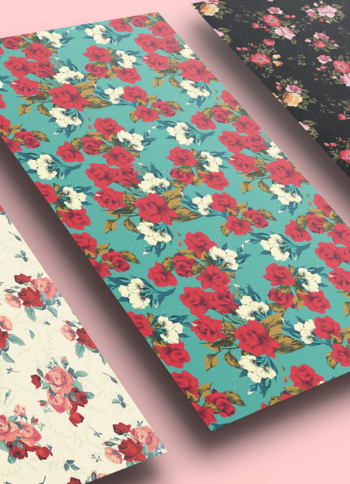
 MARTA brand identity is a celebration of tradition, quality and classic design which are combined in the flora patterns, earthy tones and quality paper choices. The unique, tailored typography can be seen in the logo that is carried through the range of production. Mixing shiny and matt with pattern and cardboard a whole new style is achieved. The flower pattern makes the design memorable and is both classic and trendy at the same time, just like the typography.
The elements of branding identity Cmok created: logotype variants, letterheads, envelopes, visiting cards, folders, patterns, identity book and accessories. The range of paper varieties used is great. Matt black, shiny white, rustic cardboard and wrapping paper mixed flower pattern, finished with stamping and other printing techniques. The whole identity shows great skill of understanding the over-all look and feel of the brand, and hopefully will represent MARTA for years to come.








 Photos via Dawid Cmok

