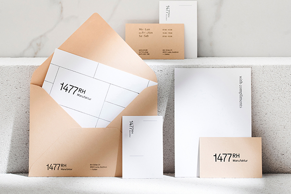
German-born, Graz-based award-winning graphic designer Saskia Schmidt creates stellar branding concepts and editorial design for small and large clients. With over ten years of experience, Schmidt always aims to push the boundaries and help her clients to shine. With a great sense of figuring out a fresh take on each task, her work ranges from illustration to packaging and more. Sharp details and imaginative and compelling visual identities are the creative’s strong suit, as Schmidt’s portfolio is full of wonderful projects – yet one recent one stuck out to us the most.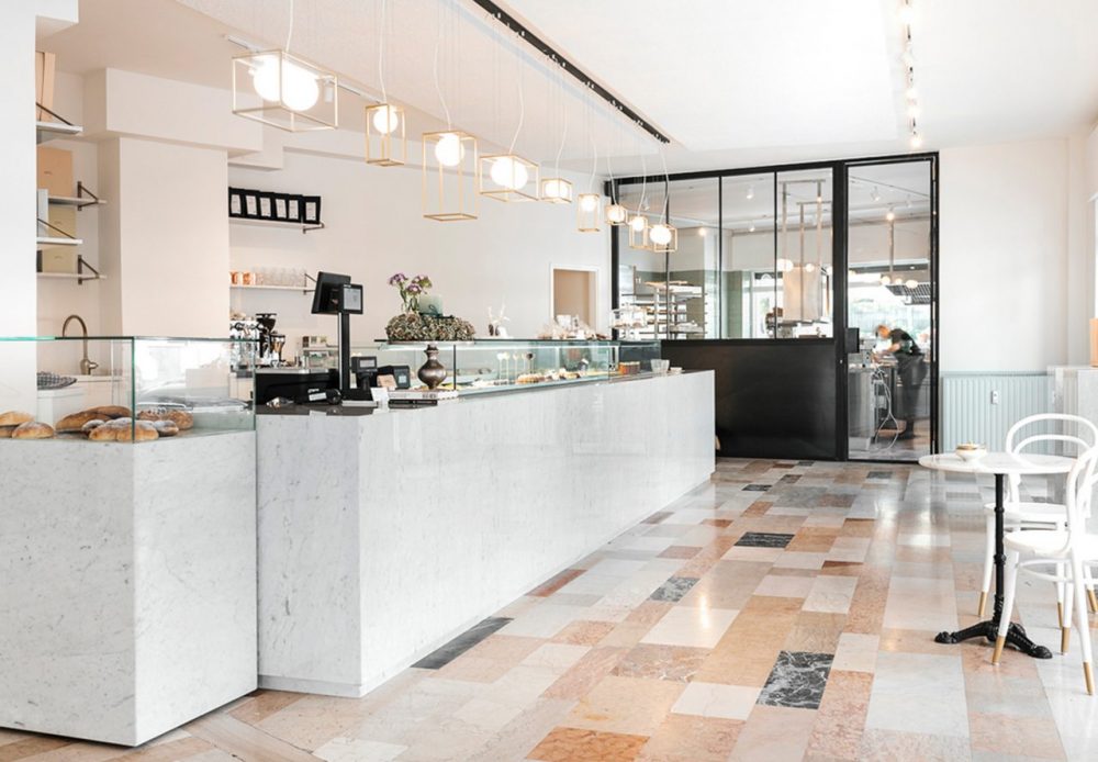
Uniquely flagged marble floor design became the inspiration and base for the corporate identity by Saskia Schmidt and Christian Perner
A colorful Gries neighborhood, in a small village called Lana in Tirol, is the setting where a tiny delicatessen named 1477RH has opened its doors recently. With much passion and effort going into renewing and renovating the restaurant space, from new tiles to countertops, the new establishment deserved an equally well-designed visual identity. Which was left in the hands of two Austrian designers, Saskia Schmidt and Christian Perner.
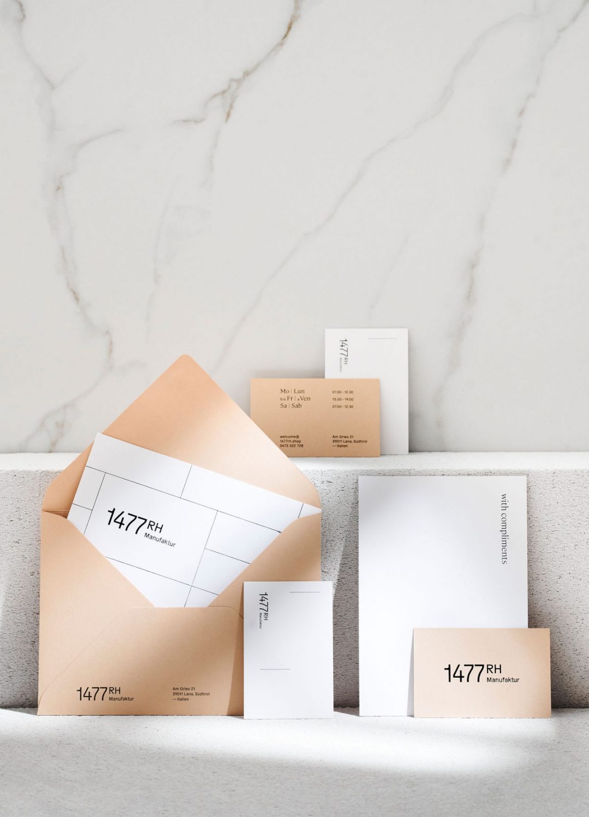
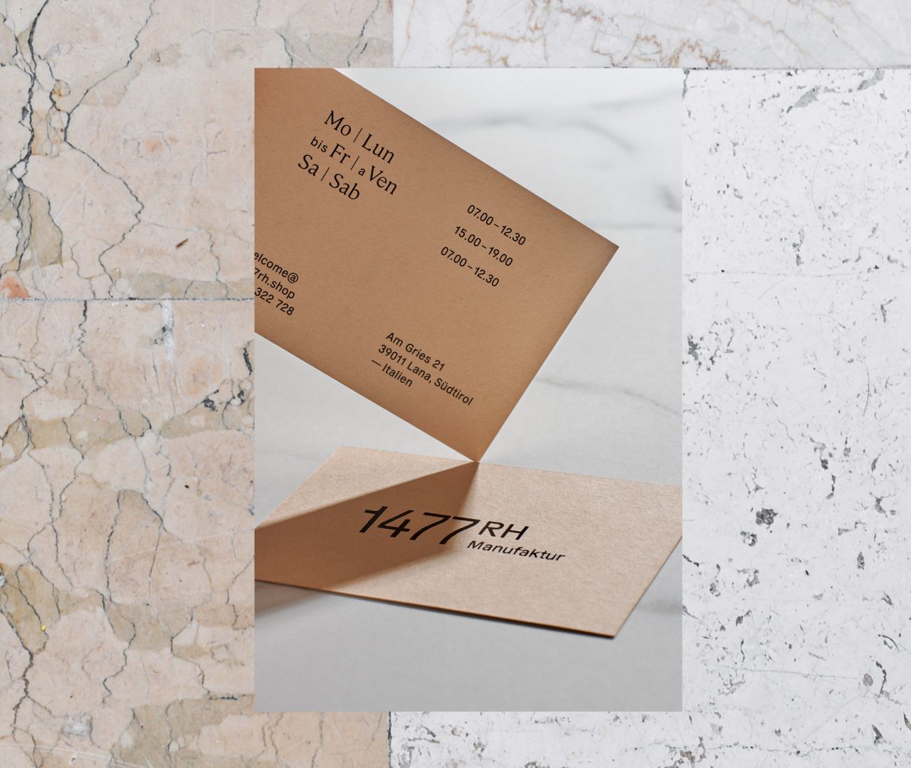
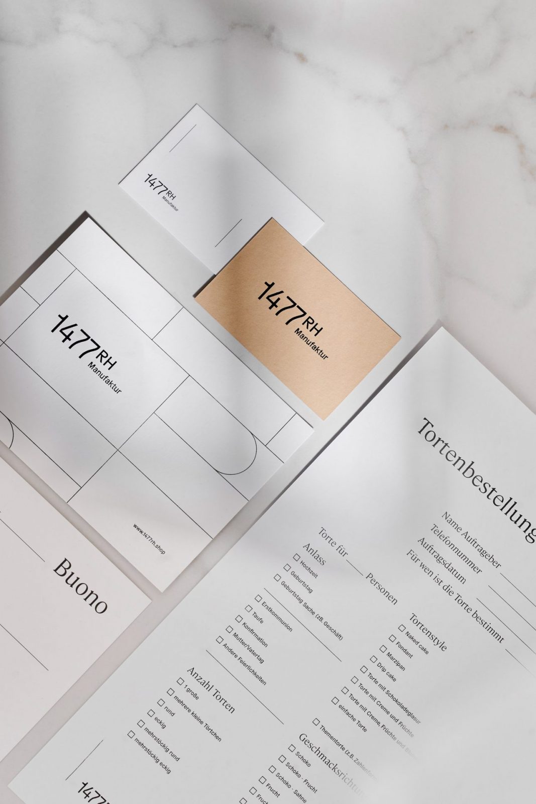
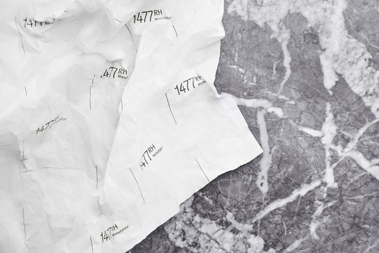
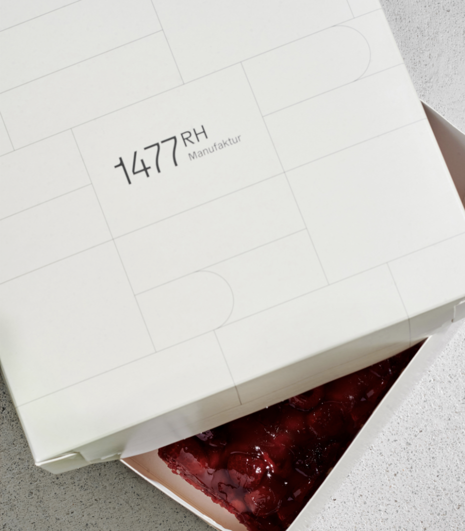
In the renovation, the only thing left untouched in the space was the stunning tiled, marble floors, which became the inspiration and base for the corporate identity. The unique floor is the focal point in both the physical space, as well as the brand’s visual representation, with the flagged floor pattern being replicated throughout the design. Keywords such as beautiful, reduced, and experience further served as a starting point for the design, which was carried out with precision and attention to.
The unique floor is the focal point in both the physical space, as well as the brand’s visual representation, with the flagged floor pattern being replicated throughout the design.
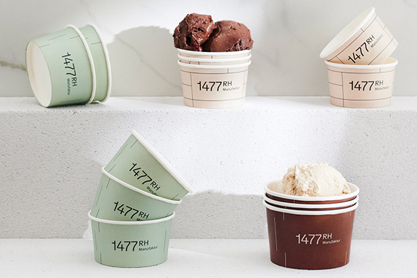
When strolling through the lively Lana village, the minimalistic design of 1477RH offers a welcome contrast to the surrounding picturesque backdrop. This taste for minimalism also sets the stage for the high-end products that are offered at the eatery.
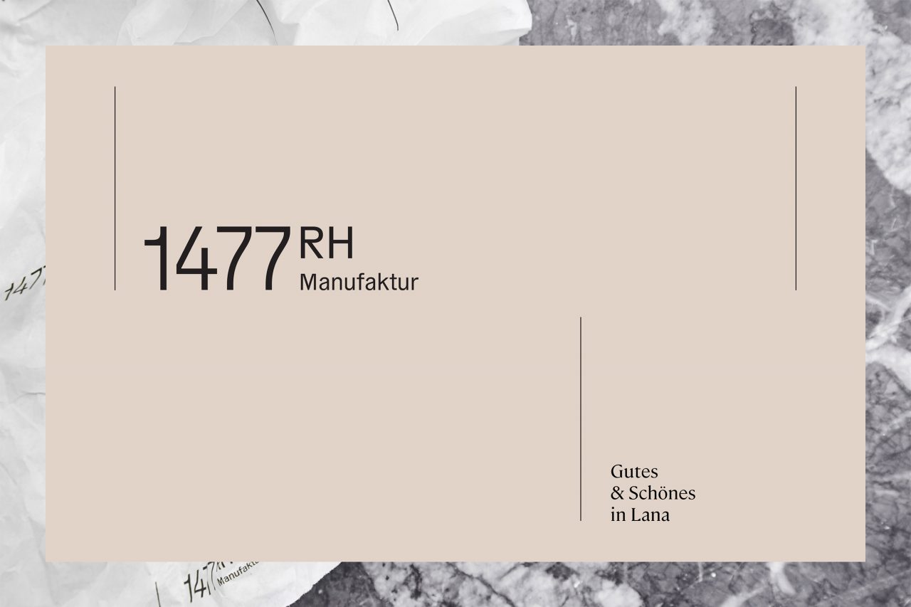
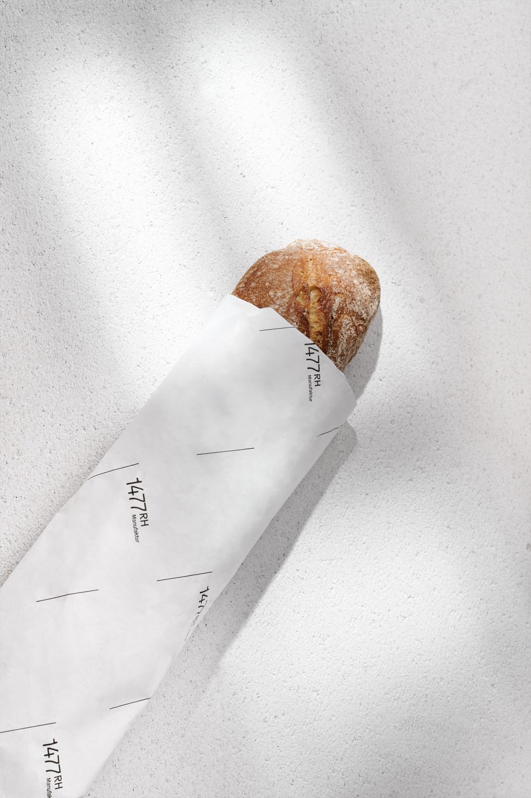
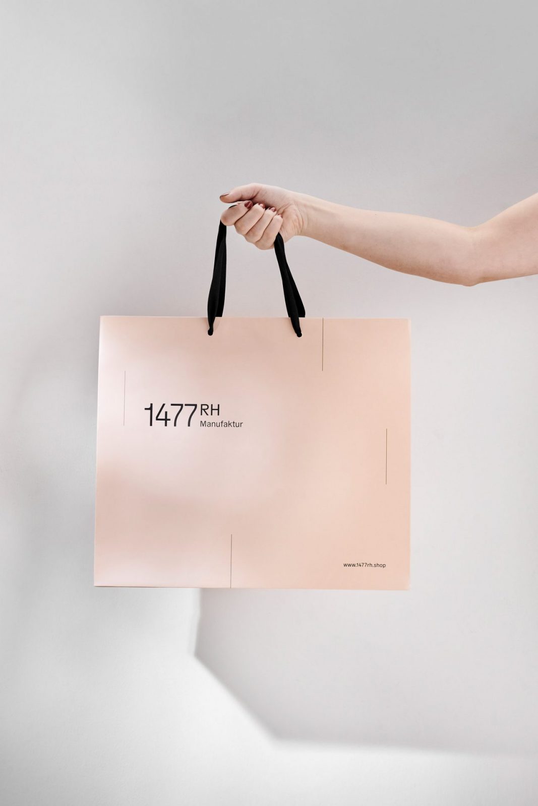
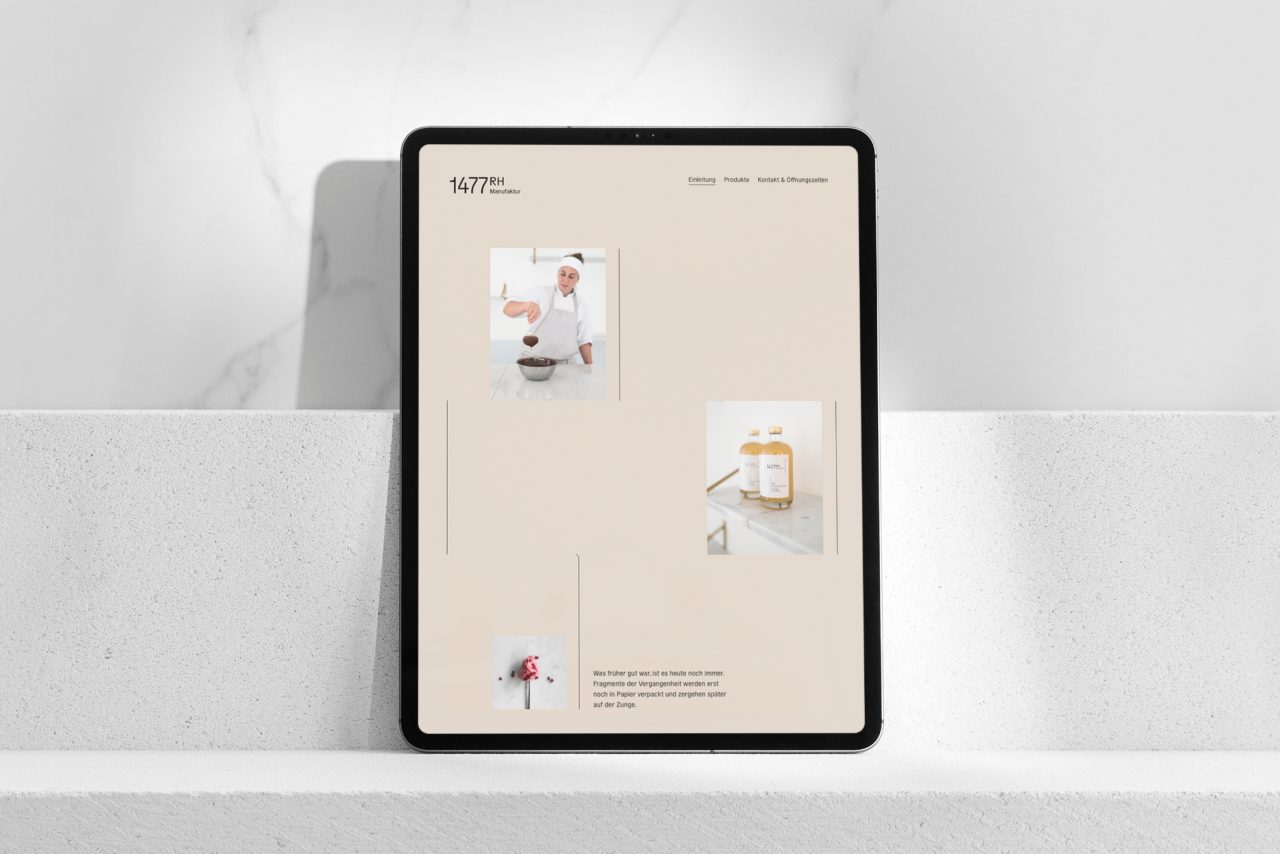
The contemporary interior is mirrored in the identity, from packaging to business cards, and the website. Additionally, the letters “R” and “H” can be spotted in the illustrated line pattern, which replicates throughout the concept. Only earthy, muted colors are used scarcely, while elegantly pure and reduced typography sub line the understated appearance. All in all, the very subtle, minimal design feels timeless and modern simultaneously.

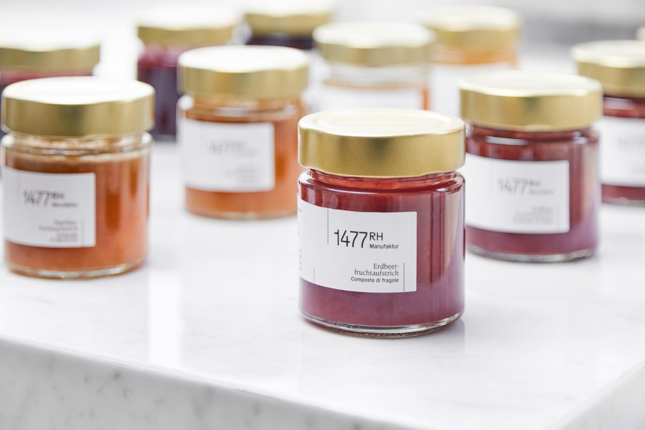

Art Direction & Design – Christian Perner & Saskia Schmidt
Concept & Strategy – Karin Novozamsky
UI / UX & Development – Elias Tinchon
Text – Katharina Zimmermann
Portfolio Photography – Valerie Maltseva
Photography – 1477 Reichhalter

