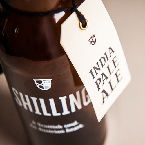
With a Scottish soul and an Austrian heart, Uli Bacher made his life dream come true in the form of his own Shilling Brewery. Beginning with a line of three unique beers that are based on international recipes, Uli created a standard of quality and taste that any beer drinker can appreciate. Moodley Brand Identity knew they had a task on their hands to create a look that matches the taste, in which they cleverly succeeded in, once again.
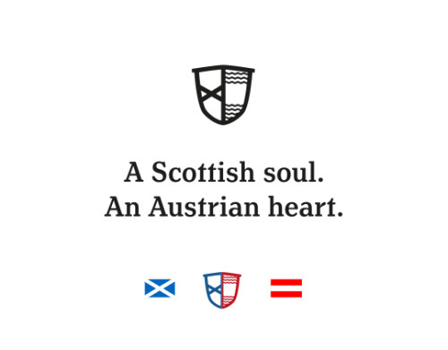
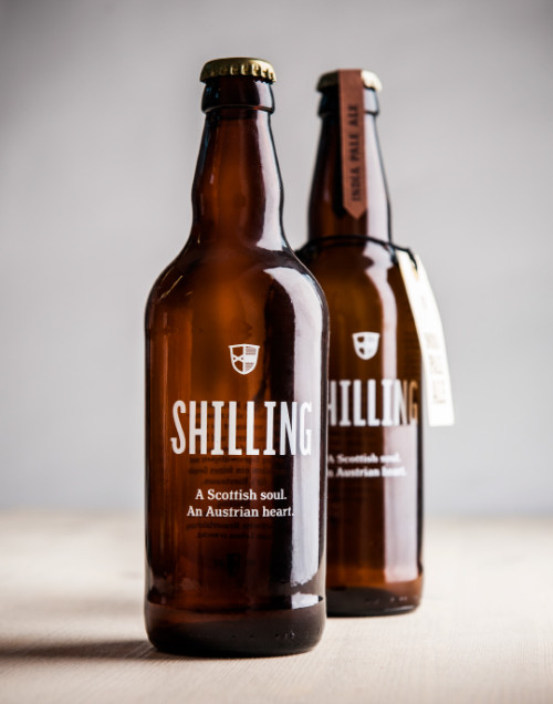
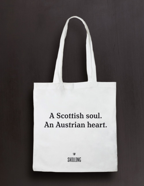
Uli Bacher, avid beer enthusiasts and traveler decided to fulfill a life long dream of his own brewery last summer by starting up and brewing three types of “shillings”. Situated in the mids of the Kärntner Nockbergen of Austria, the inspiration for the flavors came from all over the world, especially from Scotland. With a slogan – A Scottish soul. An Austrian heart – Shilling describes how the two nations with extensive knowledge and long brewing history are combined to create the best product possible.
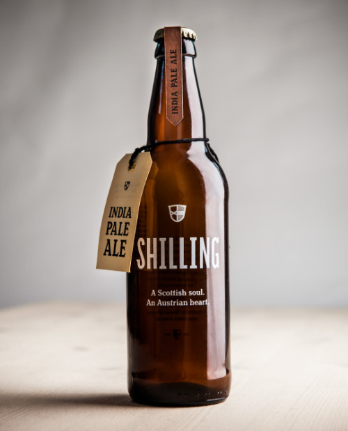
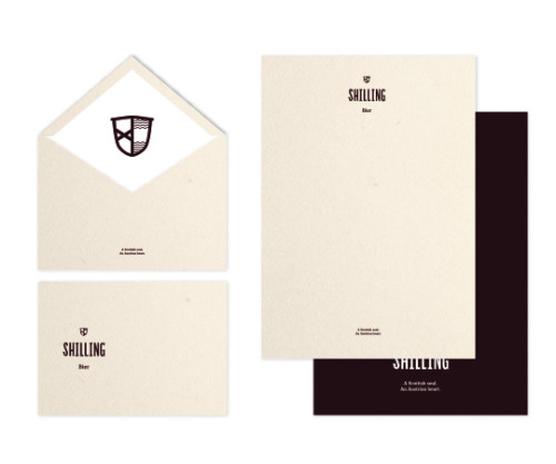
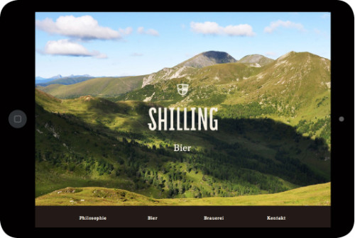
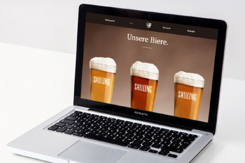
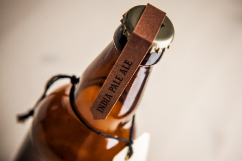
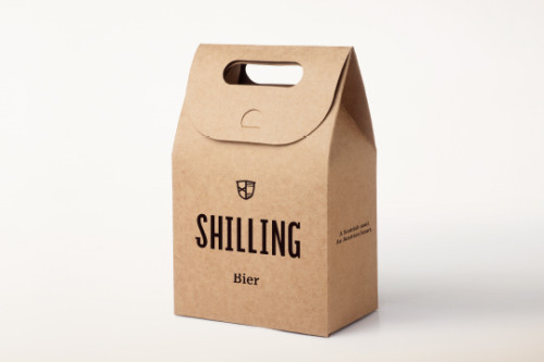
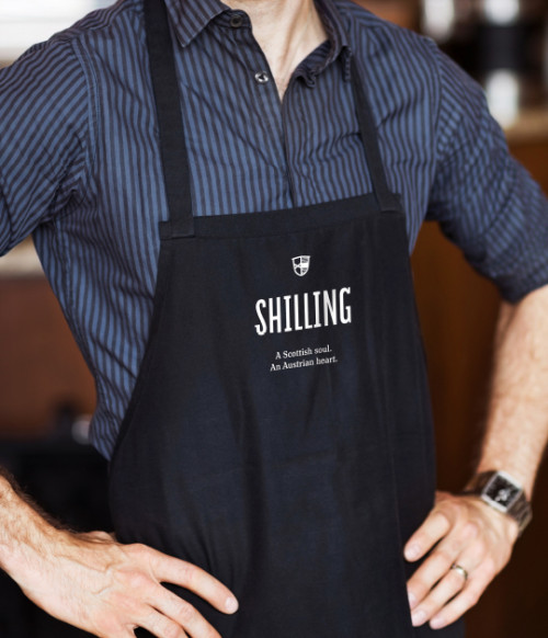
The infamous Graz based design powerhouse Moodley Brand Identity developed an appealing corporate design, suitable packaging, and a website for Shilling to match the look to the taste. Keeping the look minimal, they combined unique typography with high-quality materials and photography. No disruptive patterns, ornaments or decorations are needed when the quality of the product is highlighted. A clever idea of combining the flags of Austria and Scotland, creating a unique coat-of-arms for Shilling Brewery, embodying the prestige and origin of the beer. Also showing the scenery and rugged mountain region where the beer is made creates an appealing backstory, bringing the product closer to the user. I, one for sure, can’t wait to taste this golden nectar.





Client: Shilling Bier – Uli Bacher
Creative Direction: Mike Fuisz
Art Direction: Wolfgang Niederl, Kurt Glänzer
Graphic Design: Marie Zieger
Text: Matthias Alber, Andreas Leitner
Project Managament: Kristina Baudisch, Jasmin Gottfried
Programming: Caihui Yang

