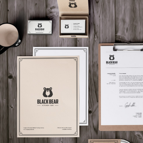
Native Bulgarian Nuray Nuri is a freelance graphic designer and digital illustrator specializing in logo and web design. One of his latest projects was to design a new visual identity and web presence for Black Bear Brewery Bar & Kitchen. See how two-tone logo and strong typography combined with vintage boarding create an interesting, retro feel.
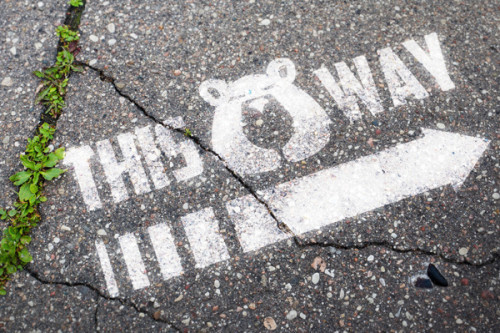
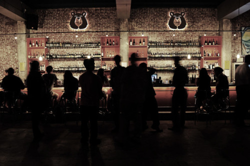
The chosen image and color of a black bear for the ideogram (logo, sign, icon) is obvious considering the name of the brewery and it is the focus point of the whole design product range from stationery and menus to interior and clothing. The minimal scope of colors, black, white and beige is smart for a timeless design. The contrast between the strong logo and typography with the vintage style boarding on the letterheads and business cards is an unlikely combo but it somehow works, creating an interesting Whole with a vintage feel.
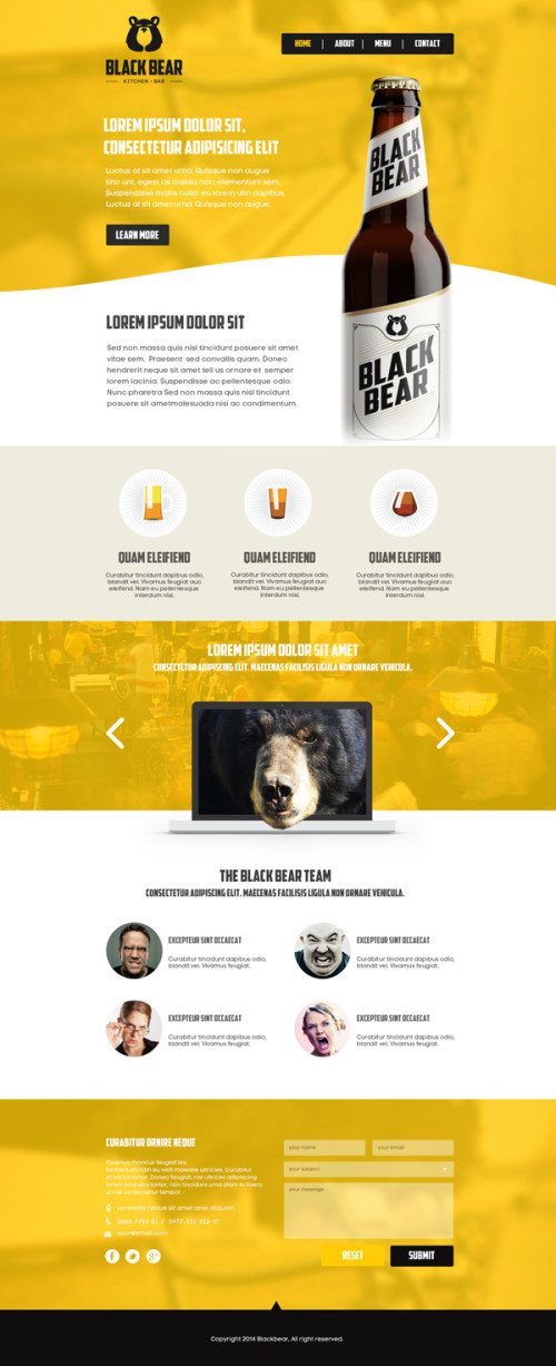
The paper products differ slightly from the online presence, being more minimal and classic, fitting for the Black bear brewery image, compared to the brighter, colourful and more modern website design. But considering the two are used in different ways: the stationery is for the bar and the website to promote and advertise the brewery product, it might be a smart decision to divide the two. All in all the overall look is classically stylish, and definitely makes me want to pop in for a burger and a beer!
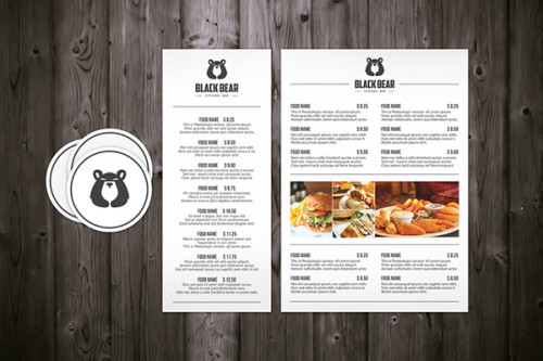
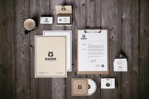
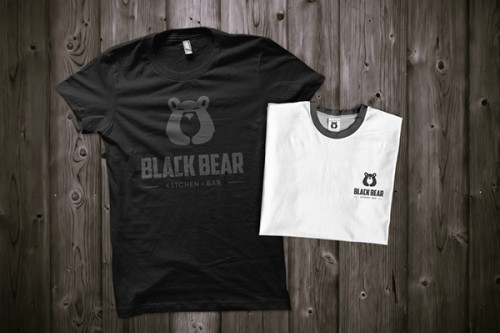
Photos via Nuray Nuri

