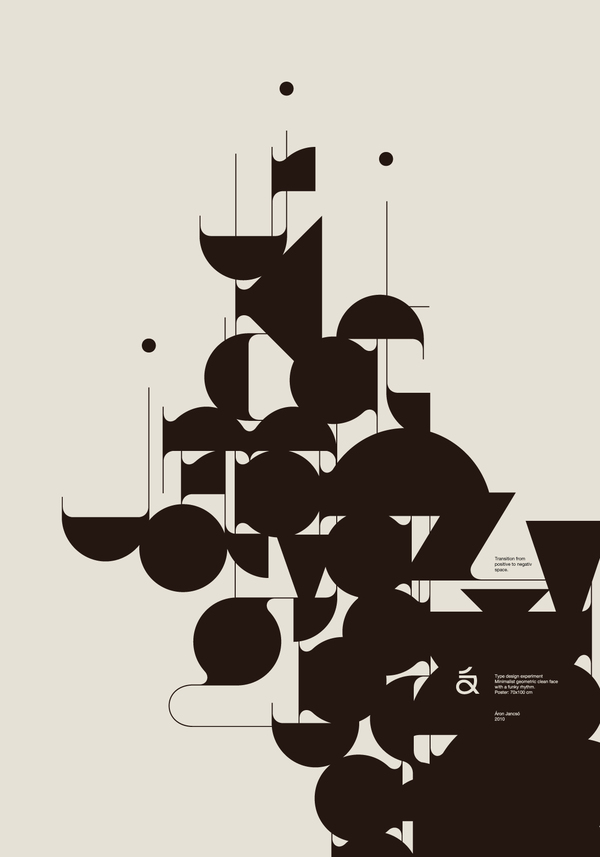
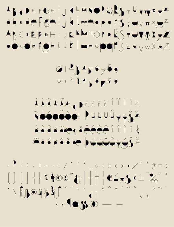
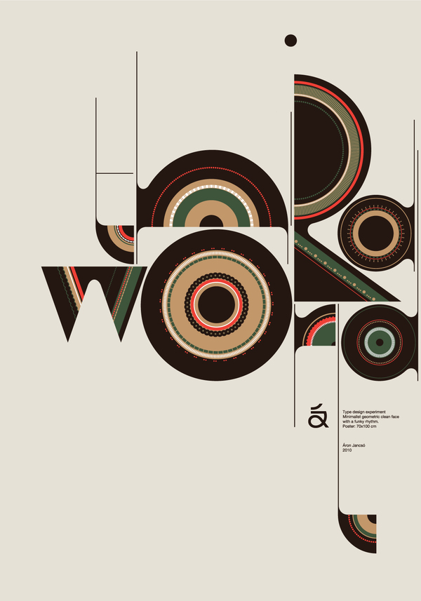
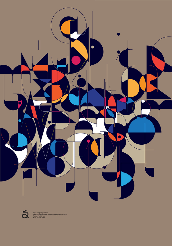
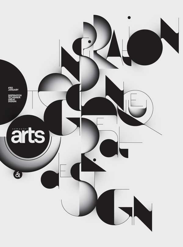
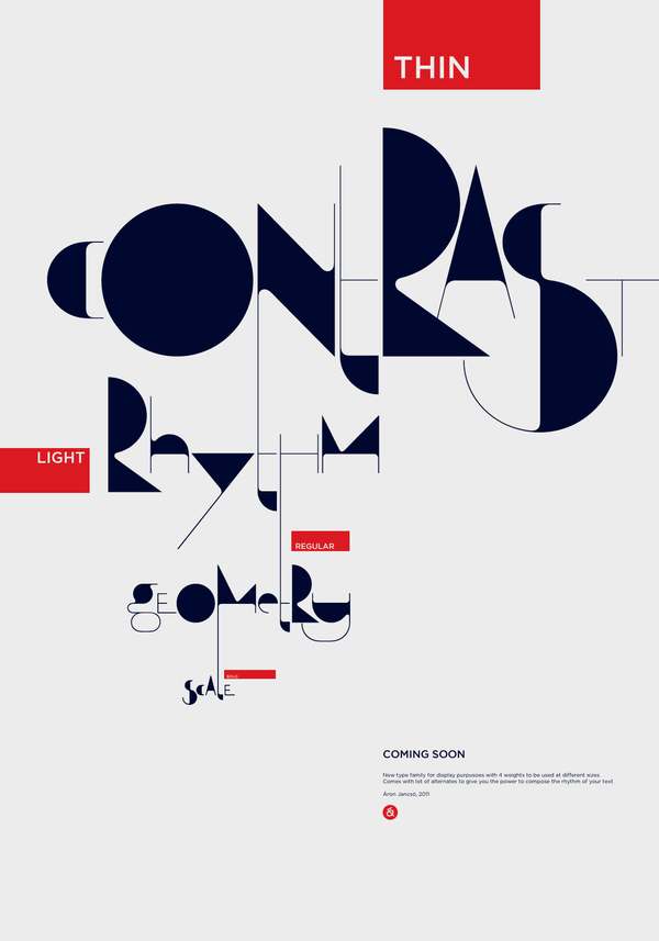
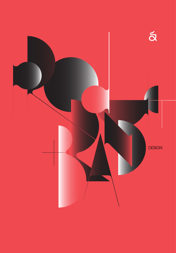
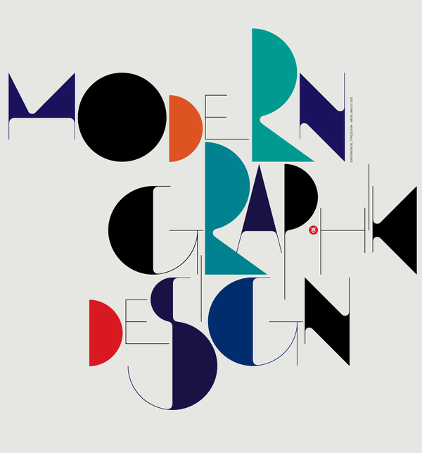
Áron Jancsó, Hungarian graphic designer and self-titled type addict creates typefaces inspired by modernism, street culture, and calligraphy. One of his latest projects, Qalto typeface is a contemporary design with a hint of the olden days, full of contrast and fun shapes.
Qalto flows and leaps like freestyle jazz. The over exaggerated forms and extremely thin lines create an eye-catching contrast, perfect for titles, headlines, posters, and logos. This high contrast conveys a stunning visual effect and a unique optical rhythm. Weather in black and white or combined with colors and textures, Qalto definitely aims to impress.
Áron Jancsó realized that some words have good rhythm and others don’t, and added stylistic alternatives for every lowercase and uppercase letter. If that’s not enough, there are four different weights, so users can choose from different sizes with the same hairline thickness, which allows for artistic freedom in arrangement and composition.
You can buy or try it at Gestalten Fonts.
