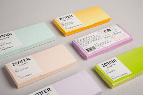
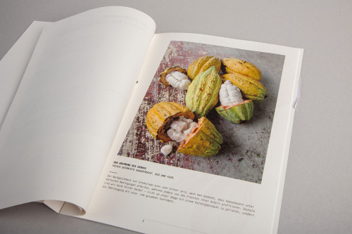
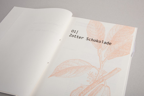
Dornbirn based designers Bernhard Hafele & Christine Fritsch designed an inspiring, though fictional re-branding for the Austrian chocolate manufactory called Zotter, based on the idea that chocolate is the medicine for our everyday life problems. A Zotter a day keeps the doctor away!
The designer’s aim was to create a new, coherent and authentic visualization of the brand identity for the renowned Zotter chocolate. As the Chocolatier Josef Zotter combines high quality and innovation in his creations, resulting in sustainable and fair production and product, Hafele and Fritsch followed the same guidelines resulting in a beautiful product range.
Their idea of holding chocolate as the key to daily life’s struggles is brilliant. So many obstacles or small problems in our lives can be fixed with a tiny dose of happiness, wrapped in a beautiful package. Not everything needs medical attention, but a tiny taste of some chocolate goods elevates the mind, let’s you forget your worries and even prevents some actual illnesses. All is all is good for the mind and for the soul.
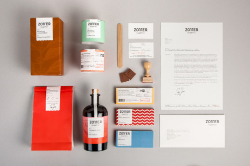
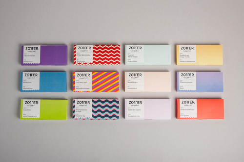
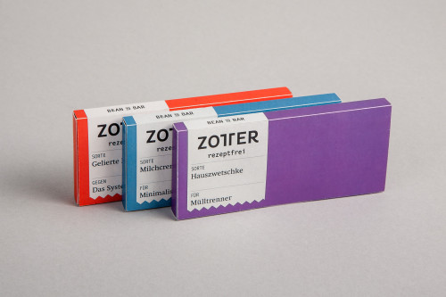
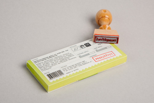
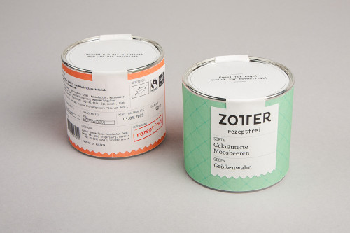
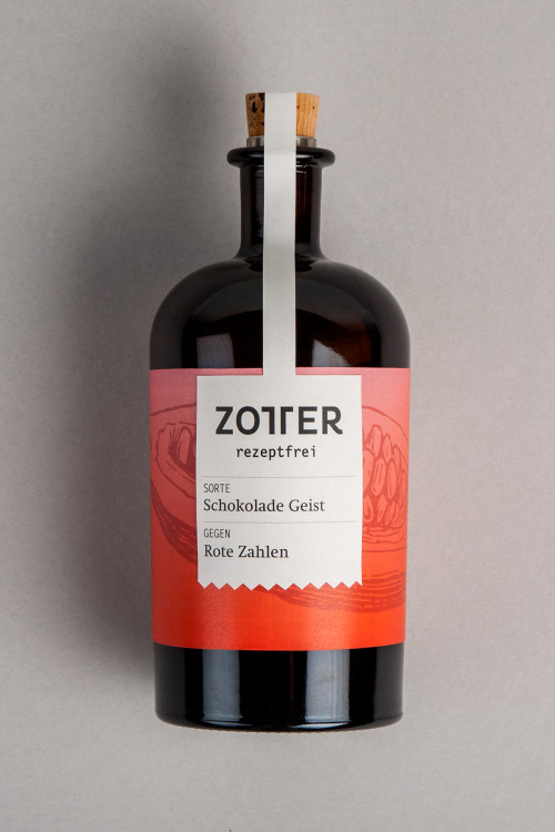
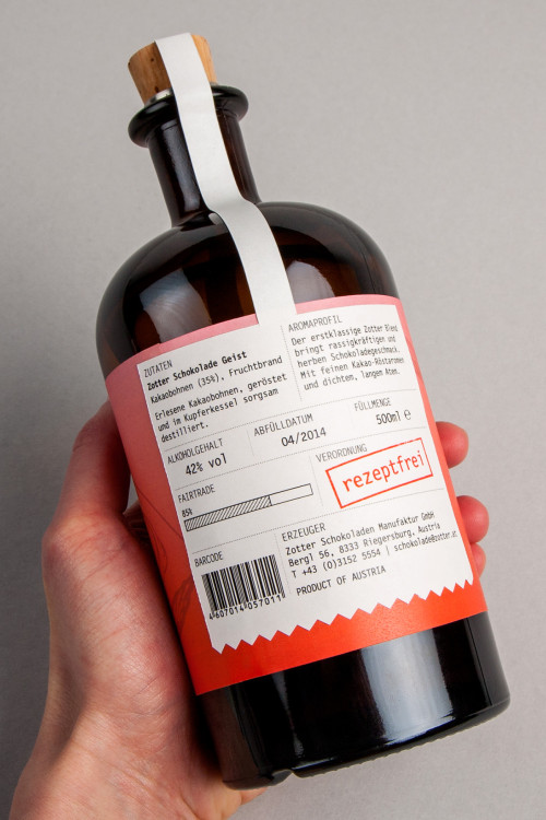
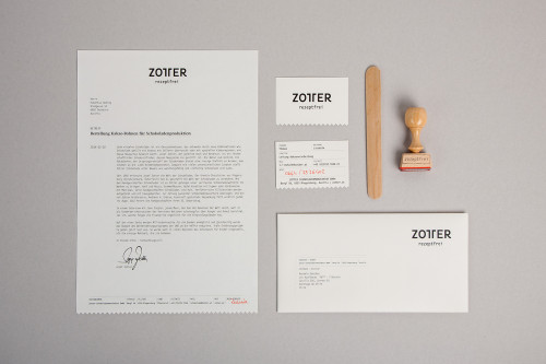
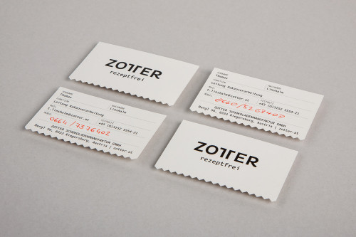
There is separate chocolates for different illnesses and neuroses of today’s society. The respective chocolate is thus “FOR” or “AGAINST” one of those ironic sufferings and provides relief for the needed situation. The idea is absolutely brilliant and designs undeniably beautiful. The chosen range of geometric patterns and pastel colors are like candy to the eye, with special attention given to the typography. The same materials such as stickers and stamps were utilized, just like in the real medicine business. The new Zotter logo is simple and clever, as well as the receipt like business cards. And so was born: Zotter Rezeptfrei
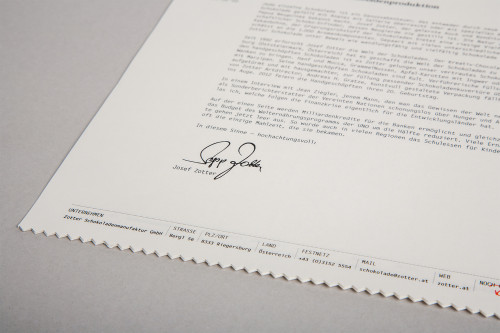 Images via Bernhard Hafele

