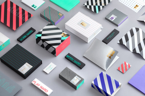
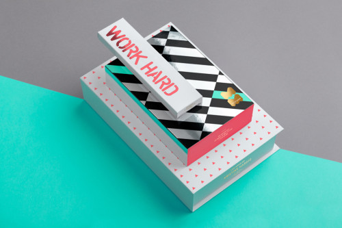
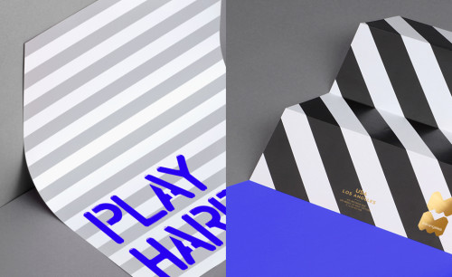
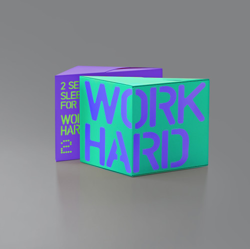
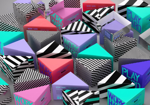
One of the most renown design agencies of Ukraine, Reynolds & Reyner hold an incredibly long list of international clients, the latest being a modern and stylish lingerie brand from Los Angeles – POMPOM. Together with fashion designers, Reynold & Reyner designed an interesting branding concept based on the two-part packaging, encasing two pieces of underwear, one for work and one for play, hence the slogan: Work Hard, Play Hard!
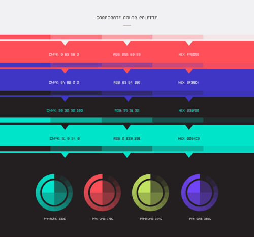
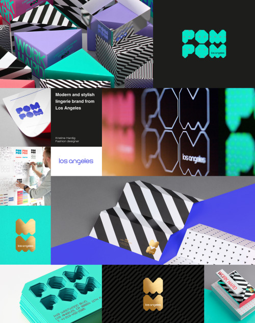
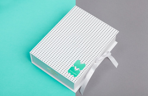
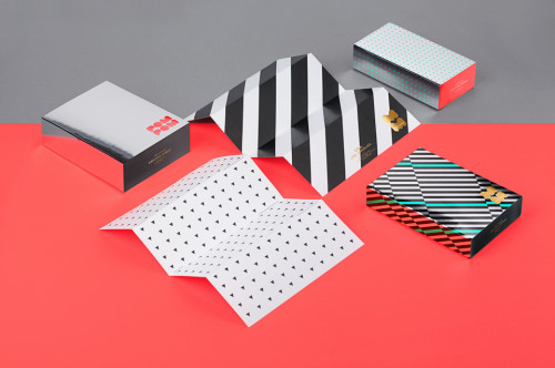
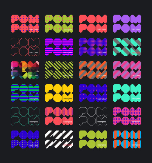
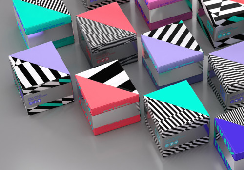
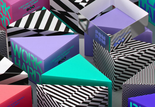
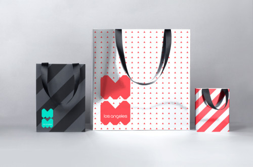
In each POMPOM set, there are two kinds of panties packed in individual boxes that resemble diagonally-cut cubes in shape. First being more comfortable and simple, for everyday use at work or fitness sessions, while the second box offers a more creative and interesting lingerie type for evenings and nights, parties and leisure. The 2-piece set is read not only in the packaging and the brand name but also in the brand’s slogan “Work hard, play hard”, a motto I personally like to live by. The fun, carefree, yet structured attitude of the brand comes across by the bold patterns and contrast of colors. Nothing is trying to be hidden or discreet like traditional in the lingerie world, POMPOM offers a different approach, certainly appreciated by many.
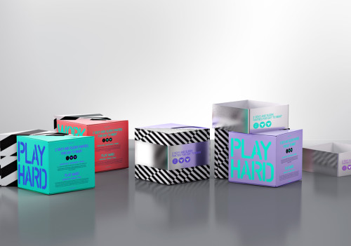
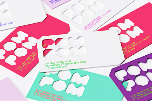
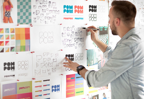
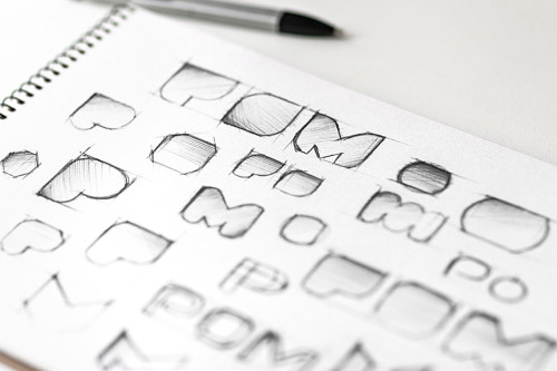
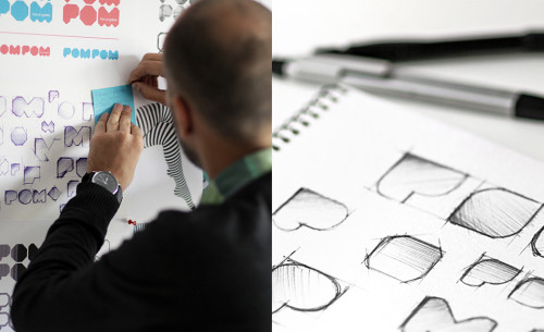
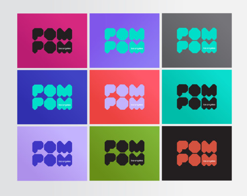
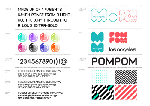
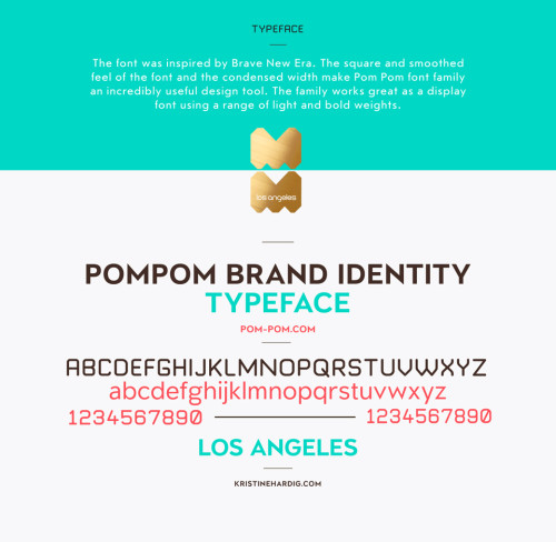
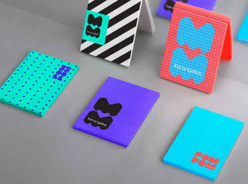
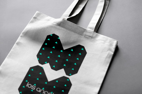
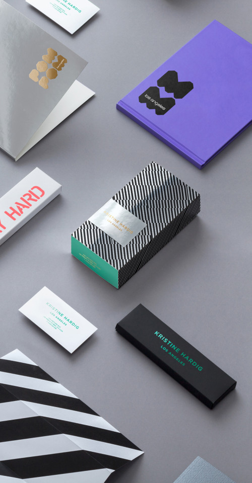
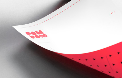
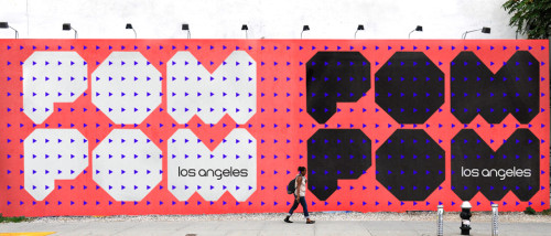
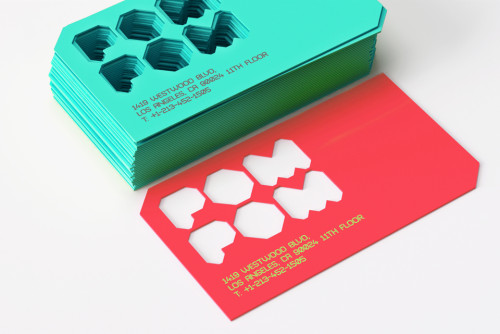
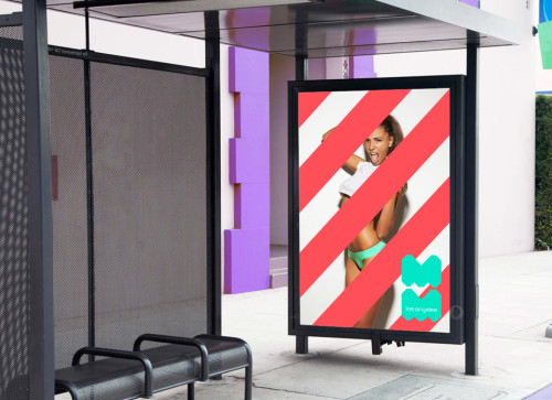
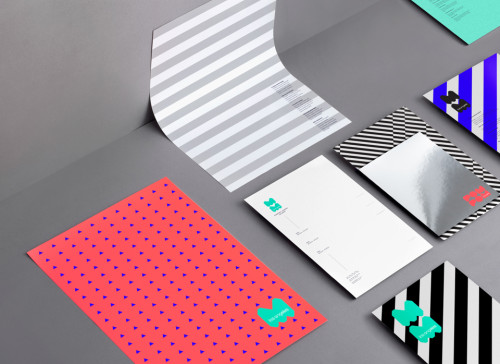
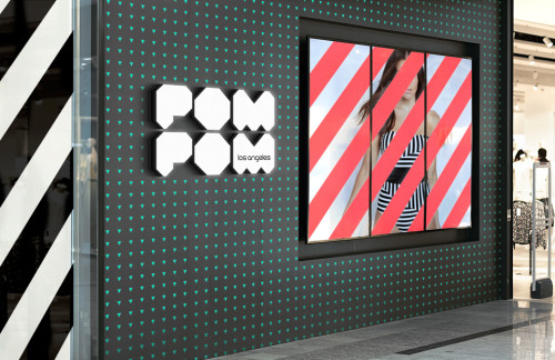
The word “POM POM” means “a bob on a hat” in English. This term is also used by Americans to describe objects that cheerleaders hold and cheer with during sporting events, such as basketball or American football matches. The name POMPOM perfectly represents the idea of lightness and happiness shown by these girls and a dual brand name refers to the idea of combining the two types of lingerie in a single set. The unique typeface that was created exclusively for the brand has the same playful youthfulness as the brand name itself. Perfectly suitable for cutouts, the simplicity of the logo is also deployed in the business cards and other packaging material.
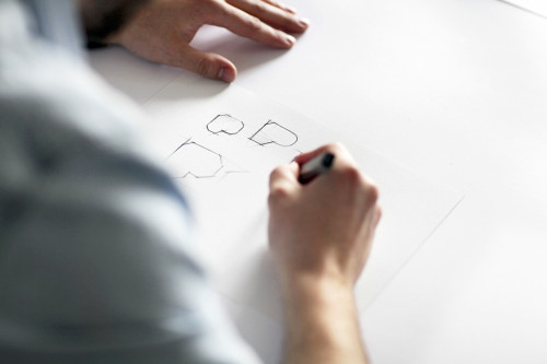
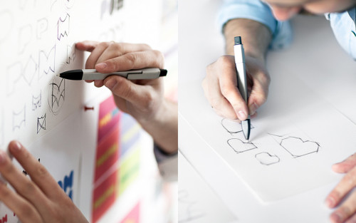
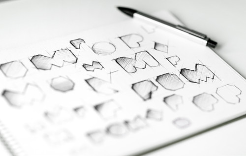
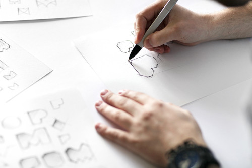
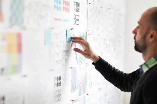
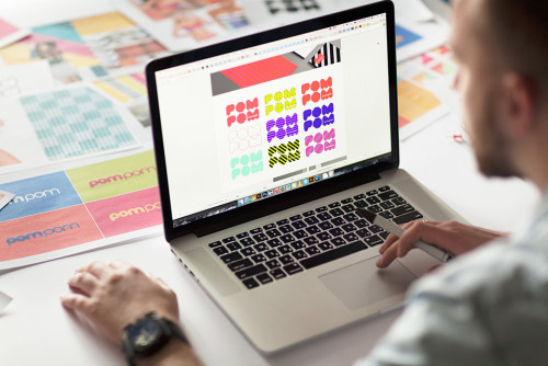
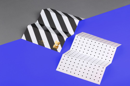
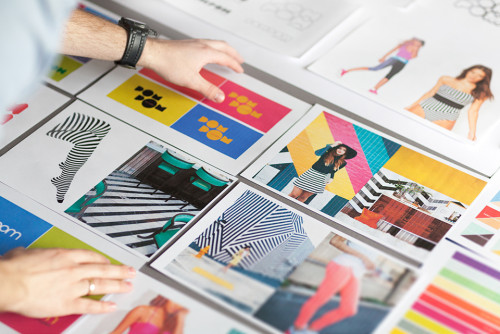
The whole branding is so sweet and full of colors, patterns and intriguing material and production choices that it’s any design enthusiasts dream. See what went into the whole design process and how the final product line was reached in the photos below. It’s a great example of how cohesive and quality branding and packaging is achieved.



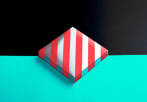
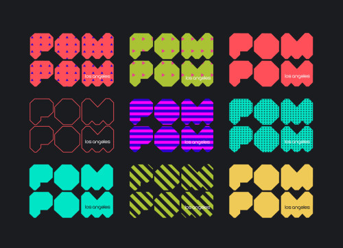
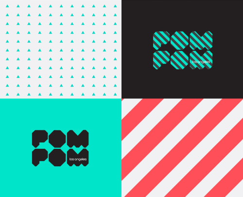
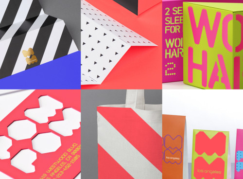


Photos via Reynolds & Reyner

