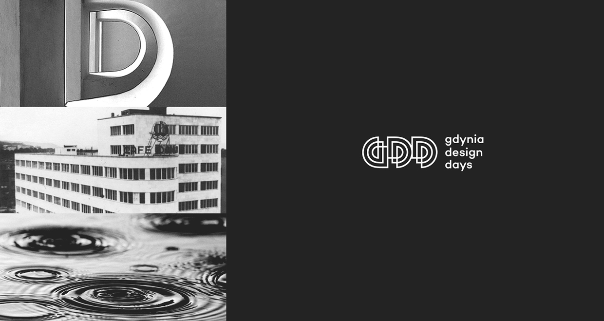
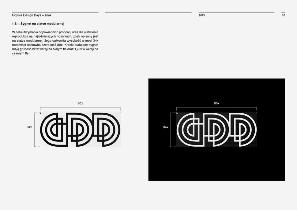
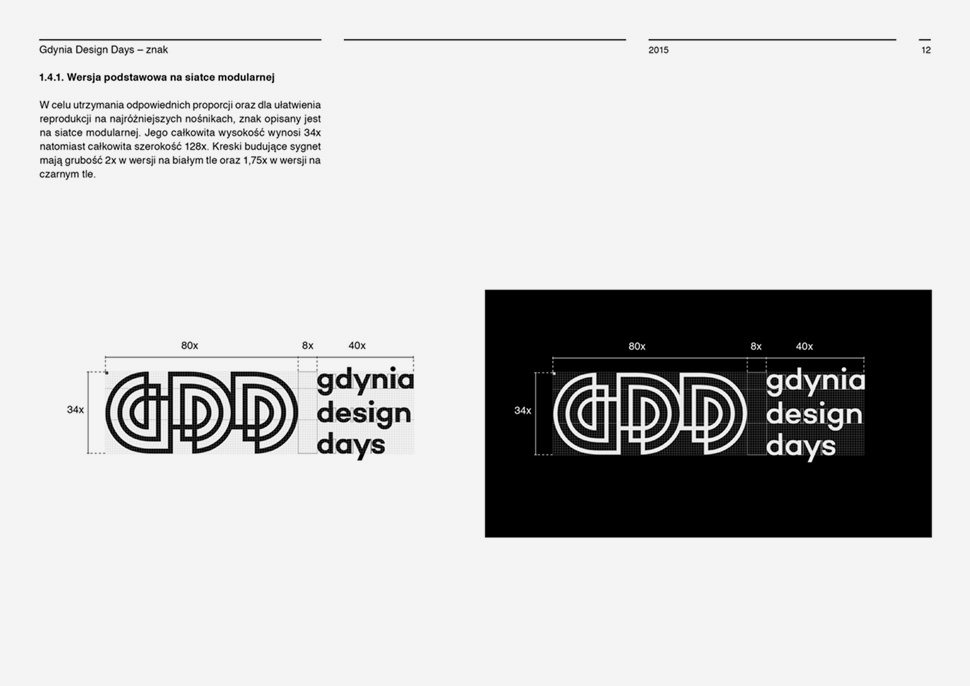
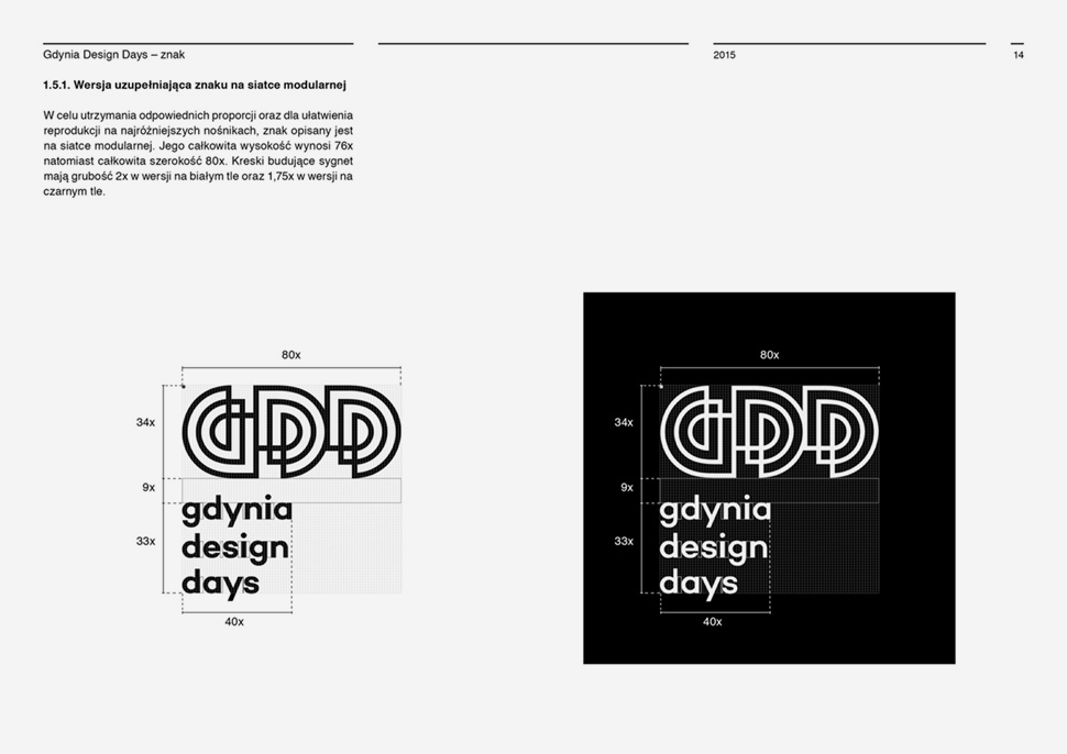
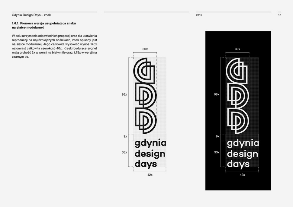
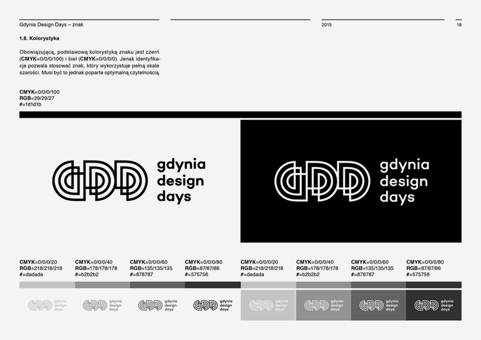
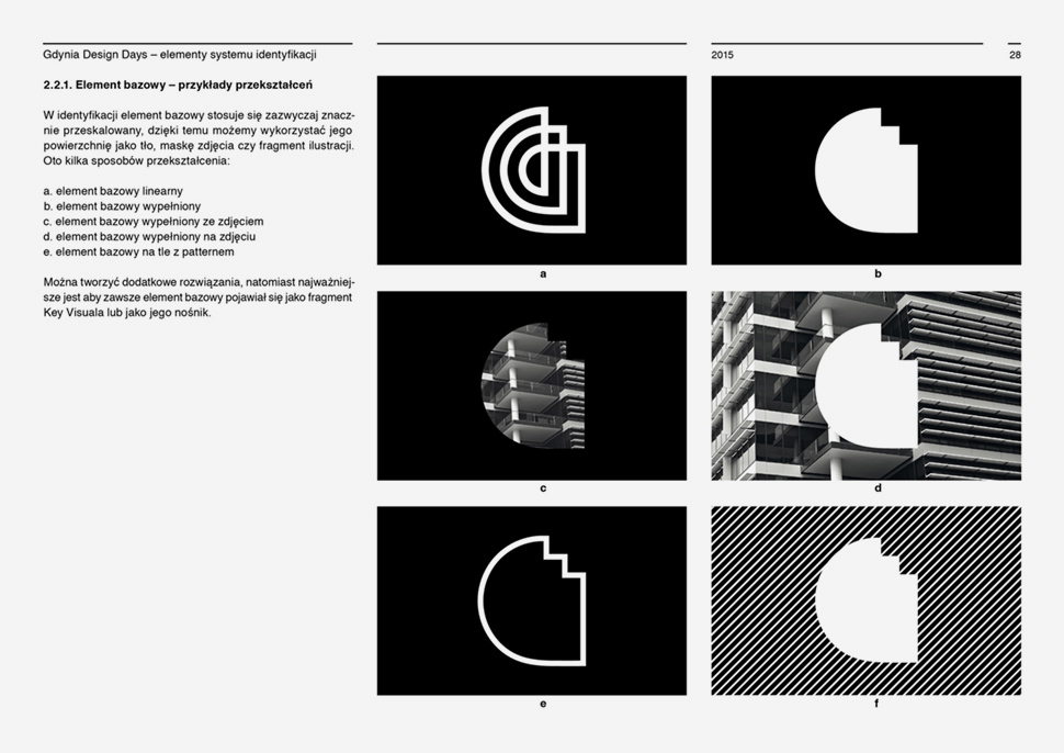
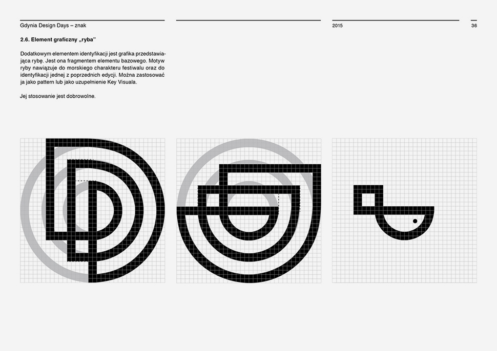
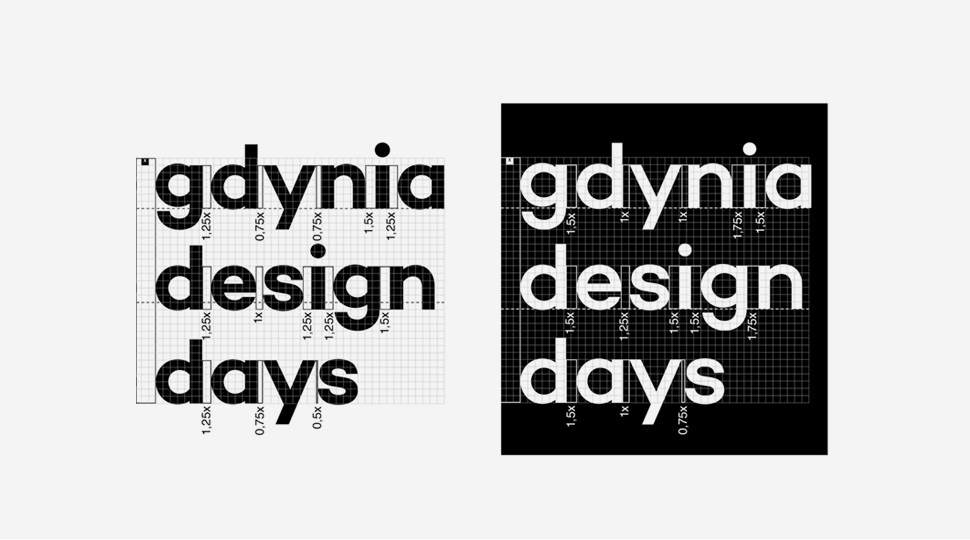
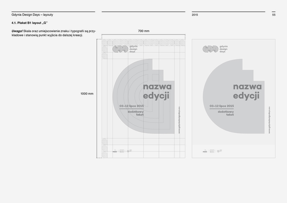
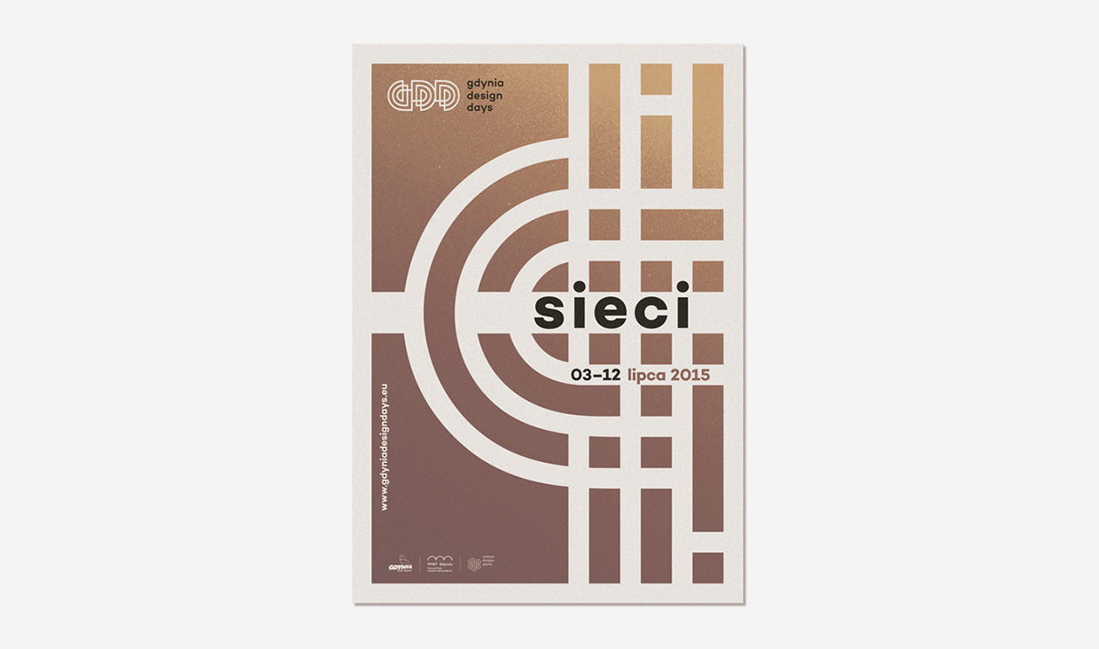
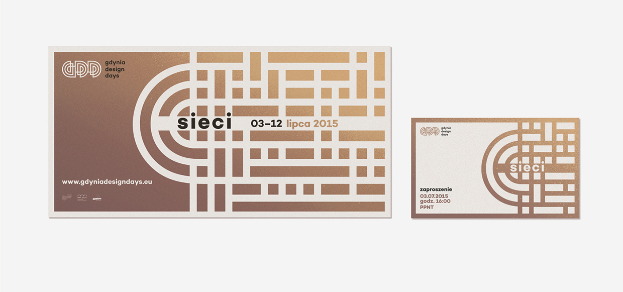
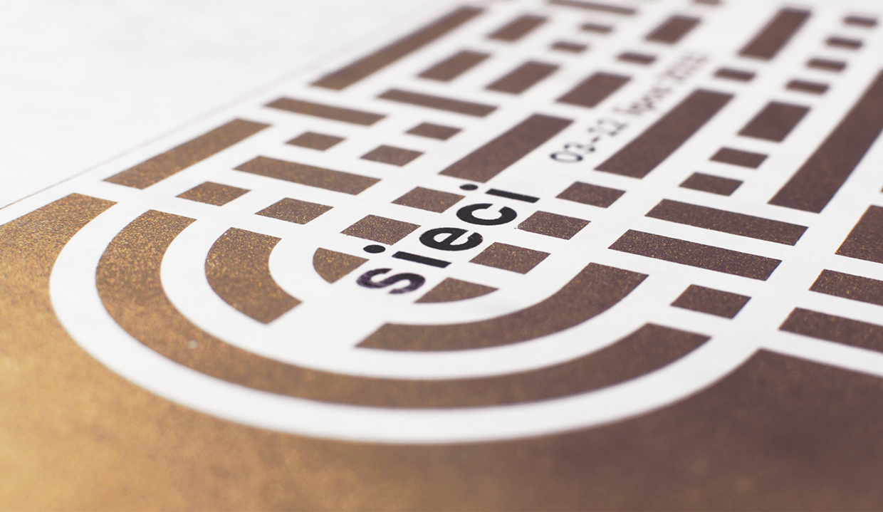
The logo is the face of any brand — the very first impression — so its design is extremely important. When faced with the task to design the branding for Gdynia Design Days, the biggest summer design festival in Poland, Gdynia based Negation studio focused on the logo, and build a timeless yet contemporary visual identity around it. See what went into the process.
To understand the logo, you need to know the reason to have one. The aim is for the logo to be immediately recognizable, as well as inspiring and admirable with an implied superiority in the field in question. The logo is one aspect of a company’s commercial brand or economic entity, and its shapes, colors, fonts, and images usually are strikingly different from another logo in the same market niche. A good logo is memorable and intriguing, build trust yet awakes interest.
Gdynia Design Days is the biggest summer design festival in Poland aimed at introducing the world of design to the common mass audience. Organizers try to arouse common curiosity and stimulate general awareness and sensitivity to well designed, innovative and aesthetic objects and products. Gdynia Design Days are the world of clever, beautiful, terse and surprising in their form objects, projects, products. Every year new spaces are appropriated for our meetings with the contemporary design. GDD promotes design, propagates good patterns, educates, stimulates cooperation between designers and business.

Negation Studio, a small graphic design and illustration studio run by two talented creatives Patryk Hardziej and Patrycja Podkoscielny, is based in the same town of Gdynia. Having vast experience in projects dealing with illustration, branding, logo design, visual communication, editorial graphics, as well as artistic projects, they take each project to it’s limits, aiming for the highest possible result. 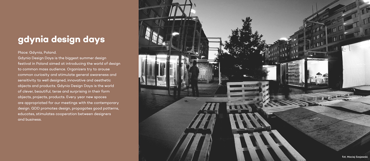

Images © Negation Studio

