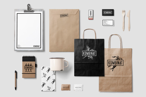
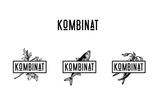
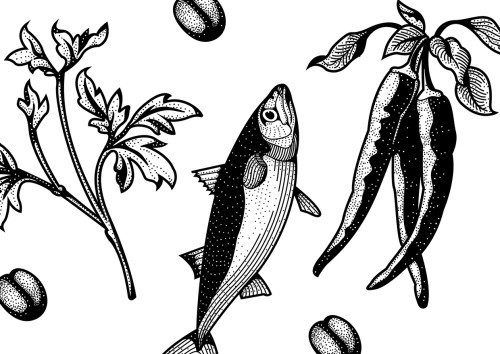
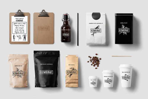
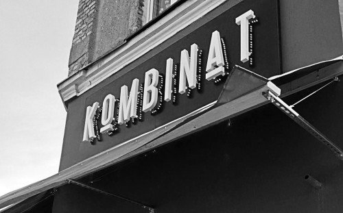
Świnoujście based designer Maria Mileńko was asked to design a logo for the young restaurant in Poznań, Poland – Kombinat. The logo, as simple as possible, was created with various background illustrations which work as the foundation for the whole branding.
Simplicity, strong typography, natural materials, and nature-inspired illustrations seem to be the four-point checklist for branding design these days. Not that I’m complaining, or in any way disagreeing with the style, it’s a formula that has been proven to work. And Mileńko’s design is a top-notch example of how it should be done.
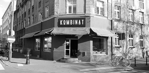
Kombinat – Tapas bar and restaurant opened about a year ago in the city of Poznań caters to both carnivores and herbivores, and has become a favorite among the locals. Serving a daily changing menu based of fresh and local ingredients in a tapas style, combining different small dishes – hence the name Kombinat.
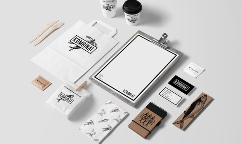
Photos via Maria Milenko

