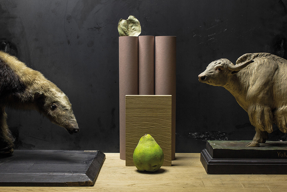
When a designer or a design agency creates it’s own branding, special care and thought goes into every detail and choice. As everyone knowns, branding is the visual identity a brand has and it works as the first impression. And for people working in the field of arts and design, it acts as the most important piece of your port folio, you want it to hit the nail on its head. Riebenbauer Design is a full service agency, working in fields of marketing branding, environmental and interior design, advertising, editorial, packaging, graphic design and digital solution, with major international client roster and more awards under it’s belt than they can count. So when a giant like Riebenbauer creates a new identity for themselves, you know there is thought and reason behind it, and it’ll be nothing less than amazing.
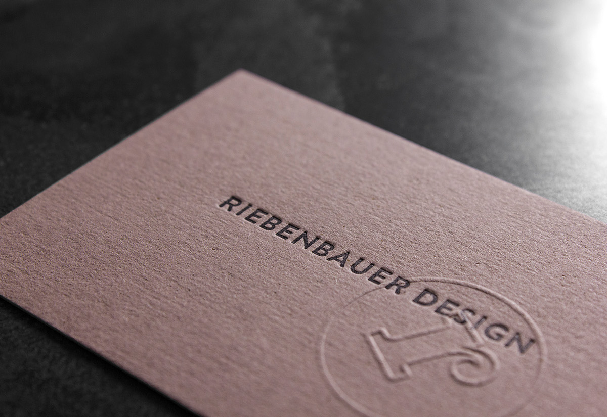
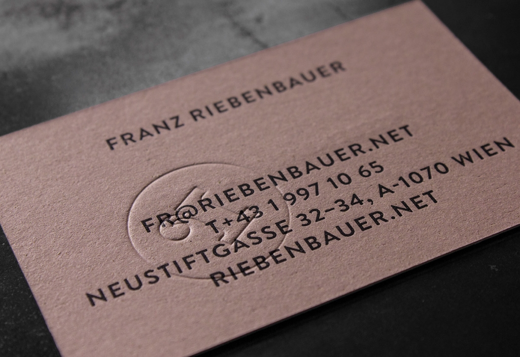
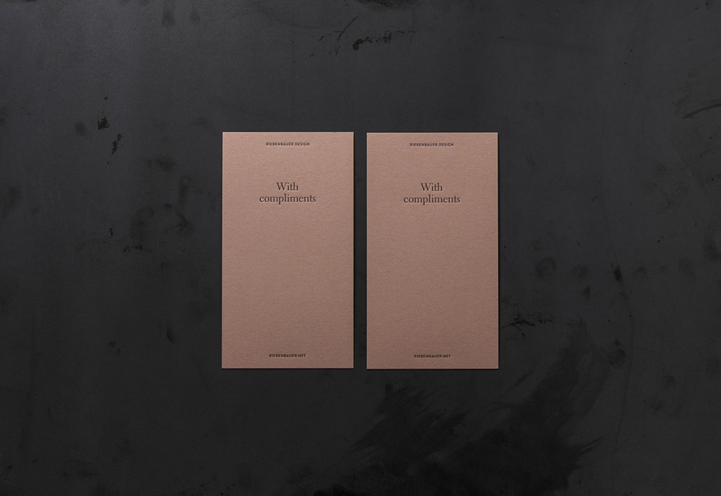
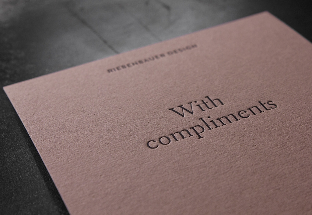
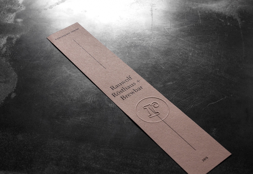
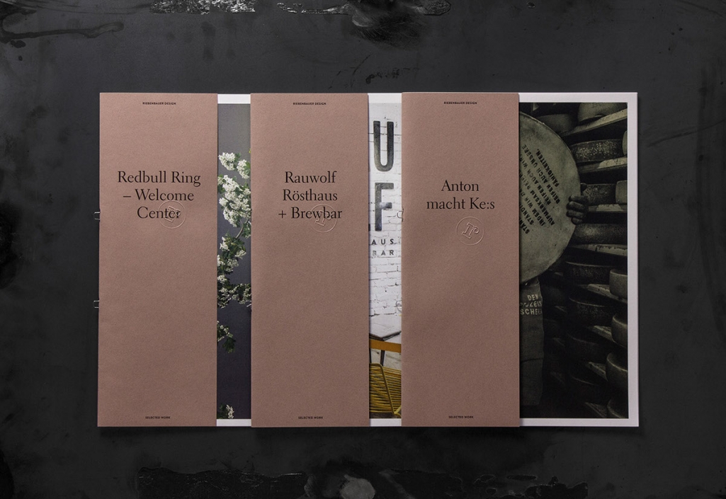
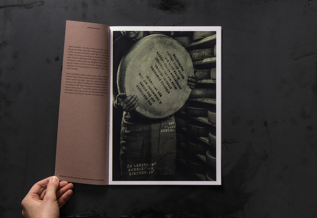
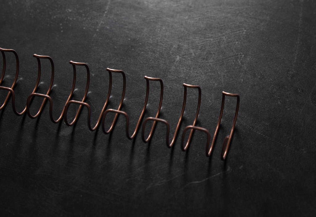
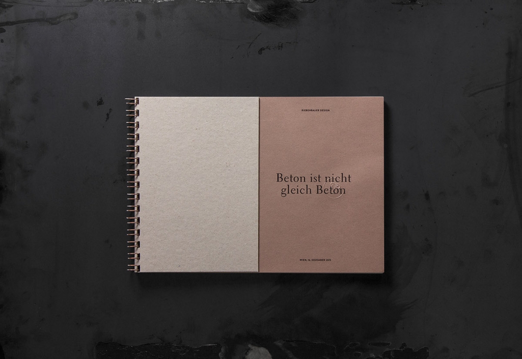
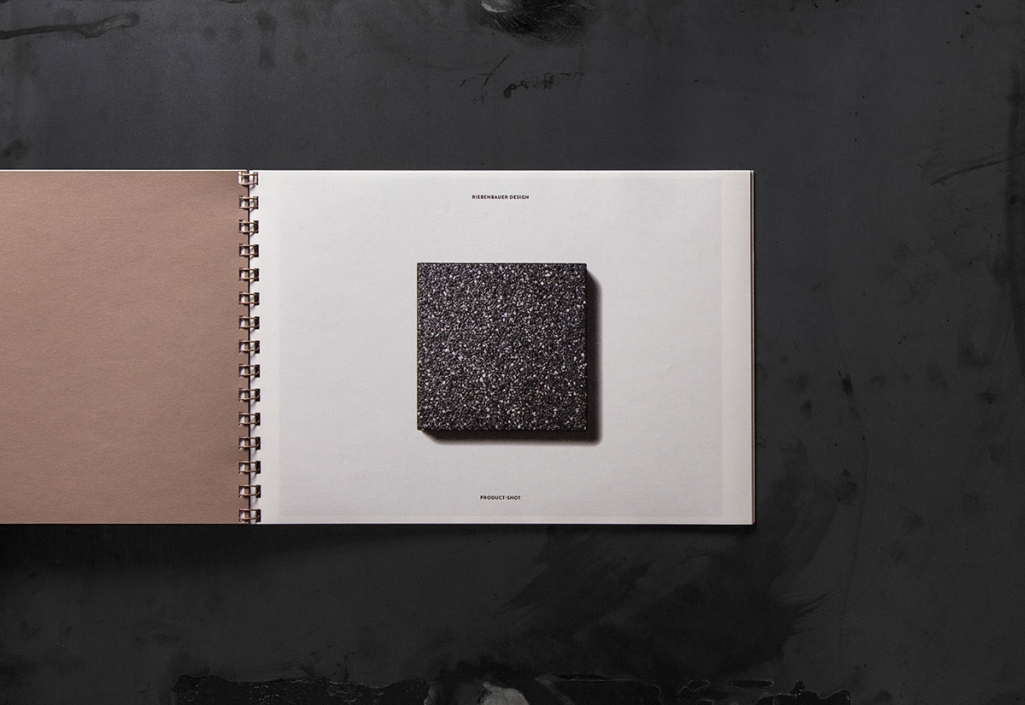
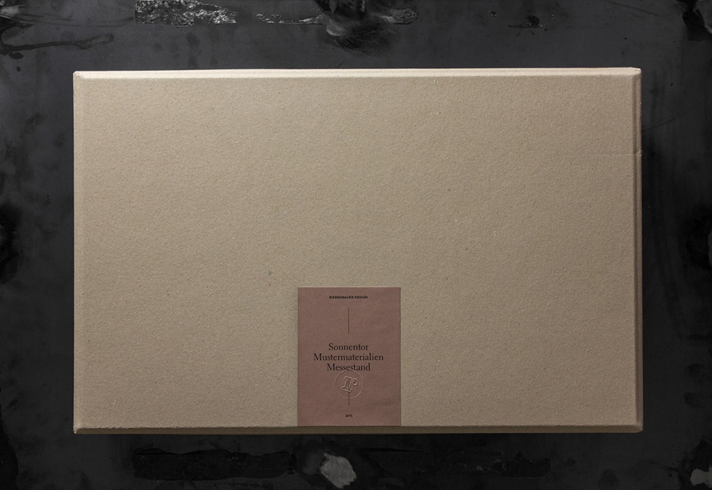
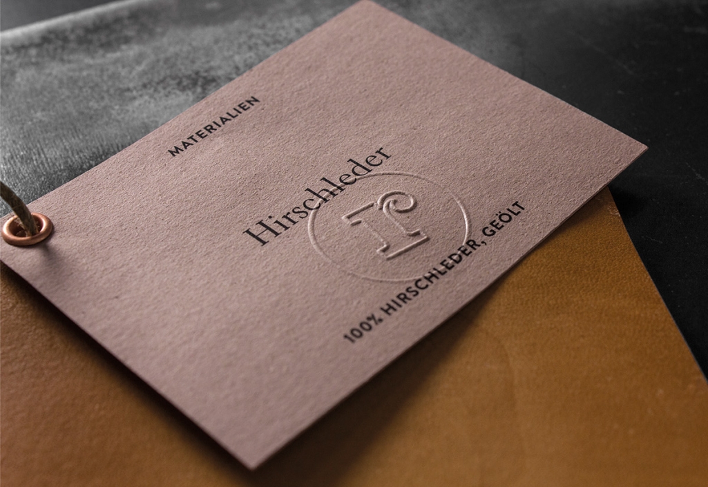
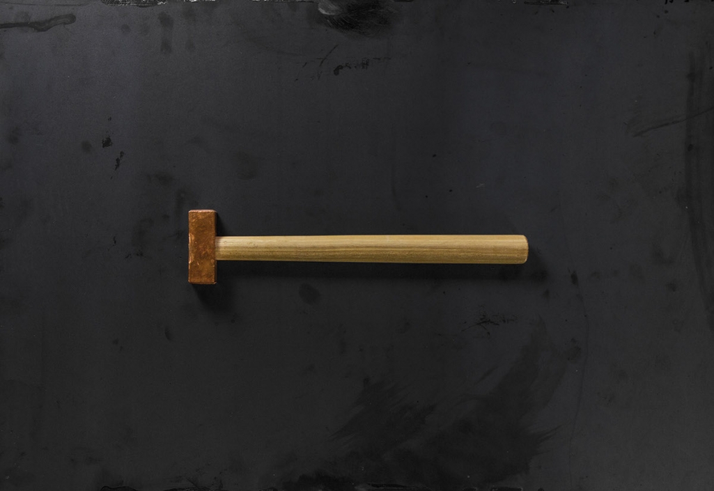
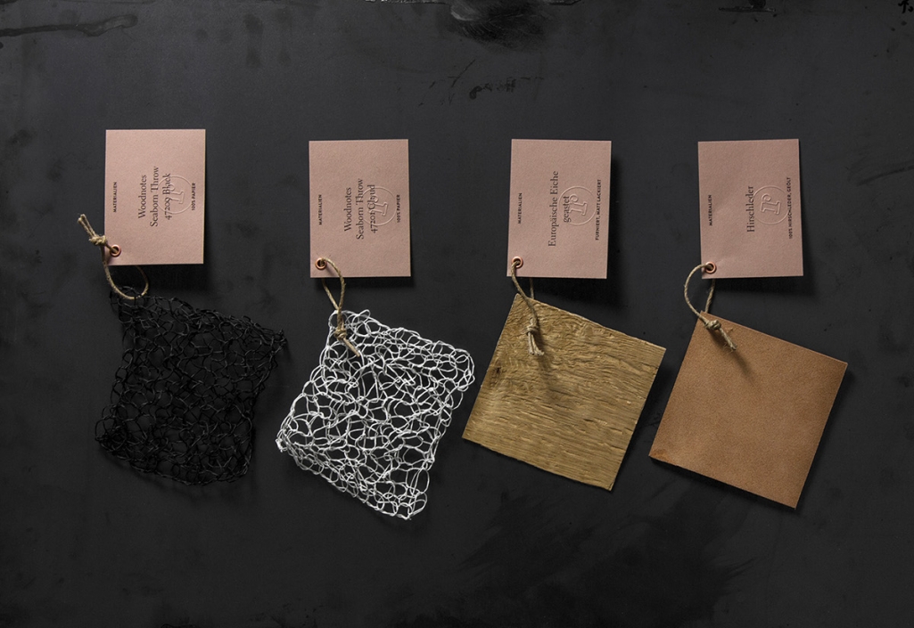
Riebenbauer Design’s new identity revolves entirely around the theme of craftsmanship. It is the center point of the studios work, so they wanted it to be reflected in all of their media. From the paper — Crush produced from organic waste — to the letterpress and the manual stamping, all printed media is made in their own workshop. Whether it is varnished, lasered or etched — their team is always searching for new possibilities and interpretations of craftsmanship. This is the common thread that connects all of Riebenbauers work, and now also as the foundation of their new look. The high quality printing techniques and earthy berry-like color combined with the Crush paper that has a surface so beautiful it’s screaming for your touch demands attention while being sophisticated and classic – perfect fitting for an agency like Riebenbauer.
Images © Riebenbauer Design

