Abels Foodservice, a trusted name in fresh fruit and vegetable distribution for over 60 years, has recently launched an exciting new branding concept by the creative force of the SEEQ agency. This rebranding aligns perfectly with Abels’ long-standing motto, “Quality without compromise,” which has defined their business since its inception. With a focus on delivering premium, fresh produce to distributors, retailers, and the food service industry, Abels has always emphasized the importance of quality and sustainability at every operation step. Their new brand identity reflects these core values while embracing modern, clean aesthetics.
SEEQ, based in Wasserviertel Germany, brings years of branding expertise to the project.
SEEQ’s journey began with a passion for photography, which soon evolved into a full-fledged advertising agency, working with local and international brands. Known for its deep dive into the essence of a company, the agency shapes every new brand concept with thoughtful strategy and stylish design.
They thrive on truly understanding, incorporating, and conveying the brand values of their client companies, and making them the cornerstones of their creative work – making SEEQ the perfect match for Abels who values quality.
For Abels, SEEQ’s rebranding concept embodies the company’s dedication to quality and freshness.
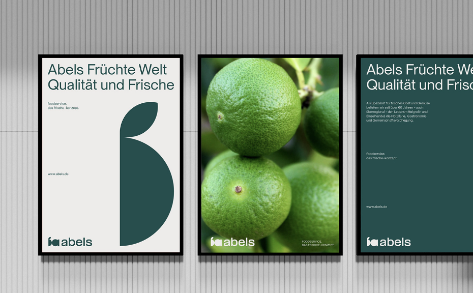
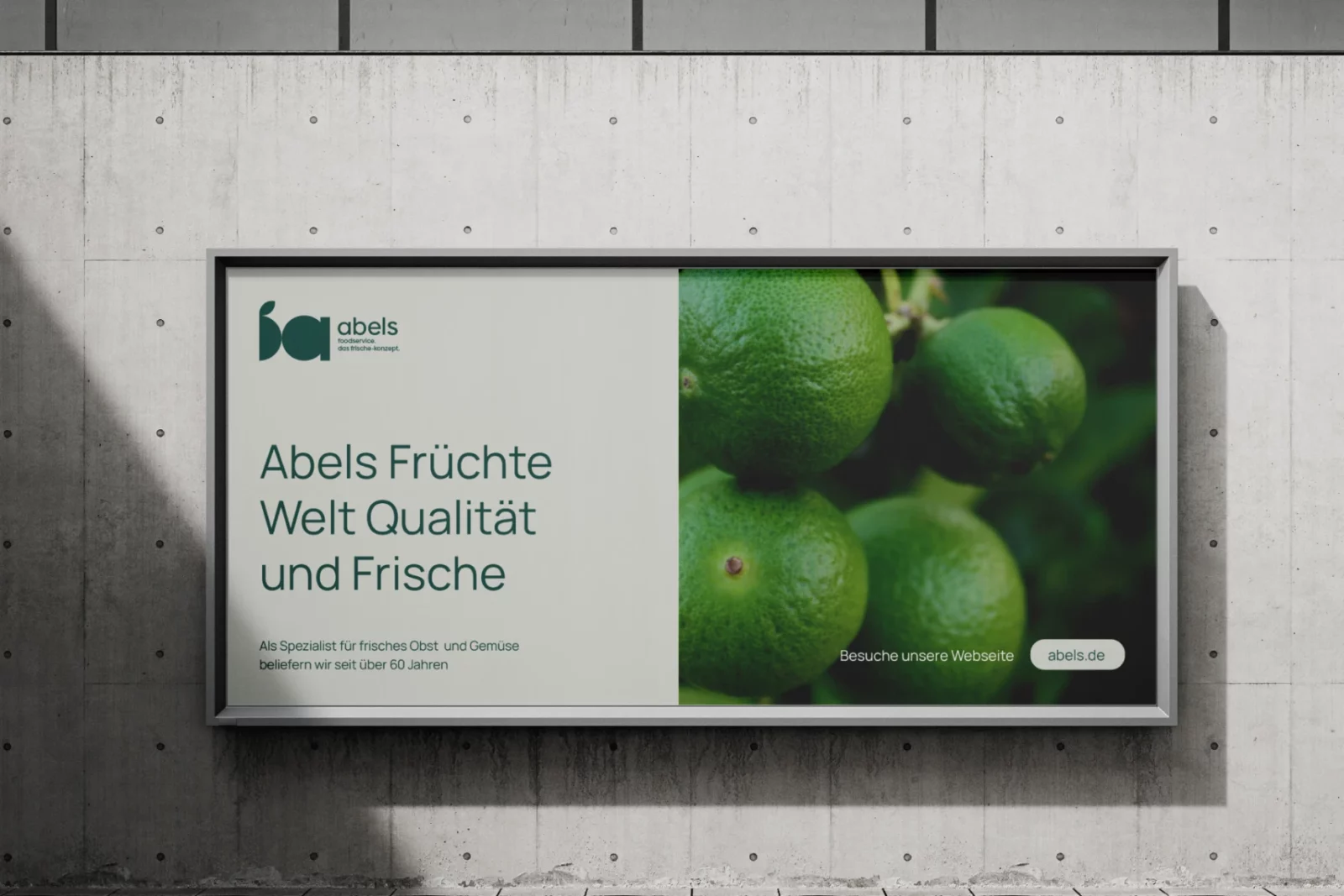
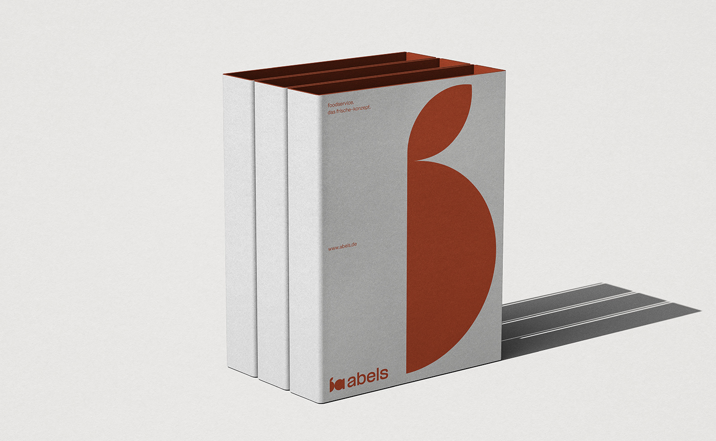
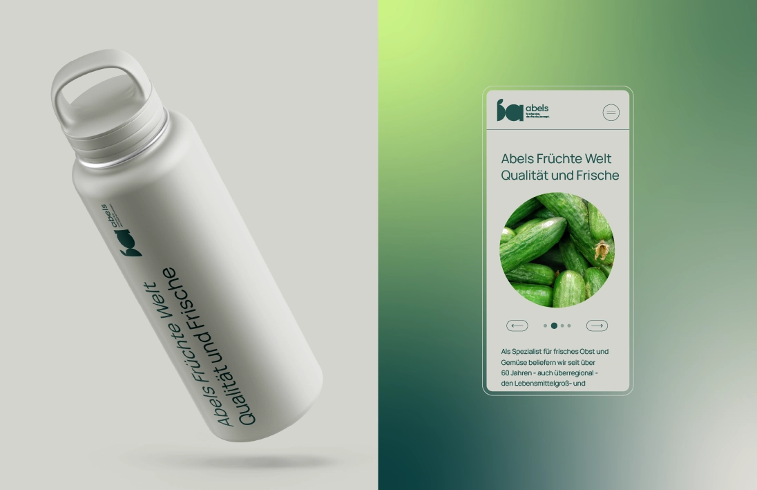
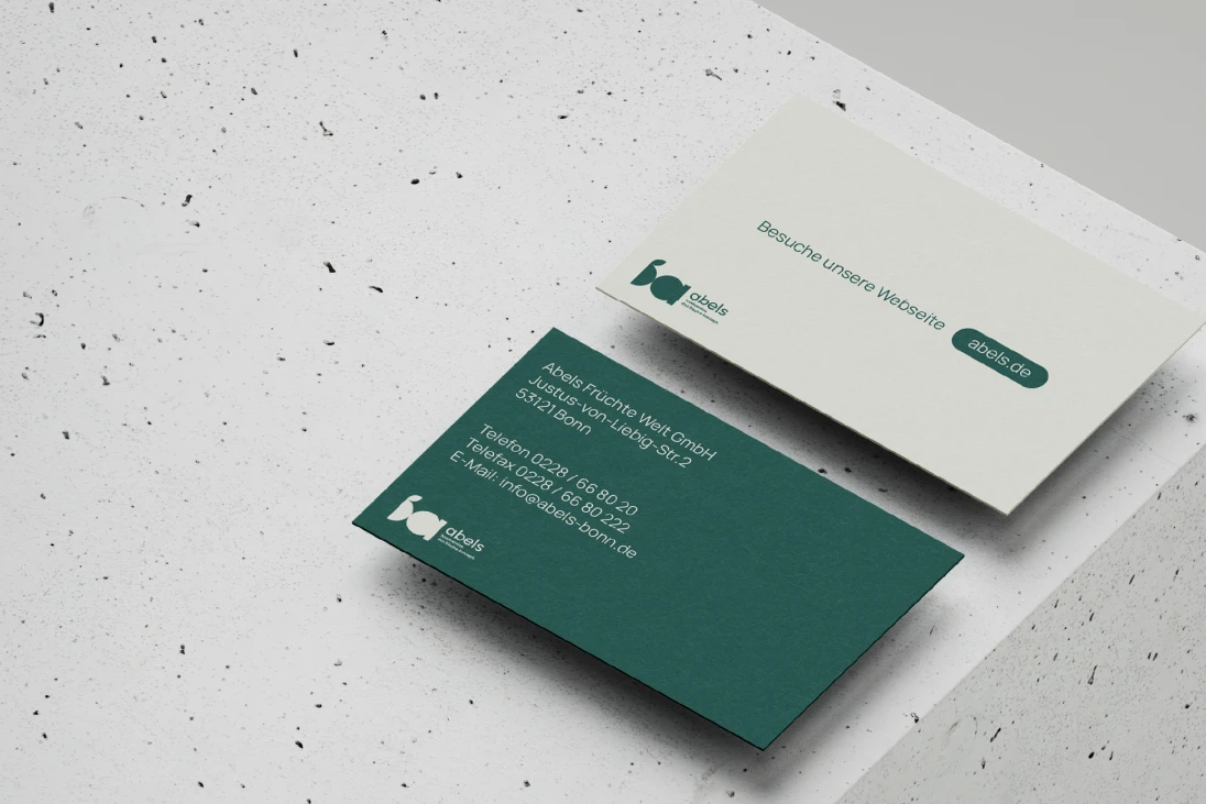
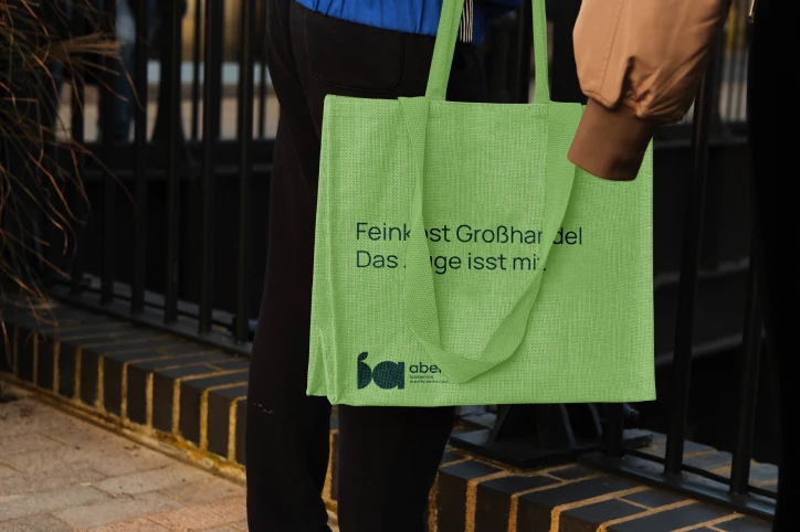
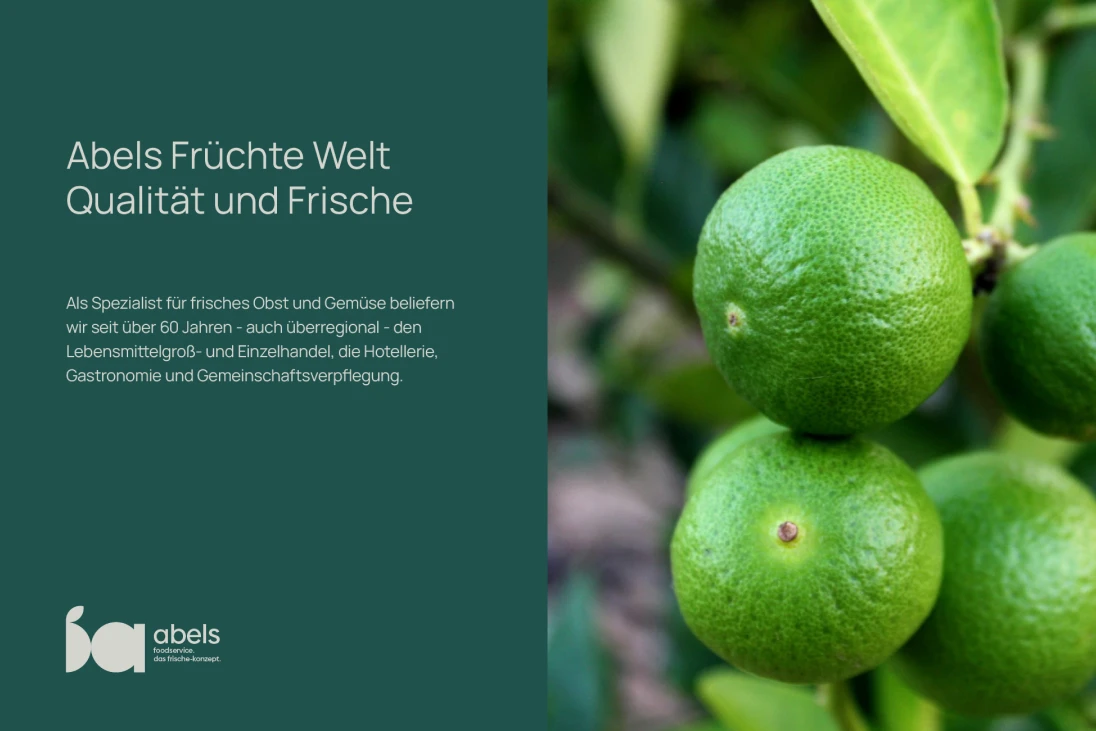
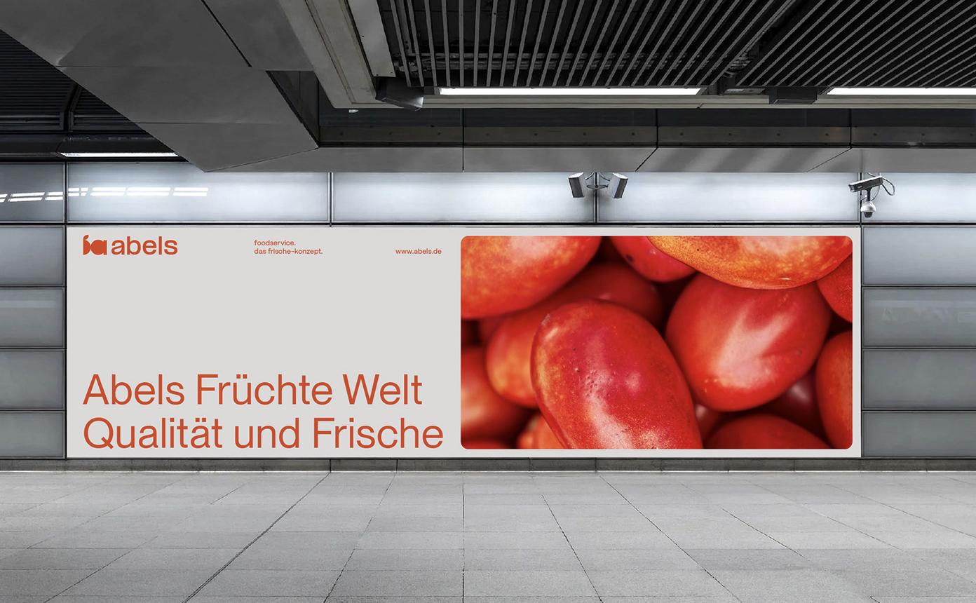
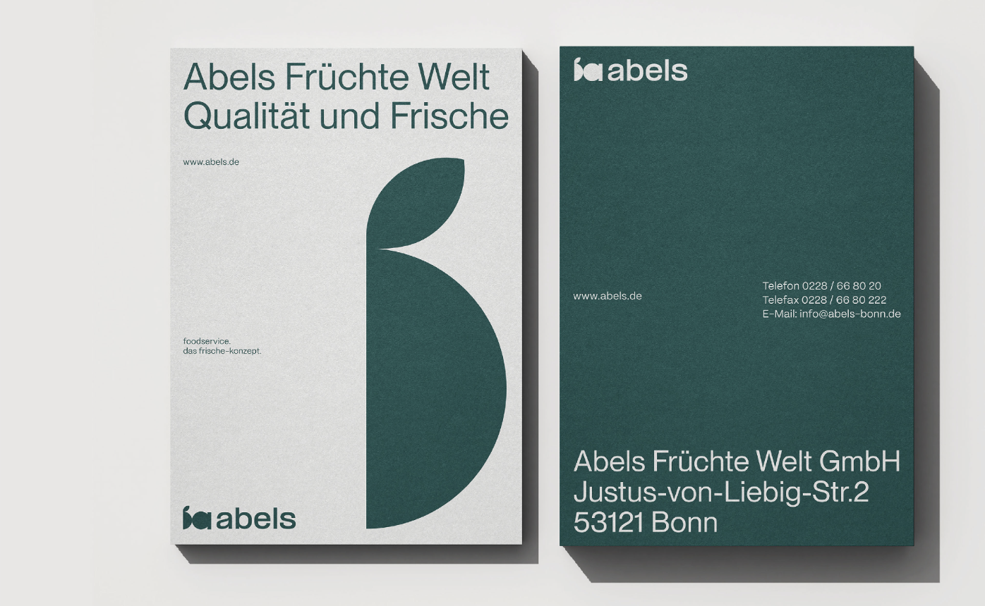
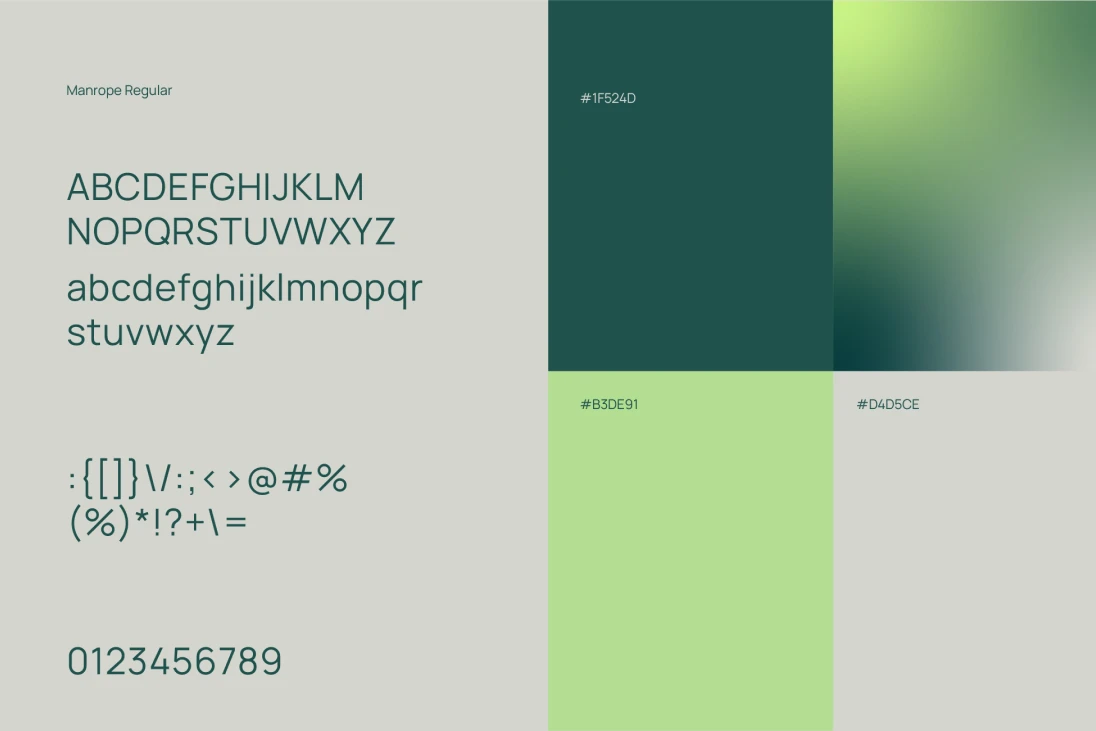
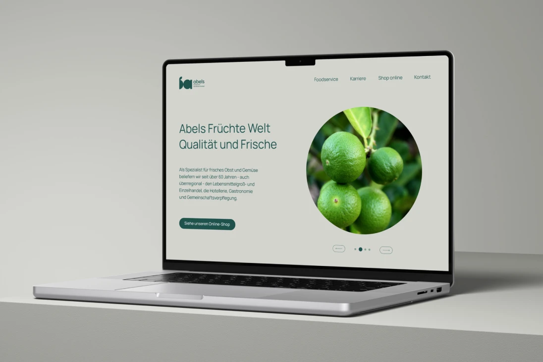
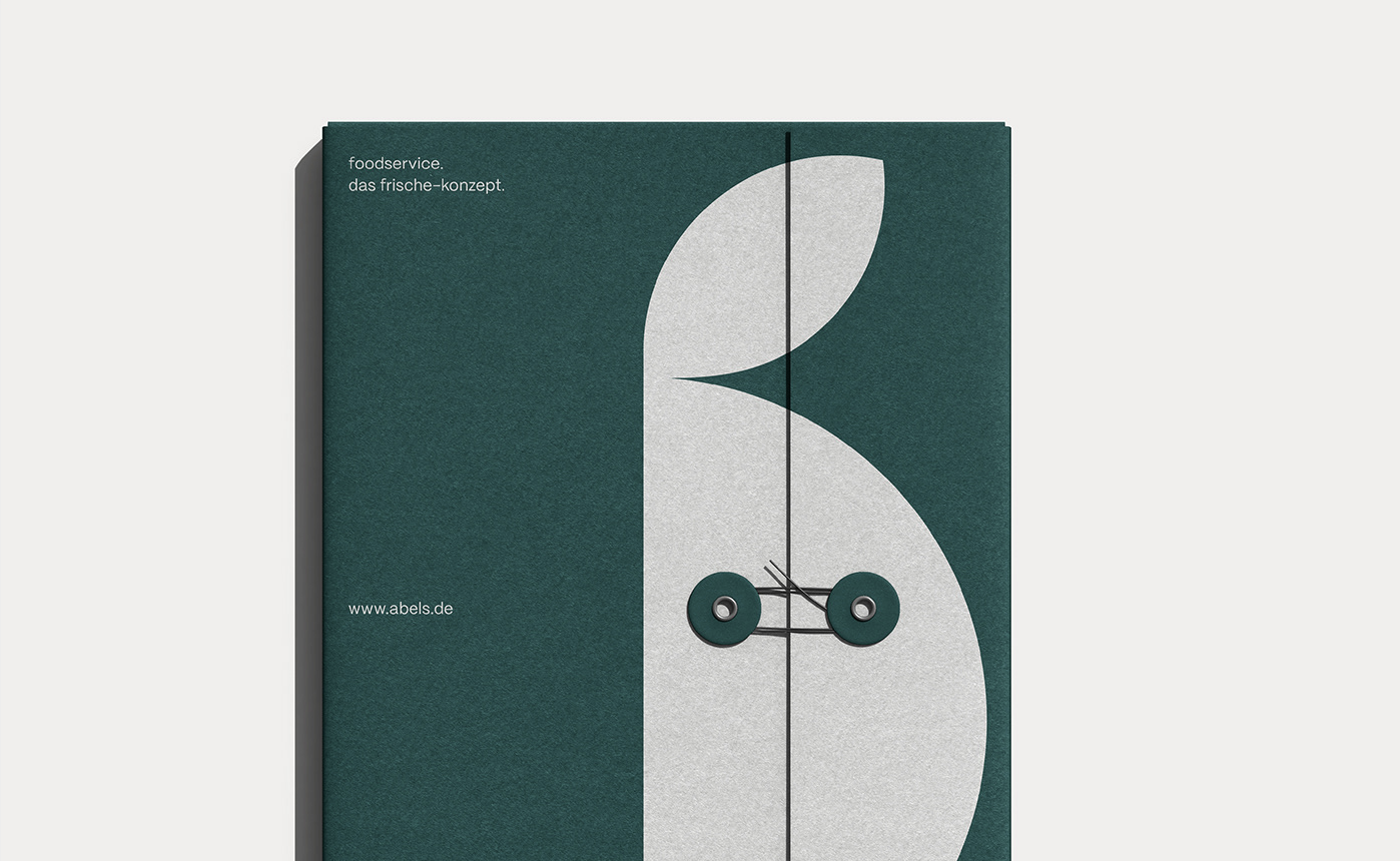
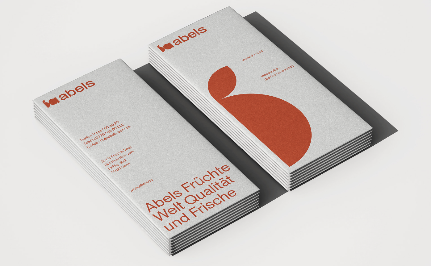
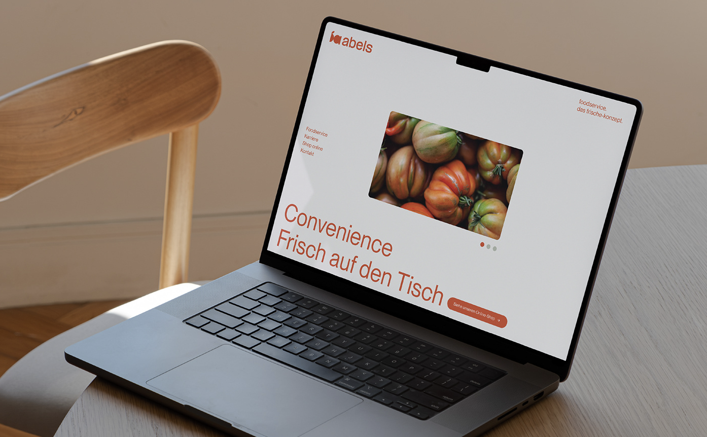
The new visual identity uses a minimalistic, yet bold approach that places the focus squarely on the core of Abels’ business—premium produce. “Our aim was to create a brand that speaks as clearly and directly as the products themselves,” shares a spokesperson from SEEQ. The design features clean cuts, geometric shapes, and soft, vibrant colors that echo the freshness and transparency Abels is known for.
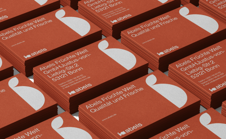
Our aim was to create a brand that speaks as clearly and directly as the products themselves. – SEEQ Agency.
SEEQ has really captured the heart of what we do. Offering the best, without cutting corners. – Abels team.
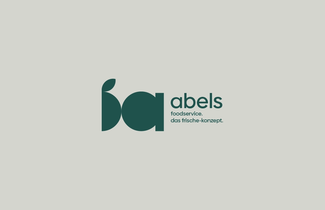
The new logo playfully incorporates the silhouette of a half-cut apple alongside the Abels lettermark. This simple, yet striking element captures the brand’s essence while allowing for broad recognition and adaptability across various platforms. The minimal aesthetic reflects a modernized outlook, but the bold execution ensures it stands out in a competitive market.
“SEEQ has really captured the heart of what we do — offering the best, without cutting corners,” says an Abels representative. This new branding perfectly mirrors the company’s unwavering commitment to quality, while creating a visual language that is as fresh and inviting as the produce they offer. With a playful yet professional design, Abels’ new brand identity positions them well for the future, while honoring their rich heritage of excellence in food distribution.
Images © SEEQ agency

