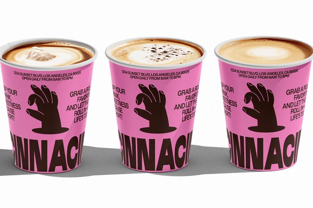
Ukrainian Yuliia Hrabynska is a passionate graphic and brand designer with a keen eye for aesthetics and a heart fueled by creativity. “I bring ideas to life, crafting visually compelling narratives that resonate. My design journey is a fusion of innovation and precision, dedicated to elevating brands and leaving a lasting visual imprint”, Hrabynska, who runs her own Julisera Studio, writes. With a range of bold concepts filling the designer’s social channels and portfolio, her Cinnacin branding and packaging concept halted our scrolling and brought a smile to our faces.
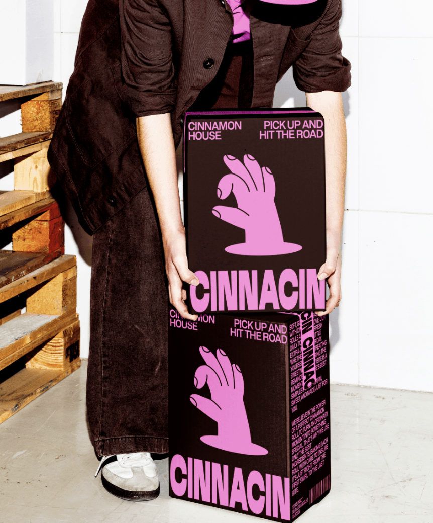
When you step into Cinnacin, you’re not just walking into a bakery – you’re entering a world where sweetness, comfort, and magic unite.
Known for its signature cinnamon rolls, Cinnacin is more than a destination for baked goods — it celebrates life’s simplest yet most cherished pleasures. With every swirl of cinnamon goodness, and every bite of soft, gooey texture, Cinnacin redefines indulgence, blending taste, joy, and connection seamlessly.
But what truly sets Cinnacin apart isn’t just the irresistibly fresh, daily-baked rolls. It’s the brand itself: bold, unforgettable, and bursting with youthful energy.
But what truly sets Cinnacin apart isn’t just the irresistibly fresh, daily-baked rolls. It’s the brand itself: bold, unforgettable, and bursting with youthful energy. Let’s take a closer look at how the essence of Cinnacin is reflected in its branding and concept, creating a complete sensory and emotional experience for its customers.
Confidence meets charm in the Cinnacin branding concept
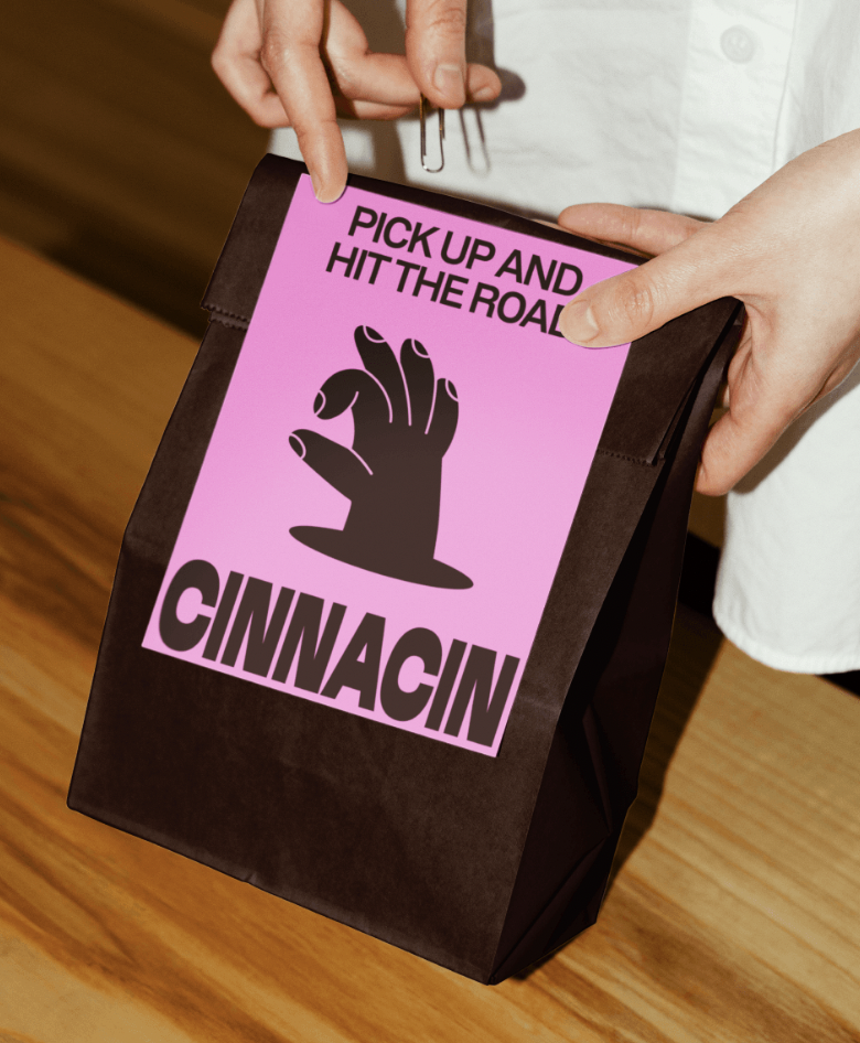
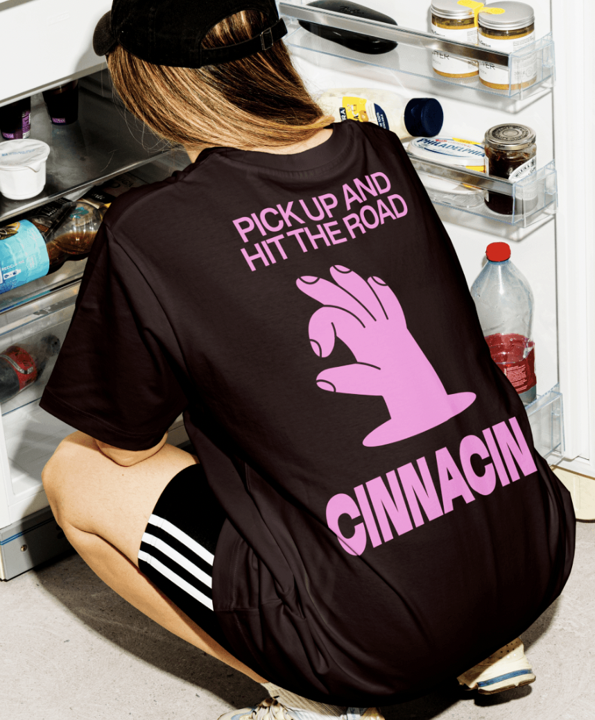
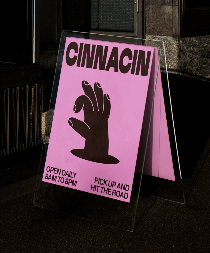
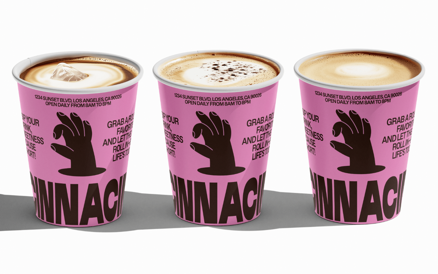
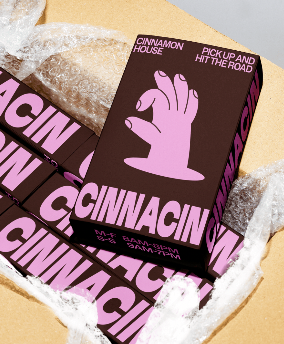
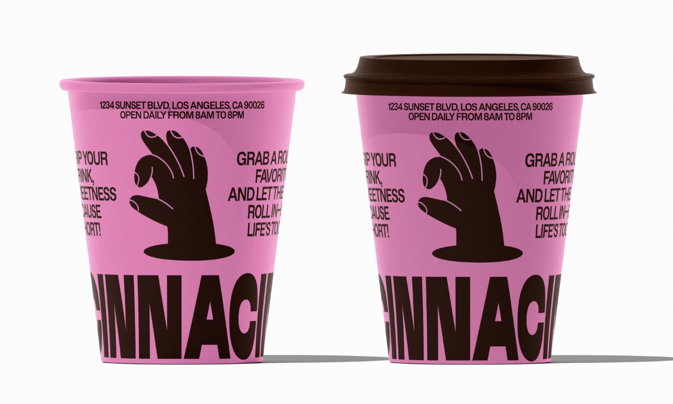
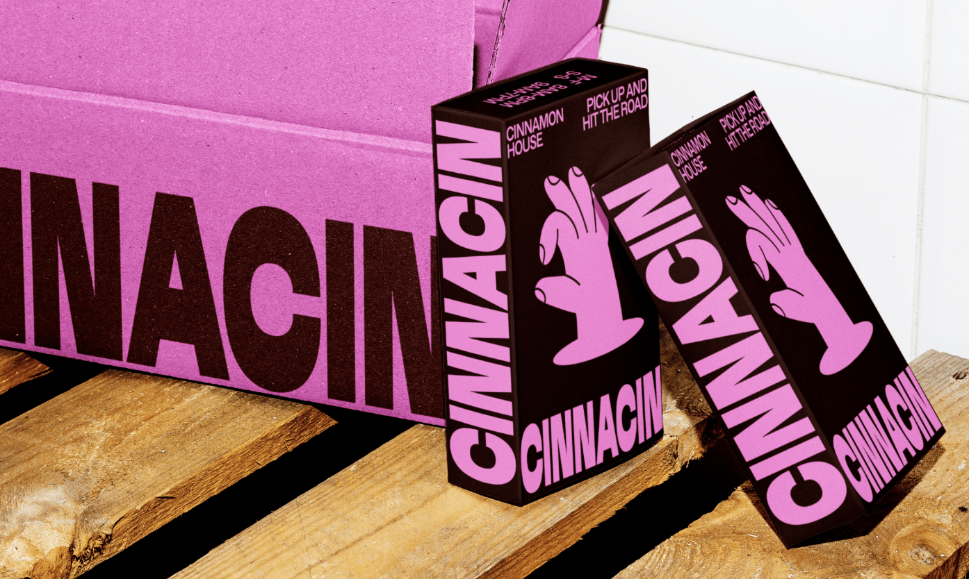
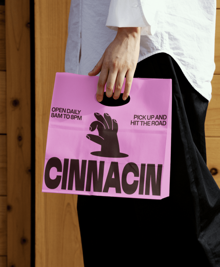
Cinnacin isn’t just about cinnamon rolls; it’s more about the vibe. The brand’s bold identity reflects confidence, fun, and a sprinkle of sophistication. The vibrant combination of dark brown and light pink in the brand’s palette is a standout choice, exuding warmth, charm, and a youthful energy that is sure to appeal to a wide audience. This unique color pairing balances playfulness and elegance, making the brand as memorable as its baked treats.
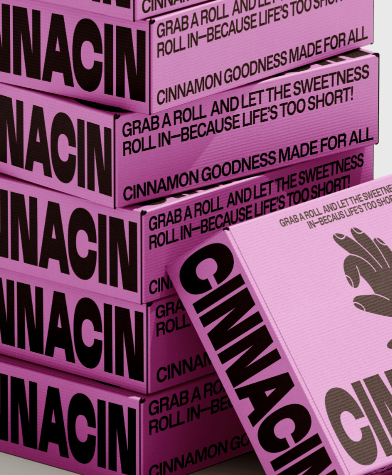
The fonts — Bacalar Condensed for a sharp, distinctive look and BDO Grotesk for a modern, approachable touch — further reinforce the brand’s personality. Together, they create a clean and refined visual identity that’s both striking and inviting. It’s a design language that speaks to those who appreciate a mix of fun and sophistication, ensuring that Cinnacin is instantly recognizable and unforgettable.
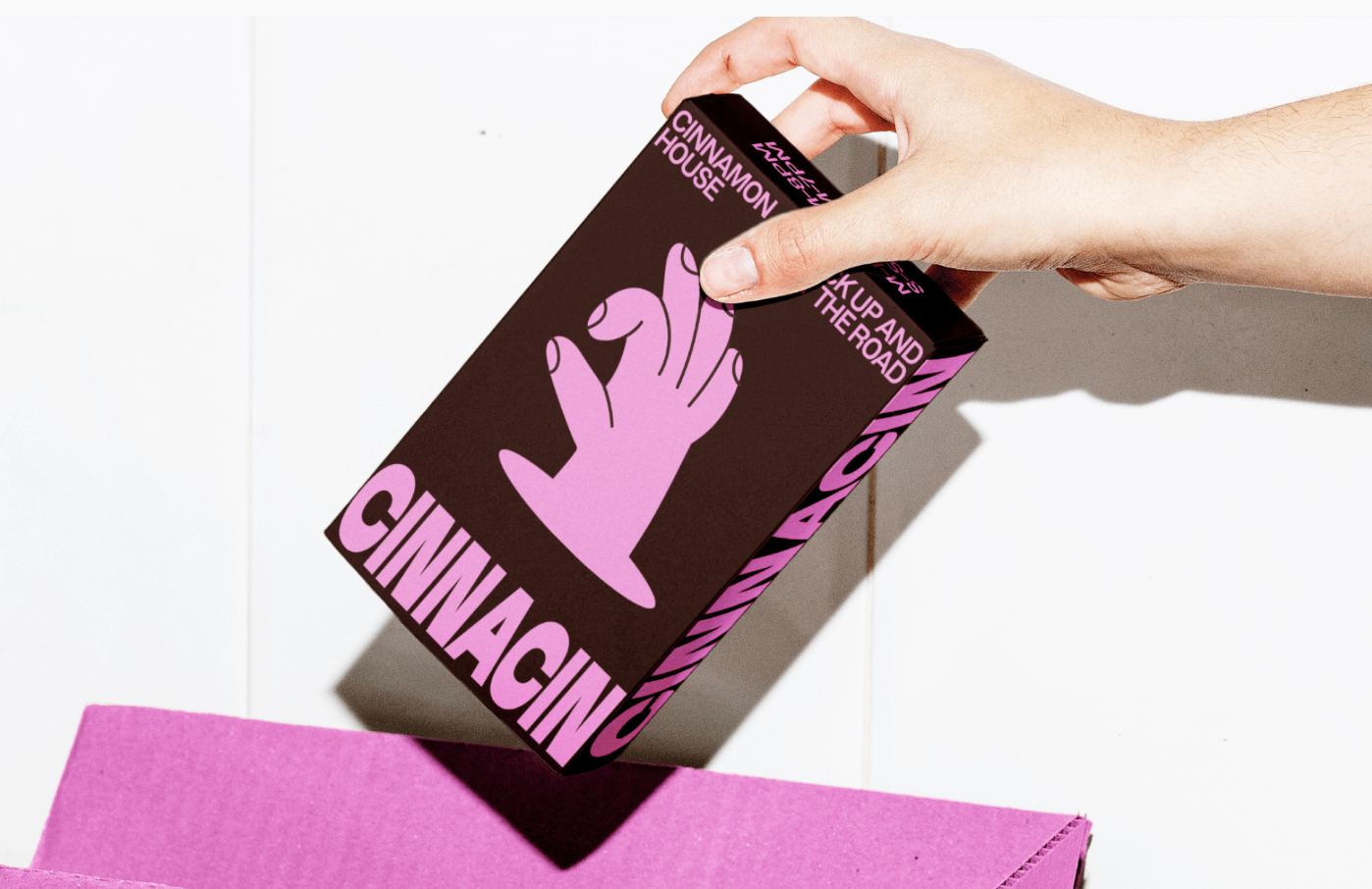
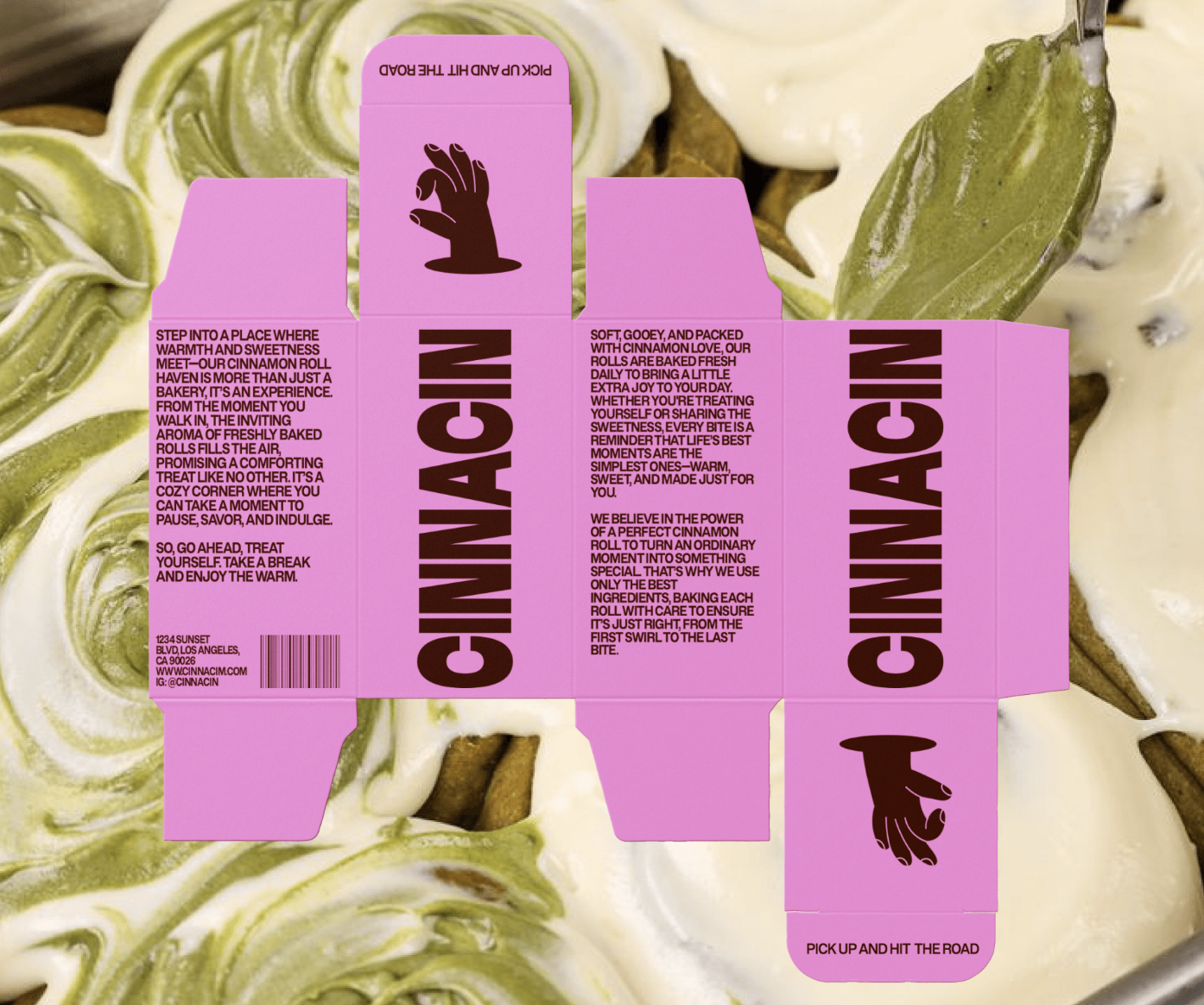
Every element of Cinnacin’s branding extends to its packaging, which is designed to enhance the customer’s experience. The clean, modern aesthetic mirrors the brand’s commitment to quality and care, while the vibrant colors and bold typography add a layer of excitement. Whether you’re carrying your cinnamon rolls home or gifting them to someone special, the packaging itself becomes part of the experience— a reminder of the joy that awaits inside. Cinnacin is a celebration of life’s sweetest joys, wrapped in style, flavor, and a whole lot of heart.


Images © Yuliia Hrabynska

