
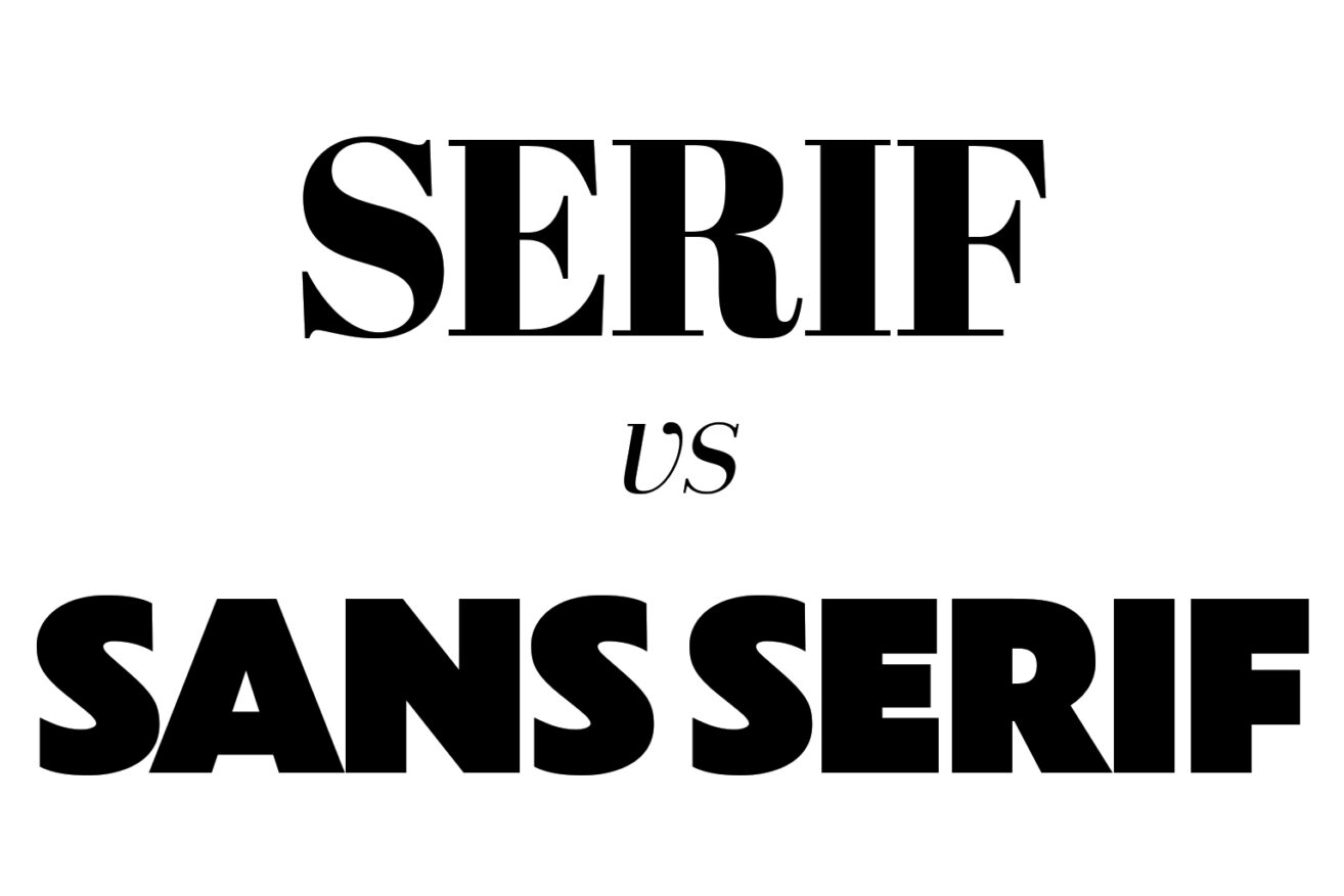
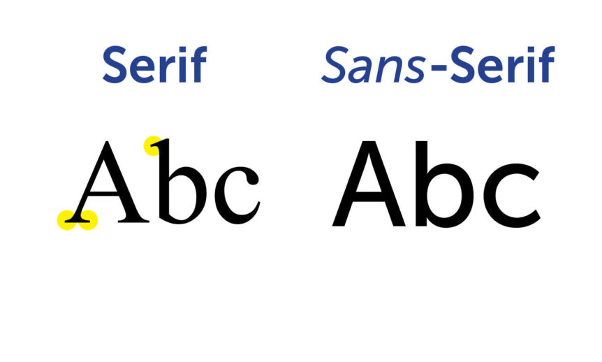
Typography is more than just letters on a page or screen — it’s a fundamental part of design, branding, and communication. At the core of typography are two major font categories: serif and sans-serif. Serif fonts, like Times New Roman and Garamond, have small decorative strokes (serifs) at the ends of letters, often giving a more classic and refined appearance. In contrast, sans-serif fonts, such as Helvetica and Arial, lack these extra strokes, resulting in a clean, modern, and minimalistic look.
But with every company jumping on the bandwagon, something unexpected happened: branding started looking the same.
For decades, brands have chosen fonts to convey their identity. Serif fonts have long been associated with tradition, authority, and sophistication, while sans-serif fonts represent modernity, simplicity, and accessibility. But in recent years, one category has overwhelmingly dominated the branding landscape: sans-serif.
Over the last decade, we have witnessed a mass migration toward sans-serif typography in branding
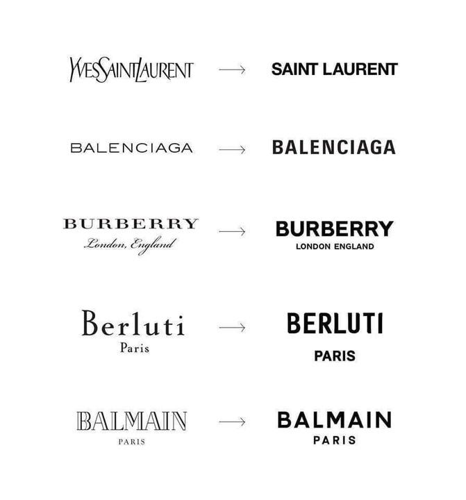
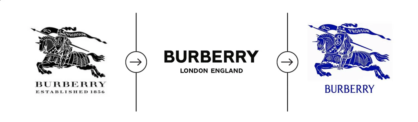
This mass-shift towards sans-serif typography was largely influenced by the rise of digital-first companies and the need for clean, legible fonts that work across various devices. Google, Airbnb, Spotify, and countless other brands opted for geometric, uniform sans-serif fonts to project a modern and tech-savvy image. But then, legacy brands like Burberry, Balmain, and Yves Saint Laurent started also abandoning their iconic serif logos in favor of sleek, minimal sans-serif typography.
But this trend wasn’t just about aesthetics — it was about adaptability. Sans-serif fonts scale better for mobile screens, provide a streamlined user experience, and ensure brands look contemporary. But with every company jumping on the bandwagon, something unexpected happened: branding started looking the same.
The problem with homogenisation
What started as a revolution in modern branding quickly became a plague of sameness. Major brands, regardless of industry, began adopting nearly identical sans-serif logotypes, leading to what designers call “blanding” — a world where everything feels eerily uniform and characterless. We wrote about this in our article Blandification In Branding: Clean, Simple, And Losing Personality?
Consumers, once drawn to the clean and futuristic appeal of sans-serif branding, are now craving distinctiveness. When every fashion house, tech startup, and corporate entity uses a variation of a geometric sans-serif typeface, individuality is lost. Brands that once had rich visual histories tied to intricate, unique typography sacrificed their identity for the sake of modernity. But now, the pendulum is swinging back.
The return of character and craft signals a shift in philosophy
In response to the homogenisation crisis, designers and brands are rediscovering the power of handcrafted, personality-driven typography. We are seeing a resurgence of serif fonts, custom lettering, and more expressive typography choices in branding. Companies are moving beyond the sterile, uniform look and embracing fonts with quirks, flourishes, and distinct character.
High-end fashion brands like Burberry, Valentino and Chloé have recently made the bold move to take step back and reintroduce serifs into their branding, restoring elegance and heritage. Tech companies, once the pioneers of minimal sans-serif, are experimenting with custom-designed typefaces that reflect their brand’s unique DNA. Even startups are opting for hand-drawn, nostalgic, or vintage-inspired typography to differentiate themselves in a saturated market.
The backlash against sans-serif domination signals a larger shift in design philosophy. Brands are realizing that in an era where everything looks the same, standing out is more valuable than simply looking modern. Typography is regaining its role as a storytelling tool rather than just a functional design choice.
This movement doesn’t mean sans-serif fonts are obsolete — far from it. Instead, it marks a return to balance, where brands prioritize uniqueness over conformity. The future of typography in branding is looking more diverse, expressive, and human again. So, will we see the full demise of sans-serif branding? Likely not. But one thing is certain. The era of generic, cookie-cutter typography is coming to an end.