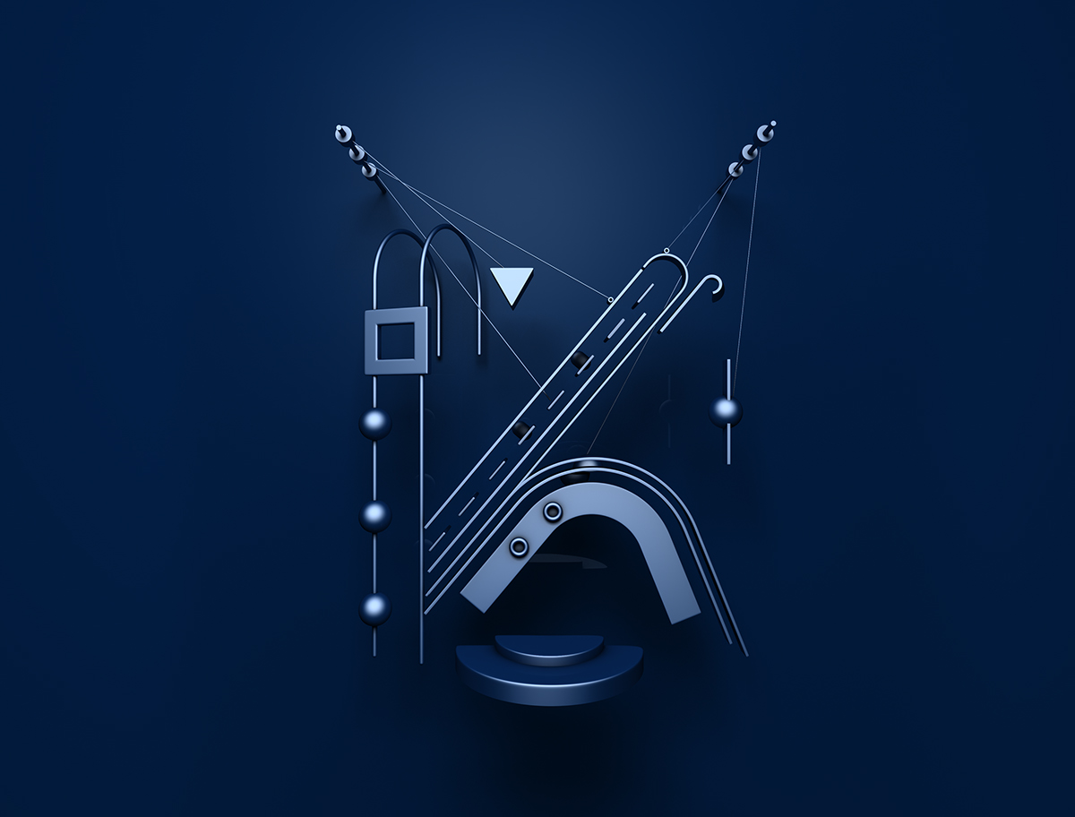
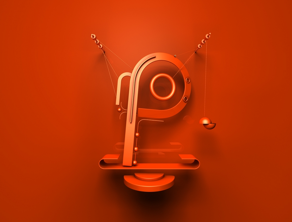
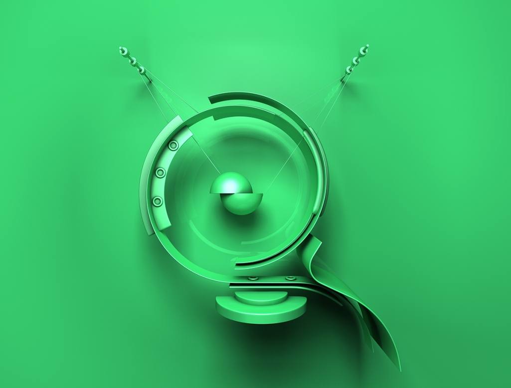
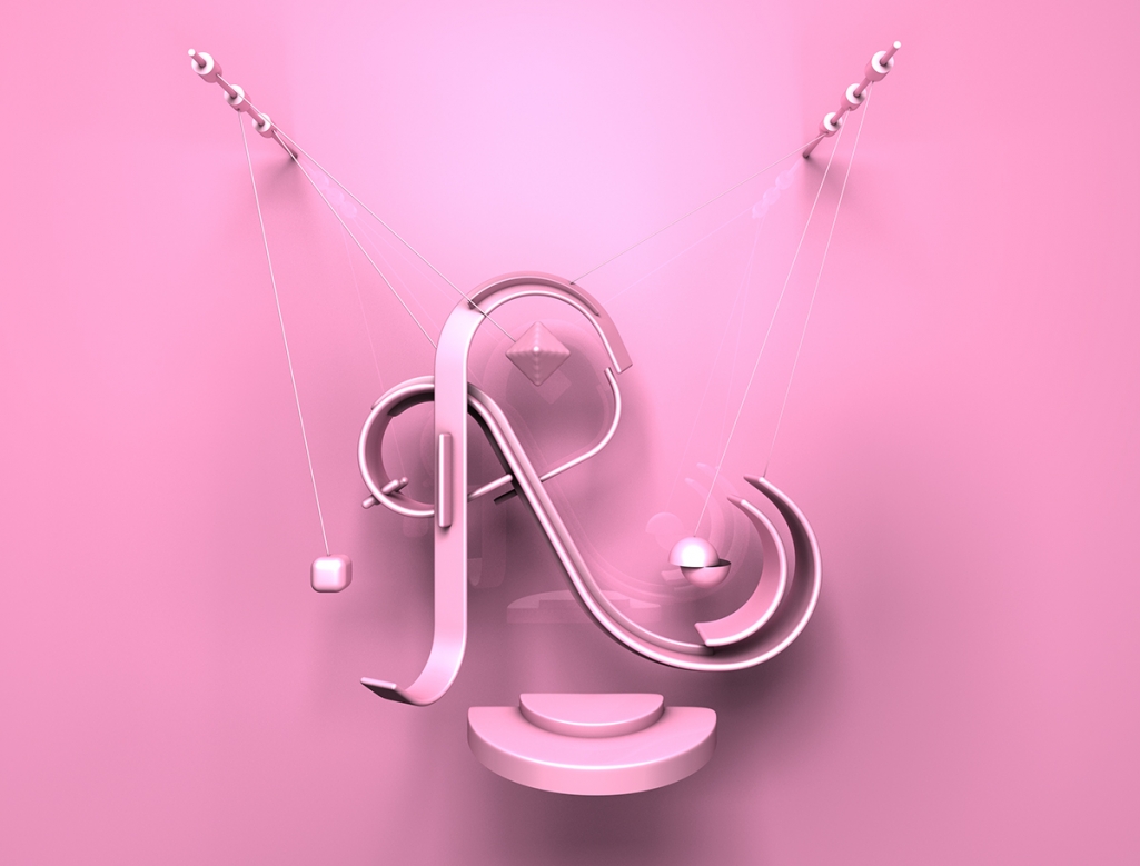
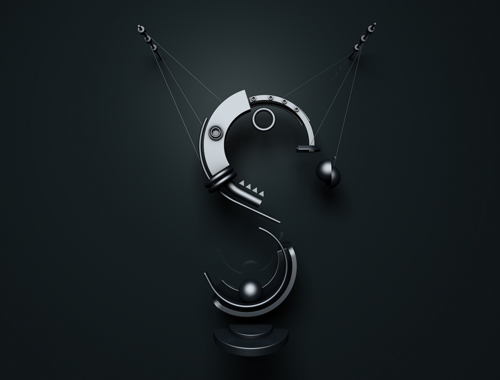
Typeface; a set of letters, numbers, etc., that are all in the same style and that are used in printing. This includes the classic font families ie. Garamond or Helvetica but also the more artistic, freehand or digitally creations ie. Shape by Jaroslav Hach. The right distinction and terminology of typography is often disputed, and I promise to dive deeper into the subject at another time. But now, I’d like to turn your attention to the masterfully created, unique and most of all, fun abstract typeface full of shapes and textures.
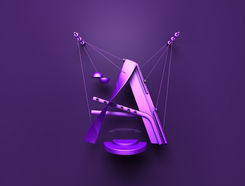
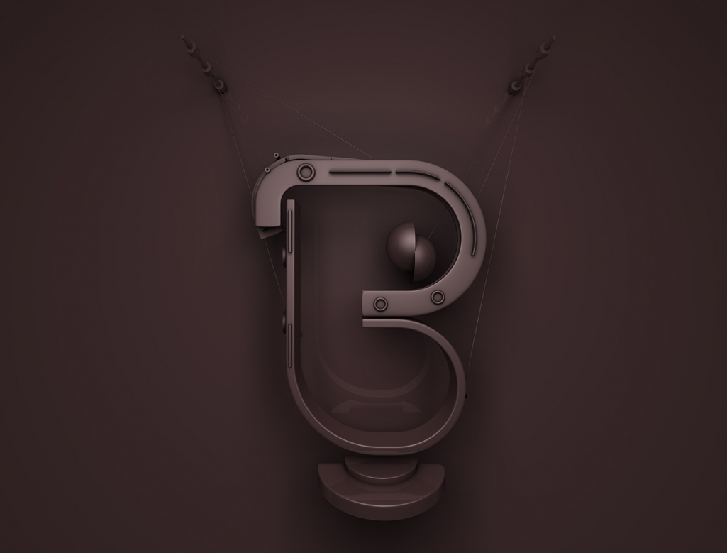
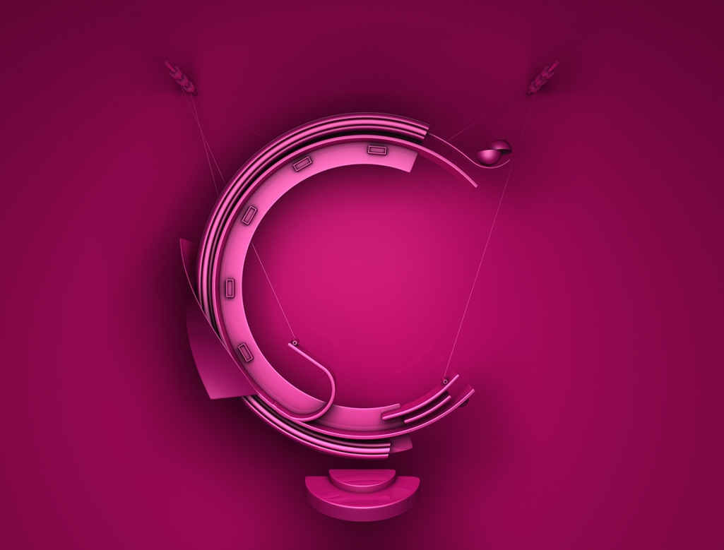
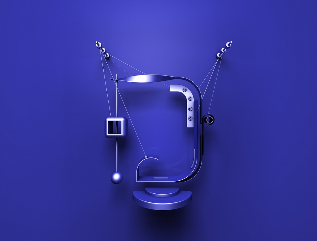
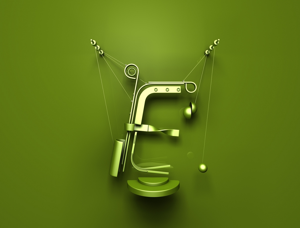
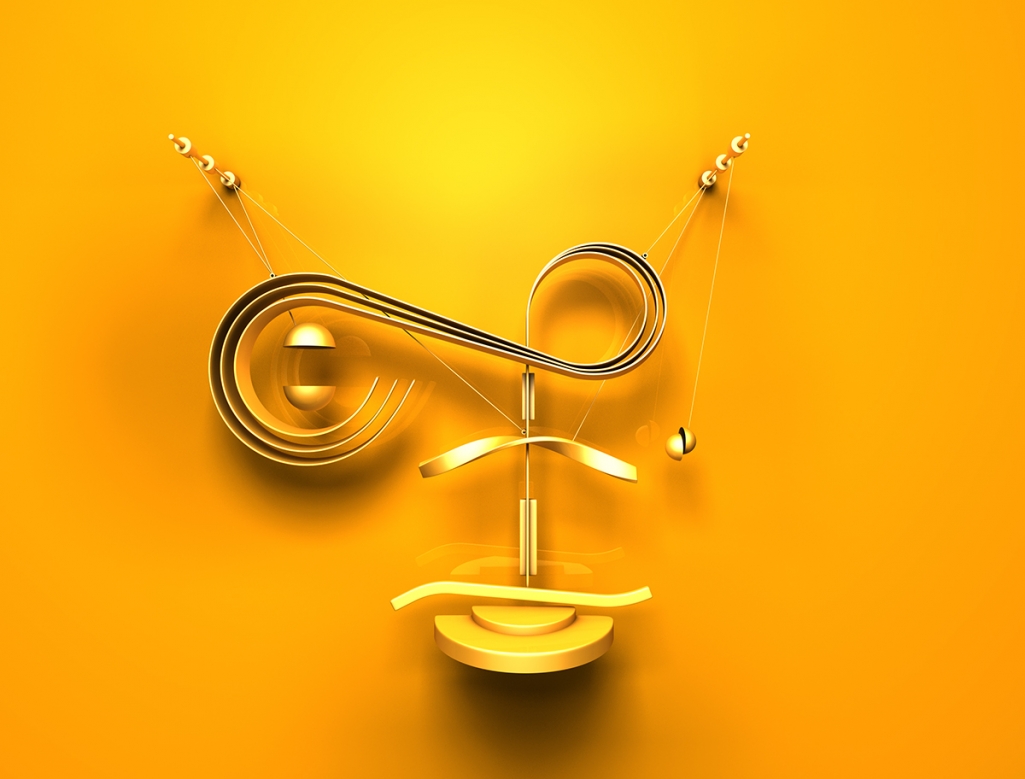
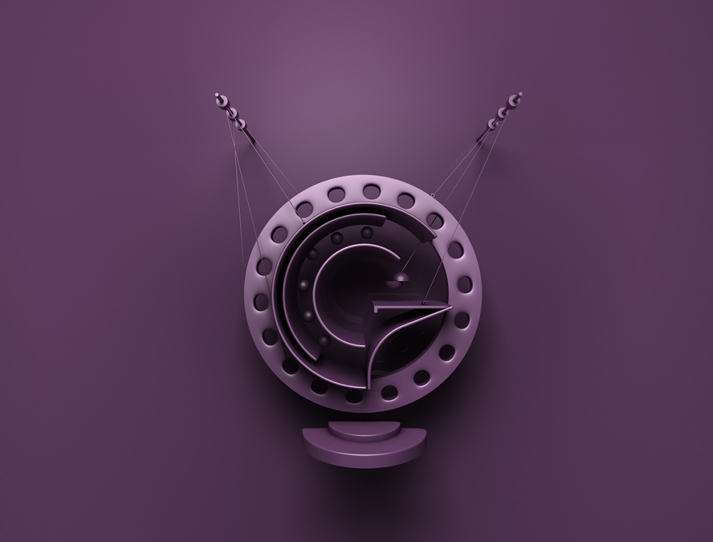
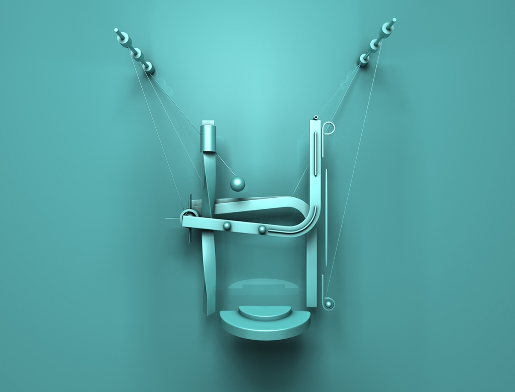
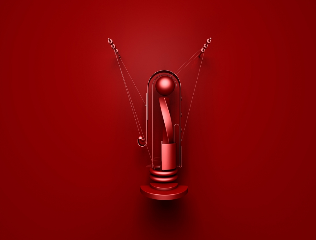
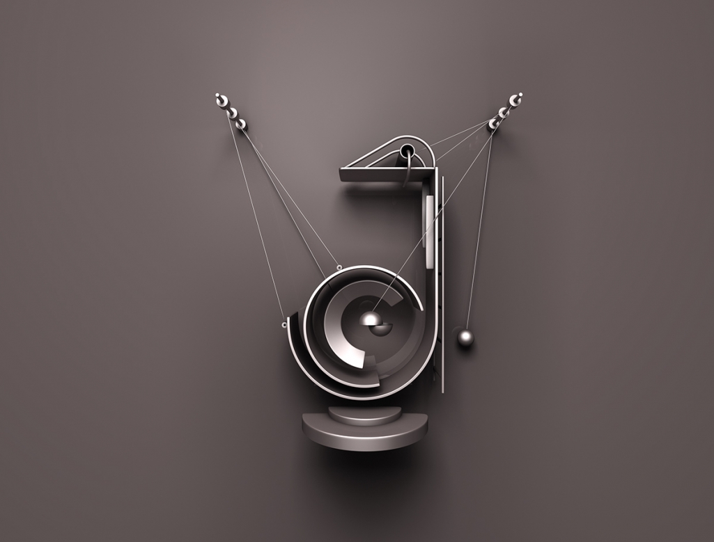
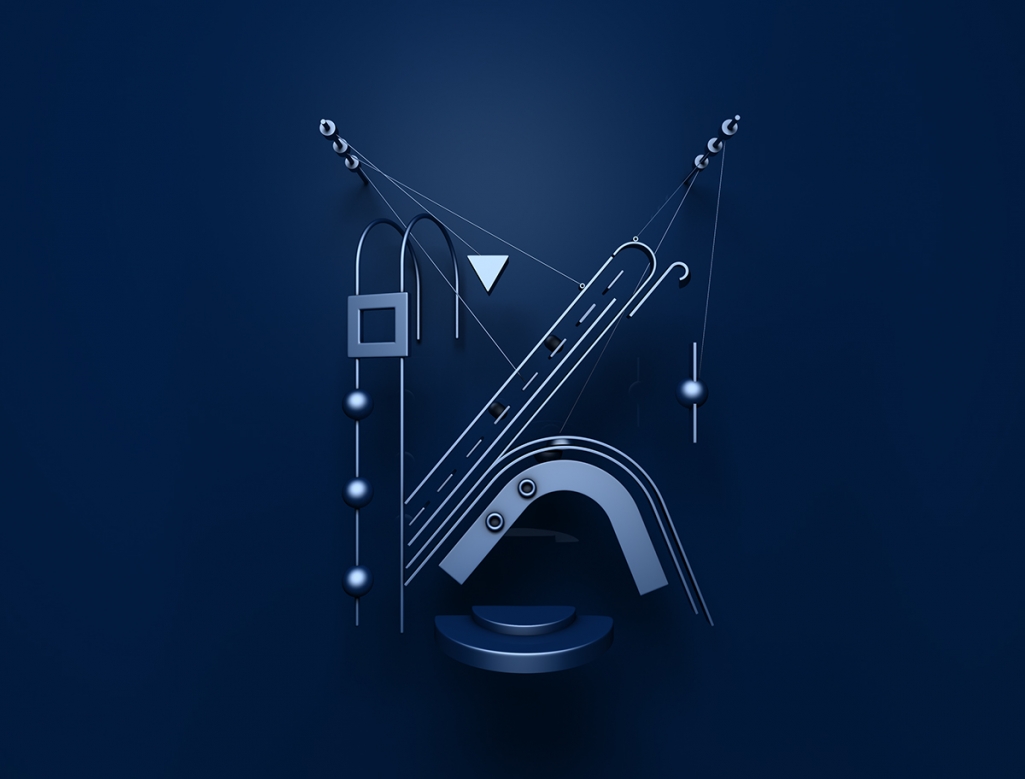
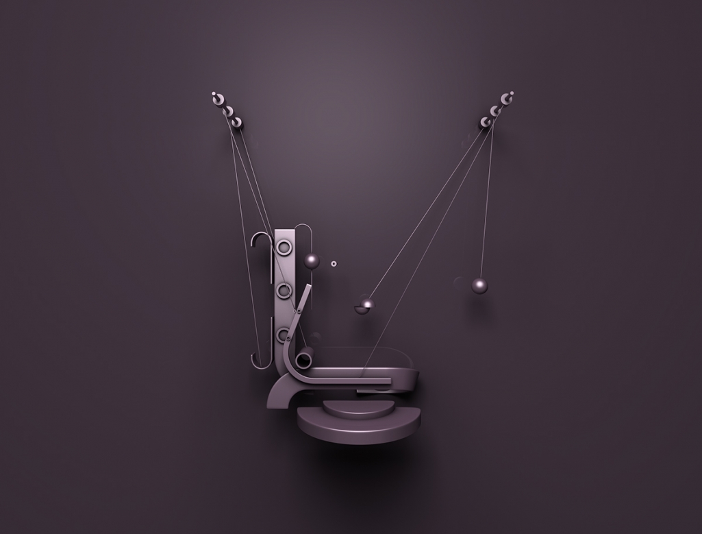
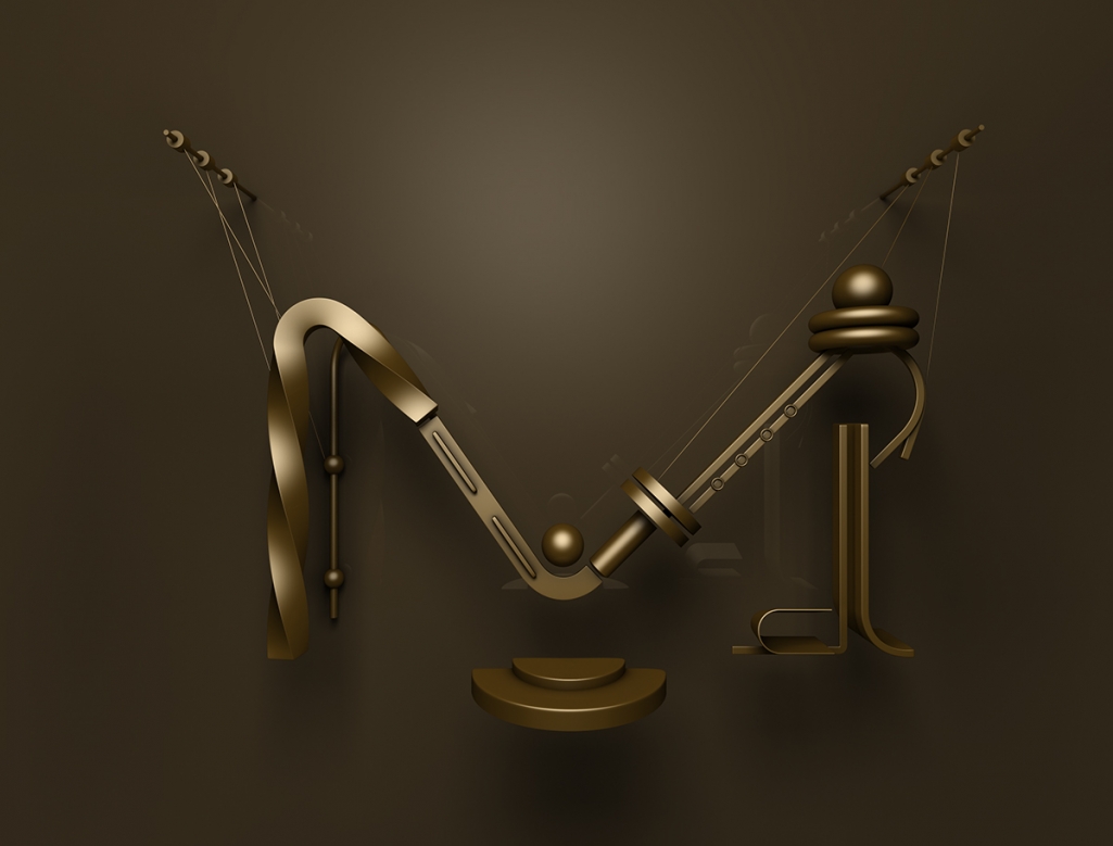
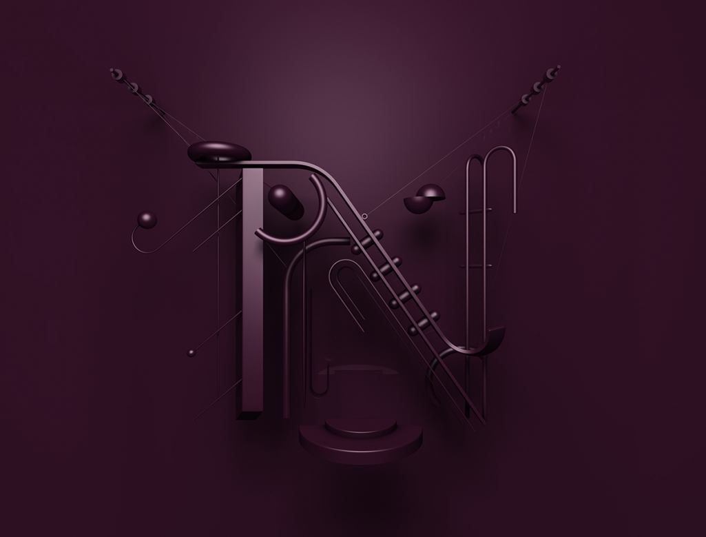
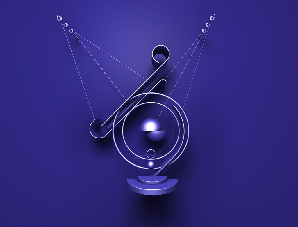
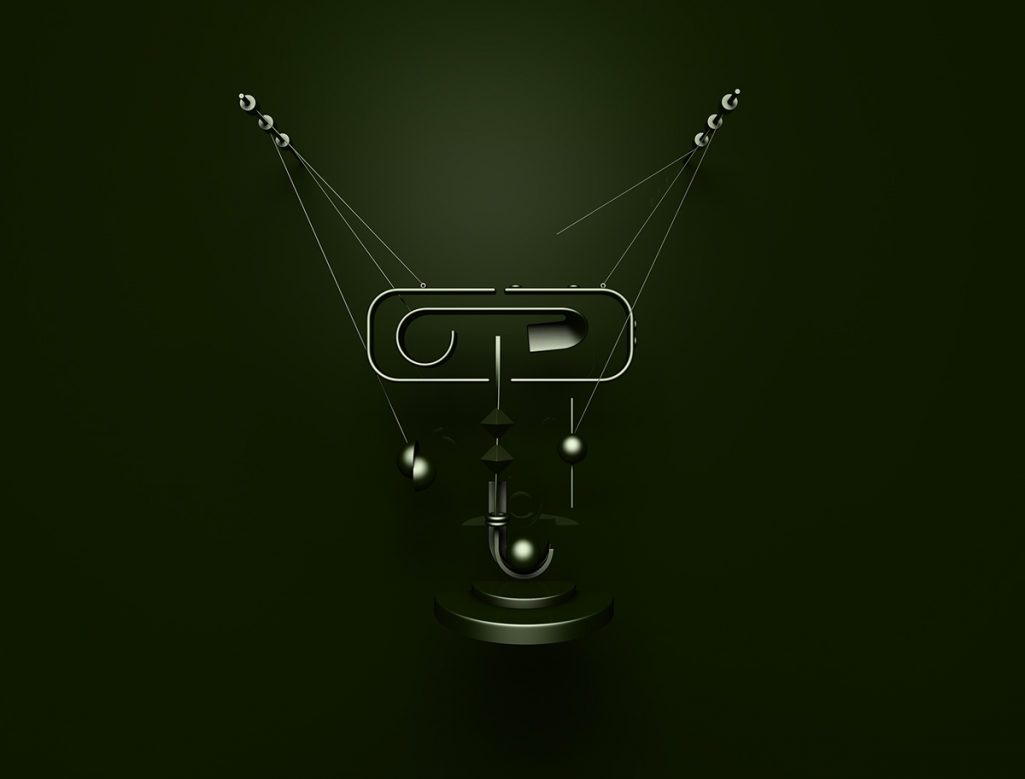
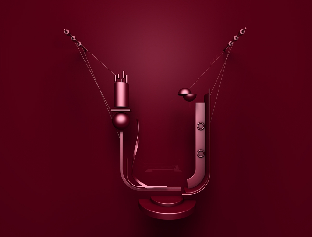
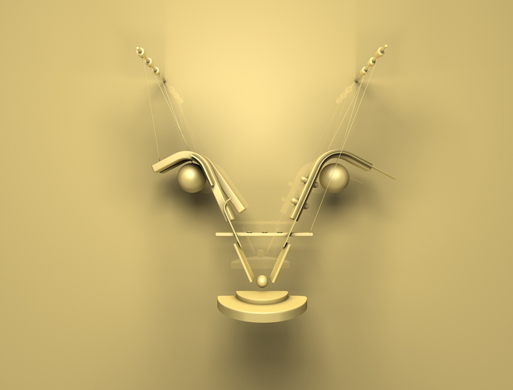
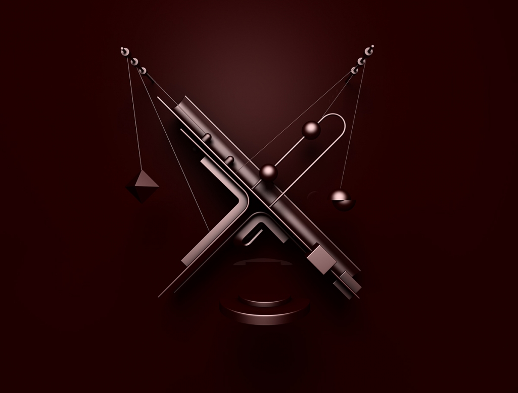
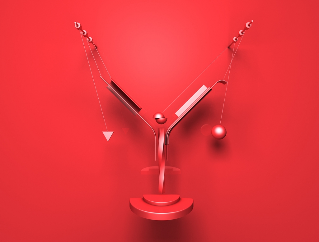
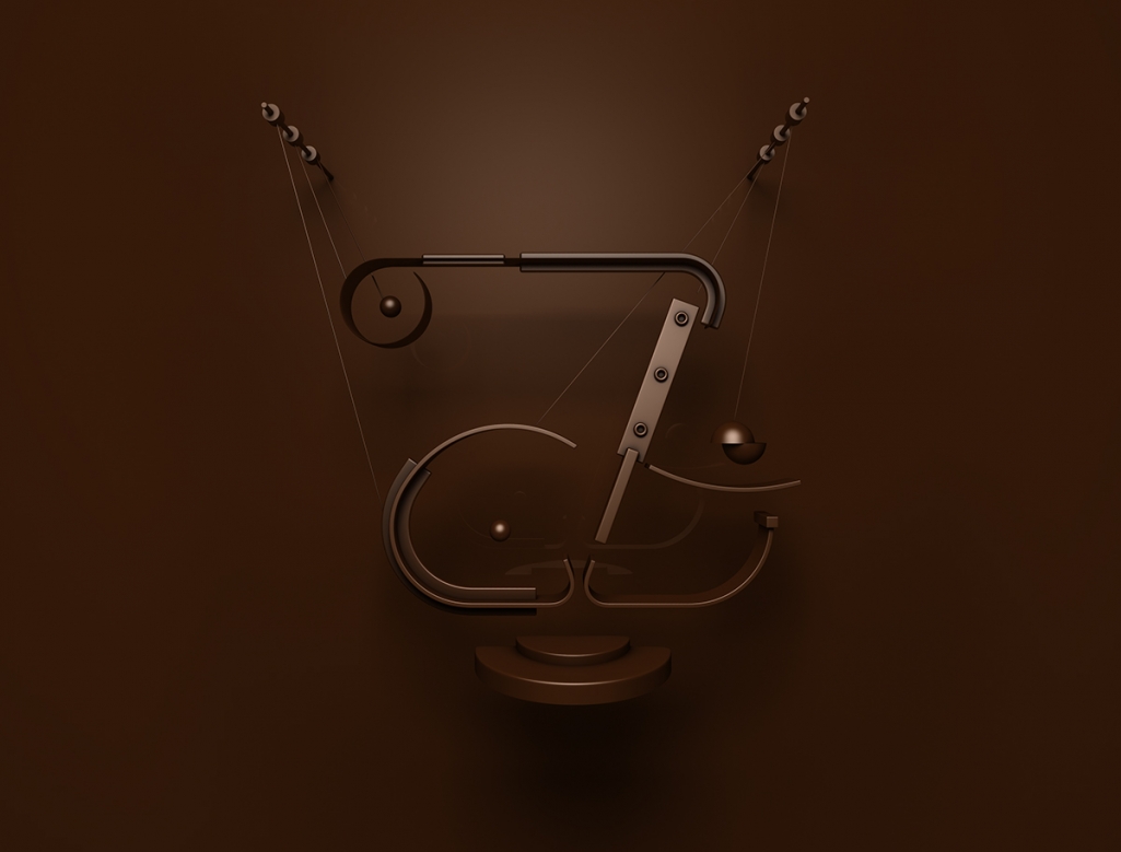
Running his own design studio Fresh Mill in Prague, Czech Republic, Jaroslav Hach specializes in web design, digital art, 3D illustration, and typography, working with a global client base. With a strong eye for detail and color, Hach creates dynamic designs with a flair for boldness and drama. Always working on personal projects to develop and train his personal style, he continuously builds on his set of skills. With an obvious interest in typography and typeface design, it was a hard choice which projects to feature. But his latest alphabet series Shape won me over with its clean and detailed look. Digitally created, and build of several shapes and imaginary objects, the letters are suspended in the air hanging from cables attached to two fixed posts, above a separate platform. The designs finished with shadows and all would perfectly fit for a groovy poster design. To see more of Hach’s work, visit his website or follow him on Instagram.

Images © Jaroslav Hach

