Vienna based multi-disciplinary designer and illustrator Daniel Triendl believes in experimentation, challenging his creative means and trying new mediums, which has helped him build an impressive portfolio and client roster – including the likes of Spiegel Magazine, Völkl Snowboards and Red Bull Media House among many. Full of energy and color, his work is dynamic and undeniably eye-catching. I took a closer look at his typographic adventures and found myself on a hell of a ride.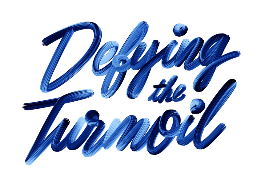
When trying to describe Triendl’s work words such as bold, minimal, fun, surprising pop into mind, yet there is no one stylistic approach his projects fall under. Which I find refreshing and unbelievably respectable. His digital illustrations often take a more geometric form, while his typographic designs vary from free-flowing to abstract, effortlessly blending together. Here’s a selection of Triendl’s commercial and personal typography explorations.

 Visual Identity and Album Artworks for Vienna based Music Artist B.Visible
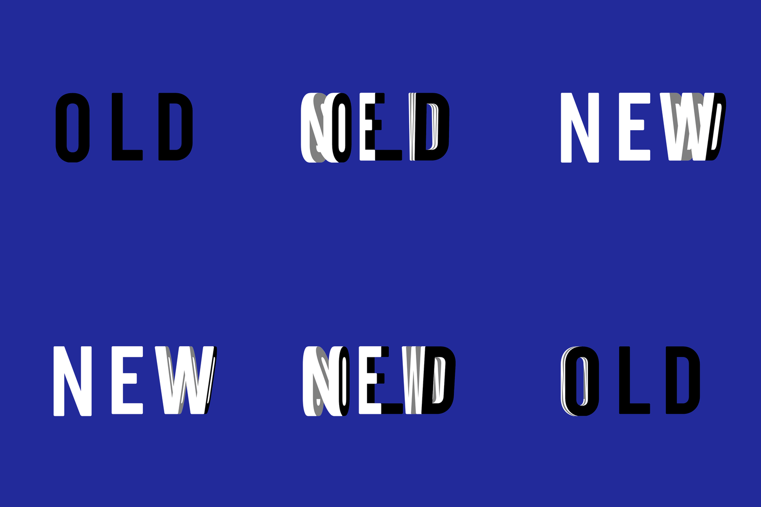

 This typographic artwork is based on the relationship between the future and the past. The movement and colours aim to communicate this further: the bright white letters moving to the right reflecting a sense of optimism, while ‘past’ shifts in the opposite direction in black, conveying a sense of closure. Both are equally important and shows that with out old there can be no new, and vice versa.
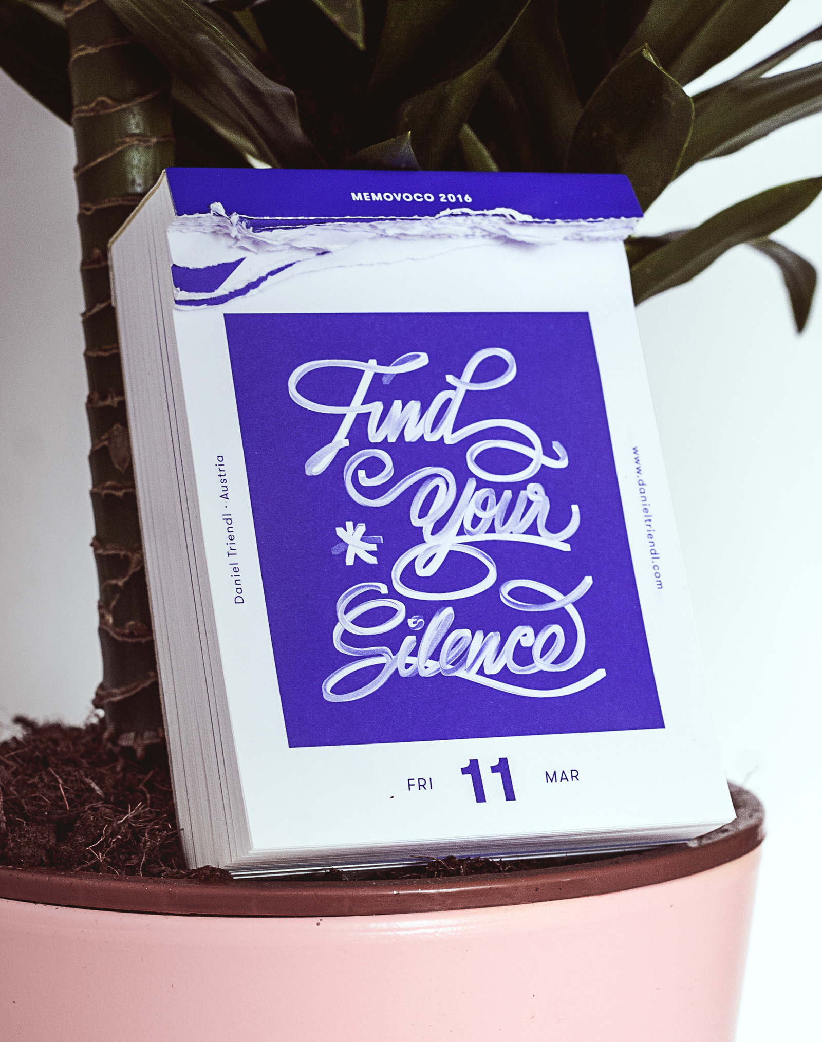 “Find Your Silence” submission for Memovoco calendar, a project that collects 365 typographic statements.

Limited edition can designs for the Mad Decent Block Party 2015 tour, commissioned by VICE Media NYC for Bud Light.
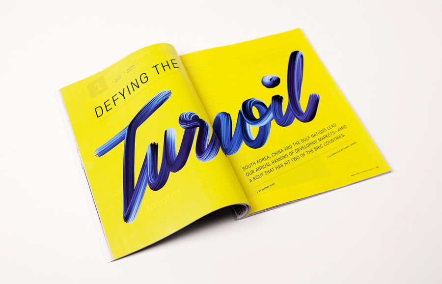 Commission for an opening spread for Bloomberg Markets Magazine.
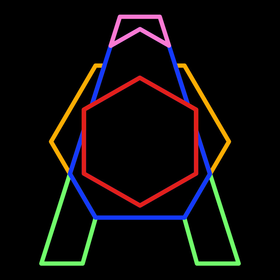

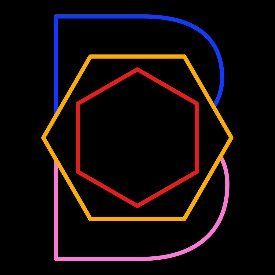
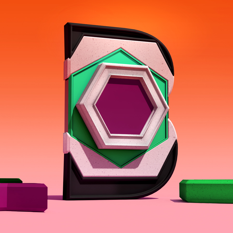

 An ongoing letter exploration based on abstract kaleidoscope shapes.
Images © Daniel Triendl
