Warning! Reading this post might awake intense cravings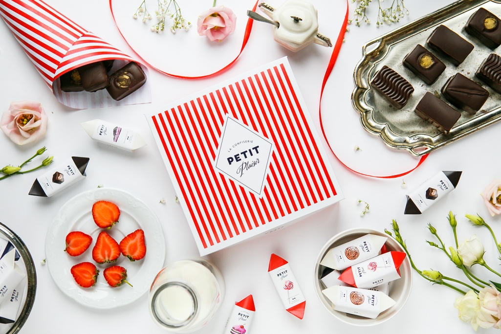
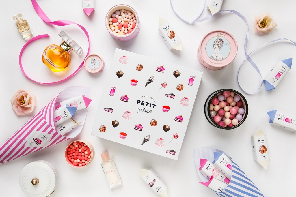
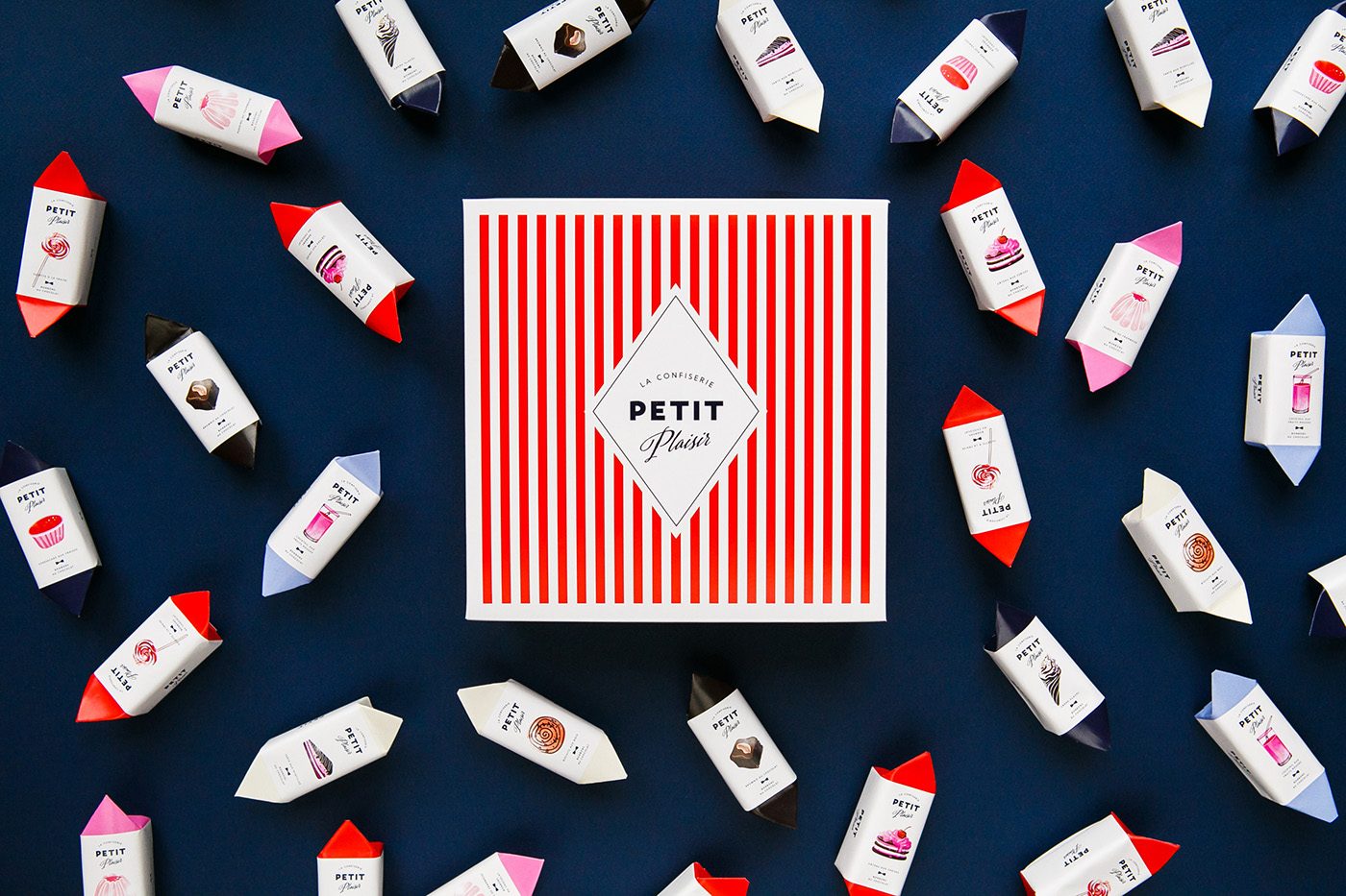
There is a few things that make me go weak at the knees – good coffee, great gin, oven fresh croissants – but nothing makes my mouth salivate more than the oh-so-sweet candy of gods, chocolate. And when it’s wrapped in as pretty packaging as the Petit Plaisir’s by The Pastry-shop Seven Guest – everything else disappears in my field of vision. Let’s just say that my affection for coco is only matched by my love for design.
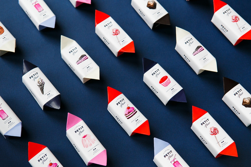
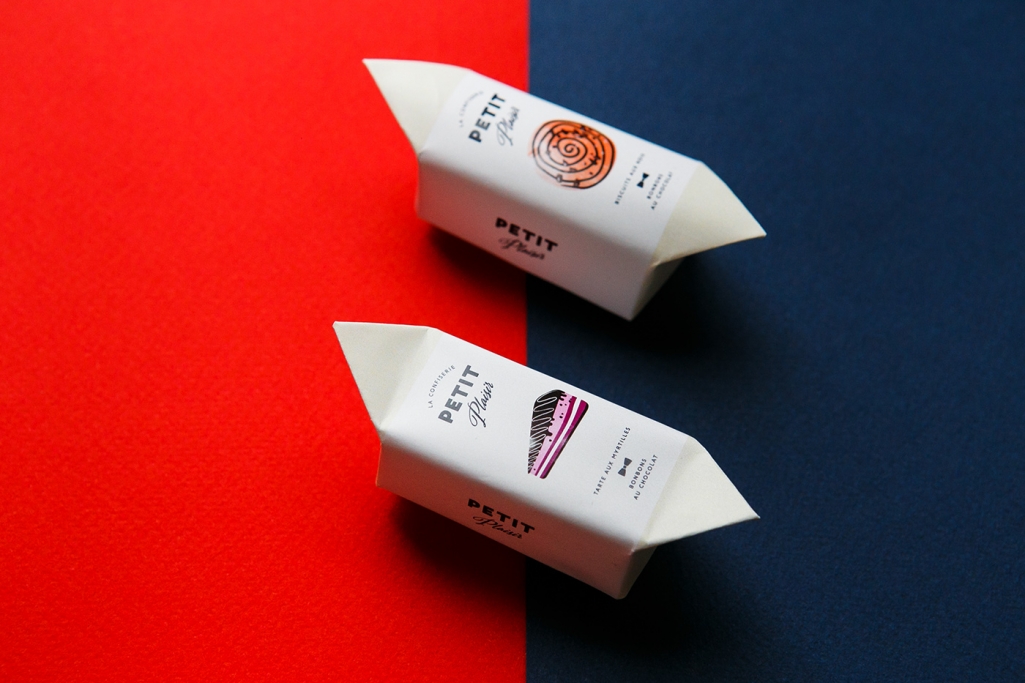
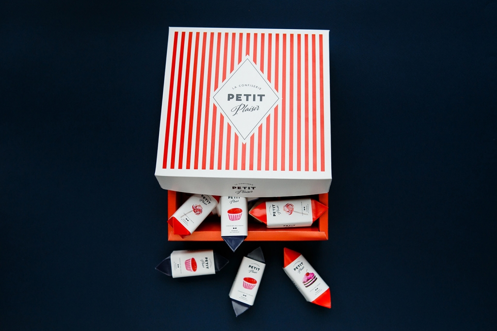
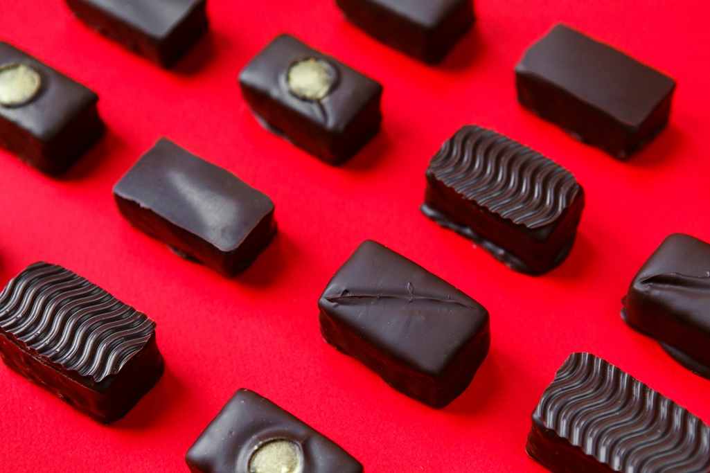
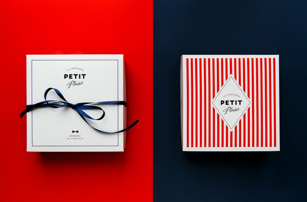
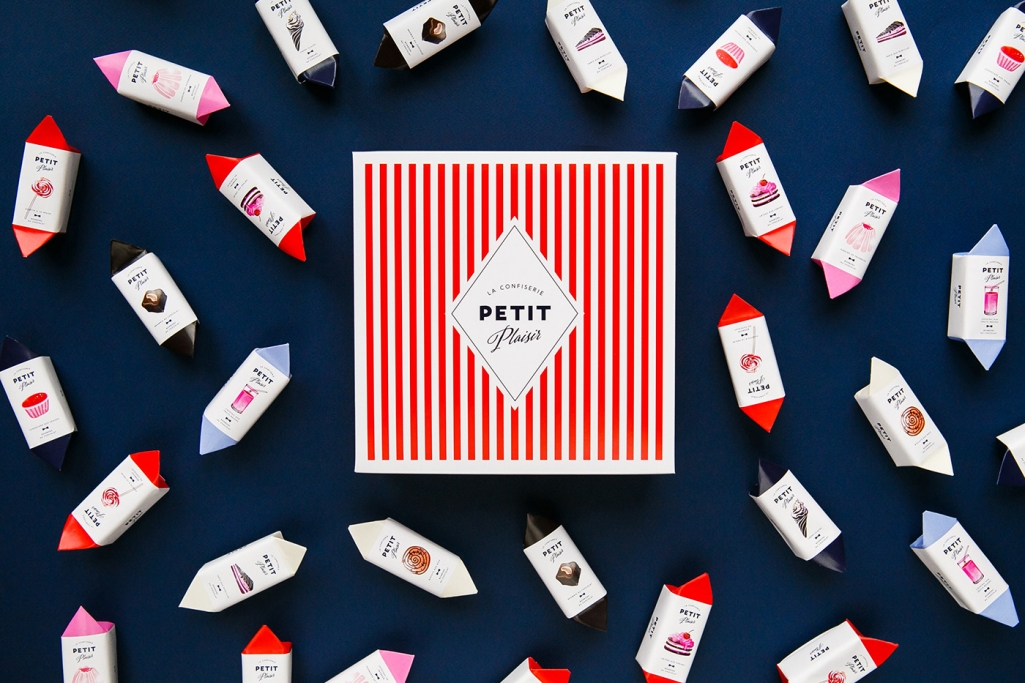
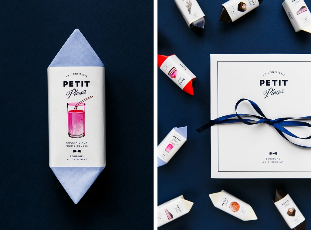
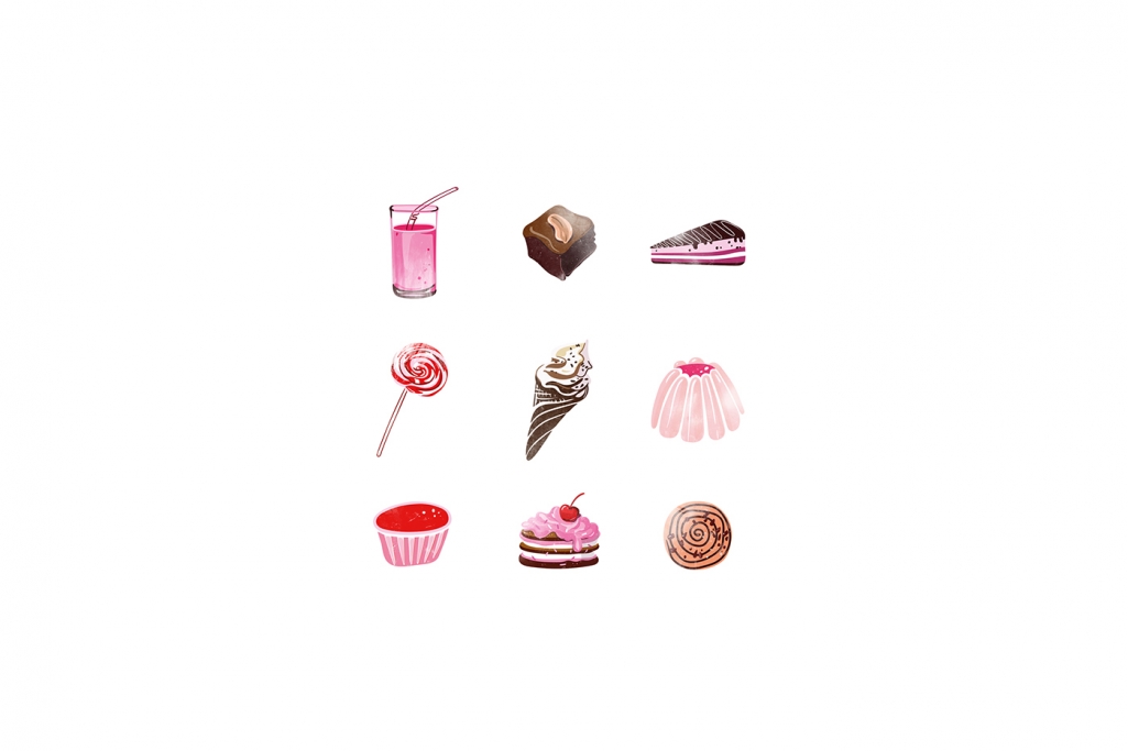
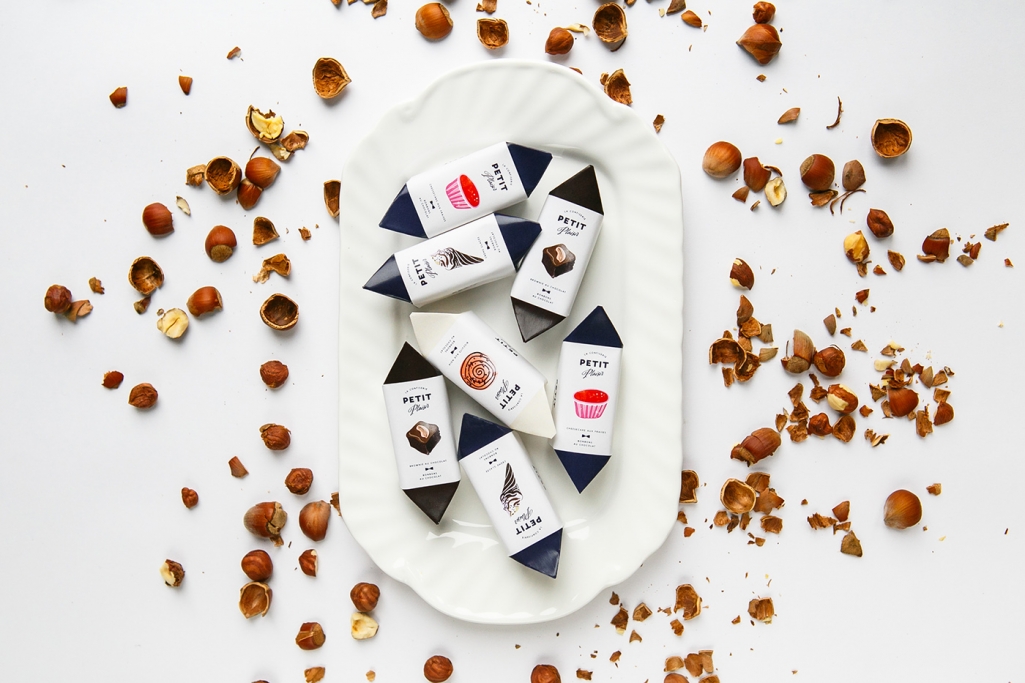
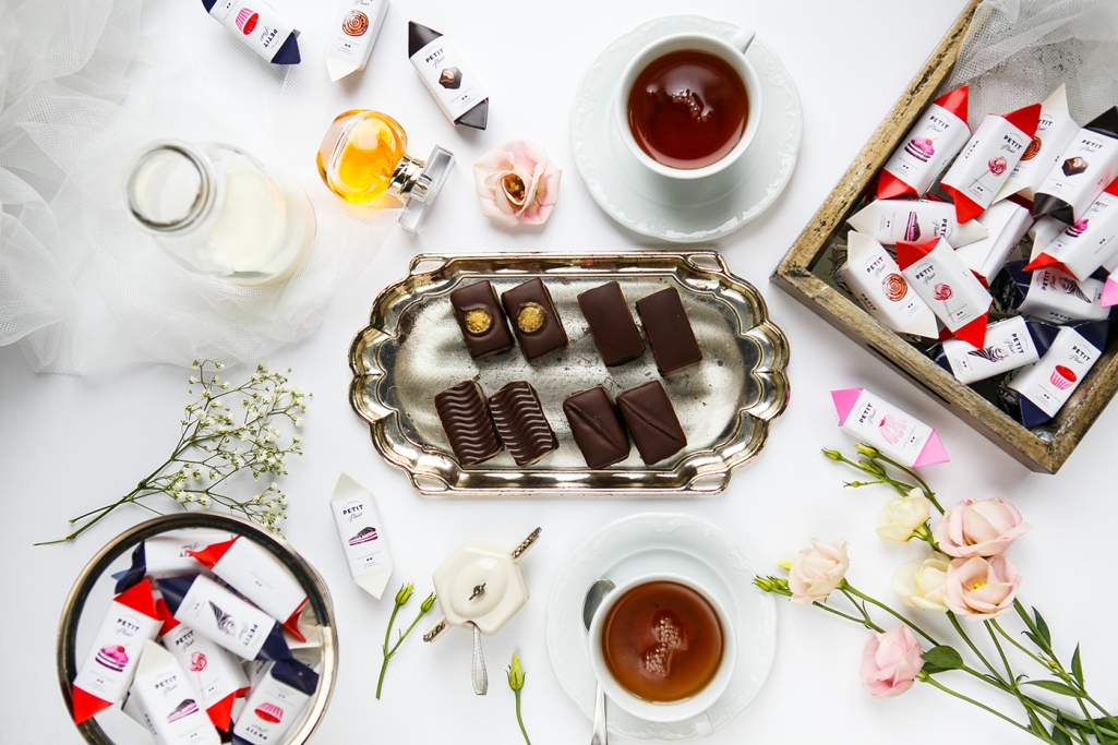
Nizhny Novgorod based Loco branding agency took upon themselves the task of designing the visual identity and packaging of Petit Plaisir (a small delectation) – a series of unique handmade chocolate products with a variety of tastes and fillings, including nine different tastes: a chocolate brownie, a blueberry pie, a cherry pie, a cookie with nuts, a strawberry pudding, a berry smoothie, a strawberry lollipop, an ice-cream. Each chocolate is wrapped in it’s own special paper with a darling, delicate illustration of the specific taste of the confectionary inside. Candy colors such as pink, red and blues are used, with the traditional candy striped pattern on the boxes. The concept is a nice combination of the classic and the contemporary. Effortlessly bringing together a high-contrast color scheme, delightfully dainty illustration and a stylishly subtle logo, the over all feel is fun and luxurious.
Images © Loco Studio

