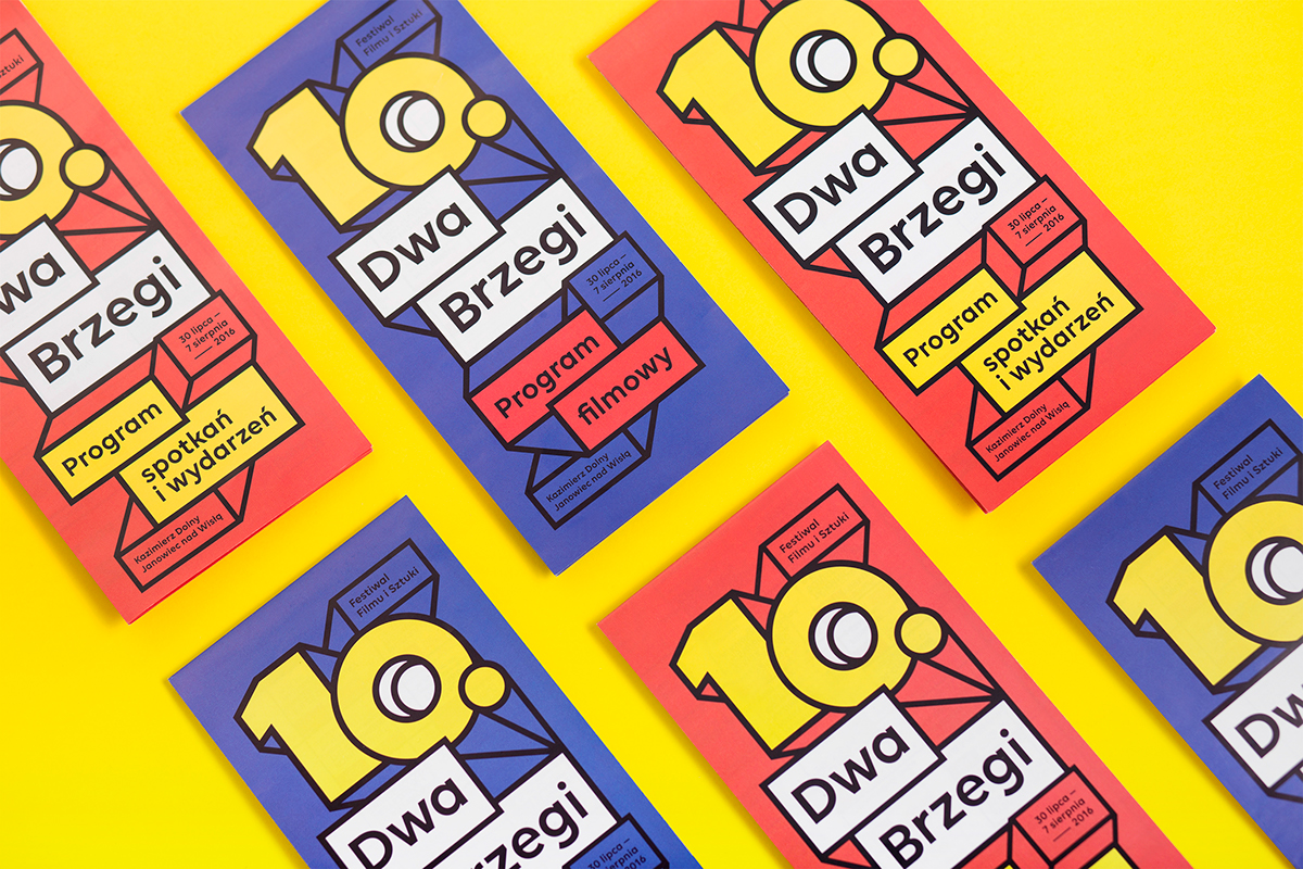


Dwa Brzegi (in eng. Two Riversides) Film and Art Festival, located on the eastern bank of the Lesser Polish Gorge of the Vistula, part of the Puławy – Kazimierz Dolny – Nałęczów tourist triangle, has an eye-catching visual identity that draws inspiration from comics and pop art. The design has proven so popular, the style has been chosen as a permanent part of the festival.
The festival reaching it’s 11th year this summer, the identity created by Polish graphic designer and lettering artist Zuzanna Rogatty follows the theme of the previous editions (9th & 10th — click here), which turned out to be very recognisable and identified perfectly with the Dwa Brzegi. She continues the theme of cinema screens, yet making it slightly more complex and adding vibrant colours. The main visual element comes from the number which year is in question, with strong contrast coming from placement, layout and color. The flexible and responsive visual system is the key of the design, easily scaled to various platforms from online to print, including huge stage banners to small pins and postcards. When an identity requires flexibility and malleability it’s good to focus on few strong key elements that communicate a strong visual message while staying contemporary and current from year to year.
©
Art direction & Graphic design — Zuzanna Rogatty
DTP & Graphic design— Radosław Bućko & sponsors

