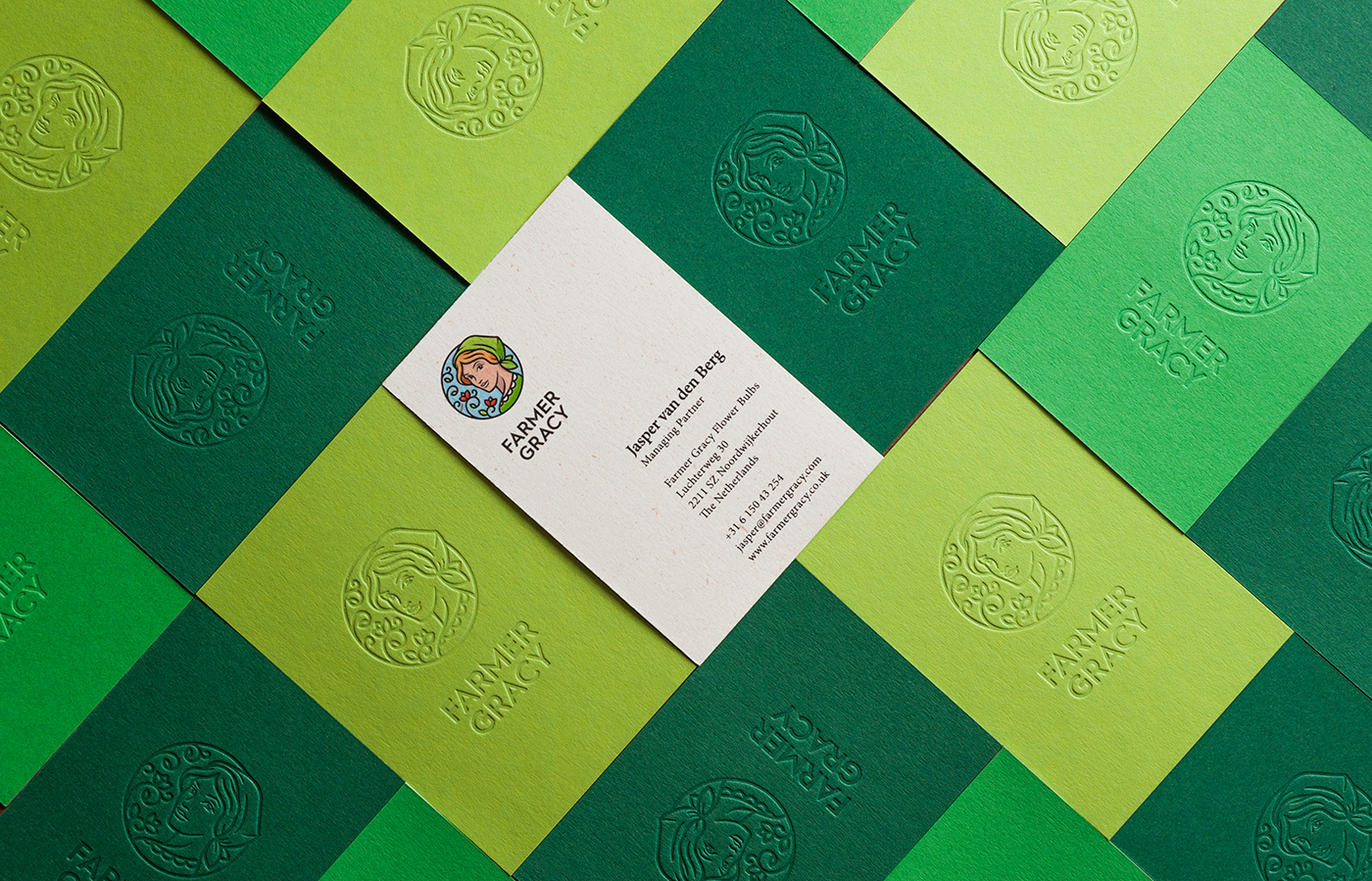
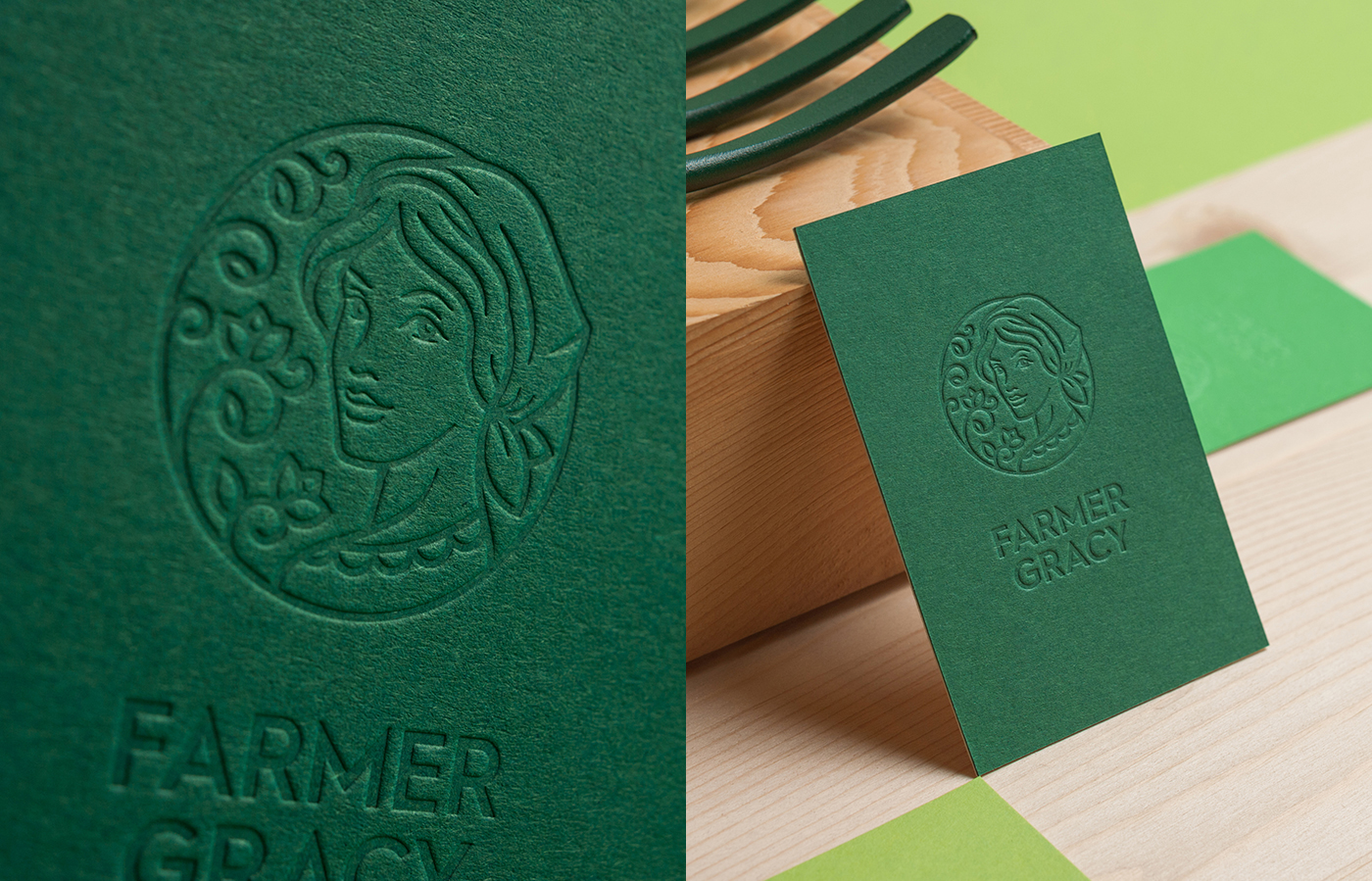
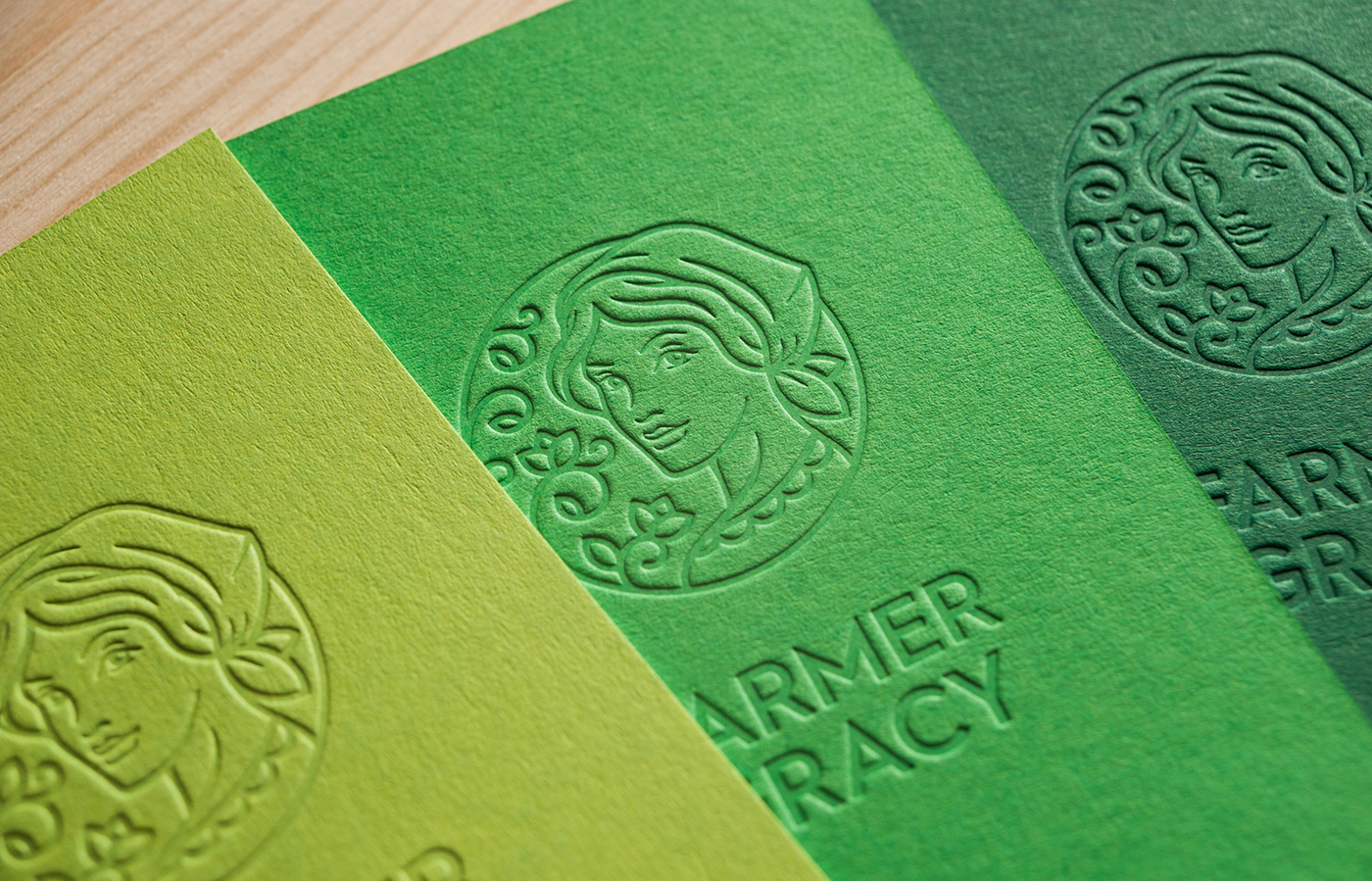
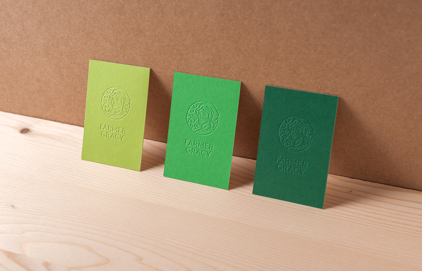
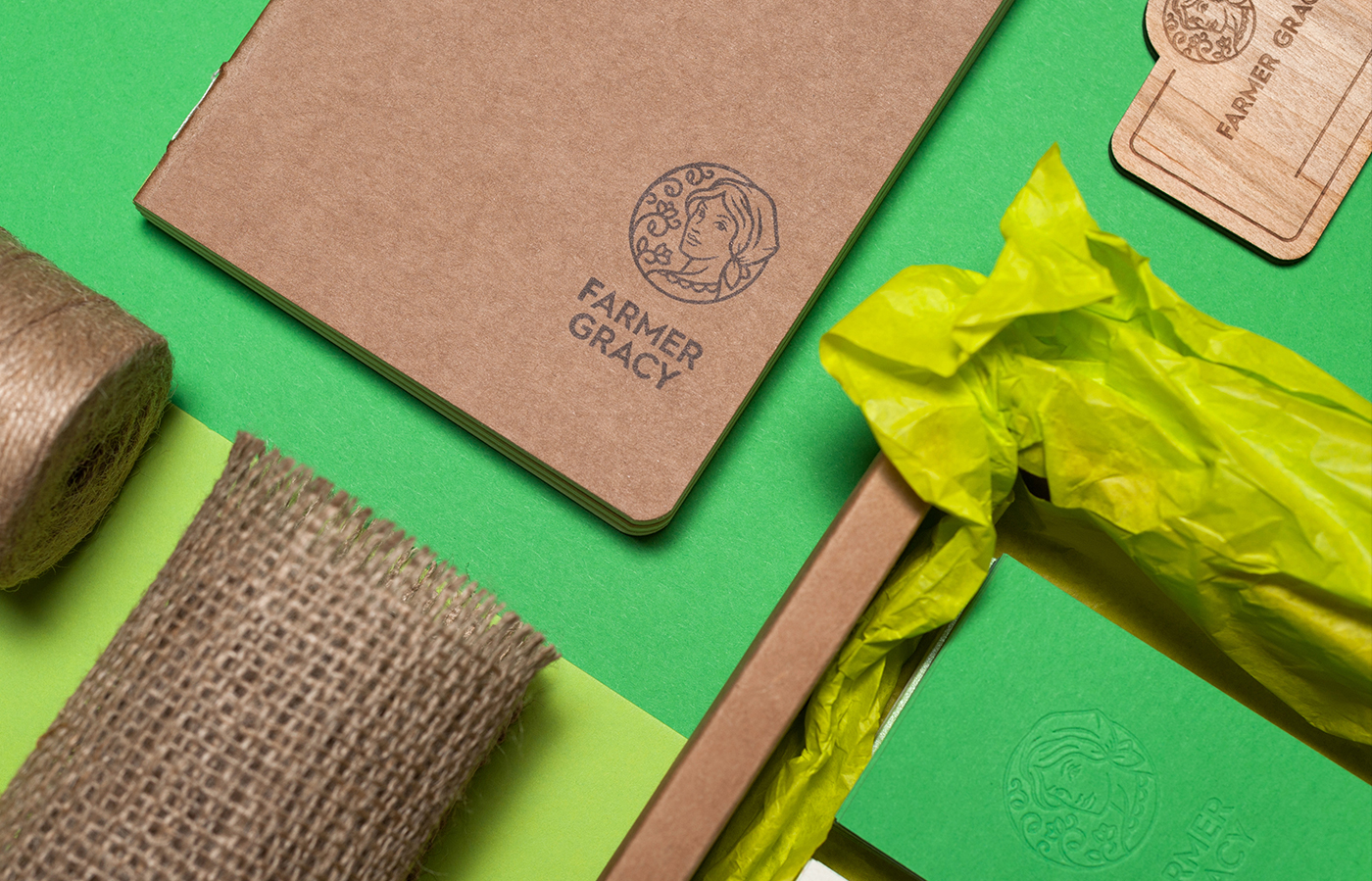
Greenery being the official Pantone color of the year I’ve been waiting to find that perfect example of branding that utilizes the color green to its full potential – not just as the lazy option for health or nature related brands – but as something surprising, luxurious and contemporary at the same time. Bulgarian Mark Collective’s corporate identity for Farmer Gracy is exactly that; fresh, memorable and most importantly, communicating the essence of the English face of a famous Dutch bulb-growing family.
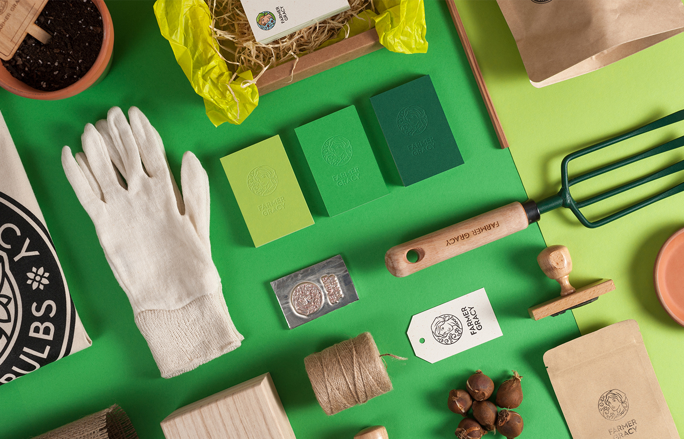
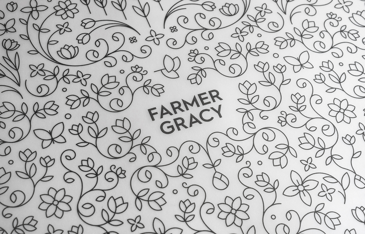
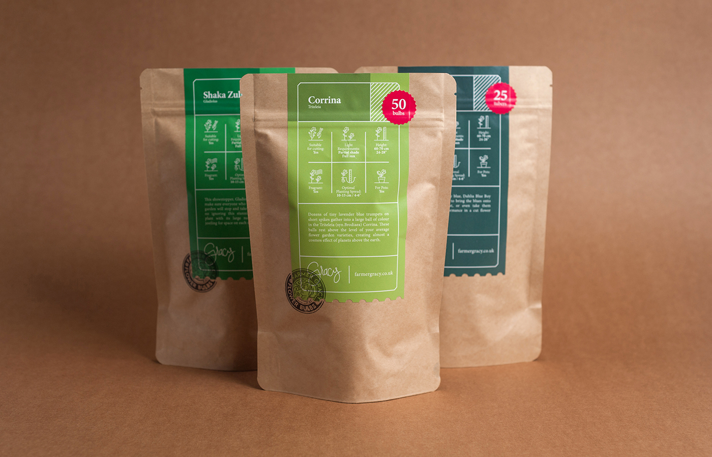
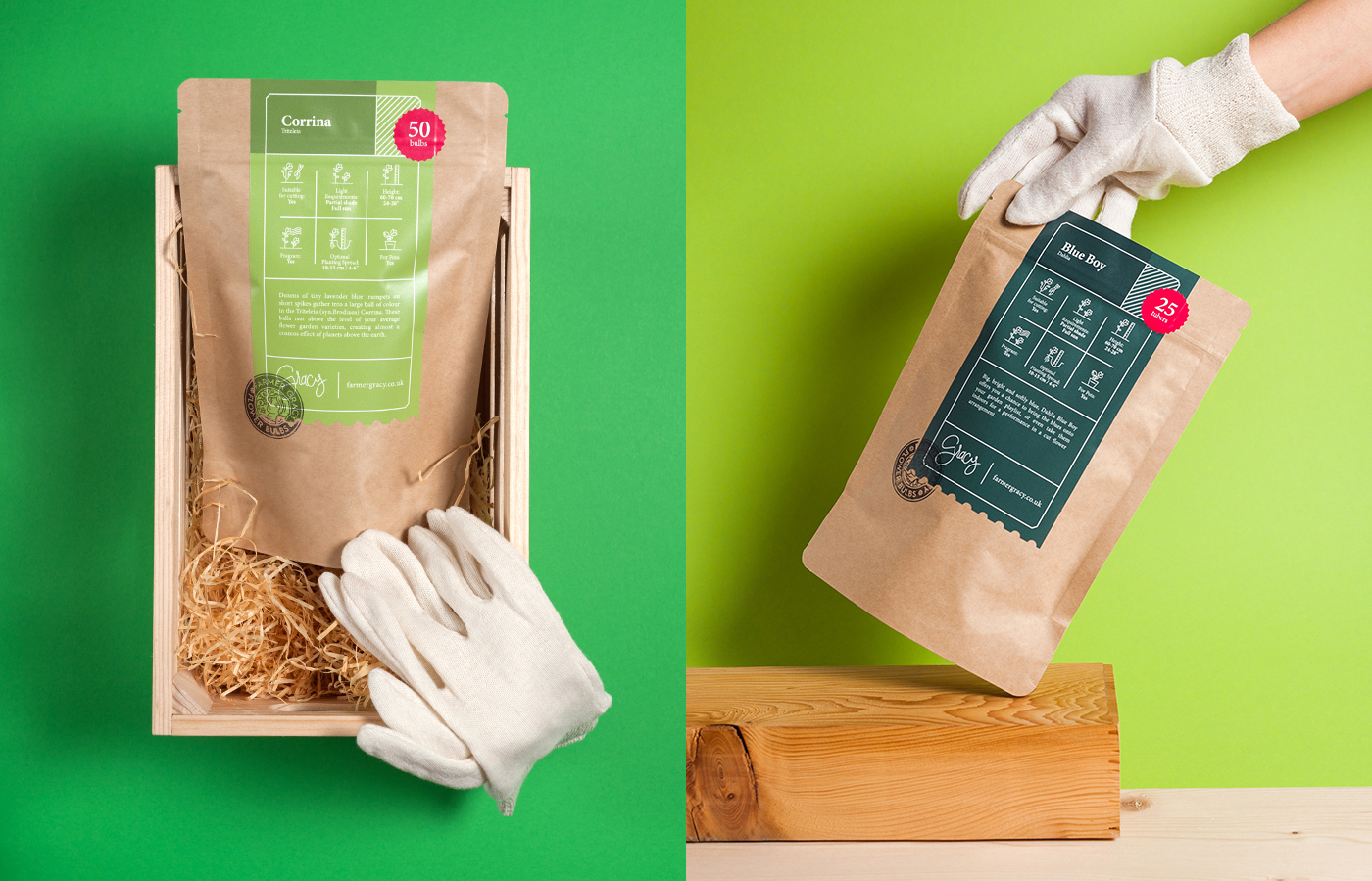
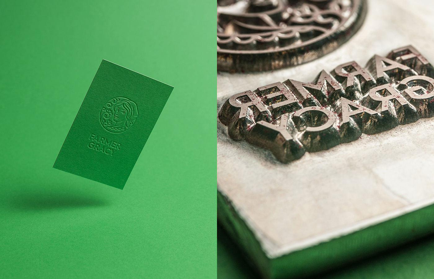
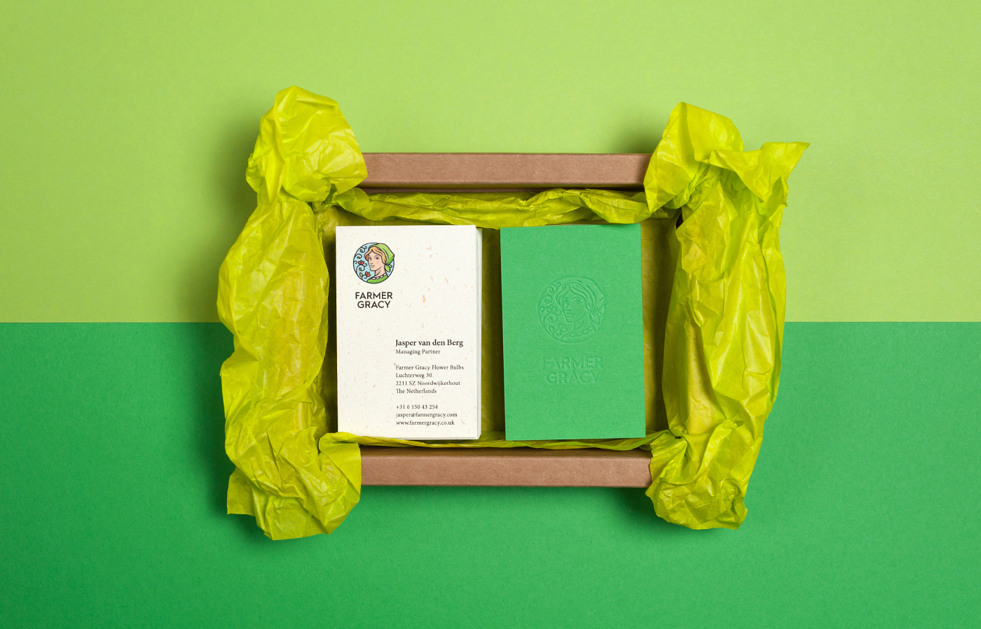
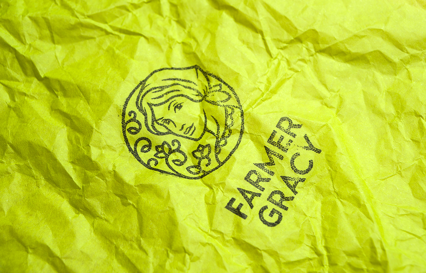
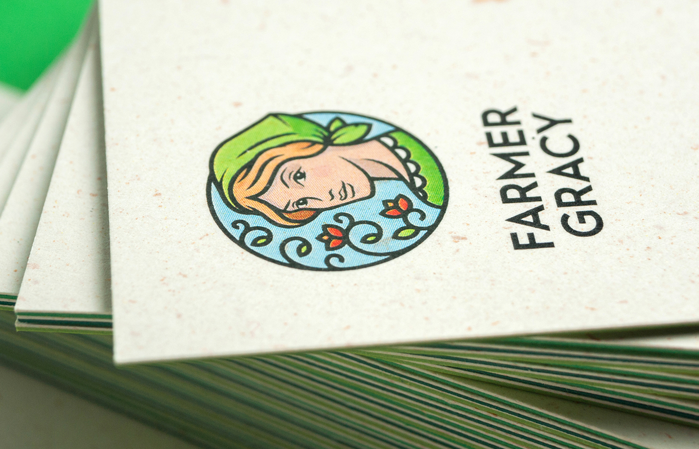
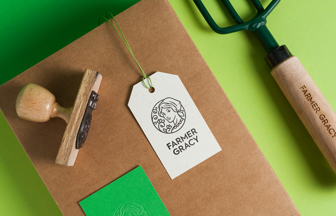
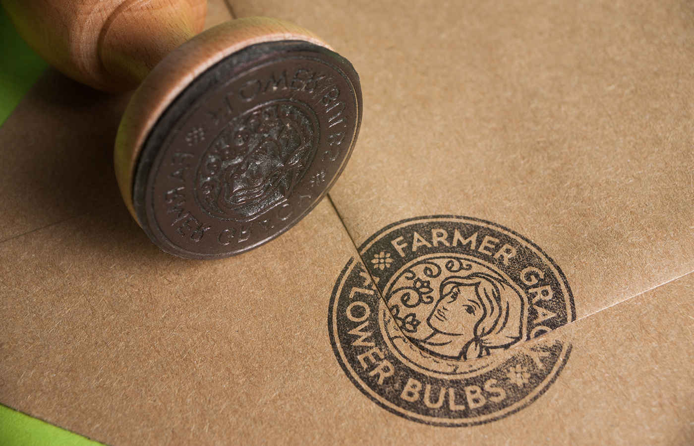
Founded on passion in 1888 by Dutch flower pioneer J.W.Lefeber, Farmer Gracy customers have always shared his ambition to grow the most beautiful flowers in the world. Having UK’s biggest selection of amazing flower bulbs, including extremely rare varieties you won’t get anywhere else, customers are able to buy directly from the Dutch farms online being guaranteed quality and authenticity. The new identity honors both the brand’s grand history and modern market leadership position by combining high-quality materials, stylish design details, and art nouveau inspired illustration.
Marka collectives work is always on the spot, well researched and high in quality, whether in ideas, creativity, or execution. They seem to thrive with corporate brand design, understanding the needs to focus on marketability, promotion, and diversity in both materials and focus group. Farmer Gracy is a prime example of this.






Images © Marka Collective

