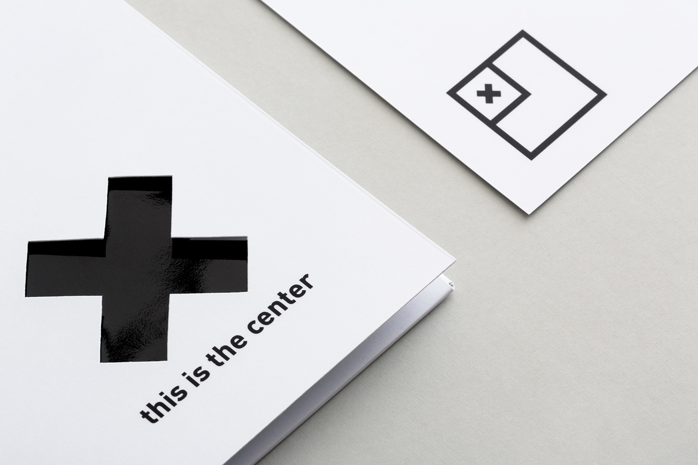
The idea of reevaluating the conception we have of the world and its unbalanced distribution of knowledge, wealth and metaphorical center became the starting point and carrying the theme of the brand. The idea was visualized by manifesting the relativity of the Center, the possibility, and excitement of exploring new centers. Communication materials make people feel confused first and then realize the other option, another point of view on reality. Thus, the goal to rethink the center is being achieved on every step.
With a grand idea, the execution is best left minimal, which is exactly what Maeutica did. The black and white branding heavily relies on the playful placement of the large X, challenging the viewer to let go of binary conceptions. Combined with strong typography and clean execution the identity feels cohesive and appropriately tasteful for the occasion. Cleverly the designed packaging stimulates the participants thought on the subject.


