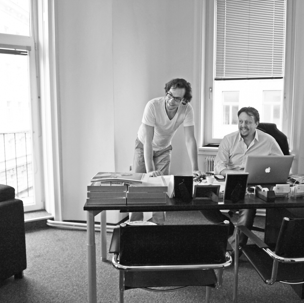
Earlier this week we paid a visit to BERNSTEINER Design Department, a studio specialized in pre-press work and creative retouching in Vienna’s seventh district. We had the pleasure to talk to Franz Josef Bernsteiner (FJB), the founder of BERNSTEINER Media Group, and Richard Schilcher (RS), two creative minds who are passionate about their work and committed to image and print perfection. We chatted with them about the importance of pre-press work and the right paper choice as well as about current trends in print publishing and their plans for the future.
 Can you briefly introduce us to BERNSTEINER?
FJB: It all started in 1996, with what is today known as BERNSTEINER Design Department. Three years later I founded BERNSTEINER Print Company, a printing house because I wanted to translate our idea of quality into final print products.
RS: At BERNSTEINER Design Department we are, among other services, specialized in repro and retouching or what is called “litho” in German. This term describes the pre-press work, the preparation of text and, especially, images for print. The screen shows everything in RGB. With the pre-press work, we make sure that the printed output matches what you see on the screen. Nowadays you have color management standards, which make this work easier, but by “litho” we understand more than simple color management.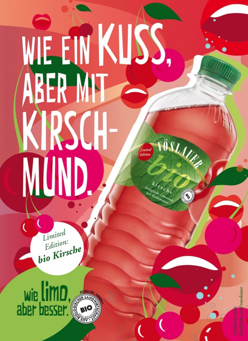
Which role do the choice of paper and the paper surface play for repro?
RS: The surface of the paper or paper class is, of course, relevant for printing and for the preparation of the data! The color behaves differently on uncoated paper than on coated paper – this must be considered.
Every good paper manufacturer or merchant – they are the ones who know the characteristics of “their” paper best – should be able to provide the corresponding ISO profile for each paper brand. This allows us to prepare the artwork for printing accordingly and to create the print data with the correct profiles.
Now I understand why my printouts of photos always look different from those on the computer!
RS: We care about repro and retouching in everything that is printed – no matter on what substrate (paper, fabric, synthetic, metal etc.) or by which printing technique. At the moment we are, for instance, working on banners for vending machines at the Donauinselfest.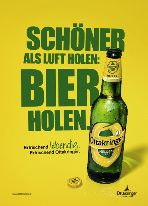
So you make sure that the yellow of Ottakringer is the same on cans, supermarket displays, beer trays and on the company’s webpage?
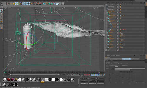
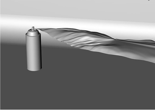
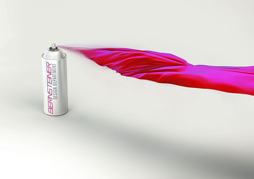
RS: Exactly! There are many “litho” secrets which we do not like to reveal. One of them, for instance, is that black text must never be four-colour (4C). And black and white images are much trickier than color images. Photoshop and other programs are still based on this “old know-how”. Next to repro, we are also specialized in so-called creative retouching. In this ad for Vöslauer, we used multiple photos to create this single composite image. We had to redraw several parts, especially the splashing water.
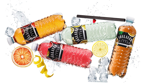
This looks so easy and natural!
RS: That is why people sometimes are surprised when they hear the price they have to pay. Indeed, it is a lot of work! There are some alchemists at BERNSTEINER, who have worked their magic on this ad.
Where do you learn this magic?
RS: Back in the days, you had to complete a four-year apprenticeship in order to become “Lithograph” or “Reprotechniker”. Today this profession is called “Mediendesigner”.
FJB: Nowadays the graduates from schools (such as the Graphische Wien) know much less about repro and retouching, but are more uncompromising and knowledgeable about computers. We hire and teach them about repro, and there are things which we can learn from them – the best mix is “old” and “young” together.
RS: At BERNSTEINER Design Department, graphic designers responsible for the creative part and reprographics taking care of the technical implementation work hand in hand.
As engineers and architects do?
RS: Exactly. And the cooperation with BERNSTEINER Print Company allows us to provide full service to our clients from the development of – let’s say – a corporate identity to the final print product. Of course, the printing house is also a second business, which prints things not only designed by us.
FJB: We also work cross media, which means that we take care of the online channels and digital communication of our customers as well.
You work for many well-known brands. Do they still spend good money on print communication?
RS: Not enough! (laughs)
FJB: They know that print is more sustainable and lasting. Fast information is digital. We print many annual reports for companies such as KTM or Ottakringer, for whom perfect quality is very important. And we see that many of our customers look for unique print products. Different finishing effects are a great way to personalize print. At the moment, for instance, I am developing the stationery for one of our customers, who wants to go for gold foil embossing.
Which current trends do you observe in print publishing?
FJB: Well, there are some magazines which are successful and thriving such as Servus. Today it is all about content, magazines not offering good content, but content which you can quickly find on the internet, are dying. And, of course, you need to pack this content nicely and cleverly. The language, imagery and overall design need to fit together.
RS: There is a trend “back to quality”.
FJB: Absolutely. We definitely see a trend towards quality both in terms of content and design.
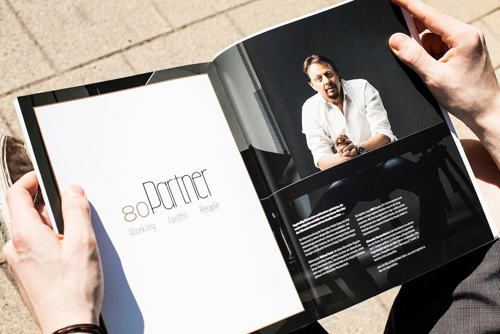
You just published the first issue of your own magazine, the BERNSTEINER, which deals with communication and media design as well as printing and shows examples of your work. Can you tell us more about it?
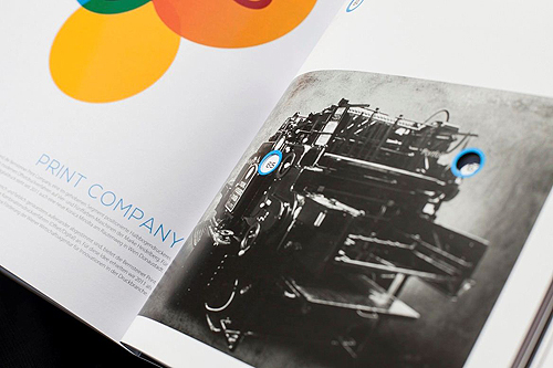
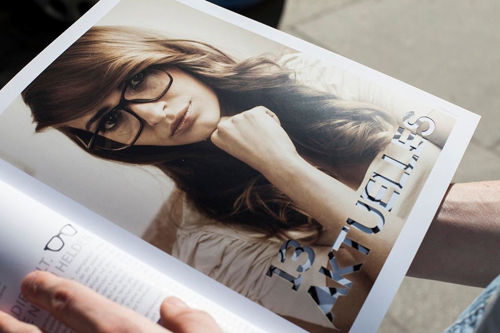
FJB: We developed and produced the 100-page magazine completely by ourselves. It shows everything which is technically possible and represents the whole range of services we offer. We used three different types of photography – digital, analogue, Polaroid. We laser- cut nine pages, embossed, varnished partially matt and gloss, we used three different kinds of paper and creative retouching. Among other topics the BERNSTEINER includes examples of our projects as well as interviews with people such as the managing director of Estee Lauder. We produced 200 copies and distributed them to decision makers in Austria.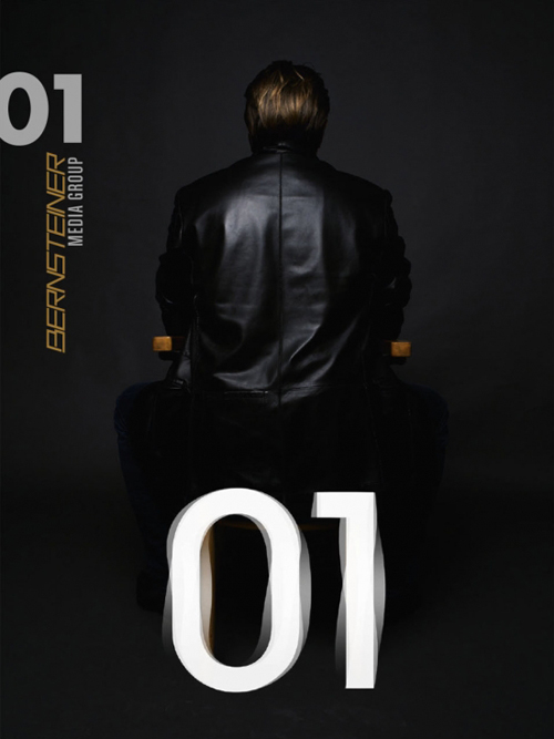
Any dream client?
FJB: My dream client would be a car brand, a real car brand such as BMW. The car industry still boasts large advertising budgets and the product is attractive, too!
RS: My dream customer is anyone who is not yet my customer.
No favorites?
RS: We print art books for several art galleries. This is the kind of work I enjoy most. When working together with artists, you can use all your knowledge. There are no hand books available to tell you what to do, experience is the only thing that counts.
FJB: For instance, we worked together with the Austrian artist Xenia Hausner. Several of her large-scale photos were reproduced by us. And we cooperated with Hermann Nitsch on a limited edition for the Porsche Club.
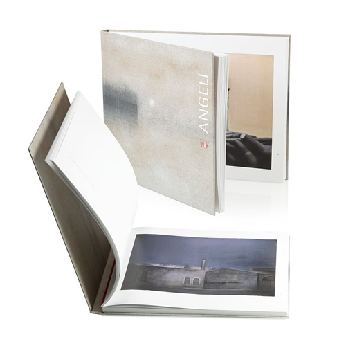
“Angeli” Artbook. Design: Didi Tadler, Litho: Bernsteiner Design Department, Print: Helmuth Breyer
What does the future hold for Bernsteiner Media?
FJB: We are not a big company, 40 people altogether. Last year we bought Austria’s most modern half format press, the Heidelberg Speedmaster XL 75. We want to extend our office in Vienna, in the seventh district, and build a digital photo studio by end of the year. The next important step will be motion pictures – videos! We want to show to people what we are doing at Bernsteiner – in the form of image videos on our web page. And once they see the videos, they will want to have them as well.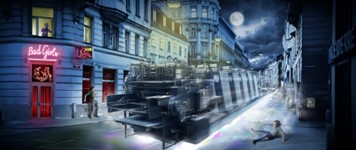
Dear Mr. Bernsteiner and Mr. Schilcher, thank you very much for the interesting interview!
Photo courtesy by Bernsteiner Media Group

