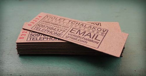
Brown kraft board has been popping up on our trend radar lately, especially in business card designs. A material which is most often overlooked as packaging or industry material has been rising the trend ladder. The strong and slightly coarse paper is so versatile that designers had to finally give it the spotlight it deserves.
Kraft paper was originally designed for packaging products with its high elasticity, tear resistance and durable qualities. The name comes from it’s production technique of kraft pulping, where most of the lignin in the wood is removed, making it stronger than other papers. Its thicker brother kraft board has many qualities which interest designers in other fields than packaging.
However, not everything that looks like kraft board is 100% kraft. Schoellershammer, a paper mill from Germany, developed SH Recycling, a 100% recycled, post consumer waste paper and board, which has a kraft optic but offers superior printability than kraft board. On top it can also be laminated with white board in order to get a duplex card.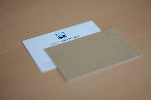
Duplex SH Recycling business cards
As so many amazing designs have been made of kraft or kraft like material, I’ve decided to focus on a specific one for now, business cards. As small and insignificant they might feel, they hold a long history in graphic design and still are thought to be the representation of a person in their profession. Business cards are simply designed to hold the basic contact information of a person or a company, easily distributed from person to person because of their small size. But nowadays they have become to stand for so much more, as the visual design of the card has a bigger role and its importance is valued. It’s usually the first image the receiver gets of the company or person, on which they base their judgement on. So you want it to be as postive, and informative as possible.
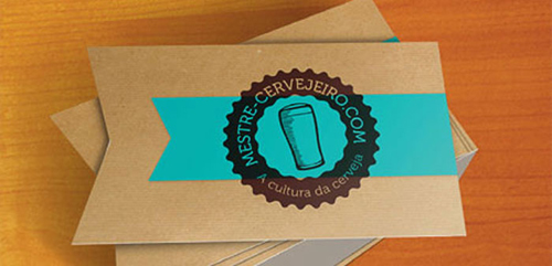
Mestre Cervejeiro is Portuguese and translates to “brewmaster” in English. These stunning business cards are a combination of kraft paper and colorful stickers, screen printed logo and geometrically cut edges.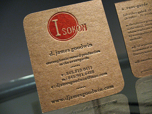
D James Goodwin has combined thick kraft board with letterpress, simple colors and rounded corners, giving the design a unique look.
The Mestre Cervejeiro and D James Goodwin designs above are great examples of how kraft board is easily moulded into new shapes. As the board is thicker than normal it can be given a more interesting shape by cutting the edges, rounding the sides or even make cut-out in the middle. Kraft board is also perfect for the letterpress technique, as well as bright colors!
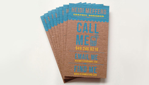
Two colored screen printed design on a kraft chipboard piece, designed by Heidi Mefferd.
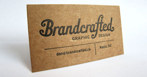
Letterpress design by Brandcrafted is a beautiful example how well kraft paper and letterpress goes together
Kraft paper business card design inspired by old ticket stubs, done with letterpress, designed by Violet Tchalakov.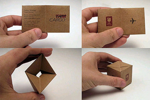
TAM Cargo figured out a way to make their business cards more fun. the basic looking card transforms itself into a mini shipping container the company uses. Strong and durable kraft paper is perfect for these kind of designs.
Even though kraft board is very limited in its color, as it mostly comes in a brown shade, it’s very versatile when given the right design. Most definitely out of all the printing techniques letterpress gives it most depth, but also the cheaper way of screen printing gives great results.
The material is really used in all its potential when it’s crafted into something new. TAM Cargo (above) did a mini version of a shipping container, so the business card holder can easily turn the card into a miniature packaging, showing the skill and expertise of the company. Clever!
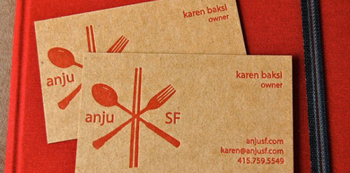
Karen Baksi’s business cards are a custom letterpress design printed onto kraft stock. The cards were created by LUCKY 8 LETTERPRESS, a design & print studio based in San Francisco, California. 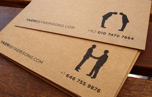
Unique minimalist business cards for Yaerisong.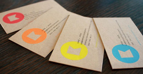
The logo is printed in a series of bright and fluorescent colors for a modern feel with a bit of a punch.
Photo source: Pinterest

