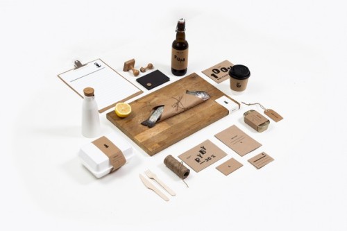
Surfing the internet, we came across Jarek Michalski, a young Polish graphic designer, and his diploma thesis project: the design of the visual identity for Ryby z Ustki, an authentic fish and chips shop in Warsaw. We were immediately intrigued by the simplicity and unpretentiousness of the design and the cool typeface.
Ryby z Ustki means Fish from Ustka, a town on the south coasts of the Baltic Sea popular for its fishing port. As the name suggests, the fish at Ryby z Ustki is not imported from overseas but freshly caught from the Polish sea coast. According to the designer, the idea for the project was just as simple as its name.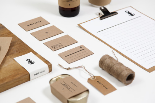

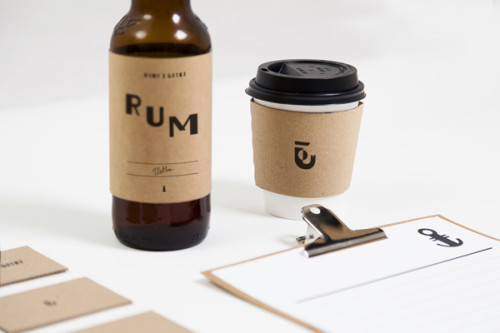
In order to emphasize the sincerity and simplicity of the place located at the back of Hala Mirowska, a 19th-century marketplace, and to keep the budget low, Jarek Michalski decided to use brown recycled paper, rubber stamps and manual letterpress. In our opinion the brown paper is a nice contrast to the shimmering and glittering surface of the fish and the little details and finishing make it interesting.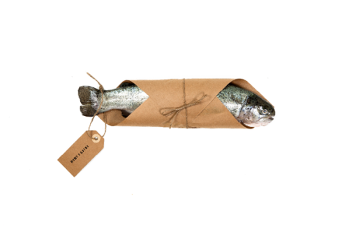
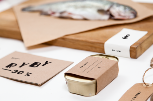
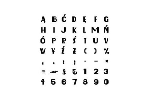
The highlight is the custom-made typeface which includes several icons such as an anchor and a sailor’s knot. The typeface was inspired by vintage signboards and advertising in public space.
 We are definitely intrigued by Ryby z Ustki identity and can’t wait to visit the place on our next trip to Warsaw. A Polish online blog wrote Jarek Michalski’s design is “fresher than fish from Ustki” – we can only agree!
Photo source: behance

