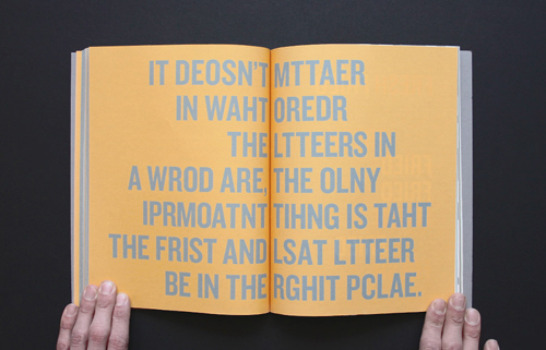
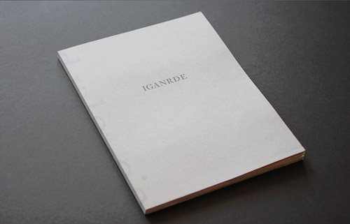
I wonder what it’s like to be dyslexic – a book about exactly what it says on the cover. Sam Barcley is young talented typography & graphic designer from the UK, who has done a wonderful job in raising the issue of dyslexia as well as designing an incredibly beautiful, book. The book helps others to understand what it really feels like to struggle with reading, by the means of typographic examples and design.
Dyslexia is very common in the modern day, and people all over the world struggle with it for a variety of reasons, three main subtypes of dyslexia exist – auditory, visual and attentional. And even though Barcley believes people with dyslexia are getting the help they need, which I believe to be true as well in most parts of the world, visual is the most common of them. In his book I wonder what it’s like to be dyslexic Barcley concentrates on giving the reader an understanding of what it really feels like to struggle in such a way, by the means of typographic examples and designs.
When I read about Barcley’s book on Kickstarter, where he managed to raise quadruple the amount he needed for the project to happen, I was blown away by the idea and his design. As someone who has struggled with dyslexia myself, the auditory type, I’ve often found myself trying to explain to others how it feels and affects my everyday life. I believe this great design truly helps others to understand, providing the reader with a beautiful, design-led experience of what it feels like to struggle with reading. 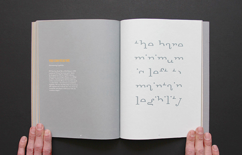
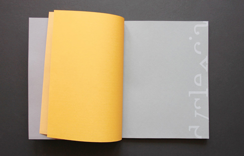
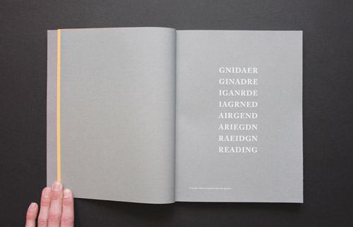
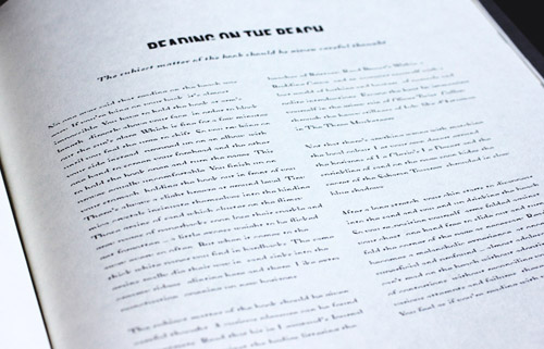
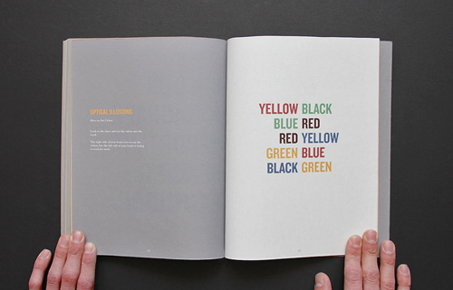
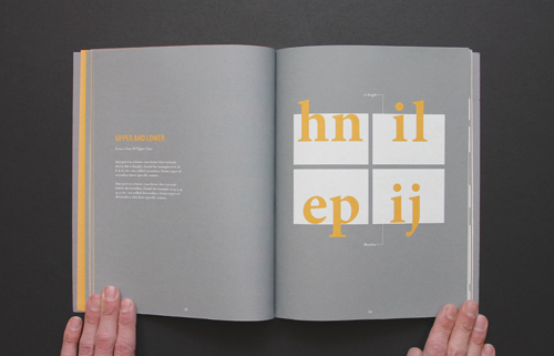
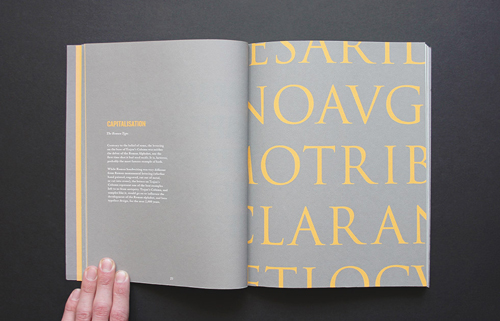
In the book Barcley showcases the different ways dyslexia occurs: words are cut in half, spaced irregularly, and modified in ways that leave them legible. But even though it may take an extra second or two to parse, you can probably figure it out. But then imagine reading every website, newspaper or this blog post like that, and you’ve got a rough understanding of what it’s like to cope with dyslexia.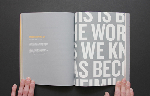
Through meticulous design that manages to be friendly as well as stylish, Barcley has created a book that is accessible, informative and has filled a very important gap in the design world. He says it was his love of typography that drove him into doing this project, and we love the fact that even though the book has a very important message, it’s the beauty that makes it into a design master piece. He also received a well deserved commendation award from ISTD (International Society of Typographic Design) for the book.
For a low 25£ (about 30€) prize you can order your own copy here, and you can follow the project on facebook.
Photos via Sam Barcley

