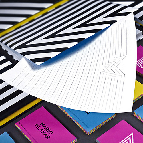
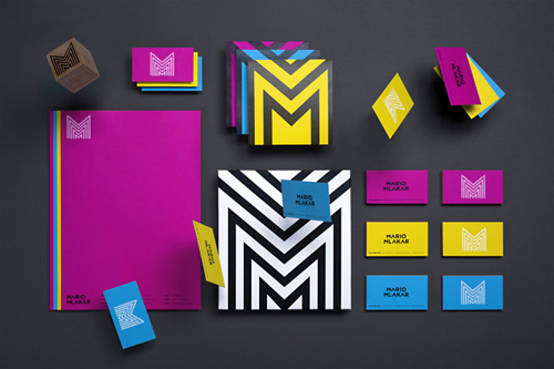
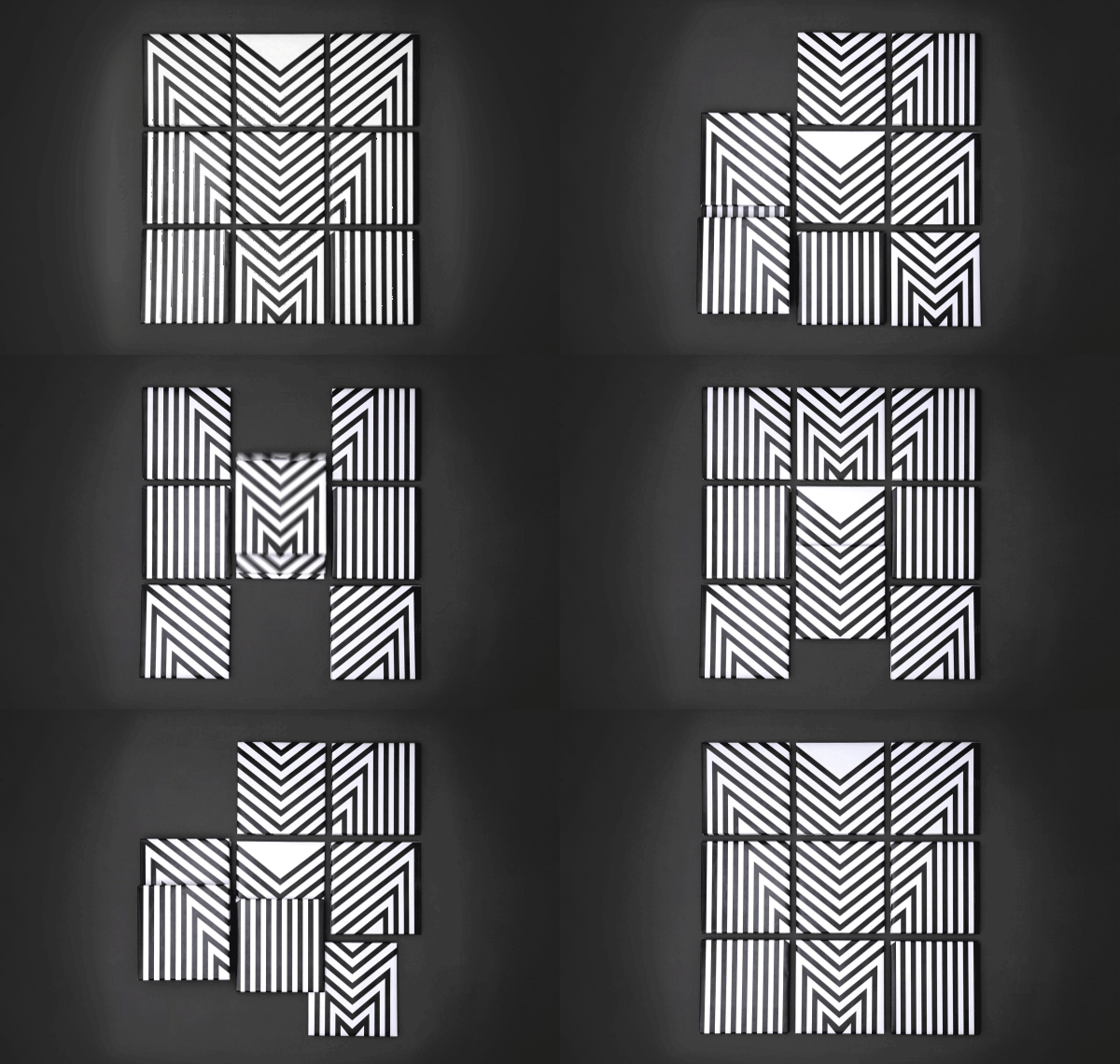
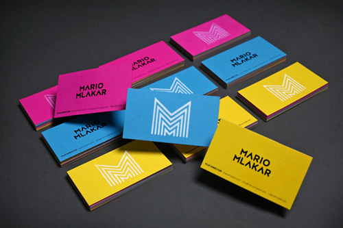
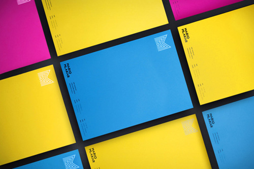
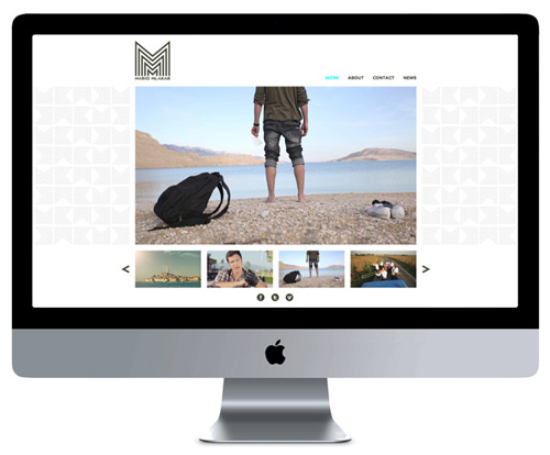
The boldly colorful and geometric visual identity for young Croatian filmmaker Mario Mlakar was designed to represent his work and personality down to every little detail. The repetitive form of the letter M, found in both his first and surname, as well as a few surprising twists can be seen in the main design elements. And as it happens to be, it was this project that brought the three creatives, who form the agency Rational International, together.
Before there was Rational International, there were three friends. Mario Mlakar wanted a homepage for his videos, so he asked his friend Bojan Opacak to make him an offer. Bojan’s friend Ivorin Vrkaš was a designer. Ivorin quickly took up the task and started working on a brand new visual identity for Mario and his work. The candy-colored visual identity shown here was the result and the first brick of the house that would later become Rational International, one of the hottest creative agencies in Zagreb, Croatia.
One of the founders, designer and visual artist Ivorin Vrkaš loves bold colors and geometric patterns. His love for strong shapes can be seen in his designs. The saturated coloration, round form finishes were chosen to emphasize Mario Mlakars personality and professional identity – a blend of strong, emotional impact and thought-out intellectual sharpness.
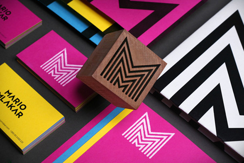
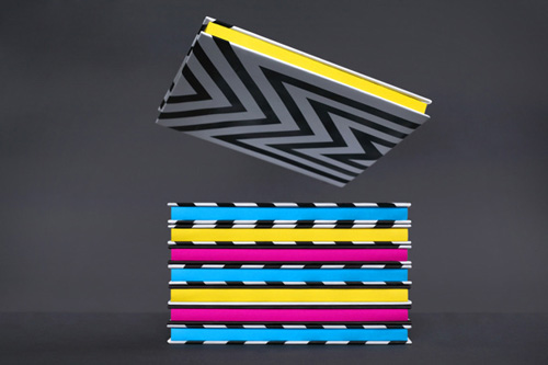
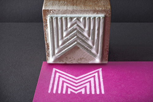
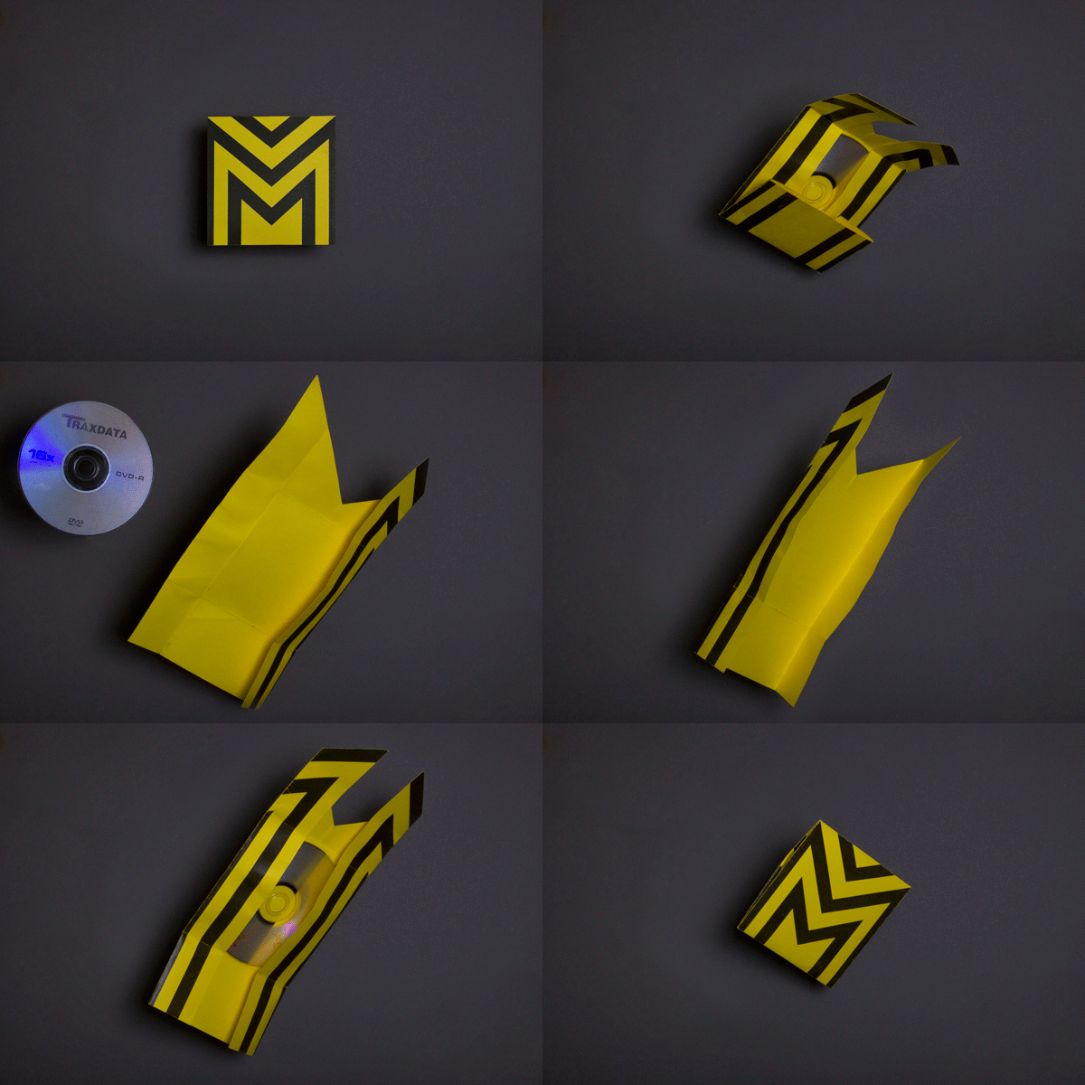
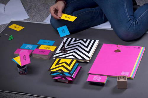
Almost every element of the identity has a “twist” to it, from the modular notebooks (see below) to the foldable M-shaped cd covers. The way the monogram was integrated in the grid of the notebook, truly shows the attention that was put into each single details. What I absolutely love about the design is the great blend of functional, clean and strong forms, crazy colors and the small hand-made touch of the rubber stamp, which is a refreshing surprise for such a clean cut look. Definitely the handy work of a professional! We can’t wait to see more of Vrkaš designs, which you can check out here.

Photos © Rational International

