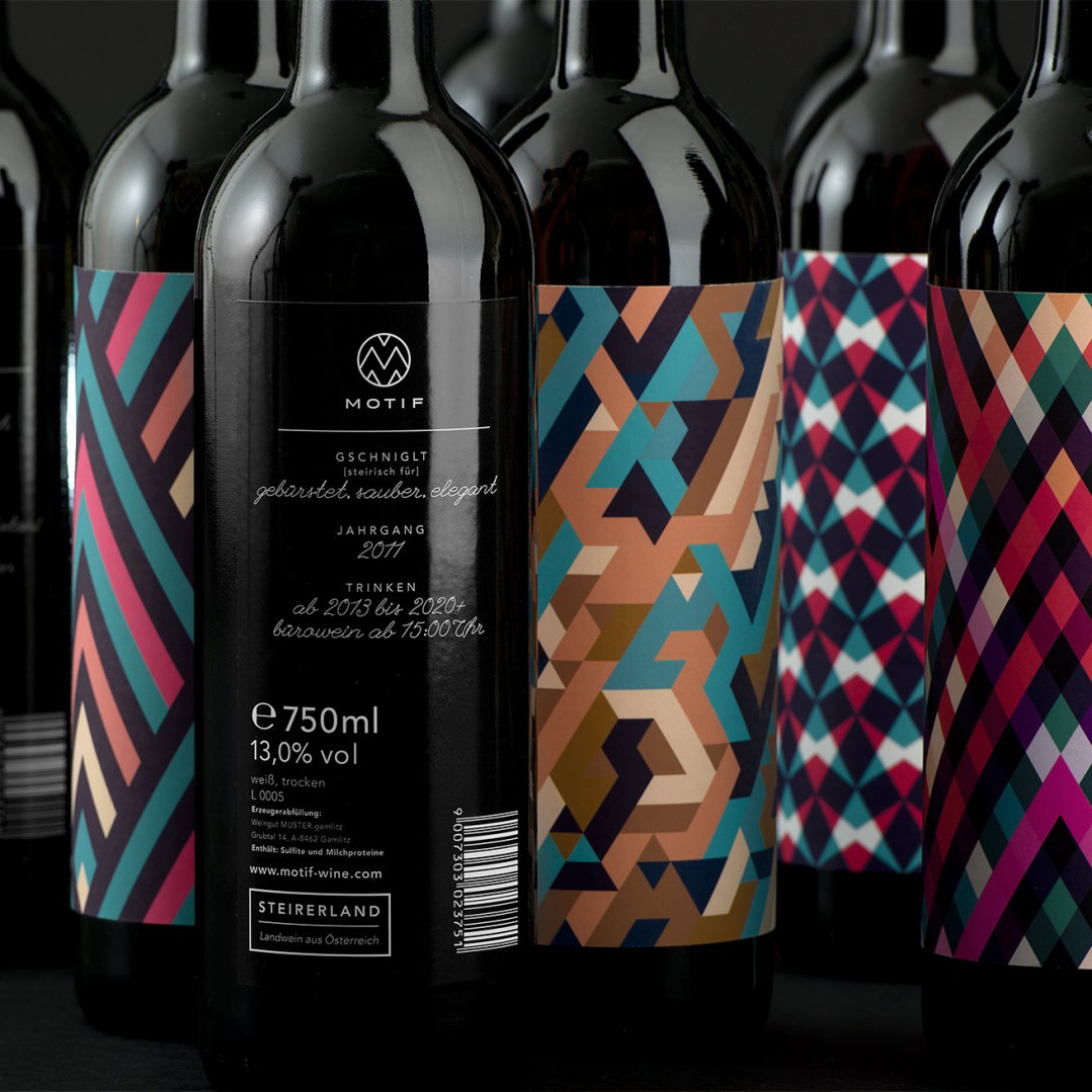
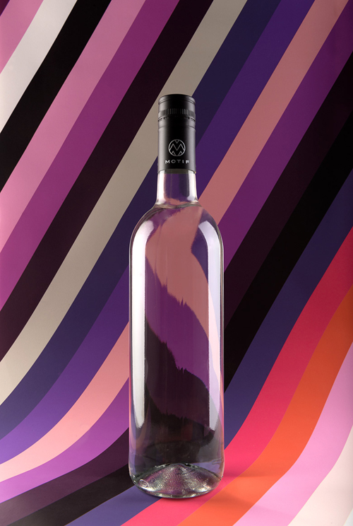
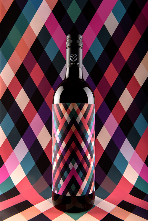
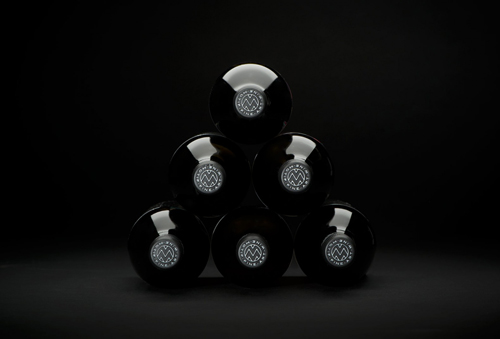
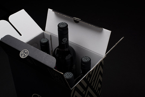
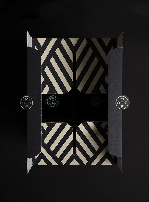
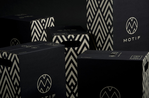
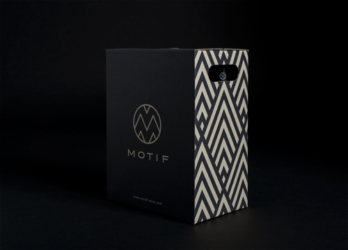
En Garde is more than an average design studio, it’s a multidisciplinary group of talented people who aim to open up new opportunities and inspire people with their innovative, future-oriented and fresh take on analog, digital and printed design. Their latest project, packaging design for Motif Wine, is one of my favorites amongst their range of projects. The sharp, geometric patterns and trendy color scheme demands attention amongst the hundreds of co-existing wine labels it has to compete against.
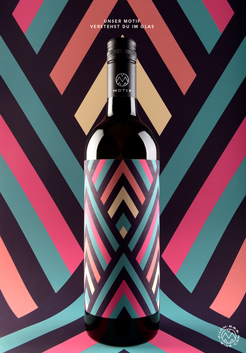
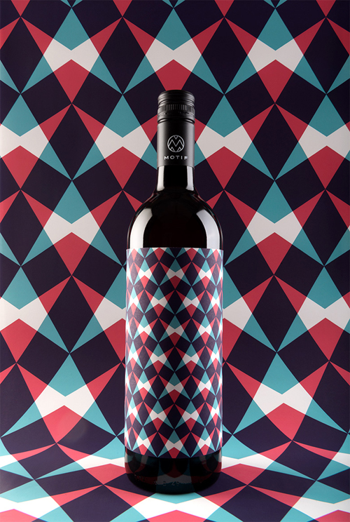
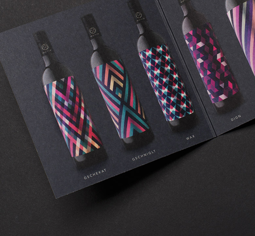
En Garde has known for their professional and innovative take on things, transforming old and musky into fresh and modern, and this is exactly what they’ve done with the Motif wine packaging. Simply giving different varieties a different pattern, instead of designing a typical, traditional written label. It truly “thinks outside the box”, while making the box look as beautiful as possible!
With customers in fields such as culture, industry, retail, institutions, media, and fashion, En Garde holds a steady foot with its extensive expertise in the competitive field of design. Working simultaneously from three different cities: Graz, Vienna and Hamburg, they’ve developed a network of professionals who together form an agency that designs for the heart. And with such an extensive variety of designers and creatives, they take on tasks like Motif wine packaging design with ease.
Always having a keen interest in patterns and prints I was automatically drawn towards the Motif wine packaging while browsing the project section on the En Garde website. The strong contrast colors and geometric forms pull you in, and you start thinking why aren’t all wine bottles designed like this. Like the Motif website states: We believe the time is ripe for a wine with few words. We will no longer dictate what we see, taste and smell. This is why we have Motif, which can only be explained by a word in our Southern Styrian dialect. And a pattern of color and form. A label, a word, a wine: you will understand our Motif in the glass.
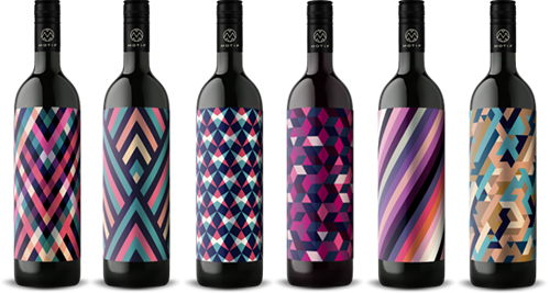
The six different wines each have a distinctive pattern which separates them of each other, all produced by the same estate in Styria. Each pattern is an expression of the character of the wine in question. A kind of personality mirror that reveals that wine is as versatile as the mood, surroundings, and situation in which one enjoys it.
In the Motif packaging, a simple idea is carried through with great design. This is exactly what good designs looks like, and I can’t wait to get my hands on one of these beautiful bottles. I’m just not sure if I dare to open it!



Photos © En Garde/Stefan Leitner

