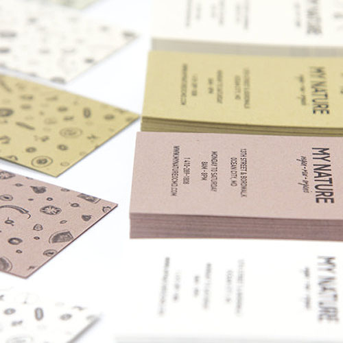
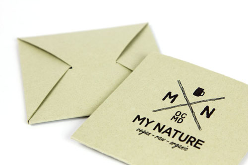
Last week’s Inspiration + Paper post was all about CRUSH, an eco-friendly paper containing residues from fruits and nuts. Sofia-based designer Liliya Gateva chose exactly this paper for the branding of My Nature, a raw vegan restaurant in Ocean City, Maryland. The result is an environmentally oriented, sustainable and absolutely delicious design.
We thought, how does it come that a designer living in Bulgaria creates the visual identity for a vegan restaurant in the US? There must be a special story behind this. Indeed, designer Liliya Gateva used to spend her summers in the US and just popped by My Nature for a wheatgrass shot last year. “I loved the place from the first second and asked if they are hiring for the season. Being a raw vegan myself, I got a dream job there for the summer. Now this restaurant takes a special place in my heart.” And this is why back in Sofia she decided to design the visual identity for My Nature.
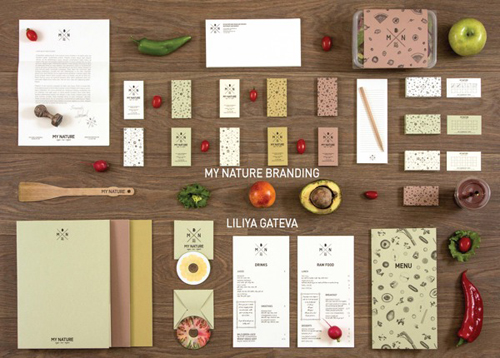
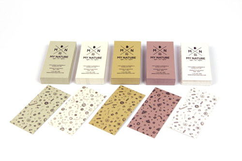
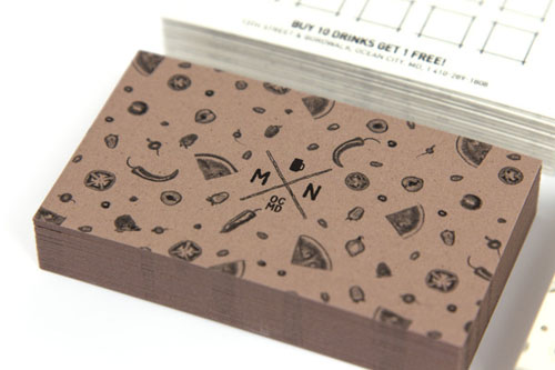
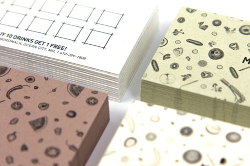
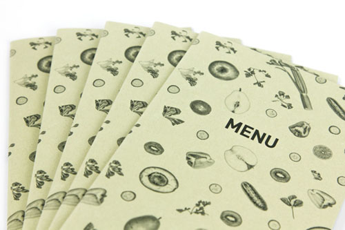
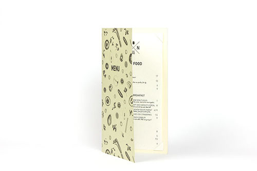
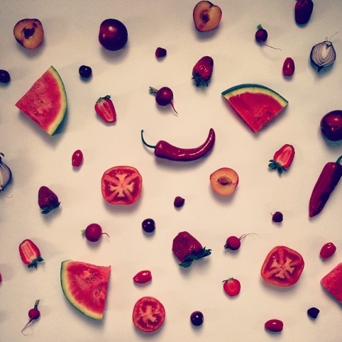
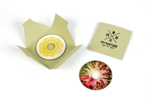
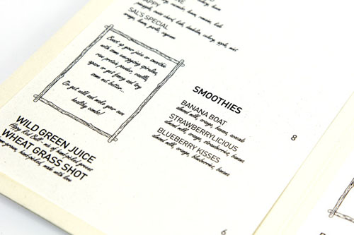 The initial idea for the branding was a clear, strong message with a vintage vibe. The logo is formed using the golden ratio and the sequence of Fibonacci numbers in the radius of the circles. For the delicate illustrations the designer photoshot a potpourri of fresh vegetables and fruits.
“I knew it needed something extraordinary that would connect to the special character of the place itself. CRUSH paper was the wow factor and the design started flowing from there.” Liliya Gateva chose CRUSH Corn, Citrus, Kiwi, Olive and Almond for the whole stationery as well as packaging of My Nature – a perfect match in our opinion. The only thing missing is a My Nature restaurant in Liliya’s hometown Sofia, that is why she needs to return to Ocean City soon.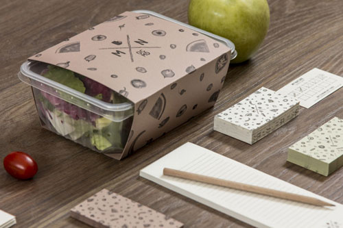
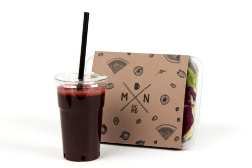
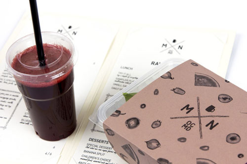
We love Liliya Gateva’s design and truely feel that it is bringing to life the My Nature brand. If you are interested in learing more about Liliya and her projects, check out her behance profile as well as Astro Kit, the design studio she is part of.
Photos © Liliya Gateva and Astro Kit

