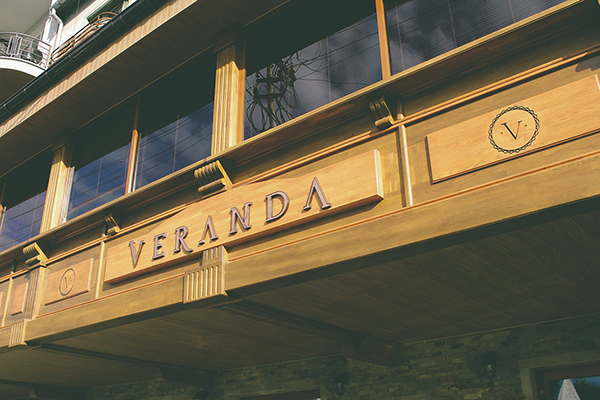
Veranda is a classic restaurant with an urban edge in the city of Uzhgorod in Ukraine. Marble meat steaks, an exceptional variety of fine wines, live jazz music and an upbeat atmosphere ― that’s what Veranda is all about. The carefully constructed typographic approach and rough illustrations mirror this in their new visual identity, designed by Tibor Tovt with the design collective Forma Line.
At Veranda Restaurant & Bar passion and precision seems to be put into everything, from the rustic yet perfectly prepared dishes served on aged wooden plates to the beautiful up-scale interior. This luxurious country style earns a fittingly high quality visual identity, including it’s own typeface, constructed with extreme precision. You can see in the skillfully created animations by Tibot Tovt, how each letter was formed of classic shapes and based on simple schematics. Everything seems to fit perfectly not a single abnormality in sight.
Tibot Tovt who worked on the project together with the design collective Forma Line, has worked on branding projects before, but Veranda feels like something special. Maybe it’s the collaboration or great styling of the photos, but it all seems very visually cohesive.
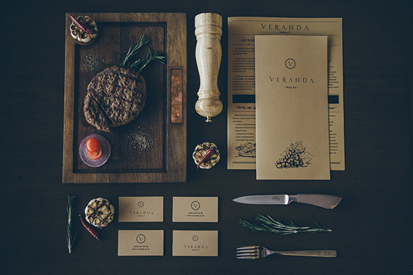
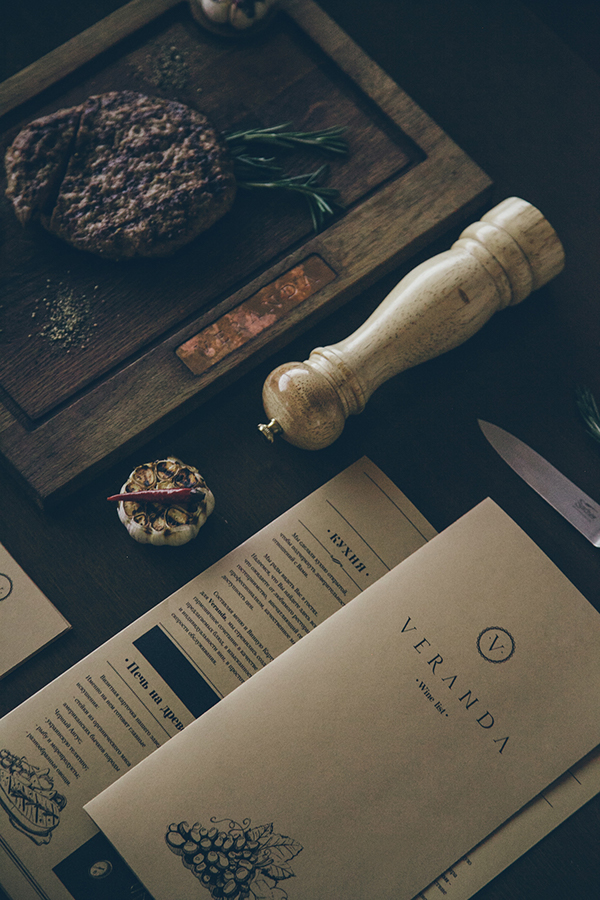
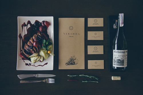
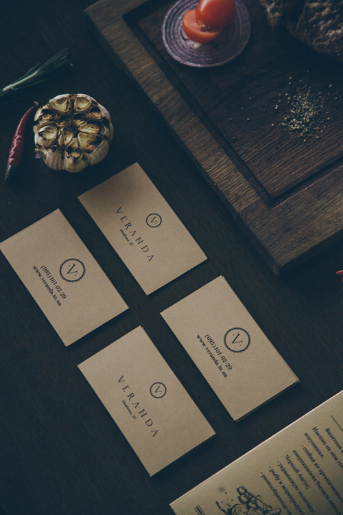
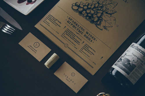
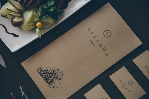
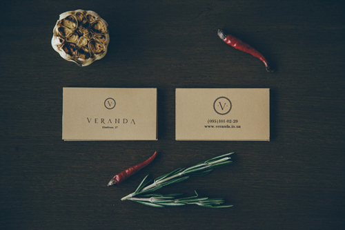
The chosen, minimalistic and warm color scheme with light browns and other earthy tones keeps perfectly with the classic guidelines. The rough, sketch-like illustrations on the menus are a great balance for the simplistic typography, almost like an ode to the olden days. The round logo with the simple V on it gives you associations of stamps and letterheads, which seems to be the main component of the overall design that brings the look to the present – round logos being right on trend at the moment!
All in all, the dark musky visuals do seem to fit perfectly for Veranda, and for some strange reason I’m dreaming of a perfectly cooked steak now!


Photos via Formaline Behance

