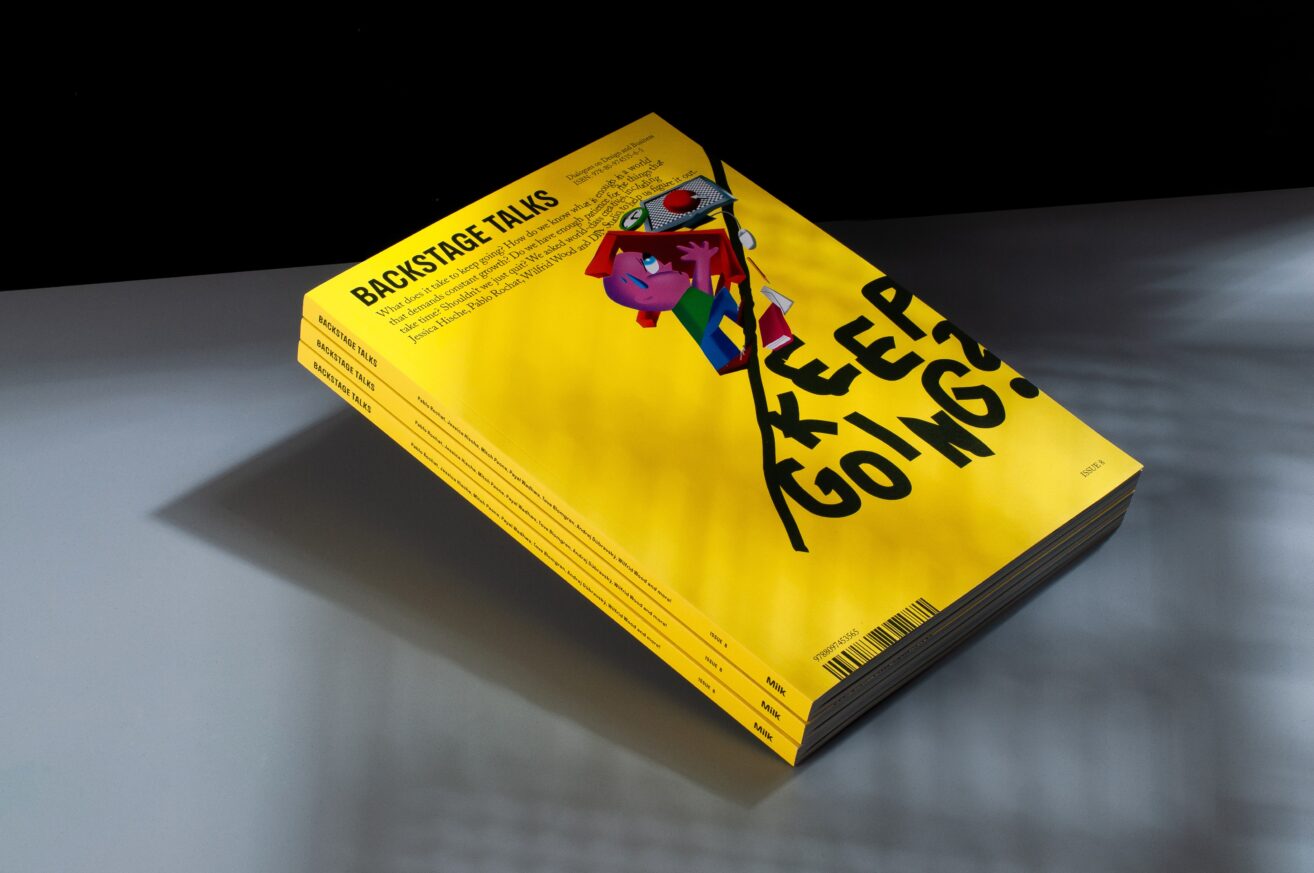
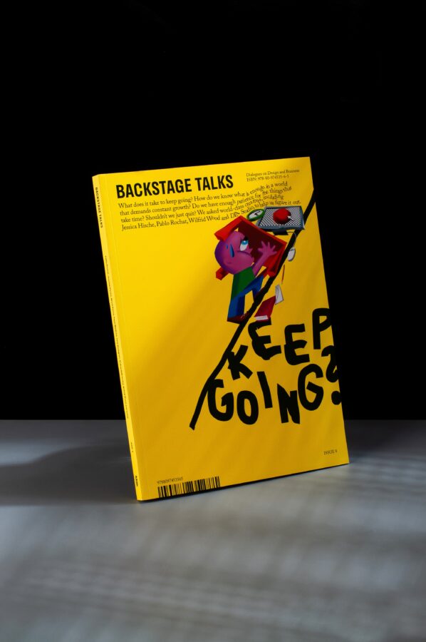
Backstage Talks is a magazine that lives at the intersection of design and business, known for its vivid visual identity and thoughtful editorial. In its eighth issue, the magazine poses big questions about the sustainability of creative work—What does it take to keep going? How do we know what is enough? Should we just quit?—and features conversations with creatives like Jessica Hische, Pablo Rochat, Wilfrid Wood, DIA Studio, and Emily Keegin. But beyond its compelling content, what makes Issue #8 truly stand out is its bold new visual direction by designer Chloe Scheffe—a design that doesn’t just evolve but crackles with raw energy and intent.
Where paper meets purpose: tactile design in perfect harmony
Published by the Bratislava-based creative collective Büro Milk, Backstage Talks is always a feast for the eyes, and this latest issue continues that legacy with a tactile, uniquely haptic experience. Printed using offset printing on GardaMatt Rough, a premium coated paper available by Europapier, the magazine makes the most of the paper’s bright color payoff and uniquely textured surface, which adds depth and richness to every page. “We chose a coated paper to get brighter colours,” the team explains. “GardaMatt Rough has also a rough surface, that we liked.”
Beyond the unique paper choice, it’s the design transformation brought by Chloe Scheffe—known for her smart, layered work across editorial and branding—that defines this issue. The brief? Scheffe tells us it was “to simply evolve the existing design of Backstage Talks. The editorial team asked that it have a greater sense of energy and grit—which we agreed was the quality of looking made, versus flawlessly vector and hermetic—but also that it retain some of its DNA, namely through preserving the existing typographic palette.“
To evolve the existing design of Backstage Talks. The editorial team asked that it have a greater sense of energy and grit—which we agreed was the quality of looking made, versus flawlessly vector and hermetic—but also that it retain some of its DNA.
Scheffe masters thoughtful typography, texture, and the art of the imperfect image
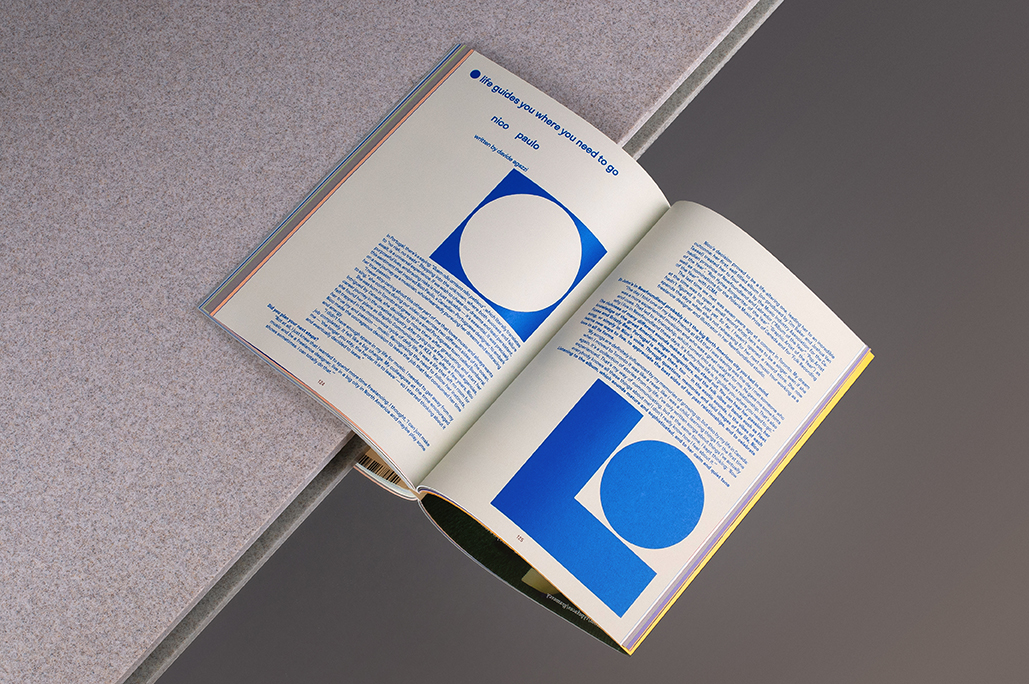
This meant keeping the magazine’s typographic palette, while also introducing a fresh voice with ABC Maxi by Dinamo, a typeface whose circular counters and bold geometry informed much of the magazine’s new visual logic. “I even created my own circles-only version of the typeface to complete the graphic system,” Scheffe reveals, referencing playful design elements found in features like Anna and Brian’s profiles.
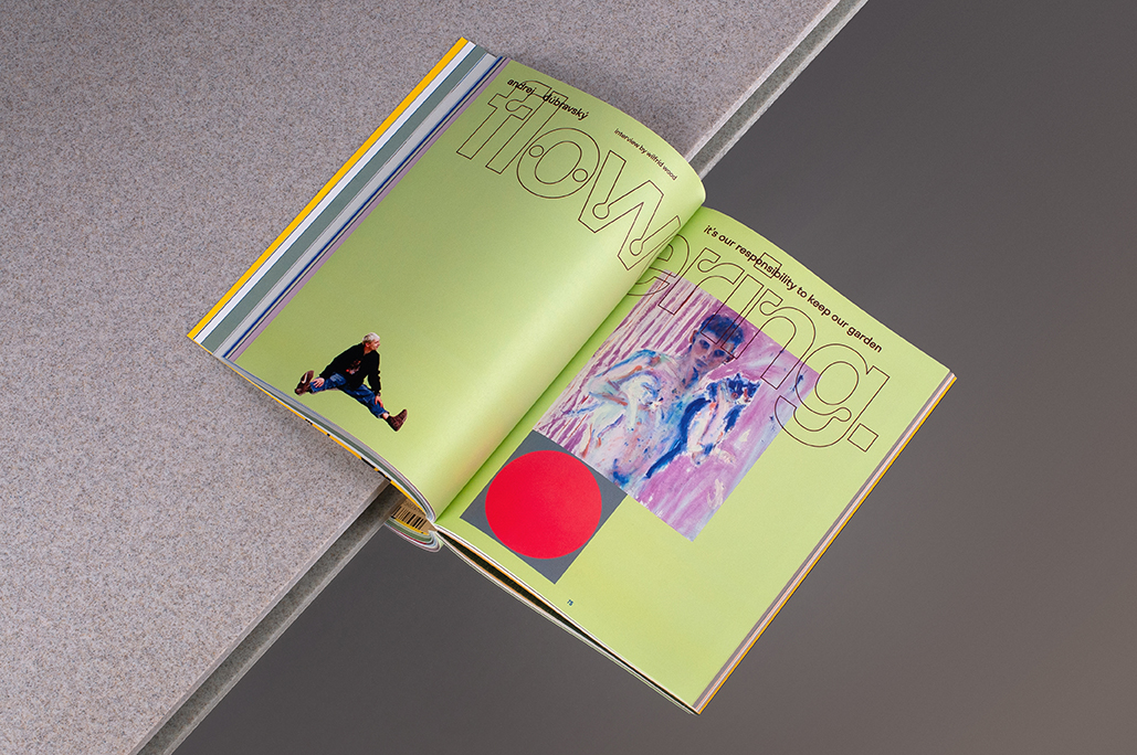
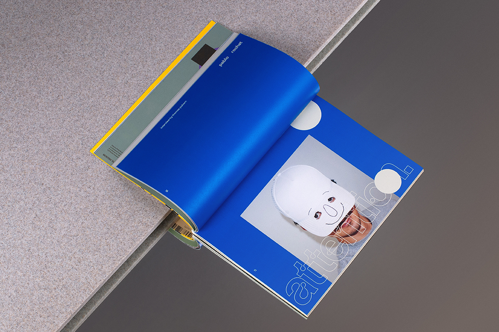
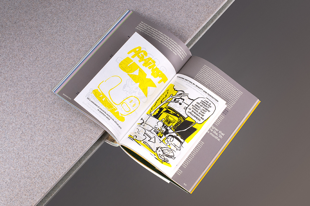
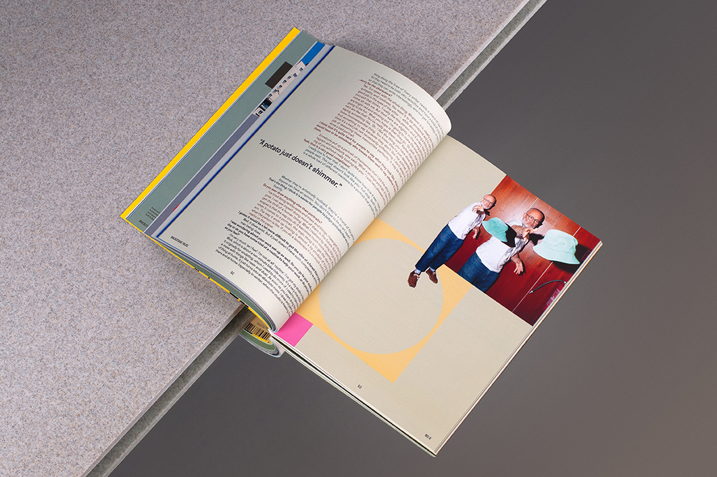
Yet perhaps the most ingenious part of the redesign lies in how Scheffe turned a constraint into a creative engine. With little available photography—mainly documentary shots from a creative conference—and no time for commissioned visuals, she leaned into DIY image-making. “First, I created a system of colorblocking so saturated and loud it functions not only as page architecture but as illustration, harmonizing or contrasting with the tone of each profile (an entire section of the magazine, about architecture, was all black and white, to allow the eye to rest); and second, the photographs became the site of the grit. I printed them out and manipulated them heavily,” she explains, “photocopying, cutting up, and folding them, then letting the dot matrices and printer flaws show on the page.” The result? A graphic language that feels both contemporary and handmade, polished and punk.
I printed them out and manipulated them heavily. Photocopying, cutting up, and folding them, then letting the dot matrices and printer flaws show on the page.
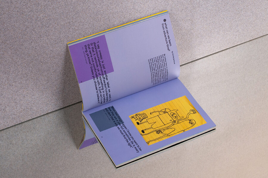
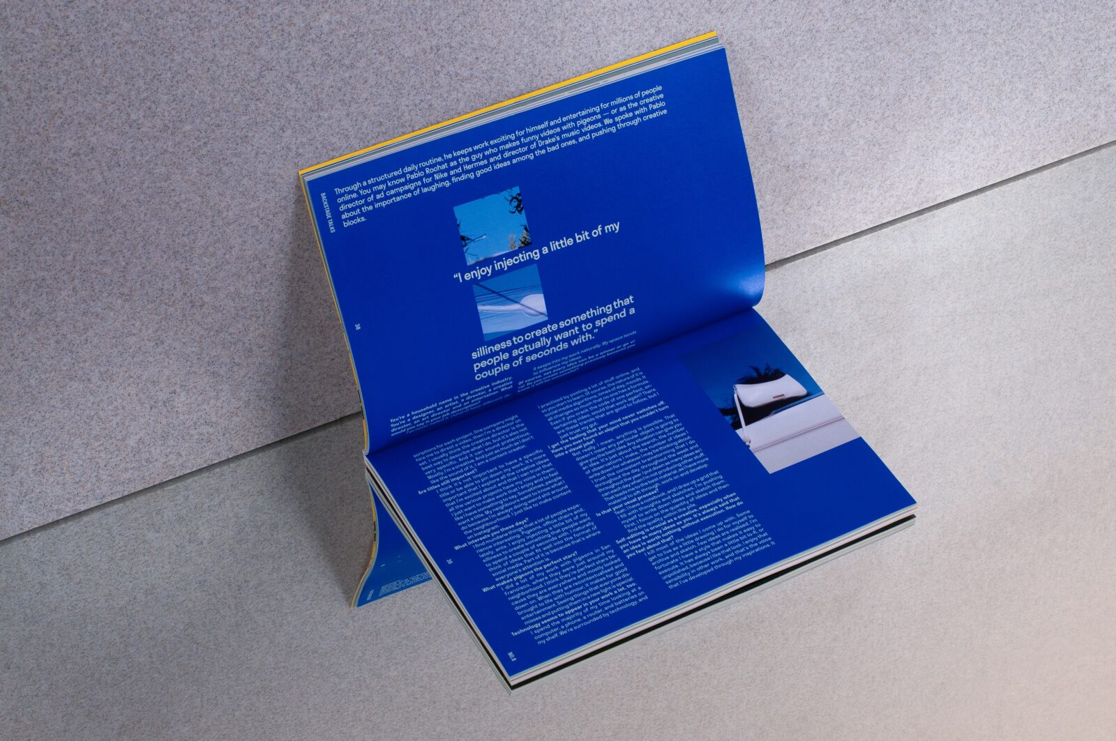
“The subjects were therefore set free from their backgrounds, allowed to roam around the grid or turn away from the reader or be concealed completely by color blocks.” These vibrant, Josef Albers-inspired color blocks serve not only as visual architecture but as a kind of emotional illustration, amplifying the tone of each feature. In contrast, images of the creatives’ actual work are presented pristine—”uncropped and full-color”—as a grounding element amid the experimentation.
Backstage Talks impact and importance hasn’t gone unnoticed
Backstage Talks won the prestigious D&AD Wood Pencil in 2024, recognized as the best of the year in the Independent Magazine category—a distinction awarded to projects that represent “creative excellence for future generations.” It’s a fitting accolade for a project that’s not just beautiful but deeply intentional. And now Scheffe’s redesign didn’t just solve the brief—it elevated it. It captures the feeling of work in progress, the pulse of creative labor, and the very essence of Backstage Talks itself: a conversation in motion. Whether you’re drawn in by its striking visuals, rich tactile feel, or thoughtful interviews, Issue #8 is a must-have for any creative’s shelf—and a shining example of how design and paper can work in perfect harmony.