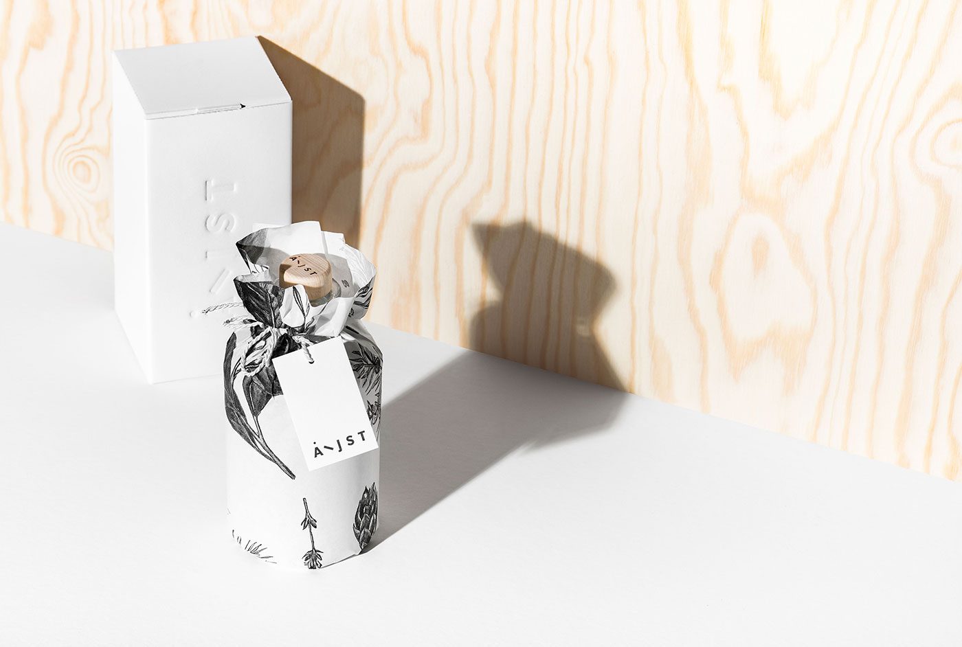
Aeijst (pronounced aced) is a Styrian gin, crafted in southern Styria to be exact and named after a local dialect word for branches, is the latest specimen competing for the most beautiful gin packaging prize in the world my mind. Aeijst is made from 100% organic ingredients, created by savouring nine different botanicals individually and then combining them into one harmonic recipe – a process that inspired it’s exquisite branding concept full of contrast and charm.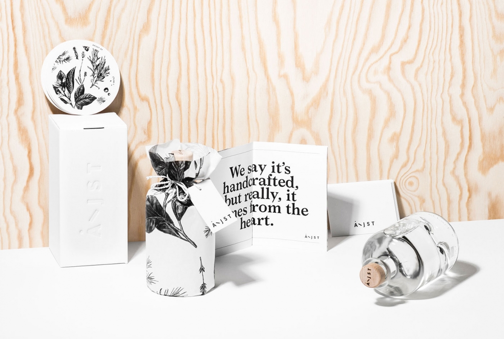
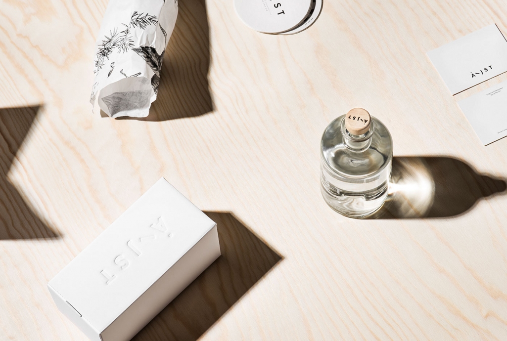
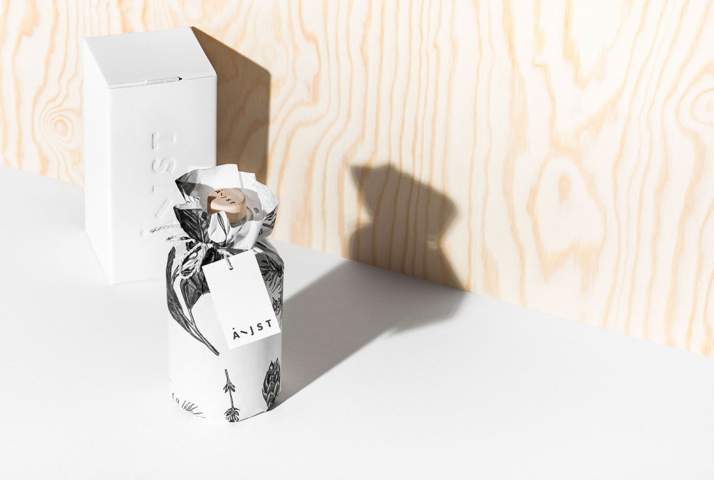
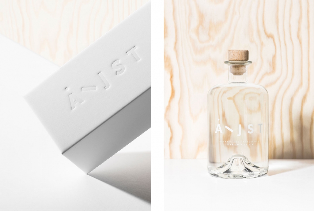
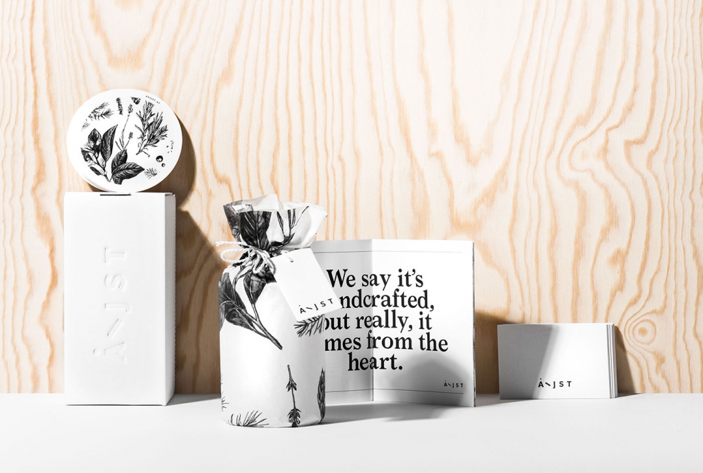
A product handcrafted out of honest convictions, balanced in its taste, puristic but not simple, deserves a matching coat. Christina Michelitsch, the art director and illustrator behind the sleek-and-shiny branding concept together with other creatives from the late designer-collective les Avignons, combines delicate hand drawn illustration with a minimalistic box and bold typography. The clear, bottle with no label and a stamped wooden cork is matched with an equally simplistic wrapping paper and a letter pressed box.
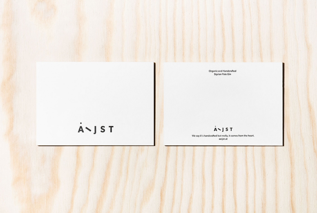
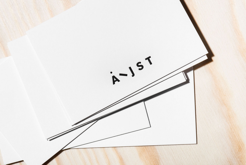
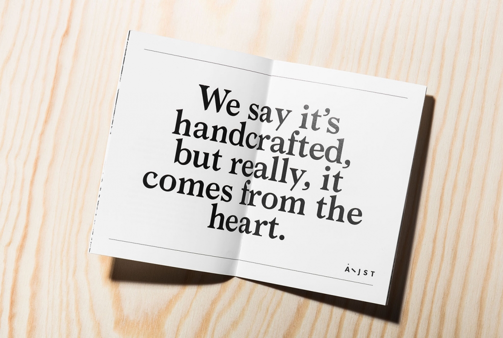
The brand identity, corporate and packaging design were all developed from the ground up. The combination of nine botanicals for the gin, as well as the passion for creating it with the best ingredients were key in the briefing for the product. The Thomann family, creators of Aeijst wanted their product to be a reflection of themselves and their work ethic: puristic, charming, reliable, elegant, confident, uncomplicated, low-key, regional but not rural and with a hint of wit. The branding includes the branding of the bottle, design for and illustration of the wrapping paper, design of the greeting cards, hang tags and a brand book that can be found inside of the box, as well as additional stationary material, a website and their social media presence.
Art Direction, Graphic Design and Illustration Christina Michelitsch
Creative Direction and Copywriting Thomas Pokorn
Programming Jürgen Genser
Photography Marion Luttenberger
Images © les Avignons

