The cross-over and collaboration between music and visual art have been present since the dawn of, well, each of the respected fields in question. As some people claim to see music, others are able to hear something when standing in front of a painting. Collaborations between musicians and artists and designers are intriguing, as it offers a playing field beyond its singular parts or players. 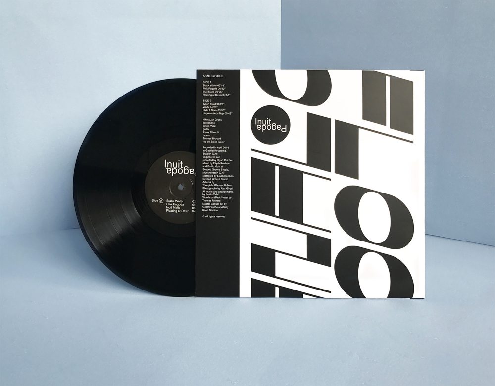
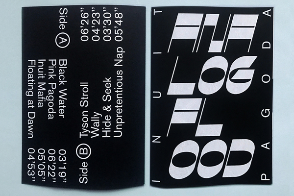
Inuit Pagoda is a Swiss-based trio comprised of saxophonist Nikola Jan Gross, guitarist Emilio Vidal, and drummer Jonas Albrecht, that began developing experimental-afro-punk music in 2019 (see the music video at the end of this article). They recently released their debut album Analog Flood, and along with it, a booklet under the name Analog Flood created in collaboration with graphic designer Théophile Glauser from Atelier U-Zehn.
Atelier U-Zehn is a silkscreen printing house and coworking place in Neuchâtel, Switzerland. With a combination of different talents of its members, enable the collective to conduct various projects, ranging from self-initiated artistic ones to communication design for various cultural events in Neuchâtel and French-speaking region of Switzerland.
Charmed by the intense music of Inuit Pagoda, as well as the beautifully designed and printed Analog Flood booklet, we asked Emilio (guitarist) and Théo (graphic designer), the creative forces behind the project, a few questions about the inspiration, conception, and realization of their joint endeavor. Both creatives, in their respective fields, are archaeologists in search of materiality. 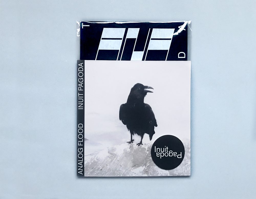
Where did the idea to collaborate come from, and how does the printed Analog Flood booklet connect to the Black Flood Album?
Analog Flood is analog by analogy!
The graphic design process uses working methodologies related to sound development and explores the similarities in the compositions of the two artistic fields. The mixing process was fully analog and the tracks were mastered with tapes. Therefore we chose to print the booklet in offset and silkscreen.
Both experimental processes provide texture and form depth to the project. The name Analog Flood has been jointly conceived by Emilio and Théo and can refer to the evolving sounds layers that overflow in the music and describes the overall aesthetic.
The definition of Flood is rather related to the way we printed: The sheets were more than completely filled with ink or varnish. The term Flood makes sense in both fields but it’s rather related to the concrete achievement. Analog reflects more the creation process.
What does Analog Flood represent?
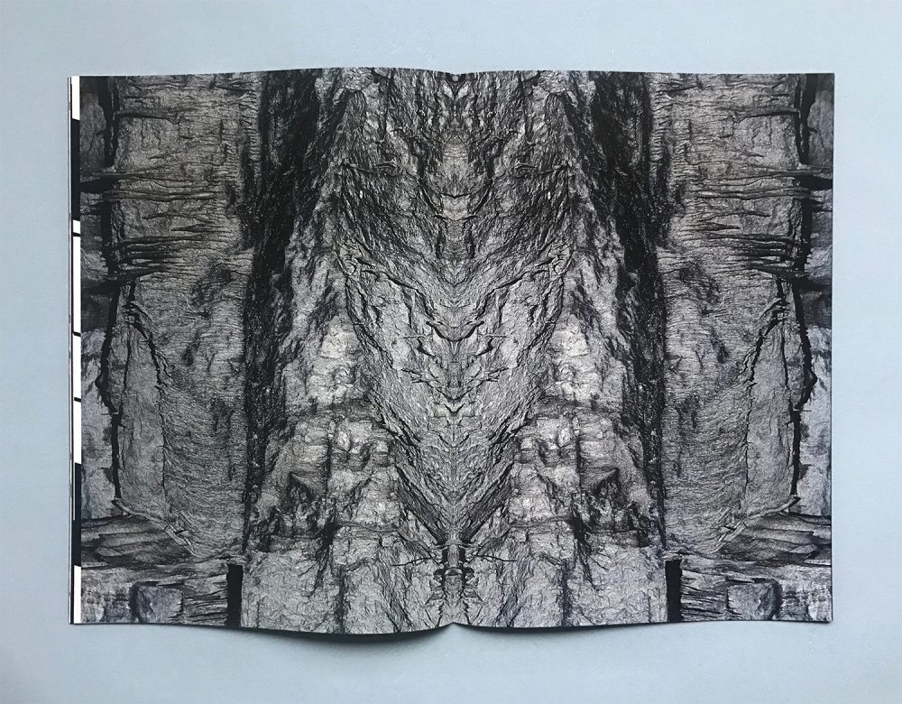
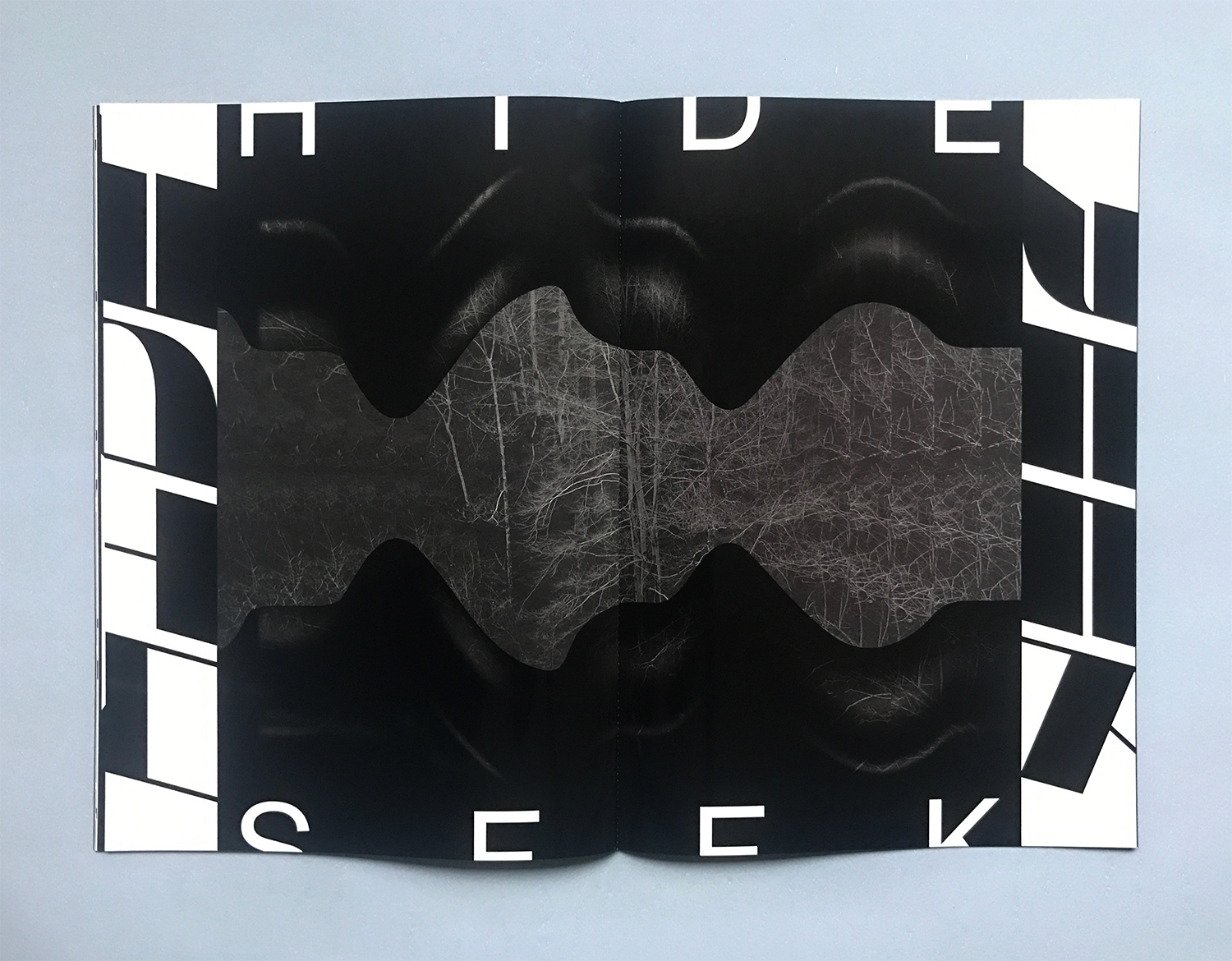
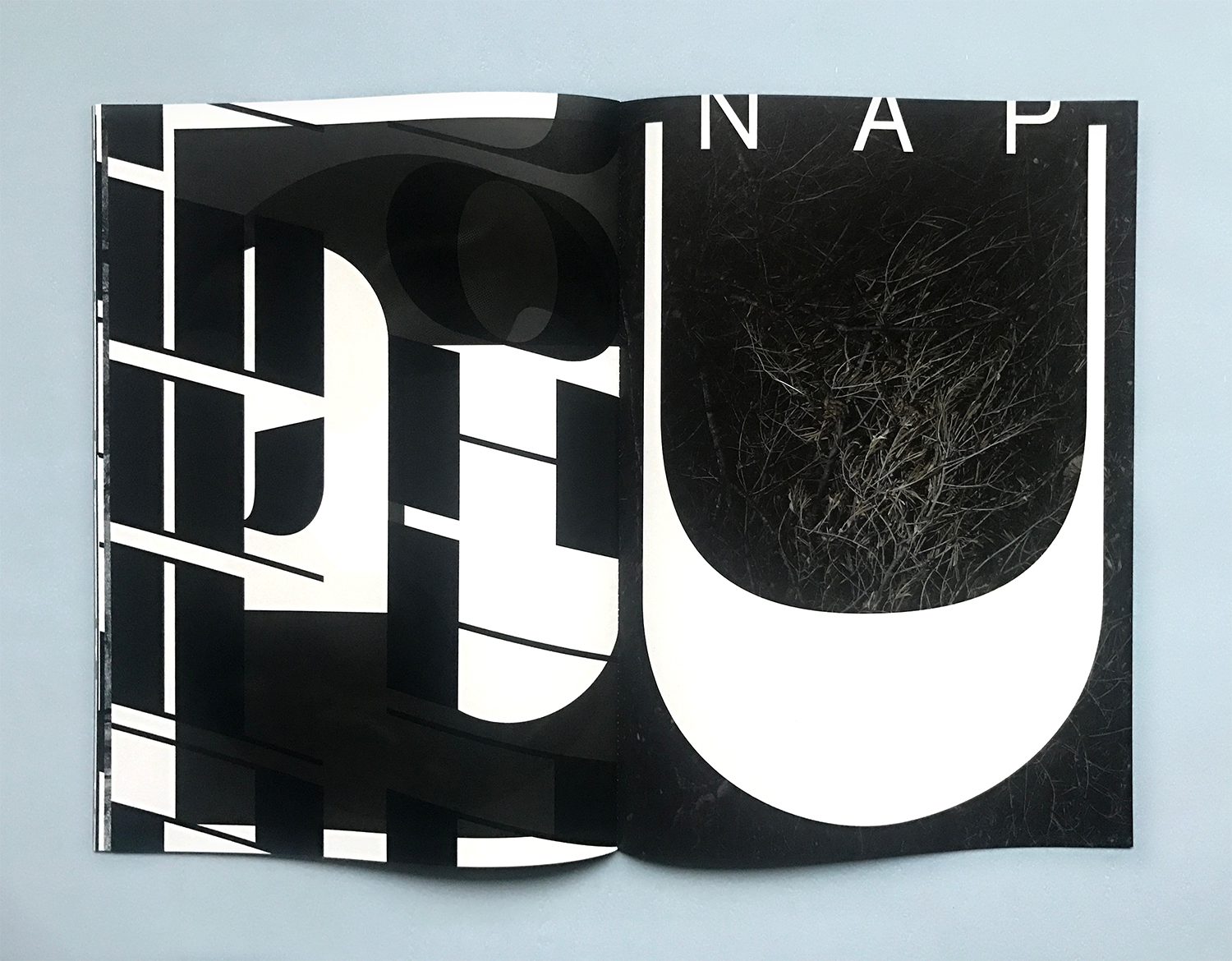
Analog Flood draws its visual sources from the North Pole, in the ice, under the sea with a spiritual detour in a distant pagoda! Mystic visuals are inspired by many cultures. The architecture of the Buddhist temples has been a basic element for the creation of the layout grid.
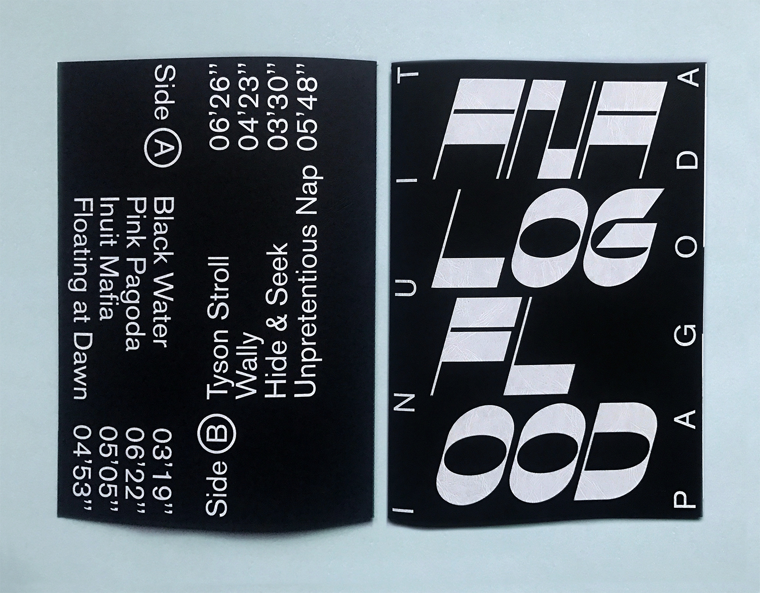
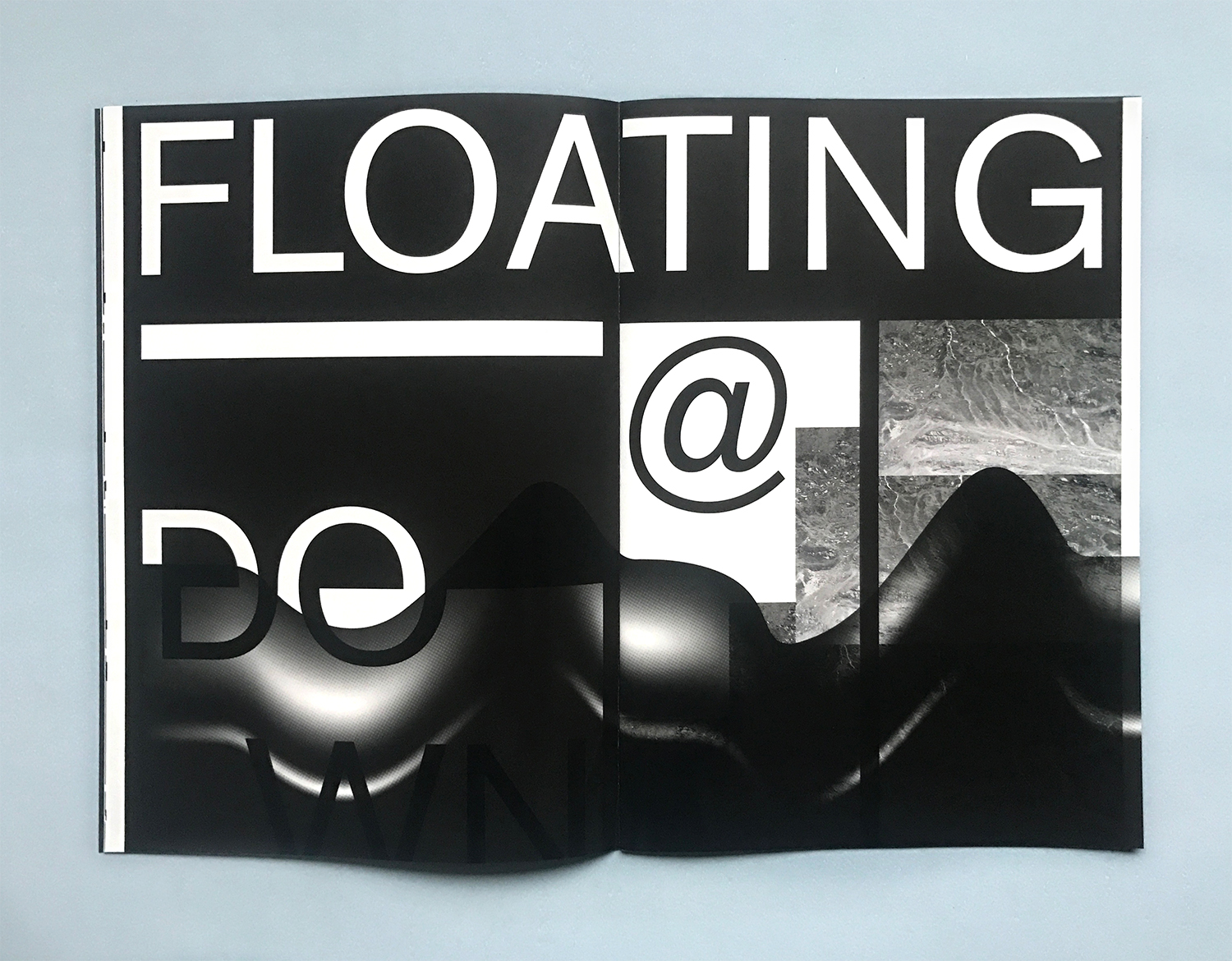
The display font designed for the project takes its inspiration from the Inuit writing system. The marked difference between forms and counter-forms allows a game of composition with the pictures.
Letters in compositions are positioned in such a way, that they are still readable while they become symbolic when they are isolated or when they are cut freeboard.
The lyrics of the song Black water have found their place in the iconographic world of Alex Girod: Hello, north pole, freeze my skeleton, Soft skin, cold breeze, icy venom Below sea surface I hear sirens, Calling sailors, dive in, silence…
 .
.
As paper and printing enthusiasts, we are eager to know what papers and printing methods were used, and were they chosen for any specific reasons?
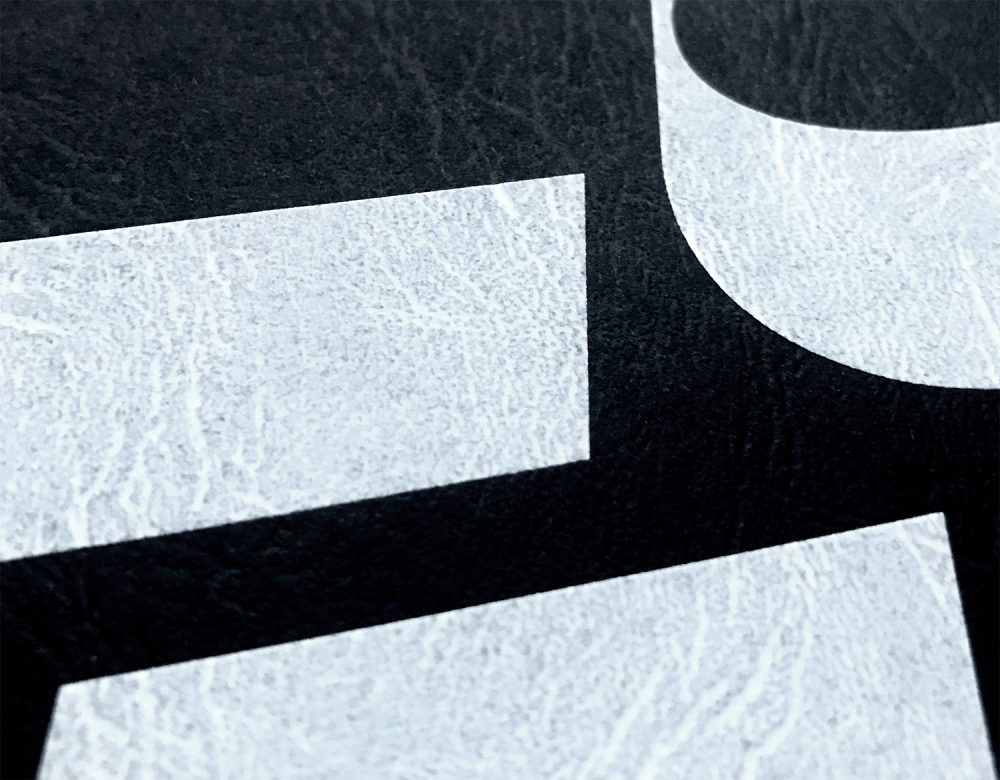
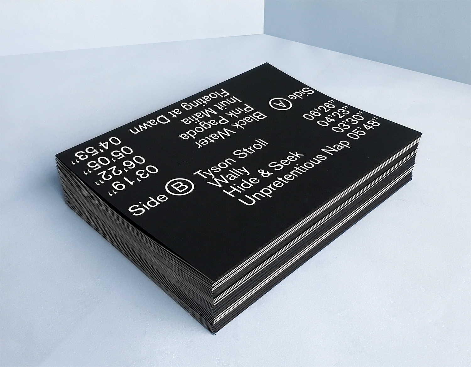
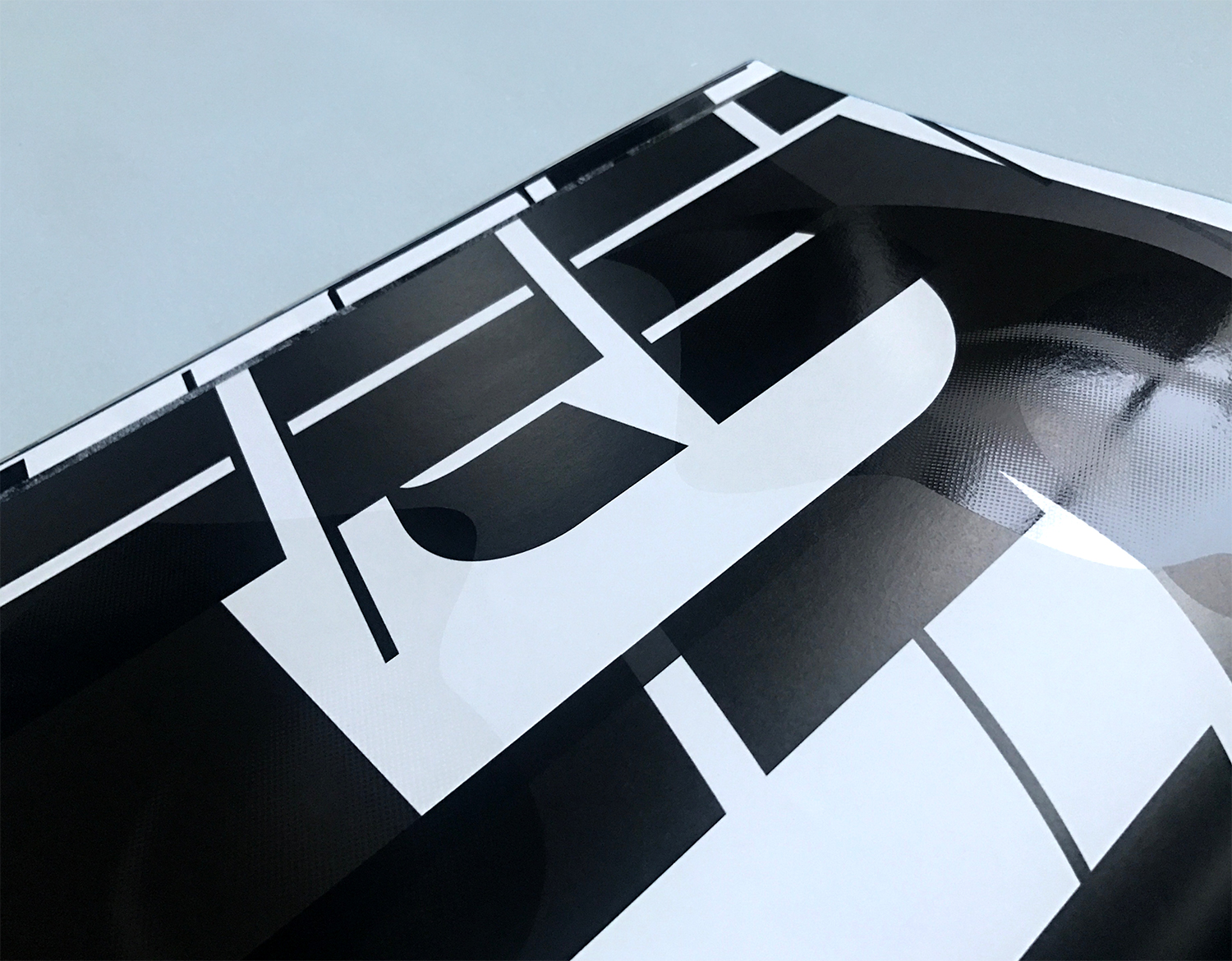
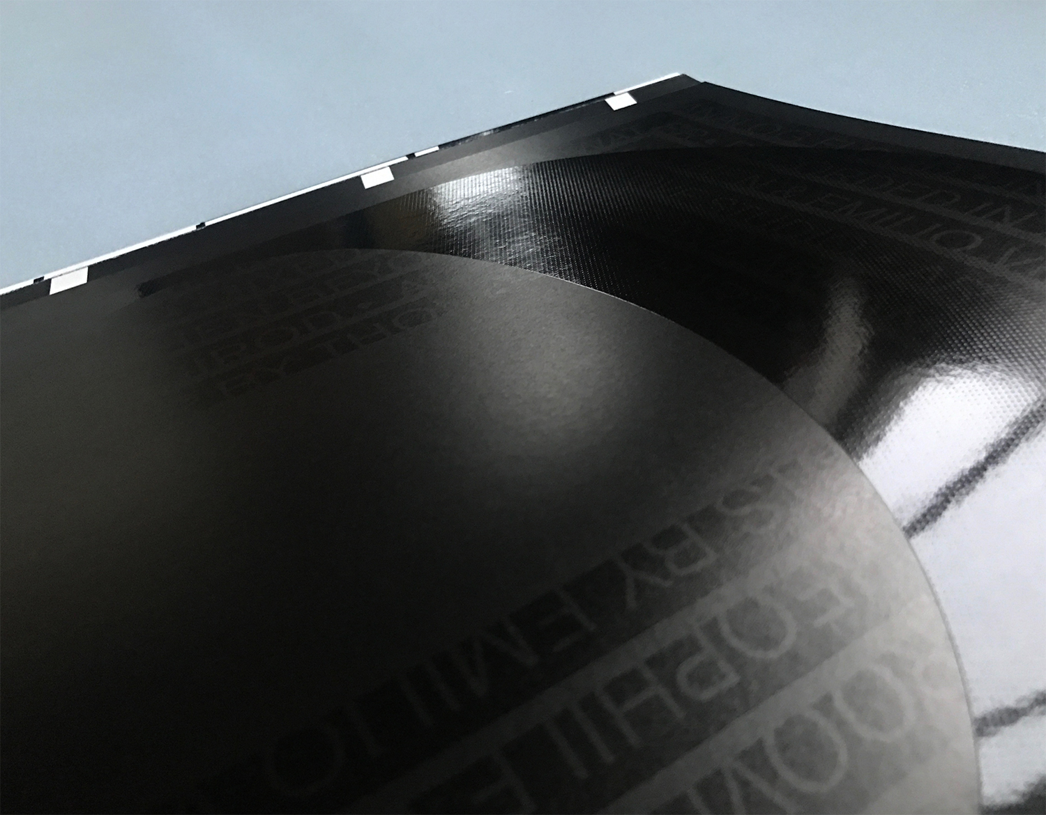
The booklet was printed in Belgrade at Alta Nova. For the cover, we chose the Color Style Leather Deep Black 300 gsm – paper exclusively available at Europapier. Its embossed structure covered with white ink in silkscreen, reminiscent of the texture of the Ice and goes well with the arctic universe of the project. To accentuate the title, we also decided to emboss the cover. The inside pages of the Booklet are printed on GardaPat 13 Kiara 135 gsm – also exclusively available at Europapier. Its natural touch appearance brings a great contrast with the UV screen printing varnish.
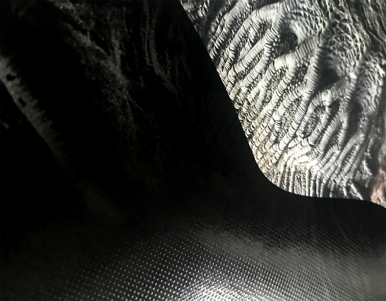
We transcribed the sound of Analog Flood project using several printing techniques. The idea is to awaken the sense of touch when you hold the booklet in your hands.
About forty microphones were used for the recording of the album, in order to have a very nuanced depth of the sound spectrum. In this same idea, the visuals were printed in CMYK in offset then a Pantone Black process was overprinted to give depth and to obtain very dense blacks. To visually transcribe the sound texture of Analog Flood, a coarse raster is printed in UV varnish. Silkscreen made it possible to physically render the relief thanks to a large deposit of ink.
Artwork by Théophile Glauser Atelier U-Zehn
Photography by Alex Girod
All music and arrangements by Emilio Vidal
You are currently viewing a placeholder content from YouTube. To access the actual content, click the button below. Please note that doing so will share data with third-party providers.
More InformationImages © Théophile Glauser

