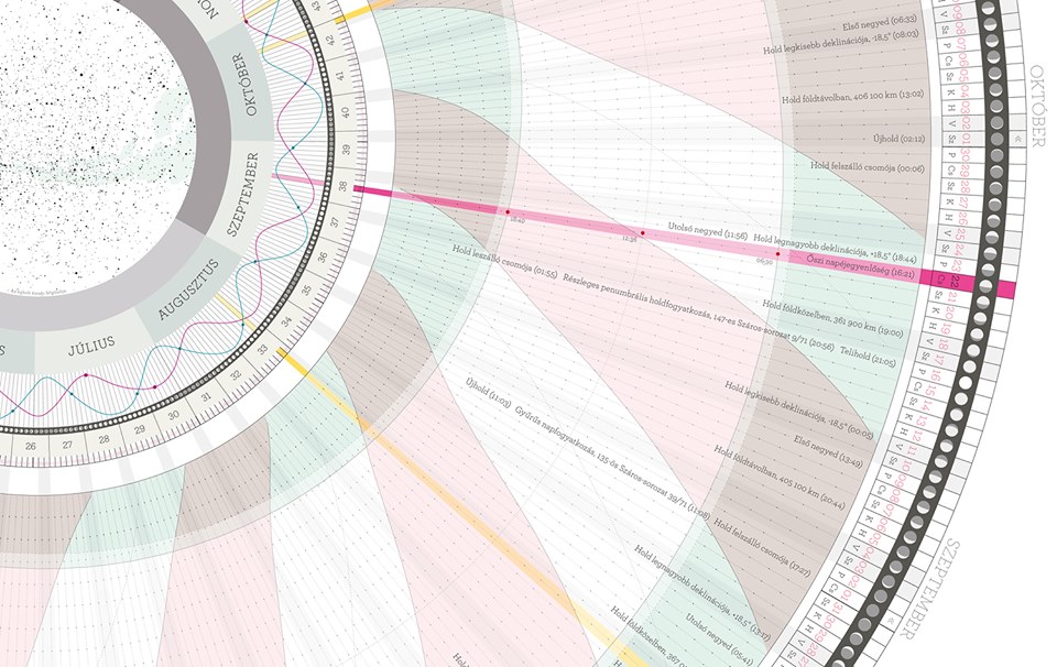
Christmas came early this year, rolled up neatly in a beautiful cardboard package that says Anaptár on the side. Anaptár is a unique, informative poster calendar designed by Anna Farkas, which is not only a work of beauty but also a source of fascinating new discoveries. The Red Dot 2015 winner and German Design Award 2016 nominated Anaptár comes in various versions, ranging from New York to Vienna, and makes a welcome Christmas gift in any home!
Even though I organize my life mainly in a digital format these days, nothing beats an old school wall calendar, that you can glance at any time and it gives you an overall view of the year. And to have one as beautiful as Anaptár, and with as much information, you can be sure it has earned its place on a prime spot in our house!
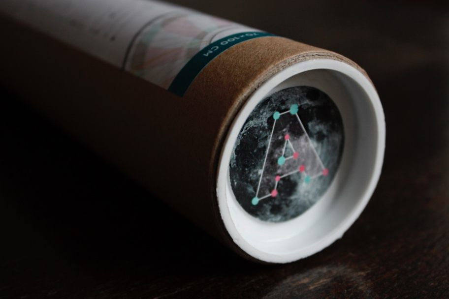
The story of Anaptár starts in 2009 when Hungarian graphic designer Anna Farkas studied peoples reflections of the calendar and how they mostly visualized it linearly. She soon realizes that her own habit of seeing the calendar year as a cycle rather than a line created an opportunity to study the matter more. With a strong interest towards the moon, she created the Anaptár calendar, which visualizes data on the Sun and the Moon in a novel fashion, offering more information than a simple enumeration of days, and thus offers new depths of knowledge. Since that year, she has come out with a new issue each year.

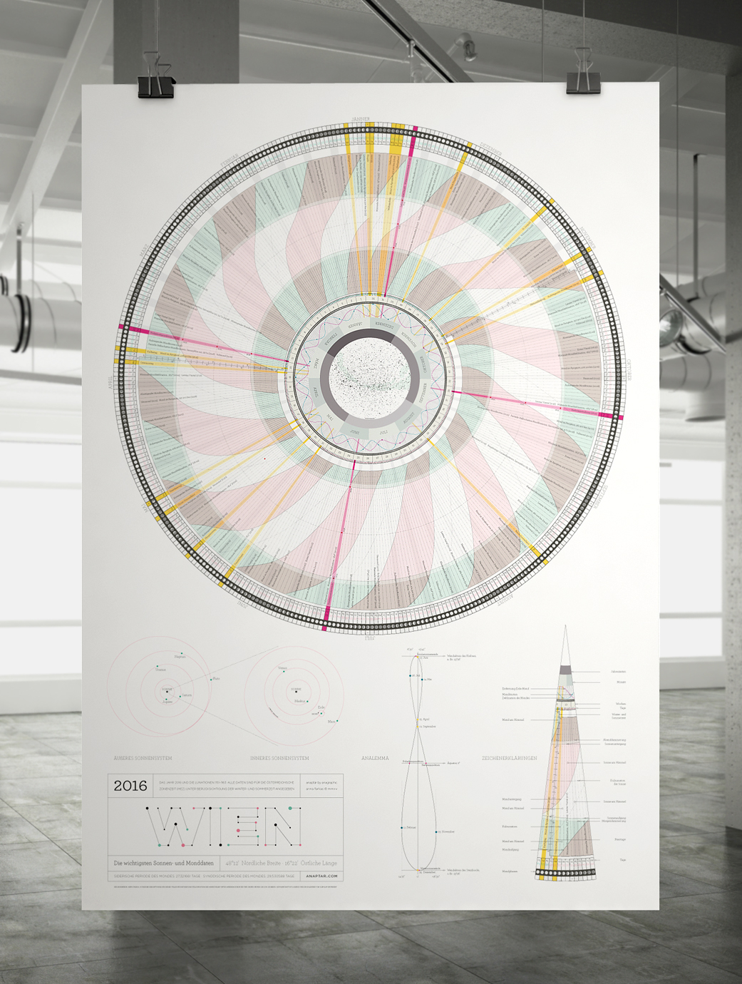
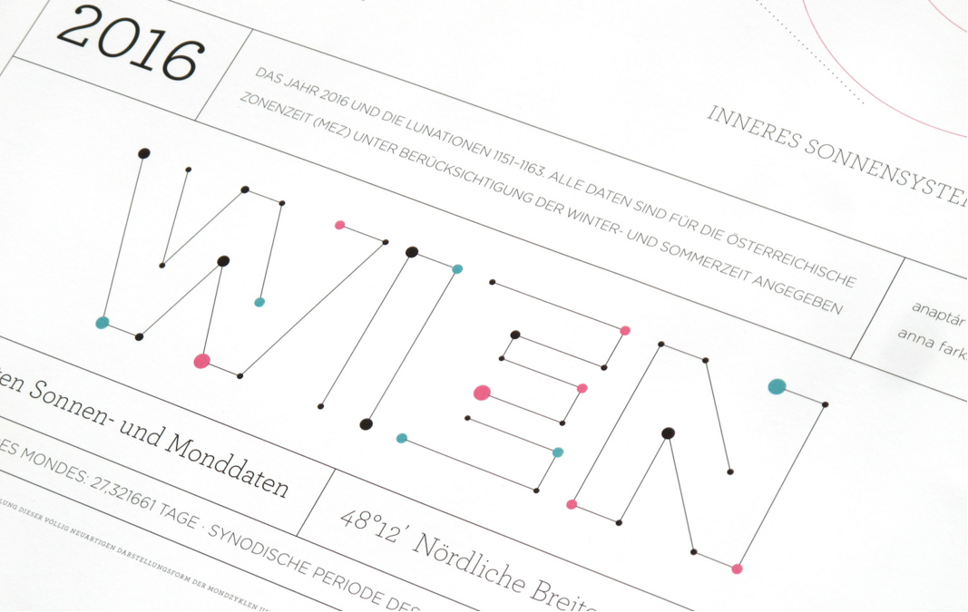
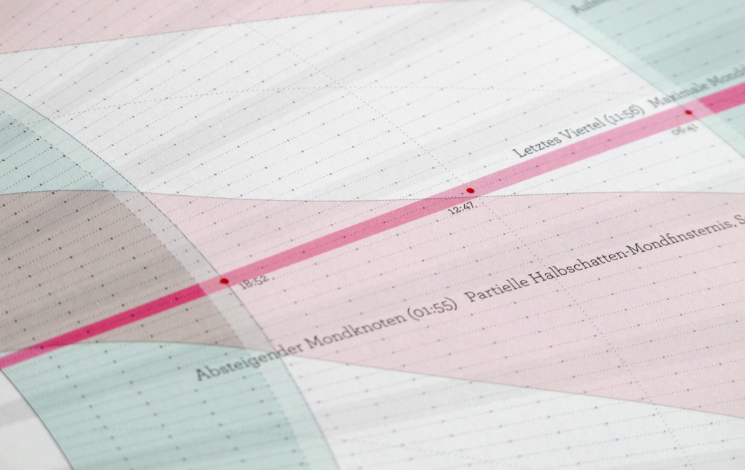
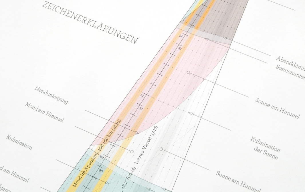
The method of presented data and the visual depiction of the lunar cycle vividly illustrates the astronomic correlations. Months are shown on the inside while dates on the outer circle. The wavy lines in the middle represent the distance between the earth and the moon as the satellite orbits us in an imperfect oval. For 2016 Farkas designed calendars for six cities, New York, London, Berlin, Copenhagen, Budapest and Vienna (YAY!) which are customised specifically for those places, listing important information as local holidays as well as information on celestial events: solar eclipses, lunar eclipses, sunrise & sunset times and other cool tidbits.
Thanks to infographic mapping, the calendar appeals even to viewers who would usually not pore over the details. So whether or not you are a lunar-nut, everyone can appreciate this gorgeous design. The light color scheme of pink, green and yellow hues, mixed with monochrome and stylish typography is not too over-powering but subtle. The amount of information Farkas managed to incorporate in such a lovely way is mind-boggling.
So what are you waiting for? Believe me, this will be THE calendar hit of 2016, so don’t miss out and get yours now, just in time for the new year!
BUY YOUR HERE.
Images ©️ Anagraphic & Design&Paper

