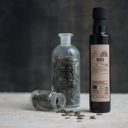
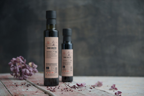
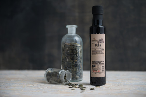
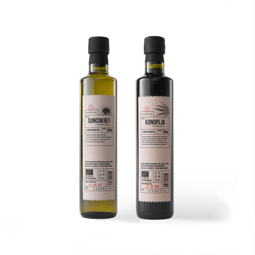
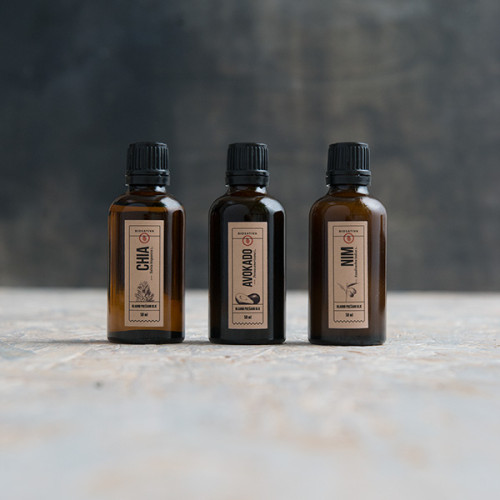
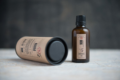
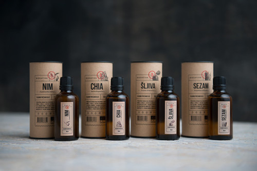
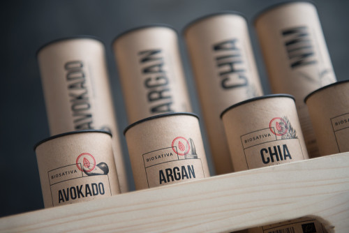
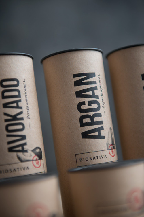
Croatian designer Negra Nigoevic designed a stylish visual identity and packaging for a new brand of cold-pressed oils named Biosativa. The simple, luxurious style is a result of the classic combination of toned down colors, quality materials, and strong typography. The design is the perfect example of how simple kraft paper can elevate a product.
Kraft paper has been one of the biggest and most prominent trends of last year in packaging design, as well as in visual identity and branding, and it is here to stay. Not only is kraft a sustainable choice it also conveys a message of ecological values. Designers have been making an extra effort into making it a respectable and serious choice when designing high-end packaging, steering away from the dusty, crafty feel it previously had. Nigoevic’s packaging for Biosativa is a great example of this.
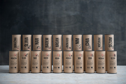
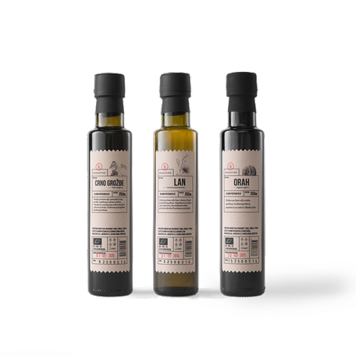
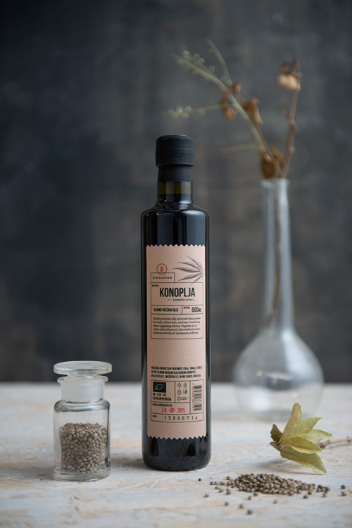
The dark bottles in which the cold pressed oils are packed remind of old apothecary medicine bottles giving the product a retro and exclusive feel. The simple labels indicate all the needed information with clear typography and small illustrations of the plant the oil in question is made of. Keeping the colors to a minimum and highlighting the name and brand is clever and elegant. The round, cylinder-shaped packaging is efficient and carries through with the overall style of the range. I definitely wouldn’t mind having these bottles on my kitchen counter.


Photos via Negra Nigoevic

