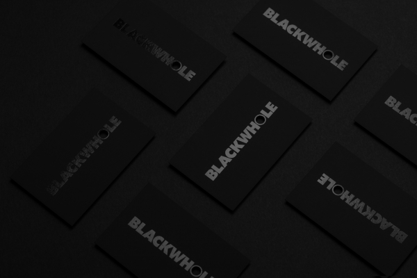
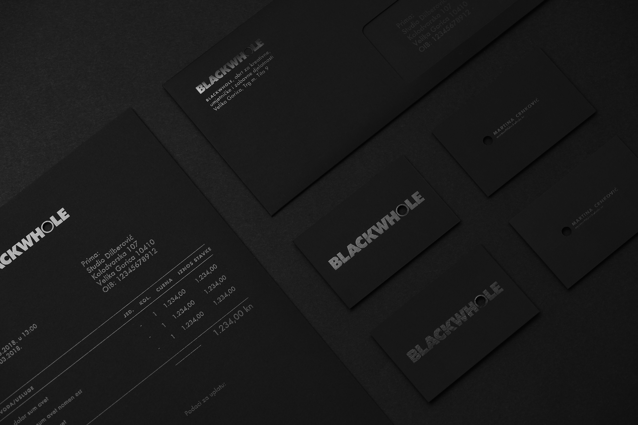
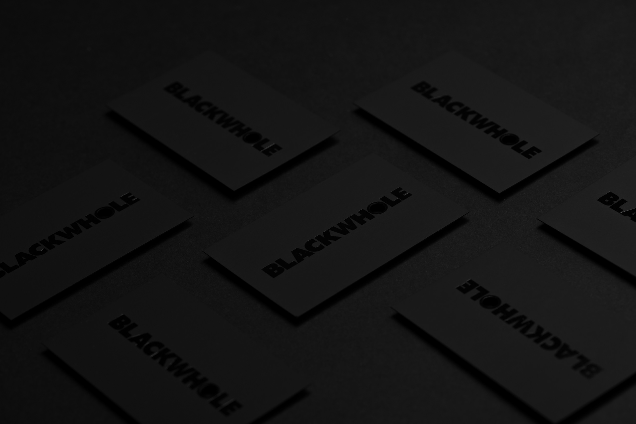
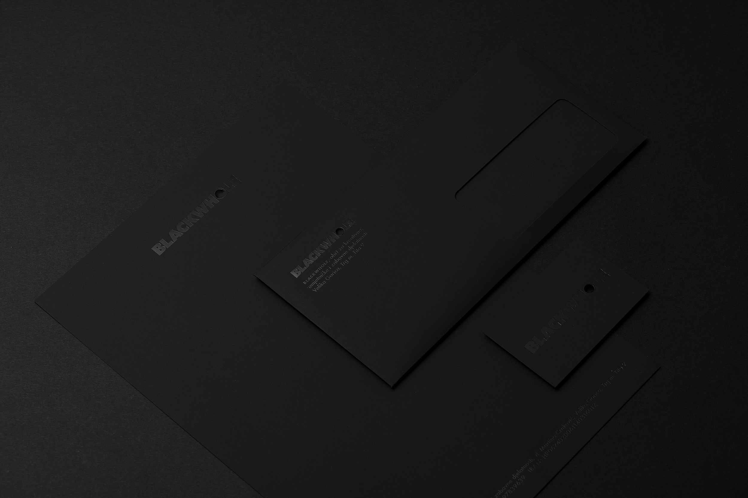
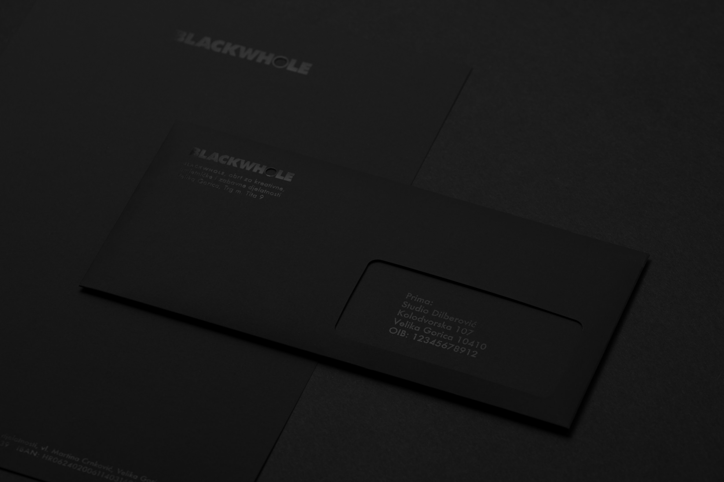
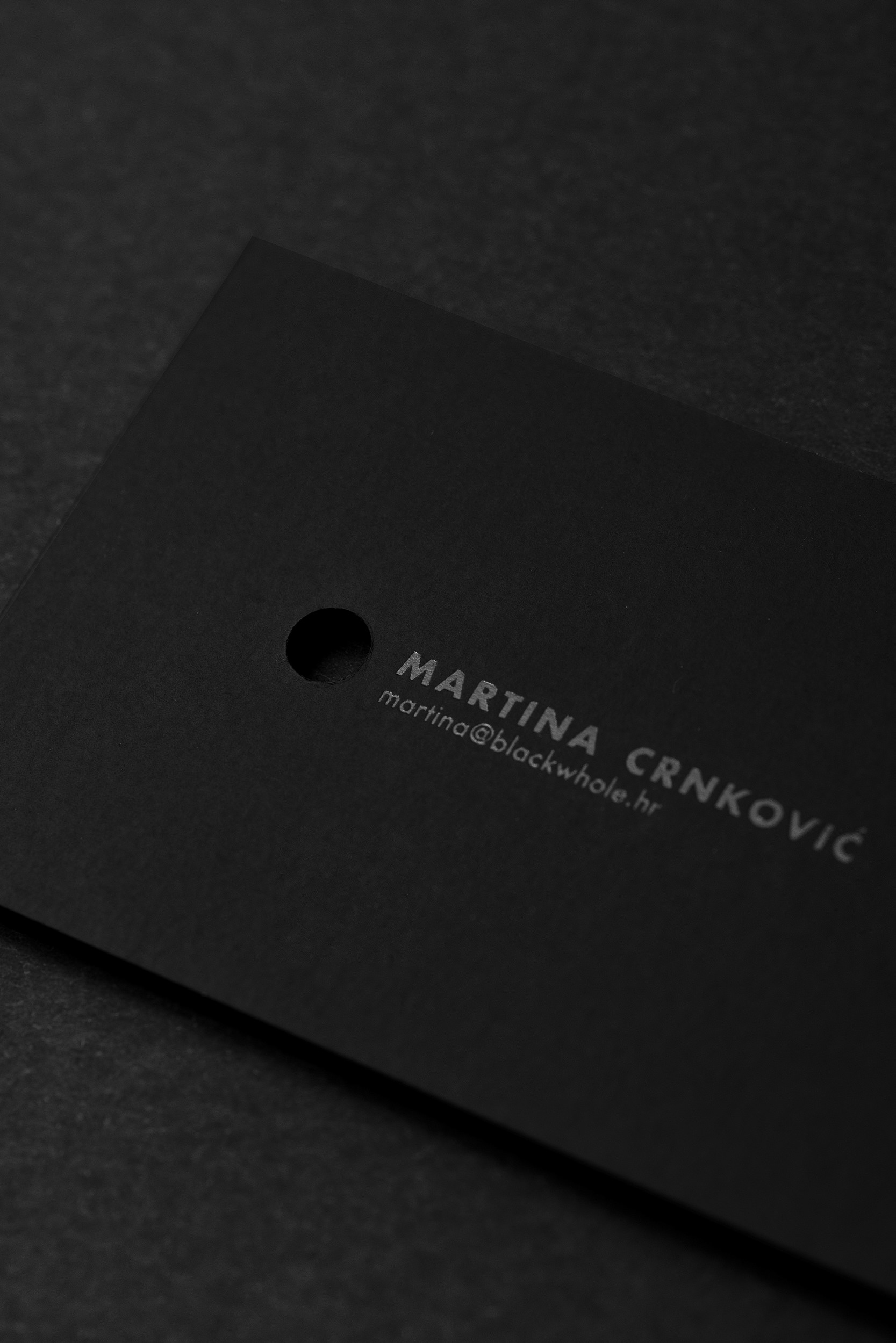
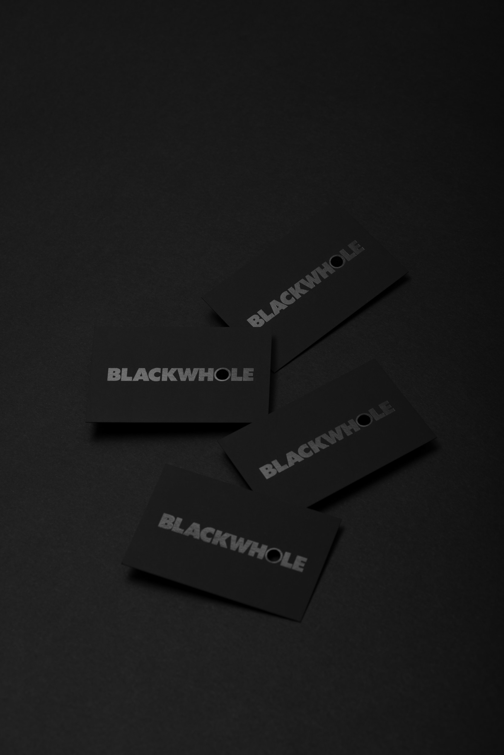
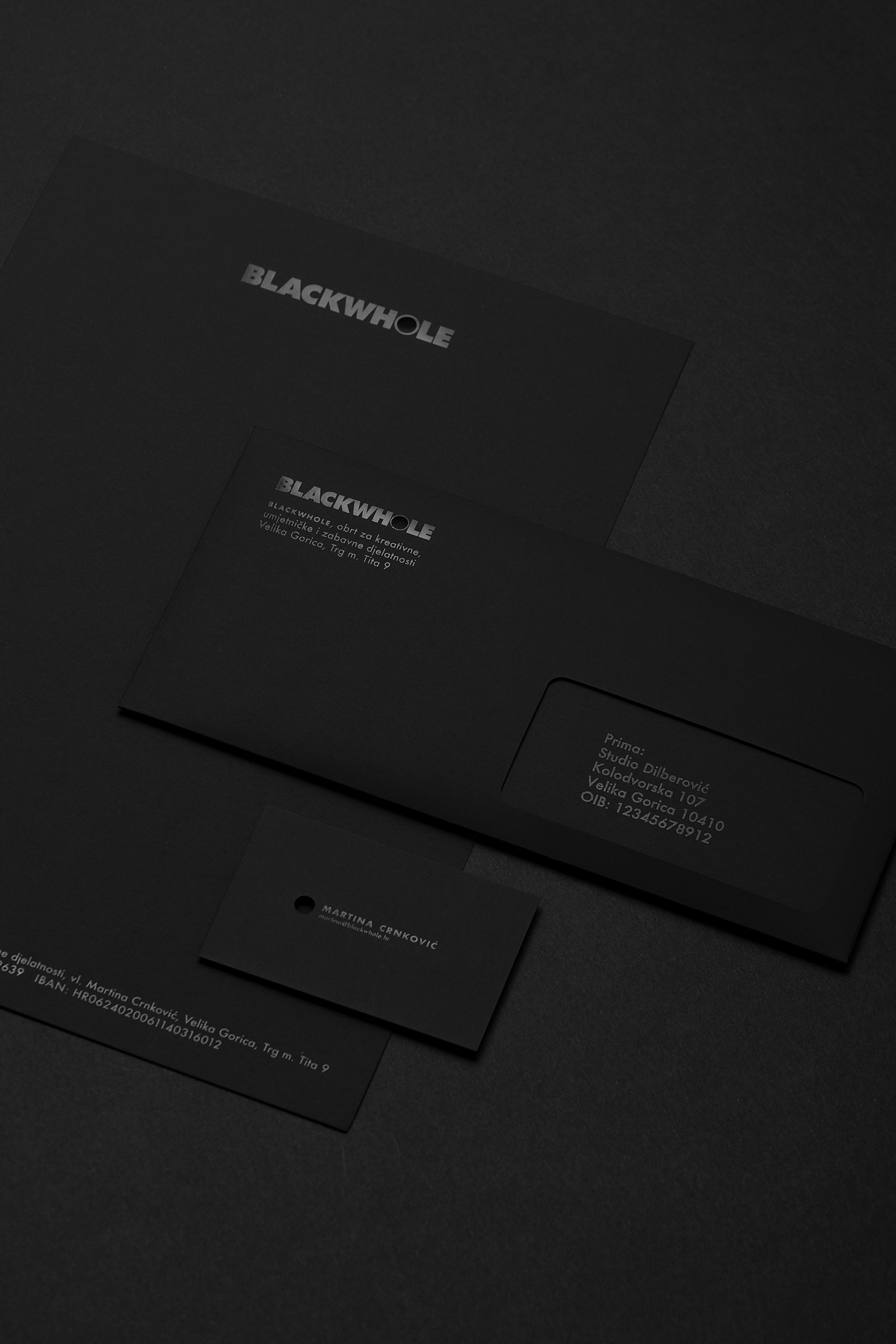
B L A C K W H O L E is an all black branding project by Croatian designer Ivan Dilberovic (previously here) with a core concept of black foil print on black paper with a punched hole, nothing more and nothing less. A design which proves that more often than not, the strongest concepts come from most seemingly simple ideas. The unique name of the one person company is at the core of the design, with a sturdy block letter logotype, including a punched out hole on the letter o. The name, a composite, inspired by the owner’s passion for the color black as well as black holes in space, plays on the identical pronunciation of the words whole and hole.
The BLACKWHOLE identity is a prime example of how to utilize hot foil printing with elegant results. Black on black is an incredibly exquisite design effect when done correctly, but it can easily become a hindrance if the contrast is lacking, making it hard to see or read. In Dilberovic’s design, the deep matt black of the paper and the high gloss of the hot foil black creates a beautiful whole, while the punched out letter in the logo becomes an intriguing focal point, demanding attention in the cleverest way possible.



Images © Ivan Dilberovic Photography: Marija Gasparovic

