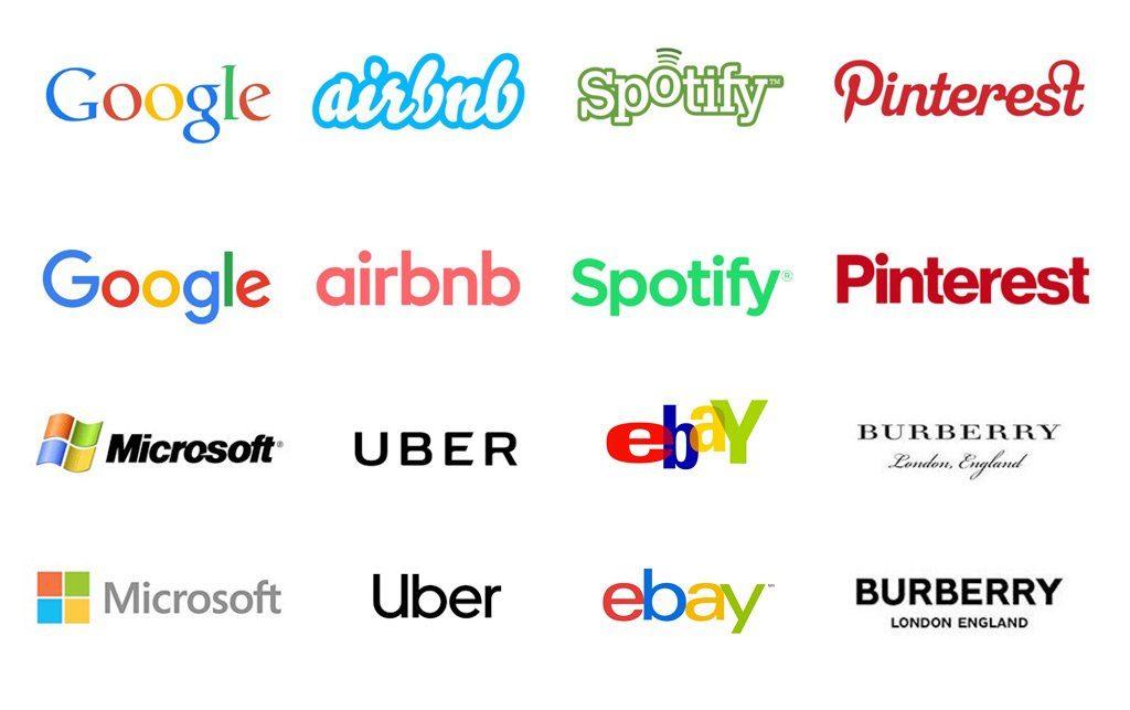
In the last decade, branding has seen a growing trend towards what critics call “blandification” or “blanding”. This refers to the simplification of logos and brand identities, often making them more uniform, less distinctive, and in many cases, devoid of personality. What once might have been bold, quirky, or highly recognizable, are now increasingly more streamlined: uniform minimalistic designs that can seem generic. While this trend may promote clarity and modernity, and even offer some ecological benefits, it also raises questions about whether brands are losing their uniqueness in the pursuit of a clean aesthetic.
What exactly is Blandification and why is it happening now?
Blandification is the process of stripping away the most intricate or distinctive elements of logos and branding elements to create simpler, flatter, and often more neutral designs. The shift is particularly prominent in industries like tech, fashion, and retail, where major players such as Google, Airbnb, and Burberry have revamped their logos into basic, sans-serif fonts. The goal here is often to appear more modern, adaptable across digital platforms, and globally accessible. However, we might argue that this results in a sea of brands that look nearly identical, sacrificing uniqueness and emotional resonance for the sake of minimalism.
One of the key drivers of blandification is the digital-first nature of modern branding. Logos are now designed to be highly scalable, versatile, and optimized for small screens like smartphones and tablets. Complex, detailed logos may not translate well into these formats, leading companies to adopt more minimalist approaches. This trend is also fueled by the desire for brands to appeal to worldwide audiences, where the simplicity and neutrality of designs are often perceived as more inclusive.

From an ecological standpoint, the trend toward blandification in branding offers some unexpected advantages.
Simplified, minimalistic logos and brand designs often require fewer resources to produce, both digitally and physically. For instance, the use of streamlined, flat colors in logos means less ink and fewer complex printing processes, which can reduce waste and energy consumption. This is especially relevant in packaging, where elaborate multi-color designs might increase the environmental impact of printing and manufacturing. By adopting a minimalist approach, brands could cut down their carbon footprint, and promote a more sustainable production process. Additionally, with the emphasis on neutrality and timelessness, blandified designs are often intended to stay relevant for longer periods, reducing the need for frequent rebranding and, consequently, reducing the waste associated with constant design updates. But it also has to be considered, how many decisions go into creating physical branding materials, from choosing the right papers to the best printing methods, and at every step of the process, greener values can be emphasized by simply making educated choices. Highlighting ecological values can surely be done without sacrificing the personality of a brand.
While the impact of Blandification on printed branding materials might offer savings in production, it simultaneously decreases the cherished emotional connection with consumers.
Blandification has a unique effect on printed branding materials, altering everything from packaging to business cards. When brands adopt simpler, more standardized visuals, the physical artifacts of branding — flyers, business cards, brochures, packaging, and advertisements — tend to look more alike, often reducing the distinctive appeal these materials can have for potential customers. Traditionally, brands leverage their print medium to create memorable, eye-catching designs that set them apart in the tactile, real-world contexts that are highly competitive. And, as more brands lean toward minimalism, printed materials can lose the depth and character that complex graphics and unique fonts once offered. While this may make for a cleaner and more uniform aesthetic, it also means that printed branding materials may struggle to capture the customer’s attention, especially in saturated marketplaces where visual differentiation is key. And while these reductions in the actual printing processes, that minimalism imposes, might lead to cost savings it also result in a decreased tactile and emotional connection with consumers, potentially making physical branding efforts feel less impactful.

