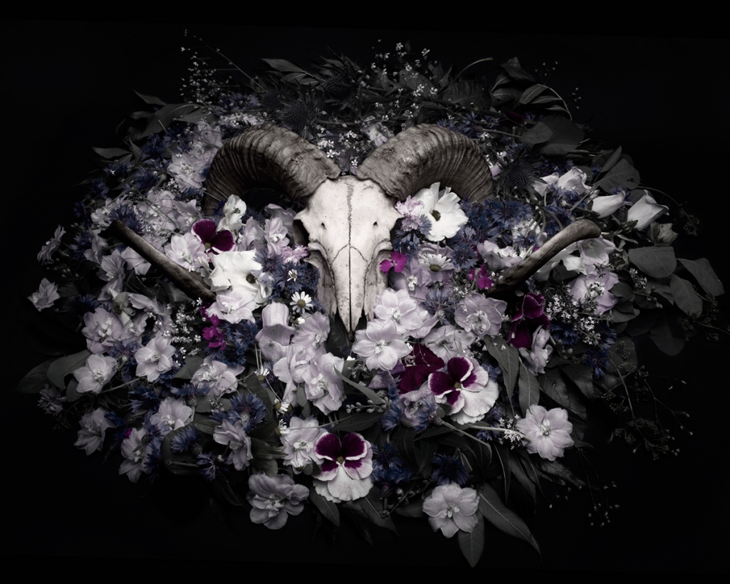
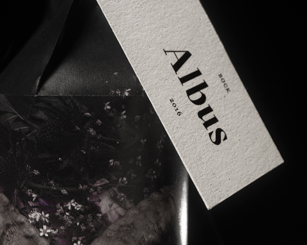
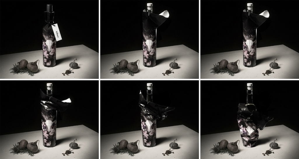
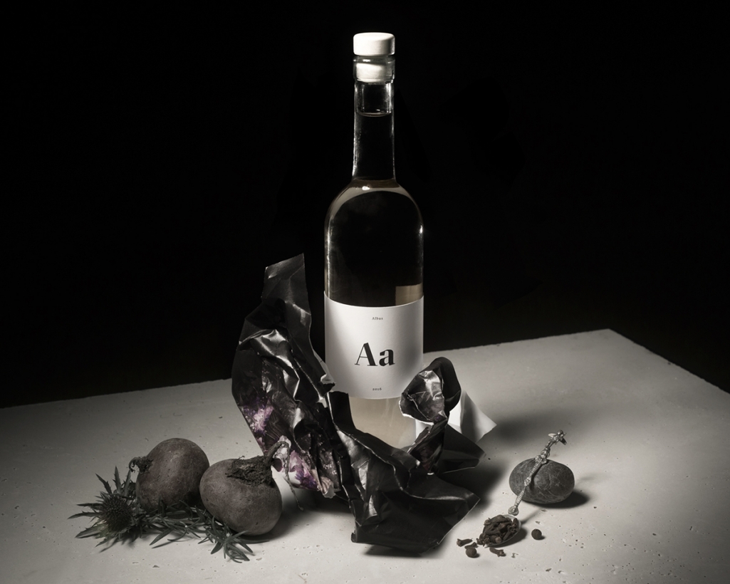
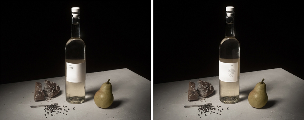
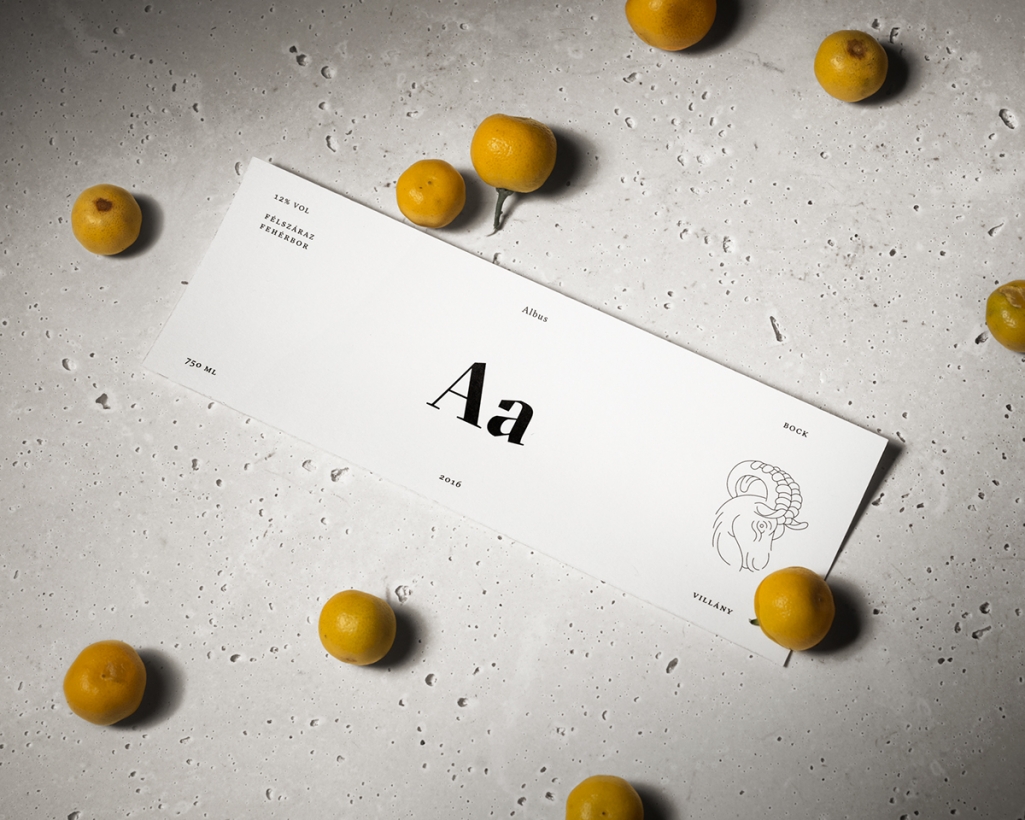
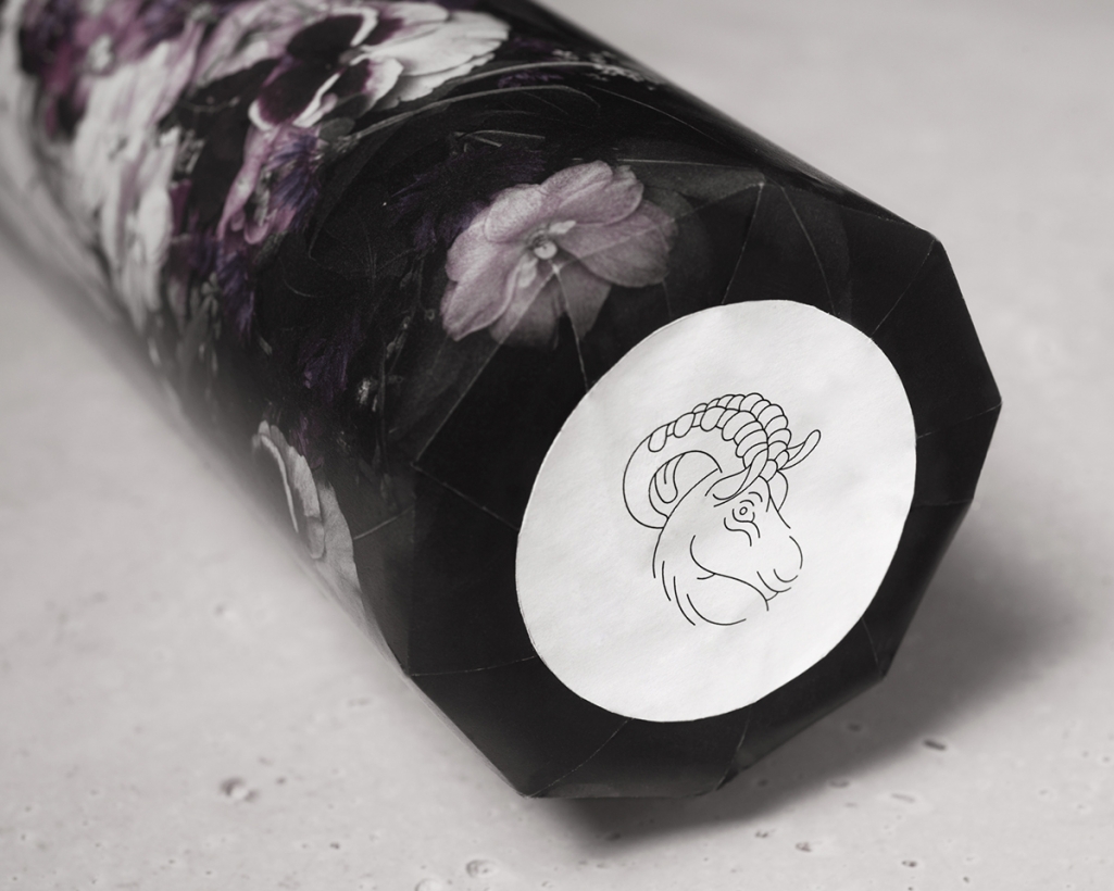
Anna Hidvegi and Kira Koroknai, students of the Hungarian University of Fine Arts Graphic Design department, created a wine packaging concept based on a paraphrase – full of drama and flair. The dark and moody Bock Albus wine design ironically feels like the breath of fresh air in the mids of all the pastel colors in trend now. The photo based packaging on the outside was inspired by still life Vanitas paintings, using a ram skull as the main element, surrounded by wild flowers. The skull is representing the winery by reflecting on their logo. In contrast, the inner label itself has a very clean, purely typographical style, accompanying a single small illustration – the Bock logo.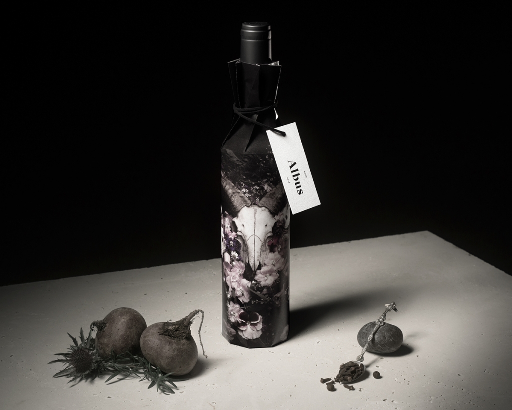
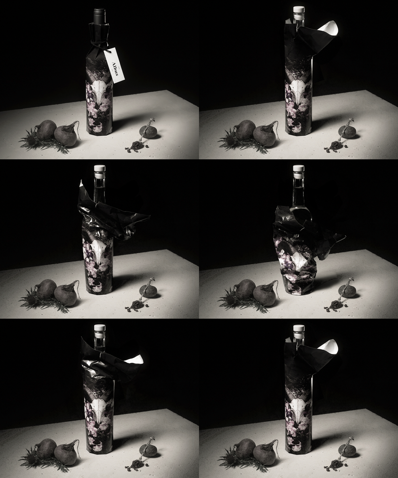
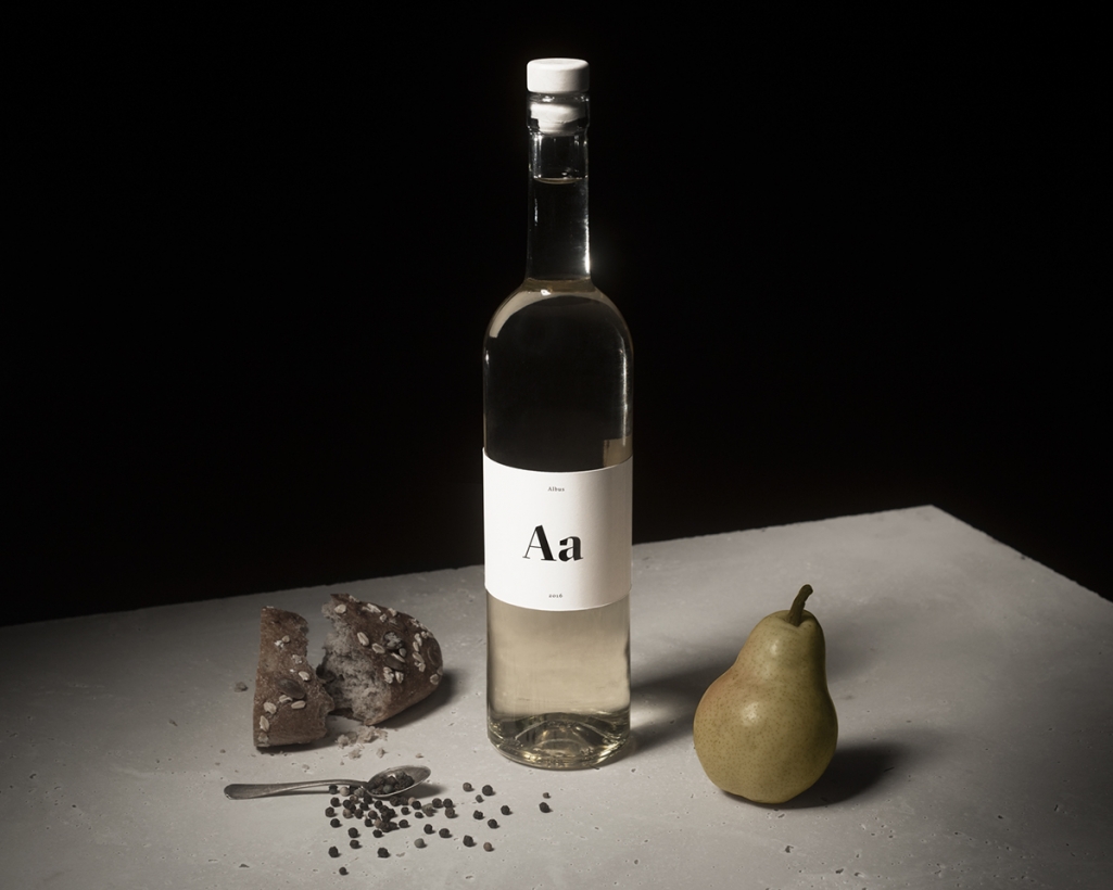
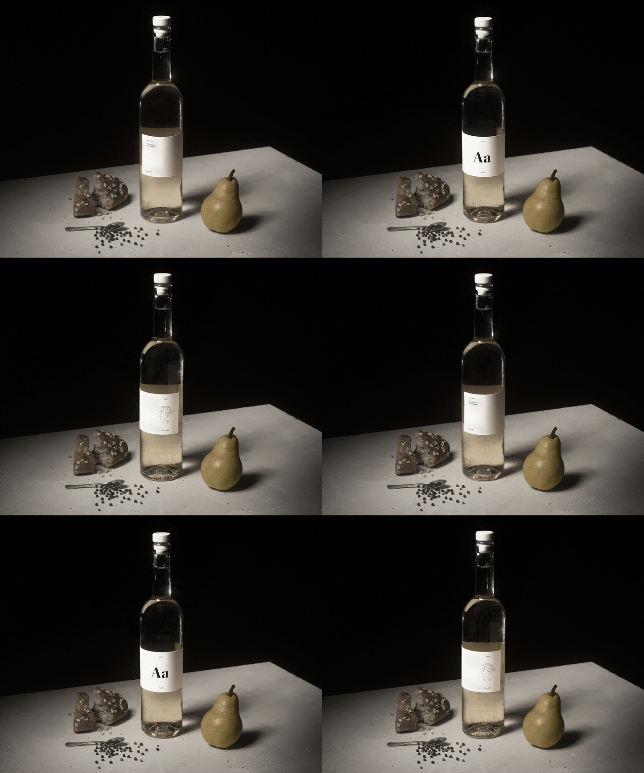
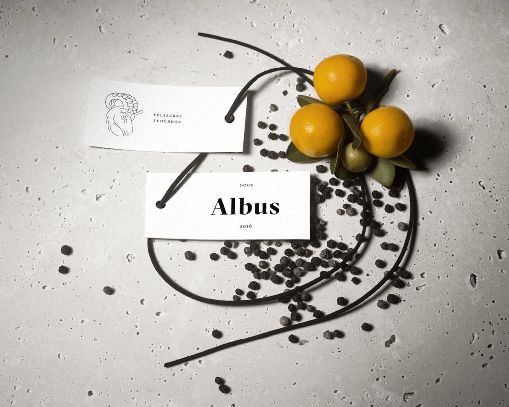
The eye-catching and elegant GT Sectra font family was chosen for the logo, as a “modernised blackletter” the typeface fits perfectly into the concept. The photos showcasing the packaging concept has a strong allegorical representation style, mimicking the 17th-18th century ideal beauty in which the sensations and feelings generated by art in the viewer generates its meaning. The still life sets around the main element – the wine bottle – surrounded by fruits and spices, reflect on the wine’s flavors. The photos are not only for the eyes but also trying to stimulate smelling and tasting at the same time. Each choice in the project is done in good taste and to support the over-all concept, from selected paper materials to graphical details.
Images © Anna Hidvegi & Kira Koroknai

