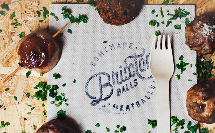
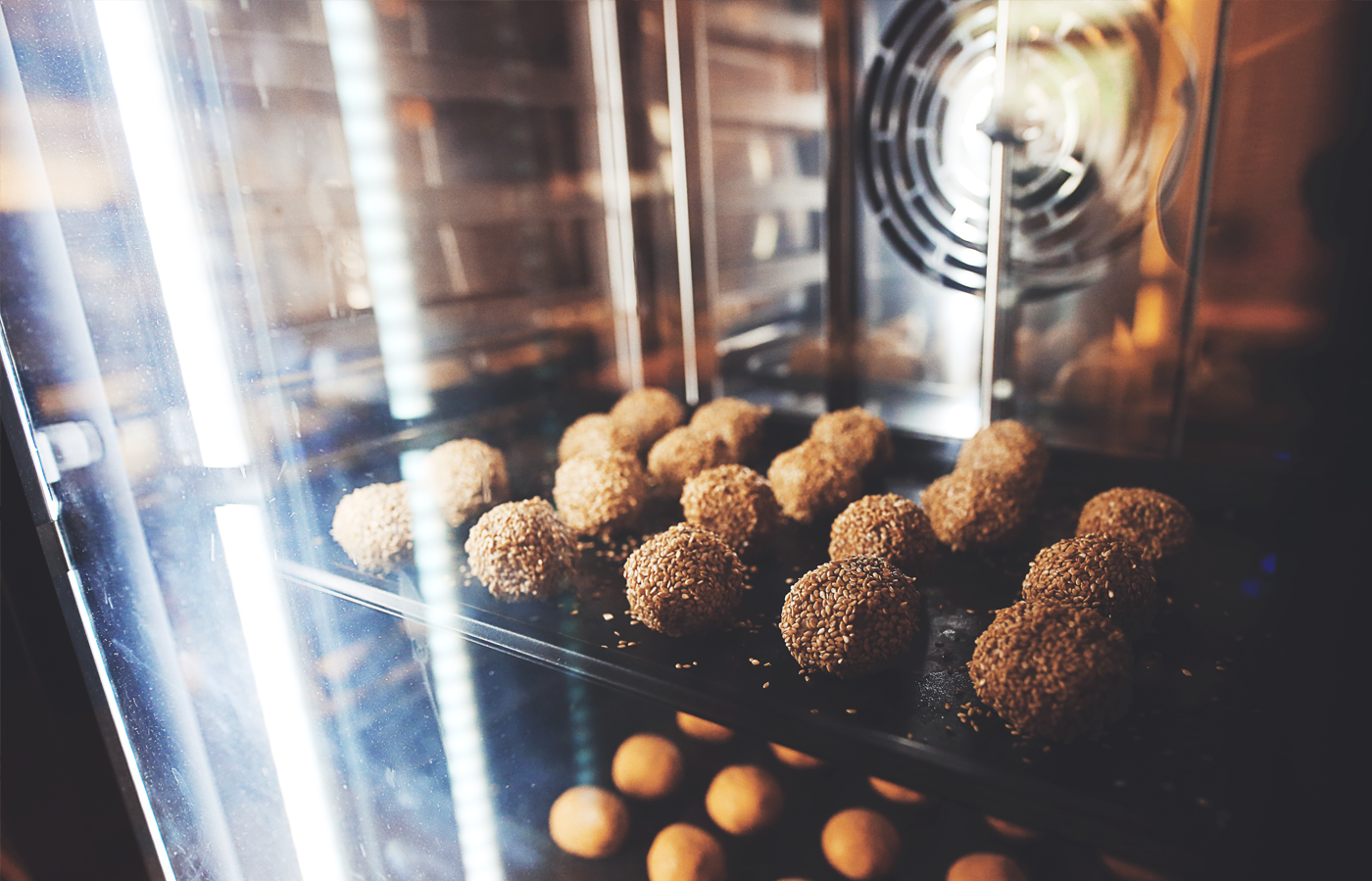




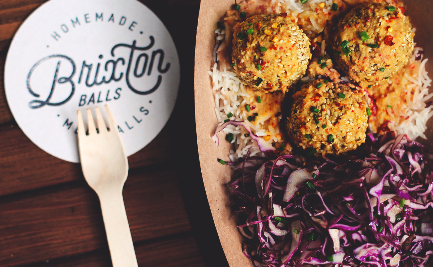


You don’t always need a plan, sometimes you just need balls. Last year Tim Simenon and Luděk Netušil decided to leave their old careers behind to follow their guts – literally – to set up the Brixton Balls street food bistro in Prague’s happening Vinohrady neighborhood. The delicious hand-made meat balls in various creative flavors have won the hearts of the locals, while the young, buzzing atmosphere and top-notch service has helped it build a steady fan base.
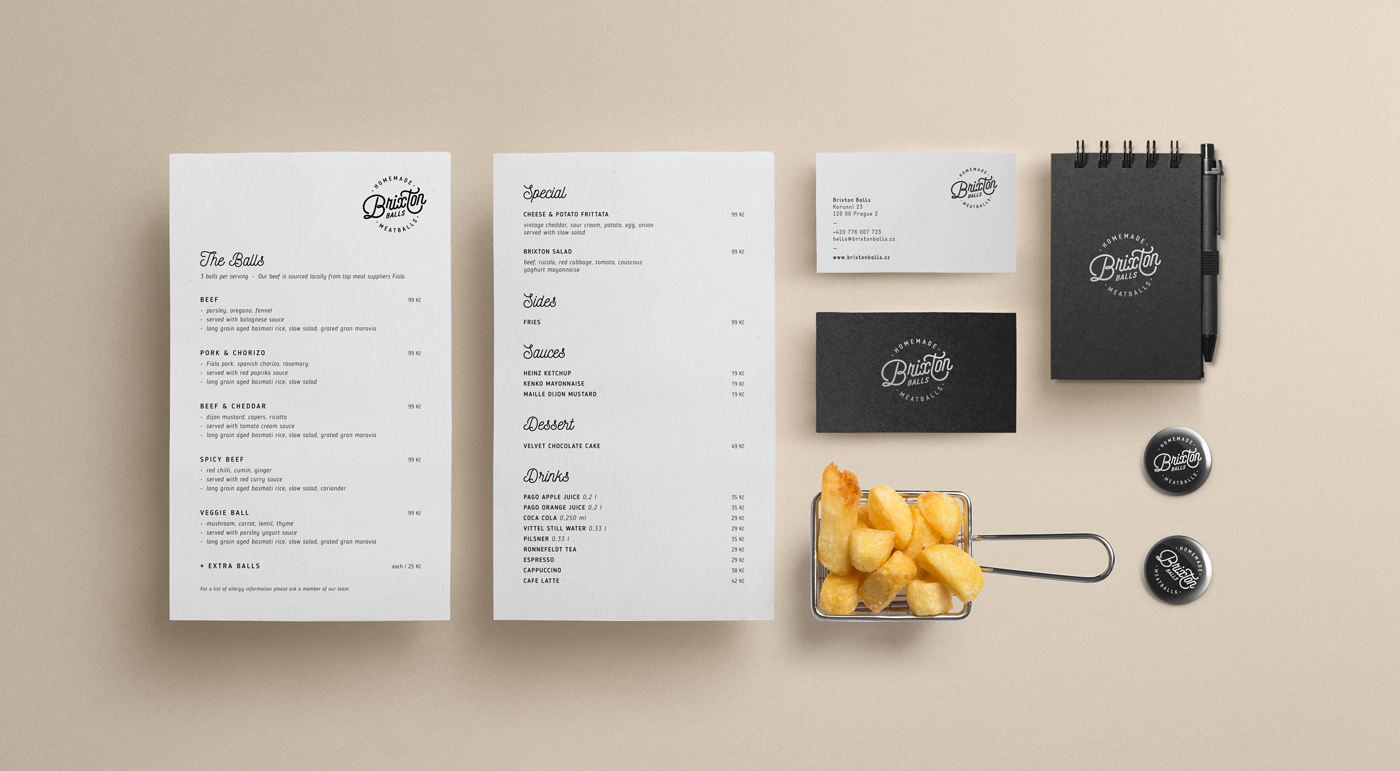
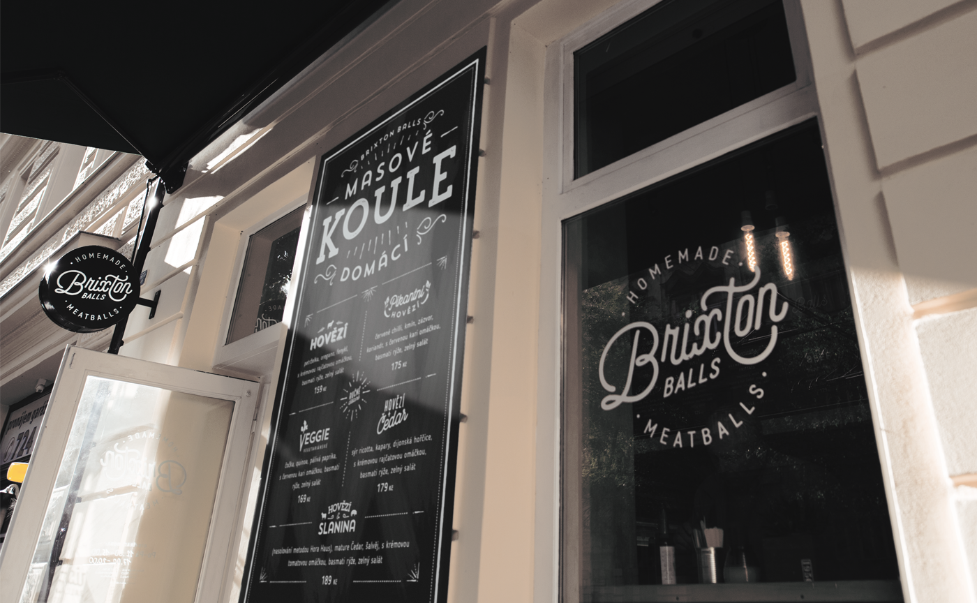
Part of the experience is the visual identity created by local MOO design studio which relies on the no-fuzz attitude and quality materials, following the ideology and mentality of the bistros cooking. The monochrome design is centered around the circular script font logo which matches the hand-lettered menu boards, and is a direct reminder what the most important thing there is: balls! The mix of matt black, off-white and light birch wood is a classic combo that stands time, while the soul of the place is made of the people in it.
Images © MOO Design

