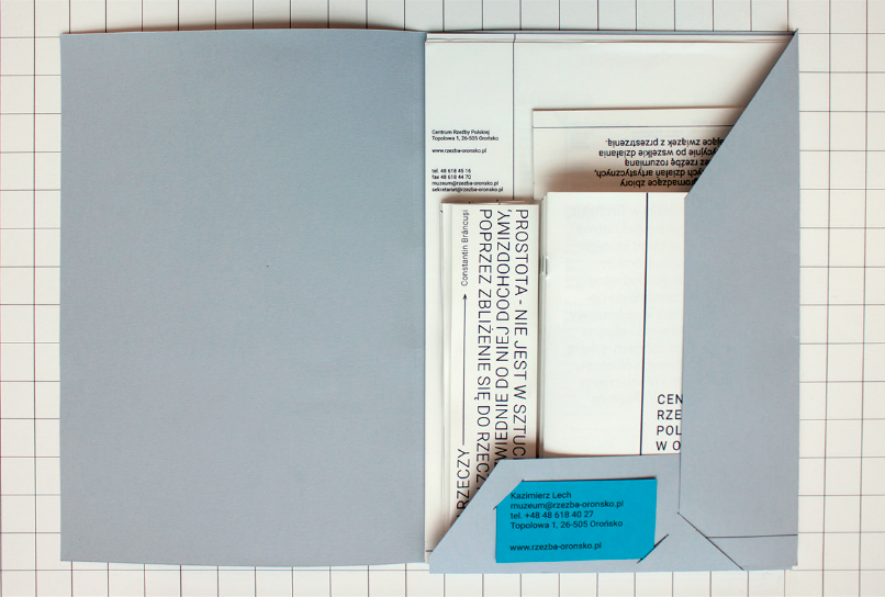
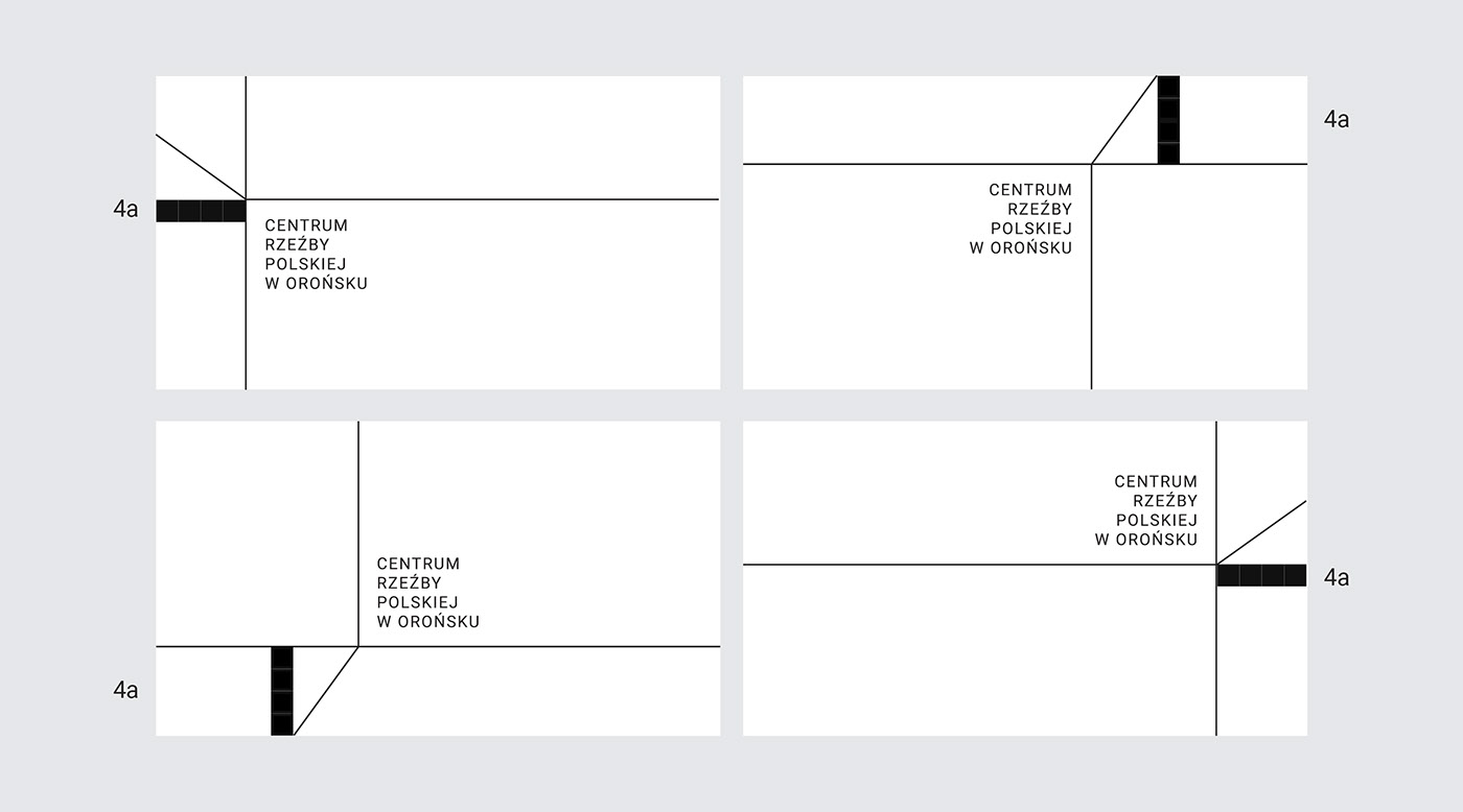
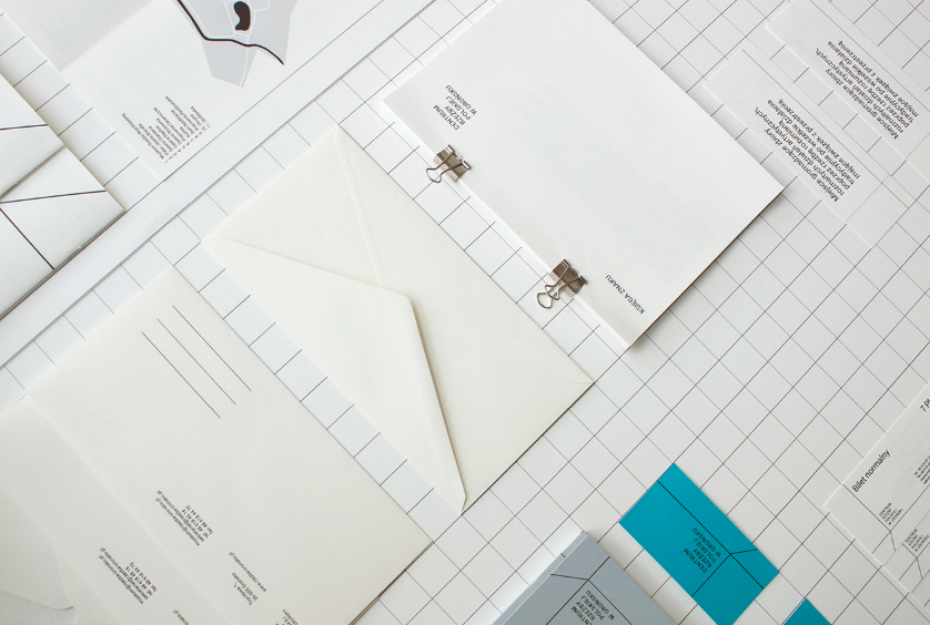
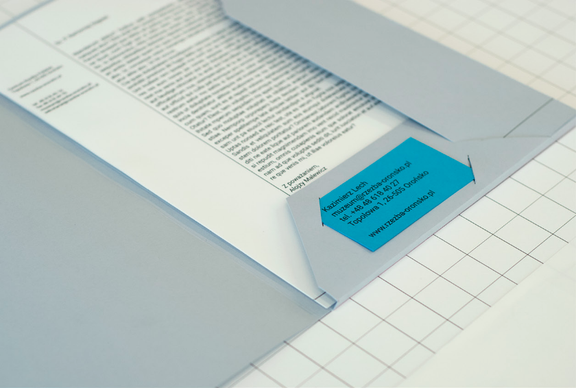
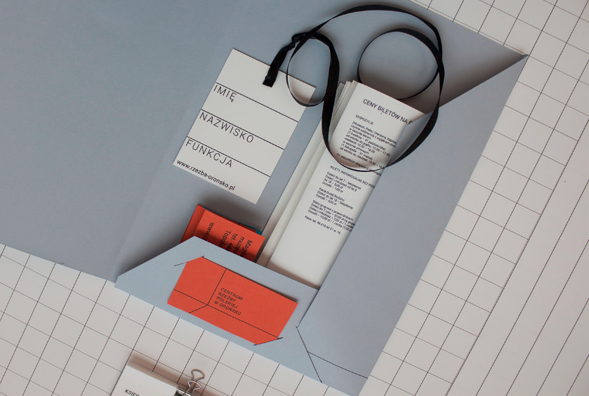
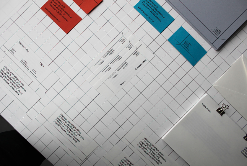
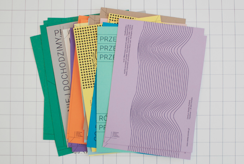
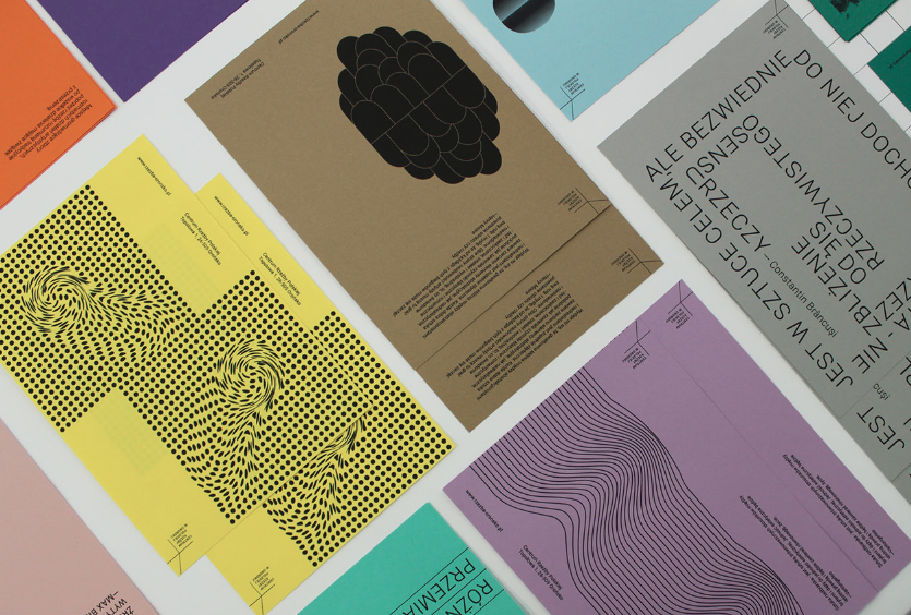
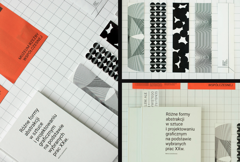
A recent graduate of Graphic Design School in Wrocław Poland, Marina Lewandowska designed a fresh new identity for the Centre of Polish Sculpture. Inspired by abstract art and modernism, Lewandowska created a cohesive visual identity including a minimalist logo, a poster series of strong graphic elements and a cool grid layout unifying the whole range.

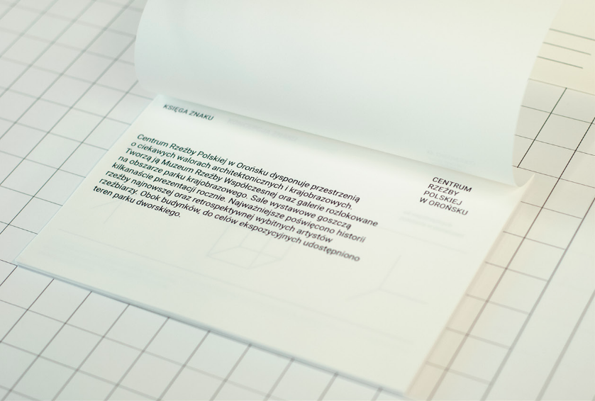
Strongly relying on typography, the identity brings together the fundamentals of good, lasting design. From a clever, simple, meaningful logo that is easily modifiable to strong adaptable layout together with an interesting color scheme and contemporary use of patterns, Lewandowska achieves a strong, cohesive design fitting for the brand.



Images © Marina Lewandowska

