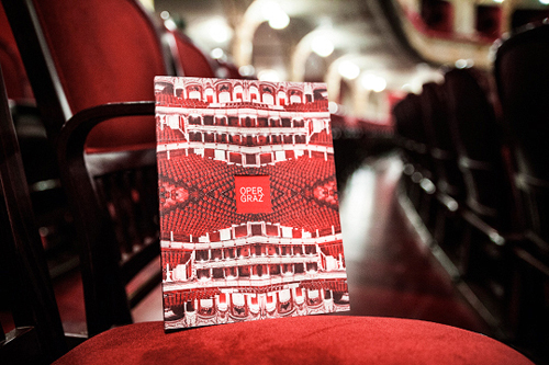
When fancy dressed ladies and gentlemen invade the nightly trams and subways of the city you can tell that the opera season in full swing. Our friends from moodley brand identity created the beautiful season’s book 2013/14 for the opera in Graz which plays with the house’s architectural structure.
The opera in Graz was planned by Ferdinand Fellner and Hermann Helmer during the epoch of neo-baroque and opened its doors in 1899. The architect duo was famous for their love of symmetry.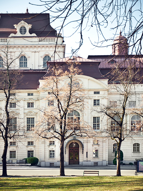
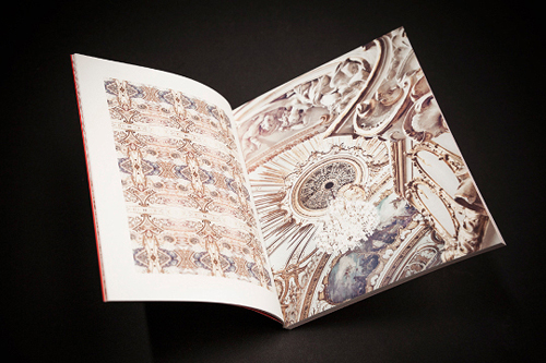
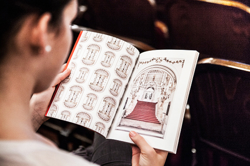
 The season’s book 2013/14 plays exactly with this: Symmetries in the splendid old structures of the opera house are discovered, deconstructed and set together in a new way. The result of this experiment is extravagant mandalas and kaleidoscopic reflections that show the architectural details such as staircases, windows or other ornaments from a very new point of view.
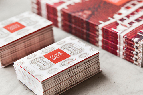
The design and simple and color scheme (red&white) give a contemporary and a bit psychedelic twist to the pompous nineteenth-century architecture of the opera house. The season’s book is printed on premium uncoated Munken paper which adds to this modern touch.
Photo source: Moodley Brand Identity, Michael Königshofer

